5 Tips for Managing Color on Different Substrates

Master color management across various substrates with actionable tips on ink selection, profiles, and pre-press setups for professional results.

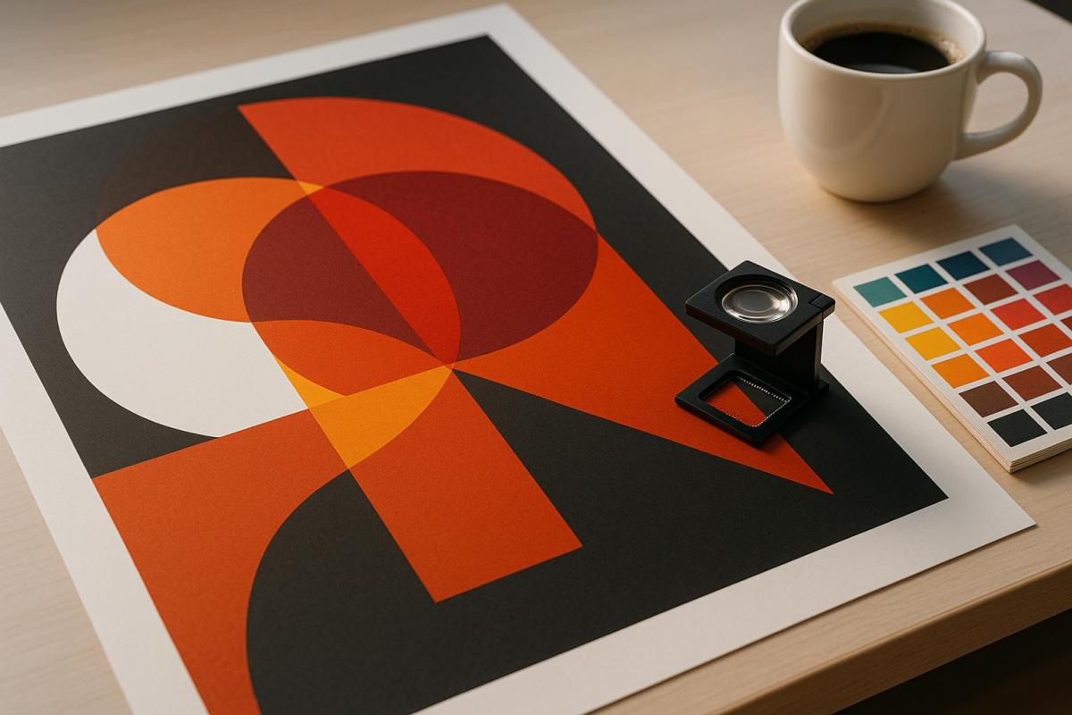
Consistent color across materials is crucial for professional printing. Different substrates – like glossy paper, plastic, or metal – interact with ink in unique ways, affecting the final result. This guide offers 5 actionable tips to maintain color accuracy and quality across all surfaces:

  • Know Your Substrate Properties: Understand texture, absorbency, and reflectivity to predict color outcomes.
  • Build Custom Color Profiles: Use ICC profiles to match colors across devices and substrates.
  • Improve Pre-Press Setup: Prepare substrates, calibrate equipment, and test thoroughly before production.
  • Manage Printing Conditions: Control temperature, humidity, and lighting to ensure consistent results.
  • Test and Review Before Final Printing: Run test prints and get client feedback to catch issues early.

Process Control for Print and Packaging

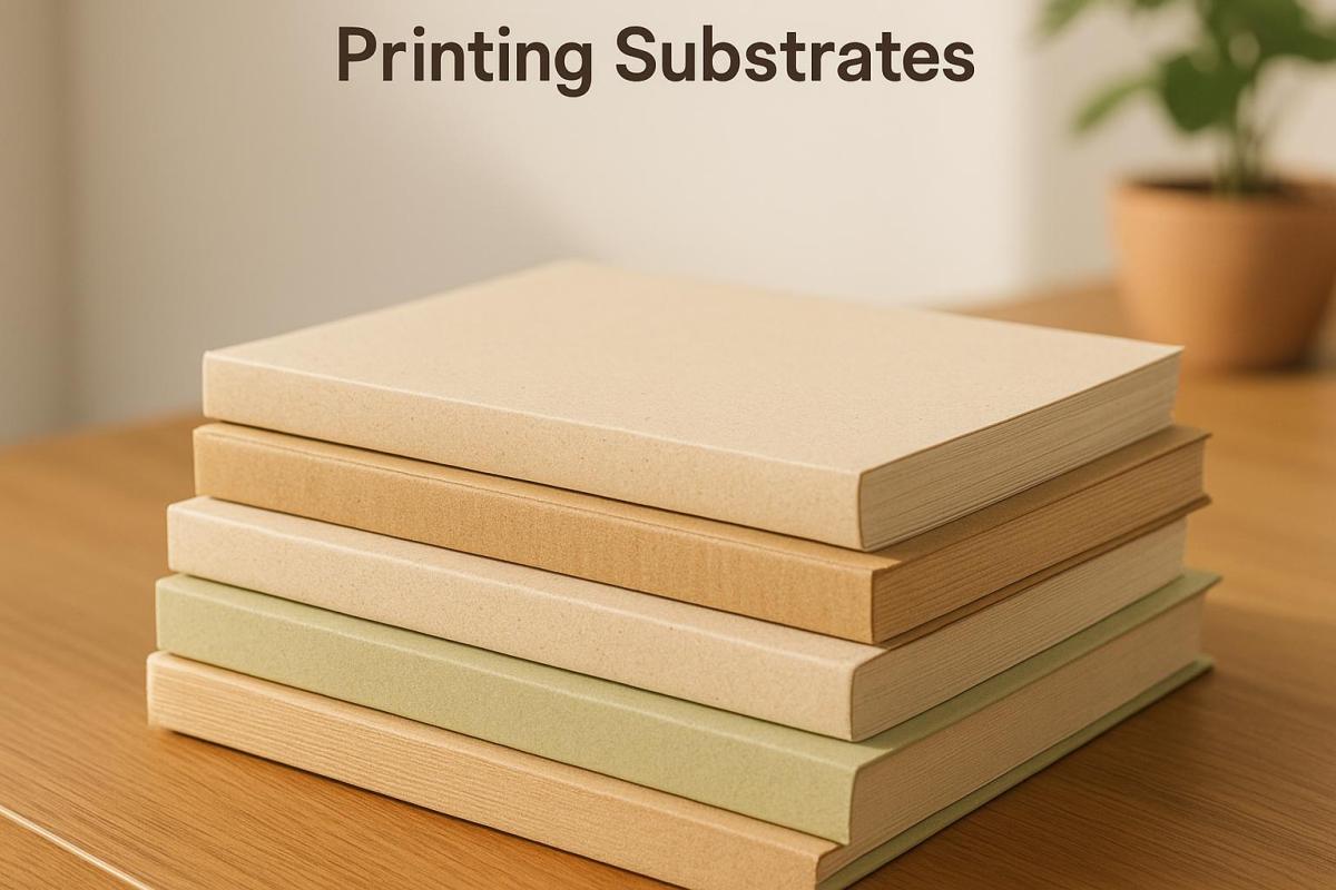
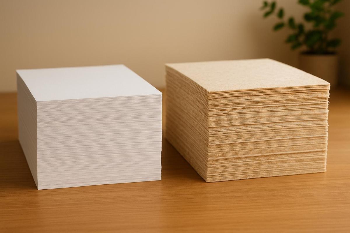
1. Know Your Substrate Properties

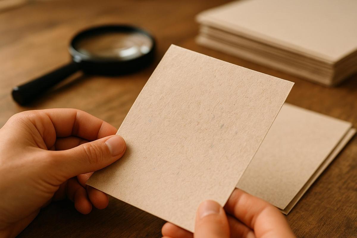
The type of substrate you use plays a huge role in determining color accuracy. Whether it’s glossy business cards or vinyl banners, each material interacts with ink in its own way, which can greatly influence the final print quality.

"The media or substrate used in large format printing plays a major role in the print quality. Different types of media and substrates have different levels of absorbency and reflective properties, which can affect the way the ink is applied to the substrate and the overall quality of the finished product." – Electronic Office Systems

Check Substrate Characteristics

When it comes to substrates, three main characteristics – texture, absorbency, and reflectivity – shape how colors appear and how the material interacts with ink.

  • Texture: This affects how well the ink adheres to the surface. Smooth materials allow for better ink adhesion and more even color distribution, while rougher textures can lead to patchy results. For example, glossy paper tends to create sharper, more vibrant images compared to matte paper because it reflects light more effectively.
  • Absorbency: This determines how much ink the material can take in. Highly absorbent substrates can produce more vivid colors and higher resolution but may be more prone to smudging or fading. On the other hand, less absorbent materials are more resistant to fading but might not deliver the same level of detail and vibrancy.
  • Reflectivity: This influences how colors look once printed. Non-absorbent surfaces often provide brighter and more vivid results, while highly absorbent ones can create a duller finish.

For digital printing, it’s important to consider specific substrate properties, such as water content (ideally between 4.7% and 5.3%), smoothness (160–200 Sheffield units), and heat resistance (up to 392°F or 200°C).

Once you understand how substrate properties affect your print, the next step is choosing the right ink.

Choose Compatible Inks

Selecting the right ink for your substrate is crucial. The ink must match the substrate’s characteristics to ensure proper adhesion and durability.

One critical factor is surface energy. Inkjet press suppliers often measure a substrate’s surface energy to check compatibility. Generally, a surface energy above 44 dynes indicates good conditions for ink adhesion. For the best results, the ink’s surface tension should be lower than the substrate’s surface energy.

Here are some common ink options based on substrate types:

  • Water-based inks: Ideal for porous materials.
  • Solvent-based inks: Best for non-porous surfaces.
  • UV-curable inks: Highly versatile, working well across various substrates. These inks cure instantly under UV light and are more energy-efficient, requiring nine times less energy and producing ten times less CO₂ than latex inks.

Before jumping into production, always test your chosen ink and substrate combination for at least 24 hours. If you’re working with specialty materials, such as stretchable substrates, consult your ink supplier for recommendations. Many manufacturers also provide validation testing services and offer primers or coatings to improve ink adhesion on challenging surfaces.

A solid understanding of these basics will help you achieve consistent, high-quality color across all your print projects.

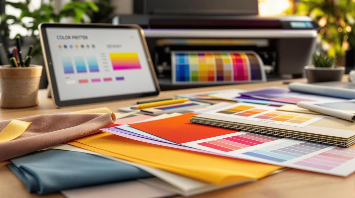
2. Build Custom Color Profiles

To achieve consistent and precise color reproduction across different materials, custom color profiles are essential. These profiles, particularly ICC profiles, play a crucial role in standardizing color management by guiding devices on how to reproduce colors accurately on various substrates. Let’s dive into how these profiles work and how to create them.

Understanding ICC Profiles

ICC profiles, developed by the International Color Consortium (ICC), are digital files that contain detailed data about a device’s unique color characteristics – such as its gamut, transformations, and color responses. They essentially act as instructions for printers, ensuring accurate color reproduction for specific substrates.

"ICC profiles allow devices to ‘translate’ color data from one device into information that another device can use to create an accurate representation." – Fujifilm

The ICC standard, established in 1994 and recognized as ISO 15076 by the International Organization for Standardization, ensures that colors remain consistent between devices. Without these profiles, the same image might look completely different on a monitor versus a printed material due to variations in hardware, ink, and substrate properties. Custom profiles solve this issue by mapping how your specific printer, ink, and substrate combination reproduces colors.

These profiles operate by linking colors between a Profile Connection Space (PCS) and your device. The PCS typically uses either the CIE L_a_b or CIE XYZ color spaces as intermediaries, enabling accurate color translation between devices.

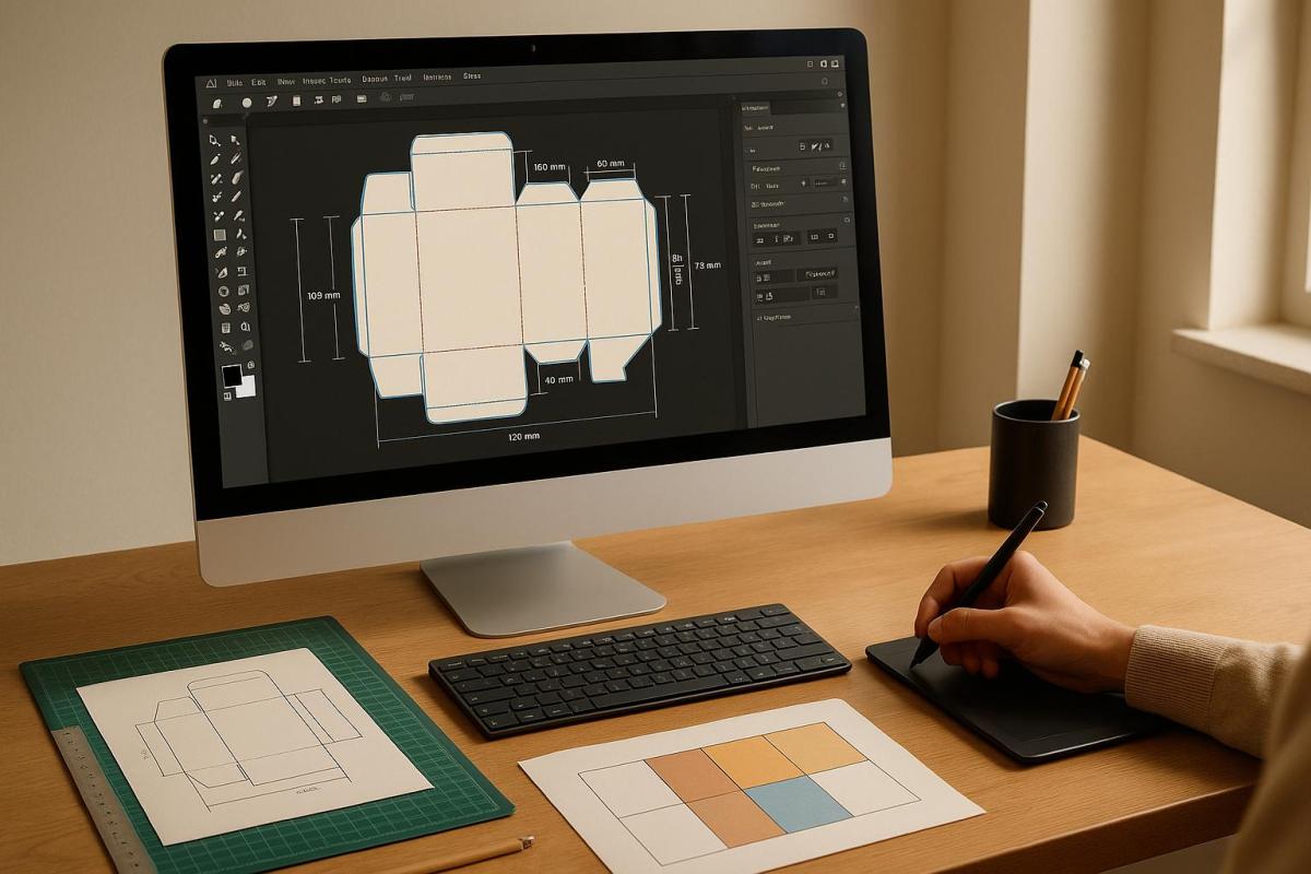
How to Create Custom Profiles

Now that we’ve covered the importance of ICC profiles, here’s how you can create one tailored to your printer, ink, and substrate combination. This process requires specific tools and a methodical approach.

Key Equipment:

  • A spectrophotometer, such as the X-Rite i1Pro 3 or i1Pro 3 Plus
  • Profiling software like X-Rite i1Profiler, CoPrA, or Spyder Print
  • Ensure the spectrophotometer accommodates your substrate’s thickness. For instance, the X-Rite i1Pro 3 Plus works with materials up to 20 mm (0.8 in) thick.

Step-by-Step Process:

  1. Set Up Your Media and Printer: Start by selecting the appropriate media, printer, and print mode within your Raster Image Processor (RIP) software. The RIP software coordinates printer settings, ink usage, and media attributes to achieve consistent results. Consider factors such as print head type, nozzle count, ink droplet size, and the substrate’s ability to absorb ink.
  2. Print and Measure Color Charts: Print color charts on the chosen substrate using production settings. Use the spectrophotometer to measure the full color range of the printed charts.
  3. Create the Profile: Let the profiling software compute a custom ICC profile based on your printer, ink, and substrate combination. Adjust settings like black generation, rendering intents, and measurement corrections to fine-tune the profile.

Important Considerations:

  • Always calibrate your devices carefully, as accurate custom profiles depend on well-calibrated equipment.
  • For complex profiling tasks, especially with challenging substrates, seeking professional assistance can be helpful.
  • Keep in mind that firmware updates on digital printers can disrupt existing profiles, so recalibration may be necessary.

3. Improve Your Pre-Press Setup

Getting your pre-press setup right is essential for maintaining consistent color accuracy across various materials. By focusing on proper substrate preparation and equipment calibration, you can lay the groundwork for reliable color reproduction.

Prepare Substrate Surfaces

The way you prepare your substrate can make or break ink adhesion and color accuracy. Different materials need specific treatments to ensure the ink adheres well and colors appear vibrant.

Start with thorough cleaning to remove dust, oils, or any contaminants that might interfere with ink adhesion. Even microscopic debris can disrupt the process. Use cleaning agents or solvents designed for your material to get the best results.

Next, condition your substrates by letting them sit in the printing environment for at least 24 hours. This step allows the materials to adjust to the room’s temperature and humidity, minimizing dimensional shifts that could affect registration and color consistency during printing.

For more advanced preparation, consider surface treatment methods like corona, plasma, or flame treatment. These techniques modify the substrate’s surface to improve ink adhesion. Each method has its strengths, but corona treatment stands out because it cleans and pre-treats the surface at the same time.

Keep in mind that different inks require specific surface energy levels for proper adhesion. For example, water-based inks need the substrate’s surface tension to be about 10 dynes/cm higher than the ink’s surface energy. UV inks typically perform best with a surface energy of 60 dynes/cm or higher.

If you’re working with tricky materials, digital primers or adhesion promoters can be a game-changer. In January 2024, Boston Industrial Solutions, Inc. introduced UV adhesion promoters like M74F, G1, and PP Primer. These products are designed to boost UV ink adhesion on challenging materials such as polypropylene and coated metals. They even offer free ink adhesion testing based on ASTM standards to help you find the best combination of inks and treatments for your needs.

"Digital primers (UV ink adhesion promoters) and mechanical pre-treatment systems function to increase the surface energy of a material. An increase in surface energy on the material in turn leads to good ink adhesion – assuming the ink is compatible with the material." – Boston Industrial Solutions, Inc.

Once your substrate is ready, the next step is to ensure your equipment is fine-tuned for the job.

Calibrate Equipment and Run Tests

Proper equipment calibration is just as important as substrate preparation when it comes to achieving consistent, high-quality results. Calibration ensures your printer performs reliably and reproduces colors accurately, no matter the substrate.

Start with basic calibration steps, such as purging and aligning the print heads and adjusting ink levels to match the substrate’s absorption characteristics. Check tonal gradation and verify that the printed output aligns with the dot percentages in your input file.

Andrea De Rossi, a Color Management Consultant, underscores the importance of this process: "The quality of the color in digital printing starts with the calibration of the printer because the qualitative yield and the economy of each reproduction process depends on the essential optimization of the printing machine used".

To fine-tune color accuracy, use a spectrophotometer to measure and update the ICC profile. Print color test charts on the specific substrate you’re using, scan them with the spectrophotometer, and update your printer’s ICC profile accordingly. This ensures your equipment can accurately reproduce colors for that material.

Don’t overlook monitor calibration, either. Adjust your monitor’s brightness, contrast, white points, and color levels to ensure what you see on screen matches the final print as closely as possible.

Finally, pre-press testing is a critical step to catch potential issues before full production. Test prints help you spot errors, optimize designs, and verify color accuracy, saving time and money in the long run. Be sure to evaluate test prints under different lighting conditions to identify any inconsistencies. This is especially important when working with difficult substrates or intricate color requirements, as it ensures your final output aligns with your vision.

sbb-itb-ce53437

4. Manage Printing Conditions

The conditions in your printing facility can significantly affect color consistency across different materials. For instance, temperature swings may cause substrates like paper to expand or shrink, leading to misaligned colors or designs. Similarly, changes in humidity can impact ink drying and paper behavior, resulting in curling, wrinkling, or uneven printing.

Take the case of Global Print Solutions, a commercial printer that faced a $50,000 loss in materials and weeks of delivery delays due to humidity-related paper curling. This example highlights the importance of maintaining stable, controlled conditions for consistent quality, especially for high-volume or precision printing jobs like product packaging and textiles.

Track Your Printing Environment

Beyond calibrating your equipment, keeping a close eye on your facility’s environment is critical. Experts recommend maintaining temperatures between 65°F–75°F and humidity levels of 40%–60% (ideally 50–55% RH) to avoid issues like material expansion, smudging, or misregistration .

Even slight changes in humidity can have a big impact. Paper can experience dimensional changes of 1–2% within just 10 minutes in low humidity. When humidity drops, paper loses moisture, which can lead to misfeeds and print quality issues. On the other hand, excessive humidity can cause ink to absorb moisture, leading to smudges. Low humidity can also create electrostatic buildup, which disrupts paper handling and affects print quality.

Lighting is another key factor for accurate color evaluation. Printed colors are perceived through reflected light, and lighting conditions – whether natural or artificial – can drastically alter how colors appear. To ensure consistency, use standard lighting sources like D50 (5000K) or D65 (6500K), which closely replicate natural daylight.

Use Control Tools

Once you know the ideal environmental ranges, modern tools can help you maintain them with ease. Environmental sensors and data loggers provide real-time monitoring of temperature and humidity, enabling quick adjustments when needed .

For precise humidity tracking, thermo-hygrometers can measure relative humidity levels. More advanced systems, like Wi-Fi-enabled data loggers, offer continuous monitoring and detailed reports. If humidity drops below recommended levels, humidification systems can restore balance, ensuring optimal conditions for printing.

Mark Thompson, Operations Director at Premier Print Services, shared how investing in precision humidity control transformed their operations:

"After we installed precision humidity control our annual maintenance costs dropped 60%, and our print quality consistency improved dramatically. We are seeing fewer reprints, happier clients, and less equipment maintenance. The system paid for itself in the first 18 months".

For lighting, consider using D50 lighting (5000°K) to eliminate unwanted color casts, such as the blue-green tint from fluorescent lights. A D50 lightbox is ideal for evaluating printed materials, ensuring consistent and reliable color assessments .

Smart technology can further enhance your environmental control. Smart sensors can provide real-time updates on temperature and humidity, while modern printers can adjust settings automatically to optimize ink flow, drying, and material handling. These proactive measures allow you to address potential issues before they impact your print quality, saving time and resources in the long run.

5. Test and Review Before Final Printing

Once you’ve nailed down the right substrate, custom profiles, and calibrated equipment, the next step is testing. This ensures that your colors stay true throughout production. Running test prints and getting client feedback can save you from costly mistakes and ensure everything looks perfect – especially on unusual materials.

Run Multiple Test Prints

After calibration and prepping your substrate, testing acts as your final quality check. Test prints help confirm color accuracy across different materials and give you a chance to tweak settings before committing to a full production run. Every material – whether it’s glossy plastic, textured metal, or absorbent fabric – reacts differently with inks, so testing helps catch any issues early.

Start by cleaning the substrates thoroughly to remove any dust or contaminants. Follow the preparation steps outlined earlier, and for garments, consider applying a light pretreatment to improve ink adhesion.

Choosing the right test substrate is critical. As Southeast Prints advises:

"Always ensure that your chosen substrate is compatible with DTF printing. Typically, DTF transfer films work best on porous surfaces which allow the ink to penetrate and adhere to the material."

Custom profiles should be created for each substrate. These profiles account for factors like ink absorption and color behavior, helping you set the right ink limits to avoid over- or under-inking. Tools like densitometers or spectrophotometers can also come in handy, providing precise color measurements to ensure consistency.

When evaluating your test prints, use full-spectrum 5,000K lighting. This helps you match the printed colors to what you see on the screen, avoiding any surprises caused by lighting differences.

Get Client Approval

Client input is a crucial part of the process. Sharing proofs with clients gives them a chance to check the color, layout, and overall design. Encourage detailed feedback by using annotation tools during the proofing stage. This ensures everyone is on the same page before moving forward with production. Setting clear deadlines for proof reviews and approvals keeps things moving smoothly.

For projects with multiple stakeholders, digital proofing tools can simplify collaboration. One full-service ad agency reported that these tools not only sped up the process but also reduced costs. Keeping the proofing process transparent strengthens client relationships and builds trust, which can lead to repeat business.

At Miro Printing & Graphics Inc., we follow these testing and review steps to make sure every project meets our high standards. By the time production begins, we’re confident that the final product will showcase your brand in the best possible light.

Conclusion

Managing color across various substrates becomes much simpler when approached methodically. The five tips outlined earlier work together to create a solid color management plan, ensuring consistent and polished results. Each step complements the next, aligning every phase – from preparation to the final print – with your brand’s expectations.

This process connects your design vision to the practical realities of printing. Understanding how materials like paper, plastic, metal, or fabric interact with your inks allows you to make smarter choices about profiles, equipment settings, and environmental conditions. This knowledge is key to creating custom color profiles that bring your designs to life exactly as intended.

"Color management refers to the process used so that color reproduction is exact and matches the original design with true and accurate color." – Sarah Jacks, Manager, INX Color Perfection®

Your pre-press setup and controlled printing environment play a crucial role in maintaining the conditions your profiles require. Factors like temperature, humidity, and substrate preparation all influence how inks behave and cure, making it essential to test and refine your output rigorously.

The testing and approval phase helps catch potential issues early. Regular equipment calibration, paired with thorough test prints, ensures your color management system remains dependable. This reliability is increasingly important as the large-format printing market grows, with projections estimating it will reach $12.70 billion by 2030.

At Miro Printing & Graphics Inc., our commitment to precise color management strengthens client trust and enhances brand identity. Consistent colors across business cards, brochures, signage, and packaging ensure your message stays cohesive and professional. This attention to detail not only improves quality but also minimizes the need for reprints.

FAQs

What’s the best way to choose the right ink for a specific substrate to get accurate colors?

Choosing the right ink for a specific material comes down to understanding how the ink interacts with the surface. For porous materials like paper, dye-based inks work well because they soak into the surface, delivering rich, vibrant colors. Meanwhile, non-porous surfaces such as plastic or metal need solvent-based or UV inks. These types of ink adhere more effectively and offer greater durability.

The finish of the material also plays a role. Glossy surfaces, for instance, often require specially formulated inks that complement their shiny coatings. To avoid surprises, it’s always a good idea to test the ink on a sample of the material first. This ensures the colors look the way you want and meet your quality expectations.

How do I create custom ICC profiles for different printing substrates?

Creating custom ICC profiles for specific printing materials requires a few essential steps to achieve consistent and accurate color reproduction. To start, you’ll need a spectrophotometer for precise color measurement and profiling software to generate the profile. Begin by printing a target color chart directly onto the material you’re profiling. This chart serves as the reference for measuring colors.

Next, use the spectrophotometer to read the colors on the printed chart. This step gathers the data necessary for the profiling software to create the ICC profile. The profile essentially defines how colors should appear on that particular material, ensuring accurate color output.

For the best results, it’s crucial to work with a properly calibrated monitor and select a color space that aligns with your printing process. Following these steps ensures your prints maintain a professional and consistent appearance, whether you’re working with paper, plastic, metal, or other substrates.

How can I ensure consistent color across different printing substrates in my facility?

Maintaining consistent color across different printing materials can be tricky, but focusing on a few essential practices can make all the difference. Start by stabilizing your printing environment – keep temperature and humidity levels steady, as changes in these conditions can affect how inks behave and, ultimately, the accuracy of your colors.

Next, rely on standardized color profiles and routine calibration. Regularly calibrate both your printers and monitors to ensure the colors you see on screen match the final output across various substrates. This step is crucial for achieving reliable color reproduction.

Lastly, introduce quality control tools like spectrophotometers. These devices let you check color consistency throughout production, so you can catch and correct any issues before they become bigger problems. By sticking to these methods, you’ll safeguard the integrity of your brand colors and deliver polished, professional results every time.

Related posts

https://app.seobotai.com/banner/banner.js?id=6833b64dd3b9661981815ef5

Overprint Settings: What Designers Need to Know

Master overprint settings to enhance your print designs, prevent issues, and achieve vibrant, professional results.

Understanding overprint settings is essential for creating professional print designs. Overprinting controls how colors interact when printed on top of each other, affecting the final look of your project. Here’s what you need to know:

  • Overprint: Layers colors directly, blending them to create new shades. Commonly used for black text and rich black areas to avoid white gaps.
  • Knockout: Removes underlying colors to ensure the top color remains pure, ideal for maintaining true color fidelity.
  • When to Use Overprint: Use for small black text, specialty finishes (like spot UV or foil), and creating rich black by layering inks.
  • Avoid Overprinting White: White objects set to overprint will disappear, as no ink is applied.
  • Tools to Preview Overprint: Use features like Overprint Preview in Adobe Illustrator, InDesign, or Acrobat to simulate how colors will blend before printing.
  • Common Issues: Mistakes with overprint settings can lead to unintended color blending, transparency conflicts, or registration problems.

Quick Comparison

Aspect Overprint Knockout
Color Interaction Blends colors together Removes underlying colors
Final Result Mixed, new colors Pure, original colors
Edge Quality May add thickness Crisp, clean edges
Registration Risk Prevents white halos Risk of white gaps if misaligned

To avoid costly errors, always preview your overprint settings, consult with your print provider, and request proofs before production. These steps ensure your designs print exactly as intended.

Overprint Basics

What is Overprinting?

Overprinting is a technique in printing where one color is applied directly on top of another, rather than removing the underlying ink. The sequence in which the inks are applied is crucial – printing yellow first and then blue will yield a different result than reversing the order.

"With overprinting, however, you mix colors together by printing one on top of the other to form an interesting level of dimension and new color results." – Plum Grove

The top layer of ink is partially transparent, blending with the base color to create new shades. For instance, cyan combined with yellow produces green. When using spot colors like Pantone inks, overprinting can even generate a custom third color without requiring an additional ink station. This method is also tied to "trapping", a reprographic process designed to prevent white gaps between colors caused by slight misalignments during printing.

Overprint vs. Knockout

To get the desired print results, it’s essential to understand the difference between overprinting and knockout, as these approaches handle overlapping colors in distinct ways.

Knockout works by removing the underlying colors where objects overlap, leaving only the topmost color visible. For example, if red text is placed over a blue background using knockout, the blue beneath the text is removed, ensuring the red prints as pure.

On the other hand, overprinting layers colors directly on top of each other, blending them to create new hues. Using the same example of red text on a blue background, overprinting would layer the red ink over the blue, potentially resulting in colors like purple or brown, depending on the inks used.

Aspect Knockout Overprint
Color Interaction Removes underlying colors Blends colors together
Final Result Pure, original colors Mixed, new colors
Edge Quality Crisp, clean edges May add thickness
Registration Risk Risk of white gaps if misaligned Prevents white halos

Knockout ensures your colors remain true to the design, but even minor misalignments during printing can result in thin white lines where colors meet. Overprinting eliminates this risk but requires careful planning, as darker elements can overpower lighter ones, leading to unintended or muddy results.

Next, we’ll look at how and when to use overprinting effectively in professional printing projects.

When to Use Overprint

Overprinting is a targeted tool in professional printing, offering both efficiency and improved print quality when applied correctly.

For example, small black text – such as body copy – should almost always be set to overprint. This prevents the formation of tiny white halos if the black ink shifts slightly during printing. As a general rule in the industry: "NEVER overprint white, ALMOST ALWAYS overprint black" – Bob Levine.

Specialty finishes like embossing, spot UV, and foil stamping also depend on accurate overprint settings. Additionally, overprinting can be a cost-saving method for creating a third color by layering two spot colors, a technique that works especially well with Pantone inks.

Another common use of overprinting is for producing rich black. By layering black ink over other colors like cyan, magenta, or yellow, printers can achieve a deeper, more saturated black. A popular formula for rich black includes 50% cyan, 50% magenta, 50% yellow, and 100% black.

"Overprinting is an advanced printing technique that should only be used by creators who understand how to implement it properly." – PrintNinja

Overprinting is also widely used in custom projects like envelopes and packaging, where variable information such as dates, batch codes, or personalized details need to be added. This method allows for mass printing of base designs, with specific details added later as needed.

The success of overprinting depends on understanding how inks, paper, and printing methods interact. Factors like ink formulation and the type of paper used can significantly influence how overprinted areas appear.

What is Overprinting & Overprint Preview in InDesign?

How to Use Overprint in Design

Overprint is a valuable tool for enhancing print quality and avoiding registration issues. Below are practical ways to use overprint effectively in your design projects.

Using Overprint for Spot Colors

Spot colors are a great way to add vibrancy to your designs without increasing production costs. When working with systems like Pantone, overprinting can create deeper tonal variations and unique effects. To ensure accuracy, always enable Overprint Preview in your design software. This feature lets you see how the colors will interact before sending your files to print, helping you spot any potential issues and decide where overprinting is necessary.

Before finalizing your spot color designs, it’s crucial to consult your print provider – such as Miro Printing & Graphics Inc. – to understand how factors like inks, paper, and printing methods will influence the final result.

Overprint for Black Text and Lines

Black text and fine lines often benefit from overprint settings, especially when placed over colored backgrounds. Most design software, like InDesign, automatically sets black text to overprint, which helps prevent registration problems with small or delicate elements. However, if you’re using 100% black ink, the underlying colors might show through. To avoid this, consider using a rich black formula that blends small amounts of cyan, magenta, or yellow for better coverage.

If your design requires black elements to knock out the background instead of overprinting, you’ll need to manually disable the overprint settings. Collaborating with your print shop – such as Miro Printing & Graphics Inc. – can help you determine the best black ink formulation based on factors like the type of paper, press capabilities, and ink system being used.

Next, let’s look at how overprint settings can enhance specialty finishes.

Specialty Finishes and Overprint

Specialty finishes, like spot varnishes and metallic inks, require precise overprint settings for the best results. For example, spot varnishes should always be set to overprint so that only the intended areas receive the glossy effect without disrupting the underlying artwork.

Metallic inks, on the other hand, can create striking effects when overprinted on darker backgrounds. To maintain control over the final look, it’s helpful to place each color component on separate layers. Additionally, using high-resolution images and vector graphics is essential, as metallic finishes tend to highlight even the smallest imperfections.

Clear communication with your printer is key when working with specialty finishes. Share your design goals early in the process and request proofs to evaluate color interactions before production. Partnering with experienced professionals like Miro Printing & Graphics Inc. ensures your final output aligns with your creative vision.

Setting Up Overprint in Design Software

Getting your overprint settings right is key to achieving accurate print results. Since each design program handles these settings differently, understanding how to configure them properly can save you from costly errors and ensure your designs look just as you intended.

Adobe Illustrator: Overprint Attributes

Adobe Illustrator

In Adobe Illustrator, the default setting is to knock out underlying colors. To enable overprint, select the object(s) you want to adjust, then go to Window > Attributes and check Overprint Fill and/or Overprint Stroke.

If you’re working with large black elements, you can fine-tune their intensity by navigating to Edit > Edit Colors > Overprint Black. This allows you to adjust how black fills and strokes interact with other colors.

To avoid surprises during production, always activate Overprint Preview by selecting View > Overprint Preview. This mode lets you see how colors blend and helps identify potential issues before sending your files to print.

Next, let’s look at how Adobe InDesign handles overprint settings.

Adobe InDesign: Overprint Controls

Adobe InDesign offers precise control over overprint settings, making it easy to apply overprinting to strokes, fills, and other design elements. By default, InDesign automatically overprints black ink to minimize misregistration issues.

To manually set overprinting for a stroke or fill, select the desired object or text, then go to Window > Output > Attributes. In the Attributes panel, check Overprint Fill for fills or unstroked text, and Overprint Stroke for strokes. For patterned lines, you can also select Overprint Gap in the same panel.

For a preview of how your colors will overprint, use the Separations Preview panel. This tool shows you exactly how your design will appear when printed, giving you confidence in your settings. If you’re working with spot colors, you can simulate overprinting by selecting a composite option in the Print dialog’s Color menu and enabling Simulate Overprint.

If you want to change the default behavior of black objects automatically overprinting, adjust it in the preferences. On Windows, go to Edit > Preferences > Appearance Of Black, or on Mac, navigate to InDesign > Preferences > Appearance Of Black. From there, you can enable or disable the default Overprint Black Swatch at 100% setting.

Finally, use Adobe Acrobat to double-check your overprint settings before sending your files to print.

Checking Overprint in Adobe Acrobat

Acrobat

Adobe Acrobat is an essential tool for verifying your overprint settings before production. Its Output Preview feature simulates how your design will appear under different printing conditions, showing exactly where overprinting occurs in the color-separated output.

To access this feature, open your PDF in Acrobat Pro and go to All Tools > Use Print Production > Output Preview. In the Output Preview dialog, enable Simulate Overprinting to see how overprint effects will appear.

For consistent results, configure Acrobat to always use overprint preview. Go to Edit > Preferences > Page Display and, under "Page Content and Information", set Use Overprint Preview to Always. This ensures you’re viewing accurate color interactions, especially when working with transparencies or spot colors.

Additionally, the Color Warnings feature in Output Preview can flag areas with rich black or potential overprinting issues, helping you catch errors before production.

For added peace of mind, consider working with a professional print provider like Miro Printing & Graphics Inc. Their expertise can help you interpret preview results and ensure your overprint settings are correctly applied, giving you a final product that matches your vision. Properly setting up overprint in each software guarantees that your designs transition seamlessly from screen to print.

sbb-itb-ce53437

Common Overprint Problems and Solutions

Even seasoned designers can encounter overprint issues that lead to unexpected results during printing. Knowing what to watch for and how to address these problems can save you headaches, time, and money.

Unintended Color Blending

One common issue with overprinting is unexpected color blending. Overprinting layers the top color onto the background color, often resulting in altered or inaccurate hues. For example, if white text or graphics are mistakenly set to overprint, they disappear entirely, allowing the underlying colors to show through what should be white space.

Another frequent issue is show-through with 100% black elements. Black ink alone might not completely cover the colors beneath it, causing them to bleed through and affect the final look. This is particularly noticeable in large solid black areas or thick black strokes.

To avoid these pitfalls, use the Separations Preview feature in your design software. This tool lets you see how colors will interact when printed, helping you catch potential issues before production. For large black areas, consider using a rich black formula, such as C:75, M:68, Y:67, K:90, instead of relying solely on 100% black. This ensures better coverage and a more polished result.

Transparency and Overprint Conflicts

Transparency effects can complicate overprinting, often leading to unexpected results that don’t become apparent until the piece is printed. Black text with drop shadows over spot colors, for instance, can create color shifts or other unwanted effects, especially with digital printers.

These problems arise because transparency settings can override your overprint settings, creating conflicts that aren’t visible in standard preview modes. These issues can stem from file compatibility problems, user settings, or the way transparency interacts with spot colors.

To tackle these challenges, enable Overprint Preview in your design software to identify problem areas. If spot colors are causing issues, converting them to CMYK can help avoid compatibility problems. Additionally, ensure all transparency and blending modes are set to normal to minimize conflicts.

When working with transparency effects like drop shadows or gradients, use them sparingly and stick to normal effect modes. Simplifying your design in this way can reduce the risk of overprint-related issues.

One of the most frustrating aspects of overprinting is discovering that the printed piece looks nothing like what you saw on your screen. This often happens due to the blending and transparency issues mentioned earlier. As Certified G7 Expert John Myers explains:

"The color you see on the screen is not necessarily what you will see on the printed piece. There is no substitute for printed samples or color proofs when it comes to knowing exactly what you are going to get".

On-screen previews can be misleading, making it essential to use overprint preview features in your design software rather than relying on standard display modes. Registration problems during printing – when press alignment is slightly off – can also cause color bleeding or unwanted mixing.

To avoid surprises, always request a high-quality printed proof from your printer before approving the final run. Communicate clearly with your print provider, sharing detailed instructions about your overprint settings and asking for their PDF specifications. For critical projects, consider attending a press check to make real-time adjustments during printing.

Collaborating with experienced print providers, like Miro Printing & Graphics Inc., can help you navigate these challenges and ensure your final product aligns with your design vision.

Best Practices for Overprint Results

Building on the overprint strategies outlined earlier, these practices can help you achieve seamless and professional print results.

Proofing Your Designs

Proofing is a critical step in spotting overprint issues before they become costly mistakes. Tools like Separations Preview and built-in preflight checks are invaluable for identifying problems such as missing fonts, low-resolution images, incorrect color modes, or improper page dimensions. As print expert Brett Mullenaux advises:

"Using Preflight and Separations Preview/Output Preview before submitting files will help".

While soft proofs are useful for reviewing layouts and content, they fall short when it comes to accurately representing color interactions. Hard proofs, on the other hand, provide a physical sample, allowing you to evaluate color consistency and ensure alignment with folds, cuts, and other finishing details. For projects where color precision is non-negotiable – like packaging or branded materials – a press proof is worth considering. Though more time-consuming and costly, it uses the actual press and materials, delivering the most accurate preview of the final product.

Once you’ve reviewed your proofs, collaborate with your printer to fine-tune your setup for the best results.

Working With Your Print Vendor

Clear communication with your printer is key to avoiding overprint issues. Share your design files along with detailed instructions about your overprint settings, and don’t hesitate to ask about their specific processes and file requirements. Print Manager Steve Carolan from Inizio Engage XD highlights the importance of open dialogue:

"Talk to them. They want to produce the best possible job for you as well. Don’t second guess how files need to be supplied – ask the question".

Engage with your printer early in the design process to address potential challenges. Printers can offer guidance on materials, finishing options, and technical details that could impact your overprint strategy. If you’re working with experienced providers like Miro Printing & Graphics Inc., leverage their expertise. Their prepress team can review your files for overprint concerns and suggest adjustments before production begins. Additionally, request PDF export presets tailored to your printer’s specifications for smoother file preparation.

Packaging Files for Printing

After thorough proofing and discussions with your printer, it’s time to prepare your files for production. Always enable Overprint Preview mode to confirm how your overprints will appear in the final product. Save your files in professional formats like PDF/X-4 and ensure the document color mode is set to CMYK for consistent color reproduction. For added assurance, use Adobe Acrobat Pro’s Output Preview to double-check color interactions, complementing your earlier digital proofing efforts.

When packaging your files, include clear documentation specifying which elements should overprint and any special instructions for transparency effects or spot colors. Print expert Susmita Dutta emphasizes the value of pre-flighting:

"Before hitting print, use pre-flighting tools to catch issues such as missing fonts or low-resolution images. A test print or digital proof reveals layout or color issues. It’s a small step that saves big headaches (and reprints!) later".

Conclusion

Understanding and mastering overprint settings is a key step toward achieving high-quality print results. As Nurfa’ain Rosdin from Gogoprint explains: "Used correctly, it enhances design depth; misused, it leads to costly mistakes".

Incorrect overprint settings can result in unintended color blending or design flaws. To avoid these issues, always use the Overprint Preview feature to identify potential problems before production begins. This simple yet crucial step can save time, money, and frustration while ensuring your designs come out as intended.

Additionally, clear communication with your print provider is just as important. Collaborating with your vendor’s prepress team can provide valuable insights and help catch any overprint-related issues early on. For instance, experienced providers like Miro Printing & Graphics Inc. offer prepress expertise to review your files and address potential concerns before production starts.

FAQs

When should I use overprint instead of knockout in my design projects?

When it comes to choosing between overprint and knockout, the decision boils down to the visual style and functionality you’re aiming for in your print project.

Overprint works well when you want the top color to mix with the one underneath, creating a combined hue or effect. It’s commonly used for special finishes like spot colors, varnishes, or foil stamping, and it can also help prevent registration issues in detailed designs. This technique is perfect for adding layered color effects or ensuring alignment in complex prints.

Knockout, however, is the default in most design software. It ensures the top color fully blocks out the background, keeping elements sharp and high-contrast. This method is ideal for text, logos, or design elements that need to stand out clearly without blending into the background.

If you’re unsure, it’s always a good idea to test your design or check with your print provider to make sure you achieve the best possible outcome.

How can I make sure my overprint settings are correct before sending my design to print?

To make sure your overprint settings are correct before sending your design to print, here’s what you should do:

  • Enable Overprint Preview: This feature allows you to see exactly how your design will look when printed. It’s a great way to spot any problems with overlapping colors or layers before it’s too late.
  • Check Your Color Settings: Pay close attention to black elements, as they often default to overprint. Also, make sure white objects aren’t set to overprint – since printing doesn’t use white ink, these areas would end up blank.
  • Inspect Each Element: Go through your design layer by layer to confirm that the overprint settings align with your vision. This step can save you from unexpected surprises in the final print.

By following these steps, you’ll avoid common overprinting errors and ensure your design turns out just the way you planned.

How do overprint settings impact the use of specialty finishes like spot UV or metallic inks in printing?

When working with specialty finishes like spot UV or metallic inks, getting your overprint settings right is key to achieving the desired effect. These settings make sure that inks and coatings layer properly, maintaining the reflective shine of metallic inks and enhancing the bold contrast of spot UV finishes.

Take spot UV varnish, for instance. It can be applied to specific design elements to create depth and a sleek, polished look. Overprinting also ensures metallic inks retain their brilliance, avoiding any dulling caused by overlapping colors or coatings. If the overprint settings aren’t configured correctly, you might end up with gaps or knockouts that disrupt the design. Paying close attention to these details is crucial for producing printed materials with a professional and eye-catching finish.

Related posts

https://app.seobotai.com/banner/banner.js?id=683264c4d3b9661981804296

5 Factors Affecting Recycled Paper Quality

Explore the five essential factors that influence the quality of recycled paper, from fiber strength to ink removal and contaminant control.

Recycled paper quality depends on five key factors: fiber strength, ink removal, contaminant control, moisture levels, and brightness.

  • Fiber Strength: Recycled fibers weaken with each reuse, typically lasting 5–7 cycles. Additives can improve strength, but virgin fibers remain stronger.
  • Ink Removal: Effective deinking ensures clean, printable pulp. Methods like flotation and washing target different ink particle sizes, while enzymatic processes offer eco-friendly options.
  • Contaminant Control: Plastics, adhesives, and food waste disrupt recycling. Advanced sorting and adhesive technologies reduce these issues.
  • Moisture Levels: Proper humidity (40–50% RH) prevents brittleness, mold, and fiber damage. Storage and acclimation are critical.
  • Brightness: Recycled paper often needs bleaching for brightness. Eco-friendly methods like TCF (Totally Chlorine-Free) balance aesthetics with reduced pollution.

Quick Comparison Table

Factor Key Issue Solution/Best Practice
Fiber Strength Weakening after reuse Use additives; mix with virgin fibers
Ink Removal Residual ink affects quality Flotation, washing, or enzymatic methods
Contaminants Plastics, adhesives, food waste Advanced sorting; recycling-compatible adhesives
Moisture Levels Brittleness or mold Maintain 40–50% RH; proper storage
Brightness Dull appearance TCF bleaching; match brightness to use

Understanding these factors ensures high-quality recycled paper for printing and packaging while reducing waste and conserving resources.

Paper Recycling: Market Deinked Pulp: A Tour of a Paper Recycling Facility with Dr. Richard Venditti

1. Fiber Strength and Condition

The quality of recycled paper hinges on the strength and condition of its fibers. Each time paper is recycled, the fibers become shorter and weaker, leading to a gradual decline in durability. This natural wear and tear is at the heart of the challenges in maintaining recycled paper quality.

Virgin fibers, which are longer and stronger than recycled ones, set the benchmark for durability. However, during recycling, the process of wetting, tearing, and re-drying damages cellulose fibers, shortening them and reducing their strength. This phenomenon, known as hornification, also decreases the fibers’ flexibility and swelling capacity, weakening the bonds between them. As David A. Kelly, a former expert in Pulp & Paper Technical & Operations Management, explains:

"Every time you wet, tear apart and re-dry cellulose fibers, bits break and they get shorter. Once-dried fibers do not bond the same the second time and are weaker."

Longer fibers are better at distributing stress, which enhances tear resistance. In contrast, the shorter fibers in recycled paper reduce both its durability and absorbency.

Typically, fibers can endure five to seven recycling cycles before they lose their structural integrity, though some advancements suggest they may last up to 25 cycles. Despite these improvements, many sources agree that fibers often don’t survive beyond five cycles without significant degradation.

The higher the recycled content in paper, the weaker the bonds between fibers, which directly impacts mechanical strength. This is why virgin fiber paperboards can often achieve equal or better performance at lower weights compared to recycled fiber containers.

To counteract the weakening of recycled fibers, manufacturers use paper strength agents that improve fiber bonding. These additives help close the performance gap between papers made with virgin and recycled fibers.

At Miro Printing & Graphics Inc., choosing the right grade of recycled paper is key for achieving the best results in digital, offset, and large-format printing. Each application has unique demands, so matching the paper grade to the task ensures high-quality output without sacrificing durability.

2. Ink Removal Process Quality

Deinking is the process of transforming wastepaper into clean pulp by removing printing ink from paper fibers. This clean, deinked pulp then becomes the foundation for creating new paper products. The quality of this step is critical – it directly impacts how bright, clean, and printable the final recycled paper will be, which is essential for high-quality printing.

"Wastepaper recycling removes ink and contaminants while preserving fiber properties."

Deinking involves a combination of mechanical and chemical methods. The process typically includes pulping the paper, cleaning it, separating ink through flotation or washing, and sometimes applying bleaching to enhance brightness.

The technology used for deinking depends largely on the type of paper being recycled and its intended application. Flotation deinking is particularly effective for removing larger ink particles (over 10 μm), making it suitable for graphic papers, newsprint, and magazines. On the other hand, wash deinking is designed to capture smaller particles (under 30 μm), which makes it ideal for producing hygiene papers.

Deinking Method Ink Particle Size Removed Best Applications
Flotation Larger than 10 μm Graphic papers, newsprint, magazines
Washing Smaller than 30 μm Hygiene papers

Many modern deinking facilities use a combination of flotation and washing to maximize efficiency. As Martin Fairbank, Ph.D., an Independent Consultant, explains:

"Most deinking mills today use a combination of flotation and washing in order to remove a wide range of ink particle sizes."

Another emerging method is enzymatic deinking, which uses enzymes like lipases and cellulases to break down ink particles naturally. This approach reduces the reliance on harsh chemicals. Studies comparing enzymatic and chemical deinking have shown promising results: enzymatic deinking improved pulp freeness by 18.30% and reduced dirt count by 32.60%. It also enhanced physical strength properties, with a 16.07% increase in burst index, a 14.54% rise in tensile index, and an 8.57% boost in double fold numbers.

The efficiency of deinking not only affects the cleanliness of the recycled pulp but also its performance in printing. For instance, recycled paper made from laser-printed materials tends to have higher brightness and luminosity compared to paper recycled from inkjet sources. This is particularly important for professional printing, where color accuracy and brightness are key to achieving high-quality results.

Deinking quality factors, such as fiber condition, play a major role in determining the overall performance of recycled paper. High-quality deinking enhances print clarity and consistency, which is vital for projects requiring precision, such as offset printing or large-format runs. At Miro Printing & Graphics Inc., understanding these differences allows for selecting the best recycled paper grades to meet specific project needs, ensuring top-notch output and customer satisfaction.

Beyond print quality, the environmental advantages of deinking are considerable. Recycling wastepaper with efficient deinking processes uses 28–60% less energy compared to producing paper from virgin fibers. This makes it an economical and environmentally friendly choice for printing operations.

3. Contaminant Control and Removal

Contaminants can severely affect the quality of recycled paper by damaging equipment, creating hazardous conditions, and reducing the value of the final product. To produce high-quality recycled paper, it’s essential to understand and manage these materials effectively.

Some of the most common contaminants include plastics, food waste, brightly colored paper, and hazardous substances. Among these, plastic bags are particularly troublesome and are often labeled the worst offenders in recycling contamination. Recent research has also revealed even more complex challenges posed by contaminants.

For example, a study conducted in Cape Town, South Africa, uncovered pharmaceutical compounds in recycled paper products. These included dexamethasone, ketoprofen, 17β-estradiol (as high as 697.49 ng/g), and carbamazepine (13.02 ng/g). Such findings highlight the need for advanced contaminant control strategies.

Adhesive contamination is another major issue. Traditional pressure-sensitive adhesives break down during the pulping process, forming tiny particles known as “stickies.” These stickies are not just a nuisance – they cost the paper industry an estimated $850 million annually. A more effective solution lies in Recycling Compatible Adhesives (RCAs). Unlike conventional adhesives, RCAs resist breaking into small particles and remain large enough to be removed through screening and flotation. Lab tests have shown that over 99% of RCAs can be successfully extracted using these methods.

Contaminant Type Impact on Quality Removal Method
Plastic bags Equipment damage, processing disruptions Manual sorting, screening
Food waste Bacterial growth, odors, quality degradation Cleaning, washing
Conventional adhesives Stickies formation; costs companies $850M/year Screening, flotation

The scale of the problem becomes even clearer when looking at broader statistics. In 2021, paper and cardboard made up 40.3% of the EU’s 84 million tonnes of packaging waste. Even seemingly minor contamination can have a domino effect – one improperly sorted item can ruin an entire batch of recyclables, sending it straight to the landfill.

To combat this, strict sorting rules and public education are critical. The recycling industry strongly discourages "wishcycling", which is the habit of tossing questionable items into recycling bins in the hope that they’ll be recyclable. This practice often leads to more contamination and disrupts the recycling process.

For businesses such as Miro Printing & Graphics Inc., understanding contaminant control is crucial when choosing recycled paper that meets quality standards. Properly managed recycled paper not only delivers better printing results and consistent color reproduction but also minimizes production challenges during offset and large-format printing.

Collaboration across the supply chain plays a vital role in tackling contamination. From manufacturers designing products with recyclability in mind to converters opting for recycling-compatible adhesives, every step contributes to producing high-quality recycled paper. This level of contaminant control is essential for meeting the demands of precision printing projects.

sbb-itb-ce53437

4. Moisture Level Control

Managing moisture levels is a key factor in maintaining the quality of recycled paper. Unlike virgin paper, recycled materials are more sensitive to humidity changes due to their weakened cellulose fibers and the absence of many protective chemical additives. This makes proper storage and monitoring essential to preserving the integrity of recycled fibers.

The consequences of poor moisture control can be severe. For example, a publishing house in Spain experienced a loss of over 40% of its recycled paper stock to mold after humidity in their warehouse exceeded 75% for three weeks. This incident led them to adopt humidity sensors and upgrade their packaging methods.

To maintain paper quality, aim for a relative humidity of 40–50% and a temperature of about 72°F. If humidity rises above 65%, the cellulose fibers can absorb moisture within just 30 seconds, causing rapid deterioration. Such fluctuations don’t just affect paper quality – they can also disrupt manufacturing. Seasonal changes in moisture levels can result in yield variations of up to 6% between summer and winter.

"Without the proper amount of moisture in the paperboard, the material will be brittle, will not fold properly into pleats, will most likely fracture and tear, and will not hold its shape." – Gralex – Thermoformers

Proper storage is critical for protecting recycled paper. Keep paper off the ground in airtight and ventilated containers, and avoid placing it near direct moisture sources. For thermoforming applications, the ideal moisture content is between 8–13%, as this range prevents brittleness and ensures strong fiber bonds.

Moisture Level Impact on Paper Quality Recommended Action
Below 8% Brittleness, cracking, poor folding Gradually increase humidity
8-13% Optimal for most uses Maintain current conditions
Above 60% RH Mold growth, fiber deterioration Use dehumidifiers

Different printing processes also have specific moisture needs. For instance, digital printing works best at 50–55% relative humidity, offset printing requires about 55% RH in the press hall, and inkjet printing performs well at 45–50% RH. Companies like Miro Printing & Graphics Inc. rely on precise moisture control to prevent paper warping and ensure stability in multi-color printing jobs.

To monitor and manage moisture effectively, tools like hygrometers and dehumidifiers are invaluable. Always store paper in its original packaging until it’s ready for use, as these packages are designed to maintain the paper’s original moisture levels. Additionally, allowing the paper to acclimate to the printing environment for 24–48 hours minimizes the risk of sudden moisture shifts that could affect print quality.

Research indicates that most recycled paper maintains a moisture content of 10–13%, which supports recycling facilities in maintaining quality standards. However, proper handling and storage throughout the supply chain remain crucial to ensuring consistent performance.

5. Bleaching and Brightness Control

Finding the right balance between visual appeal and environmental responsibility is key when aiming for optimal brightness in recycled paper. Unlike fresh fibers, which are naturally bright, recycled paper often begins with a greyish tone due to the mix of raw materials, clays, and leftover ink. As a result, recycled paper generally requires more intensive bleaching to meet the brightness levels that consumers expect.

Brightness measures how much blue light a paper reflects, while whiteness assesses the overall light balance. For office printing, most papers fall within an ISO brightness range of 82 to 95, with anything above 90 ISO considered high-quality. Brightness plays a big role in print quality – brighter paper enhances sharpness and color vibrancy and is often linked to perceptions of cleanliness and premium quality. However, the bleaching method used to achieve this brightness can significantly impact both the environment and production costs.

Bleaching Methods and Their Impact

Choosing the right bleaching process is critical for balancing brightness goals with environmental concerns. Here’s a breakdown of common methods:

  • Chlorine-based bleaching: Produces bright white paper but releases harmful pollutants like dioxins into the environment.
  • Elemental chlorine-free (ECF) bleaching: Uses chlorine dioxide to reduce pollution while still achieving good brightness levels.
  • Totally chlorine-free (TCF) bleaching: Relies on agents like hydrogen peroxide, ozone, or peracetic acid, making it the most eco-friendly option.
Bleaching Method Environmental Impact Water Usage Effectiveness
Chlorine-based High pollution (dioxins) 36.8 m³/ton Very effective
ECF (Chlorine dioxide) Moderate pollution 32.7 m³/ton Effective
TCF (Hydrogen peroxide/ozone) Low pollution 14% less than ECF Good but costlier

TCF methods stand out for their reduced environmental footprint, cutting water use by 14%, lowering effluent by 16%, and eliminating harmful AOX emissions. However, these benefits often come with higher costs and, in some cases, a slight compromise on achieving the brightest whites.

Matching Brightness to Application

Printing companies like Miro Printing & Graphics Inc. must carefully align paper brightness with specific printing needs. Whether it’s digital, offset, or large-format printing, each method has unique brightness requirements that directly affect print quality and customer satisfaction. Selecting the right paper for the job ensures consistent, high-quality results across all printing projects.

Advances in recycling technology have also made it possible to produce lighter-colored recycled paper without relying on chlorine, while still maintaining good aesthetics and whiteness. It’s important to remember that extremely high brightness isn’t always necessary – too much brightness can cause glare, making text harder to read. By choosing papers with slightly lower brightness levels, companies can reduce energy and material costs while still meeting the demands of specific printing applications.

"Effective management of paper brightness is not just about adhering to standards – it enhances paper quality. By understanding and controlling these essential attributes, you can ensure your paper not only looks better but also performs better in its intended applications." – Datacolor

Innovations and Environmental Responsibility

Eco-friendly innovations, like biopolymer strength agents and nanotechnology, are helping to improve bleaching processes while minimizing environmental harm. These advancements align with the industry’s ongoing efforts to combine high performance with responsible manufacturing practices. Certifications such as FSC and ECOLABEL further ensure that sustainable bleaching methods are used throughout the production chain.

When choosing recycled paper, it’s important to demand transparency from manufacturers about their environmental practices. Look for products that clearly trace their origins and bleaching processes. This not only ensures you’re getting a high-quality product but also supports environmentally responsible production methods. Balancing aesthetics, functionality, and sustainability is essential to maintaining the integrity and performance of recycled paper.

Conclusion

Understanding the five key factors that impact recycled paper quality – fiber strength, ink removal, contaminant control, moisture level, and brightness control – can help you make smarter choices for your printing needs. Each of these elements plays a crucial role in ensuring your final product meets professional standards while aligning with eco-conscious practices.

Recycled fibers weaken with every reuse cycle. Proper ink removal is just as important, as it determines whether the recycled pulp can meet the demands of high-quality printing. Contaminant control, which addresses issues like wax coatings and sticky residues, ensures these materials don’t interfere with your printing results. Managing moisture levels can significantly affect paper yield, with variations of up to 6% depending on seasonal changes. Lastly, brightness control through precise bleaching processes ensures the paper achieves the visual quality expected in professional applications.

Choosing high-quality recycled paper not only meets industry standards but also delivers meaningful environmental benefits. Recycling one ton of paper saves between 3,000 and 4,000 kWh of electricity – enough to power a home for nine months – and conserves about 30,000 liters (roughly 7,925 gallons) of water, while cutting greenhouse gas emissions by one metric ton of CO₂ equivalent. By focusing on recycled paper quality, you contribute to reducing waste and achieving sustainability goals.

"By improving measures of incoming paper for recycling, our mills could see increased manufacturing yields. Not only this, but our transparent reporting system will provide clear communications to customers." – Nuno Messias, waste paper manager at DS Smith Recycling Division

To make the most of recycled paper, consider the percentage of recycled content and look for certifications like the Forest Stewardship Council (FSC) to ensure responsible sourcing. Keep paper in its original packaging until you’re ready to use it to prevent moisture-related issues. Don’t hesitate to try out different recycled paper products to find the one that best suits your needs.

FAQs

How does fiber weakening affect the strength and usability of recycled paper?

Recycled paper fibers lose strength and bonding ability with each recycling cycle. Over time, this weakening limits their durability, making them unsuitable for high-strength uses unless virgin fibers are added to the mix. Generally, paper fibers can be recycled five to seven times before becoming completely unusable. Because of this, recycled paper is often reserved for lower-quality or less demanding products where strength isn’t a top priority.

What are the environmental advantages of using Totally Chlorine-Free (TCF) methods in recycled paper production?

Totally Chlorine-Free (TCF) bleaching methods bring important benefits to recycled paper production by steering clear of chlorine-based chemicals. This approach eliminates the release of harmful pollutants like dioxins – substances known to be hazardous to both human health and the environment.

Rather than relying on chlorine, TCF processes use safer alternatives like oxygen and ozone. These methods not only reduce toxic waste but also encourage cleaner manufacturing practices. Additionally, by preventing chlorine byproducts from polluting rivers and aquatic ecosystems, TCF helps maintain water quality, making it a cleaner and more responsible choice for paper production.

What steps can businesses take to minimize contaminants and improve the quality of recycled paper for printing?

To improve the quality of recycled paper for printing and reduce contaminants, businesses can follow a few practical steps. First, choose recycled paper that has undergone thorough cleaning and processing to eliminate impurities. Opt for paper with a smooth texture and good brightness levels to ensure sharp, consistent prints with even ink absorption.

Proper storage and handling also play a big role. Store recycled paper in a cool, dry area to avoid moisture-related issues like warping. Make sure the paper is compatible with your printing equipment, and regularly check printer settings to prevent problems like smudging or paper jams. By paying attention to these details, businesses can produce high-quality prints while promoting eco-friendly practices.

Related posts

https://app.seobotai.com/banner/banner.js?id=68311bf0d3b96619817f3f06

Ultimate Guide to Die-Cut Design Software

Explore the essential features and benefits of die-cut design software for creating precise, production-ready templates across various industries.

Die-cut design software helps convert creative ideas into precise digital templates for cutting machines. It’s used in industries like packaging, automotive, and medical to create accurate, production-ready designs. Here’s what you need to know:

  • Key Benefits: Precision, reduced material waste, smoother workflows, and real-time production insights.
  • Features: Tools for creating dielines, 3D previews for accuracy, and layout optimizations to save time and resources.
  • Applications: Packaging, marketing materials, automotive parts, and more.
  • Getting Started: Set up your software with CMYK color mode, 300 DPI resolution, and proper bleed areas. Use industry-standard guidelines for cut, fold, and safety lines.
  • File Export: Export in PDF/X formats with 300 DPI resolution and CMYK color mode to ensure compatibility with printers.

This software streamlines production, minimizes errors, and ensures high-quality results for various materials and designs.

How to Create Die Cut Lines for Packaging & Stickers in Illustrator (Print-Ready Setup)

Main Software Features

Modern die-cut software offers a range of tools that help create precise, production-ready designs.

Dieline Tools

Die-cut design software is equipped to generate templates that guide cuts, folds, and adhesive placements. These templates include essential dieline components:

Line Type Purpose Standard Specification
Cut Lines Define where material will be cut Solid lines, typically in magenta
Fold Lines Mark where material bends Dashed lines, usually blue
Glue Tabs Indicate adhesive areas Dotted lines with shading
Safety Lines Prevent text/logo cutoff 1/8 inch (3mm) from cut edge
Bleed Lines Ensure full coverage 1/8 inch (3mm) extension

Professional software ensures these specifications are automatically maintained while allowing intuitive adjustments as needed.

3D Preview Tools

Advanced 3D visualization tools bring flat designs to life, offering interactive previews that enhance design accuracy. These tools provide:

  • 8K texture mapping (7680×4320 resolution) for detailed previews
  • Micron-level precision (within 0.001mm) for exact measurements
  • 360-degree exploration of models for a thorough review

"3D models also let teams inject more detail, thus helping everyone stay on the same page from idea to production." – Autodesk Fusion

These features ensure that teams can visualize and refine their designs before production begins.

Layout Tools

Once the design is visualized in 3D, layout tools help refine it for efficient production. For example, GNS North America utilized advanced layout optimization software in their facilities in Canton and San Jose Iturbide. Their simulation suite allowed rapid iterations of pad and binder placements, resulting in 2D blank profiles that met strict customer tolerances.

By using die-cut software effectively, businesses can see benefits like a 30-50% boost in efficiency, faster development cycles, and reduced material waste. Key features include:

  • Automated nesting patterns to maximize material usage
  • Dynamic alignment guides for precise positioning
  • Real-time waste analysis for better resource management
  • Smart distribution of design elements to streamline production

These tools not only improve efficiency but also help minimize errors and waste during the manufacturing process.

Getting Started Guide

Software Setup

To begin setting up your die-cut design software, start by checking your system meets the necessary requirements. Once installed, configure your workspace carefully. Switch the color mode to CMYK, create separate layers for dielines and artwork, and mark the dieline layer as non-printing. Don’t forget to establish default bleed areas – set these to 0.125 inches for precision. With these settings in place, you’re ready to dive into creating your first dieline.

Making Your First Dieline

Building your first dieline is a straightforward process with two key steps:

  • Set Up Your Document
    Start by creating a document with the correct dimensions and settings. Stick to the standards: CMYK color mode, 300 DPI resolution, a 0.125-inch bleed, and a vector format. These foundational settings ensure your design is print-ready.
  • Add Guidelines
    Incorporate industry-standard guidelines for cut lines, fold lines, safety zones, and bleed areas. These guidelines help maintain accuracy and ensure your design aligns with professional printing requirements.

"When you’re ready to send your design file off to a professional printer… it’s important to make sure that it’s prepared correctly. By following these best practices, you can ensure that your print job comes out looking exactly the way you want it to." – Printing Image

Once your dieline meets all specifications, it’s time to export the file for printing.

File Export Guide

After finalizing your dieline, export your file with the following settings to ensure the best results:

Setting Type Specification Purpose
File Format PDF/X-1a or PDF/X-4 Ensures compatibility with printers
Resolution 300 DPI minimum Guarantees high-quality prints
Color Mode CMYK Maintains accurate color output
Bleed Setting 0.125 inches Allows for clean edge printing
Font Treatment Outlined Prevents font-related printing issues

For vector-based designs, keep these tips in mind:

  • Package all linked files and fonts together.
  • Remove color profiles to keep output consistent.
  • Use spot colors specifically for die-cut lines.
  • Account for a possible manufacturing variance of 1–2 mm.
  • Convert all text into outlines to avoid any font conflicts.

When exporting PDFs, make sure to enable the "Use Document Bleed Settings" option and avoid applying security restrictions that could disrupt the production process. If your file size is large, opt for secure file transfer services to maintain quality without compression.

sbb-itb-ce53437

Beginner Tips

Using Ready-Made Templates

Speed up your die-cut design process by using pre-made templates. When creating your own templates, ensure the dieline is clearly marked with a 1pt pink stroke for easy identification.

Keep your artwork and technical elements organized by separating them into distinct layers:

Layer Type Purpose
Dieline Layer Non-printing, marked with a 1pt pink stroke
Artwork Layer Contains visual elements within safe margins
Fold Lines Dashed lines to indicate folds clearly
Bleed Area Extends artwork beyond the trim for coverage

Once your template is set, think about how your choice of materials will influence the final design.

Material Guidelines

Different materials react uniquely to cutting and folding, so it’s crucial to understand their behavior. Here are a couple of key points to keep in mind:

  • Paper Selection: Choose a paper thickness that suits your project’s needs. Keep notes on which options work well for future reference.
  • Material Behavior: Adjust your machine settings to match the material you’re working with. Avoid forcing materials through the machine – if you encounter resistance, reverse the plates and check for any obstructions. To prevent warping, rotate your plates regularly [30, 33].

After selecting the right materials and refining your templates, it’s time to test your design.

Making Test Samples

Testing is an essential step before moving to full production. Break the process into these phases:

Testing Phase Action Items
Digital Review Ensure all elements are positioned correctly
Print Test Confirm that colors meet your specifications
Assembly Test Check for smooth and accurate assembly
Production Review Verify all technical requirements are met

Start by printing a smaller version of your design. Check the alignment, folds, and overall structure by assembling a mock-up. Test its durability and note any adjustments you need to make.

When experimenting with different materials, keep detailed records of the combinations and machine settings that work best. These notes will help you develop dependable workflows for future projects.

Miro Printing & Graphics Inc. Die-Cut Services

Miro Printing & Graphics Inc. brings your designs to life with expert die-cut services, ensuring precision and quality in every project.

Die-Cut Options Offered

Whether you need die-cutting for rigid boxes, folding cartons, or labels, Miro Printing & Graphics Inc. delivers with accuracy. They also provide hot stamping to give your packaging a polished, standout look.

File Setup Guidelines

To ensure smooth production, submit dieline files in vector formats such as .ai, PDF, or EPS. Be sure to include exact color specifications using Pantone codes or CMYK values.

Design Support Process

Their design team works closely with you during consultations, reviewing your files for structural accuracy and production readiness. This proactive approach helps resolve potential issues early in the process.

Summary

Die-cut design software plays a crucial role in crafting precise and professional packaging that adheres to exact specifications. Its core features – such as dieline tools, 3D previews, layout capabilities, and vector accuracy – allow designers to create production-ready formats like PDF or AI files.

"In the packaging and printing industry, the term ‘dieline’ refers to a template needed to ensure the correct layout of a final physical package." – Brandon Malz, Author, GlobalVision

By focusing on accurate dielines, designers can significantly reduce production errors, saving both time and resources. Essential elements like proper bleeds, safety margins, and full-scale mockups are critical to ensuring that the final packaging meets production standards.

Miro Printing & Graphics Inc. specializes in delivering high-quality die-cut services. Their process includes strict vector file requirements and collaborative design reviews, ensuring the creation of packaging that not only meets production needs but also makes a strong visual impact.

FAQs

What should I keep in mind when setting up die-cut design software for the first time?

When you’re setting up die-cut design software for the first time, it’s crucial to get familiar with the tools and interface. Start by ensuring your document is properly configured – this means setting the right dimensions, adding bleed areas, and defining accurate dielines. These elements are key to achieving precise die-cutting results. To keep things organized, use layers and assign distinct colors to different elements, like solid lines for cuts and dashed lines for folds or creases. This simple step can prevent mix-ups during production.

If you’re new to this, pre-made templates offered by the software can be a lifesaver. They simplify the process and help minimize mistakes. Take a moment to double-check any specific setup requirements for your project. A bit of preparation can make all the difference in creating polished, professional designs!

How do 3D preview tools improve the design process for die-cut projects?

3D preview tools are a game-changer for designing die-cut projects, offering a lifelike view of how the final product will look before it goes into production. This early visualization helps designers catch issues like misalignment or sizing mistakes, reducing the risk of expensive errors during manufacturing.

These tools also make collaboration smoother between designers and clients. By presenting a clear, interactive model of the design, clients can provide more accurate feedback and approve designs more quickly. In the end, 3D previews simplify the process, save time, and help ensure the final product aligns with expectations while minimizing the need for revisions.

How can I make sure my die-cut design is print-ready and works with professional printers?

To make sure your die-cut design is ready for printing and works seamlessly with professional printers, here’s what you need to do:

  • Create precise dielines: Use design tools like Adobe Illustrator to craft accurate dielines. Keep your cut, fold, and bleed lines on separate layers, and assign unique spot colors to each for clarity.
  • Save the file properly: Export your design as a high-resolution PDF (300 DPI) in CMYK color mode. Don’t forget to include a bleed area of at least 0.125 inches to avoid unwanted white edges after cutting.
  • Review your design thoroughly: Check that all elements stay within the safe zones. If you can, do a test print to spot any issues before sending the file to the printer.

Following these steps will help minimize errors and ensure your final product looks polished and professional.

Related posts

https://app.seobotai.com/banner/banner.js?id=68300e2cd3b96619817e0b5b

Gate Fold Brochure Printing Options

Explore the differences between digital and offset printing for gate fold brochures, and choose the best option for your marketing needs.

Gate fold brochures are a great way to make your marketing materials stand out. They feature two panels that fold inward, creating a unique and engaging design. Here’s what you need to know about printing them:

  • Digital Printing: Best for small runs (under 100 copies), quick turnarounds, and personalized designs. It’s cost-effective for short-term needs and supports eco-friendly practices.
  • Offset Printing: Ideal for larger runs (500+ copies) and projects requiring high color accuracy, sharp details, and premium finishes. It works with a wide range of paper types and offers advanced customization options.

Quick Comparison

Feature Digital Printing Offset Printing
Best For Small runs, quick delivery Large runs, premium quality
Color Options Standard CMYK CMYK and Pantone
Turnaround Time 1–3 days Longer setup time
Paper Selection Limited Wide variety
Cost Efficiency Short runs Long runs
Customization Variable data, last-minute tweaks Advanced finishes, specialty inks

Both methods have their strengths. Choose digital printing for speed and flexibility or offset printing for larger quantities and premium results. At Miro Printing & Graphics Inc., you can access both options along with expert design and finishing services to create brochures that fit your needs.

Double Gate Fold Brochure – 4 Panel Folding Example – How to fold a Closed Gatefold

1. Digital Printing

Digital printing has reshaped how gate fold brochures are produced, offering businesses of all sizes access to premium marketing materials. It’s a fast and cost-efficient solution, especially for smaller print runs.

This method shines for projects requiring fewer than 100 copies, as it skips the need for printing plates and significantly reduces setup time. At Miro Printing & Graphics Inc., digital printing is a go-to option for creating professional brochures quickly and effectively.

Feature Benefit Best Use Case
Variable Data Personalization options Targeted marketing campaigns
Quick Setup 24-48 hour turnaround Time-sensitive projects
Cost Structure Lower initial costs Short runs (under 100 pieces)
Color Accuracy CMYK color simulation Standard color projects

Design and template services range between $25 and $200.

Paper selection plays a key role in the final product:

  • 70 lb text paper: A budget-friendly choice for basic applications.
  • 100 lb text paper: Offers more durability and a polished, premium feel.
  • Cover stocks (80-100 lb): Delivers maximum visual impact but requires extra care when folding.

"Digital printing technology has made affordable brochure printing accessible to all, democratizing the process and opening up a universe of creative possibilities." – Linemark

Digital printing also aligns with eco-conscious practices by reducing waste and energy consumption, all while maintaining impressive quality.

When it comes to finishing touches, this method supports both matte and gloss coatings. Matte finishes provide a sleek, understated look, perfect for luxury-focused brands, while gloss coatings enhance vibrancy, making images stand out. Your choice of finish should complement your brand’s identity and the message you want to convey.

Another advantage? Digital printing allows for last-minute tweaks, making it an excellent choice for businesses with evolving marketing needs. Up next, take a closer look at offset printing to see how it compares for larger-scale projects.

2. Offset Printing

Offset printing is a go-to method for producing high-quality gate fold brochures, especially for larger print runs. It stands out for its exceptional color accuracy and sharp image details, which digital printing often struggles to replicate.

One of the key advantages of offset printing is its flexibility with paper options. This process works with a wide range of stocks, from premium uncoated papers to textured finishes. Here’s why offset printing is a top choice for gate fold brochures:

Feature Advantage Application
Color Accuracy Pantone & CMYK precision Brand-critical materials
Image Quality Sharp gradients & details Photo-heavy brochures
Volume Pricing Lower per-unit costs Runs of 500+ pieces
Paper Options Wide stock compatibility Premium presentations

The type of paper you choose plays a big role in determining the final look and feel of your brochure. For gate fold designs, these paper types are highly recommended:

  • Coated Papers: Deliver a smooth finish and enhance image clarity, making them ideal for vibrant visuals.
  • Cover Weight Stocks: Provide durability and a premium touch, perfect for high-end marketing materials.
  • Textured Papers: Offer unique finishes like linen or metallic, adding a distinctive element to your branding.

Offset printing’s precision and adaptability make it a standout choice for professional gate fold brochure projects. Its ability to reproduce accurate colors and intricate details ensures your design is executed flawlessly, outperforming digital printing in both vibrancy and sharpness.

Material Considerations

When planning your brochure, keep these factors in mind:

  • High Opacity: Prevents show-through, ensuring a clean look.
  • Brightness Levels: Enhances color vibrancy.
  • Surface Smoothness: Affects the sharpness of printed details.

"Known for its high-quality results, offset printing offers superior color reproduction and image sharpness that will make your prints stand out from the crowd." – VSL Print

Offset printing also allows for special finishes that can elevate your brochures. While premium uncoated papers might cost nearly double that of coated options, they often justify the expense with their durability and visual appeal. To add even more impact, consider integrating these enhancements:

  • UV Coating: Increases durability and adds a glossy finish.
  • Embossing: Provides a tactile, raised effect.
  • Foil Stamping: Adds metallic accents for a striking look.

At Miro Printing & Graphics Inc., their expertise ensures precise color registration and detailed reproduction, making them a trusted partner for sophisticated gate fold brochure projects.

sbb-itb-ce53437

3. Miro Printing & Graphics Inc. Custom Services

Miro Printing & Graphics Inc. combines technical expertise, custom design capabilities, and advanced prepress quality checks to ensure every gate fold brochure is produced to exact specifications.

To maintain top-notch quality, the production process includes several key control measures:

Quality Control Step Purpose Benefit
Prepress Review Verifies artwork and calibrates colors Preserves design accuracy
Trapping Assessment Prevents color misalignment Eliminates printing gaps
Digital Imposition Plans optimal layout Increases material efficiency
Proof Verification Confirms color and alignment Ensures precision in final output

The company offers a wide range of material options to meet diverse marketing needs, along with customizable finishing treatments such as:

  • UV Coating: Adds a high-gloss protective layer.
  • Aqueous Coating: Provides a durable, eco-friendly finish.
  • Satin Aqueous: Creates a refined, fingerprint-resistant surface.

Factors That Influence Pricing

Several factors can affect the cost of your project, including:

Cost Factor Impact on Pricing Cost-Saving Tip
Print Volume Larger orders reduce per-unit costs Order in bulk to save more
Paper Stock Premium materials increase costs Choose materials early to plan budget
Turnaround Time Rush jobs come with higher fees Schedule ahead to avoid rush charges
Design Complexity Custom folds raise production costs Opt for standard folds to save money

Professional design services are available, typically priced between $75 and $125 per hour. Proofing stages ensure color accuracy, proper panel alignment, precise trims, and flawless folds.

Additionally, in-house bindery services allow for further customization with options like perforation, micro-perforation, and specialized folding. These tailored services work seamlessly with both digital and offset printing methods, delivering consistent, high-quality results every time.

Printing Method Comparison

Let’s break down the differences between digital printing, offset printing, and the custom services offered by Miro Printing & Graphics Inc. for gate fold brochures. Here’s how they compare based on key features:

Feature Digital Printing Offset Printing Miro Printing & Graphics Inc. Custom Services
Print Quality High resolution, suitable for most uses Superior detail and color precision Tailored to meet specific project requirements
Color Range Standard CMYK inks Expanded options, including Pantone colors A mix of CMYK and additional color capabilities
Minimum Order Best for small runs (around 25–500 pieces) Cost-efficient for larger orders (500+ pieces) Flexible to accommodate various quantities
Turnaround Time Typically 1–3 business days Longer due to setup needs Streamlined for faster delivery
Paper Options Limited stock selection Wide variety of types and finishes Extensive choices for diverse needs
Customization Supports variable data for personalization Best for standardized designs Fully customizable options available

Key Takeaways

Recent advancements in digital printing have enhanced its quality and speed, making it a strong choice for short runs and personalized projects. However, offset printing remains unmatched for its exceptional detail and ability to handle a wider color gamut, including Pantone options. It also supports a broader range of specialty papers, making it ideal for projects that demand high-end finishes.

From a cost perspective, digital printing is more economical for smaller quantities, while offset printing becomes more cost-effective as the order size increases. For businesses looking to balance cost and quality, a hybrid approach might be worth considering.

Turnaround times also vary significantly. Digital printing boasts quick delivery, typically within 1–3 business days, while offset printing requires a longer setup period, making it better suited for high-volume orders.

Ultimately, choosing the right printing method can elevate the appeal and professionalism of gate fold brochures, ensuring they stand out in any marketing campaign.

Choosing Your Printing Method

When deciding how to print your brochures, the method you choose can make or break your project. Digital printing works best for smaller runs, tight deadlines, and projects that require personalized touches like variable data. It’s perfect for situations where you need quick proofs or last-minute changes. On the other hand, offset printing is the go-to for larger campaigns. It’s more cost-efficient at scale and offers a polished, professional look, especially when using Pantone colors, metallic inks, or premium finishes.

Here’s a quick comparison to help you match your project needs with the right printing method:

Project Scenario Digital Printing Offset Printing
Campaign Scale Local events, test markets National rollouts, major launches
Content Type Personalized messaging Standardized brand materials
Market Timing Rapid deployment needs Planned distribution cycles
Material Impact Standard presentation Premium brand experience
Investment Level Startup/small business budgets Established marketing budgets

For standard gate fold brochures – whether sized 8.5" x 11" or 8.5" x 14" – your timeline and print quantity will play a major role in determining the most cost-effective and successful approach.

At Miro, we take a detailed look at your project by evaluating:

  • Print volume: How many brochures do you need?
  • Timeline: Is there a tight deadline or room for planning?
  • Design complexity: Are there intricate layouts or unique finishes?
  • Material specifications: What type of paper or finishes are required?
  • Budget: What’s your financial plan for the project?

With over 30 years of experience, Miro brings expertise to every step of the process. From layout to design, we ensure your brochures make the most of your chosen printing method, delivering results that align with your goals.

FAQs

What’s the difference between digital and offset printing for gate fold brochures?

When it comes to creating gate fold brochures, you’ve got two solid printing options: digital printing and offset printing. Each brings its own strengths to the table, depending on your project’s needs.

Digital printing is a great choice for smaller print runs. It’s fast, budget-friendly, and doesn’t require the extensive setup that offset printing does. Plus, it’s perfect for projects that need personalization, like custom designs or variable data. The trade-off? It might not deliver the same level of color accuracy as offset printing.

On the flip side, offset printing shines for larger quantities. It offers outstanding image quality, bold, vibrant colors, and works with a broader range of paper types and finishes. While the setup costs can be higher, the per-piece cost drops significantly as your order size increases. Ultimately, your decision will come down to your budget, the number of brochures you need, and the level of quality you’re aiming for.

How does the type of paper impact the quality and look of gate fold brochures?

When it comes to creating gate fold brochures, the type of paper you select can make a huge difference in both quality and appearance. Thicker paper stocks – like 100 lb or higher – offer a sturdy, premium feel that exudes professionalism and durability. On the other hand, lighter paper might feel flimsier and could affect how your audience perceives the overall quality.

The paper’s finish is just as crucial. A glossy finish can make colors pop, giving your design a bold and vibrant appeal. If you’re aiming for something more understated and elegant, a matte finish is a great choice, delivering a refined and sophisticated look. Both finishes have the power to enhance your brochure, so the right choice really depends on the tone and purpose of your design. To ensure your brochure makes a lasting impression, pair high-quality paper with professional printing services. It’s the perfect combination to make your message stand out.

What should I consider when choosing between digital and offset printing for my brochures?

When choosing between digital and offset printing for your brochures, the first thing to consider is the quantity you need. Offset printing works best for large print runs because the cost per unit drops as the volume goes up. On the flip side, digital printing is a better fit for smaller orders, thanks to its lower setup expenses and faster turnaround times.

Next, evaluate the quality and customization your project demands. Offset printing excels in delivering precise color accuracy and offers a broader range of paper types and finishes, making it ideal for premium, high-quality projects. Digital printing, however, shines when it comes to personalization – think variable text or images, which are perfect for tailored marketing campaigns.

Each method has its strengths, so weigh your budget, timeline, and design requirements carefully. If you’re looking for expert advice and top-notch printing services, reach out to Miro Printing & Graphics Inc. in Hackensack, NJ.

Related posts

https://app.seobotai.com/banner/banner.js?id=682fc980d3b96619817dc364

Guide to Eco-Friendly Printing Substrates

Explore eco-friendly printing substrates that reduce waste, lower carbon emissions, and enhance brand loyalty through sustainable practices.

Did you know? The U.S. discards paper equivalent to 1 billion trees every year. This highlights the urgent need for sustainable printing practices. Eco-friendly substrates like recycled paper, plant-based materials, and stone paper can help reduce waste, conserve resources, and lower carbon emissions.

Key Takeaways:

  • Recycled Paper: Saves 17 trees and 60% energy per ton.
  • Plant-Based Materials: Bamboo and hemp grow fast and use fewer resources.
  • Stone Paper: Made from calcium carbonate, saves water and trees, and is highly durable.

Switching to these materials can cut energy use by 33%, reduce emissions by 32%, and save water by 28%. Businesses adopting these practices often see cost savings, improved brand loyalty, and access to tax incentives. Ready to go green? Let’s dive in.

Eco-Friendly Printing Solutions for Sustainable Businesses

Common Eco-Friendly Print Materials

Eco-friendly printing materials offer sustainable alternatives that maintain high-quality results while helping reduce environmental harm. Here’s a closer look at some of the most commonly used environmentally conscious printing materials available today.

Recycled Paper Options

Recycled paper has come a long way, offering consistent quality while significantly cutting down on resource usage. Producing one ton of recycled paper saves around 17 trees and uses 60% less energy compared to creating paper from virgin materials.

Recycled paper typically falls into two main categories:

Type Characteristics Environmental Benefits
Post-Consumer Recycled Made from previously used items like newspapers and magazines Cuts down on landfill waste and conserves forests
Pre-Consumer Recycled Created from unused scraps during manufacturing Reduces industrial waste and lowers the carbon footprint

Premium options like PrintWorks 100% Recycled Multipurpose Paper stand out. This product contains three times the recycled content of standard paper while meeting HP ColorLok certification standards for excellent print quality.

Plant-Based Materials

Plant-based printing materials provide another sustainable option by reducing dependence on traditional wood pulp. Hemp and bamboo papers are especially promising, as these plants grow quickly and require fewer resources. In fact, 87% of consumers say they are more likely to support companies offering eco-friendly alternatives.

These plant-based papers are often paired with sustainable inks, which are biodegradable and produce fewer volatile organic compounds (VOCs). This combination makes them a popular choice for businesses aiming to align with environmentally responsible practices.

Stone Paper Products

Stone paper is an innovative and eco-conscious alternative made from 70–80% calcium carbonate and 20–30% non-toxic resin. This material offers several unique advantages:

  • No trees are used, and water consumption during production is minimal.
  • It requires 15–20% less ink during printing.
  • It can be recycled up to 200 times, compared to the seven-cycle limit of traditional paper.

The environmental savings from stone paper production are impressive. For every ton produced, it saves:

  • 20 mature trees
  • 60 tons of water
  • 60% of the CO₂ emissions compared to virgin paper production

Stone paper is also highly durable and water-resistant, making it ideal for outdoor signage or materials that endure frequent handling. Its natural whiteness eliminates the need for optical brighteners, and it produces vibrant, high-quality prints.

Advantages of Eco-Friendly Materials

Reduced Environmental Impact

Using eco-friendly materials offers a range of environmental benefits. For example, recycled materials consume less energy during production compared to using raw resources, which helps lower carbon emissions and conserve natural resources. Digital printing also plays a role in sustainability by cutting supply chain waste by 26% and reducing the carbon footprint by 65–80%.

Environmental Benefit Impact
Forest Conservation Decreases the demand for raw materials, helping to protect forests.
Water Efficiency Uses less water compared to the production of virgin materials.
Chemical Reduction Limits the release of harmful chemicals into the environment.
Waste Minimization Reduces paper use by up to 50% with double-sided printing.

These positive environmental outcomes also enhance a brand’s reputation and marketability.

Brand Image Effects

Sustainability resonates strongly with consumers. Research highlights:

  • 82% of consumers are willing to pay more for products with sustainable packaging.
  • 63% say eco-friendly packaging improves their perception of a brand.
  • 69% actively look for recyclable packaging when shopping.

"Consumers are motivated by values when purchasing, so they buy into brands that reflect their beliefs and priorities." – Shopify

Brands that align with sustainable values often see a significant boost in customer loyalty. For instance, companies prioritizing sustainable practices experience a 306% increase in customer lifetime value. Products featuring Environmental, Social, and Governance (ESG) claims on their packaging also tend to outperform those that don’t.

But the benefits of eco-friendly practices aren’t just about perception – they also deliver financial advantages.

Long-Term Cost Benefits

Adopting sustainable printing practices can lead to noticeable cost savings. Here are some examples:

  • Energy-efficient equipment reduced energy consumption by 30%.
  • Using recycled materials lowered paper costs by 10%.
  • Print-on-demand strategies saved one company $50,000 annually.

Additionally, businesses can take advantage of tax incentives and grants designed to support eco-friendly practices. Recycled paper often proves more cost-effective due to lower production expenses and improved manufacturing processes. On top of that, digital document management systems help cut storage costs while enhancing accessibility.

sbb-itb-ce53437

Where to Use Eco-Friendly Materials

Sustainable materials don’t just offer environmental benefits – they’re also practical and versatile. Here’s how they’re making an impact across various applications.

Eco-friendly print materials are a smart choice for businesses aiming to pair quality with environmental responsibility. Examples include:

  • Business cards and letterheads crafted from 100% post-consumer recycled paper
  • Brochures and catalogs printed on FSC-certified stock
  • Direct mail campaigns using biodegradable materials
  • Sales folders and presentation tools made with sustainable resources

With 66% of consumers factoring sustainability into their purchasing decisions, the demand for eco-conscious marketing materials is on the rise. These materials are not only good for the planet but also resonate with environmentally aware customers.

Green Packaging Options

The packaging industry is undergoing a shift, driven by consumer demand for sustainable solutions. In 2019, the biodegradable packaging market was valued at $4.65 billion and is expected to grow to $12.06 billion by 2025. This growth reflects a growing awareness of the environmental impact of packaging, which accounts for 63% of solid waste in the U.S..

Industry Sustainable Solution Environmental Impact
Apparel Cornstarch-based bags Breaks down in months
Technology Wheat straw cushions Replaces foam packaging
Food Service Plant-based containers Fully compostable
Retail FSC-certified boxes Promotes forest conservation

"Biodegradable packaging is generally defined as any form of packaging that will naturally disintegrate and decompose." – TIPA

Companies like Patagonia and Dell are already leading the way. Patagonia uses cornstarch-based bags that decompose in months, while Dell ships laptops with biodegradable wheat straw cushions.

The signage industry is also embracing eco-friendly alternatives to traditional PVC materials. Some of the most popular sustainable options include:

  • Non-PVC polyethylene for banners
  • Recycled PETG for indoor and outdoor signage
  • Aluminum Composite Material (ACM) for durable, weather-resistant displays
  • Kavalan PVC-free fabric with biodegradable coatings

For example, Point Defiance Zoo & Aquarium utilized these materials in their environmental campaign, showcasing their durability and visual appeal.

"We want to be a responsible part of our community here, and we think that using more sustainable materials is going to help us be a better partner to our community." – Stan Valiulis, co-owner of Interstate Graphics

Additionally, UV inks, which reduce ink usage by 20% due to lower evaporation losses, add another layer of environmental benefit. When selecting signage materials, it’s important to balance durability, environmental conditions, and sustainability goals to achieve the best results.

Switching to Eco-Friendly Materials

Making the move to eco-friendly materials is a smart way to enhance your printing process while supporting sustainability. With careful planning, you can smoothly transition to greener practices that benefit both your business and the environment.

Material Selection Guide

Start by evaluating your current materials and prioritize these sustainable alternatives:

Material Type Sustainable Options Environmental Benefits
Paper Stock FSC-certified, 100% recycled Uses less energy, conserves water, and lowers carbon output
Inks Low-VOC plant-based Reduces toxic emissions
Coatings Water-based, biodegradable Improves recyclability and minimizes harmful chemicals

The right mix of these materials can significantly reduce your environmental footprint. Think of this as the backbone of a more eco-conscious printing process.

Finding the Right Print Partner

Partnering with a print provider that shares your commitment to sustainability is essential. Look for companies that:

  • Have certifications like ISO 14001 for environmental management.
  • Offer digital printing solutions to reduce waste.
  • Are transparent about their sustainability practices.
  • Provide eco-friendly material options.
  • Use energy-efficient equipment.

Choosing a local print shop can also help cut down on transportation-related emissions. Digital printing, in particular, is worth considering – it typically generates less waste and uses fewer resources compared to traditional methods. For example, Miro Printing & Graphics Inc. in Hackensack, NJ, is a full-service print provider offering a variety of eco-friendly services. Once you’ve partnered with a sustainable provider, be sure to let your clients know about your green initiatives to strengthen your eco-conscious image.

Client Communication Tips

Clear communication about your sustainable practices can build trust and loyalty. Here’s how to approach it:

  • Be open about your journey
    Share your efforts to adopt greener practices, including successes and challenges along the way.
  • Educate and emphasize the benefits
    Highlight the tangible environmental impacts, like reduced carbon emissions and water conservation. Use fact-based messaging and include certifications or data in your marketing materials to back up your claims.

Summary

Switching to eco-friendly printing substrates plays a key role in promoting sustainable business practices. These materials have the potential to cut energy consumption by up to 33%, reduce carbon emissions by as much as 32%, and lower water usage by 28%. Such substantial reductions make adopting eco-friendly materials not just an ethical choice, but also a smart business move.

The printing industry has made strides in offering sustainable alternatives that perform well while reducing environmental harm. Here’s a quick look at some of the most impactful materials:

Material Category Environmental Impact Business Benefits
Recycled Paper Helps combat deforestation; boasts a 74% recycling rate in Europe Lowers production costs; improves brand reputation
Plant-Based Inks Sourced from renewable materials; fewer volatile organic compounds (VOCs) Produces vibrant colors; creates a safer work environment
Water-Based Coatings Free of VOCs; non-toxic Enhances recyclability; offers better adhesion

These materials highlight the win-win nature of eco-friendly substrates. With 74% of U.S. adults – and an even higher 82% of millennials – placing a priority on environmental issues, businesses adopting sustainable printing gain a clear edge in customer loyalty. Beyond appealing to eco-conscious consumers, companies can also benefit financially. By reducing waste, improving energy efficiency, and leveraging innovative materials, operational costs can drop significantly. On top of that, many organizations qualify for tax incentives and grants when they embrace sustainable practices.

Incorporating eco-friendly substrates isn’t just about protecting the planet – it’s also a smart way to boost business performance.

FAQs

What makes stone paper an eco-friendly alternative to traditional paper?

Stone paper is a standout option for those looking to reduce their environmental footprint. Made from calcium carbonate, it eliminates the need for cutting down trees, helping to protect forests. The production process is incredibly resource-efficient, using no water and up to 60% less energy compared to traditional paper manufacturing. This not only cuts down on carbon emissions but also avoids the use of harmful chemicals like bleach or acids, making it a safer and cleaner alternative.

What’s more, stone paper is both recyclable and photodegradable, meaning it naturally breaks down under sunlight. To put its impact into perspective, switching to stone paper can save around 20 trees for every ton of wood pulp paper replaced. It’s an environmentally conscious choice that doesn’t compromise on quality, offering excellent results for printing and other uses.

How can businesses promote their use of eco-friendly printing materials to build stronger customer loyalty?

Businesses have an opportunity to build stronger customer loyalty by emphasizing their use of eco-friendly printing materials as part of their sustainability efforts. Highlighting benefits like reduced waste, lower carbon emissions, and the use of recycled or biodegradable materials can connect with environmentally aware consumers. Sharing these initiatives through social media, email campaigns, or even product packaging helps communicate the brand’s commitment to these values.

Educating customers about the specific materials and processes – such as recycled paper or soy-based inks – can also create a sense of trust and authenticity. When people see that a company shares their values, they’re more likely to stick around and spread the word about their positive experiences. By clearly communicating sustainability goals and achievements, businesses can make environmentally responsible practices a central part of their brand identity.

How can businesses switch to eco-friendly printing materials without disrupting their current operations?

Switching to environmentally friendly printing materials doesn’t have to be complicated. A good starting point is to take a close look at your current materials and processes. Are you using recycled or sustainably sourced paper? What about inks – are they free of harmful chemicals? Identifying these areas gives you a clear roadmap for reducing waste and setting meaningful sustainability goals.

Instead of overhauling everything at once, make the transition in small steps. For example, you could begin by introducing eco-friendly materials in stages, giving your team time to adjust. Providing training on sustainable practices and encouraging an environmentally conscious mindset across your workplace can also make the shift smoother. Simple measures like using digital proofs and setting limits on print quantities can further cut down on waste and help you achieve your goals more efficiently.

Related posts

https://app.seobotai.com/banner/banner.js?id=682e74cd4fa53d422080070f

How to Create Print-Ready Artwork

Learn how to prepare your artwork for print by following essential guidelines for file setup, color management, and resolution to ensure high-quality results.

Creating print-ready artwork ensures your designs meet professional printing standards, avoiding costly errors and delays. Here’s what you need to know:

  • File Setup: Use high-resolution images (300 DPI), CMYK color mode, and include a 0.125" bleed area.
  • Safe Zone: Keep critical elements 0.25" inside the trim line to avoid accidental cropping.
  • Accepted Formats: PDF/X-4, AI, EPS, TIFF, or high-quality JPG.
  • Resolution: Maintain 300 DPI for sharp, professional results.
  • Color: Convert RGB to CMYK and use Pantone colors for exact matches.
  • Font Preparation: Outline or embed fonts to prevent printing issues.
  • Proofing: Always check digital or physical proofs before final printing.

Quick Tip: Double-check bleed, resolution, and color settings before submission to avoid issues. For detailed guidance, refer to the full article.

Artwork Guidelines for Perfect Prints | File Setup & Printing Tips

Preparing files for printing involves meeting precise technical standards to ensure your designs come out looking their best.

Bleed, Trim, and Safe Areas

To avoid printing mishaps, it’s crucial to set up bleeds, trim marks, and safe areas properly. Here’s what you need to know:

  • Bleeds: Extend your design 0.125 inches beyond the trim line on all sides to prevent white edges.
  • Trim Marks: Clearly indicate where the paper should be cut.
  • Safe Areas: Keep important design elements at least 0.25 inches inside the trim line to avoid accidental cropping.
  • Embedded Fonts: Convert or embed all fonts to ensure they print correctly.
  • Images: Use images with a resolution of 300 DPI for sharp results.

Here’s a quick reference for common document sizes:

Document Type Final Size Size with Bleed
Business Card 2.3″ × 2″ 2.425″ × 2.125″
Standard Letter 8.5″ × 11″ 8.625″ × 11.125″
Postcard 4″ × 6″ 4.125″ × 6.125″

Once your layout is set, the next step is ensuring your file format is compatible with printing standards.

Accepted File Types

The file format you choose can make or break the quality of your final print. Stick to these formats:

  • PDF/X-4: The go-to industry standard for print-ready files.
  • AI (Adobe Illustrator): Ideal for vector graphics and scalable designs.
  • EPS: Excellent for artwork that needs to retain scalability.
  • TIFF: Best for high-resolution photographs.
  • JPG: Acceptable, but only if saved at 100% quality.

Vector files work best for logos and designs that need to scale without losing clarity, while raster formats like TIFF and JPG are better suited for photographic images. Once your format is set, focus on resolution.

Image Resolution Standards

Resolution plays a key role in print quality. Use these guidelines for crisp, professional prints:

  • Standard photos and graphics: 300 DPI
  • Images with text: 400 DPI for added clarity
  • Large format prints: 300 DPI at the final printed size

For standard print sizes at 300 DPI, make sure your images meet these pixel dimensions:

  • 5″ × 7″: 1500 × 2100 pixels
  • 8″ × 10″: 2400 × 3000 pixels

"300 DPI is considered the standard for high-quality printing because it is a resolution that produces sharp, crisp, and detailed images that appear smooth to the naked eye."
Real Thread

Keep in mind that enlarging images beyond their original size will lower their effective resolution, which can result in blurry prints. Always start with high-quality, appropriately sized images for the best results.

Color and Design Setup

Getting the color and design setup right is crucial for creating print-ready artwork that looks exactly as intended.

Converting RGB to CMYK

To ensure your colors translate correctly from screen to print, you’ll need to convert your files from RGB to CMYK. Here’s how to do it in Adobe Creative Suite:

  • InDesign: Choose the Print intent and use the Convert to Profile option for accurate color conversion.
  • Photoshop: Go to Image > Mode > CMYK Color, and use Proof Setup to preview how your colors will appear in print.
  • Illustrator: Navigate to File > Document Color Mode > CMYK Color to switch your document’s color mode.

For precise color consistency, especially for branding, incorporating Pantone colors is a smart move.

Using Pantone Colors

Pantone

Pantone colors ensure your brand colors and specialty prints stay consistent across different materials. Here’s a quick breakdown:

Color Type Use Case Benefits
CMYK Process Standard printing Budget-friendly and works well for most jobs.
Pantone Spot Branding and specialty prints Guarantees exact color matching with vibrant results.
Coated (PMS C) Glossy materials Produces a more striking, polished finish.
Uncoated (PMS U) Matte materials Maintains consistency on absorbent papers.

Tips for using Pantone colors:

  • Update your Pantone guides yearly to stay aligned with current standards.
  • Always reference PMS numbers for accurate color matching.
  • If Pantone inks aren’t available, convert spot colors to CMYK while keeping an eye on color fidelity.
  • Compare coated and uncoated swatches to ensure your chosen color looks right on the final material.

Once your colors are set, don’t forget to pay attention to how black is used in your design.

Black Color Settings

Black might seem straightforward, but there’s more to it than meets the eye. Here’s a guide to using the right type of black for the right purpose:

Black Type Color Values Best Used For
Standard Black C:0 M:0 Y:0 K:100 Ideal for text, line art, and small details.
Rich Black C:40 M:30 Y:30 K:100 Perfect for large areas and bold headlines.

Key adjustments for black:

  • Keep total ink coverage under 240% to avoid oversaturation, which can lead to printing issues.
  • Avoid using rich black for fine lines – this can cause ghosting or blurry details.

Final Checks Before Printing

Double-check every detail before printing to avoid costly mistakes or errors.

Font Preparation

Ensuring text elements are ready is a key step. Use these methods to maintain consistency across your project:

Font Action Method Best For
Outlining Text Use Type > Create Outlines in Adobe software Most print projects
Font Embedding Save as a PDF with fonts included Digital distribution
Font Files Include all font files with your artwork Complex projects

If you outline your fonts, always keep an editable backup. Converting text to vector shapes ensures it reproduces consistently across different printing systems, but remember – once outlined, the text is no longer editable.

Digital vs. Physical Proofs

Proofing is essential to catch errors before production begins. Here’s a breakdown of the different proof types and their uses:

Proof Type Best For Notes
Digital (Soft) Proof Layout and content checks Quick and cost-effective
Physical (Hard) Proof Color and material assessment Provides a realistic preview of output
Wet Proof Exact production match Uses actual materials and production methods

For projects where color and material accuracy are critical, request a physical proof. While digital proofs are great for checking layouts and content quickly, they can’t fully replicate the final printed product.

Pre-Print Verification

Before sending your file to print, complete these essential technical checks to ensure it’s truly print-ready:

  1. Resolution Check
    Make sure all images are at least 300 DPI to avoid pixelation in the final print.
  2. Bleed Verification
    Confirm that the bleed margins are correctly set and remain intact.
  3. Technical Elements

    • Verify that all technical settings – such as CMYK color mode, ink configurations, safety margins, and trim marks – are properly applied in your print-ready PDF.
    • Double-check overprint settings, especially for white text.
    • Ensure black text is set to 100% K for sharp output.

Finally, ask someone who hasn’t been involved in the design process to proofread the artwork. A fresh pair of eyes can spot issues you might have missed.

sbb-itb-ce53437

Miro Printing & Graphics Inc. Guidelines

Miro Printing & Graphics Inc. sets its own precise standards to ensure flawless print production, building on established industry practices. While earlier sections discuss general print requirements, this section highlights their specific, tailored guidelines.

File Setup Standards

Here’s what you need to know when preparing files for Miro Printing & Graphics Inc.:

Element Requirement Details
Bleed Area 0.125" (1/8") Extend backgrounds 0.125" beyond the trim line.
Safe Zone 0.1875" (3/16") Keep crucial content 0.1875" inside the trim.
Resolution 300 DPI Standard for print (150 DPI for wide formats over 6 ft).
Line Art 1200 DPI Ensures sharp vector graphics and text clarity.
Color Mode CMYK Use rich black: 100% K, 50% C, 50% M.
Max Color Saturation 240% Total ink coverage for all color channels.

For files under 10 MB, email submission is fine. For larger files, use a secure file transfer service. Always include PDF mock-ups for projects with multiple files to ensure accuracy.

Available Design Services

Miro Printing & Graphics Inc. offers in-house design support for clients who need assistance preparing their files. Their team can:

  • Convert RGB files to CMYK for proper color reproduction.
  • Ensure bleed and trim are correctly applied.
  • Optimize resolution and layout for professional results.
  • Create print-ready PDFs.
  • Handle font and vector management.

Designers work closely with clients to ensure all technical requirements are met before production begins.

Shipping and Distribution

Miro Printing & Graphics Inc. doesn’t just handle printing; they also make sure your materials reach their destination efficiently, all from their Hackensack, NJ facility:

Service Type Features Requirements
File Submission Accepts multiple formats PDF, EPS, JPG, TIFF, PSD, AI.
Quality Control Pre-press verification Include mock-ups for multi-page projects.
Project Delivery Local and nationwide shipping Provide delivery details upfront.
Direct Mail EDDM services available Contact their mailing department for specifics.

With these services, Miro Printing & Graphics Inc. ensures every project is handled with precision from file preparation to final delivery.

Conclusion: Print-Ready File Checklist

Preparing artwork for professional printing demands precision and careful review. Here’s a handy checklist to ensure your files align with industry standards and the requirements of Miro Printing & Graphics Inc.:

Category Essential Checks Requirements
Color Settings CMYK Profile Convert all RGB files to CMYK; use rich black (100% K) when needed
Resolution Image Quality Maintain a standard resolution of 300 DPI
Document Setup Bleed & Safe Zone Include a 0.125″ bleed; keep critical elements 0.1875″ from the trim
Typography Font Management Convert all text to outlines or embed the fonts
File Preparation Final Checks Package all linked files for submission

Before finalizing your file, double-check the following:

  • Ensure line thickness is no less than 0.25 points (around 0.003 inches).
  • Compress your files for easier upload and sharing.
  • Include crop marks to guide trimming.
  • For direct mail projects, leave a clear area of 3.75 inches by 2.875 inches for mailing details.
  • Use preflight tools to confirm fonts, image resolution, and other technical elements meet the required standards.

FAQs

What mistakes should I avoid when creating artwork for printing?

How to Ensure Your Artwork Is Print-Ready

When preparing your artwork for printing, sidestepping a few common missteps can save you a lot of headaches. Here’s what to watch out for:

  • Using RGB Instead of CMYK: RGB works fine for digital screens, but it doesn’t translate well to print. For accurate colors, always convert your files to CMYK before sending them off to the printer.
  • Skipping Bleed and Crop Marks: To make sure your design goes all the way to the edge of the page, include a bleed of at least 1/8 inch. Don’t forget crop marks – they guide the trimming process and ensure precision.
  • Not Outlining Fonts or Embedding Images: If your fonts aren’t outlined or your images aren’t embedded, you risk missing elements or running into formatting problems. Take the time to outline all text and embed linked images to avoid surprises.

Paying attention to these details will help you create polished, print-ready designs while avoiding unnecessary delays.

How can I make sure my printed colors match what I see on my screen?

To get your printed colors as close as possible to what you see on your screen, it’s essential to understand the difference between RGB and CMYK color models. Screens rely on RGB (Red, Green, Blue) to create bright, light-based colors, while printers use CMYK (Cyan, Magenta, Yellow, Black), which blends inks and has a narrower color range. Because of this, printed colors often look less vibrant than what you see on your monitor.

To improve accuracy, always set your design software to CMYK mode when preparing files for print. Using a calibrated monitor can also give you a more realistic preview of your colors. For projects where precise color matching is essential, consider working with Pantone colors, which are pre-mixed inks designed to deliver consistent results in print. These practices will help ensure your printed materials turn out just the way you envisioned.

What should I do if my print-ready file is rejected by the printer?

If your print-ready file gets rejected, the first step is to contact the printing service to pinpoint the exact issue. Some of the most common reasons for rejection include:

  • Low-resolution images: Make sure all images are at least 300 DPI to ensure they print clearly and sharply.
  • Wrong color mode: Files should be in CMYK, not RGB, since CMYK is the standard for printing.
  • Missing bleeds: Add a bleed area – usually 0.125 inches – to prevent unwanted white edges after trimming.

Double-check that you’ve correctly used the printer’s templates, as formatting errors are another frequent cause of problems. After addressing the issues, you can resubmit your file. If the technical aspects feel overwhelming, you might want to reach out to a professional print service like Miro Printing & Graphics Inc. for expert advice and assistance.

Related posts

https://app.seobotai.com/banner/banner.js?id=682dea814fa53d42207f2b55

How to Set Up Artboards for Printing

Learn how to set up artboards for printing with essential tips on resolution, color mode, bleed, and document dimensions for professional results.

To create print-ready designs, start with the right artboard setup. Here’s a quick guide:

  • Resolution: Set to 300 DPI for sharp, clear prints.
  • Color Mode: Use CMYK for accurate color reproduction.
  • Bleed and Margins: Add a 0.25-inch bleed and a 0.25-inch safe zone to avoid trimming issues.
  • File Format: Export as a print-ready PDF with embedded fonts.
  • Design Size: Create artboards at the actual size of your printed piece, including the bleed.

Common Mistakes to Avoid

  • Missing bleed → leads to white edges.
  • Wrong color mode → causes inaccurate colors.
  • Low resolution → results in blurry prints.

Pro Tip: Always proof your design and check files for errors before printing. This ensures a polished, professional result.

How to set up your design document for Print // Illustrator + InDesign // Print Ready Files Series

Core Components of Print-Ready Artboards

Creating artboards ready for professional printing involves paying close attention to specific design elements. These ensure your final product looks polished and meets industry standards. Let’s break down the essentials.

Bleed, Margins, and Safe Zones

In professional printing, defining artwork zones is crucial:

Zone Size Purpose
Bleed 0.25" on all sides Extends the background beyond the trim line
Margins 0.25" from trim Provides a visual buffer from the edges
Safe Zone 0.25" inside margins Ensures essential content stays intact

These sizes align with US printing standards, though some projects may call for adjustments. Always extend background elements into the bleed area to avoid unwanted white edges after trimming. With these zones in place, your document dimensions should incorporate the bleed for seamless integration.

Setting Document Dimensions

For US-based print projects, standard paper sizes include:

  • Letter: 8.5" × 11"
  • Legal: 8.5" × 14"
  • Tabloid: 11" × 17"

When setting up your artboard, remember to add the bleed to these dimensions. For instance, a Letter-size document with a 0.25" bleed on all sides should measure 9" × 11.5". This adjustment ensures there’s no risk of white edges after trimming.

To prepare files that meet print standards, follow these settings:

  • Color Mode: Use the CMYK color space. If your files are in RGB, convert them to CMYK before exporting.
  • Resolution: Set your document resolution to 300 PPI for sharp, high-quality prints.
  • File Format: Use vector formats for logos and text, and export your final design as a print-ready PDF.

One thing to note: CMYK colors often appear less vibrant than RGB. Bright colors like oranges and deep blues may look different when printed, so always proof your design to avoid surprises.

Software-Specific Setup Instructions

To achieve print-ready designs, you’ll need to adjust the settings of your design software to match the core print setup guidelines. Here’s how to configure some of the most widely used tools.

Adobe Illustrator Setup Guide

Adobe Illustrator

Getting your artboards ready in Illustrator involves precise adjustments to meet print standards:

  1. Create a New Document
    Go to File > New Document and configure the following settings:

    • Document Type: Print
    • Dimensions: Final trim size
    • Color Mode: CMYK
    • Resolution: 300 PPI
    • Bleed: 0.125 inches
  2. Set Up Safety Margins
    Draw a rectangle that’s 0.5 inches smaller than the artboard dimensions. Center it, then convert it to guides to mark your safety margins.

Next, let’s move on to Adobe InDesign, which provides a more advanced suite of tools for professional print preparation.

Adobe InDesign Document Setup

Adobe InDesign

InDesign is a go-to for print design, offering detailed controls for setup. Here’s a quick guide to the key settings:

Setting Recommendation Purpose
Color Mode CMYK Standard for professional printing
Resolution 300 PPI Ensures crisp and sharp output
Bleed 0.125 inches Extends artwork beyond the trim area
Safety Margin 0.25 inches Keeps important elements from being cut

To ensure the best results:

  • Convert all RGB images to CMYK and check their resolution via Window > Info.
  • Use the Preflight tool to identify and fix any potential issues.
  • Export your design as a PDF using the PDF (Print) preset for proper print compatibility.

If you prefer CorelDRAW, here’s how to set up your project for print accuracy.

CorelDRAW Page Configuration

CorelDRAW

CorelDRAW also supports professional print workflows. Follow these steps to ensure your design is print-ready:

  1. Initial Setup

    • Start a new document in CMYK color mode.
    • Set Document Raster Effects to 300 PPI.
    • Enable Overprint Preview to review how colors will overlap.
    • For large black areas, use a rich black formula: C25 M25 Y0 K100.
  2. Print Preparation

    • Convert all text to curves to prevent font issues during printing.
    • Use the Flattener Preview to check for transparency issues.
    • Switch to Wireframe View to inspect color fills and drop shadows.
    • Verify that all linked images are in CMYK mode and have a resolution of 300 PPI.
    • Define a bleed area in the page settings to extend your artwork beyond the trim line.
sbb-itb-ce53437

Preparing Files for Print

Once your artboard is set up, the next step is preparing your file to ensure it’s ready for high-quality printing.

Choosing PDF Export Settings

Export your design as a print-ready PDF using the PDF/X-1a:2001 standard. Set the resolution to 300 DPI, use the CMYK color mode, and avoid compressing images. For a quick start, select the ‘Highest Quality Print’ preset.

Don’t forget to configure print marks and bleed settings to guarantee accurate trimming.

Adding Print Marks and Bleed

To make sure your design extends beyond the trim line, add a 0.125-inch bleed on all sides. Enable crop marks in your export settings and double-check that the document’s bleed settings are applied correctly.

Once these settings are in place, it’s time to perform a final quality check.

File Quality Check Steps

Before sending your file to print, go through these essential checks:

  • Image Quality
    Zoom in to 100% and inspect all images for clarity.

    • Standard prints: Minimum 300 DPI
    • Text-heavy images: Minimum 400 DPI
    • Large format prints: Minimum 100 DPI
  • Color and Technical Details

    • Convert all RGB elements to CMYK.
    • Use rich black for areas that need solid black.
    • Embed fonts or convert them to outlines.
    • Keep image scaling within 120% to avoid quality loss.
    • Ensure all critical elements stay within the safe zones.
    • Use preflight tools to catch any technical issues.

Finally, always request a proof print before moving forward with full production. This step helps you catch any last-minute adjustments and ensures your design looks exactly as intended.

Fixing Common Setup Errors

Bleed and Margin Fixes

Getting the bleed settings right can make or break your print project. As Thomas Group Printing explains:

"Incorrectly set bleed is one of the most common mistakes we see in the files we are sent".

Key Bleed Settings to Remember:

  • Make sure your bleed matches the project requirements (usually 0.25 inches).
  • Extend background elements all the way to the bleed area.
  • Double-check that bleed settings are enabled when exporting to PDF.

Additionally, keep a safety margin of 0.25 inches from the trim edge. This ensures important content won’t get cut off or leave unwanted white borders.

Font Setup and Management

Once the layout is squared away, it’s time to fine-tune your fonts to avoid any typographic hiccups.

How to Handle Fonts Properly:

  • Always export your project as a PDF with fonts embedded.
  • For logos or design-heavy elements, convert text to outlines.
  • Check PDF properties to confirm fonts are embedded correctly.

If you run into font embedding issues, stick with widely used fonts like Arial, Times New Roman, or Helvetica for greater compatibility.

Image Quality Solutions

Low-resolution images can ruin an otherwise great design. Replace them with higher-quality alternatives to ensure sharp prints.

Resolution Guidelines:

  • For standard prints, use images with a minimum of 300 DPI.
  • If the image contains text, aim for at least 400 DPI.
  • Use vector formats for logos and text-heavy designs.
  • Avoid upscaling low-res images – it leads to blurry results.

Lastly, convert all RGB images to CMYK before sending them to print. These steps, combined with earlier quality checks, will help you achieve a polished final product.

Summary and Best Practices

Here’s a quick reference guide to help you finalize your print setup and avoid common pitfalls:

Setup Component Specification Common Issues to Watch
Color Mode CMYK RGB images require conversion
Resolution At least 300 DPI Low-resolution images may look pixelated
Bleed Area 0.125 inches Missing or incomplete bleed
Safe Zone 0.25 inches from trim Text placed too close to the edge
Font Size Minimum 8pt; 10pt for reverse text Small text may become illegible
Line Weight Minimum 0.25pt thick Thin lines may disappear

Always use the ‘Press Quality’ PDF preset to ensure your files are optimized for professional printing. Following these guidelines helps create a polished, error-free design ready for production.

Professional Print Services at Miro Printing & Graphics Inc.

Once your artboards align with the checklist, partnering with a professional printing service can help ensure your final product meets the highest standards. Based in Hackensack, NJ, Miro Printing & Graphics Inc. provides comprehensive digital and offset printing solutions tailored to your needs.

What Sets Miro Apart?

  • Pre-press File Inspection: Ensures your files are print-ready.
  • Color Accuracy Verification: Maintains consistency in color reproduction.
  • Print Proof Review: Gives you a chance to approve the final look before production.
  • Technical Support: Guides you through every step of the process.

Research shows that first impressions are made in just seven seconds, so high-quality printing plays a crucial role in leaving a lasting impact. For more intricate projects, Miro’s in-house design team can adjust your files to meet technical requirements, reducing errors and streamlining production timelines. This hands-on approach ensures your vision translates perfectly to print.

FAQs

Why should I use CMYK instead of RGB for print designs?

When preparing designs for print, it’s best to work in the CMYK color mode. CMYK stands for Cyan, Magenta, Yellow, and Black, and it reflects how ink behaves on paper. Using this mode helps ensure that the colors in your printed materials closely align with your original design.

In contrast, RGB (Red, Green, Blue) is tailored for digital screens. If you design in RGB and later convert to CMYK for printing, the colors may shift, leading to unexpected results. This can be frustrating, especially when precise color matching is essential.

Starting your design in CMYK is particularly important for projects like brochures, business cards, or marketing materials where consistent and accurate colors make a big difference.

How can I make sure my images are high-resolution and print-ready?

To make sure your images are ready for professional printing and look sharp, here’s what you need to do:

  • Set the resolution to 300 DPI (dots per inch): This ensures crisp, clear print quality and is the standard for most professional print jobs.
  • Match the image dimensions to the print size: For instance, if you’re printing a 4×6-inch photo, the image should be at least 1200 x 1800 pixels at 300 DPI.
  • Use high-quality file formats: Save your images in formats like TIFF or PNG, as these retain more detail compared to JPEGs.
  • Avoid enlarging images: Enlarging beyond the original size can result in pixelation. If resizing is necessary, it’s always better to scale down rather than up.

By following these steps, you’ll ensure your printed materials come out looking polished and professional. If you need expert help, consider reaching out to a reliable print shop like Miro Printing & Graphics Inc. in Hackensack, NJ.

How do I make sure my design has the correct bleed and margins for printing?

To get your design ready for professional printing, it’s crucial to double-check the bleed and margin settings. Typically, a standard bleed size is 0.125 inches on all sides, while margins should keep key elements at least 0.25 inches away from the trim line. These settings can usually be adjusted in the document setup options of your design software.

Make use of visual tools like crop marks and bleed lines to ensure your design extends properly into the bleed area and that no essential text or images are positioned too close to the edges. Before exporting your file, take a moment to review everything thoroughly. This step helps prevent any printing mishaps or design cutoffs.

If you’re unsure or want expert guidance, Miro Printing & Graphics Inc., located in Hackensack, NJ, offers professional support to ensure your files are print-ready and deliver exceptional results tailored to your needs.

Related posts

https://app.seobotai.com/banner/banner.js?id=682d25644fa53d42207e4036

Natural Fiber Substrates vs. Traditional Paper

Explore the eco-friendly advantages of natural fiber substrates like bamboo and cotton compared to traditional wood-based paper for printing.

Looking for eco-friendly printing options? Here’s a quick breakdown of natural fiber substrates (like bamboo and cotton) compared to wood-based paper:

  • Growth Cycle: Bamboo matures in 3–5 years; trees take 20–50 years.
  • Environmental Impact: Bamboo uses less water, absorbs more CO₂, and requires minimal chemicals. Wood-based paper production is resource-heavy but widely recycled.
  • Print Quality: Bamboo offers smooth surfaces for fine art, while wood paper ensures consistent results for high-volume printing.
  • Cost: Bamboo and cotton papers are pricier but cater to premium projects. Wood paper is more affordable for everyday use.

Quick Comparison

Criteria Bamboo Wood Paper Cotton
Growth Cycle 3–5 years 20–50 years Annual harvest
Water Usage Low Moderate Very high
Carbon Absorption 35% more CO₂ than trees Lower Variable
Print Quality Smooth, high-end finishes Consistent, versatile Durable, soft texture
Cost High (premium applications) Low (mass-market use) High (luxury printing)

Bottom Line: Choose bamboo or cotton for premium, eco-conscious projects. Stick to wood-based paper for cost-effective, large-scale printing.

Bamboo Paper: A Sustainable Alternative to Wood-Based Paper?

Raw Material Sources and Impact

The environmental footprint of paper production depends heavily on the raw materials used. Choosing the right materials can make a big difference for both sustainability and cost. Let’s break down the impact of some key raw materials and their role in paper production.

Bamboo and Cotton Production

Bamboo is an incredibly efficient material for paper production. It matures for harvest in just 3–5 years, making it a faster and more sustainable option compared to traditional wood.

Here’s why bamboo stands out:

  • Low water usage: It requires just 1/6 the water that trees need.
  • Carbon absorption: Bamboo absorbs 35% more CO₂ than trees.
  • No chemicals needed: It grows without pesticides or fertilizers.
  • Self-regenerating: It regrows naturally after harvesting.

On the other hand, cotton presents some challenges despite being a renewable resource. It’s the most pesticide-intensive crop in the world, and its water demands are staggering – producing just one kilogram of cotton requires over 10,000 liters of water.

These factors highlight the environmental trade-offs of using bamboo and cotton, setting the stage for a closer look at traditional wood pulp.

Wood Pulp and Forest Management

Traditional wood pulp, while widely used, comes with its own set of environmental concerns. This industry consumes 33–40% of all industrial wood traded globally, contributing significantly to deforestation. To put it into perspective, producing one ton of white paper requires around 17 trees, underscoring the resource-heavy nature of this process.

Here’s a quick comparison of bamboo, wood pulp, and cotton:

Feature Bamboo Wood Pulp Cotton
Water Usage Low Moderate Very high
Chemical Needs Minimal Moderate High (pesticides)
Carbon Impact 12 tons CO₂/ha/year absorbed 1 ton CO₂/40 years Variable
Growth Cycle 3–5 years 20–50 years (hardwood) Annual harvest

Beyond raw material sourcing, the production process itself has a significant impact. For every kilogram of paper made, about 3.3 kg of CO₂ is released into the atmosphere. However, sustainable practices are helping to reduce these effects. In the United States, for example, over 1 billion trees are planted annually, and only about 2% of managed forests are harvested each year.

Brazil offers an example of alternative approaches. In 2013, bamboo made up 77% of the country’s cellulose pulp derived from non-wood plant fibers. Even so, the supply fell short of the annual demand of 1 million tons, showing the challenges of scaling up alternative materials.

Manufacturing Methods and Material Features

The way natural fiber and wood-based paper substrates are made plays a big role in shaping their qualities and how they perform in different uses.

Natural Fiber Manufacturing Steps

Bamboo processing can be done using mechanical, chemical, or enzymatic methods, each with its own pros and cons. For example, mechanical processing keeps the natural properties of bamboo intact but comes with higher labor costs. This method involves crushing and separating the fibers, resulting in the following composition:

Component Percentage
Cellulose 73.83%
Hemicellulose 12.49%
Lignin 10.15%
Moisture 3.16%
Pectin 0.37%

Chemical processing, on the other hand, can enhance certain properties. For instance, one study highlights the benefits of treating bamboo strips with LMwPF resin:

"The strips were treated with LMwPF resin for 1 hour, dried at 60°C for 6–9 hours, and hot-pressed (14 kg/m², 140°C, 5–17 minutes), resulting in enhanced stability and mechanical performance."

These methods differ sharply from the standardized chemical processes used to produce wood pulp.

Wood Pulp Production Methods

Wood pulp production is largely dominated by chemical methods, with the kraft process leading the way. This process, which accounts for about 80% of global pulp production, involves breaking down lignin in wood using sulfide ions in a highly alkaline solution. The key component here is white liquor, a mix of sodium hydroxide (NaOH) and sodium sulfide (Na₂S). This method produces fibers that are stronger compared to those from other pulping techniques.

Another method, sulfite pulping, is less common today, making up less than 10% of total chemical pulp production. Despite this, it offers unique benefits. As H.L. Hintz explains:

"Sulfite pulping can be controlled to produce pulps over a wide range of lignin contents and pulp yields."

The major difference between these two methods lies in their chemical environment. Kraft pulping uses strongly alkaline conditions, while sulfite pulping employs acidic or neutral conditions with sulfur dioxide and bisulfite ions. This difference impacts the final product’s qualities: kraft pulp is known for its strength, although it starts with a darker color, which can be corrected through bleaching to achieve a high level of whiteness.

The quality of print plays a crucial role in determining the final appearance of any printed material. Papers made from natural fibers and traditional wood-based sources bring distinct characteristics to the table, influencing factors like image clarity, color intensity, and overall durability. These qualities are the result of specific manufacturing processes that shape the paper’s properties, ultimately impacting both its longevity and visual appeal.

Material Strength Tests

The strength of paper is heavily influenced by the structure of its fibers, which stems from the manufacturing techniques used. Natural fiber and wood-based papers exhibit different mechanical properties that directly affect their performance during printing. For instance, bamboo paper demonstrates directional strength, meaning it can bear more load along the alignment of its fibers. However, studies show that over time, the cellulose and hemicellulose content in bamboo fibers may decrease, potentially affecting their durability. For reference, individual bamboo fibers boast a tensile strength of approximately 1.6 GPa and an elastic modulus near 33 GPa. On the other hand, traditional wood-based and cotton papers display varying levels of durability and dimensional stability, largely dictated by their fiber compositions.

The surface of the paper is another critical factor in print quality, as it determines how ink interacts with the material. This directly affects aspects like print resolution, color accuracy, and overall visual appeal.

"Our customers seek the highest quality printing surface that will make their signs standout while trying to keep costs down."

The texture and coating of paper significantly influence the sharpness of details and the vibrancy of colors. Smooth papers are known for producing sharper images and brighter colors, while textured papers create a tactile, artistic feel with softer tones. Natural fiber papers, in particular, have unique ink absorption traits that affect color saturation and drying times. Coated papers, meanwhile, enhance both durability and color brilliance, whereas uncoated natural fiber papers offer a more organic and understated look.

"The result of using these sustainable raw materials is an overall very different aesthetic quality to a typical glossy cotton paper. The first thing to take into consideration is that they are all matte papers. This results in less contrast and more of the textural quality of the paper showing through in the final print."

Testing has shown that certain papers, like Ilford Smooth Cotton Rag, deliver exceptionally smooth finishes ideal for high-quality printing. Meanwhile, specialty bamboo papers are particularly well-suited for artistic applications, such as calligraphy and fine art printing, thanks to their distinctive properties.

sbb-itb-ce53437

Price Analysis

The cost comparison between natural fiber substrates and traditional wood-based paper reveals notable differences in both production expenses and market pricing. Understanding these dynamics is crucial for businesses aiming to choose the best material for their printing needs.

Manufacturing Cost Factors

The production costs for natural fiber and wood-based papers are shaped by several important factors. Wood pulp facilities benefit from large-scale production, making them more cost-efficient, while natural fiber processing often occurs in smaller facilities, leading to higher per-unit costs. Additionally, machines used for wood pulp processing are up to three times faster than those designed for non-wood fibers.

Here’s a breakdown of how specific cost components differ:

Cost Component Natural Fiber Impact Wood-Based Impact
Raw Materials Lower initial cost due to agricultural waste availability Costs depend on regional supply and demand
Processing Requires more energy and chemicals Streamlined and efficient processes
Equipment Higher costs per unit due to smaller-scale operations Benefits from economies of scale
Labor More labor-intensive Automation reduces labor expenses

These factors collectively explain the cost disparities between natural fiber and wood-based paper, which ultimately affect market pricing.

Market Prices

The differences in production costs are directly reflected in the prices consumers pay. In the U.S., natural fiber papers – often marketed as premium or artistic products – tend to be more expensive than their wood-based counterparts.

For everyday office use, wood-based paper is the more economical choice. For instance, Amazon Basics Multipurpose Copy Paper (8.5 × 11 inches) costs $26.09 for 2,500 sheets, which breaks down to about $5.22 per ream. On the other hand, specialty bamboo papers are priced significantly higher:

Product Type Price Quantity
Bamboo Mixed Media Paper (6" × 9.8") $13.95 15 sheets
Bamboo Mixed Media Block (9.4" × 12.6") $13.95 25 sheets
Hahnemühle Bamboo Fine Art Paper $76.40 Unit Price

For specialized printing needs like business cards and marketing materials, bamboo-based options are even pricier:

  • Business Cards: Starting at $48.76
  • Postcards: Starting at $152.07
  • Greeting Cards: Starting at $214.05
  • Bookmarks: Starting at $100.83

While natural fiber products come with higher upfront costs, their durability and eco-friendly appeal provide added value over time. In fact, industries such as automotive manufacturing have reported that using natural fiber composites can lower part costs by up to 20% and reduce weight by approximately 30%.

Environmental Impact Measurements

The environmental footprint of natural fiber substrates and traditional paper differs significantly throughout their lifecycle – from production to recycling and eventual disposal.

Decomposition and Reuse

Natural fibers break down within weeks or months under optimal conditions, while traditional paper takes several months. Recycling trends also differ: paper recycling is widely practiced. In 2021, paper and cardboard made up 40.3% of the European Union’s 84 million tonnes of packaging waste.

Material Type Decomposition Characteristics Recycling/Reuse Trends Environmental Impact Overview
Natural Fibers Weeks to months under ideal conditions Limited fiber-to-fiber recycling Naturally biodegrades into non-toxic byproducts
Traditional Paper Several months under ideal conditions Widely recycled; 40.3% of EU packaging waste in 2021 Energy-intensive production with notable CO₂ emissions

These differences in decomposition and recycling provide a foundation for understanding the broader carbon footprint of these materials.

Carbon Impact

Carbon emissions further highlight the differences between these substrates. Traditional paper manufacturing is resource-heavy and emits significant amounts of CO₂. For instance, producing one tonne of paper requires approximately 17 trees. However, recycling paper can reduce energy consumption by up to 70%, offering a more resource-efficient alternative.

Bamboo, on the other hand, presents a more eco-friendly option. Bamboo Grove highlights its environmental benefits:

"By choosing bamboo over slower-growing timber, we can reduce the strain on forests and encourage a more sustainable approach to resource management".

Bamboo’s rapid growth and efficient carbon sequestration make it a standout material. It absorbs carbon more effectively than traditional timber, contributing to lower atmospheric greenhouse gas levels. As Bamboo Grove explains:

"Bamboo’s ability to sequester carbon contributes to lowering atmospheric greenhouse gas levels. As consumers and businesses choose bamboo over carbon-intensive materials, they help decrease overall carbon emissions".

Meanwhile, innovative approaches in fiber recycling are helping reduce the environmental toll of paper. For example, the Spanish company Hilaturas Ferre has developed a mechanical recycling process that preserves fiber quality at a 15 mm staple length. This technology enables the production of yarns with up to 50% recycled content, offering a more sustainable alternative for fiber processing.

U.S. Print Market Uses

In the U.S., natural fiber and wood-based substrates cater to different needs, depending on the project requirements and client preferences.

Natural Fiber Print Projects

Natural fiber substrates are the go-to choice for premium and environmentally conscious printing. This segment is experiencing notable growth, with bamboo paper alone projected to hit $77.48 billion by 2030, expanding at a 5.9% annual growth rate in the U.S..

These materials are often used in high-end applications, such as:

Application Material Choice Key Benefits
Fine Art Prints 100% Cotton Excellent water absorption, archival quality
Legal Documents Cotton Paper Durability and fade resistance
Luxury Business Cards Recycled Cotton Premium texture with a sustainability story
Premium Packaging Bamboo Unique texture and eco-friendly appeal

For example, Mohawk and MOO collaborated to create 100% recycled cotton business cards using fabric waste from t-shirts.

While natural fibers shine in premium applications, wood-based papers remain indispensable for large-scale, cost-effective production.

Wood Paper Applications

Traditional wood-based papers dominate high-volume printing, offering affordability and versatility. In 2016, global paper demand surpassed 472 million tons, with wood-based substrates playing a key role across various industries.

Common uses include:

Project Type Paper Choice Market Trends
Commercial Print Uncoated Wood-based Increasing preference for natural textures
Labels Bio-based Substrates Rising demand for sustainable options
Marketing Materials Mixed Fiber Balances cost with quality
Catalogs Traditional Wood Efficient for high-volume production

Joshua Levine, CEO of Legion Paper, highlights the innovation in this field:

"Over the last 25 years we’ve dedicated our company to sourcing and creating the very best fine art papers the world has to offer. In creating our bamboo paper we used our resources and experience to develop something in keeping with the rest of our products–something not just unique but something that performs up to our customers’ high standards."

Both natural fiber and wood-based papers remain essential. While traditional papers dominate in mass-market printing, natural fibers are carving out a growing niche in premium and eco-conscious segments.

Miro Printing & Graphics Inc. (https://bergencountyprinters.com) expertly combines both substrate types to provide tailored, sustainable printing solutions across the U.S.

Conclusion: Substrate Selection Guide

Choosing the right substrate means aligning your project’s needs, budget, and environmental goals. Here’s a quick comparison to help guide your decision:

Project Requirements Natural Fiber Substrates Traditional Wood-Based Paper
Premium Print Jobs Great for fine art and luxury cards Better for high-volume commercial printing
Cost Considerations Best for high-end projects More affordable for large production runs
Environmental Impact Lower carbon footprint and biodegradable Supported by an established recycling system
Durability Factors Can vary in strength and moisture resistance Reliable with consistent durability
Print Quality Offers unique textures and aesthetics Ensures consistent, dependable results

This table highlights how different substrates cater to specific project needs. It builds on earlier discussions about raw materials, manufacturing processes, print quality, cost, and environmental considerations.

Natural fiber substrates shine in premium and eco-conscious projects, offering a blend of sustainability and aesthetic appeal. Meanwhile, traditional wood-based paper remains a trusted choice for high-volume printing, balancing cost and performance. In North America, paper-based substrates still dominate 48% of the label market, underscoring their importance in the industry.

At Miro Printing & Graphics Inc., substrate selection is guided by these key steps:

  • Assessing project requirements: Matching substrate features to specific needs.
  • Considering budgets and production volumes: Balancing costs with scale.
  • Evaluating sustainability goals: Factoring in certifications and environmental impact.
  • Testing print quality: Ensuring the material meets design standards.
  • Reviewing durability needs: Tailoring to the application’s demands.

Whether you’re creating premium marketing materials or managing large-scale commercial printing, the right substrate can make all the difference. Natural fibers are perfect for luxury and sustainable projects, while traditional papers deliver dependable results for high-volume needs.

"It’s been talked about for a long time, but now we’re starting to see more action and traction with companies embracing sustainable solutions."

FAQs

What makes bamboo a more eco-friendly alternative to traditional wood-based paper?

Bamboo stands out as an eco-friendly alternative to traditional wood-based paper, largely because of its incredibly fast growth. While trees can take anywhere from 20 to 50 years to mature, bamboo reaches maturity in just 3 to 5 years. This quick regrowth not only helps combat deforestation but also ensures a steady, renewable supply of raw materials.

On top of that, bamboo production tends to leave a smaller environmental footprint. It produces fewer greenhouse gas emissions and requires less water during manufacturing. Beyond its production benefits, bamboo plays a vital role in maintaining healthy ecosystems. It helps prevent soil erosion, enhances soil quality, and provides habitats for various species, which supports biodiversity. For consumers looking to make eco-conscious choices, bamboo offers a more planet-friendly option.

How does the print quality of bamboo and cotton paper compare to traditional wood-based paper?

Bamboo and cotton paper stand out for delivering exceptional print quality, often surpassing traditional wood-based paper. These natural fibers are particularly good at absorbing ink, which leads to sharper details and richer, more vibrant colors. Plus, their smooth texture enhances the clarity of printed images, making them ideal for projects that demand precision and fine detail.

On the other hand, wood-based paper tends to fall short in vibrancy and sharpness due to its composition and surface texture. For anyone aiming to achieve premium-quality prints – whether for personal or business use – bamboo and cotton paper offer an attractive combination of performance and visual appeal.

Why are natural fiber papers more expensive, and when does it make sense to use them?

Natural fiber papers, crafted from materials like bamboo and cotton, often come with a higher price tag. This is largely due to the labor-intensive processes and lower yields involved in their production compared to traditional wood-based paper. Unlike wood pulp, these fibers typically require specialized cultivation and processing methods, which add to the cost. On top of that, many producers of natural fiber papers prioritize eco-friendly practices, further influencing their pricing.

Even with the added expense, these papers are a top choice when quality, aesthetics, and environmental consciousness matter most. They’re commonly used for luxury stationery, high-end packaging, and eco-friendly branding – perfect for businesses aiming to connect with environmentally aware audiences. Their standout features, like durability, biodegradability, and distinctive textures, make them an appealing option for those looking to create a memorable impression while aligning with sustainable values.

Related posts

https://app.seobotai.com/banner/banner.js?id=682be6a34fa53d42207cacd3

How to Choose Materials for Award Certificates

Selecting the right materials for award certificates enhances their durability, appearance, and authenticity, making achievements memorable.

Want your award certificates to stand out? Start with the right materials. The paper you choose impacts durability, appearance, and authenticity – key factors in creating a professional and lasting impression. Here’s what you need to know:

  • Durability: Acid-free and lignin-free papers prevent yellowing and deterioration. UV-resistant options protect against fading.
  • Visual Appeal: Matte finishes enhance readability, while textured options like linen add sophistication. Paper weight (measured in lbs or GSM) also affects the certificate’s perceived value.
  • Authenticity: Heavier paper (80–130 lbs) feels premium. Security features like watermarks and holographic seals prevent forgery.

Top Paper Types:

  1. Parchment Paper: Timeless look, acid-free, compatible with most printers.
  2. Linen Paper: Textured, formal, and ideal for prestigious awards.
  3. Cotton Paper: Durable, long-lasting, and perfect for archival-quality certificates.

Quick Comparison Table:

Paper Type Key Features Best Use Case
Parchment Paper Acid-free, printer-friendly General awards
Linen Paper Textured, formal look Executive or corporate awards
Cotton Paper Durable, archival quality Diplomas, premium awards

Pro Tip: Test print samples to ensure compatibility with your printer and design. For advanced effects like foil stamping or embossing, consult professional printing services.

Make your certificates memorable with the right materials – because the details matter.

Certificate Paper, Award Boards, and Foil Seals

Types of Certificate Paper

When choosing certificate paper, three main types stand out for their professional look and unique qualities. Each option brings its own advantages, which align with key material selection criteria discussed later.

Parchment Paper

Parchment paper has a timeless appeal that elevates the look of any certificate. Here’s what makes it special:

Feature Advantage
Acid-free composition Prevents yellowing, ensuring long-lasting quality
Printer compatibility Works seamlessly with both inkjet and laser printers
Color variety Available in shades like Natural, White, Brown, Blue, Antique Gold, Salmon Pink, and Cream
Writing compatibility Works well with fountain pens, gel pens, and more

The cost of premium parchment paper typically ranges from $12.99 to $15.95 for 50–100 sheets (8.5" x 11", 24 lb).

Linen Paper

Linen paper stands out with its woven texture, offering a sophisticated tactile experience. Its key benefits include:

  • A textured surface that adds a refined, embossed feel
  • A polished, formal look ideal for prestigious certificates

This textured finish makes linen paper an excellent choice for awards that demand a distinguished presentation.

Cotton Paper

Cotton paper is known for its exceptional quality and durability, thanks to its cotton fiber composition. Here’s what it offers:

  • Long-lasting performance due to its acid-free, pH-neutral makeup
  • Options for smooth (hot-pressed) or textured (cold-pressed) finishes
  • Greater resistance to wear and tear compared to wood-pulp papers

For example, Southworth‘s 100% Cotton White Business Paper (32 lb) exemplifies these qualities, making it perfect for certificates that need to stand the test of time.

These characteristics ensure the paper’s durability, aesthetic appeal, and authenticity, paving the way for further considerations like paper weight and surface types when designing professional award certificates.

Key Material Selection Criteria

Now that we’ve covered quality paper options, let’s dive into the specific attributes that ensure your certificates look and feel professional. When choosing materials, several factors come together to create a polished and impactful final product.

Paper Weight and Thickness

The weight of the paper is a major factor in giving certificates a sense of importance and durability. Paper weight is typically measured in pounds (lb) or grams per square meter (GSM), and the choice depends on the type of award you’re designing.

Certificate Type Recommended Weight Best Use Case
Informal Awards 24 lb (90 GSM) School certificates, participation awards
Standard Awards 80 lb (216 GSM) Corporate recognition, achievement awards
Premium Awards 100–130 lb (270–350 GSM) Executive awards, formal diplomas

"The right paper weight can transform a simple brochure into a compelling tactile experience, endorsing professionalism without saying a word." – Olivia Gray, PrintingCenterUSA

Keep in mind that standard office printers can typically handle paper up to 80 lb, while heavier weights often require professional printing equipment.

Surface Types

The finish of your certificate paper not only influences its visual appeal but also determines how well it holds printed details. Here are three common finishes to consider:

Matte Finish

  • Offers a smooth, non-reflective surface.
  • Improves readability, especially for detailed text.
  • Gives a clean and professional look.

Glossy Finish

  • Produces vibrant colors, making it ideal for certificates with photos.
  • Adds a shiny, eye-catching effect but may show fingerprints.

Textured Finish

  • Provides a unique tactile feel, enhancing the perceived quality.
  • Works well for formal ceremonies or high-end awards.
  • May require specialized printing methods for the best results.

Your choice of finish can significantly influence the overall design and feel of the certificate. It’s worth considering how these finishes align with the tone and purpose of the award.

Printing Requirements

The paper you select should be compatible with your printing method to avoid production issues. Here’s a quick guide:

Digital Printing

  • Use vector-based artwork for sharp, scalable designs.
  • Ensure a resolution of at least 300 DPI for crisp details.
  • Convert fonts to outlines to prevent font-related errors.
  • Stick to the CMYK color space for accurate color reproduction.

If you’re planning to add special effects like foil stamping or embossing, heavier paper stocks (100 lb or more) are essential to handle these finishes. For these premium touches, create separate mask files and clean up template layers to avoid errors during production.

For advanced printing and finishing techniques, consulting with professionals – like the team at Miro Printing & Graphics Inc. in Hackensack, NJ – can make all the difference in achieving a flawless result.

sbb-itb-ce53437

Special Printing Effects and Security

Adding special printing effects and security features not only enhances the visual appeal of certificates but also ensures their authenticity. These advanced methods elevate a simple certificate into a prestigious and secure document.

Foil and Embossing Options

High-end certificates often feature metallic foil stamping and embossing, creating a polished, three-dimensional effect. These techniques are most effective when used with sturdy paper stocks that can withstand the finishing process without losing their shape.

Here’s a quick guide for achieving the best results with foil stamping:

Design Element Minimum Requirements Best Practices
Line Thickness 0.2mm (0.008 in) Keep lines bold and clean
Text Size 6pt (approx. 2mm height) Use 8pt or larger for clarity
Element Spacing 0.5mm (0.02 in) Allow space between elements

When foil stamping is paired with embossing, the raised designs add depth and sophistication to the certificate.

"Nothing says elegance in print more than foil stamping and embossing. Metallic foil print provides an ordinary piece with an attention-grabbing quality."

Popular metallic foil colors include:

  • Gold: A classic choice for formal recognition.
  • Silver: Perfect for sleek, corporate awards.
  • Copper: Ideal for unique and artistic designs.
  • Blue: Often used for educational achievements.

While these effects enhance the certificate’s aesthetics, incorporating security features is equally important for ensuring authenticity.

Security Features

To prevent unauthorized duplication, certificates should include multiple layers of security. Modern security papers are designed with both visible and hidden elements that make counterfeiting nearly impossible.

Visible Security Features:

  • Custom watermarks created during the paper manufacturing process.
  • Holographic seals that reflect light and add a dynamic visual element.
  • Security fibers that are embedded in the paper and visible to the naked eye.

Hidden Security Features:

  • Microtext that can only be read with magnification.
  • Chemical sensitization that reacts to tampering attempts.

With counterfeit goods costing the global economy over $500 billion annually, robust security measures are more critical than ever. Combining visible and hidden features creates a strong defense against forgery.

Premium security papers often come with built-in elements that make verification simple while discouraging unauthorized reproduction. As Genuine Printing explains, "As certificate paper manufacturers, we have an in-depth understanding of paper quality and design… ensuring their honors and achievements are appropriately represented."

For organizations looking to create professional-grade certificates with advanced features, partnering with experienced printing specialists is key. Companies like Miro Printing & Graphics Inc., based in Hackensack, NJ, offer the expertise and tools – both digital and offset printing – to bring these sophisticated effects and security measures to life.

Cost and Environmental Impact

When deciding on certificate materials, it’s not just about durability and authenticity – cost and environmental considerations also play a crucial role. Thoughtful decisions here can leave a lasting impression and reflect an organization’s commitment to sustainability.

Green Paper Options

Eco-conscious certificate paper options are widely available, offering both professional quality and environmental responsibility. For example, FSC-certified papers ensure sustainable forestry practices by planting a new tree for every one harvested. These choices strike a balance between quality, sustainability, and cost.

Here are some popular eco-friendly paper options:

Paper Type Environmental Impact Cost (15 Sheets) Best Use Case
FSC Certified Sustainably managed forests $7–9 Formal ceremonies
Tree-Free (Sugarcane) Zero tree impact $4.74 Large-scale events
Recycled Kraft 100% post-consumer waste $8–10 Modern designs

For organizations focused on sustainability, opting for materials with certifications like the EU Ecolabel, German Blue Angel, or Austrian Eco Label ensures adherence to high environmental standards.

With sustainable options in mind, let’s examine how cost aligns with quality.

Price vs. Quality

Investing in premium paper often translates to better durability and presentation, which can justify the higher price. Paper weight significantly influences both the certificate’s sturdiness and its perceived value.

Here’s a general cost-quality comparison:

Quality Level Paper Weight Price Range (100 Sheets) Recommended Use
Basic 24lb Bond $15–20 Internal recognition
Standard 32lb Parchment $25–35 Professional certificates
Premium 80lb Cotton $45–60 Formal awards

For organizations unsure about balancing cost and quality, professional printing services like Miro Printing & Graphics Inc. in Hackensack, NJ, can offer valuable insights. These experts can help you navigate budget constraints while ensuring your choices align with both financial goals and environmental priorities.

Interestingly, recent data reveals that 76% of consumers prefer products with independently certified sustainability credentials. This growing trend highlights the increasing importance of choosing eco-friendly options for certificates.

Conclusion: Selecting Your Certificate Materials

Choosing the right materials for certificates does more than just add visual appeal – it reinforces the significance of the achievement. The weight, texture, and overall quality of the paper play a key role in how recipients perceive and value their accomplishments.

For the best results, consider working with professional print services like Miro Printing & Graphics Inc., based in Hackensack, NJ. They offer a wide range of premium materials and expert advice to help you make the right choice. Here’s a quick guide to align materials with your purpose:

Purpose Recommended Material Benefits
Professional Awards 32lb Parchment Traditional look; excellent durability
Academic Diplomas 80lb Cotton Premium feel; archival quality
Corporate Recognition Linen Paper Sophisticated texture; executive appeal

Interestingly, 52% of hiring managers still rely on physical documentation to verify credentials. On top of that, with 61% of global consumers willing to pay more for sustainable products, eco-friendly options like FSC-certified papers are becoming an appealing choice.

Before finalizing your decision, test print samples on different materials. This ensures your design and printing method work seamlessly while keeping quality and cost in balance.

FAQs

What’s the difference between parchment, linen, and cotton paper for award certificates?

When selecting paper for award certificates, the choice often comes down to parchment, linen, or cotton paper, each bringing its own distinct qualities to the table:

  • Parchment paper offers a polished, sophisticated appearance with a slightly textured surface. Its durability and acid-free nature make it a top pick for formal certificates that need to stand the test of time.
  • Linen paper stands out with its subtle, fabric-like texture that exudes elegance. It’s a sturdy option, often enhanced with cotton fibers for a higher-quality feel.
  • Cotton paper is the most durable of the three, boasting a soft texture and superior ink absorption. It delivers rich, vibrant colors and resists yellowing, making it ideal for certificates meant to last.

For a polished and classic look, parchment is a solid choice. If you want a touch of texture, linen adds that extra sophistication. And when durability and vibrant color are priorities, cotton paper is the clear winner.

How can I create high-quality award certificates that are also eco-friendly?

When designing award certificates that balance quality and eco-consciousness, consider using materials like 100% recycled cardstock or tree-free paper crafted from bamboo or sugarcane. These options are sturdy, professional in appearance, and help minimize environmental impact.

To take it a step further, opt for FSC-certified paper and print with soy-based inks, which are gentler on the environment. These thoughtful choices not only highlight your dedication to sustainability but also showcase your commitment to creating well-crafted, meaningful certificates.

What printing effects and security features can make award certificates more professional and secure?

When designing award certificates that stand out and feel more official, incorporating special printing effects can make a big difference. Techniques like embossing, foil stamping, or thermography add raised textures or metallic details, giving the certificate a polished and high-quality appearance.

To enhance security, choose heavyweight cardstock and consider adding features like watermarks or embedded threads to deter counterfeiting. For an extra layer of protection, you can include invisible UV inks, holograms, or unique serial numbers. These elements not only safeguard the certificate’s authenticity but also make it look more sophisticated and professional.

Related posts

https://app.seobotai.com/banner/banner.js?id=682b5ab14fa53d42207baff9