Paper Drilling vs. Hole Punching: Key Differences

Compare drilling and punching: mechanisms, capacity, precision, materials, and when to use each for office or commercial jobs.

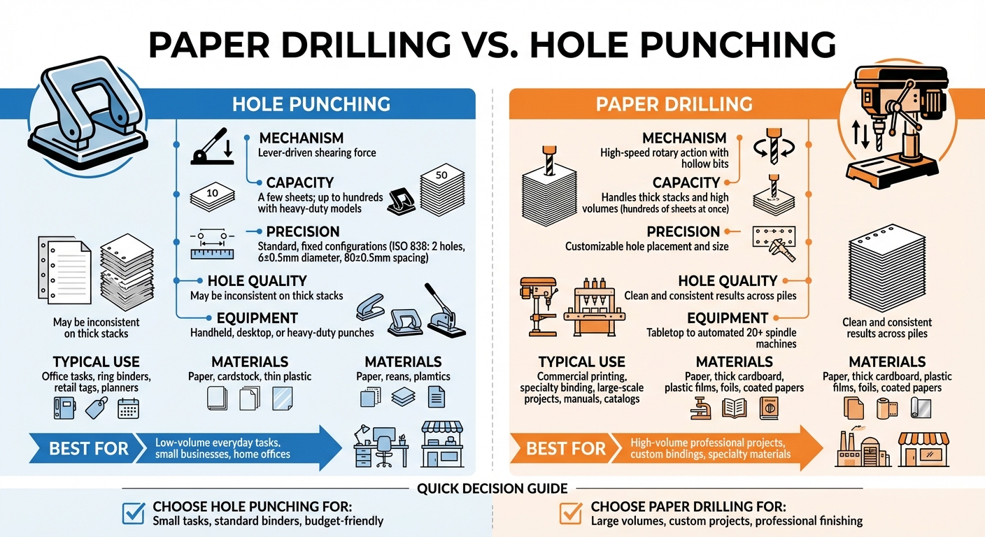
When deciding how to create holes in paper, paper drilling and hole punching are the two primary methods. Both achieve the same result – holes for binding – but they differ in how they work and what they’re best suited for:

  • Paper Drilling: Uses high-speed, hollow drill bits to handle thick stacks of paper or materials like cardboard and plastic. Ideal for large-scale or custom projects in commercial settings.
  • Hole Punching: Relies on a lever mechanism to shear through a few sheets at a time. Perfect for everyday office tasks like preparing documents for binders.

Quick Comparison

Feature Hole Punching Paper Drilling
Mechanism Manual shearing with a lever High-speed rotary drilling
Capacity A few sheets; up to hundreds (heavy-duty models) Thick stacks; hundreds of sheets at once
Precision Standard, fixed configurations Flexible hole placement and sizes
Typical Use Office tasks, planners, tags Commercial printing, manuals, catalogs
Materials Paper, thin plastic Paper, cardboard, plastic films

Bottom Line: Use hole punching for small, routine tasks and paper drilling for high-volume or professional-grade projects. Each method serves specific needs, so choosing the right one saves time and ensures better results.

Paper Drilling vs Hole Punching Comparison Chart

Paper Drilling vs Hole Punching Comparison Chart

How to DRILL PAPER OR CARDSTOCK- BEST METHOD!!

What is Paper Drilling?

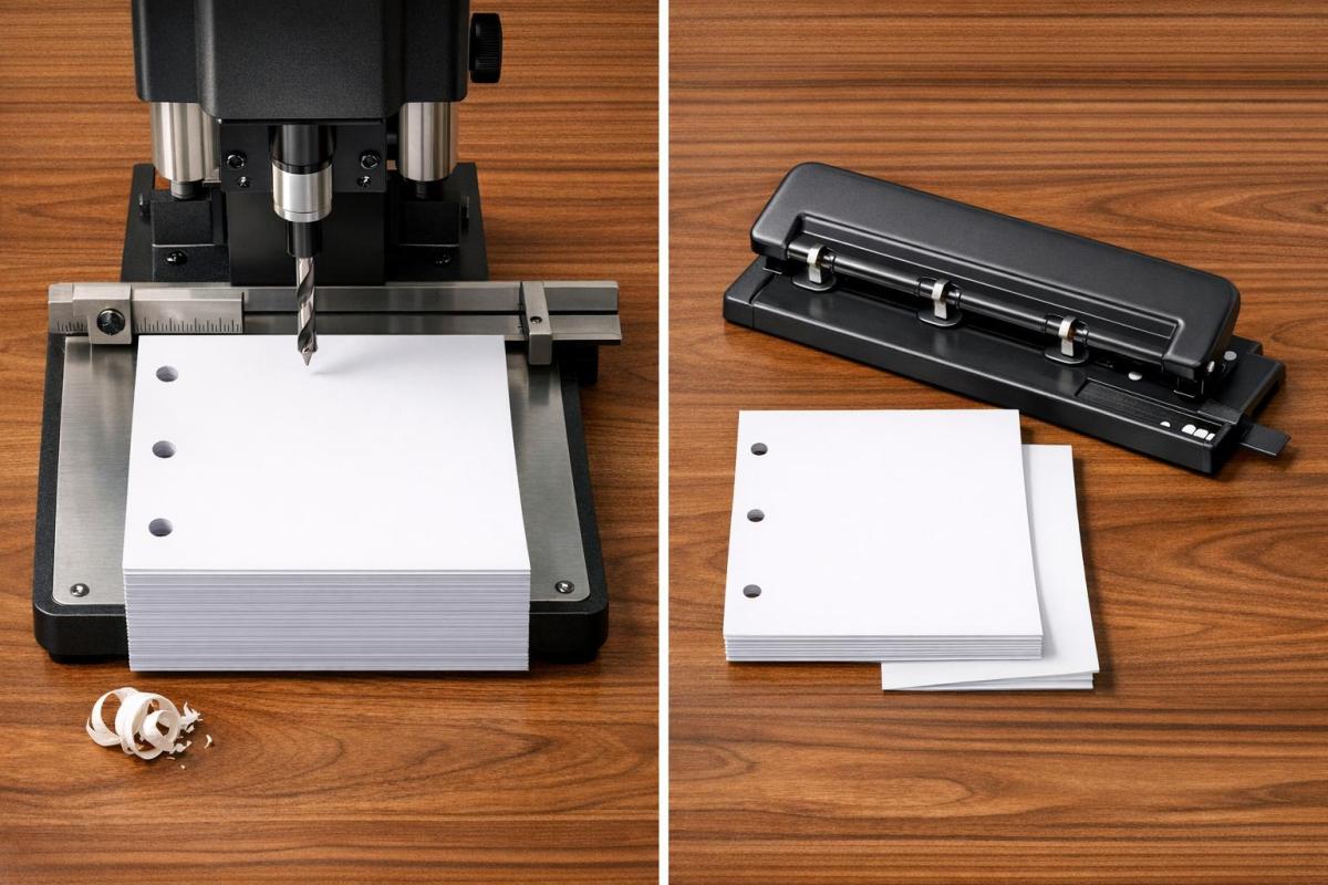
Paper drilling is a specialized technique used in professional printing and binding to create round holes in large stacks of paper. Unlike a standard office punch that relies on manual effort, this process uses motorized equipment with high-speed, hollow drill bits to cut through thick paper stacks with ease.

It’s a go-to method in print shops and binderies because it works on a variety of materials, from regular bond paper to more challenging surfaces like glossy paper, plastic films, and even cardboard.

How Paper Drilling Works

The process revolves around hollow drill bits mounted on a motorized spindle. These bits spin at high speeds and either lower into a stationary stack of paper or, in some setups, the paper is raised toward the spinning bits. As the drill cuts, it removes cylindrical cores of paper, which are evacuated through the hollow center of the bit. This is different from traditional punching, where material is forced through a die.

Paper drilling machines come in a range of sizes and capabilities. Smaller operations might use tabletop models with one or two spindles, while industrial setups can feature over 20 spindles, allowing multiple holes to be drilled at once. This flexibility makes the technique suitable for both small custom jobs and large-scale production.

This precision and efficiency make paper drilling indispensable for a variety of applications.

Common Uses for Paper Drilling

Paper drilling is the standard for preparing high-volume documents. It’s commonly used to create holes for ring binders, manuals, catalogs, and loose-leaf collections. It also plays a key role in specialty binding systems like spiral binding, wire comb binding, and plastic comb binding, where precise hole patterns are essential.

But it doesn’t stop with office documents. Industrial paper drilling is used for producing stationery, tags, point-of-sale materials, and even large-format items like posters or signage that require mounting holes. A unique application can be found in casinos, where paper drills are used to "cancel" decks of playing cards by drilling through them – an effective way to prevent marked cards from being reused in play.

What is Hole Punching?

Hole punching is a shearing process used to create precise holes in materials like paper, leather, cloth, or plastic. It’s a staple in offices, primarily for organizing documents into binders or folders. Unlike industrial paper drilling, which handles large-scale tasks, hole punching is designed for smaller, more personal projects.

The tool has been around since the late 19th century. While its basic design has stayed consistent, modern versions range from simple, manual desktop tools to heavy-duty mechanical models.

How Hole Punching Works

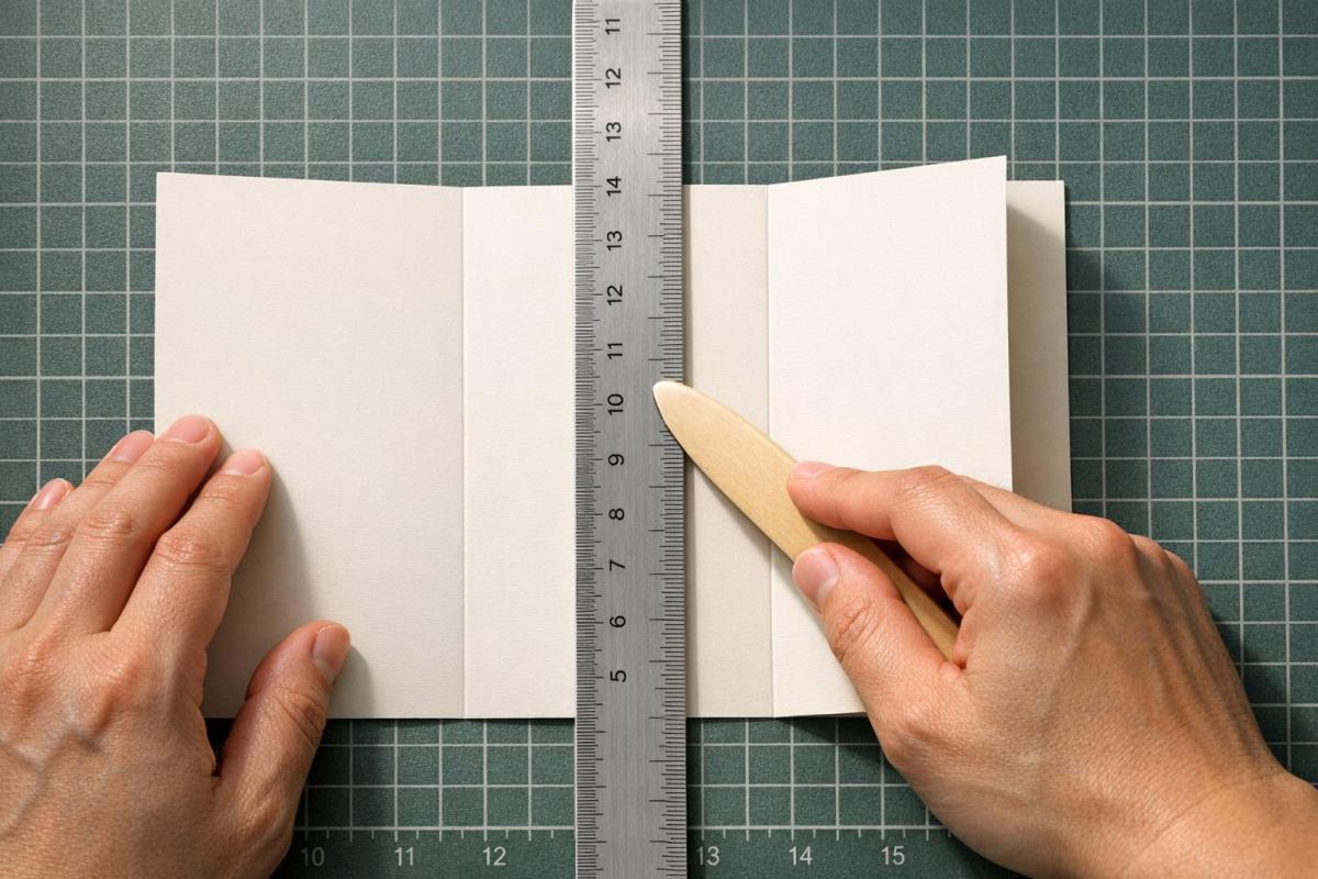
At its core, a standard hole punch has three main parts: a handle (lever), a punch head (a cylindrical blade), and a die (a flat plate with a hole that matches the punch head). When you press the lever, the punch head cuts through the material and into the die. Because the punch only needs to travel the thickness of the material, the lever is designed to maximize force with minimal effort. For example, most office punches only need a lever about 3.1 inches (8 centimeters) long to handle typical tasks.

There are two main types of punch designs: solid and hollow. Solid punches push the waste material, known as "chads", out through the bottom of the die. Hollow punches, on the other hand, push the waste upward through the center of the tool bit, making them better suited for thicker stacks of paper. Many punches also include a "chad collector" that needs to be emptied regularly to keep the tool running smoothly.

For tasks beyond the capacity of manual models, mechanical and industrial punches use motorized, hydraulic, or pneumatic systems. These advanced models, often computer-controlled (CNC), can handle much larger volumes. While standard office punches tackle just a few sheets at a time, heavy-duty versions can punch through up to 150 sheets, and industrial machines can manage as many as 470 sheets. However, even these numbers fall short of the capabilities of paper drilling machines, which are designed for even larger-scale operations.

Hole punching isn’t limited to filing and organizing – it serves a variety of purposes across different industries and hobbies.

Common Uses for Hole Punching

Hole punching is a go-to tool for organizing documents in offices. It’s ideal for preparing papers for ring binders and presentation folders. Standards vary by region: the international ISO 838 standard specifies two holes with a diameter of 6±0.5 mm, spaced 80±0.5 mm apart. In the U.S., the three-hole system is most common for letter-sized paper, with holes spaced 4.25 inches (108 mm) apart.

Single-hole punches are often used for more specific tasks. For example, they’re commonly used to mark admission tickets as used. In the British Civil Service, treasury tags secure papers through a single hole in the upper left corner.

Hole punching also plays a role in crafting and creative projects. Scrapbookers use decorative punches to create shapes and patterns, while crafters make confetti or design custom notebook systems. Beyond paper, hole punches can handle materials like leather, cloth, and thin plastic in small quantities. For added document security, eyelet punches create a hole and simultaneously crimp a metal loop (rivet) around it.

This simple yet versatile tool continues to prove its usefulness in both practical and creative endeavors.

Key Differences Between Paper Drilling and Hole Punching

Understanding the distinctions between paper drilling and hole punching can help identify which method best suits specific commercial printing tasks.

Mechanism and Equipment

The way these two methods operate is fundamentally different. Paper drilling uses hollow, high-speed rotating bits to bore through stacks of paper. As the drill cuts, waste material is expelled through the center of the bit. On the other hand, hole punching relies on a lever-driven shearing force. A punch head – either solid or hollow – is pushed through the paper into a die plate beneath it.

Paper drilling machines are more complex, featuring a spindle-driven mechanism, hollow drill bits, and either a movable table or head. These machines can be equipped with multiple spindles, ranging from a single bit to setups with over 20 spindles, allowing for multiple holes in a single pass. In contrast, hole punches are simpler tools, consisting of a handle, a punch head, and a fixed die plate. While some punches offer minor manual adjustments, they generally stick to fixed configurations.

Capacity and Volume

When it comes to handling large-scale tasks, paper drilling clearly outshines hole punching. It is built for high-volume jobs, capable of processing thick stacks of paper in one go. Multi-spindle drilling machines further enhance its efficiency, making it ideal for commercial and industrial applications.

Meanwhile, hole punching is better suited for smaller tasks. Standard punches handle only a few sheets at a time, though heavy-duty models with extended lever arms can manage up to several hundred sheets in one operation. However, they still can’t match the capacity of paper drilling machines.

Precision and Hole Quality

For projects requiring accuracy and clean results, paper drilling is the go-to option. It creates consistent, smooth holes across thick stacks and offers flexibility in hole placement and size. This level of precision is particularly valuable for custom print jobs or non-standard configurations.

Hole punching, while effective for thin stacks, struggles with thicker piles. Its configurations are generally fixed – such as the ISO 838 standard, which specifies two holes with precise spacing and diameter measurements. This rigidity can limit its use for specialized needs.

Comparison Table

Feature Hole Punching Paper Drilling
Mechanism Lever-driven shearing force High-speed rotary action with hollow bits
Sheet Capacity A few sheets; up to hundreds with heavy-duty models Handles thick stacks and high volumes
Precision Standard, fixed configurations Customizable hole placement and size
Hole Quality May be inconsistent on thick stacks Clean and consistent results across piles
Equipment Range Handheld, desktop, or heavy-duty punches Tabletop to automated 20+ spindle machines
Typical Use Office tasks, ring binders, retail tags Commercial printing, specialty binding, large-scale projects
Material Versatility Paper, cardstock, thin plastic Paper, thick cardboard, plastic films, foils

These differences highlight why paper drilling and hole punching are suited for different applications, ensuring optimal results based on the specific task at hand.

When to Choose Each Method

Deciding between paper drilling and hole punching comes down to what your project requires. Factors like volume, precision, and material type play a key role in making the right choice.

Best Scenarios for Paper Drilling

Paper drilling is the go-to option for large-scale professional projects that need fast processing of thick stacks of paper. Drilling machines can handle hefty materials like catalogs, manuals, and brochures in just one pass. This method is especially useful for custom projects that require non-standard hole sizes or precise placement, which are often essential for specialty bindings like wire-o or comb binding. Beyond paper, drilling can also tackle tougher materials like plastic films, foils, coated papers, and heavy cardboard. It’s even suitable for large-format items like banners and posters. However, if your needs are smaller in scale, hole punching might be a simpler and more practical alternative.

Best Scenarios for Hole Punching

Hole punching shines in low-volume, everyday tasks. If you’re organizing documents for standard two- or three-hole ring binders, a punch is a quick and efficient tool. It’s also perfect for smaller applications like personal planners, hang tags for retail, or point-of-sale materials where only a few sheets need processing. For small businesses, home offices, or one-off projects, investing in drilling equipment often doesn’t make sense – hole punching offers an affordable and accessible solution.

Conclusion

Choose between paper drilling and hole punching based on the scale and needs of your project. Hole punching is perfect for everyday tasks like organizing a few sheets for standard binders or planners. It’s straightforward, cost-effective, and ideal for smaller volumes.

Paper drilling, on the other hand, is designed for high-volume and precise projects. It can handle thick stacks of paper in a single pass, offers flexibility with custom hole sizes and placements, and works with a variety of materials such as plastic films, cardboard, and coated stocks. It’s the go-to option for specialty bindings and large-format projects.

The difference lies in the mechanism – drilling uses hollow rotating bits, while punching relies on a shearing force. This makes drilling the better choice for commercial print jobs where precision and durability are key.

For professional finishing, Miro Printing & Graphics Inc. offers in-house paper drilling and binding services. Their advanced equipment can handle everything from standard booklets to custom projects requiring exact hole placement, ensuring your materials look polished and well-organized.

Understanding these distinctions will help you select the right method – whether it’s a simple desktop punch for filing or professional drilling for larger production needs.

FAQs

Will hole punching damage or misalign thick stacks?

When working with thick stacks of paper, hole punching can sometimes lead to damage or misalignment if not handled properly. However, by using the right tools and applying careful techniques, you can achieve clean and precise holes, even with larger stacks. Paying close attention to the process can prevent common issues and ensure a smooth outcome.

What hole sizes and patterns can paper drilling do?

Paper drilling involves using hollow drill bits to create holes of different sizes in paper. This technique supports a variety of hole patterns, such as the standard two-hole and three-hole arrangements commonly used for filing and binding. The available configurations and sizes typically depend on the specific machine being used.

Can paper drilling handle plastic, foil, or coated paper?

Paper drilling isn’t just for paper – it can also handle materials like plastic, foil, and coated paper. This process uses hollow drill bits specifically designed to cut through different substrates, including laminated and coated finishes. Plus, it works well for large stacks of paper, making it a flexible solution for projects involving non-paper materials.

Related Blog Posts

https://app.seobotai.com/banner/banner.js?id=69c34a921b352ff267cbfc3f

How Post-Press Finishing Impacts Print Quality

Finishes like Spot UV, foil, embossing and lamination define print quality—boosting durability, texture and perceived value.

Post-press finishing is the secret to transforming printed materials into polished, high-quality products. It goes beyond printing to enhance durability, appearance, texture, and protection. Here’s a quick breakdown of six key techniques and their benefits:

  • Spot UV: Adds glossy highlights to specific areas for contrast and tactile appeal – great for business cards and brochures.
  • Matte Varnish: Creates a smooth, glare-free finish, ideal for text-heavy materials like manuals.
  • Lamination: Protects prints with a durable plastic film, perfect for menus and book covers.
  • UV Coatings: Delivers vibrant colors and scratch resistance but may crack on folds.
  • Digital Embossing: Adds raised textures for a 3D effect, enhancing depth and detail.
  • Foil Stamping: Applies metallic finishes for a shiny, luxurious look, often used for logos and premium branding.

Each method offers unique strengths, from enhancing visual impact to improving durability. Choosing the right finish depends on your project’s goals, budget, and usage requirements.

1. Spot UV

Spot UV is a printing technique that applies a glossy coating to specific elements like logos, text, or images. This selective application creates a visually striking contrast that grabs attention.

Eye-Catching Design

Spot UV is all about creating contrast. When applied to a matte background, the glossy finish highlights key design features, making them pop. As McKenzie Swisshelm from American Business Machines puts it:

"Spot UV adds a touch of shine that highlights key elements and gives print products a premium, professional appearance".

The process relies on digital precision, requiring only a 100% black layer to mark coating areas. This level of control makes Spot UV a go-to option for items like business cards, brochures, and luxury packaging.

Multi-Sensory Appeal

Spot UV doesn’t just look good – it feels good too. The raised, glossy coating adds a tactile dimension that enhances the overall experience. When applied to elements like brand names or intricate patterns, it creates a multi-sensory effect that elevates the perception of quality.

Budget-Friendly Sophistication

One of Spot UV’s standout features is its cost-effectiveness. It delivers a premium look without the hefty price tag of techniques like foil stamping or embossing. Since the process is digital, it eliminates the need for custom dies or screens, making it particularly affordable for short print runs or customized projects. This means you can achieve a high-end finish without breaking the bank.

Miro Printing & Graphics Inc. leverages advanced digital technology to produce Spot UV finishes that are as engaging to touch as they are to see.

2. Matte Varnish

Matte varnish creates a smooth, non-reflective finish that gives prints a soft, understated look. Unlike glossy finishes that reflect light, matte varnish absorbs it, resulting in a modern and subtle appearance. It’s a technique that combines visual appeal with practical benefits.

Aesthetic Appeal

One standout advantage of matte varnish is its ability to reduce glare, making text easier to read – especially in items like manuals and brochures. It also enhances the perceived quality of the paper, giving printed materials a more polished and professional presentation.

Texture and Feel

Matte varnish adds a smooth, velvety texture that feels great to the touch. However, it does come with a tradeoff: it can soften image details compared to gloss finishes. When used over images, matte varnish tends to reduce sharpness and vibrancy, offering a more muted visual effect.

Durability

This finish provides basic protection against ink smudging and is less prone to showing fingerprints, making it a good choice for items that are handled frequently. That said, it has its limitations. As Gordon Pritchard notes:

"It is more resistant to fingerprinting than a gloss varnish however it will tend to scuff or gloss up with wear".

To minimize scuffing or burnishing during shipping, placing blank interleaving paper between printed items is recommended.

Affordability

Matte varnish is an economical finishing option. Since it uses a standard on-press litho plate, there’s no need for costly offline equipment, keeping production costs low. However, it offers less protection than options like aqueous or UV coatings and may yellow over time with prolonged exposure. This is in contrast to finishes like Spot UV, which focus on enhancing gloss and tactile contrast.

3. Lamination

Lamination involves covering printed materials with a protective plastic film, as explained by John Monson. Unlike liquid coatings that harden on the surface, lamination fuses a film directly onto the sheet, giving it extra thickness and weight.

Durability

Lamination is ideal when prints need to endure tough conditions. It’s perfect for items like menus that face spills, book covers that get tossed around, or playing cards that are constantly shuffled. The film acts as a shield, protecting against damage and wear. Unlike UV coatings, which can crack along fold lines, lamination – when properly scored – holds up better under bending. This durability ensures prints maintain their quality over time. As John Monson puts it:

"Pick lamination when the piece will undergo frequent handling and friction".

At Miro Printing & Graphics Inc., lamination is a go-to solution for making high-use materials both sturdy and visually appealing.

Aesthetic Enhancement

Lamination doesn’t just protect – it also improves how prints look and feel. Gloss lamination makes colors pop, while matte or satin finishes cut down on glare and hide fingerprints. For premium products, soft-touch lamination adds a velvety texture that exudes sophistication, making it a popular choice for luxury packaging and upscale business cards.

Next, we’ll explore UV coatings, another way to elevate print quality.

Cost Implications

Lamination does come with a higher price tag, but its durability can make it worth the cost. The process is more labor-intensive and uses physical film, which increases expenses compared to liquid coatings. However, for items that face heavy use, the investment pays off by reducing the need for replacements. For short-term materials like event flyers, though, John Monson advises:

"If it’s a handout that will live for one event, lamination is usually overkill."

It’s also worth noting that the added thickness might affect shipping costs. Always test fold lines on a sample before placing large orders to ensure the final product meets expectations.

4. UV Coatings

After lamination’s tactile durability, UV coatings bring their own appeal with a combination of striking visuals and affordability.

UV coating is a liquid compound that solidifies in milliseconds when exposed to ultraviolet light. Unlike lamination, which uses a bonded film, UV coating forms a thin, durable polymer layer. As John Monson puts it:

"UV coating is a hardened coating. Lamination is a bonded film. Different tools, different results."

Durability

UV coating provides a scratch-resistant finish that resists yellowing, making it a solid choice for prints that will see frequent handling. However, its rigidity can lead to cracking along fold lines. If your project includes aggressive folding, like brochures or booklets, aqueous coating is a better alternative. Similarly, for items that need to endure frequent wiping or heavy wear, lamination offers better long-term protection.

Aesthetic Appeal

Gloss UV coating adds a vibrant, photo-like finish that makes colors pop, making it the go-to choice for about 99% of UV coating applications. For designs that require a more understated look, matte and satin finishes are also available, offering non-reflective options.

Selective gloss is another standout feature, enhancing specific design elements to create contrast and draw attention. Thanks to its clarity and resistance to yellowing, UV coating preserves the quality and vibrancy of prints over time.

Cost Considerations

UV coating is an affordable option, especially for high-volume projects, as it cures almost instantly. For instance, applying gloss UV coating to 1,000 business cards costs less than $10.

While selective gloss applications are slightly more expensive than full-sheet (flood) UV coating, they provide a strong visual impact at a fraction of the cost of lamination. However, UV coating is not suitable for areas meant for writing, as its slick surface does not hold ink.

Next, we’ll dive into finishing techniques that add unique textures to your designs.

5. Digital Embossing

Digital embossing takes print design to the next level by adding raised textures that bring depth and dimension to your projects. Using high-resolution inkjet technology, this method applies clear polymer layers in varying thicknesses, creating intricate details and a striking 3D effect.

Tactile Experience

One of the standout features of digital embossing is the tactile experience it provides. These raised details not only look stunning but also feel distinctive, enhancing the perception of quality and authenticity. As BcardsCreation highlights:

"Subtle tactile effects engage emotional memory centers without overwhelming with decorative excess, reinforcing premium brand perception through understated sophistication."

For luxury or high-end designs, less is often more. Focusing on just one or two elements, like a logo or brand name, can make a stronger statement. Pairing this technique with thicker materials, such as cotton blends or heavyweight paper, ensures the embossed details remain sharp and impactful.

Aesthetic Enhancement

Unlike traditional embossing, digital methods allow for variable data printing. This means you can personalize designs – think custom packaging or limited-edition runs – without the added expense of tooling. Plus, combining embossing with colorized inks creates a dynamic, multi-sensory design that truly stands out.

Cost Implications

Digital embossing offers a cost-effective alternative to traditional methods by eliminating the need for custom metal dies. This makes it ideal for small- to medium-sized projects, with minimum orders as low as 48 units. Yukta Arora from PackagingConnections explains:

"Digital embossing revolutionizes this by eliminating physical tooling, enabling on-demand production and rapid prototyping."

The streamlined setup not only reduces costs but also speeds up production. To ensure the best results, designers should carefully space embossed lines to avoid polymer pooling or blending.

At Miro Printing & Graphics Inc., cutting-edge digital embossing techniques bring both visual and tactile appeal to every project, creating designs that leave a lasting impression.

Up next, we’ll explore how foil stamping adds even more texture and visual interest to printed materials.

6. Foil Stamping

Foil stamping is a printing technique that uses metallic or pigmented finishes to create a shiny, reflective surface. By heating a die to temperatures between 90 and 180°C, a thin layer of foil is transferred onto the material. This process makes logos, text, or design elements visually striking, standing out far more than standard ink.

Visual Appeal

The reflective nature of foil stamping gives printed materials a polished, high-end look, making them stand out in retail settings. Modern systems like the MGI iFOIL allow for precise application of metallic finishes, which can even be combined with subtle 3D effects to elevate the design. The metallic sheen naturally draws the eye, making it a popular choice for brands aiming to grab attention.

Texture and Dimension

Beyond its visual impact, foil stamping adds a tactile quality to printed pieces. Techniques such as foil embossing create raised, three-dimensional designs that not only feel unique but also evoke a sense of luxury and craftsmanship. This tactile element often reinforces the perception of quality and sophistication.

Cost Considerations

Foil stamping involves upfront costs for die fabrication, making it less budget-friendly for small print runs. However, it becomes more cost-efficient for larger quantities. Flat foil stamping is generally the more economical choice, while sculpted 3D foil stamping is priced higher due to its intricate, multi-step process. To ensure clean foil application, smooth-surface papers like coated ivory board (≥250 gsm) are recommended, and design elements should maintain a minimum line thickness of 0.15–0.2 mm.

At Miro Printing & Graphics Inc., advanced foil stamping techniques combine visual brilliance with tactile sophistication, helping brands create materials that stand out and exude premium quality.

This exploration of foil stamping highlights its ability to enhance both the look and feel of printed designs while considering practical factors like cost and material choice.

Advantages and Disadvantages

Post-Press Finishing Techniques Comparison: Durability, Appearance, Texture & Cost

Post-Press Finishing Techniques Comparison: Durability, Appearance, Texture & Cost

When choosing a finishing method, it’s essential to weigh both performance and appearance. The right finish can elevate print quality by striking a balance between durability, visual appeal, and cost.

Here’s a comparison of six popular finishing techniques based on key criteria:

Finishing Technique Durability Appearance Texture Cost Level
Spot UV Moderate; resists scuffing High-gloss contrast on specific areas Smooth, slightly raised Moderate (adds production steps)
Matte Varnish Moderate; flexible for folding Subtle, non-reflective; reduces glare Smooth, paper-like Low to Moderate
Lamination High; tear and water-resistant Glossy, matte, or soft-touch options with added thickness Plastic-like or velvety (soft-touch) Moderate to High
UV Coatings Moderate; hard shell but prone to cracking on folds High vibrancy and "pop" Hard and slick Low to Moderate
Digital Embossing High; creates a permanent structural change 3D, raised effect Tactile, raised surface Moderate to High
Foil Stamping High; securely bonded Shiny metallic or deep colors Smooth, metallic feel High (requires custom dies)

This breakdown highlights the unique strengths and drawbacks of each technique, helping you make informed decisions.

For items like menus or membership cards that endure frequent handling and exposure to moisture, lamination is a standout choice due to its high durability. As John Monson puts it:

"UV coating is a hardened coating. Lamination is a bonded film. Different tools, different results".

However, UV coatings, while vibrant, can crack along folds, making them less ideal for foldable materials. Flexible finishes are better suited for such projects.

Beyond durability, consider how finishes influence branding and readability. For luxury branding, pairing matte lamination with Spot UV or Foil Stamping can create a striking, tactile contrast. As Color Vision Printing explains:

"Spot UV works best on darker substrates. Also, a matte substrate with low sheen is ideal because it provides the most contrast with the glossy UV".

Matte and satin finishes are excellent for reducing glare and improving text readability in manuals and brochures. On the other hand, gloss finishes amplify color vibrancy and make images stand out, though they may compromise readability under bright light.

Conclusion

Post-press finishing takes a standard print and turns it into something that stands out and performs. Each technique brings its own flair: Spot UV and Foil Stamping add striking visual contrast and a premium tactile experience; Matte Varnish minimizes glare for easier readability in text-heavy designs; Lamination adds durability, especially for items that endure heavy use or exposure to moisture; UV Coatings enhance color richness; and Digital Embossing introduces textured elements that draw attention and engage the senses.

When applied with precision, these methods elevate print materials from mere ideas to polished, high-quality products. Automated, integrated systems ensure consistent results while reducing the risk of errors that could impact the final outcome.

For businesses looking to incorporate these techniques, Miro Printing & Graphics Inc. offers a wide range of in-house post-press services in Hackensack, NJ. Their capabilities include cutting, folding, binding, die cutting, and more – perfect for projects that require both durability and visual appeal. They also provide digital, offset, and large-format printing services to meet diverse needs.

Knowing how each finishing option enhances print quality helps you make choices that align with your brand, budget, and goals.

FAQs

Which finish is best for items that will be folded?

For items that need to be folded, the right finish makes all the difference. It ensures smooth, accurate creases while avoiding cracking or any damage during the folding process. Techniques like scoring or other finishes designed specifically for folding help preserve both the quality and durability of the final product.

Can I write on a UV-coated or laminated print?

Yes, but it depends on the finish. UV coating provides a smooth, glossy surface that might only work with certain types of pens. Lamination, on the other hand, tends to be more adaptable and easier to write on, though how well it holds writing can vary depending on the specific type of lamination applied.

How do I choose a finish based on budget and print quantity?

Choosing the right finish comes down to your budget and the size of your print run. If you’re working with a smaller budget or have a limited print run, aqueous coating is a solid choice. It’s cost-effective and provides basic protection for your prints. On the other hand, if you’re producing larger quantities or want a more polished, high-end appearance, varnishes – whether gloss, satin, or matte – offer added durability and a more striking visual effect. Weigh your options carefully to ensure the finish aligns with your project’s goals.

Related Blog Posts

https://app.seobotai.com/banner/banner.js?id=69c326791b352ff267cbe964

Deadline Management for Custom Print Projects

Plan milestones, streamline approvals, add 5–10% buffer, and use tracking tools to keep custom print projects on schedule without sacrificing quality.

Managing deadlines for custom print projects requires careful planning, clear communication, and proactive problem-solving. These projects often have fixed deadlines tied to events or launches, making timely delivery critical. Here’s how to stay on track while maintaining quality:

  • Plan thoroughly: Define the project scope, set realistic timelines, and break the work into milestones.
  • Use tools: Gantt charts, Kanban boards, and project management software help track progress and dependencies.
  • Communicate clearly: Regular updates and streamlined approval processes prevent delays.
  • Prepare for issues: Include buffer time for unexpected delays and have contingency plans ready.
  • Maintain quality: Conduct checks at every phase to avoid rework and ensure a polished final product.

Setting Realistic Timelines and Planning Your Project

Custom Print Project Timeline: 4 Key Phases from Briefing to Installation

Custom Print Project Timeline: 4 Key Phases from Briefing to Installation

Before diving into production, it’s crucial to have a detailed plan in place. This plan should clearly outline tasks, deadlines, and responsibilities. A well-organized project roadmap can mean the difference between smooth execution and complete chaos.

Defining Project Scope and Requirements

Your project begins with a strong foundation: a clear and detailed brief. This document should cover the essentials, including objectives, target audience, design specifics (like size, materials, colors, and finishes), quantities, and whether the project is a one-time effort or involves multiple locations with varying needs, such as creative design, installation, or removal. Don’t forget to account for any local challenges, such as difficult-to-access locations.

It’s equally important to define what’s excluded from the project scope and implement a formal process for handling change requests. This approach helps you avoid “scope creep” – those unexpected mid-project additions that can throw off your timeline.

"A great print project feels effortless, but that comes from careful planning. When communication flows and expectations are clear, everything else follows naturally." – Matt Walsh, Operations Director, KGK Genix

To stay on track, industry experts advise setting aside 5–10% of your budget for unexpected adjustments or last-minute creative changes. This buffer ensures you’re prepared for surprises without jeopardizing the project’s progress.

Dividing Projects into Milestones

Once the project scope is defined, break it down into manageable milestones. These checkpoints help you monitor progress and ensure that each stage is completed before moving on to the next. For instance, you can’t begin printing until the client signs off on the final proof, and installation can’t be scheduled until the printed materials are delivered to the site.

Project Phase Estimated Duration Key Activities
Briefing & Design Approval 1–2 weeks Setting objectives, identifying the audience, and finalizing design approval
Artwork Prep & Proofing 3–5 days Preparing high-resolution files, bleeds, and color proofs
Production & Finishing 1–2 weeks Printing, foiling, layering, or other finishing touches (depending on complexity)
Delivery & Installation 1–5 days Shipping materials and completing on-site installation (varies by location)

Make sure to include contingency time in each phase to account for common delays, such as material shortages, shipping issues, or late client approvals.

Timeline Tracking Tools and Methods

After establishing milestones, use tracking tools to monitor progress and adjust schedules as needed. Tools like Gantt charts are great for visualizing task durations, overlaps, and dependencies, making it easier for everyone involved to understand the timeline.

For more complex projects, PERT charts can help identify the "critical path" – the sequence of tasks that must be completed on time to avoid delays. Meanwhile, Kanban boards are ideal for tracking workflow through specific stages like design, prepress, and production.

Modern project management software such as Smartsheet or Jira can automate updates and keep schedules in sync. For example, Welocalize, a language services company, used Smartsheet to manage thousands of localization projects across time zones. By centralizing project data and using dynamic Gantt charts, they reduced project kickoff time from 8 hours to 2 hours and saved each project manager 1 hour per day.

No matter which tool you choose, it should act as a single source of truth for everyone involved. Use features like color-coded deadlines, clearly marked task dependencies, and real-time updates to keep the team aligned. When everyone understands how their role fits into the bigger picture, the project is far more likely to stay on track.

Communicating Effectively with Stakeholders

Once you’ve established a solid project timeline, keeping the communication channels open and clear with stakeholders becomes essential for the success of custom print projects. When you have multiple teams involved – designers, production staff, clients, and installers – miscommunication can quickly derail progress and lead to missed deadlines. This is where a project manager plays a pivotal role, acting as the go-between to translate technical terms like bleeds, crop marks, and CMYK color profiles into something clients can easily understand. Without this clarity, files might arrive unprepared for production, creating delays that affect the entire schedule.

Consistent check-ins with all stakeholders help everyone stay aligned and provide opportunities to make adjustments as needed. These regular feedback loops ensure that small issues – like a slight color mismatch or an incorrect material choice – don’t grow into major problems that halt production. When communication is consistent and clear, teams can tackle challenges early, avoiding costly delays or revisions.

Setting Communication Expectations

During the initial briefing phase, it’s critical to define your communication methods and timelines. Decide upfront whether updates will be shared via email, project management tools, or scheduled calls, and set expectations for response times. For instance, if clients typically need 2–3 business days for approvals, build that into your schedule instead of relying on faster responses that may not happen.

Implement a centralized tracking system to give every stakeholder access to the project’s current status. This eliminates the need for endless follow-up emails and confusion about which design version has been approved or whether materials have been ordered. A single source of truth keeps everyone on the same page, streamlining client approvals and revisions while keeping the project on track.

Handling Client Approvals and Revisions

Referring back to the documented project scope is essential when evaluating client-requested changes. This ensures you can determine whether a change fits within the original agreement or requires adjustments to the timeline or budget. Clear documentation allows you to manage these requests efficiently, avoiding unexpected disruptions to the project.

Structure the workflow so that each phase relies on the previous one being completed and approved. For example, production should only begin after the client has signed off on the final proof, and installation should only be scheduled once printed materials are ready. This setup encourages timely client decisions and prevents delays. Allocate 1–2 weeks for design approvals and 3–5 days for artwork proofing in your timeline, and communicate these deadlines early so clients know when their input is required. This approach keeps the project moving forward without unnecessary hold-ups.

Improving Prepress and Production Efficiency

Once communication channels are in place, the next step is to fine-tune the technical side of things – specifically, prepress and production. These stages are the backbone of converting digital designs into physical prints. By understanding the technical requirements and teaming up with a full-service print provider, you can cut down on production times without sacrificing quality.

Preparing Print-Ready Files

The first priority is ensuring your digital files are truly ready for print. This means they must meet specific technical standards, such as:

  • Using the CMYK color mode
  • Including 0.125-inch bleeds and crop marks
  • Maintaining a resolution of at least 300 DPI (higher for intricate designs)

"The printer is asking for high-res files, bleeds, crop marks, CMYK, and you’re sitting there wondering if it’s too late to say this was meant for digital only." – Denisa R., PMP-certified project manager

These specifications aren’t just recommendations – they’re essential for keeping production on track and avoiding quality issues. Since distractions can derail this process, try to dedicate uninterrupted time to file preparation. Research shows that after a distraction, it takes an average of 23 minutes and 15 seconds to regain full focus. Catching errors early in this stage saves time and resources later.

Working with Full-Service Print Shops

Collaborating with a full-service print shop can simplify your workflow and reduce inefficiencies. Many of these shops use advanced Print Management Information Systems (MIS) to automate repetitive tasks like order entry, file prep, and job routing. This automation can drastically cut down on turnaround times. For example, manual order processing often takes 10–20 minutes per order, but automated systems handle these tasks much faster.

A great example of this efficiency in action comes from a 2024 case study. An insurance provider switched to the Avanti Slingshot Print MIS to overcome the challenges of outdated, fragmented systems. Before the change, employees spent eight hours a day on manual order processing. After adopting the new system, that time dropped to just 30–60 minutes daily, and error rates fell from 3–5% to a mere 0.5%. This shift saved both time and money on labor and materials.

"Manual rekeying of orders, especially from web-to-print tools, can take 10-20 minutes per order, wasting valuable time and resources." – Matt Prusa, Director of Sales at Ricoh USA

Integrated print shops, like Miro Printing & Graphics Inc., offer everything under one roof – digital printing, offset printing, large format printing, and bindery services. This all-in-one setup eliminates delays caused by outsourcing and keeps your timelines more predictable. When prepress, printing, and finishing are handled in the same facility, the entire process becomes smoother and easier to manage.

Preparing Contingency Plans for Delays

Even with streamlined prepress and production workflows, delays can still happen. And when they do, they can derail entire projects if you’re not prepared. Here’s a key stat to consider: 92% of missed deadlines in the printing industry are caused by approval delays, while 82% are linked to communication breakdowns between stakeholders. Knowing where delays are likely to occur – and having a plan in place – can turn potential disasters into manageable setbacks.

Common Causes of Print Project Delays

Delays in print projects often snowball, leaving little room to recover. For instance, data readiness issues – like incomplete mailing lists, incorrect file dimensions, or missing bleeds – can bring production to a standstill. These kinds of errors force rework, eating into the time allocated for later stages [15, 16].

Another major culprit? Approval workflow bottlenecks. Teams that rely on manual proofing through email often run into version control problems. Proofs can sit idle for days, and confusion over who has final approval authority can lead to unnecessary debates and delays [15, 17].

Then there’s the issue of production capacity. If you’re relying on a single print facility, you’re vulnerable to equipment downtime, maintenance issues, or seasonal surges – like those during the holidays or end-of-quarter rushes [15, 16]. Large-scale projects, in particular, tend to take 20% longer than planned, making buffer time a must.

"Always add in buffer time to accommodate slippage in the schedule. The larger the project, the more buffer you will need." – Storey Kenworthy

On top of that, external factors like subcontractor delays or extreme weather can throw off timelines. For example, if a freelance designer misses a deadline or a supplier runs out of specialty paper, the entire project can get pushed back. Identifying these risks upfront is key to creating solid contingency plans.

Developing Backup Strategies

The best way to prepare for delays is to plan backward from your delivery date. Start by setting milestones and then add buffer time – extra days to handle unexpected issues. For complex projects, this buffer should account for 5-10% of the total timeline, giving you room to address last-minute changes without compromising quality [1, 20].

Streamline your approval process by limiting the number of reviewers to only those who are essential. Use centralized proofing tools instead of email to avoid version confusion and ensure the latest iteration is always the one that moves forward [15, 17]. Assign one person to have final sign-off authority from the start.

Diversify your vendor options. Don’t rely on just one print facility. Build relationships with multiple suppliers, including those offering a range of services, like Miro Printing & Graphics Inc., which handles digital, offset, and large-format printing along with in-house bindery. This approach gives you flexibility if one vendor faces capacity issues or equipment problems [15, 16].

To avoid last-minute surprises, standardize pre-flighting by checking file specifications – like bleeds, resolution, and dimensions – before proofing begins. If your project involves specialty materials, confirm their availability with suppliers early on [15, 20]. This step can save you from scrambling at the eleventh hour.

Lastly, plan ahead for seasonal surges. High-volume campaigns during peak periods, like holidays, require extra foresight. Schedule maintenance, build in buffer time, and establish quick revision workflows to keep momentum even when unexpected changes arise [15, 16, 19].

Maintaining Quality While Meeting Deadlines

Once contingency plans are in place, it’s essential to weave quality control into every step of the process. This prevents rework and keeps projects on schedule without sacrificing standards. Quality checks shouldn’t just come at the end; they need to be part of the workflow, from prepress to finishing. Catching issues early – like during proofing or production – saves time and avoids costly delays.

Think of quality control as an ongoing process rather than a last-minute task. For example, you might verify color accuracy during proofing, ensure materials meet specifications before production, and inspect final prints before they leave the facility. Skipping these steps to save time can backfire, leading to redoing entire projects and missing deadlines.

Setting Up Quality Inspection Points

To maintain high standards, set up inspection points at critical stages:

  • Prepress Checks: Confirm file specifications – like bleeds, resolution, and color profiles – before proofing. This prevents flawed files from entering production and causing delays.
  • Production Monitoring: During printing, check for color consistency, especially in large-format or offset projects where variations can stand out. Inspect alignment, registration, and material quality as sheets come off the press. For specialty finishes (like embossing or foiling), review samples before full production begins.
  • Finishing and Installation: Precision matters during finishing and installation. For example, poorly applied graphics can result in visible seams or uneven surfaces that harm the final look. Post-installation checks ensure everything is secure and meets brand standards. Depending on complexity, delivery and installation typically take 1 to 5 days per location.

Using tools like Gantt charts can help track quality milestones alongside production deadlines. The 8/80 rule is another helpful guideline: tasks should generally take between 8 and 80 hours to maintain manageable tracking.

Once the project wraps up, conduct a post-project review. This helps assess whether deadlines were realistic and if quality standards were upheld. Such thorough inspections not only ensure a polished final product but also streamline delivery and fulfillment.

Managing Delivery and Fulfillment

Delivery and fulfillment are where all the planning and effort come together. To avoid last-minute surprises, build a 5–10% buffer into your project timeline for unexpected issues like material shortages or shipping delays.

Prepare for delivery by documenting key details, such as site access, safety protocols, and necessary tools for installation teams. This reduces the risk of delays caused by missing equipment or credentials.

For projects requiring ongoing fulfillment, partnering with a full-service print shop can simplify the process. For example, Miro Printing & Graphics Inc. offers digital, offset, and large-format printing, along with mailing and fulfillment services. Their in-house capabilities minimize miscommunication and logistical challenges during production and delivery.

Regular check-ins, like mid-week updates, help keep deadlines on track. Using a prioritization matrix to sort tasks by urgency and importance can also prevent last-minute chaos.

For long-term installations, schedule periodic maintenance to extend the lifespan of materials and maintain brand quality.

"Remember, a rushed job is often a twice-done job." – Claudio Gutierrez, President & Founder, Valens Project Consulting

Conclusion

Managing deadlines effectively can turn custom print projects from stressful endeavors into manageable and successful operations. The key lies in three main principles: thorough planning, clear communication, and smart contingency measures. Begin with a detailed brief that outlines your goals, technical requirements, and firm deadlines. Then, implement a structured, phased plan to ensure everyone stays on the same page and accountable throughout the process. These steps form the backbone of a project, balancing efficiency with quality.

Incorporate a 5–10% buffer at every stage to absorb unexpected delays, and include quality checks – like proofing and final inspections – to minimize the risk of rework. Maintain consistent, documented communication with regular updates among all team members and stakeholders to address issues promptly and keep the project moving forward.

"Project management is really about trust. Our clients trust us to bring their ideas to life, and we take that responsibility seriously from start to finish." – Graham Pitts, Managing Director, KGK Genix

Wrap up each project with a comprehensive review to fine-tune your timeline, communication, and quality assurance strategies for future projects. Assess whether your timeline was realistic and gather client feedback to continually improve. By embedding these practices into your workflow, you’ll create a dependable system that delivers impactful print projects on schedule.

FAQs

How much buffer time should I add to a print project schedule?

When planning your print project schedule, it’s wise to include a buffer of 10-20% of the total estimated production time. This extra time helps account for potential delays, such as proofing, approvals, or unexpected technical hiccups.

For instance, if your project is expected to take 10 days, adding 1-2 extra days can make a big difference. Be sure to communicate this buffer clearly with your team and clients. This way, everyone stays on the same page, and the project is more likely to wrap up smoothly and on time.

What’s the fastest way to prevent approval delays?

Using digital tools like web-to-print software is a smart way to sidestep approval delays. These tools simplify the review process, cutting down the time wasted on manual workflows. With features that allow for quicker proofing and approvals, they help ensure custom print projects stay on track.

What should I check to ensure my files are print-ready?

To get your files ready for printing, make sure they meet these key requirements: high resolution, the correct CMYK color profiles, bleed areas, and crop marks. Using high-resolution graphics is crucial to avoid pixelation, and proper color settings help prevent mismatched tones. Following these steps ensures smoother production and a polished final print.

Related Blog Posts

https://app.seobotai.com/banner/banner.js?id=69c1d6481b352ff267cbc481

Ultimate Guide to Embossing and Debossing

Practical guide to embossing and debossing: learn processes, materials, types, and finishing options for premium packaging and stationery.

Embossing and debossing are mechanical printing techniques that add a tactile, three-dimensional element to designs. Embossing raises parts of the material, creating a textured, standout effect, while debossing presses designs inward for a recessed, engraved look. Both methods use custom metal dies, heat, and pressure to create their effects.

Key Takeaways:

  • Embossing: Raised design; bold and textured; works well for logos, seals, and luxury packaging.
  • Debossing: Recessed design; subtle and refined; ideal for stationery, journals, and premium branding.
  • Best materials: Heavyweight, uncoated papers (300 gsm or thicker) with long fibers for durability and sharp impressions.
  • Can be combined with foil stamping or spot UV for added visual appeal and durability.

These techniques are widely used in business cards, invitations, luxury packaging, and more, offering a high-end feel that engages both sight and touch. The choice between embossing and debossing depends on the desired visual and tactile effect, as well as material considerations.

The Embossing Process

How Embossing Works

Embossing relies on a pair of custom metal plates known as dies. The male die has a raised (convex) version of the design, while the female die (or counter-die) features a matching recessed (concave) impression. To create the embossed effect, your paper or cardstock is sandwiched between these dies, and a press applies heat and pressure. This reshapes the fibers of the material into a raised, three-dimensional design.

The heat softens the paper fibers, ensuring the impression is both precise and durable. A typical emboss depth ranges from 15 to 25 microns – about 1/64th of an inch. Proper alignment of the dies is crucial; even slight misalignment can result in weak or uneven impressions.

To ensure sharp, clean results, always use a vector file (like those created in Adobe Illustrator) for die production. Raster images, such as JPEGs, lack the clarity needed for the fine edges of metal dies. For best results, use fonts no smaller than 11 points and maintain a minimum line thickness of 1.0 point to prevent breakage. Also, keep embossed elements at least 3 mm to 5 mm away from trim edges and 4 mm from folds to avoid wrinkling or distortion.

This foundational process supports the various embossing techniques explained below.

Types of Embossing

Embossing Type Description Best Application
Blind Relies purely on texture and shadow, with no ink or foil Minimalist designs, stationery
Registered Aligns the raised design perfectly with printed ink or foil Logos, brand names, packaging
Combination Embossing and foil stamping occur simultaneously High-end labels, certificates
Multi-Level Creates a sculptural effect with varying depths Crests, intricate illustrations
Glazing Produces a shiny, polished raised surface using high heat and pressure Dark, heavy-weight paper stocks

Where Embossing Is Used

Embossing techniques are a versatile tool in modern print design. They’re commonly used to enhance logos, crests, monograms, and detailed graphics like botanical patterns or fine line art. For example, business cards with embossed logos convey a sense of professionalism and care, while wedding invitations and luxury stationery gain a tactile, heirloom-like quality.

Packaging and book covers also benefit from embossing, especially when using textured patterns like linen, leather grain, or geometric designs. These textures not only elevate the design but also help reinforce premium branding and justify higher price points. Embossing works best on uncoated, long-fiber paper stocks, such as cotton paper, which hold deep impressions far better than coated papers that may crack under pressure.

One thing to note: standard embossing leaves a recessed (debossed) mirror image on the back of the sheet. If a flat reverse side is needed, you can opt for duplexing (mounting two sheets together) or select an alternative finishing technique.

How To Deboss and Emboss Using the KSF 3 Press | Using Your Hot Stamping Press

The Debossing Process

Debossing, like embossing, brings a tactile element to designs, but instead of raising the material, it presses the design inward, creating a recessed effect.

How Debossing Works

Debossing involves pressing a design into a material to create a sunken impression. Steven Waxman, a printing consultant at Printing Industry Exchange, explains:

"The paper fibers can be bent easily by the heat and pressure of the process".

The process uses a male die to press the design into the material, supported by a female counter-die. Heat and pressure push the fibers into a permanent recessed shape. Unlike embossing, debossing usually doesn’t leave a visible impression on the reverse side – especially with thicker paper stock – making it ideal for double-sided designs.

For best results, use paper that’s at least 300gsm (14pt) to prevent tearing. Soft, thick papers like linen or felt are particularly effective because their fibers are more pliable under heat and pressure. Designs should be submitted as vector files to ensure precise die cutting. Also, keep debossed elements away from edges to avoid wrinkling or tearing.

A practical tip? Increase the letter spacing in your design. During debossing, the paper fibers stretch, which can cause closely spaced letters to merge together.

This recessed method not only ensures design clarity but also protects the impression from surface wear.

Blind vs. Foil Debossing

Blind debossing relies purely on the interplay of light and shadow over the recessed surface, creating a subtle and textured effect. This minimalist approach works well for professional stationery, leather-bound journals, and other designs that aim for a refined, understated look.

Foil debossing, on the other hand, combines the recessed impression with metallic or colored foil. The foil is stamped into the indented area, creating a reflective, high-contrast finish while protecting the foil from scratches. This technique is perfect for high-end wedding invitations, luxury product packaging, and certificates that need a bold, eye-catching touch.

Both techniques offer excellent durability. Because the design is recessed, it’s naturally shielded from wear and tear. Blind debossing is usually more affordable since it requires only one process and doesn’t involve the precise alignment needed for foil or ink.

Feature Blind Debossing Foil Debossing
Additional Elements None (no ink or foil) Metallic or colored foil
Visual Style Subtle, textured, understated Bold, reflective, high-contrast
Primary Appeal Tactile and elegant Luxurious and striking
Best Application Business stationery, journals Wedding invitations, premium packaging
Cost Lower Higher due to foil and complexity

Where Debossing Is Used

Debossing is often used to add sophistication and depth to professional materials like letterhead, presentation folders, and promotional items. On business cards, a debossed logo can create a premium, engraved effect that leaves a lasting impression.

Luxury packaging frequently incorporates debossing to elevate brand perception. Think high-end cosmetics boxes, wine labels, or gourmet food packaging. The recessed design helps contain ink or foil, reducing the chance of smudging or bleeding. This precision makes debossing ideal for intricate logos, monograms, or brand names.

For best results, consider cotton-based papers with long fibers, which produce deeper, sharper impressions. Avoid glossy or coated stocks, as they’re prone to cracking under pressure. Blind debossing looks particularly striking on uncoated, matte papers, which enhance the interplay of light and shadow. The main cost comes from creating custom metal dies – usually made from magnesium, copper, or brass. While this can be expensive for small runs, it becomes more economical for larger production volumes, typically over 1,000 units.

Embossing vs. Debossing: Key Differences

Embossing vs Debossing: Visual Comparison Guide

Embossing vs Debossing: Visual Comparison Guide

Understanding the differences between embossing and debossing helps clarify when to use each technique in design projects.

Both methods add a three-dimensional quality, but they achieve this in opposite ways. Embossing raises the design, giving it a bold, textured feel, while debossing presses the design into the material, creating a more subtle, engraved effect.

One practical difference lies in how these techniques affect the reverse side of the material. Embossing leaves a mirrored imprint on the back, which might not be ideal for certain projects. On the other hand, debossing usually leaves the back smooth, especially when using thick materials like 30pt cardstock for business cards. If a clean back surface is essential, duplexing – gluing two sheets together after embossing – can solve the issue.

Durability is another factor to consider. Since embossed designs are raised, they can wear down or flatten with frequent handling. Debossed designs, being recessed, are generally more resistant to wear and maintain their look over time.

Comparison Table: Embossing vs. Debossing

Feature Embossing Debossing
Impression Direction Raised above the surface Recessed into the surface
Die Configuration Male die pushes up into the female die Die presses down into the material
Tactile Feel Bold, textured Subtle, engraved
Visual Effect Catches light, creates shadows Clean, minimalist appearance
Reverse Side Mirrored or hollow imprint Smooth or flat on thick materials
Durability Can flatten with frequent handling More resistant to wear
Best Applications Logos, seals, luxury packaging Leather goods, minimalist branding
Typical Cost Higher due to labor and complexity Lower with fewer production steps

These distinctions play a crucial role in choosing the right method for commercial printing projects. Each technique has its strengths, making them suitable for different applications depending on the desired effect and material.

Choosing Materials for Embossing and Debossing

When it comes to embossing and debossing, selecting the right paper stock is crucial. The paper’s weight, texture, and coating all play a role in achieving sharp, durable impressions.

Heavyweight stock is a must for quality results. Paper with a weight of at least 300 gsm (around 14 pt) can endure the pressure from metal dies without tearing or distorting. Long-fiber papers, like those made from cotton or linen, are excellent for creating deep impressions without cracking. In contrast, coated or glossy papers are more fragile and susceptible to surface damage. As the Inprint Group explains:

"Embossing and debossing work best on uncoated and textured stocks… They are less effective on very thin papers or coated stocks that can crack under pressure".

Let’s dive deeper into the best paper choices for each technique.

Best Papers for Embossing

Embossing calls for paper thick enough to support raised designs without collapsing. While 300 gsm or heavier is suitable for most projects, some specialized uses may work with stocks under 200 gsm. The key is to opt for uncoated, long-fiber cardstock that can handle the die’s pressure. Smooth, uncoated papers are particularly good at showcasing fine details, whereas heavily textured stocks might blur intricate designs. To avoid issues during production, ensure embossed elements are placed at least 3 mm (approximately 0.12 inches) to 5 mm (approximately 0.20 inches) away from trim edges and folds.

Now, let’s look at the specific needs for debossing.

Best Papers for Debossing

Debossing works best with soft, pliable papers that can take a deep impression without damage. Cotton and linen papers are favorites for this technique because their fibers compress easily, resulting in clean and lasting indentations. Thicker stocks, typically 300 gsm or more, are ideal for achieving deep, letterpress-style results. Unlike embossing, debossing often leaves the back of thick materials smooth, making it a great choice for projects where both sides of the paper need to look polished. Be cautious with recycled paper, as its compressed fibers can lead to inconsistent detailing.

Combining Embossing and Debossing with Other Techniques

Expanding on embossing and debossing, adding extra finishes can take print designs to the next level. When paired with techniques like foil stamping, spot UV coating, or die-cutting, these methods create multi-dimensional effects that exude quality. In fact, 72% of consumers say high-quality packaging shapes their perception of a brand. Strategically layering these finishes turns ordinary print materials into tactile experiences that scream premium craftsmanship.

Adding Foil Stamping or Spot UV Coating

Registered embossing ensures that raised or recessed areas align perfectly with finishes like foil or spot UV, adding depth and a touch of elegance to specific design elements. When foil stamping is introduced, the metallic sheen – whether gold, silver, copper, or holographic – grabs attention by reflecting light. As the Gentle Packing Team explains:

"The foil brings out crisp detail in the raised or recessed areas, drawing the eye and making the design even more eye-catching than standard ink or plain embossing".

For debossing, foil applied within the recessed areas not only enhances the polished look but also protects it from wear and tear. Similarly, spot UV coating creates striking contrasts, especially on matte or dark surfaces. By adding a high-gloss finish over embossed areas, it amplifies both the visual impact and the smooth texture of the design. Combining these techniques opens up opportunities for even more dynamic and memorable effects.

Layering Multiple Finishing Techniques

Stacking techniques like die-cutting with blind embossing or foil stamping produces sculptural, three-dimensional designs that stand out. Die-cutting defines the shape, while embossing or debossing introduces texture and depth. However, care must be taken with design details – serif fonts smaller than 10 pt or 11 pt and lines thinner than 1.0 pt can lose clarity during the pressing and coating processes.

While these advanced combinations may increase initial costs due to custom dies and additional press runs, they become highly economical for larger orders of 1,000 units or more. For projects that aim to deliver a premium, high-end look, companies like Miro Printing & Graphics Inc. use these techniques to create visually and physically captivating print materials.

Applications in Commercial Printing

Embossing and debossing add a tactile element that can redefine how a brand is perceived. Whether it’s in corporate settings or luxury retail, these techniques create a physical connection with customers that flat printing simply can’t match. Here’s a striking fact: 60% of consumers base purchasing decisions on touch. That’s why businesses are turning to dimensional finishes for materials that leave a lasting impression. Let’s explore how these techniques shine in commercial printing projects.

Business and Marketing Materials

When it comes to business and marketing materials, embossing and debossing bring a touch of sophistication. For example, business cards with embossed designs offer a bold, standout effect, while debossing gives them a sleek, modern edge. But it doesn’t stop with cards – letterheads, envelopes, and presentation folders can also benefit. Using blind embossing, which relies on light and shadow rather than color or foil, these materials gain a refined, professional appearance.

Marketing brochures often use raised or recessed titles to invite interaction. Similarly, certificates and awards incorporate embossed seals or signatures to convey authenticity and a sense of prestige. These tactile enhancements elevate everyday marketing collateral while also making a strong impact on premium items like high-end packaging and personal invitations.

Luxury Packaging and Invitations

For luxury products, embossing and debossing add a sense of exclusivity. Think about product boxes, wine labels, or cartons – these finishes make them feel premium. Debossing, in particular, stands out for its durability, as the recessed design is naturally shielded by the surrounding material, making it 30% more resistant to wear from frequent handling. As BrillPack puts it:

"A raised logo or sunken design signals quality, making customers see your brand as upscale. It’s like a warm welcome that says, ‘We’re special.’"

Event and wedding invitations also benefit from these techniques. Embossing, often paired with foil stamping, adds a romantic and elegant touch that’s hard to ignore. And for personal items like leather journals, notebooks, or wallets, debossing has become a go-to choice. The engraved design not only looks polished but also conveys a sense of permanence and high quality. Companies like Miro Printing & Graphics Inc. use these methods to create standout materials that leave a lasting impression in competitive markets.

Conclusion

Embossing and debossing techniques bring a new dimension to printed materials, transforming them into tactile experiences that convey a sense of quality and craftsmanship. The choice between the two depends on your project goals: embossing creates raised designs that catch the light, while debossing leaves recessed impressions that are durable and understated.

The materials you choose play a big role in the final outcome. Papers with uncoated, soft fibers – like cotton-based options – are ideal for holding deep impressions, while glossy stocks may crack under pressure.

For projects that require these specialty finishes, partnering with an experienced print shop makes all the difference. Miro Printing & Graphics Inc., with over 30 years of expertise, excels in delivering complex custom work. Their in-house bindery and design services ensure embossing and debossing are seamlessly integrated into the final product. As one client shared:

"Mike and his team at Miro have delivered stars, comet, and galaxy size projects… No matter how little or large, no matter what the deadline, I sleep at night knowing Miro is on it."

  • LycoRed T.

Their attention to detail and thorough proofing process help avoid potential issues, ensuring the final product meets the highest standards. Whether it’s luxury packaging, wedding invitations, or business cards that stand out, expert guidance can elevate your project to leave a lasting impression.

FAQs

How do I choose embossing vs. debossing for my project?

Choosing between embossing and debossing comes down to the style and texture you’re aiming for. Embossing gives a raised, three-dimensional effect, making it perfect for elements like logos or premium details that you want to pop. On the other hand, debossing presses the design into the surface, creating a more understated, recessed look. To decide, think about the material you’re working with, the kind of tactile experience you want to create, and how much you want the design to stand out visually.

What paper stock gives the cleanest, deepest impressions?

Thicker paper or cardstock is ideal for embossing, as it allows for clean and well-defined impressions. Using heavier materials along with detailed dies ensures precise and polished results.

Can embossing or debossing be combined with foil or spot UV?

Yes, embossing and debossing can work alongside foil stamping or spot UV to create eye-catching designs with both visual and tactile appeal. These methods elevate the look and feel of printed materials, adding layers of depth and a polished finish.

Related Blog Posts

https://app.seobotai.com/banner/banner.js?id=69bf33211b352ff267cb5aeb

Top Inks for Polycarbonate Printing

Compare solvent, UV, and specialized plastic inks for durable polycarbonate prints, plus surface-prep, curing, and testing tips for long-lasting results.

Printing on polycarbonate is tricky due to its smooth, non-porous surface and low surface energy, which makes ink adhesion challenging. The right ink can make all the difference in achieving durable and vibrant results for applications like automotive panels, membrane switches, and signage. Here’s a quick breakdown of the best ink options for polycarbonate:

  • Solvent-Based Inks: Form a chemical bond with the surface, offering strong adhesion and flexibility. Great for second-surface printing and vibrant finishes.
  • UV Screen Printing Inks: Cure instantly under UV light, providing a glossy, durable finish with excellent scratch resistance.
  • Specialized Plastic Inks: Designed for polycarbonate, these inks deliver top-tier adhesion, durability, and color consistency, often using advanced chemical formulations.

Key Considerations:

  • Proper surface preparation (e.g., cleaning with isopropyl alcohol or using flame/corona treatments) is essential for adhesion.
  • Testing adhesion with tools like Dyne pens ensures print quality.
  • Protective coatings and second-surface printing can extend the lifespan of prints.

Quick Tip: For long-lasting results, pair the right ink with proper curing and surface prep techniques. Whether you’re printing on automotive dashboards or industrial labels, understanding the strengths of each ink type ensures your projects hold up under wear and exposure.

UV Printing | How to Get Good Ink Adhesion

1. Solvent-Based Inks

Solvent-based inks create a chemical bond with polycarbonate’s hydrophobic surface. Additives like triethanolamine are sometimes included in the formulation to slightly etch the plastic, embedding the dye permanently into the material. This process ensures a bond that traditional inks simply can’t match, particularly on smooth polycarbonate surfaces.

Adhesion Quality

The Candoc PC Series stands out for its ability to handle demanding applications such as membrane switches and automotive components, offering strong adhesion and resistance to delamination. Modern solvent inks, like LogoJET‘s formulation (priced at $125.00 per 100 mL bottle), allow for direct printing without requiring surface pretreatments. These inks dry quickly – inkjet applications take just 1 to 5 seconds to air dry, while screen-printed versions reach a touch-dry state in 10–15 minutes and harden fully within 3–4 hours.

To protect polycarbonate from solvent damage, high-quality solvent inkjet films include a barrier coat. This coating prevents the solvents from degrading the polycarbonate’s structure, ensuring long-term durability. When thinning solvent inks for screen printing, it’s critical to limit the reducer to 10–15%; exceeding this amount can compromise performance.

These features combine to make solvent-based inks highly durable and reliable.

Durability

Solvent inks are particularly effective in second surface printing, where the image is printed in reverse on the back of clear polycarbonate. This method leverages the material’s 200x impact resistance, protecting the print from touch, weather, and vandalism. Even under constant bending or physical stress, the inks remain flexible and resist delamination.

Color Vibrancy

Beyond durability, these inks deliver outstanding visual quality. They produce sharp, transparent colors, extra-opaque finishes, and even metallic mirror effects. For example, Polycolor Extra-opaque solvent inks provide excellent coverage, achieving 20 to 25 m²/kg when applied with a 61-64 mesh screen. For projects requiring maximum opacity on treated polycarbonate, using an extra-opaque series as the final layer ensures optimal results.

2. UV Screen Printing Inks

UV screen printing inks cure almost instantly when exposed to ultraviolet light, forming a hard and durable finish on polycarbonate surfaces. The Ruco 975UV series is a prime example, offering high reactivity that ensures thorough curing and excellent adhesion, even during fast-paced production runs. Unlike traditional air-drying inks, UV inks solidify immediately, preventing smudging and maintaining detailed precision.

This rapid curing process not only enhances print sharpness but also ensures strong adhesion to the substrate.

Adhesion Quality

The Marabu Ultra Plus UVP series is known for its highly cross-linked structure, which ensures strong adhesion on various plastic substrates, including polycarbonate. For demanding applications like automotive dashboards or electronic displays, an added adhesion modifier boosts both mechanical and chemical resistance. This cross-linking forms a tough bond during UV exposure, allowing the ink to endure frequent handling and environmental stress without peeling or cracking.

Durability

Once cured, UV inks offer impressive resistance to solvents and water, significantly extending the lifespan of prints on polycarbonate. Specialized formulations, such as the VG and VK series, include UV resistance to prevent fading from outdoor exposure. Meanwhile, the FLG-HF G05 formulation provides enhanced scratch resistance, making it ideal for surfaces subject to frequent touch or cleaning. These qualities make UV inks particularly suited for industrial applications where prints face constant wear or harsh conditions.

Color Vibrancy

UV inks create a high-gloss finish that enhances color depth and visual vibrancy on polycarbonate surfaces. Marabu’s Ultracolor system offers bold shades like Brilliant Blue, Magenta, Violet, and Grass Green, designed for vivid and eye-catching results. The instant curing process locks pigments in place, preserving their brightness and preventing dullness over time. For applications requiring complete opacity, high-opaque versions of white and black deliver full coverage while maintaining a glossy finish.

These features make UV inks an excellent solution for overcoming the challenges of polycarbonate’s low surface energy and sensitivity to heat, ensuring prints that are both vibrant and long-lasting.

3. Specialized Plastic Inks

Specialized plastic inks provide tailored solutions to tackle the unique challenges of printing on polycarbonate, focusing on adhesion, durability, and vibrant color reproduction.

These inks are specifically formulated to address the non-porous surface of polycarbonate. By incorporating chemical affinity additives like polyamines (e.g., polyethyleneimine or polyvinylpyrrolidone), they create strong bonds with the substrate. Some formulations even use lower amines, such as triethanolamine, to form microscopic pores that help embed dyes effectively.

Adhesion Quality

What sets specialized plastic inks apart is their superior adhesion properties. For instance, the Candoc PC Series is engineered to resist delamination in demanding applications. These inks are available in 1-component systems (requiring only a solvent) or 2-component systems (which combine a solvent with a hardener) to meet varying durability needs.

"PC Series Polycarbonate ink has been developed to meet the high standards and specifications of the membrane switch, automotive, and appliance applications… [offering] delamination resistance, excellent flexibility, [and] outstanding adhesion properties." – Davis International

Other options, like the INXCure CardPro series, deliver top-tier bond strength to prevent delamination in card applications. Meanwhile, the 10KK series offers a two-component system that enhances durability beyond what single-component systems can achieve.

Durability

Durability is another key strength of these inks. Products like the BA Series resist abrasion, making them ideal for high-contact surfaces such as smartphone cases or industrial machine guards. Many of these inks are also "forming capable", meaning they can endure the heat and stretching involved in vacuum or pressure forming without cracking or losing adhesion.

For electronics applications, the XIP-HF Series provides halogen-free options with electrical properties, available in both matte and gloss finishes. These features make them suitable for a wide range of uses, from consumer devices to industrial components.

Color Vibrancy

Specialized plastic inks also excel in delivering consistent and vivid colors. Their high-strength pigments ensure vibrant results across production runs. For example, the Candoc PC Series offers high-clarity transparent colors, perfect for backlit applications like automotive displays and membrane switches. Advanced ink vehicles further enhance transfer quality, ensuring sharp and vivid color reproduction.

Some UV curable systems are particularly noteworthy, as they are 100% reactive, curing instantly without volatile solvents to lock in color. For applications where flexibility is critical, the XFM series strikes a balance between color clarity and delamination resistance.

These specialized inks not only meet the demands of polycarbonate printing but also elevate the overall quality and performance of the finished product.

Surface Preparation for Better Ink Adhesion

Even the best inks won’t stick well to a surface that’s not clean. While polycarbonate naturally has a high dyne level, which helps ink bond effectively, contaminants like dust, grease, fingerprints, and static electricity can quickly ruin that advantage.

The simplest and most reliable way to clean the surface is by using high-purity isopropyl alcohol (IPA) with a lint-free cloth. This combination removes oils, moisture, and fingerprints without leaving behind lint, unlike regular paper towels. When peeling off the protective polyethylene film, it’s also a good idea to use an ionized gun. This tool neutralizes static charges that might attract dust and interfere with how evenly the ink spreads.

Before moving forward, it’s important to test the surface energy. Use Dyne pens to check this – you’re looking for a minimum reading of 40. If the test ink beads up or leaves gaps, the surface needs further treatment.

"When using Dyne pens, for a good printing surface, we want to see a minimum of 40." – Sean Lanigan, President of Applied Surface Technologies

If the surface fails the Dyne test, you can try flame treatment or other advanced methods like corona discharge to improve its wettability. A butane torch works well for flame treatment, but be careful not to overheat and warp the plastic. For more advanced options, corona discharge or plasma treatment can oxidize the surface, making it more receptive to ink. In some cases, Pyrosil treatment is used, which adds an invisible silicon dioxide layer to create high surface energy and enhance bonding for UV inks.

Once printing and curing are complete, test the ink adhesion with a cross-hatch test. Score the ink in a grid pattern, apply 3M #600 tape, and peel it off at a 180° angle. If the ink stays on the surface, the adhesion is solid. Keep in mind that polycarbonate scratches easily, so avoid abrasive cleaning methods that could leave marks on your final print.

With the surface properly prepared, it’s time to explore how these steps impact the durability of ink on polycarbonate.

How Long Different Inks Last on Polycarbonate

The lifespan of prints on polycarbonate depends heavily on the type of ink used and the level of protection applied. External factors like UV exposure, moisture, and physical wear play a significant role in determining how long the ink will last. For instance, prolonged UV exposure can cause the polycarbonate to yellow and standard inks to fade. Similarly, moisture can lead to ink delamination, especially when water-based inks are used. On top of that, glossy finishes tend to show scratches and abrasions more quickly, even though polycarbonate itself is a tough material.

To combat these challenges, the right ink formulations and protective measures are essential. UV-curable inks and two-component formulations are excellent choices for resisting fading and wear. These inks are specifically designed for low surface energy plastics like polycarbonate and can endure exposure to harsh chemicals and outdoor environments. Another effective approach is second-surface printing, where the ink is applied to the reverse side of the polycarbonate, allowing the material itself to act as a shield. This method significantly increases the durability of the print.

"The substrate becomes the protection of the ink… reverse prints on polycarbonate last considerably longer than 1st surface prints." – Hopkins Printing

Protective overcoats also play a critical role in extending the lifespan of polycarbonate prints. UV-curable varnishes and hardcoats, such as Marnot Advanced Polycarbonate, provide an additional layer of protection against scratches and chemical exposure. For applications like membrane switches that experience frequent handling, textured finishes – like velvet or suede – are particularly effective. These finishes not only hide fingerprints and minor scratches but also enhance the durability of the prints. Unlike untreated polycarbonate, these coatings are designed to pass the ASTM D3359 cross-hatch tape test, which measures adhesion strength.

For outdoor signage or industrial labels, using polycarbonate films with UV-stabilized coatings is crucial to prevent hazing and yellowing. In environments with heavy chemical exposure, pairing specialized inks like the Candoc PC Series with protective varnishes ensures that prints remain intact. To guarantee long-term performance, it’s essential to perform environmental simulation testing, such as humidity chamber tests and accelerated UV exposure cycles, to confirm that the prints can withstand actual conditions.

Ink Comparison Table

Polycarbonate Ink Types Comparison: Performance and Applications

Polycarbonate Ink Types Comparison: Performance and Applications

Printing on polycarbonate requires choosing the right ink to balance drying time, adhesion, color quality, and durability. Here’s a quick-reference table summarizing the key performance aspects of various ink types:

Ink Type Drying Time Adhesion Method Color Quality Durability Rating Recommended Applications
Solvent-Based 30 mins – 2 hours Solvent "bites" or etches into the film surface Wide range; includes metallics and fluorescents High; resistant to water and mild chemicals Graphic panels, toys, electronic casings
UV Screen Printing Instant (seconds) Photoinitiators react to UV light to harden ink Vibrant; high-gloss finish High scratch resistance; can become brittle if over-cured Smartphone cases, eyewear, medical devices
Specialized Plastic (2-Component) 30 – 60 mins (heat) Chemical reaction with hardener or heat catalyst High gloss or satin finishes Exceptional; resistant to chemicals, oils, and heat (up to 200°F) Industrial tools, automotive parts, medical grade products

This table highlights how each ink type caters to the demands of durability, adhesion, and vibrant color reproduction on polycarbonate surfaces. Let’s take a closer look at each option:

Solvent-based inks chemically etch into the surface, providing strong adhesion and a broad color spectrum. As Jim Hingst notes:

"Solvent based inks generally bond well because the solvent in the ink chemically bites into the film".

While these inks offer excellent bonding, they require proper ventilation during drying and benefit from forced drying at 130°F to 150°F.

UV inks cure almost instantly under UV light, making them perfect for high-speed production. They deliver vibrant, scratch-resistant finishes but can become brittle if over-cured.

Two-component specialized inks rely on chemical cross-linking for top-notch durability. They resist chemicals, oils, and temperatures up to 200°F, making them ideal for industrial and medical-grade applications. Full curing is essential before any post-printing processes.

Conclusion

Choosing the right ink for polycarbonate printing means aligning the ink’s chemistry with your specific application needs. Solvent-based inks are ideal for creating strong chemical bonds, UV-curable inks offer instant curing and vibrant finishes, and two-component inks provide industrial-grade durability.

When working with polycarbonate – a non-porous, low-energy material – factors like adhesion, thermal sensitivity, and mechanical workability are crucial. Proper surface preparation, such as using corona or plasma treatment or cleaning with high-purity isopropyl alcohol, ensures better adhesion and flexibility, especially during forming processes. These steps directly influence the print’s durability and lifespan.

If there’s any variability in your polycarbonate batches, always conduct adhesion tests to ensure consistency. For applications in harsh environments, protective printing techniques can further enhance durability.

Achieving high-quality results requires precision in formulation and expert handling during the printing process. For complex industrial projects or large-scale production, combining technical expertise with proper ink formulations and processing controls is key. As John White from AndresJet explains:

"Printing on polycarbonate requires a delicate balance of surface treatment, ink chemistry, and curing control."

Whether you’re creating membrane switches, automotive parts, or outdoor signage, understanding the available ink options helps you produce prints that stand out visually and hold up over time. For more tailored advice on improving your polycarbonate printing processes, reach out to the experts at Miro Printing & Graphics Inc.

FAQs

Which ink type is best for outdoor polycarbonate?

UV inks are a great choice for outdoor polycarbonate applications because they provide strong durability and resist weathering, chemicals, and scratches. These inks can maintain their performance for 5–7 years outdoors without requiring additional protective measures, making them a dependable option for extended use.

Do I need flame or corona treatment before printing?

When printing on polycarbonate, surface treatments like corona, plasma, or flame treatment are highly recommended. These methods work by increasing the material’s surface energy and introducing polar functional groups, which significantly improve ink adhesion. Without treatment, polycarbonate’s nonpolar nature causes it to repel ink, leading to poor print quality and durability.

How can I prevent scratching and ink peeling?

To reduce the chances of scratching or ink peeling on polycarbonate, it’s important to use inks that are made specifically for this material. Look for options with high adhesion and flexibility to ensure better performance. Inks like UV-curable or eco-solvent types can also offer improved durability. Before printing, make sure the surface is thoroughly cleaned and free from dust or oils – this helps the ink stick better and last longer. Following these steps can protect the print quality and help it withstand environmental wear and tear.

Related Blog Posts

https://app.seobotai.com/banner/banner.js?id=69bde28c1b352ff267cb3290

How to Choose Substrates for Large Format Printing

Match substrate to location, lifespan, and weather—compare vinyl, PVC, Coroplast, Sintra, Dibond, finishes, and durability for lasting large-format prints.

When selecting a substrate for large format printing, the key is to match the material to your project’s location, duration, and environmental conditions. The substrate directly impacts durability, color quality, and overall performance. Here’s a quick guide to help you make the right choice:

  • Indoor or Outdoor Use: Outdoor projects need weather-resistant materials like vinyl, PVC, or aluminum composite, while indoor projects can use lighter options like foamcore or paper-based substrates.
  • Lifespan: For short-term use (e.g., events), affordable materials like Coroplast or foamcore work well. Long-term signage benefits from durable options like Dibond or acrylic.
  • Weather Resistance: Consider UV protection, waterproofing, and temperature tolerance. For windy areas, mesh vinyl is ideal, while aluminum composite resists rust and warping.
  • Finish: Matte reduces glare, gloss enhances color vibrancy, and textured finishes add visual or tactile interest.
  • Durability: Thickness and rigidity matter – PVC and aluminum are sturdy, while foamcore is lightweight but fragile.

The right substrate ensures your prints not only look great but also last as intended. Work with printing professionals for tailored advice.

Best Print Media for Large Format Printers | Substance Media and Laminate

Step 1: Identify Your Project Needs

Start by defining the key details of your project: its location, expected lifespan, and the environmental conditions it will face. Will it be indoors or outdoors? How long does it need to last? What kind of weather or exposure will it endure? Answering these questions will help you narrow down the best substrate options for your project.

Indoor vs. Outdoor Use

The location of your print is one of the most important factors to consider. For outdoor projects, you’ll need materials that can withstand weather conditions like rain, snow, and humidity. Substrates such as vinyl, PVC, and Coroplast are built for these challenges. On the other hand, indoor prints can use lighter, more affordable materials like foamcore or paper-based substrates. However, keep in mind that these won’t hold up if exposed to the elements.

Sunlight is another critical consideration. UV exposure can fade colors and weaken materials over time, so outdoor signage often requires UV-resistant inks or protective lamination to maintain its appearance. Temperature fluctuations also play a role – extreme heat can warp certain plastics, while freezing conditions may cause some materials to crack. Flexible options like polymeric or cast vinyl are better suited for cold environments. For windy locations, mesh vinyl is a smart choice because its perforations reduce the risk of tearing.

Other factors like finish and usage also matter. Matte finishes help reduce glare in bright lighting, while glossy finishes can make colors pop in low-light settings. If you’re creating floor graphics, prioritize slip-resistant materials with high durability. For lobby signs or displays viewed up close, opt for substrates that allow for higher resolution and detail.

Lifespan and Environmental Factors

After considering location and weather, think about how long the print needs to last and what level of durability is required. For short-term projects like a weekend event or trade show, lightweight and inexpensive materials such as foamcore or Coroplast are practical. They’re easy to transport, set up, and dispose of when the event is over. For retail signage that needs to last several months, PVC (Sintra) or certain grades of vinyl strike a balance between cost and durability.

If your project involves permanent outdoor signage, you’ll need something much tougher. Materials like aluminum composite (Dibond) or acrylic are excellent choices because they resist warping, rust, and UV fading over time.

"Choosing the wrong substrate can result in warped or curled signage, poor image clarity, or a short lifespan, especially outdoors." – Schiele Group

Waterproof materials are essential in high-humidity environments or areas exposed to direct rain. Paper-based substrates will warp or delaminate under such conditions, so avoid them for outdoor use. To extend the life and vibrancy of outdoor prints, consider using UV-protective lamination, especially for projects intended to last several months or longer.

Step 2: Assess Durability and Weather Resistance

After defining your project needs, the next step is to determine how well different substrates handle physical stress and environmental exposure. The material you choose should retain its appearance and structural strength for the duration of its intended use – whether that’s just a few days or several years. This step builds on your earlier analysis by focusing on how materials perform under real-world conditions.

Material Thickness and Rigidity

The thickness of a substrate plays a big role in its ability to maintain shape and resist damage. For instance, PVC substrates come in thicknesses ranging from about 0.12 inches (3mm) to 1 inch (25mm), making them adaptable for various project requirements. Temporary outdoor projects often use Coroplast (corrugated plastic) in thicknesses of around 0.16 inches (4mm) to 0.39 inches (10mm). On the other hand, foamcore is lightweight due to its high air content, but it’s more susceptible to damage. This makes foamcore great for indoor displays but unsuitable for outdoor or high-traffic environments.

"A more durable substrate, such as PVC or aluminum, will yield a longer-lasting print." – Electronic Office Systems

For projects requiring high durability, rigid materials like Aluminum Composite Material (ACM) and PVC outperform flexible options like paper or foamcore. Material composition is just as important as thickness. For example, aluminum resists rust in humid conditions, while some plastics may warp when exposed to intense heat. These attributes are critical when pairing materials with the environmental challenges you identified earlier.

Resistance to Fading, Tearing, and Temperature Extremes

Substrates react differently to sun, rain, wind, and temperature changes. To extend their lifespan, consider using UV-protective laminates or coatings with weather-resistant materials. These add an extra layer of defense against UV rays and physical wear.

Temperature extremes also demand careful material selection. Polymeric or cast vinyl stays flexible and resists cracking in freezing conditions, while calendered vinyl may not hold up as well. For regions with significant temperature swings, Aluminum Composite (commonly called Dibond) and PVC board are reliable choices because they resist warping under heat. Acrylic substrates naturally block UV rays to minimize image fading, though they can cost 30% to 100% more than aluminum alternatives.

Wind is another factor to consider. While standard vinyl works fine in calm environments, mesh vinyl is better for windy areas like fences or scaffolding. Its perforated design allows air to flow through, reducing the "sail effect" that can tear solid materials. Additionally, the type of ink used impacts durability – UV-curable and pigment-based inks generally resist fading better than dye-based inks when paired with the right substrate. Finish options, which will be discussed later, can also improve a material’s ability to withstand environmental stressors.

Step 3: Choose the Right Finish

After considering durability and weather resistance, it’s time to select a finish that complements both the material and the environment where your print will be displayed. The finish you choose plays a big role in how your design is perceived, influencing color vibrancy, detail clarity, and overall readability under various lighting conditions.

Matte, Gloss, and Textured Finishes

Matte finishes are excellent for reducing glare and diffusing light, making them a great choice for text-heavy designs or bright indoor spaces like trade shows or conferences. They have a smooth, velvety texture that hides fingerprints and smudges well. While matte finishes tend to soften colors, giving them a more natural feel, this can sometimes make designs look less bold. To counter this, you can boost contrast and saturation in your design files by 5–10%. If you’re working with deep blacks, avoid using 100% K alone; instead, use a rich black formula (e.g., C=60, M=40, Y=40, K=100) to achieve a more dynamic result.

"Matte is often the go-to for a premium, tactile experience, conveying a sense of quality and professionalism." – Emma Davis, Content Writer, 4OVER4

Gloss finishes are perfect for creating vibrant, high-contrast visuals. They reflect light, making colors pop and details sharper, which works well for photo-heavy designs or outdoor banners where bold visuals are key. The glossy coating smooths the surface, allowing inks to sit on top for a richer appearance. However, gloss finishes can emphasize fingerprints and imperfections and may create glare in bright or uneven lighting. On the plus side, they’re moisture-resistant and easy to clean.

Textured finishes add a layer of tactile interest to your prints. Options like "Soft Touch" (which feels suede-like), "Grit" (a rougher texture), or "Pearl" (a subtle shimmer effect) can elevate high-end displays. For practical applications, such as floor graphics, textured finishes with anti-slip properties are a smart choice, offering both style and safety.

By understanding these finish options, you can better tailor your design to achieve the desired aesthetic and functionality.

How Finish Affects Color and Appearance

Gloss finishes amplify details and depth, making them ideal for applications like outdoor billboards where vivid colors and sharpness need to grab attention from a distance.

Satin finishes offer a middle ground, balancing vibrant colors with reduced glare, making them suitable for mixed-light environments like trade shows or conference spaces.

When deciding on a finish, consider the lighting conditions of your display location. Matte finishes excel in direct sunlight or under bright overhead lights, as they maintain readability without creating distracting reflections. On the other hand, gloss finishes deliver the most visual impact in controlled indoor settings but may cause glare in areas with strong natural light, such as near windows. If your print will be handled frequently, matte finishes are generally a better option since they hide smudges more effectively, though gloss finishes remain easier to clean.

These details about how finishes affect appearance and usability will help you fine-tune your print strategy as you move forward.

Step 4: Compare Common Substrate Materials

Large Format Printing Substrate Comparison Guide

Large Format Printing Substrate Comparison Guide

Once you’ve decided on your desired finish, it’s time to evaluate substrate options that align with your project’s durability and environmental requirements. Each material has its own strengths when it comes to weight, cost, and resilience.

Vinyl Banners

Vinyl, made from polyvinyl chloride (PVC), is a go-to choice for both indoor and outdoor use. It’s flexible, waterproof, and built to handle harsh conditions like rain, intense sunlight, and temperature swings. This makes vinyl banners ideal for event signage, promotional displays, and storefront advertising. Plus, they’re easy to roll up for shipping or storage without damage.

"Vinyl is dependable for outdoor prints that need to look good and stay strong in rough weather." – Max Deng, MaxPrintHub

Vinyl banners are commonly available in weights like 13 oz and 18 oz. While traditional vinyl weighs around 550gsm, newer 440gsm options offer similar strength with easier handling. High-quality vinyl can last anywhere from 1 to 9 years, depending on care and conditions. For double-sided banners, blockout vinyl prevents light from passing through, and adding lamination or UV coatings can further extend its lifespan.

Canvas

Canvas provides a textured, fabric-like surface that’s perfect for high-end indoor applications. Its classic, woven appearance makes it a favorite for art reproductions, photo prints, and gallery displays. While durable enough for indoor use, canvas is heavy in larger formats and not suitable for outdoor conditions due to its limited weather resistance. Typically, canvas prints are stretched over wooden frames or mounted on boards for display.

Coroplast (Corrugated Plastic)

Coroplast

Coroplast is a lightweight, corrugated plastic material best suited for temporary outdoor signage. Think yard signs, political campaigns, or event wayfinding. It’s waterproof and affordable, making it a practical option for short-term projects like real estate signs or weekend promotions. Coroplast works well with H-stakes for easy installation in the ground. However, while it handles rain effectively, it can weaken over time, bending or breaking without proper support.

Foamcore

Foamcore is an ultra-light material with a polystyrene core, making it ideal for indoor use. It’s easy to transport and mount but also quite fragile, prone to denting and damage. Foamcore isn’t waterproof, so it warps or disintegrates when exposed to moisture. It’s best for short-term indoor displays like posters, presentations, or trade show graphics. Velcro strips or easels can help protect its edges during installation in controlled environments.

Sintra (PVC Board)

Sintra

Sintra is a PVC board known for its durability and flexibility, making it a solid choice for both indoor and outdoor signage. It’s commonly used for menu boards, directional signs, and retail displays. Available in thicknesses from 3mm to 25mm, Sintra offers options for projects requiring different levels of structural support. Outdoor-grade Sintra is water-resistant and provides a polished look for exterior applications. It’s also easy to cut, drill, or mount, allowing for custom designs.

Dibond (Aluminum Composite)

Dibond

Dibond is one of the toughest substrates available, made from two aluminum sheets bonded to a solid core. It’s rigid, rust-proof, and perfect for permanent outdoor installations like building signage or architectural displays. While heavier and more expensive than other options, Dibond’s longevity makes it worth the investment for long-term use. To protect against scratches or fading, always apply a laminate or UV coating.

Substrate Durability Weight Best Application Environment
Vinyl Banners High (1–9 years) Lightweight Event signage, storefronts Indoor/Outdoor
Canvas Medium Medium/Heavy Art prints, gallery wraps Indoor
Coroplast Low (Temporary) Lightweight Yard signs, event wayfinding Outdoor (Temp)
Foamcore Low Very Light Presentations, POP displays Indoor Only
Sintra (PVC) High Medium Menu boards, retail signage Indoor/Outdoor
Dibond Very High Heavy/Rigid Permanent building signs Outdoor (Long-term)

"The substrate you choose for a large format project isn’t just a surface. Each material offers unique strengths depending on where and how your print will be displayed." – Leech Group

Now that you’ve reviewed the material options, move on to Step 5: Work with Printing Professionals to bring your project to life.

Step 5: Work with Printing Professionals

Once you’ve decided on your materials and finishes, the next step is collaborating with printing professionals to bring your vision to life. Choosing the right substrate becomes a lot simpler with the guidance of experienced experts. With so many options available, a full-service print shop can help you identify the best fit based on your project’s goals, the display environment, and your budget. It’s worth noting that large format printing requires specialized equipment – printers capable of handling materials over 100 inches wide – which are usually only found in professional facilities.

When consulting with a printing professional, be sure to provide all the key details about your project. Is your sign going indoors or outdoors? Will it face extreme conditions like strong winds, intense heat, or freezing cold? Is it meant to be temporary or permanent? What’s the expected viewing distance? And how do you plan to install it – flat or rolled? These specifics help the experts tailor their recommendations to your needs.

Printing professionals can match substrates to your project’s technical and environmental demands. They might suggest additional features like UV lamination for sun protection, grommets for secure hanging, or custom contour cutting for unique shapes. Their expertise ensures that your print not only looks great but also holds up under the conditions it’ll face. They also understand how different materials interact with various inks, temperatures, and moisture levels. Since printing full-scale samples isn’t practical for large format projects, it’s a good idea to request proofs. This lets you preview colors and image clarity before committing to a full production run.

For those in Hackensack, NJ, Miro Printing & Graphics Inc. offers a full range of large format printing services. Their team provides expert guidance on substrate selection, along with printing, finishing, shipping, and installation advice. They’re committed to making sure your project meets all your expectations from start to finish. To explore their services and get personalized recommendations, visit bergencountyprinters.com.

Conclusion

When choosing a substrate, think about where your display will be, how long it needs to last, and the conditions it will face. Outdoor prints need to handle UV exposure, rain, and temperature changes, while indoor prints should focus more on aesthetics and managing glare in well-lit areas.

The material’s finish is just as important. It influences everything from how vibrant the colors look to how long the print lasts. Gloss finishes make colors pop, making them ideal for eye-catching advertisements, while matte finishes minimize glare, giving a polished look to indoor displays.

Don’t forget to consider shipping and installation. Factors like whether the print will be rolled or shipped flat depend on the material’s weight, stiffness, and mounting requirements. For example, mesh vinyl works well for outdoor banners in windy spots since its tiny holes let air pass through, reducing the risk of damage.

FAQs

What’s the best substrate for my specific install method (grommets, adhesive, or mounting)?

The best material to use depends on how you plan to install your project:

  • Grommets: For banners or signs, sturdy materials like vinyl or PVC are ideal. They can handle wear and tear effectively.
  • Adhesive: If you’re creating decals or wall graphics, adhesive-backed vinyl is a reliable choice. It sticks well and offers a clean finish.
  • Mounting: For projects requiring stability, rigid materials such as foam core, ultraboard, aluminum, or acrylic are excellent options.

Always factor in the conditions where the material will be used and how long it needs to last to make the right choice.

Do I need lamination or UV coating for my print?

When deciding between lamination and UV coating, it all comes down to how durable and polished you need the final product to be.

UV coating creates a shiny, eye-catching finish that enhances colors and provides moderate resistance to scuffs. However, it’s less flexible and can crack along folds or creases.

On the other hand, lamination offers superior protection against moisture and general wear, making it a better choice for items exposed to outdoor conditions or frequent handling.

Go with lamination if you need long-lasting durability, or opt for UV coating if your priority is a sleek, vibrant look for prints that won’t face heavy use.

How do I choose between Sintra (PVC) and Dibond for outdoor signs?

Sintra (PVC) is a lightweight plastic that’s built to withstand the elements, making it a solid choice for outdoor signs. Its weather-resistant nature means it can handle sun exposure, dents, and scrapes without breaking the bank. If you need a durable yet affordable option for general outdoor use, Sintra fits the bill.

On the other hand, Dibond is an aluminum composite panel known for its rigidity, sleek finish, and exceptional durability. It’s a top-tier choice for premium outdoor signage when you want a polished look and long-lasting performance.

Ultimately, your decision comes down to durability requirements, the aesthetic you’re aiming for, and your budget. Both materials have their strengths – choose the one that aligns best with your project’s goals.

Related Blog Posts

https://app.seobotai.com/banner/banner.js?id=69bd0a381b352ff267cb2743

Retail Brands Requiring GMI Certification

Why top U.S. retailers require GMI certification for packaging: ensures color accuracy, print consistency, audits, and smoother supply chains.

GMI certification is mandatory for packaging suppliers working with top U.S. retailers like Walgreens, CVS, Target, Home Depot, and Lowe’s. This certification ensures packaging meets strict quality and color consistency standards, protecting brand reputation and consumer trust.

Key Points:

  • What is GMI Certification? A quality control system based on ISO 12647 standards, evaluating process control, equipment, training, and print consistency.
  • Why it Matters: Ensures consistent packaging quality across production runs and locations. Poor packaging can lead to negative consumer perceptions, with 67% associating damaged packaging with lower product quality.
  • Retailers Requiring GMI Certification:
    • Walgreens: Focuses on color accuracy and quarterly inspections.
    • CVS: Demands strict color management and random spot checks.
    • Target: Uses a grading system to evaluate suppliers on print quality and consistency.
    • Home Depot: Requires batch evaluations to maintain uniformity.
    • Lowe’s: Enforces sample reviews for consistent results.

Benefits for Suppliers:

  • Access to contracts with major retailers.
  • Reduced risks of shipment rejections and costly reprints.
  • Streamlined supply chain operations with consistent quality benchmarks.

GMI certification is a rigorous but crucial step for suppliers aiming to meet the high standards of these leading retailers.

GMI Certification Requirements by Major U.S. Retailer

GMI Certification Requirements by Major U.S. Retailer

1. Walgreens

Walgreens, with over 8,200 pharmacies across the U.S., enforces strict packaging standards through GMI certification to safeguard its brand across thousands of private-label products. To begin the certification process, suppliers must first receive a customer nomination to gain facility access for evaluation.

Color Accuracy

Walgreens places a high priority on color accuracy, which is measured against their stringent standards by GMI. Quarterly in-store inspections are conducted to ensure packaging consistency. In 2014, Dion Label Printing became a certified print provider for Walgreens, achieving and maintaining the prestigious "Blue" rating – the highest performance level – for both digital and flexographic label printing.

The GMI certification ensures uniformity in packaging appearance across various production runs, facilities, and printing technologies. Walgreens requires suppliers to submit ink drawdowns prior to production and press sheets during production for GMI approval. This meticulous process guarantees that packaging produced in one location matches perfectly with packaging from another.

Process Control

In October 2016, Netpak, a packaging firm, underwent a comprehensive on-site audit by a GMI certification engineer to renew its status as a preferred printer for Walgreens. The audit covered critical areas like process control, equipment maintenance, staff training, operator skills, and equipment performance. Netpak, certified since 2014, continues to provide Walgreens with access to its extensive distribution network. Suppliers must prepare months in advance – typically 2 to 4 months – to address potential compliance issues caused by equipment wear or staff changes.

"Netpak have always set very high quality standards to serve the valuable brands of our partners and the GMI Full certification comes as an acknowledgment of the quality of our staff, the strength of our procedures and the rigor of our production processes."

  • Islem Yezza, Vice-President Sales & Marketing, Netpak

Walgreens’ rigorous standards serve as a benchmark for other major retailers.

2. CVS

CVS

CVS mandates GMI certification for all its private-label packaging suppliers. By collaborating with Graphic Measures International (GMI), the pharmacy chain sets strict requirements and ensures precise print quality and color management across its packaging supply chain.

Color Accuracy

CVS’s certification process includes multiple quality checkpoints to uphold its approved color standards. Printers working with CVS must measure and document color outputs throughout the entire label printing process. Additionally, suppliers are required to submit press sheets to GMI for review before production release. To ensure compliance, GMI conducts random spot checks on CVS retail shelves to confirm that packaging aligns with approved color standards.

In February 2018, Dion Label Printing became the first U.S. printer to earn GMI certification for both digital and flexographic printing for CVS brands. By adhering to GMI’s monitoring guidelines, Dion Label Printing achieved a "blue" rating – the highest performance level at the time – ensuring consistent brand presentation.

GMI certification also assesses the repeatability of print jobs across multiple production runs and facilities, ensuring uniform packaging across all CVS locations. Printers are rated based on their historical consistency: Platinum (90% or higher), Silver & Gold (80–89%), and Bronze (below 79%). Inovar Packaging achieved a Platinum-level certification with a historical consistency score surpassing 90%, making them a key packaging supplier for CVS. These high standards for print consistency support CVS’s focus on maintaining a consistent and reliable brand image.

"GMI has partnered with CVS to ensure consistent brand appearance by establishing detailed requirements and monitoring each aspect of print quality and color management."

  • Dion Label Printing

Brand Integrity

CVS takes additional steps to protect its brand integrity by conducting thorough production audits. Consistent color and superior print quality are essential for maintaining customer trust, as visual appeal heavily influences purchasing decisions. GMI certification plays a critical role in safeguarding CVS’s brand by evaluating production workflows, equipment performance, operator training, and processes like prepress, plating, and post-press operations. The front-end certification process typically takes 3–5 weeks to complete.

3. Target

Target

Target requires GMI certification for its private-label packaging to ensure consistent brand presentation across all its stores. This involves working with GMI to certify suppliers through independent evaluations and regular monitoring, guaranteeing uniform quality and adherence to brand standards.

Color Accuracy

The certification process includes on-site audits that assess a supplier’s equipment, workflows, and processing capabilities across four key areas: pre-press, plate making, printing, and post-press. GMI uses a standardized system, grounded in ISO 12647 best practices, to evaluate color accuracy and print quality across different suppliers and platforms.

Suppliers are graded on a scale from 0 (fully qualified) to 3 (serious defect). To achieve full certification, suppliers must maintain an average score of 1 or lower in every subcategory. Those scoring between 1 and 1.5 are granted “pending” status and given six months to improve under GMI’s guidance.

"The main goal of GMI certification is to improve the packaging quality of Target products and help its printing plants improve production efficiency and stabilize printing colors."

  • Shanghai Nanbei Enterprise Management Consulting Center

This meticulous color evaluation helps ensure consistent printing results across suppliers.

Target’s GMI certification system is designed to achieve uniformity in product appearance across all store shelves. Suppliers are evaluated using a grading system: Platinum for scores of 90% or higher, Silver & Gold for 80–89%, and Bronze for below 79%. These grades reflect the supplier’s performance in meeting Target’s private-label packaging standards.

To prepare for an on-site audit, suppliers must first complete a GMI self-assessment form, reducing the likelihood of failure during formal evaluations. Once ready, they download specific test page files from Target’s website, print them, and submit the samples for review by GMI consultants.

By focusing on both color precision and print uniformity, Target ensures that suppliers meet its quality expectations at every stage of production.

Process Control

GMI also evaluates process control elements such as equipment maintenance, operator training, and overall performance to ensure that every production run meets Target’s strict quality benchmarks. This ensures certified printers can consistently deliver results that uphold Target’s brand integrity and maintain consumer trust.

"GMI certification is more than a seal of approval, it’s a system that safeguards your brand and helps you succeed at retail."

  • Inovar Packaging Group

These thorough evaluations not only uphold Target’s standards but also prepare suppliers for meeting the demands of other major retailers.

4. Home Depot

Home Depot

Home Depot requires GMI certification for all its packaging suppliers to maintain consistent packaging standards across the board and protect how its products are displayed on shelves. This means that whether you’re looking at Home Depot’s signature orange packaging in New York or California, it meets the same strict measurements set by GMI, leaving no room for subjective visual checks. By relying on GMI certification, Home Depot ensures its brand image remains reliable and consistent.

Color Accuracy

Home Depot uses a scientific color management system to guarantee that its packaging colors match the brand’s exact standards. This system eliminates any guesswork, ensuring precise color matching every time. GMI evaluates suppliers based on five key areas: process control and documentation, equipment maintenance, training procedures, operator skills, and equipment performance.

"Graphic Measures International (GMI) certification is a process that holds packaging suppliers accountable to established brand owner color standards."

In January 2021, Chief, a printing company, expanded its GMI certification for Home Depot by adding Spot Color Flexo to its existing Digital Print certification. This upgrade allowed Chief to produce a broader range of packaging and displays for Home Depot while adhering to the retailer’s strict quality requirements.

With such precise color management in place, Home Depot also ensures print quality remains consistent through thorough post-production inspections.

Even after suppliers obtain GMI certification, Home Depot requires production samples from every batch to be sent to GMI for evaluation before the products hit the shelves. This ongoing process guarantees that quality remains consistent across all packaging. Completing the initial GMI certification typically takes three to five weeks.

Suppliers are assessed based on historical consistency benchmarks to maintain high standards.

Brand Integrity

Poor packaging – whether due to inconsistent colors or low-quality labels – can harm a retailer’s reputation and shake consumer confidence. Research indicates that 66.6% of consumers question a product’s quality if its packaging looks damaged or discolored. And with around 73% of purchase decisions made at the point of sale, having uniform, high-quality packaging is crucial for brand success.

"Retailers have a vested interest in protecting the look and integrity of the products on their shelves. Inconsistent colors or low-quality labels can damage both the retailer’s reputation and the brand’s."

  • Daniele Smith, Inovar Packaging Group

5. Lowe’s

Lowe's

Lowe’s ensures consistent branding across all its locations by requiring packaging suppliers to collaborate with GMI-certified printers. This partnership guarantees high-quality packaging that meets strict retail standards nationwide. GMI certification involves an intensive on-site evaluation by engineers to confirm that suppliers can consistently deliver results that align with Lowe’s requirements.

This meticulous process is the foundation of Lowe’s commitment to quality, starting with precise color management.

Color Accuracy

Lowe’s prioritizes precise color accuracy by using a scientific color management system to measure packaging colors against their stringent brand standards. GMI evaluates five critical aspects of a printer’s operation – process control, documentation, equipment maintenance, training, and operator capability – to ensure that every label mirrors the intended design.

"GMI certification is one of the ways that allow all printing companies to adhere to the same set of standards so that the brand identity is consistent all over the world."

To maintain quality over time, Lowe’s suppliers are required to send samples from every production run to GMI for review before the batch is approved. This post-certification process ensures repeatable print quality across different jobs and facilities. Printers are scored based on their consistency, with Platinum status awarded for a 90% or higher consistency score. Alternatively, Platinum status can be achieved by maintaining a combined pass rate of 95% or more for 36 consecutive months with at least 25 submissions.

GMI’s scoring system is strict: a ‘0’ represents perfection, ‘1’ and ‘2’ indicate minor flaws, and a ‘3’ signifies major issues that automatically fail the print job. This rigorous evaluation guarantees that only top-quality packaging reaches Lowe’s shelves.

Brand Integrity

Packaging is often the first interaction consumers have with a product, making quality critical. Poor or inconsistent packaging can harm both Lowe’s and its product reputations, as 66% of consumers associate discolored or damaged packaging with lower product quality. With about 73% of purchase decisions made at the point of sale, maintaining high-quality, consistent packaging is essential for protecting the brand’s image.

"The GMI full Certification guarantees that the final packaging will meet the highest standards of quality, thereby safeguarding the brand integrity."

  • Netpak Packaging

How GMI Certification Affects Packaging Supply Chains

GMI certification reshapes how packaging moves from the printing stage to the retail shelf by introducing a standardized quality control system rooted in ISO 12647 standards. It focuses on five key production areas: process control and documentation, equipment maintenance, training procedures, operator capability, and equipment performance. This system ensures consistent production quality, reducing uncertainty across the supply chain and paving the way for smoother operations in production and distribution.

One major benefit? It helps avoid costly delays. GMI-certified suppliers are less likely to face shipment rejections due to color or quality issues. This means faster delivery to shelves and fewer expenses tied to reprints. For brands working with multiple suppliers, GMI certification acts as a universal quality benchmark, ensuring consistent results no matter where the packaging is produced.

"By choosing a GMI Certified printer, brands reduce costly risks while ensuring their packaging performs at the highest level."

  • Daniele Smith, Inovar Packaging Group

Another advantage lies in material efficiency. Standardized controls reduce the chance of misprints or errors during large production runs, catching problems before thousands of packages are wasted. This not only saves materials and money but also strengthens supplier reliability. Continuous monitoring ensures that quality standards are maintained long after the initial certification, reinforcing trust between brands and suppliers.

For suppliers aiming to work with major retailers, GMI certification isn’t just helpful – it’s essential. With about 800 GMI-certified printers globally, including around 250 in the United States, certification signals to top retailers like Walgreens, Target, CVS, Home Depot, and Lowe’s that a supplier meets strict packaging standards. Platinum-level certification, in particular, gives brands confidence in supplier dependability and guarantees uniform packaging quality across all store locations. These rigorous standards help unify supply chain performance, meeting the high expectations of major retailers.

Conclusion

For packaging suppliers aiming to collaborate with major retailers like Walgreens, Target, CVS, Home Depot, and Lowe’s, GMI certification is essential. This certification sets a universal quality benchmark, ensuring that packaging consistently meets strict color accuracy and quality standards, no matter where it’s printed.

This robust framework brings clear advantages to both suppliers and retailers. GMI certification not only provides access to preferred printer programs but also opens doors to North American retail distribution channels. It also reduces risks tied to packaging quality – since a large portion of purchase decisions happen at the point of sale, damaged or discolored packaging can lead consumers to question product quality. By ensuring consistent quality, GMI certification helps avoid costly rejections and reprints, speeding up the time it takes for products to reach store shelves.

The certification process, as outlined earlier, is thorough and demands ongoing compliance. It evaluates critical factors like process control, equipment maintenance, operator skills, and training procedures. Suppliers must maintain these standards through regular audits and by submitting production samples for review before batch release. This continuous oversight builds the trust retailers require to manage complex supply chains with multiple facilities.

"GMI certification is more than a seal of approval, it’s a system that safeguards your brand and helps you succeed at retail."

  • Daniele Smith, Inovar Packaging Group

Retailers such as Walgreens, CVS, Target, Home Depot, and Lowe’s rely on GMI standards to maintain their premium brand image. For suppliers, achieving this certification signals reliability and the ability to deliver consistent, scalable results. In a competitive market, where damaged packaging can erode consumer trust, GMI certification ensures products remain shelf-ready and brand reputations stay intact.

At Miro Printing & Graphics Inc., we are committed to upholding these rigorous standards. Through precision, consistency, and quality, we ensure every package meets the exacting demands of GMI certification. This not only strengthens brand integrity but also streamlines supply chain operations, ensuring packaging excellence at every step.

FAQs

How do I start the GMI certification process?

To kick off the GMI certification process, start with an online self-evaluation. This step checks your facility’s equipment and procedures against GMI’s baseline standards, covering areas such as color measurement tools, calibration practices, and maintenance routines.

Once you’ve met these requirements and paid the certification fees, you’ll be sent a print test kit. Your task is to submit test prints for review. If your prints meet the criteria, your facility will achieve GMI certification.

How long does GMI certification take for a print facility?

The GMI certification process for a print facility typically takes 3 to 5 days once payment is received. During this period, GMI provides a print test kit to evaluate whether the facility meets their required standards.

What happens if a batch fails GMI review after certification?

If a batch doesn’t pass the GMI review after certification, the entire print job is considered a failure. In such cases, the job must be reprinted to meet the necessary quality standards. This process ensures that all packaging consistently adheres to GMI’s strict guidelines.

Related Blog Posts

https://app.seobotai.com/banner/banner.js?id=69b968f91b352ff267ca952b

Custom Thermal Binding for Branding

Learn how thermal binding creates durable, tamper-evident, customizable covers to enhance brand identity for proposals, reports, and marketing materials.

Thermal binding is a simple yet effective way to give your documents a polished, professional look while preserving your branding elements. It uses heat to secure pages in an adhesive-lined cover, creating a clean, book-like spine. This method is ideal for businesses looking to elevate proposals, reports, and marketing materials with custom covers featuring logos, colors, and finishes like foil stamping or embossing.

Key Highlights:

  • Professional Finish: No punched holes; clean, glue-bound spine for a sleek appearance.
  • Durability: Heat-activated adhesive ensures long-lasting bonds, even for frequent handling.
  • Customization: Covers can include logos, brand colors, and premium textures like leatherette or linen.
  • Applications: Perfect for proposals, annual reports, brochures, and marketing materials.
  • Security: Tamper-evident binding ensures document integrity.

Thermal binding not only enhances the look of your materials but also reinforces your brand identity with high-quality, personalized designs. Whether you’re preparing client presentations or corporate handouts, this method ensures your documents leave a lasting impression.

How to use Thermal Binding

Key Benefits of Thermal Binding for Branding

Thermal binding offers a range of advantages for businesses aiming to enhance their brand image through printed materials. Its refined look, durability, and customization options make it a standout choice.

Professional and Polished Appearance

Thermal binding creates a sleek, book-like finish thanks to its smooth, glue-bound spine. Unlike other binding methods, it doesn’t require punching holes, which helps preserve the integrity of layouts and branding elements. This feature is especially useful when your materials include custom designs or high-quality visuals.

"The smooth, glue-bound spine gives documents a clean, book-like finish. It’s ideal for reports, proposals, manuals, and self-published books." – PrintFinish

Another key benefit is its tamper-resistant nature. The heat-activated adhesive fuses the pages firmly into the spine, making it difficult to alter the document without reheating the glue. Any attempt to add or remove pages becomes immediately noticeable. This added security is critical for legal documents, contracts, and high-stakes business proposals where maintaining document integrity is essential. Beyond aesthetics, the polished finish also contributes to the document’s durability and professional presentation.

Durability and Longevity

Thermal binding uses heat-activated adhesive to penetrate paper fibers, creating a secure and lasting bond. This method ensures that documents can withstand frequent handling without falling apart. It’s capable of holding hundreds of pages securely, making it suitable for large reports or manuals.

For added protection, library-quality hardcovers are available. These not only enhance durability but also provide a formal and professional look, ideal for materials that require long-term storage or frequent use. The combination of strength and style ensures your branded materials retain their quality over time, reinforcing a strong professional image.

Customization for Brand Identity

Thermal binding isn’t just about durability – it’s also highly customizable, allowing businesses to reflect their brand identity in every detail. Covers can feature logos, brand colors, and graphics, applied through techniques like one-color and multi-color offset printing or four-color process printing. To add a premium touch, options like foil stamping, embossing, and custom die-cut windows are available.

"The wide range of colors and textures of our cover materials, when coupled with our graphic capabilities, provides you with endless possibilities to reflect your company’s image." – ThermoBind

Material choices include linen, premium leatherette, and even recycled paper, so you can select a texture and feel that aligns with your brand’s values. By tailoring the cover materials and finishes, you create a lasting impression that sets your business apart. Considering that up to 93% of consumers base decisions on the visual appeal of logos and materials, investing in these customizations can have a powerful impact on how your brand is perceived.

Customization Options for Thermal Bound Covers

Thermal binding covers come in two main styles: hardcovers and softcovers. Hardcovers are built with 100 pt. chipboard wrapped in premium materials like Kivar, Silktouch Nuba, and Skivertex Silver Linen, making them perfect for more upscale uses. Softcovers, on the other hand, are designed for frequent handling and include options such as Presidential, Executive, Prestige Linen, Whitegloss, and Leatherflex. For added flair, specialty finishes like frosted fronts (SteelMat) or crystal-clear covers (SteelCrystal) protect and highlight the first page of your document. These material and finish choices allow you to align your thermal bound covers with your brand identity seamlessly.

Material Options

Hardcovers are ideal for premium projects like proposals, annual reports, or self-published books, accommodating sizes from 1/8" (15–30 sheets) to 2" (430–500 sheets) thick. Softcovers are better suited for items like catalogs or brochures that require flexibility for mailing and handling. If you’re aiming for a timeless look, Prestige Linen or Elegant Linen finishes provide a classic texture. For a more polished, sophisticated feel, consider leather-like options such as Leatherflex or Premium Leatherette. Glossy Lithowrap and matte lamination are also available, enhancing the visual appeal while minimizing glare. Beyond the material itself, adding logos and brand colors ensures your documents reflect your company’s image.

Logo and Color Integration

Take your branding to the next level by incorporating your logo and colors through techniques like offset printing, silkscreening, foil stamping, or embossing. Both 1-4 color offset printing and silkscreening produce high-resolution graphics while matching your brand’s exact colors using the Pantone Matching System (PMS). For an elevated look, foil stamping adds a metallic touch in shades like shiny gold, silver, red, or blue, as well as pigment finishes in black or white. Pairing embossing with foil stamping creates a raised effect, giving your logo both visual and tactile prominence.

Custom die-cut windows are another way to enhance branding, allowing internal pages – such as title pages or letterheads – to peek through. These windows can be tailored to any shape or size, from standard rectangles (1 3/4" x 4") to unique designs that reflect your brand’s personality. Keep in mind that custom covers often require a minimum order of 100 pieces for laminated covers or 300 pieces for specific hardcover styles. Discounts are available for bulk orders at quantities like 200, 300, 500, 1,000, 2,500, 5,000, and beyond. These options not only protect your pages but also create a strong visual impact, ensuring your brand stands out with a professional, polished presentation.

Applications of Thermal Binding in Business Branding

Proposals and Presentations

Thermal binding transforms client documents into polished, professional presentations. For instance, real estate agencies often use thermal-bound listing books to present properties with a sleek, high-end finish during competitive pitches. Similarly, corporate presentations and client proposals benefit from the clean, glue-bound spine, which avoids the industrial look of mechanical binding methods and maintains the design’s visual appeal. Plus, the quick process allows for fast preparation of documents when time is tight. Beyond proposals, thermal binding adds a sophisticated touch to a variety of business documents.

Annual Reports and Brochures

Annual reports, catalogs, and pricelists gain a professional edge with thermal binding, offering durability for frequent handling. Companies often choose hardcover options with leather-like finishes for formal annual reports, while softcovers provide the flexibility needed for mail-friendly catalogs. Thermal binding accommodates a wide range of document sizes, with spine widths that can handle up to 500 sheets. This flexibility makes it suitable for everything from slim brochures to detailed company reports. Such refined presentation reinforces your brand’s premium image and professionalism.

Marketing Materials

Thermal binding also elevates marketing materials, giving them a polished, eye-catching finish. Whether it’s promotional booklets, photo books, or portfolios, these materials stand out at trade shows and client meetings. Customized covers featuring company logos and brand colors further strengthen brand identity. Additionally, the tamper-evident nature of thermal binding ensures document security, as any page removal is immediately noticeable. For portfolios requiring even greater security, VeloBind systems can secure up to 750 pages with pronged bars, making edits impossible without a full rebind. Window-cut covers provide an extra branding opportunity by showcasing specific artwork or title pages without opening the document. Across all applications, thermal binding consistently enhances the professional image of your brand in every business material.

Step-by-Step Thermal Binding Process at Miro Printing & Graphics Inc.

Thermal Binding Process: From Document Preparation to Professional Finish

Thermal Binding Process: From Document Preparation to Professional Finish

Document Preparation

At Miro Printing & Graphics Inc., the thermal binding process starts with careful preparation. Before binding, every document undergoes a thorough check to ensure print readiness and proper formatting. High-quality paper, typically between 80 and 100 gsm, is used for printing, and documents are reviewed for typos to guarantee a polished final product. Once printed, the pages are collated and aligned perfectly with the spine using a paper jogger. This step ensures the adhesive can bond evenly to the paper.

Choosing the correct spine width is another crucial step. Thermal binding covers can accommodate up to 500 pages, so selecting a cover that’s too small may lead to jamming, while an oversized cover could result in a weak binding. Additionally, static cling is checked to prevent misalignment of the first and last pages. Once these details are addressed, the documents are ready for binding, ensuring a smooth and precise outcome.

Binding and Finishing

After preparation, the binding process begins. The document is inserted into a thermal binding cover, which contains heat-activated adhesive. The assembly is then placed into a thermal binding machine, where the adhesive melts and bonds to the paper fibers, creating a seamless, hole-free finish. This heating process typically takes 60 to 90 seconds.

Once the adhesive has melted, the spine is gently tapped against a hard surface to ensure the pages are securely embedded in the glue. The bound document is then placed in a cooling rack for about 15 minutes, allowing the adhesive to solidify completely. This step results in a durable, professional finish that resembles a book.

Miro Printing & Graphics Inc. also offers custom cover options to enhance the document’s appearance and reinforce brand identity. For clients needing precise color matching, the Pantone Matching System is used to ensure the cover colors align seamlessly with other corporate materials. This attention to detail ensures that every bound document is both functional and visually impressive.

Conclusion

Thermal binding does more than just polish your documents – it turns them into tools that strengthen your brand. With its sleek, book-like finish, thermal binding not only enhances the look of your materials but also ensures they’re durable enough for long-term use. This method is particularly cost-effective, cutting printing expenses by 30%–70%, while enabling the production of over 420 documents per hour. Plus, its heat-activated adhesive provides a secure, tamper-evident seal, making it a practical choice for both small and large-scale projects. As Sarah Cordeiro from Southwest Business Products puts it, "Thermal binding is recommended for documents that need to both look professional and remain intact".

Miro Printing & Graphics Inc. takes thermal binding to the next level with their expertise in custom design. From precise Pantone Matching to foil stamping and embossing, they handle every detail, ensuring your materials are not just functional but visually impressive. Their combination of technical skill and creative design makes it easier for businesses to stand out in competitive markets.

Whether it’s client presentations or corporate handouts, thermal binding offers an affordable way to deliver polished, professional materials that last. Choosing custom thermal binding doesn’t just improve the look of your documents – it boosts your brand’s credibility and leaves a lasting impression on your audience.

FAQs

What’s the best cover type for my document?

The right cover type depends on what you value most – durability, appearance, or style. Hard covers provide a polished, high-end look, making them perfect for formal presentations or professional reports. On the other hand, soft covers are lightweight and more suited for casual or versatile uses. Both options can be tailored with features like embossing or die-cut windows, helping your document reflect your branding and presentation objectives.

How do I choose the right spine size?

To choose the right spine size for thermal binding, start by measuring the thickness of your document’s pages when they’re loosely stacked together. A helpful guideline is to estimate 8–10 sheets of 20 lb paper per millimeter of spine width. If you’re uncertain, try fanning the pages near the spine to minimize any gaps. If you opt for a slightly larger spine, you can crease the cover with a ruler after binding to achieve a neater finish.

What files are needed for logo color matching?

For precise logo color matching, it’s crucial to supply vector files like EPS, paired with Pantone or CMYK color codes. Additionally, high-resolution images (at least 300 DPI) are necessary to maintain color accuracy and ensure top-notch quality during printing.

Related Blog Posts

https://app.seobotai.com/banner/banner.js?id=699ceec7efc60cc2af096ec6

Ultimate Guide to Specialty Substrates

Guide to printing on specialty substrates—wood veneer, natural fibers, stone, metal—covering surface prep, inks, printing methods and durable finishing.

Specialty substrates are transforming the printing industry by offering materials beyond paper and cardboard. These include wood veneer, bamboo, hemp, stone-based papers, metal, and glass. They deliver unique textures, durability, and eco-conscious options for businesses aiming to stand out. Here’s what you need to know:

  • Materials: Options like wood veneer, natural fibers (bamboo, hemp, cotton), and stone-based papers offer durability, moisture resistance, and premium aesthetics.
  • Applications: Perfect for signage, luxury packaging, custom awards, and promotional items.
  • Preparation & Printing: Proper surface prep (sanding, sealing) and using the right printing techniques (UV inkjet, offset) are critical for high-quality results.
  • Benefits: These substrates resist wear, water, and chemicals, making them ideal for outdoor or high-touch uses.

For businesses, partnering with experts ensures flawless execution and long-lasting results. Specialty substrates aren’t just a surface – they’re a statement.

Golden Digital Ground – Printing on Specialty Papers

Wood Veneer Substrates

Wood veneer adds a sophisticated, natural touch to custom printing projects. It’s made by bonding a thin decorative wood layer – typically between 1/25" and 1/50" (1.0 mm to 0.51 mm) thick – to a core material like MDF, particleboard, or plywood. This combination offers not just visual appeal but also structural stability, making wood veneer a standout choice among specialty substrates.

Natural wood veneers dominate the market, accounting for about 60% of total sales. These veneers are sliced directly from logs such as oak, walnut, cherry, mahogany, and maple, showcasing the unique grain patterns of each species. For projects requiring uniformity over large areas, engineered wood veneers are created by reconstructing natural wood fibers into consistent patterns. Reconstituted veneers – making up around 25% of the market – are crafted from real wood fibers (commonly poplar or pine) and designed to mimic the appearance of rarer species. This option is both cost-effective and environmentally conscious. The fastest-growing segment, digitally printed wood veneer, enables custom high-resolution designs, from logos to intricate imagery, offering unmatched flexibility.

"Opt for natural wood veneer if you want to highlight the natural beauty of wood, especially in projects where grain patterns are a key design feature."
– Steve Kitts, JSO Wood Products

Types of Wood Veneer

Each type of wood veneer brings its own strengths to the table:

  • Natural veneer: Perfect for luxury designs where organic grain patterns add character and uniqueness.
  • Engineered veneer: Offers consistent patterns, making it ideal for sleek, modern spaces.
  • Reconstituted veneer: Balances affordability and sustainability, catering to high-volume needs.
  • Digitally printed veneer: Delivers limitless design possibilities, making it a favorite for branded or themed environments.

Surface Preparation Methods

Achieving professional results on wood veneer starts with proper surface preparation. Begin by cleaning the veneer with 99% isopropyl or denatured alcohol to remove dust and residues. Always handle the material with gloves to avoid contamination from skin oils.

For MDF or particleboard cores, lightly sand the surface with 80-grit sandpaper to create a texture that improves ink or adhesive bonding. Test readiness with a water drop test – if water doesn’t absorb within 10 seconds, additional sanding is needed.

Since untreated wood veneer is porous, UV ink can sometimes absorb unevenly, leading to fuzzy prints. To prevent this, apply a sanding sealer, primer, or a 25% matte varnish as a pore sealant before printing. Allow the veneer and core to acclimate together for 48 hours to avoid warping during production.

Ink Adhesion Problems and Fixes

Even with careful preparation, adhesion issues can occur. For example:

  • Ink beading: This happens when the surface is too smooth or has low energy. A quick scuff sanding with 60- to 100-grit sandpaper can fix this.
  • Fuzzy or ghosted images: High porosity can cause ink to diffuse into the fibers. A sealing coat applied beforehand can resolve this.
  • Ink cracking: Heated conveyor dryers can over-dry wood fibers, causing cracks. Air drying is a better option, as it allows moisture to dissipate naturally. For UV printing, regularly inspect curing lamps to ensure even curing and prevent tacky spots.

"Untreated wood might need a primer or 25% matte varnish layer to seal it. Otherwise, UV ink may partially absorb into the surface and ‘spread out,’ which may lead to lower image quality."
– Philip Chu, Product Manager for UV and Specialty Devices, Roland DGA

To confirm proper ink adhesion, perform a cross-hatch tape test. With these steps in place, wood veneer becomes a versatile and reliable substrate for premium printing projects. Next, we’ll delve into natural fiber substrates to explore even more specialty printing options.

Natural Fiber Substrates

Building on our discussion of wood veneers, natural fiber substrates offer a blend of organic textures and eco-friendly aesthetics. These materials fall into three primary groups: cellulose fibers (plant-based, such as cotton), bast fibers (stem-based, like hemp, linen, and jute), and protein fibers (animal-based, including silk and wool). Each category has unique traits that influence how ink interacts with the surface and affects overall print quality.

Cotton is the most commonly used natural fiber. Its softness and absorbency make it ideal for both screen and digital printing. Typically, cotton used for printing ranges from 120 to 180 GSM (grams per square meter). However, it’s prone to shrinking, so heat fixation must be handled with care.

Linen, derived from flax, stands out for its strength and quick-drying abilities. With weights generally between 150 and 200 GSM, it’s heavier than cotton and has a natural sheen. However, its low elasticity makes it stiffer and more likely to wrinkle, although it softens over time. Bold designs tend to work better on linen, as its coarse texture can obscure finer details.

Hemp is incredibly strong, with a tensile strength of 550–900 MPa. It resists mold naturally and can absorb 7–9% of its weight in moisture without feeling damp. Despite these advantages, hemp paper is about six times more expensive than traditional wood-fiber paper due to limited processing facilities. Jute, another bast fiber, is a more affordable option with moderate strength (250–500 MPa) and a higher moisture regain of 10–12%. Its rough texture is well-suited for industrial uses, packaging, and home décor.

"The fabric directly affects the value proposition behind the final product."
– Nessan Cleary

Each fiber type requires specific pre-treatment methods to achieve the best printing results.

Properties of Natural Fibers

The chemical composition of natural fibers plays a key role in their print performance. For instance, hemp contains 70–74% cellulose and only 5–8% lignin, contributing to its exceptional strength and durability. Linen has a similar cellulose content (64.1–71.9%), while jute features slightly lower cellulose levels (60–70%) and higher lignin content (10–13%), giving it a rougher texture.

All natural fibers are hydrophilic, meaning they naturally absorb water due to the hydroxyl groups in their lignocellulose structure. While this property enhances ink absorption and produces vibrant colors, it can also lead to excessive ink spread (dot gain) and bleeding if not properly managed.

The growing demand for environmentally friendly materials has made natural fibers increasingly popular. By 2024, 67% of fashion and merchandise companies were expected to require suppliers to use eco-friendly materials. Hemp, for example, absorbs more carbon dioxide than trees and uses significantly less water compared to cotton. These sustainable materials often command a 15–30% price premium over conventional textiles.

Wool is known for its excellent moisture management, capable of absorbing up to 30% of its weight in moisture without feeling wet. It’s highly valued for insulation and luxury winter clothing. Silk, the only natural filament fiber, creates a unique shimmering effect due to its triangular prism-like structure. Its high tensile strength and dyeability make it a favorite for upscale printing projects, although it requires acid dye inks and careful steaming post-print for the best results.

Pre-Treatment for Ink Application

Proper pre-treatment is essential for achieving high-quality prints on natural fibers. Industry data shows that 60–80% of textile printing defects can be traced back to issues in fabric preparation. As the saying goes:

"The golden rule in the dyeing of textiles is that a fabric well prepared is a fabric half dyed."
CottonWorks

The preparation process begins with scouring, which removes dirt, oils, and natural waxes that can interfere with ink absorption. Natural fibers often have a waxy outer layer that must be stripped away to allow for even ink bonding. Next, bleaching eliminates color and impurities, creating a uniform white base for accurate color reproduction. For cotton, mercerization – a treatment with caustic soda – enhances strength, luster, and dye absorption, resulting in brighter, longer-lasting prints. Finally, singeing burns off loose fibers to create a smoother surface, improving the sharpness of printed designs.

Before printing, ensure the fabric is absorbent, clean, and flat – commonly referred to as "Prepared for Printing". A quick water drop test can verify readiness: if water beads on the surface instead of soaking in, additional scouring may be needed.

Chemical coatings and primers are applied as a final step to optimize the fabric for printing. These coatings often include thickeners to prevent ink bleeding and maintain sharp image quality. The type of coating depends on the ink being used. For reactive dyes (suitable for cellulose fibers like cotton and linen), alkali-based top coatings enable the dyes to form chemical bonds with the fibers. For pigment inks, which don’t naturally adhere to fibers, binders or resin systems are used to secure the color particles to the fabric surface.

"Pigments exist in a particle state… The process of pigment printing utilizes a binder system since pigments inherently lack an affinity for cotton fabric."
– Faujia Mushtari, TexSPACE Today

Once printed, fixation processes lock the design in place. Reactive dyes require steaming and washing to remove unreacted dyes and restore the fabric’s softness. Pigment inks, on the other hand, need dry heat curing at 300–325°F to set the binders. When working with pigments, finding the right balance is crucial – while more binder improves durability, it can also make the fabric feel stiff.

For digital inkjet systems, pre-heating the fabric or using specialized coatings helps control ink spread and bleeding. This step is especially important for bast fibers like hemp and linen, as their coarse textures can cause unpredictable ink behavior. Additionally, always preshrink natural fibers before printing to prevent image distortion during heat fixation, as natural fibers are prone to shrinking. These preparation techniques ensure the unique qualities of each material are preserved while delivering top-tier print results.

Next, we’ll dive into printing methods that maximize the potential of these substrates.

Printing Techniques for Specialty Substrates

Comparison of Digital, UV Inkjet, and Offset Printing Techniques for Specialty Substrates

Comparison of Digital, UV Inkjet, and Offset Printing Techniques for Specialty Substrates

When working with wood veneers and natural fibers, selecting the right printing method is key to achieving high-quality results. The interaction between the substrate and printing technology can make or break the final product.

Digital, UV, and Offset Printing

Different printing technologies offer unique benefits depending on the substrate. UV inkjet is particularly versatile for specialty materials. Its instant curing process prevents ink from soaking into porous materials, making it a great choice for wood veneers and coarse natural fibers.

"UV inkjet is one of the most robust digital printing technologies around in terms of substrate interaction" – EFI Jetrion

For optimal results, ensure the substrate’s surface energy exceeds 44 dynes. If not, treatments like corona or flame must be applied.

Liquid toner technology is another strong option, used in about 72% of digital substrate conversions. It offers exceptional color accuracy but requires precise surface preparation. The ink bonds at a molecular level, sometimes as thin as 50 layers, making surface chemistry critical. Substrates like natural fibers and wood veneers often need pre-applied coatings or primers to ensure consistency. Without these treatments, dot area variability can fluctuate by up to 50% on uncoated surfaces.

Offset lithography works well for tree-free papers like bamboo, cotton, and bagasse, especially for high-volume projects. However, it’s less effective with thicker or less absorbent materials.

"Offset lithography is more limited in substrate choice… But exotic choices are available, workable, and more readily obtainable" – Trish Wales

When using natural fiber papers such as bagasse, confirm the fiber strength with your supplier. Shorter fibers can negatively impact print quality. For wood veneers, pre-optimized surfaces are essential to prevent ink absorption issues. Applying a sanding sealer can help block ink absorption, while solvent-based inks should be air-dried to avoid rapid fiber contraction.

"Drying ink on a wood surface is especially troublesome when using a heated conveyor dryer, because the wood fibers dry and contract too rapidly, which results in cracks" – Johnny Shell, Vice President of Technical Services at SGIA

Printing Technique Comparison

Technique Pros Cons Ideal Applications
Digital (Toner) High color accuracy; excellent dot quality on treated surfaces Requires primers; sensitive to surface chemistry; higher per-unit cost Short-run custom labels, promotional items on natural fibers
UV Inkjet Instant curing prevents ink spread; strong adhesion; no coating needed for surfaces above 44 dynes Heat from UV lamps can warp thin veneers; moderate equipment cost Wood veneers, outdoor signage, rigid natural fiber displays
Offset Cost-effective for high-volume runs; great quality on traditional and tree-free papers High setup costs; limited compatibility with thick or non-absorbent materials Large-scale packaging, bamboo and cotton papers, bagasse substrates

For specialty projects, the Process Metallic Color System offers a unique advantage, allowing up to 250 metallic colors to be produced using just five inks in a single run. This feature enhances the natural look of materials like wood and fibers.

These techniques provide a solid foundation for creating custom printed items, from signage to promotional products, while maintaining the integrity of specialty substrates.

Applications in Custom Printing

Specialty substrates like wood veneer bring a distinct charm to printing projects, turning them into memorable branding opportunities. The natural warmth and texture of wood veneer make it a standout choice for both signage and promotional uses.

Signage and Packaging

Wood veneer is often the go-to material for high-end signage and architectural branding. From lobby signs to wayfinding elements and dimensional branding, it provides a polished, professional look that’s hard to match. It’s even ideal for construction site signs like "Future Home of…" displays or corporate lobby installations where a sophisticated appearance is key.

"Wood is an eye-catching alternative to synthetic materials, offering warmth, texture, and durability that stands out in both indoor and outdoor applications." – Steve, Thysse

In the world of packaging, wood veneer brings an unmistakable luxury feel. Popular uses include wine bottle boxes, labels, candy boxes, and flower packaging. Retailers also use wood substrates for pedestals, footwear walls, platforms, and freestanding point-of-purchase displays, combining strength with visual appeal.

Choosing the right wood type is critical. Plywood-based veneers are excellent for outdoor signage due to their durability and resistance to weather. On the other hand, MDF (Medium-Density Fiberboard) works best for indoor displays, as it’s prone to warping in moist environments.

Beyond signage and packaging, wood veneer shines in creating unique awards and promotional items.

Awards and Promotional Items

Wood veneer’s natural beauty makes it a perfect choice for custom plaques, nameplates, and interior decor like wall art or branded conference room accents. Techniques like laser engraving and etching add precision and dimension, making awards and promotional pieces truly stand out.

For items with curved surfaces, such as electronics casings, 0.6 mm paper-backed veneers offer the flexibility needed for a perfect fit. Plus, wood veneer is incredibly resource-efficient, offering a 40:1 surface ratio advantage over solid wood. This means a single log can produce 40 times more usable material while reducing carbon emissions by 40% to 70%. Fast-growing species like bamboo and poplar provide renewable options, with bamboo maturing in just 3–5 years and poplar in 10–15 years. For environmentally conscious brands, FSC or PEFC certifications ensure sustainability.

Reclaimed wood offers an additional layer of uniqueness. Salvaged from old barns or industrial buildings, it brings a rich patina and a compelling story of sustainability to any project.

Working with Miro Printing & Graphics Inc.

Full-Service Solutions for Specialty Substrates

When it comes to custom projects that require specialty substrates like wood veneer or natural fibers, Miro Printing & Graphics Inc., based in Hackensack, NJ, is a standout partner. They bring extensive expertise to every stage of the process, from substrate testing to finishing, ensuring a tailored and high-quality result. Their direct-to-substrate printing technology skips the need for transfer paper, allowing digital images to be printed directly onto materials with exceptional detail and precision.

Using UV-curing inks, Miro ensures strong adhesion to textured surfaces such as wood and specialty fibers. Their two-stage UV curing process not only secures the print but also enhances its durability, helping your wood veneer signage or natural fiber packaging look great even under tough conditions. This attention to detail ensures long-lasting results that meet both functional and aesthetic needs.

In addition to printing, Miro offers a full range of in-house finishing services, including die-cutting, scoring, folding, and laminating. Whether you need slip-resistant laminates for wood displays or custom shapes for unique promotional items, they handle it all under one roof. Their digital, offset, and large-format printing capabilities provide the flexibility to tackle projects of all sizes, from small custom awards to large-scale signage. This combination of advanced technology and comprehensive services makes partnering with a local expert like Miro a smart choice.

Benefits of Working with Local Experts

Collaborating with a local provider like Miro Printing & Graphics Inc. offers more than just technical expertise – it adds a layer of personalized service that enhances the entire process. Their team works closely with clients to select the right materials, whether it’s wallcoverings, textiles, rigid boards, or synthetic papers, ensuring the project aligns with both functional and aesthetic goals. During early consultations, they address key factors such as project goals, application (indoor or outdoor), installation surface, appearance, durability, budget, and timeline.

"In digital print, the substrate isn’t just something you print on – it’s a strategic tool. It influences quality, sustainability, cost, and customer satisfaction." – Substrate Bank

Local expertise also ensures consistency across materials and locations. Miro’s understanding of how inks interact with challenging surfaces like metal, wood, and plastic helps avoid common problems like bleeding, warping, or poor adhesion. Their quick turnaround times and personalized service make it easy to conduct test runs and make adjustments as needed. For businesses looking to create tactile, memorable branding through alternative surfaces, Miro offers both the quality and convenience needed to bring those ideas to life.

Conclusion

Specialty substrates like wood veneer and natural fibers bring a rustic charm and a high-end feel to custom printing that standard paper simply can’t replicate. But getting great results means understanding the quirks of each material. For instance, wood substrates absorb moisture unevenly, while natural fibers can vary in quality from batch to batch.

Preparation is critical when working with these materials. Wood often needs a sanding sealer to manage ink absorption, and natural fibers may require pre-treatment to ensure the ink adheres properly. As Johnny Shell, Vice President of Technical Services at SGIA, wisely points out:

"The end result is only as good as the compatibility between the ink and the wood sealer; therefore, test before you print."

Skipping these steps can lead to problems like ink bleeding, warping, or a lack of durability. Taking the time to prepare properly sets the stage for printing success.

Choosing the right printing method is just as important. UV-cured inks, for example, provide strong adhesion on textured surfaces, while digital printing offers the precision needed for intricate designs. Each material-ink pairing has unique requirements – heated dryers might crack wood fibers, and some materials need longer curing times for adhesives to fully set.

Working with experienced professionals can make all the difference. Miro Printing & Graphics Inc., based in Hackensack, NJ, is a great example of a company that blends technical know-how with a range of in-house services. From testing substrates to using advanced direct-to-substrate printing and two-stage UV curing, they ensure your wood veneer signage or natural fiber packaging looks stunning and holds up over time.

Whether you’re crafting eco-friendly packaging, tactile promotional materials, or custom awards, the substrate you choose plays a key role in shaping the customer experience. Partnering with local experts who understand the complexities of these materials ensures your project delivers the quality and professionalism your brand demands.

FAQs

What is the best specialty substrate for outdoor use?

Polycarbonate and acrylic are strong options for outdoor applications because they offer UV resistance, long-lasting durability, and the toughness to handle different weather conditions. These materials are built to hold up well, even under constant sunlight and challenging environments.

Do I need primers or sealers before printing on wood or fabric?

Primers or sealers are commonly suggested to improve ink adhesion and ensure better print quality when working with materials like wood or fabric. Whether or not they’re required largely depends on the surface characteristics of the material and any existing coatings. Performing a few quick tests can help you figure out if applying a primer or sealer is necessary.

How can I prevent warping, bleeding, or poor ink adhesion?

When working with specialty substrates, issues like warping, bleeding, or poor ink adhesion can arise if the materials and techniques aren’t well-matched. To avoid these problems, it’s crucial to select compatible materials and printing methods. Here’s what to focus on:

  • Ink selection: Use inks specifically formulated for the substrate you’re working with.
  • Moisture content: Ensure the substrate’s moisture level falls within the ideal range of 4.7% to 5.3%.
  • Heat resistance: Verify that the substrate can withstand temperatures of up to 200°C.

For substrates like wood veneer or natural fibers, proper surface preparation and thorough testing are essential. Always align your printing technology to the substrate and conduct preliminary tests to guarantee a smooth process.

Related Blog Posts

https://app.seobotai.com/banner/banner.js?id=699bdad8efc60cc2af093f63

Manual Folding Techniques for Print Projects

Manual folding is the backbone of precise print work — plan folds, score heavy stocks, and adjust panel widths to avoid buckling.

Folding isn’t just about creasing paper – it’s about precision and design. Whether you’re crafting brochures, maps, or invitations, the way you fold impacts readability, alignment, and overall quality. Manual folding ensures control over these details, especially for projects requiring specific layouts or tactile finishes. Here’s what you need to know:

  • Plan folds early: Design with folding in mind to avoid costly errors. Adjust inner panels by 3/32" to 1/8" to prevent buckling.
  • Choose the right fold type: Options include half folds (simple), tri-folds (common for brochures), double parallel folds (compact), and roll folds (progressive reveals).
  • Use proper tools: Bone folders, scoring tools, and templates are key for clean, sharp folds.
  • Pay attention to paper: Fold parallel to the grain to avoid cracking, especially with heavier stocks. Scoring is a must for thick paper.

Manual folding is all about precision and preparation. Testing your design with a physical dummy and understanding fold mechanics can save time, money, and frustration. Ready to fold like a pro? Dive into the details.

How to Crease Paper

Parallel Folding Methods

Manual Folding Techniques Comparison Guide for Print Projects

Manual Folding Techniques Comparison Guide for Print Projects

Parallel folds all move in the same direction, stacking panels neatly on top of one another. These folding techniques are a staple for print projects like brochures and event programs. Let’s break down some popular methods – half, tri-, double parallel, and roll folds – and their practical applications.

One challenge with parallel folds is panel compensation. To prevent buckling, inner panels need to be slightly narrower than outer ones. As Puget Bindery explains:

"Inside panels must be slightly narrower than outside panels. Without this adjustment, nested panels buckle and the piece will not sit flat."

For standard paper, reduce the fold-in panel by 3/32" to 1/8". For heavier cover stock, adjust this to 1/8" to 3/16". Additionally, always fold parallel to the paper grain to avoid uneven or cracked creases, especially with thicker paper.

Before committing to a full print run, it’s smart to create a physical dummy. Print a copy, trim it, and fold it manually to check panel alignment and ensure the reading flow makes sense. Below are details on specific parallel fold types and their ideal uses.

Half Fold (Bi-Fold)

A half fold divides a sheet with a single central fold, creating four panels (two on each side). Both panels are equal in width, making this method straightforward for manual folding. It’s a go-to for greeting cards, event programs, menus, and simple booklets. When designing, think of the layout as two facing pages, ensuring the left and right panels work together visually.

Tri-Fold (Letter Fold)

The tri-fold divides a sheet into three sections using two parallel folds, resulting in six panels. One end folds inward by about a third of the width, and the other folds over it. This style is widely used for brochures and mailers because it fits neatly into standard business envelopes. For an 8.5" x 11" sheet, the two outer panels are typically 3.6875 inches wide, while the inner fold-in panel is about 3.625 inches wide – a slight difference (1/16 inch) that prevents telescoping. To avoid design issues, keep text and graphics at least 1/8 inch away from fold lines.

Double Parallel Fold

This fold starts by halving the sheet, then folding it in half again in the same direction, creating eight panels. Since the panels nest twice, each inner panel needs to be slightly smaller than the previous one to avoid uneven edges. For thicker paper (above 170gsm or 100# cover), scoring the folds first can help prevent cracking along the edges.

Roll Fold

The roll fold creates a cascading effect with multiple inward folds, resulting in eight or more panels. It’s perfect for step-by-step guides, detailed pamphlets, or marketing materials where content is revealed progressively. Each inner panel should be about 1/16 inch smaller than the one it folds into to prevent buckling. Keep in mind that many people flatten roll-folded documents immediately, so design the inside spread with this in mind.

Fold Type Total Panels Panel Sizing (8.5" x 11" Sheet) Best Use Case
Half Fold 4 Two equal panels (≈5.5" each) Greeting cards, programs, menus
Tri-Fold 6 Two panels ≈3.6875"; inside ≈3.625" Brochures, mailers
Double Parallel 8 Outer panels slightly larger Compact promotional inserts
Roll Fold 8+ Successive panels reduced by ≈1/16" Step-by-step guides, tutorials

Combination Folding Methods

Combination folds alternate folding directions to create compact, dynamic layouts, making them perfect for collapsing large sheets or guiding readers through step-by-step content. Two popular options here are the French fold and Z-fold variations.

Unlike parallel folds, which rely on consistent crease directions, combination folds introduce variety, enhancing how content flows. For example, the French fold uses a right-angle approach – one horizontal fold followed by a vertical fold – while Z-folds create a zig-zag pattern by alternating fold directions. As Puget Bindery explains:

"Folding structure directly influences how readers move through content. Choose the fold before beginning layout, not after."

These folds don’t require adjustments to panel widths, unlike roll folds where panels nest inside each other. However, grain direction is critical – fold parallel to the grain to avoid cracking, especially with heavier paper stocks. For such stocks, scoring the fold lines is essential to reduce stress on the paper fibers.

French Fold (Right Angle Fold)

The French fold, also known as a quarter fold, involves folding a sheet in half horizontally, then folding it again vertically at a 90-degree angle. This creates eight panels (four on each side) and reduces a large sheet into four equal quadrants. It’s ideal for invitations, maps, posters, and programs where you want a dramatic "grand reveal" effect – starting with a compact piece that unfolds into a larger display.

Typically, French folds are printed on one side, with the blank side folding inward. This layout works well for designs needing uninterrupted space, like product imagery, technical diagrams, or event posters. To ensure clean results, keep all text and key design elements at least 1/8 inch away from fold lines to accommodate any panel shifts during folding.

Z-Fold Variations

The standard Z-fold uses two alternating parallel folds to create three equal-width panels, opening like an accordion. Because the panels don’t overlap, they can all remain the same width without causing buckling. This setup is great for brochures, timelines, or step-by-step instructions since content flows naturally across the panels as the reader unfolds them.

For extended content, accordion folds continue the zig-zag pattern across four or more panels, making them perfect for longer timelines or detailed guides. Map folds take this concept further by combining multiple parallel and cross folds, allowing large sheets – like tourism maps or engineering layouts – to collapse into pocket-sized formats. When designing Z-fold pieces, avoid placing heavy ink on fold lines, as these areas are more likely to crack, exposing the white paper underneath.

With these folding methods clarified, the next section will explore the tools and materials needed for precise manual folding.

Specialty and Asymmetric Folds

Specialty and asymmetric folds push beyond traditional methods, offering creative ways to make print projects stand out. These designs incorporate unique shapes, diagonal creases, and dimensional elements that often require extra steps like scoring, die-cutting, or even manual folding. Trish Witkowski, Founder of Foldfactory, highlights their appeal:

"The Specialty category is the most exciting of the bunch. Filled with unique formats, many of these styles require scoring and die‐cutting, and possibly hand‐folding."

Asymmetric folds take this creativity to another level with panels of varying sizes that create layered, dynamic effects. However, this approach demands precision – outer panels need to be slightly narrower (by 1/16" to 1/8") than inner panels to ensure smooth nesting and avoid buckling. Because of their complexity, it’s crucial to request a finishing template from your printer before starting your layout. While standard folds typically add about $0.01 to the base printing cost, specialty folds requiring manual labor can add around $0.06 per piece. Below are examples of common specialty folds and how to design for them.

Gate Fold

The gate fold, sometimes called a barn door fold, is designed to immediately capture attention. It features two outer panels that fold inward from opposite sides to meet at the center, creating a dramatic "reveal" effect. Readers first see the outer spread, then open the "gates" to uncover the full interior content. This format works especially well for product launches, invitations, or premium marketing pieces where building anticipation is key.

A standard gate fold includes three panels (six surfaces in total), while a closed gate fold adds an additional fold along the center, resulting in eight panels with a booklet-like structure. To avoid production issues, adjust panel widths to prevent buckling, and keep text and graphics at least 1/8" away from fold lines to account for slight mechanical shifts during printing.

Short Panel Folds

Short panel folds add both visual appeal and practical functionality, such as pockets for holding additional materials. These folds use panels of different lengths, giving them a modern and layered look. For example:

  • Stepped Double Parallel: This design shortens the cover panel and adjusts the trailing panels to create visible tabs along one edge, perfect for navigation-heavy content like catalogs or guides.
  • Asymmetrical Accordion: Here, panel lengths vary in pairs, creating overlapping layers while maintaining a clean, flush appearance when folded.

For a more functional twist, the Carrier Combo fold flips a short panel inward from the bottom, forming a pocket to hold items like business cards or coupons. This not only adds utility but also increases engagement with your print piece. When working with short panel folds, ensure the paper grain runs parallel to the folds for smoother results, as previously mentioned.

Tools and Materials for Manual Folding

Having the right tools on hand is crucial for achieving precise manual folds. Basic essentials include a ruler, scissors, and a pencil to mark fold lines accurately. Using these tools helps maintain alignment, which is key to preserving print quality. Another critical factor is paper grain – it should always run parallel to the fold line. Folding against the grain forces all the fibers to bend simultaneously, leading to resistance and cracking, especially with heavier paper stocks. These basics set the stage for more advanced techniques like scoring and using guides to handle different paper types effectively.

Bone Folders and Creasing Tools

For heavier paper weights, scoring tools are indispensable. Scoring compresses the paper fibers before folding, which prevents cracking and ensures the finished piece lays flat. Without scoring, heavy stocks can develop ragged edges and visible damage along the fold lines. A bone folder is particularly useful for creating sharp, clean creases after the initial fold, giving your project a polished and professional look. After scoring and folding, templates can help maintain consistent dimensions across your work.

Templates and Guides

Templates are a lifesaver when it comes to ensuring accurate panel geometry before folding. Many commercial printers offer free downloadable templates in formats like InDesign, Illustrator, or PDF. These templates come with pre-set fold lines and die-cut marks, making them an essential tool for projects involving precise panel adjustments. They also account for panel math, which ensures that inner panels are slightly narrower – by 1/16" to 1/8" – than outer panels to prevent buckling. Jesse Park from Action Graphics highlights the importance of testing designs early:

"It’s much better (not to mention less expensive) to discover design problems on your own laser proof than after it has gone to press".

Printing and folding a test copy is a simple but effective way to verify alignment and catch potential issues.

Paper Types and Weights

Choosing the right paper weight is essential for successful manual folding. Heavier cover stocks require scoring to avoid cracking and also need wider panel adjustments. As noted by the Puget Bindery:

"Grain should run parallel to the fold whenever possible. Incorrect grain direction increases cracking, warping, and inconsistent folds".

Each fold doubles the paper’s thickness, which reduces the area available for subsequent folds and makes precision even more critical. For sturdy folded pieces, 160 gsm cardstock offers a great balance between durability and ease of folding.

Step-by-Step Folding Process

Once you’ve gathered your tools and materials, you’re ready to dive into the folding process. Follow these steps to ensure precise and professional results.

Preparing Your Workspace and Materials

Start by setting up on a flat, clean surface, and make sure your hands are clean as well. Before committing to the final design, it’s a good idea to test things out. As RoyerComm suggests:

"Before finalizing your design, print a test copy and physically fold it according to your chosen technique. This step can help you identify any issues with alignment, content placement, or folding accuracy."

To maintain precision, draw fold lines on the paper using a pencil and ruler, or opt for a patterned sheet to help guide your folds evenly. Keep in mind that inner panels should be slightly narrower (by about 1/16"–1/8") to avoid buckling when folded. For heavier paper stocks, scoring the fold lines beforehand is crucial – it compresses the fibers and prevents cracking. Also, ensure that critical text and design elements are positioned at least 1/8" away from the fold lines to accommodate slight shifts during the folding process.

Making Precise Folds

Precision starts with proper alignment. Carefully match the edges of the paper before applying any pressure. Once aligned, secure the edges and crease from the center of the fold outward using a bone folder. Always fold parallel to the paper’s grain when possible. Folding against the grain can create resistance, leading to a rough, uneven finish and increasing the chance of cracks. For larger stacks of paper, a paper jogger can help align the sheets perfectly and remove static, making the folding process smoother. Paying attention to these details ensures a polished, professional outcome.

Fixing Common Folding Errors

Even with careful preparation, mistakes can happen – but addressing them promptly can save your project. Here’s how to tackle some common folding issues:

  • Telescoping (rounded edges that won’t stay closed): This occurs when the inner panels are too wide. To fix it, trim the inner panel width by at least 3/32".
  • Cracking along the folds: This is often a result of heavy paper stock. Switch to a lighter, more flexible paper or ensure you’re scoring the fold line before applying pressure.
  • Uneven folds: If folds aren’t lining up, slow down and apply consistent pressure throughout the process.

Trish Witkowski, President of Finishing Experts Group, underscores the importance of catching mistakes early:

"A mistake caught in the bindery almost always means a reprint, or an undesirable work-around."

Quality Control and Finishing

Once the precise manual folding is done, a thorough quality control process ensures your print project achieves a polished, professional appearance. This step involves checking alignment, crease quality, and the overall condition of the paper to avoid expensive reprints.

Creasing for Clean Folds

When working with heavier paper stocks – anything over 170g for standard boards or 140g for translucent papers – pre-creasing is a must to prevent cracking during folding. Creasing compresses the paper fibers to create a hinge, while scoring partially cuts the stock. Typically, the crease bead should be positioned inside the fold. As printing consultant Steven Waxman explains:

"The bump that the scoring rule creates should be inside the final fold rather than outside of it. This allows for more even folding and less stress on the paper fibers".

However, translucent papers are an exception; they should be folded away from the bead to avoid surface damage. Maintaining a relative humidity of around 50% is also important to keep the fibers flexible and prevent cracking. Once creased and folded, check that every fold aligns perfectly to maintain consistency.

Checking Alignment and Consistency

Small inaccuracies in folding can quickly escalate. Jesse Park from Action Graphics highlights this issue:

"If the first fold is off by 1/32 of an inch, the next one multiplies any variation, shifting the second 1/16 of an inch, and the third 1/8 of an inch and so on".

To avoid such problems, create a physical folding dummy. Mark it with letters or incremental lines – like "A" meeting "A" or one line for the first fold, two for the second – to act as your guide. These alignment checks, combined with proper creasing, ensure consistent results. For nested panels, such as tri-folds or roll folds, confirm that interior panels are 1/16" to 1/8" narrower than the outer panels to avoid telescoping.

Handling Specialty Papers

Specialty papers demand extra care to avoid damage during folding. Always fold parallel to the paper grain for the best results. For papers with heavy ink coverage or dark solids, avoid placing these elements directly on fold lines, as cracking is most visible in these areas. Bali Print Shop offers this advice:

"The only way to totally eliminate cracking is to apply a film laminate to the surface. The laminate encapsulates the surface of the paper and will not allow any cracking".

Recycled papers, with their shorter fibers, are more prone to tearing and poor-quality folds compared to virgin paper. For translucent papers weighing 200gsm or more, leave at least 4–6 mm (0.16–0.24 inches) of space between parallel folds to maintain structural integrity. Additionally, when using slow-drying or metallic inks, apply varnish before folding to prevent smudging. Keep in mind that varnish creates a slippery surface, which can affect grip during the folding process.

Conclusion

Mastering manual folding techniques revolves around three main types: parallel folds (like half, tri-fold, or roll), accordion or Z-folds (with alternating directions), and gate or specialty folds (such as inward folds or intricate designs like the French fold). Grasping these basics not only ensures precision but also unlocks creative possibilities in print design.

Attention to detail is key: fold parallel to the grain, adjust inner panels by 3/32" to 1/8" to avoid buckling, and leave at least 1/8" of clearance around text and images. As Trish Witkowski, President of the Finishing Experts Group, advises:

"Think finishing at the beginning. Resist the temptation to design in a vacuum and get your printer’s opinion early".

Creating a physical folding dummy early in the process is critical. It helps verify reading order, panel measurements, and catch potential errors. Tools like bone folders and scoring for heavier stocks can make a big difference, and frequent alignment checks prevent mistakes from adding up.

Cost-wise, standard folds typically add about $0.01 to your base print price, while more intricate hand-finished folds start around $0.06. Folding remains one of the most cost-effective ways to enhance both the visual and tactile appeal of your print projects. Experimenting with paper weights and specialty folds can further elevate engagement. By applying these techniques, your designs will consistently deliver both functionality and striking visual impact.

FAQs

How do I know the paper grain direction before folding?

To figure out the grain direction of a sheet of paper, you can try the fold method:

  • Take a standard 8.5 x 11-inch sheet of paper.
  • Fold it once along the length (long side) and then along the width (short side).
  • Pay attention to which fold feels smoother or easier. The direction where the paper folds more effortlessly is the grain direction.

Why does this matter? Folding against the grain can lead to cracks or uneven folds, which can affect the quality of your print projects. Knowing the grain direction helps you achieve cleaner, sharper folds.

When should I score instead of just folding by hand?

When working with heavier or thicker paper stocks – typically those measuring 0.006 inches or more – it’s better to score the paper rather than folding it by hand. Scoring creates a crease that minimizes fiber stress, prevents cracking, and ensures a neat, polished fold. This is especially important for heavy cardstock, designs with dark inks, or full-coverage prints. While thinner paper that folds easily might not need scoring, it’s strongly advised for thicker materials or folds made against the grain.

Which fold style is best for my project’s content flow?

The best fold style depends on what you’re aiming to achieve and the type of content you’re presenting. For neatly organized sections or step-by-step instructions, a tri-fold or half fold is a solid choice. If your content follows a timeline or sequence, an accordion fold can make it easier to follow. Want something visually bold? A gate fold or Z-fold can make your design stand out. Pick a fold that improves readability and draws readers into your content.

Related Blog Posts

https://app.seobotai.com/banner/banner.js?id=699b9d6fefc60cc2af0910ef