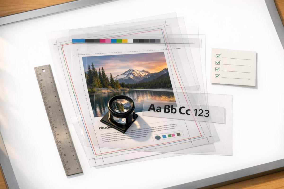
Anti-scratch coatings protect book covers from damage like scratches, fingerprints, and moisture, while improving durability and appearance. They’re ideal for heavily used books like textbooks, cookbooks, and children’s books. Options include soft-touch lamination, anti-scratch matte lamination, gloss finishes, and spot UV coating. Prices vary from less than $0.01 to $0.30 per cover, depending on the type and order size. Each finish offers unique benefits, such as vibrant colors with gloss lamination or a velvety texture with soft-touch finishes. Choosing the right coating depends on factors like handling frequency, design goals, and budget.
A Guide To Book Cover Finishes.
sbb-itb-ce53437
Soft-Touch Lamination
Soft-touch lamination, often referred to as velvet or suede lamination, involves applying a thin, pre-textured polyester film to a book cover using heat and pressure. This technique not only delivers a velvety texture that feels high-end but also serves as a protective layer. It shields the cover from scratches, scuffs, and water while adding thickness and rigidity to reduce the risk of spine cracking.
Features and Benefits
What sets soft-touch lamination apart is the tactile experience it provides. Its suede-like texture enhances the perceived value of products, making it a popular choice for premium items like coffee-table books, luxury catalogs, and board game boxes. Additionally, it resists fingerprints and smudges, keeping covers looking pristine even after frequent handling.
Natalie Wiley, Content Marketing Supervisor at Printivity, highlights its appeal:
"The velvet feel and soft touch finish of this lamination instantly create a luxurious experience for anyone holding your product." – Natalie Wiley, Content Marketing Supervisor, Printivity
This finish pairs especially well with thicker paper stocks (typically over 105 gsm) and complements techniques like spot UV coating or metallic foil stamping. These additions create glossy accents that stand out beautifully against the soft, matte background. Proper care ensures the finish retains its premium look and durability over time.
Maintenance Tips
While soft-touch lamination is durable, proper care is necessary to keep it looking its best. Though modern anti-scratch formulations have improved resistance to scuffs, rough handling can still leave marks. If fingerprints or dirt appear, gently wipe the surface with a soft cloth. Avoid storing laminated books in humid environments, as moisture can compromise the finish. For perfect-bound books, limit the lamination to the exterior cover to ensure proper adhesion. The film’s resistance to moisture and dust helps maintain its polished appearance, supporting the goal of long-lasting aesthetics and protection.
Matte Lamination with Anti-Scratch Coating
Matte lamination has a sleek, professional look but tends to show marks and scuffs easily compared to other lamination types. Anti-scratch matte lamination solves this issue by adding a hardened coating – often made with cross-linked polymers – that resists everyday wear while maintaining its soft, non-reflective surface. Lab tests back these claims, as outlined below.
Research shows that this coating reduces visible damage by 70% compared to standard matte films. Additionally, materials treated with anti-scratch lamination last up to three times longer, cutting down on the need for expensive reprints. The finish also minimizes glare under direct light and effectively hides fingerprints, smudges, and oil marks.
Advantages of Anti-Scratch Matte Lamination
The non-reflective finish provides an elegant look, making it a popular choice for business materials, educational books, and literary works. Lauren Harpum from Spine Book Printing highlights its appeal:
"The non-reflective finish of matt lamination gives book covers a refined, professional appearance. This makes it suitable for business publications, educational resources, and literary novels." – Lauren Harpum, Spine Book Printing
Beyond its visual appeal, the texture of the finish – whether smooth or slightly textured – adds a tactile element that enhances the reader’s experience. Combining anti-scratch matte lamination with Raised Spot UV creates a bold contrast, highlighting glossy, textured elements against the matte background. Despite these benefits, pricing remains accessible, with international offset printing costing about $0.30 per unit for orders over 700 units, or a flat rate of roughly $200 for smaller runs.
Best Use Cases
This type of lamination is especially valuable for items that face heavy use. For books that need to withstand frequent handling while maintaining a polished look, anti-scratch matte lamination is a top choice. PrintNinja emphasizes its importance for materials that "see more action than a typical book does", such as custom game boards. High-traffic items like reference manuals, workbooks, journals, and children’s board books benefit greatly from this added protection. For hardcover books with printed wraps, this lamination is essential to prevent wear at the hinges and avoid tearing.
If you’re looking for a way to combine durability with a sophisticated finish, Miro Printing & Graphics Inc. offers expert anti-scratch matte lamination services to keep your book covers looking flawless.
Gloss Lamination
Gloss lamination creates a sleek, glass-like finish that enhances colors and details, making them appear more vibrant and striking. This finish not only boosts visual appeal but also adds a layer of protection against scratches. The clear plastic film reflects light, adding depth and making ink colors appear to "pop" off the page.
In addition to intensifying colors, gloss lamination protects against scratches, scuffs, moisture, water, and even chemical exposure. For perfect-bound books, a 1.3 mil laminate strikes a balance between flexibility and durability, reinforcing the cover to prevent cracks along the spine and fold lines. Natalie Wiley, Content Marketing Supervisor at Printivity, explains:
"Gloss lamination produces a shiny, glass-like appearance that enhances the color and vibrancy of the ink on a page."
Key Benefits of Gloss Lamination
The reflective surface of gloss lamination is easy to clean, making it an excellent option for books that are frequently handled. It also offers strong durability, with better resistance to tearing and wear compared to other finishes. Rick from Formax Printing highlights this durability:
"When toughness and longevity are important factors, a Laminate coating is your best coating choice."
Another advantage is its cost-effectiveness. While gloss lamination might have a slightly higher upfront cost than basic liquid coatings, it can save money over time by extending the lifespan of books and reducing the frequency of reprints. This makes it a smart choice for books that endure heavy use, like children’s books, cookbooks, textbooks, and field guides.
Considerations for Gloss Lamination
One potential drawback of gloss lamination is the glare it produces under direct lighting. The reflective surface can make text harder to read at certain angles, particularly in bright or overhead lighting conditions. For this reason, it’s less suitable for text-heavy books or materials meant for brightly lit environments. As PRC Book Printing notes:
"Glossy lamination is often preferred for book covers that have a lot of color or high-quality images, as it makes them appear more vibrant and eye-catching."
Although the smooth surface resists stains, its high shine can make fingerprints and smudges more noticeable. Thankfully, these marks are easy to clean with a cloth. Additionally, when using thicker gloss laminate, rounded corners are recommended to avoid sharp edges that could pose a safety concern. For the best results, gloss lamination pairs well with coated paper stock.
Miro Printing & Graphics Inc. can guide you in deciding if gloss lamination is the right fit for your book cover, ensuring vibrant colors and lasting protection. Up next, we’ll explore how Spot UV coating can further enhance design details while adding protective benefits.
Clear Acrylic Sprays and Nylon-Based Laminates
When it comes to custom book projects, there are alternative options for protecting covers from wear and tear. Clear acrylic sprays and nylon-based laminates each bring their own strengths to the table. Clear acrylic sprays are a cost-effective and simple choice for smaller or DIY projects, offering a layer of protection against smudges, scratches, and toner rub-off on digitally printed covers. While they don’t provide the same level of durability as film laminates, they’re perfect for artistic or low-volume applications where ease of use is a priority.
Clear Acrylic Sprays
Clear acrylic sprays are a budget-friendly solution, especially for hand-painted or custom book covers where professional lamination might not be practical. These sprays create a protective barrier that’s easy to apply, making them a popular choice for small-scale or one-off projects.
Nylon-Based Laminates
Nylon laminates stand out for their ability to prevent curling, making them a top pick for perfect-bound books and paperbacks. Unlike polypropylene or polyester films, nylon’s hygroscopic nature allows it to absorb moisture, which helps the book covers lay flat, even in challenging conditions.
Don Leeper, CEO of Bookmobile, highlights this benefit:
"Lay-flat lamination is made of nylon, which is more permeable to water molecules in the air than the alternative polypropylene or polyester films."
At a thickness of 1.2 to 1.3 mil, nylon films provide excellent clarity, vibrant colors, and strong scratch resistance. They also support additional features like spot UV and foil stamping, making them versatile for high-end projects. However, this quality comes at a cost – nylon laminates can be about twice as expensive as standard gloss films. Their reliability in handling fluctuating climates makes them a solid choice for books that need to withstand environmental changes.
If curl resistance and premium finishes are a priority for your book project, companies like Miro Printing & Graphics Inc. can guide you in deciding if nylon-based laminates are the right fit. Up next, we’ll explore how Spot UV coating can enhance designs while adding an extra layer of protection.
Spot UV Coating
Spot UV coating steps up book cover protection by blending eye-catching visuals with targeted scratch resistance. This method involves applying a clear, liquid varnish to specific design elements – like titles, logos, or patterns – and curing it instantly with ultraviolet light. The result? A striking contrast between glossy, raised areas and a matte or soft-touch laminated background. While it builds on the protective qualities of gloss lamination, spot UV adds an extra layer of visual flair by selectively highlighting design features.
How Spot UV Works
The process starts with a specialized UV plate created from the designer’s file, which pinpoints where the gloss should be applied. Once the varnish is in place, ultraviolet light cures it instantly, creating a durable, glassy finish. The thickness of the coating can vary, from a subtle 10 microns to a bold 100 microns for a pronounced 3D effect. This precision allows designers to emphasize specific elements with a high-gloss finish.
Susan Han, CEO of QinPrinting, highlights the appeal of this technique:
"Spot UV coating… elevates the aesthetic and tactile appeal of book covers by applying a clear, glossy coating selectively… This process accentuates specific design elements, making them stand out, and adds a luxurious depth and contrast to what might otherwise be considered a flat design."
For the best results, spot UV should always be applied over a matte or soft-touch laminate. The interplay between the subdued background and the glossy highlights enhances the design’s overall impact. Experts suggest keeping spot UV coverage to no more than 25% of the total cover area for optimal effect.
Design Applications
Spot UV doesn’t just protect – it transforms. It’s particularly effective on bold typefaces, logos, and larger solid areas where the glossy finish truly shines. The coating also seals the ink, protecting against smudges, scratches, and moisture while enriching color depth and vibrancy.
A creative twist known as "blind" spot UV applies the varnish to unprinted areas, creating subtle patterns or text that reveal themselves at certain angles. That said, placement matters. Avoid applying spot UV near edges, spine folds, or score lines, as the hardened coating can crack when the cover bends or trims. A clearance of at least 1/8 inch (3 mm) from these areas is recommended to prevent damage. Additionally, using vector-based mask files ensures precision and crisp edges.
Spot UV coatings also have an eco-friendly edge. They’re free of solvents and don’t emit volatile organic compounds (VOCs). By pairing seamlessly with matte or soft-touch laminates, spot UV enhances both the look and durability of book covers. If your project needs a finishing touch that combines striking visuals with localized protection, Miro Printing & Graphics Inc. can guide you on whether spot UV is the right choice for your design.
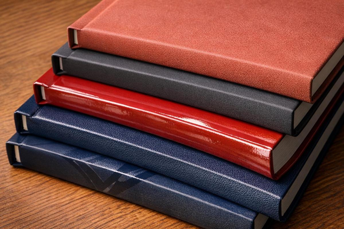
Choosing the Right Anti-Scratch Coating
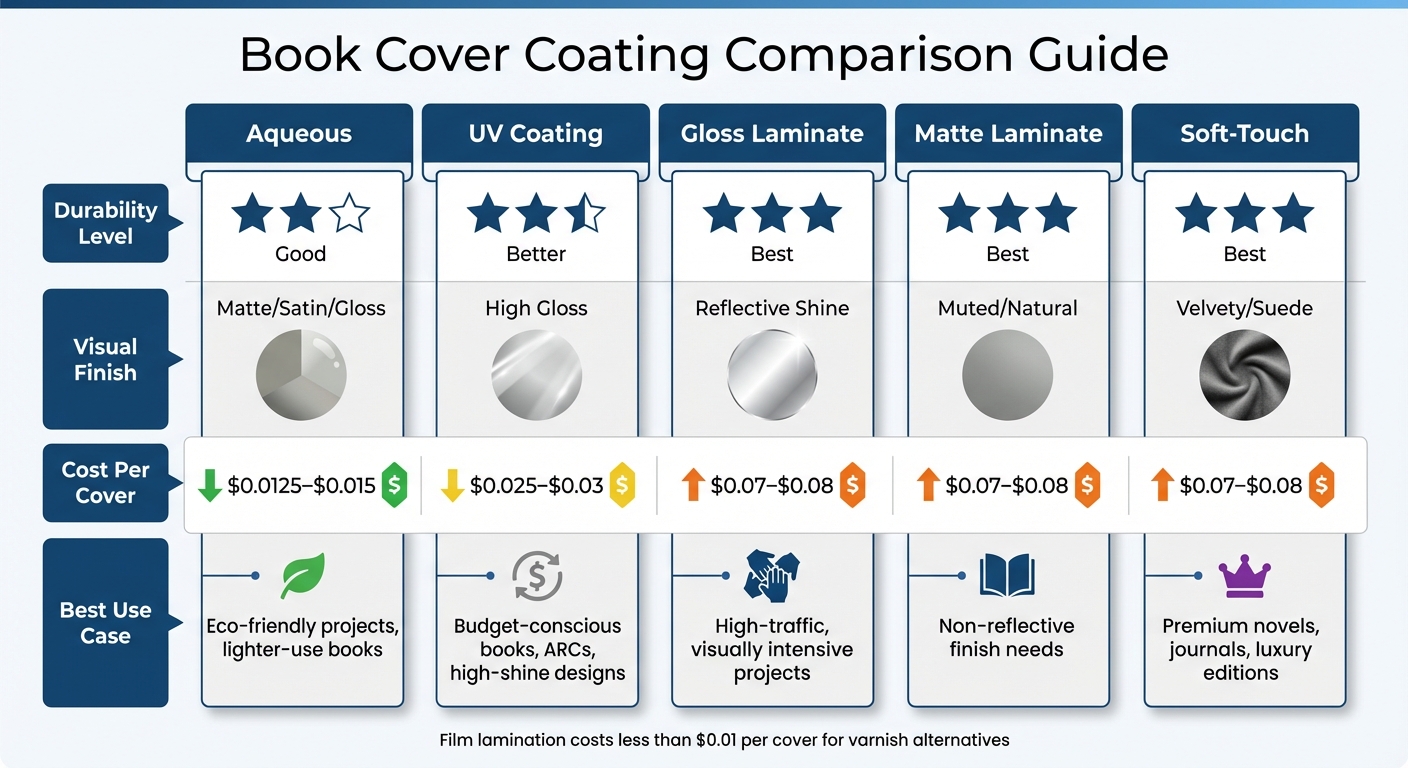
Anti-Scratch Book Cover Coating Comparison: Durability, Cost & Best Uses
Factors to Consider
When deciding on the best anti-scratch coating, think about how often the item will be handled, the desired appearance, and your budget. For books that see heavy use, like textbooks, cookbooks, or children’s books, film lamination is a solid choice. It protects against moisture, stains, and frequent handling. On the other hand, books that spend most of their time on shelves can benefit from UV coating, which offers reliable protection at a lower price.
The visual finish plays a big role, too. Gloss finishes enhance color vibrancy, while matte and soft-touch finishes provide a more sophisticated, glare-free look. Covers with darker or solid colors tend to show scuffs, fingerprints, and streaks more easily. In these cases, soft-touch matte lamination is a great option to hide imperfections. The coating you choose should balance both the practical and aesthetic needs of your project.
Budget is another important factor. Varnish is the most affordable, costing less than $0.01 per cover. Film lamination costs around $0.07–$0.08 per cover, while UV coating falls in the middle, at $0.025–$0.03. For high-end editions, such as memoirs or luxury novels, the velvety texture of soft-touch lamination is worth the added expense, as it enhances the perceived value of the book.
If you’re looking for eco-friendly options, aqueous coatings are a good pick, though they are slightly less durable. Meanwhile, UV coatings cure instantly and release no VOCs, making them another environmentally conscious option.
Comparison of Coating Options
| Coating Type | Durability | Visual Finish | Cost Per Cover | Best Use Case |
|---|---|---|---|---|
| Aqueous | Good | Matte/Satin/Gloss | $0.0125–$0.015 | Eco-friendly projects, lighter-use books |
| UV Coating | Better | High Gloss | $0.025–$0.03 | Budget-conscious books, ARCs, high-shine designs |
| Gloss Laminate | Best | Reflective Shine | $0.07–$0.08 | High-traffic, visually intensive projects |
| Matte Laminate | Best | Muted/Natural | $0.07–$0.08 | Ideal for projects needing a non-reflective finish |
| Soft-Touch | Best | Velvety/Suede | $0.07–$0.08 | Premium novels, journals, luxury editions |
For children’s books, gloss film lamination is a practical option – it’s both durable and easy to clean. If you’re working on a budget, like with advance reader copies (ARCs), UV coating offers a professional shine at a lower cost. For premium editions, pairing soft-touch matte lamination with Spot UV creates a striking, tactile design that stands out. Additionally, if you’re worried about cover curling, UV coating is a better choice since it creates less surface tension compared to film lamination.
For tailored advice on coating options, reach out to Miro Printing & Graphics Inc. for expert assistance.
Conclusion
Choosing the best anti-scratch coating for your book cover involves balancing protection, longevity, and the overall feel. Whether you’re producing children’s books that need to endure rough use or memoirs that call for a refined finish, your choice of coating will influence both the book’s durability and its visual appeal.
As Jordyn from Gorham Printing notes:
"The type of cover finish you choose should be considered in tandem with cover design since it will complement your cover artwork".
This interplay between functionality and aesthetics is key. Think about how often the book will be handled, who the readers are, and whether features like moisture resistance or vibrant color enhancement are priorities. For instance, film lamination offers excellent durability at around $0.07–$0.08 per cover, while UV coating provides solid protection at nearly half the price. These price points highlight the trade-offs between durability and finish options discussed earlier.
Technical compatibility is another crucial factor. Some UV coatings may not adhere well to specific digital toners, potentially leading to a brittle surface that compromises protection. It’s always a good idea to request samples before committing to a large print run to ensure the finish works as intended.
For personalized guidance, professional support can simplify the decision-making process. Miro Printing & Graphics Inc. in Hackensack, NJ, offers a range of printing and post-press services. Their expertise can help you address technical details, such as ensuring toner compatibility or recommending PUR adhesive for heavily coated covers, so your books maintain their quality and appeal.
FAQs
Which coating works best for dark or solid-color covers?
Spot UV coating works beautifully on dark or solid-color covers. It boosts contrast, adds a sense of depth, and delivers a sleek, glossy finish. When used selectively on certain design elements, it makes colors stand out and gives the cover an upscale, polished appearance.
Will lamination or UV coating cause cover curl or spine cracking?
Lamination tends to hold up better than UV coating when it comes to durability. While UV coating can crack if the cover is bent or folded, lamination is less likely to lead to issues like cover curling or spine cracking, making it a sturdier choice for book covers.
How do I test coating compatibility with digital toner before a print run?
To check if a coating works well with digital toner, try an adhesion test, such as a cross-hatch or tape test. Here’s how it works: make small cuts in the coating, press adhesive tape over the area, and then peel it off. If the coating remains in place, it’s a good sign that it’s compatible. Testing this on a sample print helps confirm the coating’s adhesion and durability before committing to a full print run.
Related Blog Posts
- UV Printing vs. Lamination: Which Protects Better?
- Ultimate Guide to Glossy Coatings for Printing Projects
- Matte vs Gloss Lamination: Key Differences
- Lamination vs Coating: Which Offers Better Protection?
https://app.seobotai.com/banner/banner.js?id=699a4943efc60cc2af08df61