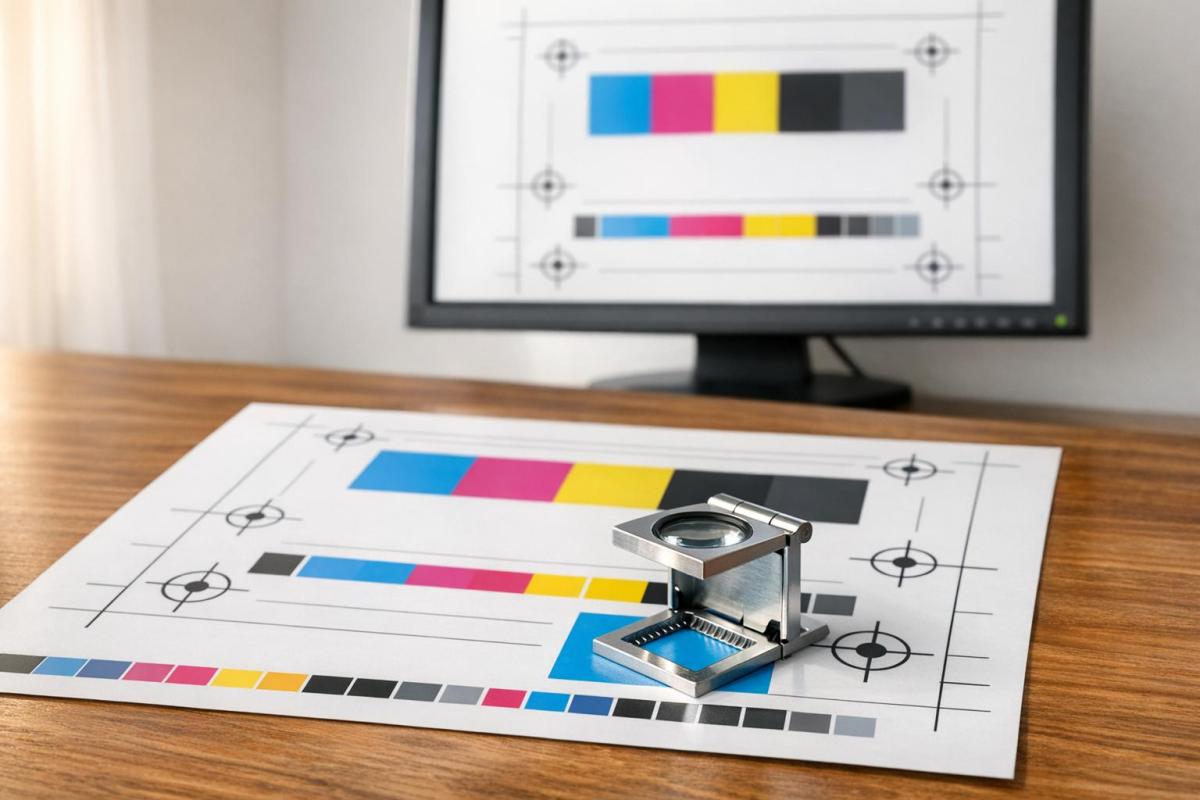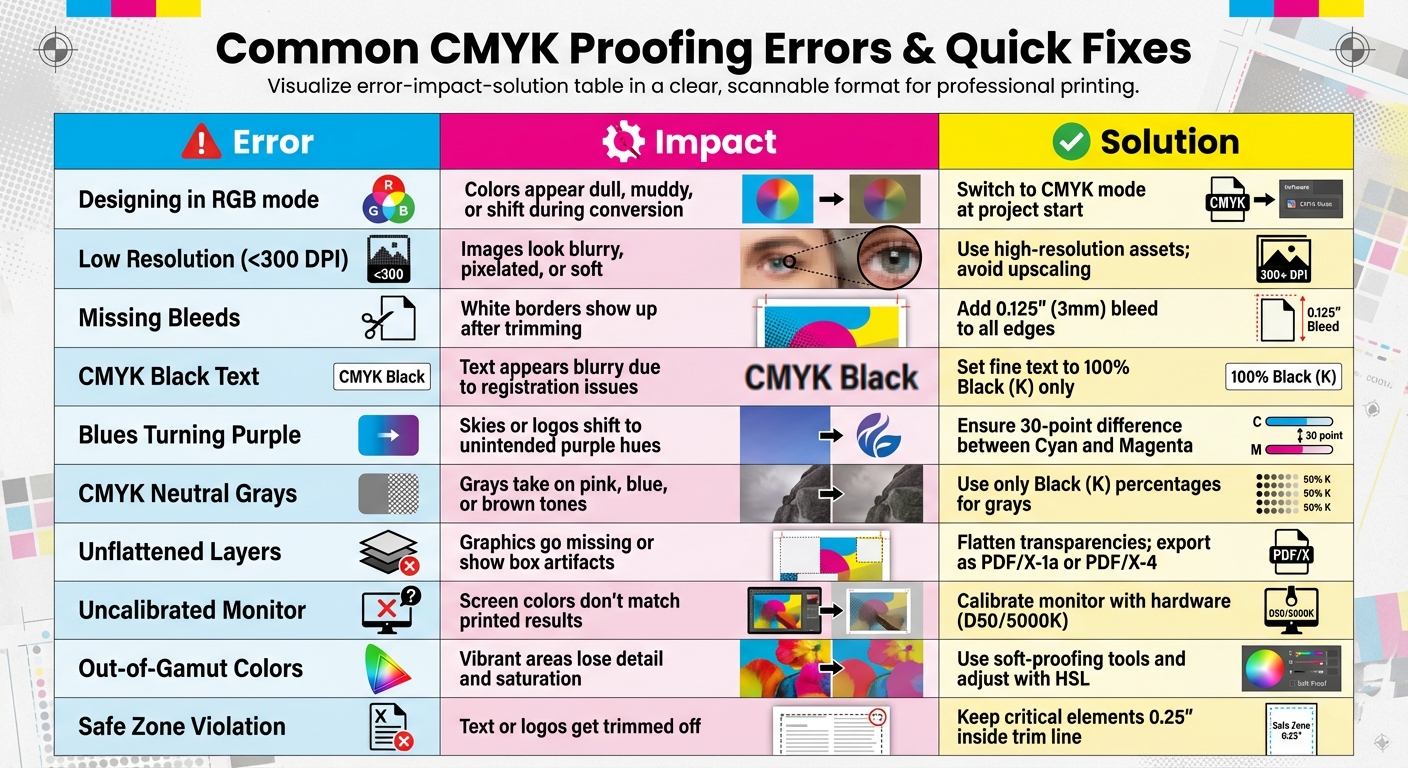
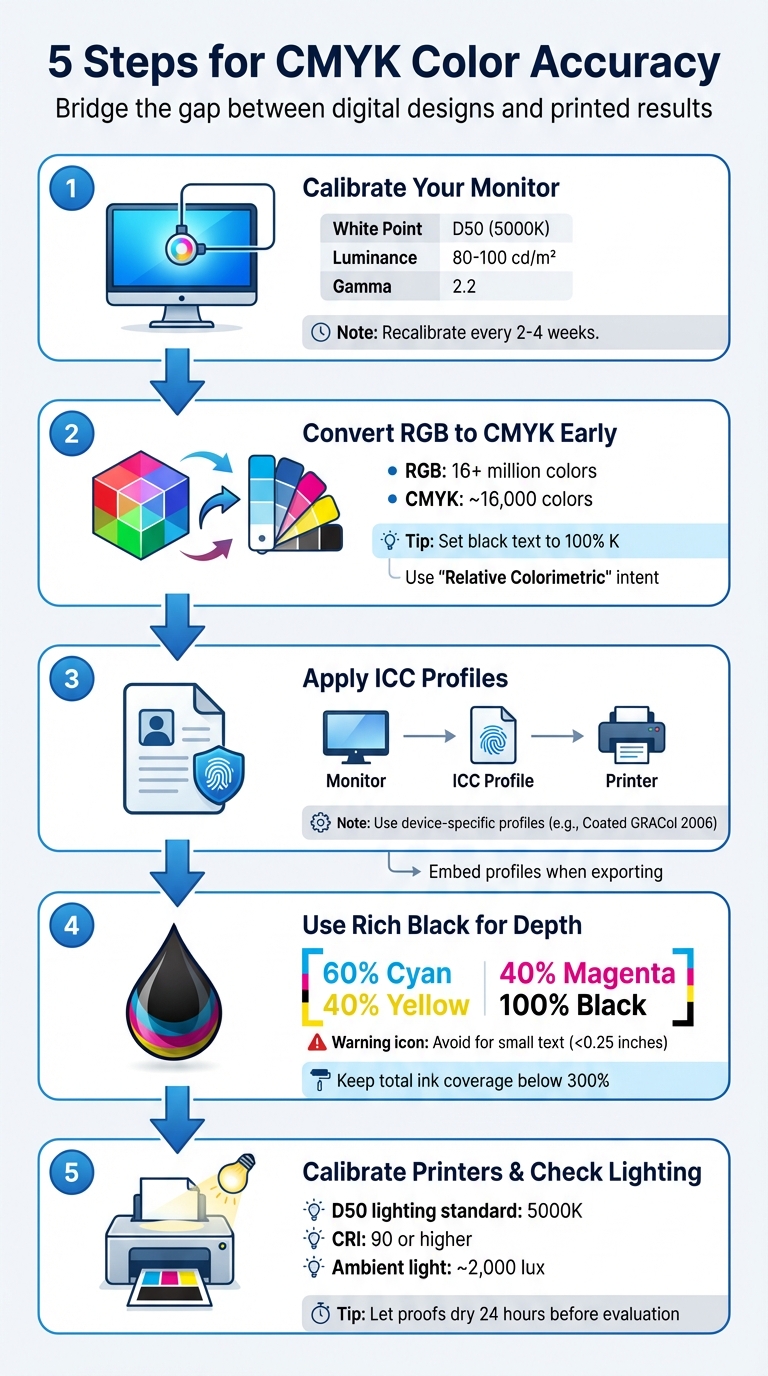
Achieving accurate colors in print is challenging because screens use RGB light, while printers rely on CMYK ink. This difference often leads to inconsistencies between what you see on screen and the final printed product. To avoid these issues, follow these five key steps:
- Calibrate Your Monitor: Use a hardware colorimeter to ensure accurate colors. Adjust settings like white point (D50), luminance (80–100 cd/m²), and gamma (2.2). Recalibrate every 2–4 weeks for consistent results.
- Convert RGB to CMYK Early: Start your design in CMYK or convert it early to manage tonal shifts. Set black text to 100% K for sharpness and use "Relative Colorimetric" intent for better color matching.
- Apply ICC Profiles: Use device-specific ICC profiles to maintain consistent colors across monitors, printers, and paper. Synchronize settings in Adobe apps and embed profiles when exporting files.
- Use Rich Black for Depth: For deep blacks, combine 60% Cyan, 40% Magenta, 40% Yellow, and 100% Black. Avoid this for small text to prevent misregistration.
- Calibrate Printers and Check Lighting: Ensure your printer is calibrated and evaluate proofs under D50 (5000K) lighting to match the final output.
These steps help bridge the gap between digital designs and printed results, ensuring your colors are accurate and consistent.
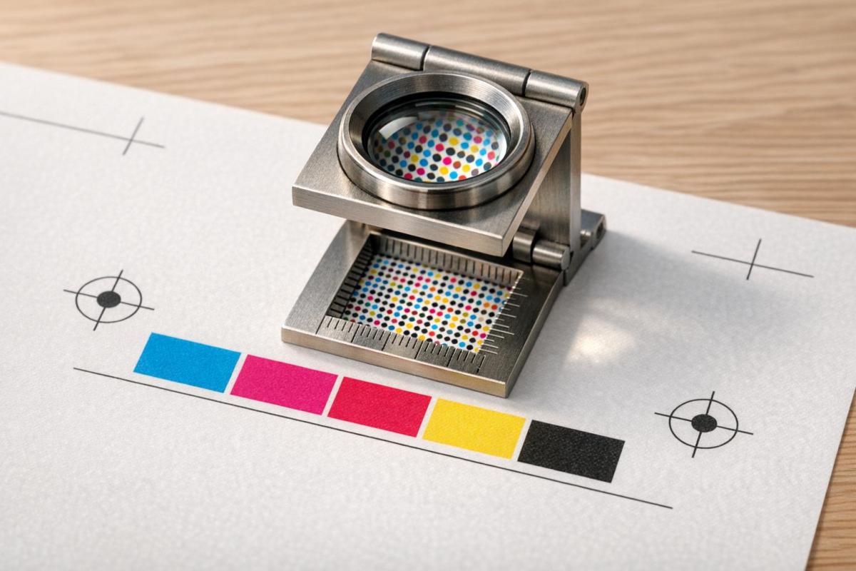
5-Step Process for Achieving CMYK Color Accuracy in Print
1. Calibrate Your Monitor
Monitor and Equipment Calibration
Getting your monitor properly calibrated is a crucial step if you want your prints to match what you see on screen. Relying on your eyes alone to judge color temperature or brightness isn’t reliable – our perception can be subjective. Even built-in operating system tools fall short, as they depend heavily on personal judgment. To avoid guesswork, a hardware colorimeter is your best bet. These devices measure and adjust your monitor’s settings with precision.
For those just starting, options like the Datacolor SpyderX Start or ColorMunki Smile are available for around $100–$150. If you’re aiming for greater accuracy, the X-Rite i1Display Pro is a solid choice. Before calibrating, let your monitor warm up for about 30 minutes to ensure stable color temperature and brightness.
Here are the key settings to aim for when calibrating for print accuracy:
| Setting | Target Value | Why It Matters |
|---|---|---|
| White Point | D50 (5000K) | Mimics the warmer tone of paper white |
| Luminance | 80–100 cd/m² | Reflects the properties of printed paper |
| Gamma | 2.2 | Standard for professional workflows |
Turn off any display features like eco-modes, blue light filters, dynamic contrast, or auto-brightness – these can disrupt color consistency. Since monitor backlights naturally dim by about 10–15% each year, it’s a good idea to recalibrate every 2–4 weeks if you’re working on projects where color accuracy is critical. Setting a recurring reminder can help you stay on schedule.
To further improve color accuracy, create a workspace with controlled lighting. Work in a dim room with neutral gray walls and surroundings, and even consider wearing neutral-toned clothing to avoid unwanted color reflections. Once your monitor is calibrated, take advantage of soft proofing in Adobe Photoshop (View > Proof Setup) to preview how your design will look with specific CMYK profiles before sending it off to print. This extra step can save you from unpleasant surprises when your project comes back from the printer.
sbb-itb-ce53437
2. Convert Designs from RGB to CMYK Early
File Preparation and Color Mode Conversion
Once your monitor is calibrated for accurate screen colors, shift your workflow early by converting files from RGB to CMYK. Why? Because delaying this step can hurt your print quality. RGB supports over 16 million colors, while CMYK is limited to around 16,000. Waiting until the last minute to convert often results in colors looking dull or muted on paper.
John Myers, a Prepress Technician and Certified G7 Expert at Walsworth, puts it this way:
Art created in RGB colorspace will need to be converted to CMYK ink channels. This can cause unexpected changes in tonality.
By converting early, you can manage these tonal shifts instead of leaving them to chance. This step ensures better control over your colors and sets the stage for fine-tuning. For best results, start your Photoshop files in CMYK mode right from the beginning or manually convert them using Image > Mode > CMYK Color. In Illustrator, the equivalent option is Edit > Edit Colors > Convert to CMYK.
Once converted, don’t stop there. Use Photoshop’s Curves Adjustment Layer to tweak any colors that may have shifted during the process. Pay extra attention to black text – it should be set to 100% K (black ink only) rather than a mix of cyan, magenta, and yellow. Mixed blacks can lead to blurry or misaligned text due to registration issues. Additionally, when converting, apply the "Relative Colorimetric" rendering intent. This setting preserves RGB colors that are reproducible in CMYK while mapping out-of-gamut colors to their closest match.
Taking this step early avoids costly errors and ensures your print proofs match expectations. As PrintPlace emphasizes:
Accurate colors are especially important for color branding and art reproductions, and neglecting to convert files from RGB can result in prints you may find unusable.
3. Apply ICC Profiles for Devices
Why ICC Profiles Matter for Consistency
Once you’ve converted from RGB to CMYK, applying ICC profiles is crucial to maintaining consistent color across all devices. An ICC profile acts as a blueprint for a device’s color behavior, ensuring that colors are translated accurately between different devices. It uses device-independent color models like CIE L_a_b* or CIE XYZ to achieve this precision.
Here’s the thing: every device interprets color differently. Monitors display colors using RGB light, while printers rely on CMYK ink. Without ICC profiles, the same color values can look completely different depending on the device. As Harold Johnson, the author of Mastering Digital Printing, puts it:
ICC profiles are the device’s fingerprint.
To get the best results, you need to use the correct profile for each device in your workflow. During editing, rely on device-independent working space profiles like Adobe RGB or sRGB. For the final output, choose specific output profiles – such as Coated GRACol 2006, which is a common standard for U.S. commercial printing. If you’re working with a printing company, always ask them which profile they recommend before finalizing your design.
ICC profiles are also essential for soft proofing. This process lets you preview how your design will look when printed by simulating the final output on a calibrated monitor. To streamline your workflow, synchronize color settings across Photoshop, Illustrator, and InDesign using Adobe Bridge. When exporting your final files, use the PDF/X-4:2008 preset to embed the profiles properly. And don’t forget – when using color-managed applications, disable color management in your printer driver to avoid double-profiling.
4. Use Rich Black for Deep Blacks
Techniques for Achieving Sharp, Deep Blacks
Relying solely on standard black ink (100% K) can leave large areas looking dull or grayish because the ink is translucent – allowing paper fibers to show through and dilute its intensity. To achieve a deeper, more vibrant black, rich black is the solution. This method layers CMY (Cyan, Magenta, Yellow) beneath 100% Black to block light and create a more saturated finish.
To get the best results, use the common formula: 60% Cyan, 40% Magenta, 40% Yellow, and 100% Black (60/40/40/100). You can tweak these CMY percentages slightly to produce cooler or warmer tones, depending on your desired effect.
However, rich black isn’t suitable for everything. Avoid using it for small text, fine lines, or barcodes. Why? Because applying multiple colors introduces the risk of misregistration. Even a tiny paper shift – just 0.004 inches (around 0.1 mm) – can cause blurred edges or unwanted color halos. PrintNinja explains:
The microscopic variations in plate registration between the 4 colors can cause slight color shadows to appear around the text, called ghosting.
For small elements (under 0.25 inches), stick to flat black (0/0/0/100) for clean, sharp edges.
Another key tip: keep your total ink coverage below 300% to avoid bronzing or smudging. Some printers even recommend staying at or below 240% for better results. Never use the "Registration" swatch (100/100/100/100) for artwork. Its excessive 400% ink coverage can cause smearing and drying issues.
When working in Adobe Illustrator or InDesign, adjust your "Appearance of Black" preference to "Display All Blacks Accurately" for both screen and print. This ensures your monitor doesn’t mislead you, as screen blacks often appear richer due to backlighting. Always request a physical proof on your chosen paper stock before committing to the full print run. This is the only way to confirm that your rich black achieves the desired depth and aligns with your overall color expectations.
Paying close attention to these ink details ensures your CMYK prints look polished and professional.
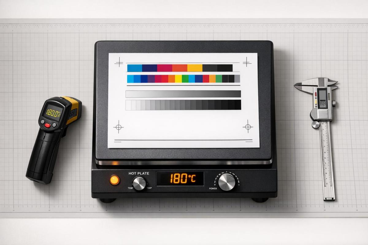
5. Calibrate Printers and Check Under Consistent Lighting
Printer Calibration for Predictable Results
After fine-tuning your monitor, the next step is to calibrate your printer to maintain consistent CMYK output. The goal of printer calibration is to achieve results that are both predictable and repeatable across multiple print runs. Don Hutcheson, President of HutchColor, LLC, puts it perfectly:
Color management is not about achieving ‘perfect’ color… It’s about achieving predictable and repeatable color.
To do this, use a spectrophotometer to measure printed color targets. These devices provide far more accurate results compared to software-only adjustments. Before starting the calibration process, make sure your printer is in good working order – clean the nozzles and ensure tone values print linearly. For example, if your design shows 50% cyan, it should print as 50% cyan on paper. Calibration also accounts for how different paper types absorb and reflect light, which can significantly impact color output.
Lighting Conditions for Proof Evaluation
Once your printer is calibrated, evaluating proofs under proper lighting ensures that what you see matches the final print. Inconsistent lighting can distort your perception of colors. The industry standard for proof evaluation is D50 lighting, which mimics daylight at 5,000 Kelvin. This lighting standard helps prevent metamerism – a phenomenon where colors appear to match under one light source but differ under another.
For accurate evaluation, your workspace should meet specific conditions: lighting fixtures with a Color Rendering Index (CRI) of 90 or higher, ambient light levels around 2,000 lux, and a setup away from windows to avoid fluctuating natural light. Walls should be painted neutral gray (N8, 60% reflectance) to avoid introducing color casts. Additionally, remove any brightly colored objects from your surroundings and wear neutral-colored clothing to avoid influencing your perception. For critical projects, request a physical hard proof on the exact paper stock you’ll use. Let the proof dry for at least 24 hours before making your final evaluation.
Mastering Colour Accuracy: Why CMYK Matters for Print Success
Conclusion
Achieving accurate CMYK color reproduction requires following a series of well-coordinated steps. Calibrating your monitor lays the groundwork, ensuring your design decisions are based on accurate color representation. Converting to CMYK early tailors your file for the specific press and paper type, reducing the risk of unexpected color shifts. Applying ICC profiles such as GRACoL or SWOP helps maintain color consistency throughout the workflow. Using Rich Black adds the depth needed for a polished look, while printer calibration and consistent lighting ensure your printed output aligns with your expectations. Together, these practices not only simplify production but also reinforce your brand’s reputation.
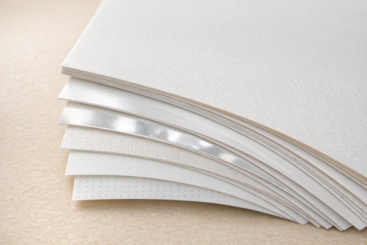
Consistency is key. As John Myers, a Prepress Technician and Certified G7 Expert at Walsworth, highlights, the way artwork is prepared and handed off to the printer directly impacts whether printed pieces match each other or align with physical products. Reliable color output fosters trust in your brand, while inconsistency can subtly erode its perceived value. Factors like monitor angles, ambient lighting, and paper characteristics must be carefully managed. For instance, the whiteness, texture, and coating of paper can significantly alter how colors appear compared to a backlit screen.
When all these steps come together, the final printed piece will faithfully represent your creative vision. Miro Printing & Graphics Inc., located in Hackensack, NJ, offers professional printing services with calibrated equipment and a skilled team that understands these technical details. Whether you need digital, offset, or large-format printing, their expertise ensures the color accuracy your brand demands. They also provide in-house design services to help you prepare files correctly from the outset.
For projects where color precision is critical, physical proofs offer a reliable way to bridge the gap between digital previews and the final production, giving you peace of mind before committing to a full print run.
FAQs
Which CMYK ICC profile should I use for my print job?
To get accurate color reproduction, select an ICC profile tailored to your specific printing conditions. This includes factors like the type of paper you’re using and the printing process itself. Doing so ensures consistent colors across your entire print project.
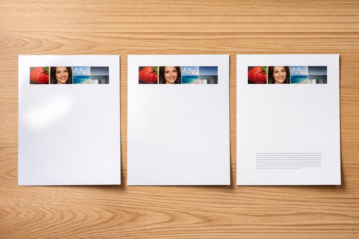
Why do my printed colors look different on different paper stocks?
Printed colors can look different depending on the paper stock because each type of paper interacts with ink in its own way. Things like how much ink the paper absorbs, whether it has a glossy or matte finish, and its level of brightness all play a role in how the colors turn out. These differences are completely normal and are influenced by the specific material being printed on.
Should I order a hard proof or is soft proofing enough?
If getting the colors just right is a top priority, it’s a good idea to order a hard proof. A hard proof gives you a physical sample of how the colors will look when printed, something that soft proofing can’t fully guarantee. Why? Because factors like monitor calibration and lighting conditions can affect how colors appear on screen. While soft proofing is useful for a quick preview, it’s not the most dependable option for exact color matching.
Related Blog Posts
- How to Adjust Colors for Offset Printing
- Soft Proofing Techniques for Accurate Colors
- How to Ensure Color Accuracy in Proofing
- Common CMYK Color Issues in Printing
https://app.seobotai.com/banner/banner.js?id=69910eaeefc60cc2af070ca1