Fogra Standards for Proof-to-Print Matching

Fogra standards and ISO 12647 define measurable color targets, ICC profiles, viewing conditions and measurements to ensure reliable proof-to-print matching.

Fogra standards ensure accurate color reproduction in printing by providing measurable benchmarks. They align with ISO standards (like ISO 12647) to eliminate guesswork and disputes, making proofs legally binding and color-accurate. These standards cover various printing methods, including offset, digital, and textile printing. Fogra-certified workflows help maintain consistency, from proofing to final prints, by using tools like ICC profiles, spectrophotometers, and standardized lighting. As of 2026, over 430 companies and 1,600 systems are Fogra-certified globally.

Key takeaways:

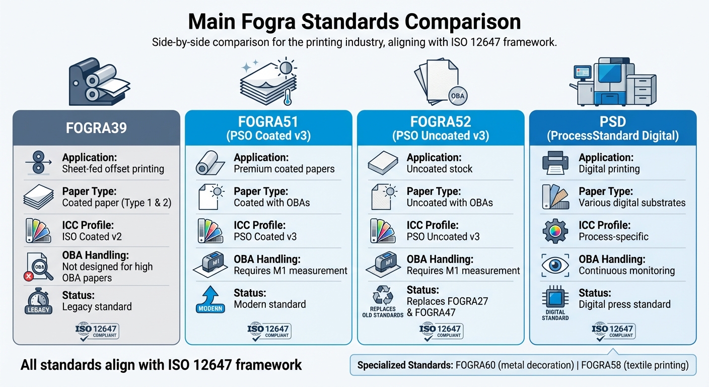
  • Main standards: FOGRA39 (offset), FOGRA51/52 (OBA papers), PSD (digital printing).
  • Tools: Fogra Media Wedge, ISO 3664 lighting, ICC profiles.
  • Benefits: Precision, fewer disputes, and compliance with ISO 12647.

Fogra simplifies color communication, ensuring consistent results across all stages of printing.

de FOGRA 39 a FOGRA 51. APRENDE, CONVIERTE y MIGRA a la nueva ISO 12647 de IMPRESIÓN

FOGRA

How Fogra Standards Control Color Quality

Fogra Standards Comparison Chart: FOGRA39 vs FOGRA51 vs FOGRA52 vs PSD

Fogra Standards Comparison Chart: FOGRA39 vs FOGRA51 vs FOGRA52 vs PSD

Fogra standards bring precision to color matching by setting clear, measurable criteria. Instead of relying on subjective visual judgments, these standards establish target values and tolerances for every aspect of color reproduction, ensuring consistency across the board. They bridge the gap between device-dependent values (like CMYK percentages) and device-independent color measurements (such as CIELAB), creating a direct link between digital files and printed results.

This scientific approach takes the uncertainty out of the equation. When a print or proof is evaluated against Fogra standards, the data either meets the defined tolerances or it doesn’t – no room for debate. The characterization data precisely maps ink percentages to color values, leaving no guesswork.

Main Fogra Standards Explained

Different printing processes and paper types demand tailored standards. FOGRA39 has been the go-to standard for sheet-fed offset printing on coated paper (Paper Type 1 and 2), working hand-in-hand with the ISO Coated v2 ICC profile. However, with modern papers incorporating high levels of Optical Brightening Agents (OBAs), FOGRA39 has struggled to address the resulting visual inconsistencies.

Enter FOGRA51 (PSO Coated v3), designed specifically for premium coated papers with OBAs. This standard requires M1 measurement conditions to account for the brightening agents, ensuring accurate visual matches. Similarly, FOGRA52 (PSO Uncoated v3) addresses uncoated stock with OBAs, replacing older standards like FOGRA27 and FOGRA47.

For digital printing, the ProcessStandard Digital (PSD) was developed to guarantee consistent color accuracy and reliable performance over long runs – essential for maintaining quality on digital presses. Fogra has also expanded its reach with specialized standards like FOGRA60 for metal decoration and FOGRA58 for textile printing.

How Fogra Standards Connect to ISO 12647

Fogra standards align seamlessly with the globally recognized ISO 12647 framework, which sets universal benchmarks for print quality. While ISO 12647 provides the overarching guidelines, Fogra translates these into practical, real-world applications. Their characterization data and certification processes help printers achieve ISO compliance with measurable accuracy.

"The contract proofing standard (ISO 12647) has established itself worldwide as the tool for colour communication and has put an end to the diffuse situation with various manufacturer-specific processes and specifications."
– Dr. Andreas Kraushaar, Head of Prepress, Fogra

ISO 12647 is divided into eight parts, covering everything from offset lithography (Part 2) to digital proofing (Part 7) and validation prints (Part 8). For instance, when a printer uses FOGRA51 characterization data, they adhere to ISO 12647-2 standards for offset lithography. The Fogra data provides critical metrics like L_a_b* values for solids and overprints, Tone Value Increase (TVI) targets, and hue angle specifications, making ISO compliance both achievable and measurable.

Companies such as Miro Printing & Graphics Inc. rely on these standards to deliver consistent, color-accurate proofs and final prints, ensuring quality every step of the way.

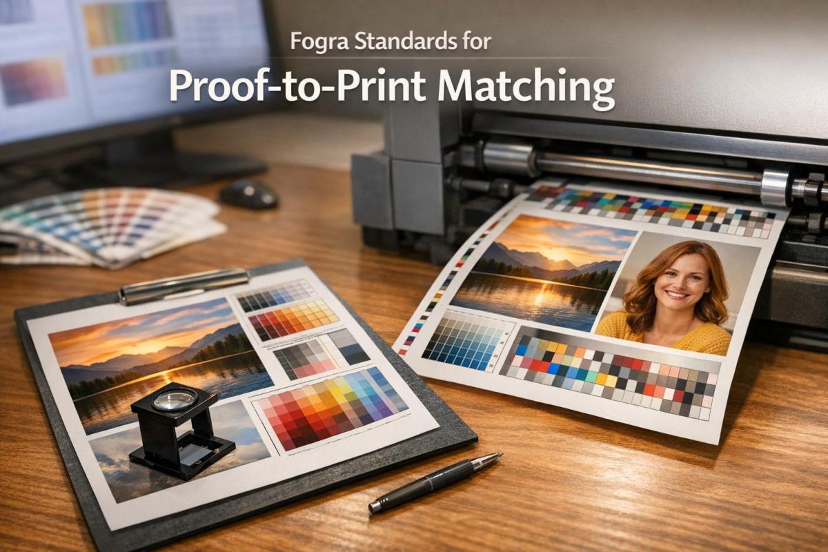
What You Need for Accurate Proof-to-Print Matching

Getting proof-to-print matching right is all about maintaining precise color standards, like those outlined by Fogra. To achieve this, you need the right tools, controlled lighting, and reliable measurement instruments. The essentials include standardized lighting, accurate ICC profiles, and dependable measurement devices. These elements work together to remove the guesswork, ensuring that what you see on a proof matches the final printed result. Let’s dive into how standardized viewing, ICC profiles, and objective measurements keep color consistency on point.

Why Standardized Viewing Conditions Matter

Lighting can play tricks on your eyes. A proof might look one way under fluorescent office lights, another under natural daylight, and completely different under incandescent bulbs. These shifts can lead to costly mistakes and unhappy clients. That’s why ISO 3664:2009 specifies D50 (5000K) illumination for all color-critical evaluations in the graphic arts industry.

"Colours are actions of light… Misjudgements due to incorrect lighting almost immediately lead to complaints and thus to increased costs." – Fogra

Certified viewing cabinets go beyond simply providing the right color temperature. They are evaluated on factors like color rendition, metamerism (how colors change under different light sources), UV energy levels, and even how evenly the light spreads across the viewing area. For companies pursuing certification, Fogra charges $1,100 for non-members ($770 for members) to audit a single viewing cabinet. Each additional cabinet costs $410 for non-members ($287 for members).

To ensure that staff involved in color approvals can accurately assess colors, the Farnsworth-Munsell 100 Hue Test is used to evaluate their ability to distinguish subtle differences in hue.

Using ICC Profiles for Color Accuracy

ICC profiles are the link between your digital files and the final printed product. By simulating exact printing conditions – whether for offset, digital, or large-format printing – they ensure consistent color reproduction across different devices and materials. Without the right profile, you’re left guessing how colors will turn out.

To get started, download the appropriate Fogra characterization data (e.g., FOGRA51, FOGRA52, or PSD) and embed it into your PDF/X files. These profiles need to be used consistently throughout your prepress workflow. Make sure your software handles PDF color transformations correctly and that your RIP (Raster Image Processor) respects the embedded profiles. For soft proofing, monitors must meet ISO 12646 and ISO 14861 standards to ensure that what you see on screen aligns with the intended print output.

Objective measurements can then confirm the color accuracy achieved digitally, providing an extra layer of confidence.

Measurement Tools for Color Verification

Accurate color measurement is non-negotiable. Spectrophotometers are the go-to tools for this, measuring the actual color values of prints and comparing them to reference data. They detect even slight color shifts and ensure compliance with ISO standards. These devices follow ISO 13655 guidelines, which specify proper measurement conditions, including the backing material (white or black) and illumination modes (M0, M1, or M2).

The Fogra Media Wedge CMYK V3 is a key tool for verifying proof accuracy. This control bar includes carefully defined color patches that represent critical values and tonal ranges. When measured with a spectrophotometer, it provides objective proof that your output meets ISO 12647-7 tolerances.

Tool/Technology Relevant Standard Purpose
Viewing Cabinets ISO 3664:2009 D50 lighting for color evaluation
Media Wedge CMYK V3 ISO 12647-7 Control bar for color verification
Spectrophotometer ISO 13655 Physical measurement of color values
Softproof Monitor ISO 12646 / 14861 Consistent on-screen color display
Proofing Substrates ISO 12647-7 Certified paper for print simulation

In digital printing workflows that follow ProcessStandard Digital (PSD), continuous monitoring for color drift is essential. You can use handheld spectrophotometers or integrate inline measurement systems directly into your press for automated checks. Basic PSD certification costs $3,625 for non-members ($2,537.50 for members), while recertification fees are $2,800 for non-members ($1,960 for members).

How to Apply Fogra Standards in Your Printing Workflow

Applying Fogra standards involves a step-by-step approach that ensures consistent color accuracy from the initial file preparation to the final printed product. By setting up clear checkpoints at each stage where color variations can occur, you create a reliable and repeatable workflow that builds client confidence. Here’s a breakdown of the workflow to maintain color consistency throughout production.

Workflow Steps from Data to Final Print

Start with data preparation: Export your files as PDF/X-4, embedding the appropriate Fogra profile (such as FOGRA51, FOGRA52, or a relevant legacy profile). This ensures that color intent is preserved across all software and RIPs in your workflow.

For contract proofing under ISO 12647-7, include the Fogra Media Wedge CMYK V3 on every proof. This wedge is essential for verifying compliance with color tolerances. Make sure to use proofing substrates that meet ISO 12647-7 standards. When working with modern bright white papers (like those under FOGRA51/52), set your spectrophotometer to M1 measurement mode to account for optical brighteners and UV content.

If you’re creating design proofs that don’t require full contract-level accuracy, you can follow ISO 12647-8 (Validation Print). This approach offers slightly broader tolerances while still delivering consistent and predictable color results.

Throughout the production process, frequent calibration is crucial. Regularly calibrate proofing printers and monitors to maintain alignment with the standards. For digital printing environments using ProcessStandard Digital (PSD), rely on drift detection tools – either handheld or inline – to catch color shifts early and prevent issues before they escalate.

"Prerequisites for professional colour communication are perfect print data, colour-accurate proof prints and correct matching conditions." – Fogra

By following these steps, you can ensure that every printed piece meets the stringent color standards required for reliable proof-to-print matching. This structured workflow also prepares you to take full advantage of certified proofing systems.

Benefits of Certified Proofing Systems

Using FograCert Contract Proofing Systems simplifies compliance with ISO 12647-7. These systems include pre-approved hardware, software, inks, and papers, eliminating the need for you to individually test and validate each component.

For companies aiming for ProcessStandard Digital (PSD) certification, the framework offers clear guidelines and objective testing through PSD PrintCheck. As of early 2026, Fogra has certified around 430 companies, 1,600 systems, and 110 individuals.

"The Fogra PSD certification is more and more a requirement of our customers. Our employees have a clear work quality standard and we have a clear criterion towards our customers." – Ulrich Schätzl, CEO of Schätzl Druck & Medien GmbH & Co. KG

The PSD Colour Data service takes automation a step further by verifying color accuracy for each print job. Using inline or handheld measurement devices, this system checks the Fogra Media Wedge and provides quality feedback (rated A, B, or C) within 2 to 4 working days. This fully digital verification process reduces manual effort and labor costs while maintaining objective quality standards. At $120 per print combination for non-members (or $84 for members), it’s a cost-effective way to document consistent quality throughout your production runs.

Fixing Common Proof-to-Print Problems

What Causes Color Mismatches

Color mismatches often arise due to issues with substrates, measurement settings, or viewing conditions. For instance, using non-OBA paper when the standard calls for OBA-rich paper (like FOGRA52) can alter the white point, resulting in a warmer proof.

Measuring papers with optical brighteners in M0 mode instead of M1 can also cause noticeable color shifts, introducing blue or yellow hues. Similarly, viewing conditions that don’t meet ISO 3664 standards – such as inconsistent 5000K lighting or insufficient UV content – can disrupt accurate color comparisons.

Software can also play a role. Standard ICC conversions in tools like Photoshop may inadvertently add too much magenta when working with FOGRA52 profiles, while specialized device-link profiles handle these conversions more accurately. Additionally, uncalibrated monitors or printing presses make achieving a reliable color match nearly impossible.

"Complications and complaints are usually caused by print data that has not been prepared correctly." – Fogra

Addressing these problems requires aligning substrates, measurement settings, and viewing conditions, as outlined below.

How to Fix Color Matching Issues

To resolve these mismatches, start by ensuring your proofing substrate matches the required standard. For FOGRA51/52, use proofing papers with optical brighteners. Verify accuracy with the Fogra Media Wedge CMYK V3 and measure using a spectrodensitometer to meet ISO 12647-7 tolerances.

Check that the measurement backing complies with ISO 13655 standards, as an incorrect backing can distort readings. When proofing, use the Absolute Colorimetric rendering intent to accurately replicate the source’s white point on your proofing paper. Avoid Perceptual rendering, which prioritizes visually "pleasing" results over precision.

Ensure your viewing booth maintains consistent 5000K lighting by using a reliable color temperature indicator. If color discrepancies persist, consider using the Farnsworth-Munsell 100 Hue Test to evaluate the color discrimination abilities of personnel. These adjustments integrate smoothly into Fogra-based workflows, helping to achieve consistent and accurate results.

Conclusion

Fogra standards serve as the foundation for achieving consistent proof-to-print accuracy. By replacing manufacturer-specific methods with globally recognized benchmarks, these standards ensure that proofs align with legal requirements and ISO 12647-7 color-accuracy guidelines. This structured approach supports every stage of a high-quality printing workflow.

But it’s not just about accuracy. Adopting standards like ProcessStandard Digital (PSD) can lead to practical benefits, such as quicker setup times, less waste from plate remakes, and fewer disagreements between print providers and their clients. As Ron Ellis, a consultant and author, succinctly puts it:

"Standards aid efficiency and efficiency leads to profits".

These certifications reinforce trust across the industry in Fogra’s reliability.

Managing the entire workflow effectively is crucial. This involves using standardized viewing conditions that comply with ISO 3664 and verifying substrates with tools like the Fogra Media Wedge CMYK V3. Dr. Andreas Kraushaar, Head of Prepress at Fogra, highlights this importance:

"Prerequisites for professional colour communication are perfect print data, colour-accurate proof prints and correct matching conditions".

For print providers aiming to secure top-tier contracts with global brands, Fogra certification offers verifiable proof of quality. Automated tools, such as PSD Colour Data, further simplify the process by reducing manual tasks and delivering feedback within just 2-4 working days, making quality assurance both faster and more efficient.

FAQs

What are Fogra standards, and how do they ensure color accuracy in digital printing?

Fogra standards are globally recognized guidelines designed to ensure consistent and precise color reproduction in digital printing. Among these is the ProcessStandard Digital (PSD), which defines clear target values and tolerances for achieving color accuracy. Certifications like PSD PrintCheck and PSD Color Data play a key role in this process, utilizing tools such as the Fogra MediaWedge to objectively measure and verify color consistency across print jobs.

Following Fogra standards allows printers to maintain dependable proof-to-print matching, ensuring the final printed product mirrors the original design. This level of accuracy is particularly crucial for projects where color fidelity is non-negotiable, such as branding materials or premium-quality prints.

What are the key tools for ensuring color consistency based on Fogra standards?

Achieving reliable proof-to-print results with Fogra standards relies on using the right tools to standardize color and maintain precision. Key resources include Fogra characterization data tailored for inks and substrates, test forms to assess image quality, and measurement backings aligned with ISO 13655 standards. Fogra also offers soft-proof lighting guidelines to ensure on-screen proofs are evaluated under ideal viewing conditions.

For digital printing, the ProcessStandard Digital (PSD) handbook outlines a comprehensive workflow to maintain consistent color throughout the production process. Tools like the Fogra Media Wedge CMYK V3 and FOGRACert certification play a critical role in ensuring proofs meet strict tolerances, guaranteeing accurate color reproduction on the final print.

By incorporating these tools and guidelines, you can achieve consistent, professional-quality results where the proof aligns seamlessly with the final printed product.

What is the connection between Fogra standards and ISO 12647 for printing quality?

Fogra standards align with the ISO 12647 guidelines, including ISO 12647-7, which focuses on proofing. These standards help printers and proof providers meet internationally recognized benchmarks for color accuracy and consistency.

Adhering to Fogra standards allows certified providers to ensure dependable proof-to-print matching, delivering consistent, high-quality results across various printing processes.

Related Blog Posts

https://app.seobotai.com/banner/banner.js?id=697038c00a871bef4adda7db

How to Prepare Files for Die-Cutting

Step-by-step die-cut file checklist: create vector die lines on a separate spot-color layer, add 0.125 in bleed and safe margins, set overprint, and export a print-ready PDF.

Die-cutting transforms flat designs into unique shapes like folders, boxes, or tags. To ensure precision and avoid errors, proper file preparation is essential. Here’s what you need to know:

  • Die Lines: These vector guides indicate where cuts, folds, and perforations occur. Use high-contrast spot colors (e.g., 100% Magenta) and set strokes to "Overprint" to prevent gaps.
  • Document Setup: Add a 0.125-inch bleed and maintain safe margins of at least 0.125 inches for key content like text or logos.
  • Vector Paths: Always create die lines as vector paths in software like Adobe Illustrator. Keep them on a separate, locked layer labeled clearly (e.g., "Die Lines").
  • Exporting: Save your file as a print-ready PDF with CMYK color mode, 300 dpi resolution, and outlined text. Double-check settings in Adobe Acrobat to ensure accuracy.

Mistakes like missing bleeds or incorrect die lines can disrupt production. Following these steps ensures your design translates perfectly to the final product.

Die-Cutting File Preparation Checklist: 4-Step Process for Print-Ready Files

Die-Cutting File Preparation Checklist: 4-Step Process for Print-Ready Files

Die Lines and Why They Matter

What Are Die Lines?

Think of a die line as a blueprint for your design – a vector guide that shows exactly where cuts, folds, and perforations will happen. It’s what turns a flat, printed sheet into a finished product with your desired shape or structure. This is especially crucial for intricate designs involving curves or internal cutouts, as precision is key.

"A dieline is the art file that shows where cuts, perforations and folds need to be made. This dieline is a vector object that should be delivered to your printer in your art files." – Adam Fox, Solutions Analyst, Suttle-Straus

Die lines serve as the template for creating physical dies. These dies use sharp blades for clean cuts, dull blades for scoring, and blades with small nicks for perforations. By following the die line, every detail of your design can be executed with precision.

On top of the basics, ensuring proper color separation is another step that guarantees production accuracy.

Using Spot Colors for Die Lines

Spot colors are essential for keeping die lines separate from the rest of your design. Assign specific spot color swatches, such as "Die Cut", "Score", or "Perf", to clearly indicate finishing instructions. High-contrast colors like 100% Magenta or Cyan are great choices because they stay visible during proofing.

"Creating a spot color in the file that is titled with the name of the operation (die cut, score, or perf) is the ideal way to start. That way when the file is processed, the spot color will stand out from the rest of the design." – Adam Fox, Solutions Analyst, Suttle-Straus

You can also use different line styles to make instructions crystal clear: solid lines for cuts, dashed lines for folds, and dot-dash lines for perforations.

Line Weight and Overprint Settings

For die lines to be effective, their weight should fall between 0.25 pt and 0.5 pt – thick enough to be visible but not overwhelming. Set the die line strokes to "Overprint" to avoid knockout gaps, which ensures the print remains seamless despite the typical 1–2 mm production variance.

Always create die lines as vector paths using software like Adobe Illustrator. Cutting machines rely on the mathematical precision of vectors, something raster images simply can’t provide.

How to prepare a PDF file with a die-cut line for printing

Setting Up Your Document

Getting your document setup right is the backbone of successful die cutting. Every detail, from dimensions to margins, plays a role in ensuring your design aligns perfectly with production standards and delivers high-quality results.

Document Size and Bleed Requirements

Start by setting your document to the final trim size. For example, if you’re designing an 8.5" x 11" brochure, that’s your base canvas. Then, add a bleed of 0.125 inches on all sides. This extra space ensures there are no unwanted white edges if the cut shifts slightly during production.

In Photoshop, increase the canvas size by 0.25 inches overall to account for the bleed. Most printing processes have a mechanical tolerance of 1/32" to 1/16", with some manufacturers noting a variance of 1–2 mm. The bleed compensates for these natural shifts, keeping your design intact.

Once the bleed is set, establish safe margins to protect key design elements.

Safe Margins for Important Content

Always keep essential content – like text, logos, and key graphics – at least 0.125 inches inside the trim line. This "safe zone" ensures your important elements remain intact, even with slight cutting variances.

"Any text that extends beyond this margin will fall outside the mechanical tolerances of our paper-cutting equipment and may get cut off inadvertently." – ProPrint Digital

In Adobe Illustrator, you can add guides 1/8 inch inside the trim line to mark this safe zone visually. If your design includes borders, leave at least 0.25 inches of white space between the trim line and the border. For designs with folds, maintain a 1/8-inch margin on both sides of each fold line to prevent text from being obscured by the crease.

Using Vector Formats for Die Lines

Once your dimensions and margins are set, focus on creating die lines using vector formats. Vectors are resolution-independent, meaning they provide the precision needed for cutting equipment to follow exact paths, regardless of size.

Use Adobe Illustrator’s vector tools to draw die lines. Stick to line weights between 0.25 pt and 0.5 pt – thick enough to be recognized by prepress software but not so thick they cause confusion. Always place die lines on a separate, locked layer labeled clearly as "Die Lines" or "CUT" to differentiate them from your CMYK artwork. This ensures they don’t accidentally print while still serving as a precise guide for cutting equipment.

Creating Die Lines in Adobe Illustrator

Adobe Illustrator

Once your document is set up correctly, it’s time to create the die lines that will guide the cutting process. Adobe Illustrator’s vector tools are perfect for this task, offering precision and ease when you follow these steps.

Creating Spot Swatches for Die Cuts

Start by opening the Swatches panel (Window > Swatches). Click on "New Swatch" and give it a name, like Die Cut. Set the Color Type to Spot Color – this ensures it’s recognized as a finishing instruction. Choose a bright, high-contrast color, such as 100% Magenta or Cyan, to make it stand out. Ensure this color isn’t used anywhere else in your design. Set the Color Mode to CMYK and apply this spot color to the stroke of your die line.

Next, open the Attributes panel (Window > Attributes) and check the Overprint Stroke box. This step helps avoid unwanted white gaps caused by slight registration shifts during production.

Drawing Die Lines with the Pen Tool

With your spot swatch ready, switch to the dedicated die line layer. Use the Pen Tool to draw a fully closed vector path that outlines the final shape of your product. Set the stroke weight to 1 pt, which is the standard for digital die-cutting paths.

Different line styles communicate specific instructions:

  • Solid lines: Indicate cuts.
  • Dashed lines: Represent valley folds or creases.
  • Dot-dash lines: Mark mountain folds.

For smoother results, use rounded corners and joins to avoid jagged edges. You can refine your paths using the Direct Selection Tool or the Simplify command (Object > Path > Simplify) to reduce unnecessary anchor points. Always ensure your paths are completely closed – open paths can cause errors in cutting software.

Organizing Layers for Die Lines and Artwork

Once your die lines are complete, organize your layers to keep everything clear. Place the die line layer above your CMYK artwork and label it Die Line. Use separate layers for your main artwork, labeled Artwork. If your project includes additional finishing processes, create individual layers for each, such as FOIL, EMBOSS, SCORE, or PERF.

Finally, lock your layers to prevent accidental changes. When everything is ready, export your design as a print-ready PDF to ensure smooth production.

Exporting and Checking Your File

Exporting as a Print-Ready PDF

To prepare your design for professional printing, export it as an Adobe PDF that maintains vector quality and supports printing workflows. In Adobe Illustrator, navigate to File > Save As and choose Adobe PDF as the format. Make sure your color mode is set to CMYK unless you’re working with specific Pantone colors. Set all raster effects and images to a resolution of 300 dpi. Add a 0.125-inch bleed on all sides to avoid unwanted white borders after trimming. Convert all text into outlines by selecting Type > Create Outlines, and remove any embedded color profiles.

"All designs need to be exported as PDF… This essential step makes sure that any color or image reaching the edge of your design extends past the trim area, eliminating the risk of unsightly white borders when the edges are cut and trimmed off." – Susan Han, CEO, QinPrinting

Once exported, open the file in Adobe Acrobat to double-check that all settings are accurate.

Checking the File for Errors

After exporting your PDF, it’s time to verify its accuracy. Open the file in Adobe Acrobat Pro and go to Print Production > Output Preview. Check the Separations list to confirm that your spot color (e.g., "Die Cut") is listed as a separate plate. To ensure overprint settings are correct, toggle the spot color plate off. If the underlying artwork remains visible without gaps or knockouts, your overprint setup is working as intended.

Run a preflight check to catch any technical issues, such as open paths, duplicates, or overlapping elements that might disrupt the cutting process. Finally, inspect the bleed area and confirm that all critical content is positioned at least 0.125 inches inside the die line to account for mechanical tolerances.

Creating a Die-Only File (If Needed)

Some print shops may request two separate PDFs: one with the full artwork and die lines, and a second "die-only" file containing just the cutting paths. Creating this die-only file is straightforward. Hide or delete the artwork layer, leaving only the die line layer visible against a white background. Export this as a separate PDF, ensuring you use clear file names like "Project_Print.pdf" and "Project_DieLine.pdf" to avoid confusion. This additional file acts as a precise guide for the die-maker, reducing the risk of production errors.

Final Tips for Die-Cut File Preparation

To ensure precision in your die-cut projects, always use vector paths for your die lines. Rasterized or pixelated edges can’t be read accurately by cutting equipment, which could lead to errors. Keep your die lines on a separate, clearly labeled layer – something like "Die Lines" or "DO NOT PRINT" works well. This prevents them from merging with your CMYK artwork. Assign a dedicated spot color to these lines and set them to overprint in your attributes panel to maintain the integrity of your design.

When creating die lines, don’t forget to account for production variances. Mechanical tolerances of 1/32" to 1/16" and manufacturing variances of 1 mm to 2 mm are common in the die-cutting process. Make sure your design includes safe margins, and verify that all background elements extend fully into the bleed area to avoid any unwanted gaps or white edges.

Before submitting your files, take an extra step to check your work in Adobe Acrobat Pro. Use the Print Production > Output Preview tool to confirm that your spot color shows up as a separate plate and that overprint is correctly applied.

Mistakes like missing bleeds, misplaced text, or active die lines in the final prepress PDF are frequent culprits behind failed die-cut projects. Avoid these by double-checking every detail.

For more complex designs, such as packaging or structural layouts, it’s a smart move to request a 1:1 mockup or CAD sample before moving into mass production. This helps confirm that everything fits and folds as intended. Finally, consider teaming up with a professional print shop like Miro Printing & Graphics Inc.. They can provide expert prepress reviews, structural templates, and advice on material tolerances, saving you from unexpected costs and delays.

FAQs

What mistakes should I avoid when preparing files for die-cutting?

When preparing files for die-cutting, there are a few key things to keep in mind to avoid common pitfalls. First, always work with vector file formats like AI, EPS, or SVG. Unlike raster files such as JPG or PNG, vector formats provide the precision needed for clean and accurate cutting. Be sure to designate your cut lines using a distinct spot color (like magenta), set to a 0.25 pt stroke, and place them on a separate, clearly labeled layer.

It’s also important to include a bleed area by extending your artwork 0.125 in to 0.25 in beyond the cut line. This ensures there are no unwanted white edges after cutting. At the same time, keep critical design elements well away from the edges to prevent accidental trimming. When you’re ready to finalize, export your file as a PDF with bleed and spot colors intact.

To avoid surprises, consider running a test cut on your material to confirm everything is aligned perfectly. If you’re feeling uncertain, Miro Printing & Graphics Inc. offers services to review your files, verify proper setup, and even perform test cuts to guarantee your project turns out just right.

How do I properly set up my files for die-cutting?

To get your files ready for die-cutting, here’s what you need to do:

  • Set up a dedicated layer for cut lines: In a vector editing program like Adobe Illustrator, create a separate layer specifically for cut lines. Give it a clear name, such as "CUT LINES", to avoid confusion.
  • Use closed paths and a spot color: Outline each cut shape using closed paths with a stroke weight of 0.25 pt and no fill. Choose a bright spot color like magenta or green for the stroke and label it "CUT."
  • Include bleed and safe margins: Extend your artwork 0.125 in beyond the cut line to account for bleed. Keep key elements at least 0.125 in inside the cut line to prevent them from being trimmed.
  • Export a print-ready PDF: Save your file as a PDF using settings like PDF/X-1a or PDF/X-4. Make sure to include bleed, crop marks, and preserve the spot color.

When submitting to your printer, provide two PDFs: one showing only the cut lines and another with the full artwork but without the cut lines. This ensures accurate production and avoids any issues during die-cutting at Miro Printing & Graphics Inc.

Why should I use vector paths instead of raster images for die-cut lines?

Using vector paths guarantees that your die-cut lines are sharp, scalable, and maintain their resolution no matter the size. This precision is crucial for die-cutting machines to accurately follow the design. On the other hand, raster images, made up of pixels, can lead to blurry or jagged edges when resized or processed by the machine.

By relying on vector paths, you ensure your design is executed with clean, exact lines, minimizing the risk of errors or misalignment during the cutting process. This approach delivers professional, polished results that stay true to your original vision.

Related Blog Posts

https://app.seobotai.com/banner/banner.js?id=696ecb730a871bef4add3c4e

Study: Substrate Properties and Adhesion Failures

Top 10 nm of substrate surface control ink adhesion: surface energy, roughness, contamination, and pretreatments to prevent adhesive, cohesive, or substrate failures.

Your print quality heavily depends on substrate properties. The top 10 nanometers of a substrate’s surface determine whether ink adheres successfully or fails due to peeling, uneven coverage, or weak bonding. Key factors include:

  • Surface Energy: Ink must spread (not bead) on a substrate. For example, water-based inks struggle with low-energy surfaces like polyethylene (28–32 mN/m) without treatment.
  • Surface Roughness: Rough textures can improve adhesion by creating physical anchors, but incomplete ink penetration weakens bonds.
  • Surface Chemistry: Additives, contamination, or oxidation can interfere with bonding, even on high-energy materials like stainless steel.

Failures occur at three levels:

  1. Adhesive Failure: Ink separates cleanly from the substrate, often due to low surface energy or contamination.
  2. Cohesive Failure: Ink splits internally, indicating weak ink structure.
  3. Substrate Failure: The substrate itself tears, showing the bond exceeds the material’s strength.

To improve adhesion:

  • Chemical Treatments: Plasma or flame treatments increase surface energy by adding polar chemical groups.
  • Mechanical Treatments: Sandblasting adds texture for better mechanical anchoring.
  • Pretreatments: Align surface energy with ink type (e.g., water-based inks need 45–48 dynes/cm).

Proper surface preparation ensures ink adhesion, better print quality, and durability. Always test surface energy and address contamination before printing.

The Science Behind Surface Pretreatments for Adhesion to Plastics – Adhesives, Coatings, Inks

Types of Adhesion Failure and What They Mean

Three Types of Adhesion Failure in Printing: Visual Identification Guide

Three Types of Adhesion Failure in Printing: Visual Identification Guide

Understanding where adhesion fails – whether at the interface, within the ink, or in the substrate – helps pinpoint the root cause of print quality issues. Spotting the failure location can often be done with a simple visual check, but more challenging cases may require advanced tools like SEM (Scanning Electron Microscopy) or XPS (X-ray Photoelectron Spectroscopy) to identify the exact problem. Let’s break down the main types of adhesion failure and what they reveal about your printing process.

Adhesive Failure: Separation at the Interface

Adhesive failure happens when the ink separates cleanly from the substrate, leaving the surface spotless with no ink residue. This type of failure signals that the bond between the ink and the substrate was the weakest link.

The most common cause? Poor wetting. If the substrate’s surface energy is too low or contaminated with substances like silicone or surfactants, the ink won’t form a strong chemical bond. Variations in surface energy also play a key role in adhesion performance.

"Chemistry and roughness at the bonding interface can compromise the adhesion of a system with good viscoelastic properties."
– Michaeleen Pacholski, Ph.D., The Dow Chemical Co.

When the interfacial bond is stronger than the ink’s internal strength, the failure shifts to a different mode: cohesive failure.

Cohesive Failure: Internal Material Breakdown

Cohesive failure occurs when the ink or adhesive splits internally, leaving behind ink residue on both the substrate and the tool used to remove it. This failure type suggests that the interfacial bond is solid, but the ink’s internal structure is weak.

The root cause often lies in the ink’s formulation – issues like insufficient curing or inadequate crosslinking can compromise its strength. Interestingly, the energy required to cause cohesive failure is far greater than the theoretical surface energy because most of it is absorbed through deformation of the ink’s bulk material.

But if both the adhesive and ink remain intact, the substrate itself might be the problem.

Substrate Failure: When the Material Breaks

Substrate failure happens when the substrate tears or breaks before the adhesive bond gives way. In these cases, fragments of the substrate – like paper fibers or bits of cardboard – stick to the removed ink. This indicates that the bond strength exceeds the structural integrity of the substrate.

For example, recycled materials like paper or corrugated cardboard often exhibit weaker adhesion due to poor fiber quality rather than surface chemistry issues. In heavy-duty applications, substrate failure shows that the bond is stronger than the material itself.

Failure Type What You See What It Means Weakest Link
Adhesive Clean substrate; all ink gone Poor bonding at the surface Interface between ink and substrate
Cohesive Ink residue on both surfaces Strong bond, weak ink structure Internal structure of the ink
Substrate Substrate fragments attached Bond stronger than the material The substrate itself

How Surface Texture and Energy Affect Adhesion

Adhesion is influenced by two critical substrate properties: surface texture and surface energy.

Surface Roughness and Physical Anchoring

Let’s start with surface texture. Imagine surface roughness as a landscape of peaks and valleys. When ink seeps into these tiny irregularities, it forms a mechanical interlock, creating a strong physical anchor that enhances the bond. The rougher the surface, the greater the potential bonding area. However, this only works if the ink can flow into those valleys. If the ink is too thick (high viscosity) or the surface features are too deep, air can become trapped, reducing the contact area and weakening the bond.

Surface roughness is measured on two scales:

  • Macroscale features: Larger than 10 µm, often caused by fiber dispersion or irregularities in the base paper.
  • Microscale features: Smaller than 10 µm, influenced by pigment particles and binder types.

"If the adhesive can wet the entire surface, including all of the peaks and valleys, the contact area and bond strength will increase; if the adhesive cannot wet out the entire substrate, the contact area decreases and bond strength suffers."
– Michaeleen Pacholski, Ph.D., The Dow Chemical Co.

In non-impact printing methods like inkjet, substrate roughness plays a major role in the final image quality. For example, Atomic Force Microscopy revealed that glossy photo paper has an average roughness of 9.71 nm, while satin paper is significantly rougher at 312.1 nm – over 30 times rougher. Additionally, pigment-based inks (with particle sizes around 100 nm) can fill surface pores, improving gloss. Dye-based inks, made up of single molecules, often can’t fill these low spots as effectively.

Surface Energy and Ink Spreading

Surface energy determines how well ink spreads over a substrate at a molecular level. For ink to spread spontaneously, the substrate’s surface energy must be higher than the ink’s surface tension. High-energy substrates encourage wetting, while low-energy materials often need treatments to improve ink adhesion. For instance, standard topcoats for label films typically have surface energies between 38 and 45 mN/m. Materials like metal and glass naturally promote wetting due to their high surface energy, whereas low-energy plastics like polyethylene and polypropylene require additional treatment to achieve better ink spread.

Surface energy isn’t just about its total value – it also depends on its composition. The balance of polar and dispersive forces in a substrate can predict how well adhesion will perform. Surface analysis usually focuses on the top 10 nm of the material, where these molecular interactions occur. A contact angle below 60° between the liquid and substrate generally indicates good wetting.

One challenge with very high surface energy materials is their tendency to attract low-energy contaminants like oils or surfactants from the environment. These contaminants can lower the surface energy and reduce adhesion. Even stainless steel, with surface energies ranging from 34 to over 250 mN/m, can experience reduced adhesion over time due to surface oxidation or airborne contamination.

Understanding these factors helps in choosing and treating substrates effectively for optimal adhesion.

Chemical Treatments to Improve Adhesion

When surface texture alone doesn’t solve adhesion challenges, chemical treatments can step in to improve ink bonding. These treatments alter the substrate’s surface by introducing polar chemical groups, making it more receptive to inks and coatings.

Plasma and Flame Treatments

Both plasma and flame treatments work by increasing surface energy, adding oxygen-containing chemical groups like hydroxyl, carboxyl, and carbonyl to the substrate. These polar groups enable stronger adhesive bonds.

Plasma treatment uses ionized gas to activate the surface. In February 2024, researchers from Masaryk University, in collaboration with Effetec s.r.o., demonstrated that a quick 1–5 second plasma treatment on PMMA substrates boosted peel force from about 0.15 N/mm to 0.34 N/mm. This method works particularly well for transparent materials like polycarbonate and PMMA, as it enhances adhesion without compromising clarity or causing visible defects. For tougher polymers like PEEK, atmospheric plasma treatment increased tensile shear strength from 7 MPa to 13 MPa.

Flame treatment achieves similar results through thermal oxidation. A 2015 study by Dow Chemical evaluated flame-treated HDPE bottles from Berlin Packaging and Inhance Products, showing an increase in surface oxygen content from 0.2% to nearly 10%. While flame treatment typically penetrates 5–10 nanometers deep, air plasma treatments can exceed that depth, reaching beyond 10 nanometers.

Both treatments are time-sensitive due to hydrophobic recovery, so printing should occur within hours of treatment.

Treatment Type Substrate Example Adhesion Before Adhesion After Time Required
Plasma (HDCSBD) PMMA 0.15 N/mm 0.34 N/mm 1–5 seconds
Plasma (Argon) PEEK 7 MPa 13 MPa Not specified
Flame HDPE 0.2% oxygen 10% oxygen Not specified

While chemical treatments modify the surface chemistry, combining them with mechanical treatments can further enhance adhesion.

Mechanical Treatments: Sandblasting and Other Methods

Mechanical treatments, like sandblasting, add surface texture by creating peaks and valleys that improve mechanical interlocking. This increased roughness complements chemical modifications, leading to significantly better adhesion.

For example, in a study on wood-polymer composites, mechanical abrasion alone provided limited improvement. However, when combined with corona discharge treatment (a plasma method), pull-off strength jumped from 0.2 MPa on untreated surfaces to 3.4 MPa – a 17-fold increase.

The downside of mechanical methods is the potential for material loss or surface damage. For delicate 3D-printed parts or precision components, plasma treatment offers a safer alternative, improving adhesion without the abrasion-related risks.

Applying Adhesion Science to Printing

Understanding adhesion science at the molecular level can make a noticeable difference in print quality. Factors like surface energy, chemical compatibility, and contamination control play a crucial role in determining the success of a print job – especially when dealing with tricky materials.

Selecting Substrates for Better Adhesion

To achieve good adhesion, it’s essential to match the substrate’s surface energy with the ink’s properties. When surface energy and tension don’t align, ink can bead up instead of spreading evenly. Ideally, the substrate’s surface energy should be higher than the ink’s surface tension to ensure proper wetting and adhesion.

Chemical compatibility also plays a big role. For example, when inks and substrates share similar chemical structures – like using acrylic adhesives on PMMA – van der Waals forces can create stronger bonds. Interestingly, the top 10 nanometers of a substrate’s surface are what really dictate molecular bonding.

However, contaminants such as silicone or surfactants can weaken these bonds. High-energy surfaces like metal and glass are particularly prone to contamination, while porous materials like recycled cardboard may fail because loose fibers reduce adhesion strength. In cases where the substrate’s natural properties aren’t up to the task, pretreatments can help bridge the gap and improve adhesion.

Using Pretreatments to Strengthen Print Adhesion

Pretreatments are often used to adjust substrate properties to meet the needs of specific inks. For example, solvent-based inks typically require substrates with surface energies around 36–38 dynes/cm, water-based inks need 45–48 dynes/cm, and UV inks perform best on surfaces with 60+ dynes/cm. To stabilize their properties, substrates should be conditioned in the printing environment for at least 24 hours before use.

In January 2018, a study published in Applied Adhesion Science by researchers from the University of the Philippines highlighted how ink formulation impacts adhesion on polyethylene (PE) films. They developed a water-based ink that achieved 100% adhesion on untreated PE by incorporating specific defoamers to eliminate microfoam defects. While surfactants enhanced gloss, the study found that excessive additives could migrate to the ink–substrate interface, reducing adhesion overall.

To avoid costly mistakes, verifying surface energy is a must. Tools like Dyne pens or contact angle measurement systems can confirm whether a substrate meets the required energy levels. This is especially important since material properties can vary due to factors like processing aids or storage conditions.

Substrate Considerations for Specialized Printing

Specialized printing projects, such as large-format graphics or printed electronics, come with their own challenges. For rough materials like corrugated cardboard, surface roughness can affect how ink fills microscopic valleys. In these cases, the ink needs to have low enough viscosity to penetrate surface voids rather than bridging over them.

For printed electronics, substrate properties are critical to the performance of the final device. In December 2024, researchers from Boise State University and Idaho National Laboratory, including Timothy L. Phero and James A. Smith, used laser-induced spallation to study the adhesion of silver films printed on aluminum alloy substrates. Their findings showed that sintering conditions significantly influence adhesion strength and the reliability of additively manufactured electronic devices.

Both surface and bulk properties matter when it comes to adhesion. While surface chemistry and roughness affect initial bonding, bulk properties like flexibility and modulus determine whether the bond can handle mechanical stress or environmental changes over time. For example, increasing a substrate’s surface energy from 20.5 to 53.6 mN/m can improve tack by 300–500%. Additionally, for acrylic pressure-sensitive adhesives, adhesion energy can increase by more than 300% after 24 hours of contact with stainless steel due to molecular rearrangement. These examples highlight why careful substrate preparation is key to achieving durable, high-quality prints.

At Miro Printing & Graphics Inc. (bergencountyprinters.com), we integrate these principles into our printing processes to deliver outstanding results for every project.

Conclusion: Understanding Substrate Properties and Adhesion

When it comes to successful printing, everything boils down to what happens within the top 10 nanometers of a substrate’s surface. Dr. Michaeleen Pacholski from The Dow Chemical Co. puts it perfectly:

"For PSAs, the intimate contact of the adhesive molecules with the molecules at the surface of the substrate can strongly affect overall performance".

This highlights why surface chemistry and roughness are far more critical to adhesion than the bulk properties of the substrate.

Take surface energy, for instance. For ink to properly wet a surface, the substrate’s surface energy must be higher than the ink’s surface tension. A clear example is water-based inks, which have a surface tension of about 73 mN/m. These inks struggle to bond with polyethylene films, which typically have a surface energy of just 28–32 mN/m. Boosting the surface energy significantly improves tack, making proper substrate preparation a must. However, even the best preparation can be undone by minor contaminants.

Even tiny traces of silicone or surfactants can disrupt molecular adhesion. Advanced surface analysis tools like X-ray photoelectron spectroscopy (XPS), which examines the top 10 nanometers, and secondary ion mass spectrometry (SIMS), which focuses on the top 2 nanometers, reveal just how much these ultra-thin layers influence adhesion. Understanding and controlling these factors is key to achieving top-tier print quality.

These findings tie directly into earlier discussions on substrate selection and pretreatment. Matching the ink chemistry to the substrate, managing surface roughness, using the right pretreatments, and verifying surface energy before production are all crucial steps. When done right, these measures ensure prints stick properly, colors spread evenly, and the final products meet high-quality standards.

FAQs

How do plasma and flame treatments improve substrate adhesion?

Plasma and flame treatments improve how well surfaces bond by cleaning off contaminants, subtly etching the surface, and adding polar functional groups. These modifications boost the surface’s free energy and wettability, helping inks and adhesives spread more evenly and stick more securely.

The result? A smoother application and stronger adhesion – key factors for high-quality printing and long-lasting performance across a range of uses.

How does surface energy affect ink adhesion to different materials?

Surface energy is a key factor in how effectively ink sticks to a material. For ink to adhere properly, the material’s surface energy must be higher than that of the ink. This ensures the ink spreads evenly across the surface, forming a strong and stable bond.

When materials have low surface energy, the ink may not spread well, resulting in poor adhesion and potential printing flaws. To achieve top-notch printing results, it’s essential to select and prepare substrates with the right surface energy.

Why is it important to understand substrate roughness for improving print quality?

Understanding substrate roughness plays a key role in how ink behaves on a surface. The texture of the substrate influences how ink is absorbed and spreads, which in turn affects color consistency, image clarity, and the final look of the print, including its gloss and durability.

When you fine-tune substrate roughness, you can produce sharper, more polished results. This ensures the printed product not only looks great but also stands the test of time in terms of quality and appearance.

Related Blog Posts

https://app.seobotai.com/banner/banner.js?id=696da17e0a871bef4ad3b4f4

Common Challenges with ISO 17972 Adoption

Explore workflow, software, and training hurdles in ISO 17972 adoption and practical fixes: CxF-compatible tools, system upgrades, and staff training.

ISO 17972 is a standard that ensures accurate color communication in the printing industry. While its adoption offers benefits like improved color consistency and reduced errors, many businesses encounter challenges, such as:

  • Workflow Issues: Miscommunication between brands and printers often leads to errors and inefficiencies.
  • Technology Gaps: Legacy systems and software incompatibility with ISO 17972 can hinder implementation.
  • Training Needs: Teams often lack the knowledge to interpret spectral data and use the standard effectively.

To overcome these obstacles, businesses should upgrade to compatible systems, invest in process control software, and provide structured training for their teams. Though implementation may take 3–12 months, the long-term gains include better color precision, fewer reprints, and stronger client relationships.

Beyond ISO 12647: New ISO standards for the printing industry Webinar

Common Challenges in Adopting ISO 17972

ISO 17972 aims to improve color communication, but adopting it isn’t always straightforward. Print businesses often face technical and organizational obstacles that can slow down implementation. Understanding these challenges is key to navigating them effectively. Below, we break down the main hurdles and offer practical insights.

Inconsistent Workflow Communication

A major issue lies in fragmented communication between printers and brands. The use of varied tools and file formats often leads to manual data entry, increasing the likelihood of errors. On top of that, print requirements are frequently described in vague terms like "superior quality", which leaves room for inconsistent interpretations among stakeholders. This lack of clarity can result in costly physical proofs and production delays. Cindy Cooperman, VP of Brand Global Strategic Accounts at X-Rite, highlights the burden of this process:

"The sample and proofing process is burdensome and cost prohibitive, as the requirements continue to expand. Costs can quickly add up when considering the expense to produce, ship, evaluate, and store hundreds and thousands of print proofs and samples."

To tackle these issues, standards like the Print Requirements Exchange (PRX, ISO 20616-1) and Print Quality Exchange (PQX, ISO 20616-2) have been introduced. These frameworks help standardize how print requirements flow from buyers to printers and how quality attributes are reported back for review.

Software and Hardware Compatibility Problems

Technical limitations also pose a challenge. Many legacy systems and proprietary formats lack native XML support, which is essential for ISO 17972. Additionally, the wide range of color management tools available – each with its own methods for data handling – complicates integration. Some measurement tools and software currently in use don’t even support ISO 17972.

Specific parts of the standard, like ISO 17972-4:2018 for spot color characterization, have their own constraints. For instance, it applies only to isotropic (paper-like) substrates and requires precise ink and paper combinations from the characterization process, limiting its use in complex packaging environments. While vendors like Chromachecker, MeasureColor, Techkon, and X-Rite provide solutions aligned with these standards, upgrading existing systems often demands significant investment and careful planning.

Training and Knowledge Gaps

One of the most underestimated challenges is the human factor. ISO 17972 defines file formats but doesn’t specify the processes or methodologies needed to interpret the data. This lack of direction can confuse teams transitioning from manual workflows to more objective, data-driven ones. Eddy Hagen, an independent consultant and author at Insights4print.ceo, emphasizes the importance of clear communication:

"If you want your print jobs to be executed perfectly to your wishes, you need to communicate those wishes clearly and unambiguously. Communicating your brand colors is best done scientifically: as Lab-values or even spectral values."

Without adequate training and guidance, teams often struggle to replace subjective press checks with objective workflows based on spectral and XML data. These knowledge gaps can slow down adoption and lead to mistakes that compromise the benefits of standardization. Bridging these gaps is crucial for achieving the consistent results promised by ISO 17972.

How to Overcome ISO 17972 Adoption Challenges

3-Step Guide to Overcoming ISO 17972 Adoption Challenges

3-Step Guide to Overcoming ISO 17972 Adoption Challenges

Adopting ISO 17972 can feel overwhelming, but the right strategies – upgrading technology, refining workflows, and ensuring proper training – can bridge the gaps in communication, compatibility, and skills.

Use Process Control Software

Process control software that supports the Color Exchange Format (CxF) is a game-changer for streamlining workflows and cutting reliance on physical samples. By using digital spectral data, you ensure consistency and enable global sharing, which can significantly reduce turnaround times.

Software aligned with ISO 17972-4 (CxF/X-4) allows you to embed spot color data directly into PDF/X-4 files. This creates a secure "job bag" that retains all essential color information during file transmission. As Ray Cheydleur, Printing and Imaging Product Portfolio Manager at X-Rite, explains:

"X-Rite’s CxF3, and now ISO CxF, ensures an accurate and efficient exchange of digital standards, measurements and metadata."

Advanced tools like the ORIS CxF Toolbox and CxF CLOUD can even predict ink behavior during overprinting or sequence changes. When choosing software, make sure it processes full spectral data instead of just L*a*b* values to maximize accuracy.

Upgrade Software and Systems

Older systems often fall short when it comes to supporting ISO 17972. Many legacy tools lack native XML support, making it crucial to transition to PDF/X-4 workflows. Unlike earlier PDF versions, PDF/X-4 fully supports the spot color and overprint features defined by the standard.

Start by conducting a thorough compatibility audit of your workflow. Ensure that your design tools can import full spectral data – many older applications are limited to handling L*a*b* values. Similarly, confirm that your RIPs and proofing systems can accurately interpret and reproduce embedded CxF data. This includes ensuring proper communication of device settings, filter adjustments, and substrate details.

While upgrading systems does require upfront investment, the improvements in accuracy and efficiency often justify the cost in the long run.

Train Staff on ISO Standards

Even the best technology won’t deliver results if your team doesn’t know how to use it effectively. ISO 17972 defines file formats but doesn’t specify how to interpret the data, making structured training essential. Laurel Brunner, Managing Director of Digital Dots Limited, emphasizes this point:

"With the adoption of ISO 17972-1:2015, a new dimension has now been added to standards compliance that will help everyone in the color workflow more easily produce color quality within expected tolerances."

Tailor training programs to your specific workflow needs. For example, focus on Part 3 for output target data and Part 4 for spot colors. Staff should also develop a strong understanding of X-Rite’s Color Exchange Format version 3 (CxF3), which serves as the backbone of ISO 17972. This knowledge helps shift workflows from subjective, manual methods to objective, data-driven processes based on spectral and XML data.

Consider collaborating with industry organizations or vendors that offer certification programs in color management and ISO standards. Hands-on training that covers practical scenarios – like interpreting spectral data, setting up measurement conditions, and resolving compatibility issues – can be especially effective. Pairing training with workflow audits ensures that both technical and operational improvements are reinforced. Regular refresher courses can also keep your team’s skills sharp as technologies and standards evolve.

At Miro Printing & Graphics Inc., ongoing training and workflow audits play a critical role in maintaining quality and consistency for every project.

Benefits of Adopting ISO 17972

Adopting ISO 17972 can bring meaningful improvements to print businesses. While implementing the standard may pose initial challenges, it ultimately reshapes how companies manage color, collaborate with stakeholders, and stand out in a competitive industry. These advancements directly affect both operational efficiency and client satisfaction.

Improved Color Accuracy and Consistency

ISO 17972 takes color precision to the next level by using spectral measurement data rather than relying solely on Lab or CMYK values. This approach captures the entire visible spectrum of a color, providing a more comprehensive profile. Unlike physical swatches that can fade or get damaged, digital spectral definitions remain intact and are embedded directly into PDF/X-4 or PDF/X-6 files, ensuring long-term reliability.

This level of accuracy has a noticeable impact on production. Traditional CMYK can only match about 55% of PANTONE Spot colors, while digital CMYK raises that to 65%. By incorporating Extended Gamut Printing (ECG) – which adds orange, green, and violet to the CMYK palette – businesses can achieve up to 90% accuracy in matching PANTONE Spot colors. This reduces waste, reprints, and rejected jobs. Dan Gillespie, Director of Technical Services at Alder Technology, highlights the importance of spectral definitions:

"We need the spectral definitions – we can’t continue to use named colors with variable target values and we can’t accurately print spot color tints and overprints without them."

Enhanced Communication Between Stakeholders

ISO 17972 creates a standardized framework for color communication, ensuring that brand owners, designers, and print providers are all on the same page. Ray Cheydleur, Printing and Imaging Product Portfolio Manager at X-Rite Pantone, explains its significance:

"ISO CxF/X (ISO 17972-1:2015) with additional parts provides a framework for exchanging everything from target data to spot color tone values. It ensures an accurate and efficient exchange of digital standards, measurements, and metadata."

This universal approach eliminates confusion in the production process. All relevant color data – such as spot colors, tolerances, substrate specifications, and measurement conditions – is securely included in the digital job file. With everyone working from the same data, disputes over color matching are minimized, and production timelines improve. INX Subject Matter Experts emphasize this benefit:

"The ability to achieve color faster means less waste, fewer minutes (or hours) spent adjusting color, more productive time for presses, the ability to do color-consistent reorders."

This clarity not only boosts efficiency but also strengthens your competitive edge.

Competitive Market Advantage

Once businesses overcome the initial hurdles of adopting ISO 17972 – such as compatibility, training, and communication – they are well-positioned to thrive in the market. Certification signals a commitment to quality and reliability, which resonates with clients. In a printing industry projected to be worth $494.53 billion in 2023, adhering to internationally recognized standards can set a business apart.

Clients often prefer working with providers who meet global standards, as it reflects a dedication to excellence and best practices. ISO compliance also simplifies the process of competing for international contracts and building cross-border partnerships. Furthermore, the use of standardized color data ensures consistent reorders, which is essential for maintaining strong, long-term client relationships.

For print service providers like Miro Printing & Graphics Inc., adopting ISO 17972 can enhance production precision, streamline operations, and solidify their reputation in the competitive U.S. market.

Conclusion

Implementing ISO 17972 can be a challenging endeavor for print businesses, often involving hurdles like workflow communication gaps, software compatibility issues, and the need for staff training. However, with focused investments in technology, employee development, and process refinement, these challenges can be effectively addressed.

The process typically takes between 3 to 12 months to complete. To start, conduct a gap analysis to identify areas needing attention, then phase the implementation to prioritize critical aspects. This phased strategy not only helps manage financial constraints but also eases the learning curve for employees. As Fujifilm highlights:

"Achieving ISO certification can improve internal processes, enhance market competitiveness and build customer trust".

Strong leadership plays a pivotal role in ensuring a smooth transition. Top management must dedicate adequate resources and promote a culture of ongoing improvement. Designating an internal ISO champion to oversee the project ensures someone maintains a comprehensive perspective throughout the process. Additionally, involving employees early on is crucial – when staff understand how standardized workflows will simplify their roles, resistance to change often diminishes.

The rewards are considerable. Businesses can expect enhanced color accuracy, reduced waste, and stronger client relationships. For example, companies like Miro Printing & Graphics Inc. have seen significant improvements in operational efficiency and market positioning by adopting ISO 17972. Maintaining certification requires regular internal audits and management reviews over a three-year period. With proper preparation and dedication, the long-term advantages far outweigh the initial investment, setting the stage for sustained success.

FAQs

How can businesses enhance communication in their printing workflows?

To enhance communication within printing workflows, businesses can consolidate project details into a single, cloud-based platform accessible to all team members in real time. This approach keeps designers, production staff, sales teams, and clients on the same page, whether they’re working remotely or following flexible schedules. A strong management system that incorporates tools for file sharing, collaboration, and job tracking can significantly reduce errors, streamline proof approvals, and eliminate the back-and-forth of lengthy email threads.

Equally important is integrating software systems to ensure information flows smoothly. Linking tools like digital proofing platforms and automation modules allows production data, client feedback, and cost information to be shared automatically, minimizing manual tasks. Consistent file naming practices, regular cross-department check-ins, and aligning workflows with ISO 17972 standards can further cut down on miscommunication and help projects stay on schedule.

What steps can businesses take to make their legacy systems compatible with ISO 17972?

To bring legacy systems in line with ISO 17972 standards, start by thoroughly assessing your current hardware, software, and workflows. Compare them against the standard’s requirements, paying close attention to areas like color measurement, data exchange formats, and printing conditions. This evaluation will help pinpoint gaps that need addressing. Potential upgrades might involve incorporating ICC profile support, updating color measurement tools, or implementing middleware to ensure compatibility.

After making the necessary updates, integrate these new processes into your daily operations. Create clear workflows for essential tasks such as RGB-to-CMYK conversions, proof verification, and quality control checks. Ensure your team is well-trained on these updated procedures. To maintain compliance and deliver consistent, high-quality results, make regular equipment calibration and periodic audits a routine part of your operations. These steps will help your legacy systems meet ISO 17972 standards while continuing to provide the reliability your clients depend on.

Why is ISO 17972 training important for successful implementation?

Training on ISO 17972 plays a key role in helping employees grasp the technical requirements of the standard. This knowledge ensures the standard is applied correctly, minimizing errors and inconsistencies. Without proper training, businesses may encounter challenges like uneven processes, quality problems, or even resistance to new practices.

Providing thorough training helps organizations transition more smoothly, uphold high-quality print production standards, and establish more efficient workflows. The result? Improved operations and strengthened client trust through consistently dependable outcomes.

Related Blog Posts

https://app.seobotai.com/banner/banner.js?id=696d77d30a871bef4ad391f3

Substrate Selection for Print Quality

How substrate texture, porosity and moisture affect ink adhesion, color accuracy and durability; recommendations for digital, offset and large-format use.

Choosing the right substrate is crucial for achieving high-quality prints. The substrate affects how ink adheres, the sharpness of images, and the durability of the final product. Here’s what you need to know:

  • Surface Texture: Smooth substrates improve ink coverage and color precision. Coated papers create sharp visuals, while uncoated papers offer softer tones.
  • Moisture Content: Balanced moisture prevents curling and warping. Store paper in controlled conditions (70°F, 40% humidity) and allow time for acclimation.
  • Porosity: Low-porosity substrates enhance color vibrancy, while high-porosity materials absorb ink, leading to muted tones.

Different printing methods have specific substrate requirements:

  • Digital Printing: Liquid toner needs coated substrates, while dry toner works with heat-resistant materials.
  • Offset Printing: Ideal for coated and uncoated papers, with synthetic options for UV offset.
  • Large Format Printing: Vinyl and aluminum are durable for outdoor use, while fabric works well for indoor displays.

For cost and durability, balance your needs:

  • Use lighter paper for short-term projects to save on costs.
  • Opt for synthetic materials like vinyl or polyester for long-term durability.
  • Consider sustainable options like FSC-certified or recycled paper.

Whether you’re printing business cards or outdoor banners, matching substrate properties to your project ensures the best results.

Substrate Selection Guide by Project Type and Printing Method

Substrate Selection Guide by Project Type and Printing Method

Substrate Properties That Affect Print Quality

The physical and chemical characteristics of your substrate play a big role in determining how ink adheres, how sharp your images look, and how durable the final prints are. Three main factors influence print quality: surface texture, moisture balance, and porosity. Let’s break these down.

Surface Texture and Smoothness

The smoothness of a substrate reflects its uniformity, which directly affects how ink spreads and the lifespan of printing plates. As ZXC Print explains:

Smoothness is a critical indicator of paper quality, reflecting the uniformity and flatness of its surface.

Rougher surfaces can lead to uneven ink coverage and accelerate wear on printing plates. Additionally, textured substrates may cause halftone dots (the tiny dots that create shades and colors) to break apart or disappear, reducing image clarity and color precision.

For xerographic printing, maintaining paper smoothness between 150 and 200 Sheffield units is ideal. Coated papers hold ink on the surface, resulting in vibrant and crisp images, while uncoated papers allow ink to penetrate the fibers, creating softer tones and a more tactile feel. Lexmark highlights the importance of balance:

If paper is too rough, toner cannot fuse to it properly. If paper is too smooth, it can cause paper feeding or print quality issues.

Moisture Content and Stability

A substrate’s moisture content is another critical factor in achieving consistent print results. Paper naturally absorbs and loses moisture, and any imbalance can cause curling, warping, or feeding problems.

To maintain stability, store paper in a controlled environment – ideally around 70°F (21°C) with 40% relative humidity. Many label manufacturers suggest keeping the printing area between 65–75°F (18–24°C) and 40–60% relative humidity. Proper storage is key: keep the paper in its original wrapper and off the floor, using pallets or shelves.

Conditioning is equally important. Allow the substrate to acclimate to the printing environment for 24 to 48 hours before use. Thicker stocks may need several days to stabilize. This helps prevent curling and feeding jams. Papers made from 100% chemically treated pulped wood offer better stability compared to those containing natural fibers like cotton. For demanding conditions, such as outdoor use or high humidity, synthetic materials like SmartFlex resist moisture, ensuring they don’t warp, shrink, or become brittle.

Porosity and Ink Absorption

Porosity, or how porous a substrate is, affects how ink behaves when applied. The tiny gaps between fibers create capillary action, pulling ink from the plate or nozzle onto the surface. However, excessive porosity can cause ink to spread uncontrollably (known as dot gain), reducing sharpness, while low porosity may hinder proper ink transfer.

Porosity also impacts color vibrancy. Coated substrates, with lower porosity, keep ink on the surface, producing vivid, dense colors – perfect for brochures and catalogs. In contrast, porous materials like newsprint absorb ink deeply, leading to muted tones but faster drying times. As Labels and Labeling notes:

Consistent dots ensure uniform color.

Excessive porosity or overly thin ink can cause issues like show-through, where ink seeps through to the back of the sheet. Similarly, too much absorption can result in binder seepage, leaving pigments without enough binder to create gloss.

On non-porous materials like vinyl or polyester, ink adheres through chemical bonding or UV curing. For UV inkjet printing on synthetic substrates, a surface energy greater than 44 mN/m is necessary to ensure proper ink adhesion without additional pre-treatment.

Matching Substrates to Printing Methods

Choosing the right substrate for a specific printing method is crucial for achieving the best print quality. Each printing technology comes with its own set of substrate requirements. What works well for offset printing might not perform as effectively in digital printing, and vice versa. Understanding these differences can save you from costly errors and ensure your project meets its quality expectations.

Digital Printing

Digital printing encompasses various technologies like liquid toner (e.g., HP Indigo), dry toner (e.g., Xeikon), and inkjet systems. Each has unique needs when it comes to substrates.

Liquid toner dominates 72% of the digital printing market and requires substrates with specialized coatings or primers to ensure proper ink adhesion and dot consistency. As Labels & Labeling highlights:

"The foundation for [color accuracy] is press repeatability, and half of press repeatability is dot consistency."

Dry toner, which accounts for about 19% of the market, is slightly more forgiving. However, it demands substrates that can handle fuser temperatures as high as 230°C (446°F). Materials like metallized papers and heat-sensitive synthetics should be avoided as they may melt under these conditions. For best results, standard xerographic printers work with paper weights ranging from 60 to 220 g/m², with an ideal smoothness between 150 and 200 Sheffield units.

For UV inkjet printing, surface energy plays a key role. EFI Jetrion explains:

"If [surface energy] is above 44 they know they will probably not have any trouble; any kind of regular UV ink is going to work well – give a nice film and nice adhesion."

Switching to premium instant-dry gloss paper can significantly improve color accuracy compared to non-optimized coated alternatives. To ensure consistent results, always use substrates recommended by your press manufacturer. For projects requiring durability, such as water or tear resistance, synthetic papers like BOPP or HDPE – when properly treated for ink adhesion – are excellent choices.

These requirements contrast sharply with the needs of traditional offset printing, as detailed below.

Offset Printing

Offset printing, in contrast to digital methods, has its own specific substrate demands. While traditional offset printing primarily uses paper and cardboard, advancements in UV offset technology have expanded the range to include plastics, synthetics, and metal-laminated papers. This versatility makes it a reliable choice for everything from business cards to premium packaging.

Coated papers graded No. 1 to No. 3 are ideal for projects requiring high-quality image reproduction, with "Premium" grades offering the brightest finishes. On the other hand, uncoated papers are better suited for text-heavy materials like books, manuals, and letterheads, especially when users need a writable surface. For heavier or coated papers used in brochures or folders, scoring the substrate before folding can prevent cracking along the fold lines.

Synthetic substrates used in offset printing must have a surface energy above 44 dynes to ensure proper ink wetting. Vinyl substrates for UV offset printing can last over seven years outdoors, making them a durable choice for long-term applications. Additionally, subsurface printing on clear synthetics – where the image is printed on the back of the substrate – can eliminate the need for lamination while delivering excellent durability.

Large Format and Specialty Printing

Large-format printing, used for banners, posters, and signage, requires substrates that can handle large sizes, outdoor exposure, and varying viewing distances. Vinyl remains the top choice for banners, with options like scrim vinyl for heavy-duty use and mesh vinyl for building wraps that allow airflow. High-quality banner vinyl typically weighs between 13 oz and 18 oz.

For outdoor signage, Dibond (Aluminum Composite Material) stands out for its rigidity, UV protection, and resistance to corrosion, making it perfect for long-term, high-end installations. Corrugated plastic (Coroplast) is a cost-effective, waterproof option commonly used for temporary signs like real estate or election yard signage.

XL Digital emphasizes the importance of considering more than just upfront costs:

"Choosing solely based on price often leads to expensive problems down the line. Consider the total cost of ownership, including installation complexity and expected lifespan."

For vehicle wraps or curved surfaces, cast vinyl is preferred over calendared vinyl due to its superior stability and ability to conform to irregular shapes. Mesh vinyl is also a practical choice for large outdoor banners, as it allows wind to pass through, reducing the risk of tears. Fabric substrates are gaining popularity for retail displays and trade show booths because they’re lightweight, easy to transport, and offer a glare-free, polished look. Large-format printing can accommodate roll widths ranging from 18 to 100 inches, making it suitable for a wide range of applications.

Choosing Substrates by Project Type

Selecting the right substrate for your project is the key to achieving a polished, professional finish. While substrate properties like texture and coating play a big role, how these factors fit into specific project needs is just as important.

Marketing Materials (Brochures, Business Cards, Flyers)

Marketing materials need to make an impact without breaking the bank. The substrate you choose affects not only the look but also the feel of your materials, leaving a lasting impression on potential customers.

Business cards should feel substantial and professional. Typically, 12pt or 14pt cover stock (100# or 120# cover weight) is used, but premium options like 18pt to 24pt are also available. For cards that require writing, such as appointment reminders, opt for a dull/matte or uncoated finish to avoid smudging. If you’re using metallic inks, stick to gloss-coated stocks, as the effect doesn’t translate well to uncoated or matte surfaces.

Brochures often use 100# gloss text for a balance of quality and cost. For brochures with multiple folds, lighter text-weight paper (70# to 100#) works best to ensure they lay flat.

Flyers benefit from 80# or 100# gloss text, offering a cost-effective yet polished appearance. For standalone handouts like table tents, consider upgrading to 80# gloss cover for added sturdiness. A paper brightness of 90 or above enhances colors, which is vital since color influences 85% of customer purchasing decisions.

Project Type Recommended Substrate Key Features
Business Cards 120# (14pt) Cover Durable, professional feel
Brochures 100# Gloss Text Vibrant colors, folds easily
Flyers 80# or 100# Text Economical, sharp image quality
Postcards 120# Gloss or Dull Cover Meets postal thickness standards
Letterhead 70# Uncoated Text Lightweight, printer-friendly

Keep in mind that mailing brochures or postcards comes with specific postal regulations regarding thickness, and weight directly impacts postage costs.

Packaging and Labels

Packaging and labels not only need to look good but also withstand tough conditions. From shipping to environmental exposure, these substrates must stay intact and legible. A poor choice can lead to financial losses or even safety hazards if critical details fade or become unreadable.

For indoor, short-term uses like retail labels or packaging, paper substrates work well. However, for items exposed to moisture, chemicals, or outdoor conditions, synthetic substrates like polypropylene, polyester, or vinyl are the better choice. As Taylor Corporation highlights:

"A label’s failure in legibility, colorfastness or adhesion can create significant financial loss and even the risk of injury."

  • Polypropylene: Moisture-resistant and moderately durable, this is ideal for consumer goods and soft drink labels, lasting six months to two years in indoor or short-term outdoor settings.
  • Polyester films: More rigid and tear-resistant, these substrates work well for industrial labels and can last two to five years outdoors.
  • Vinyl substrates: Exceptionally durable, these can last seven or more years outdoors and are perfect for curved surfaces.

Synthetic films also provide better color consistency and dot precision compared to rougher paper surfaces. For digital printing, ensure substrates have a surface energy of at least 44 to guarantee proper ink adhesion. Subsurface printing, where the image is printed on the back of a clear synthetic material, offers added durability by using the substrate itself as a protective layer.

Large-Format Projects (Banners, Signs)

Large-format projects like banners and signs require substrates that can handle outdoor exposure and large-scale displays. The material you choose determines the durability and effectiveness of your signage.

Vinyl is a go-to for outdoor banners due to its weather resistance. For windy areas, mesh vinyl with tiny holes allows wind to pass through, reducing the risk of tearing. Max Deng from MaxPrintHub notes:

"Vinyl is great for outdoor signs because it lasts long and handles weather well. Paper, however, works best for short-term indoor displays."

Aluminum is another excellent choice for long-term outdoor signage, offering rust-proof durability. If you’re looking for a glossy, eye-catching finish, acrylic delivers, though it can cost 30% to 100% more than aluminum. For temporary indoor displays, foam board is lightweight and affordable, while corrugated plastic is commonly used for yard signs and temporary outdoor notices.

Fabric substrates are gaining popularity for trade shows and events. They’re lightweight, wrinkle-free, and washable, making them reusable for multiple occasions. This aligns with the shift toward recyclable or biodegradable options, which over 65% of brands now prefer.

For outdoor applications, consider adding a protective film or laminate to block UV rays and prevent scratches. Match the finish to the setting: use matte finishes to reduce glare in professional indoor spaces, and opt for glossy finishes to make colors stand out in advertisements.

Weighing Cost, Durability, and Environmental Impact

Choosing the right substrate means finding the perfect balance between cost, durability, and environmental impact. This balance helps you make smarter decisions while maintaining print quality. Start by considering options that are cost-effective but still meet your standards.

Budget-Friendly Substrate Options

Cutting costs doesn’t have to mean sacrificing quality. Standard house stocks often strike a great price-to-quality balance compared to custom specialty papers. For large-scale projects like flyers or direct mail, lighter paper weights (70 lb to 80 lb text) are a practical choice since they help reduce mailing expenses.

Coated paper can be another economical option. It’s typically less expensive than uncoated paper and delivers vibrant colors with crisp image quality. Plus, lighter coated paper offers added protection without extra bulk. When selecting substrates, keep their function in mind to avoid unexpected shipping or mailing costs.

While budget-friendly options save money upfront, durability is key for long-term use.

Durability for Long-Term Use

For materials that need to withstand tough conditions, investing in durability pays off. Synthetic substrates like vinyl, polyester, and polypropylene are excellent choices. They resist moisture, tearing, and UV exposure, with durability ranging from vinyl’s 7+ years to polyester’s 2–5 years and polypropylene’s 6 months to 2 years outdoors. Though these materials may cost more initially, they save money over time by reducing the need for replacements.

For paper-based projects in damp environments, applying a UV coating helps repel water effectively. Heavier cover stocks (12 pt to 18 pt) are ideal for items that get frequent handling, such as business cards or menus. Be sure to consider substrate adhesion and legibility, as poor choices can lead to financial or safety risks.

Environmental Considerations

Opting for sustainable substrates benefits both the planet and your print quality. Look for certifications like FSC, PEFC, or SFI to ensure the paper is sourced from responsibly managed forests. Many papers contain 10–30% post-consumer waste, but you can also find options with up to 100% recycled content.

Bamboo paper is a standout alternative – it’s renewable, fast-growing, and requires minimal resources. For outdoor applications, synthetic papers made from HDPE are both water-resistant and recyclable, offering durability without compromising sustainability. However, keep in mind that while paper substrates are biodegradable, certain adhesives can make the final product non-biodegradable. As All Print Heads explains:

Switching to sustainable paper comes with a myriad of benefits that extend beyond just reducing your carbon footprint.

Conclusion

Choosing the right substrate is all about matching the material’s properties to your project’s goals. Factors like surface texture, moisture stability, and ink absorption play a huge role in determining how your print will look and hold up over time. As Allied Printing aptly states:

Paper can make or break a job, it’s as simple as that. You can have a beautifully designed piece, but if you choose the wrong paper, it won’t have the impact you envisioned.

Equally important is the printing method you plan to use. For instance, liquid toner reacts strongly to the substrate’s characteristics, while dry toner is more adaptable. Understanding these differences can help you avoid costly mistakes, such as reprints, while ensuring consistent color and quality.

When selecting a substrate, think about your project’s specific needs. If it’s a short-term flyer, you won’t need the same durability as an outdoor sign that has to withstand the elements. The environment and lifespan of your printed piece should guide your choice.

Cost and environmental impact are also key considerations. For budget-friendly projects, standard house stocks or lighter paper weights are sensible options. On the other hand, heavier or synthetic substrates are better suited for long-lasting projects. If sustainability is a priority, look into FSC-certified or recycled-content materials to meet environmental goals without sacrificing quality.

Finally, involve your print provider early in the process. Their expertise can help you match substrates with press capabilities for the best possible results. For tailored advice and reliable printing solutions, you might consider reaching out to Miro Printing & Graphics Inc. (https://bergencountyprinters.com), a trusted resource for delivering top-notch print quality.

FAQs

How does the texture of a substrate affect print quality?

The texture of the substrate has a big impact on print quality because it influences how the ink interacts with the surface. Smooth surfaces are great for achieving sharp details, consistent colors, and a clean, polished look. This makes them perfect for high-resolution photos or professional marketing materials. On the other hand, rough or textured surfaces can cause uneven ink absorption, which may result in blurred edges, color inconsistencies, or less-defined details.

For materials with more texture, like linen or felt, adjustments might be necessary. This could include using thicker layers of ink or adding protective coatings to maintain quality. At Miro Printing & Graphics Inc., we factor in the texture of the substrate, along with material type and the chosen printing method, to deliver the best possible results for your project.

What should I consider when choosing substrates for digital and offset printing?

Choosing the right substrate plays a key role in delivering high-quality prints, and the requirements vary depending on whether you’re using digital or offset printing.

For digital printing, the substrate must support effective ink or toner adhesion. This often means using materials with special coatings or treatments to ensure compatibility with inkjet inks or proper conductivity for toner. A smooth, bright, and uniform surface works best for creating vibrant colors and sharp details. Plus, the substrate needs to withstand the high temperatures of digital printing presses without deforming or melting.

In offset printing, the focus shifts to handling wet inks and mechanical pressure. Coated papers are a common choice because they offer a consistent surface for ink application, minimizing issues like dot gain. Stability under heat and pressure is also essential to achieve precise and reliable results.

At Miro Printing & Graphics Inc., we take the guesswork out of substrate selection. Whether your project calls for heat-stable, coated sheets for offset printing or specially treated media for digital printing, we ensure your prints meet the highest standards every time.

How can I choose an environmentally friendly substrate for printing?

When choosing a more planet-friendly substrate, start by checking for certifications like FSC, PEFC, or SFI. These labels indicate the material comes from responsibly managed forests. For paper options, aim for those with a high percentage of post-consumer waste (PCW) content, as this helps reduce the reliance on new fibers. Also, ensure the substrate works well with eco-conscious inks, such as soy-based or low-VOC varieties, to cut down on environmental harm.

It’s always a good idea to ask your printer to confirm the substrate’s sustainability features, like recycled content or whether renewable energy was used in its production. If you’re considering non-paper materials like synthetic films, look for options that are recyclable or made from recycled materials. Steer clear of coatings that might make recycling difficult, and choose materials designed for easy processing after use. Pairing sustainable substrates with mindful printing practices allows you to maintain high-quality results while aligning with your environmental priorities.

Related Blog Posts

https://app.seobotai.com/banner/banner.js?id=696c27200a871bef4ad346af

Ultimate Guide to Metallic and Iridescent Cardstock

Compare metallic and iridescent cardstock, learn printing methods, best uses, brands, and tips for foil, laser, and packaging projects.

Looking to add a refined touch to your projects? Metallic and iridescent cardstock are specialty papers designed to transform ordinary designs into stunning creations. Here’s what you need to know:

  • Metallic Cardstock: Offers a consistent, reflective shine in single colors like gold or silver. Perfect for wedding invitations, business cards, and luxury packaging.
  • Iridescent Cardstock: Features a color-shifting effect that changes with light, creating a rainbow-like finish. Great for festive designs, bold packaging, and eye-catching crafts.
  • Both types are durable, often acid-free, and compatible with specific printing techniques like laser printing, foil stamping, and white ink underprinting.

Quick Comparison

Feature Metallic Cardstock Iridescent Cardstock
Finish Mirror-like or pearlescent Color-shifting, prismatic
Best Uses Luxury, formal designs Festive, playful projects
Printing Compatibility Laser, digital, offset Laser, offset
Durability Acid-free, fade-resistant Scratch-resistant options

Whether you’re crafting elegant invitations or vibrant packaging, these papers provide a polished, professional look. Read on for tips, techniques, and brand recommendations to get the best results.

Metallic vs Iridescent Cardstock: Complete Comparison Guide

Metallic vs Iridescent Cardstock: Complete Comparison Guide

3 🤯 Ways to Use METALLIC Paper featuring NEW Release from Simon Says Stamp #cardmakingtutorial #card

Simon Says Stamp

What Is Metallic Cardstock?

Metallic cardstock is a type of paper with a special coating made from aluminum or mica, giving it a reflective, shimmering surface. Unlike regular cardstock, which typically has a matte or uncoated finish, metallic cardstock stands out with its striking, glossy appearance.

The Stardream series, for instance, uses a mica coating that creates a soft, pearlescent glow. Some metallic cardstocks have shimmer and color that run through the entire sheet, making both sides equally dazzling. Others feature a single-sided finish, like a mirror or sparkle effect, with a plain white back.

This cardstock comes in various weights, ranging from 65 lb to 105 lb cover weight (130–375 gsm). Lighter weights, such as 81 lb text, are great for projects requiring flexibility, like crafting paper flowers. On the other hand, heavier weights are perfect for items that need durability and structure, such as business cards, luxury invitations, and upscale packaging.

Beyond its aesthetic appeal, metallic cardstock has some practical perks. Many options are acid-free, lignin-free, and pH neutral, which helps prevent fading and brittleness over time. The metallic coating also boosts moisture resistance and makes the paper easier to fold and score.

Metallic cardstock is a go-to choice for projects like wedding invitations, business cards, luxury packaging, scrapbooking, menus, and holiday greeting cards. Its reflective finish instantly adds a touch of sophistication and elegance. Up next, we’ll look at iridescent cardstock, which offers a softer, pearlescent glow that complements metallic finishes beautifully.

What Is Iridescent Cardstock?

Iridescent cardstock creates a mesmerizing, color-shifting effect that changes with the light or viewing angle. Unlike metallic cardstock, which has a consistent reflective shine, iridescent paper dances through a spectrum of hues, much like the rainbow shimmer on a soap bubble or the surface of a CD. This unique effect is caused by optical phenomena, making it stand out from the steady gleam of metallic options.

The science behind this effect is called goniochromism, which occurs due to thin-film interference. Essentially, light waves bounce off semi-transparent layers or tiny structures on the paper’s surface, creating the illusion of shifting colors. In some cases, diffraction adds a full rainbow spectrum when the paper is tilted.

The term "iridescent" itself reflects its origins, combining the Greek word iris (meaning rainbow) and the Latin suffix -escent (indicating a tendency toward). This highlights the fact that the colors of iridescent cardstock are structurally generated rather than applied through traditional chemical dyes.

For instance, premium lines like Stardream achieve their shimmering, light-catching finish by using a mica coating. This coating refracts light to produce a soft, glowing luster. Other types achieve their vivid, scratch-resistant colors by laminating a polyester film onto a cast-coated board, which encapsulates dyes for a more dramatic effect. Depending on the method, the finish can range from a subtle pearlescent shine to a bold, oil-slick rainbow effect.

Pearlescent finishes, which reflect mostly white light, create a gentle, pearl-like glow. On the other hand, true iridescent finishes manipulate light to deliver a constantly shifting spectrum of colors. This dynamic quality makes iridescent cardstock a popular choice for festive invitations, eye-catching packaging, and bold, creative designs.

Metallic vs. Iridescent Cardstock: Key Differences

When it comes to specialty cardstock, metallic and iridescent options each bring their own unique flair. Metallic cardstock is all about consistency – it offers a steady reflective finish in a single color, like gold, silver, or copper. The shine remains the same no matter the angle or lighting, making it a go-to for a sleek and polished look. On the other hand, iridescent cardstock is dynamic and ever-changing, shifting through a spectrum of colors as light hits it, much like the mesmerizing effect of soap bubbles or an oil slick.

The way these two types reflect light sets them apart. Mirror-finish metallic cardstock creates sharp, high-shine reflections, while pearlescent metallics, often enhanced with mica coatings, give off a softer, more refined glow. Iridescent cardstock, however, uses prisms to create a lively, color-shifting effect that grabs attention in a completely different way.

These visual qualities influence their ideal uses. Metallic cardstock is perfect for projects that demand a luxurious or professional feel, such as premium packaging for cosmetics and electronics, high-end menus, or corporate branding materials. Its consistent shine exudes sophistication and exclusivity. Iridescent cardstock, with its playful and eye-catching design, is better suited for celebratory and whimsical projects like baby shower invitations, festive gift wrapping, or creative scrapbooking where a touch of magic is desired.

When it comes to printing, pearlescent metallics (like Stardream) are compatible with both laser and digital printers, making them versatile for various designs. However, mirror-finish metallics are less porous and work best with laser or offset printing methods. For adhesives, mirror finishes require strong options like Scor-tape to ensure a clean, polished result, as liquid glues may not adhere as well to their smooth, non-porous surfaces.

Comparison Table

Feature Metallic (Mirror) Metallic (Pearlescent/Shimmer) Iridescent (Holographic)
Reflectivity High (Mirror-like) Subtle (Luster/Glow) High (Prismatic)
Color Variation Single, consistent color Single color with mica shimmer Multi-color/Rainbow shift
Visual Effect Sharp, direct reflections Soft, elegant sheen Dynamic, color-changing
Coating Type Laminate film Mica coating Holographic film
Best Uses High-impact accents, cake toppers Wedding invitations, formal stationery Modern packaging, eye-catching crafts

Understanding these differences can help you choose the right cardstock to make your project stand out. Next, let’s explore some top specialty cardstock options that highlight these distinctive features.

Types and Brands of Specialty Cardstock

Here’s a closer look at some standout specialty cardstock brands that cater to professional-grade projects.

Stardream Cardstock

Stardream

Stardream cardstock is known for its dual-sided, mica-infused coating that creates a stunning pearlescent shimmer on both sides. Produced in Italy by Gruppo Cordenons, this paper ensures full-color saturation throughout the sheet, making it a favorite for elegant designs.

The collection includes 25–27 colors, such as Anthracite, Kunzite, and Lapis Lazuli. It comes in two weights: 81 lb Text (120 gsm) for lighter uses like crafting paper flowers, and 105 lb Cover (285 gsm) for sturdier projects like business cards and invitations. A standard pack of 8.5 x 11-inch sheets costs about $14.99, with bulk options available for larger needs.

"This iridescent pearlescent paper has an extremely smooth dual-sided metallic finish with a soft subtle shimmer that catches light beautifully and lends a touch of elegance to every design." – Stardream Paper

Stardream cardstock is ideal for laser and digital (dry toner) printing. It also supports professional techniques like letterpress, foil stamping, and embossing, though it’s not compatible with inkjet printers. This archival-quality paper is acid-free, lignin-free, chlorine-free, and pH neutral, ensuring it resists fading over time. Matching envelopes in standard sizes are available to complete coordinated stationery sets.

Curious Metallics

Curious Metallics

Curious Metallics offers a refined finish with a luminescent sheen and delicate sparkling flecks. Its specialized finishes include options like "Ice Gold", which features a soft pearlized shimmer, and translucent iridescent variants that add understated elegance to any project.

Available in multiple weights, including 70 lb and 80 lb text, Curious Metallics is priced competitively. For example, a pack of Curious Light Specs Gold (70 lb Text Weight, 8.5 x 11 inches) costs approximately $12.95 for 100 sheets. Its dual-sided metallic finish makes it a go-to for premium designs like brochures, certificates, and business cards. Colors such as Electric Blue, Poison Ivory, and Virtual Pearl add a unique touch, while its archival quality ensures durability for long-term use.

Holographic and Iridescent Foil Cardstock

Holographic cardstock delivers a futuristic, eye-catching effect. When viewed straight on, it appears solid, but tilting it reveals a spectrum of colors. This effect is achieved through a high-quality laminate film coating that creates a mirror-like, reflective surface.

Popular holographic options include brands like Mirri, which offers designs such as Silver Rainbow, Pillars of Light, and Gallium, as well as Encore Paper with options like Unicorn Holographic and Ice Chips. Single 12 x 12-inch sheets are priced between $1.49 and $2.19, while a variety pack of 20 sheets costs around $27.99. These materials are perfect for projects where a bold first impression is key.

Holographic cardstock is best suited for laser and offset printing, as most options are incompatible with inkjet printers unless specifically labeled. For clean edges when die-cutting heavyweight options (like 105 lb cover), use a double-pass setting. When adhering this material, solid adhesives like Scor tape work better than liquid glues, which can disrupt the reflective surface.

This type of cardstock is popular for high-end applications, including business cards, brochures, menus, and luxury packaging. Many professional-grade options are acid-free, lignin-free, and fade-resistant, ensuring vibrant and long-lasting results for your creative projects.

Printing Techniques for Specialty Cardstock

Digital Printing

When it comes to metallic and iridescent cardstock, digital and laser printing shine – literally. These methods work so well because dry toner fuses perfectly to the non-porous surface, maintaining the cardstock’s reflective finish. Laser printing, in particular, is often the go-to choice for specialty cardstock since the toner creates a durable, plastic-like layer that resists smearing on metallic coatings.

If you’re aiming for vibrant metallic colors, try printing CMYK layers over a silver ink base. This approach allows the light to build up, preserving the cardstock’s shimmer. On coated metallic stocks, the ink doesn’t absorb into the paper but instead stays on the surface. This results in better "ink holdout", which enhances the reflective shine.

For heavier cardstock, use your printer’s manual feed tray and set it to "heavyweight" or "coated" mode to avoid paper jams. Additionally, short-grain paper is easier to bend around printer rollers compared to long-grain, which can help minimize feeding problems when working with thicker stocks.

These digital printing techniques create a solid foundation for even more striking effects, like foil stamping and white ink underprinting.

Foil Stamping and White Ink Underprinting

To elevate specialty cardstock further, techniques like foil stamping and white ink underprinting add extra flair and sophistication.

Foil stamping uses heat and pressure to apply a metallic film directly onto the cardstock, producing an ultra-reflective, mirror-like finish. This method is far more striking than metallic inks. Traditional foil stamping requires a custom metal die for each design, which makes it more costly for smaller print runs but perfect for high-end projects like business cards, invitations, or luxury packaging.

For a more budget-friendly option, digital foiling (also called foil fusing) is a great alternative. This process applies toner-reactive foil to areas with dry toner, allowing intricate details – down to 6-point text – to shine, as long as toner saturation is sufficient. It costs around $0.04–$0.08 per 8.5" × 11" sheet and eliminates the need for expensive dies. Smooth, uncoated cardstock works best for this method, as textured papers can interfere with foil adhesion.

"The best paper stock for foil fusing is going to be a smooth and uncoated sheet. Real textured paper with mountains and valleys won’t allow the foil to properly adhere." – Mallory Morsa, Product Expert, Binding101

White ink underprinting is another powerful tool, especially for dark or highly reflective cardstock. By laying down a white ink base first, you ensure that subsequent colors don’t get absorbed into the paper or fade into dark backgrounds. This keeps colors vibrant and metallic effects prominent. If you’re designing with foil in mind, keep your elements bold and simple. Thin lines or intricate scripts may not transfer well, and foil can make text appear slightly larger. Adjust kerning and leading to maintain clarity and readability.

Project Ideas and Applications

Leveraging the unique qualities of specialty papers can elevate a variety of print projects, from professional stationery to creative packaging.

Business Cards and Invitations

Metallic and iridescent cardstock can make business cards and invitations stand out with a polished, eye-catching finish. The reflective surface naturally highlights key details like company names, logos, and event information, creating a clear visual hierarchy. Foil-accented business cards are a popular choice for high-end projects, offering a premium look at competitive prices. For best results, use text sizes of 10pt or larger to maintain readability against the reflective background, and limit foil accents to specific areas to ensure the design remains focused and impactful.

Greeting Cards and Scrapbooking

Specialty cardstock isn’t just for professional use – it’s perfect for personal projects like greeting cards and scrapbooks. These papers add a touch of shimmer to creations for weddings, baby showers, retirements, and holiday celebrations. The Stardream line, featuring up to 25 colors such as gold, silver, and copper with dual-sided metallic finishes, is ideal for projects involving folding and cutting. Individual sheets are priced between $1.50 and $2.50, and bulk purchases often come with discounts of up to 15%.

Posters and Packaging

Specialty cardstock also shines in larger formats like posters and packaging. Metallic cardstock is especially favored in luxury packaging for industries like jewelry, electronics, and cosmetics due to its reflective properties, which enhance the product’s perceived value. Tony Gao, Business Director at EPACK, notes:

"Metallic paper transforms ordinary packaging into something extraordinary, combining visual allure with practical benefits".

Beyond aesthetics, metallic cardstock offers practical advantages like moisture resistance and light shielding, which can extend the shelf life of products such as cosmetics and gourmet foods. For packaging, a weight of 325gsm (455 microns) is commonly used for boxes, inserts, and tags. Advanced textured metallic papers can even mimic materials like leather or linen, adding a tactile element. For food packaging, such as confectionery boxes, it’s crucial to ensure the material complies with FDA non-toxicity and food safety standards.

If you’re ready to bring these ideas to life, Miro Printing & Graphics Inc. in Hackensack, NJ provides a full range of printing and post-press services to bring your designs to perfection.

Conclusion

Metallic and iridescent cardstock can add a touch of sophistication and flair to any print project. From business cards to wedding invitations and custom packaging, these specialty papers combine visual charm with durability, making them a standout choice for creative designs. The secret to success lies in choosing the right finish and pairing it with the best printing techniques.

As The Paper Mill Store puts it, "Incorporating metallic tones into your craft and design projects is like finding your favorite pair of designer jeans on sale for half price – you get all the glamor without spending an absolute bomb". With options like Stardream’s pearlescent dual-sided finish, Mirricard’s stunning mirror-like surface, and the dynamic color-shifting effects of holographic cardstock, there’s a perfect paper to fit any creative idea or budget.

To achieve a polished result, stick to laser printers, check the paper grain before folding, and use reliable adhesives like double-sided tape.

Ready to elevate your next project? Miro Printing & Graphics Inc., located in Hackensack, NJ, offers expert printing and post-press services. With their careful material selection and precise techniques, they can help turn your metallic and iridescent designs into something truly remarkable.

FAQs

What are the most effective printing techniques for metallic and iridescent cardstock?

When using metallic and iridescent cardstock, foil stamping is an excellent way to achieve bold, reflective designs that catch the eye. Another great option is spot-metallic ink printing, which adds a polished metallic effect to selected parts of your design, especially on coated sheets. To bring texture and dimension to your project, consider embossing or debossing. For an added touch of shine and durability, spot varnish or UV coating can be applied. These methods emphasize the distinct qualities of metallic and iridescent cardstock, ensuring your designs leave a lasting impression.

What makes iridescent cardstock change colors when viewed from different angles?

Iridescent cardstock achieves its mesmerizing color-shifting effect through a special coating made of micro-structured or thin-film layers. These layers play with light, creating interference that reflects varying colors based on the viewing angle or lighting conditions. This dynamic and striking look makes it an ideal choice for artistic projects and high-end designs.

What types of projects work best with metallic and iridescent cardstock?

Metallic cardstock is an excellent choice when you want your project to stand out with a sleek, polished appearance and a durable finish. Its sturdy, smooth surface makes it perfect for formal pieces like invitations, business cards, holiday greetings, or even custom die-cut and embossed designs. The reflective quality adds a touch of sophistication, making it a go-to option for upscale projects.

Iridescent cardstock, by contrast, brings a playful twist with its color-shifting effect that changes depending on the light. This makes it ideal for party invitations, decorative tags, scrapbook embellishments, or creative overlays. The shimmering finish adds a fun, dynamic vibe to any design. For professional results, Miro Printing & Graphics Inc. can expertly handle your metallic or iridescent projects, ensuring precision and high-quality finishes.

Related Blog Posts

https://app.seobotai.com/banner/banner.js?id=696ad31c0a871bef4ad31156

5 Types of Vinyl Substrates for Printing

Compare cast, calendered, glossy, matte, and perforated vinyl—costs, durability, finishes, and best uses to choose the right substrate for your print project.

Vinyl substrates are a go-to material for printing projects due to their durability, flexibility, and ability to adhere to various surfaces. Choosing the right type of vinyl can make or break your project, whether it’s for short-term signage or long-term vehicle wraps. Here’s what you need to know:

  • Calendered Vinyl: Affordable and great for flat surfaces or short-term use, but less durable and prone to shrinking over time.
  • Cast Vinyl: Thin, flexible, and long-lasting, ideal for complex surfaces like vehicle curves, but comes at a higher cost.
  • Glossy Vinyl: Reflective and vibrant, perfect for attention-grabbing designs, though it may show fingerprints or glare.
  • Matte Vinyl: Non-reflective and glare-free, best for indoor use or subtle visuals.
  • Perforated Vinyl: Designed for windows, offering one-way visibility while maintaining vibrant graphics.

Quick Tip: For long-term outdoor projects or intricate surfaces, invest in cast vinyl. For budget-friendly, short-term needs, calendered vinyl is a solid choice.

Quick Comparison

Vinyl Type Durability (Outdoor) Cost Finish Type Best Use Cases
Calendered 3–6 years Low (~$0.61/sq ft) Glossy or Matte Flat signs, indoor decals, short-term banners
Cast 7–10+ years High (~$1.00/sq ft) High-Gloss Vehicle wraps, complex curves, long-term signage
Glossy 3–5+ years Varies High-Shine Outdoor signs, branding, vibrant graphics
Matte 1–3 years Affordable Non-Reflective Indoor wall graphics, labels, glare reduction
Perforated 1–3 years Medium to High One-Way Vision (Perforated) Storefront windows, vehicle window graphics

The right vinyl depends on your project’s surface, budget, and lifespan requirements. Read on for a detailed breakdown of each type.

Vinyl Substrate Types Comparison: Durability, Cost, and Best Uses

Vinyl Substrate Types Comparison: Durability, Cost, and Best Uses

Roland BN20/20A Media Guide | What Material Do I Use?

1. Calendered Vinyl

Calendered vinyl is made by pressing molten PVC through heavy rollers, which results in a thicker and more rigid film, typically ranging from 2.5 to 6 mils in thickness. For comparison, cast vinyl is usually around 2 mils thick. This manufacturing process also means the material tends to shrink when exposed to heat.

Cost

When it comes to affordability, calendered vinyl stands out as the budget-friendly choice. It can cost up to four times less than cast vinyl. Within this category, monomeric films are the most affordable and are perfect for entry-level needs, while polymeric films provide better durability and performance.

"If cast vinyl is king, then calendared vinyl is the prince of vinyl… Less expensive than cast vinyl, it is ideal for interior signage as well as short term outdoor banners and signs."

Durability

The outdoor lifespan of calendered vinyl varies depending on the type. Monomeric films typically last 2–4 years, while polymeric films can endure for 5–8 years. However, the material’s tendency to shrink over time can affect its long-term reliability.

"Calendared film tends to shrink over time, resulting in less resistance to the elements. However, it is more economically efficient, making it perfect for shorter term signs and banners."

These durability traits make calendered vinyl a solid option for short- to medium-term projects.

Ideal Applications

Calendered vinyl works best on flat surfaces or areas with gentle curves. It’s a great fit for point-of-purchase displays, indoor wall graphics, floor murals, and temporary promotional signage. It’s also suitable for partial vehicle graphics on flat-sided vehicles like box trailers or pickup trucks.

However, it’s not recommended for complex surfaces like deep recesses, corrugated areas, or intricate curves. In these situations, the material’s memory can cause issues like lifting or adhesive lines. Always pair calendered vinyl with a compatible laminate, and avoid using cast laminates unless specifically advised by the manufacturer.

2. Cast Vinyl

Cast vinyl is created by pouring a liquid mixture onto a casting sheet and then baking it to evaporate the solvents. This process leaves behind a relaxed, ultra-thin film (just 1–2 mils thick) with no memory, unlike calendered vinyl. The result is a highly flexible material with a smooth, professional finish.

Durability

When it comes to longevity, cast vinyl stands out. It offers outdoor durability ratings ranging from 7 to 10 years, with some premium options lasting up to 12 years. The casting process gives it excellent dimensional stability, helping it resist fading, cracking, and UV damage far better than lower-grade alternatives.

"Cast vinyls are more durable than calendered vinyl, with many cast products rated at seven or more years of outdoor durability."

This durability makes it a go-to choice for challenging applications on intricate surfaces.

Ideal Applications

The thin and flexible nature of cast vinyl makes it perfect for complex surfaces. It conforms easily to curves, rivets, and deep recesses without lifting or bubbling. This makes it an excellent choice for full vehicle wraps, fleet graphics, marine applications, and architectural graphics on textured surfaces. It’s also ideal for high-end outdoor signage and premium branding projects where a flawless finish is essential.

Popular products in this category include 3M 1080, Avery SW900, and Briteline WrapCAST. To maximize performance, always pair cast vinyl with a cast over-laminate. Mixing it with a calendered laminate is not recommended and may even void warranties.

Cost

While cast vinyl delivers exceptional performance, it comes at a higher price. It typically costs two to three times more than calendered vinyl. However, for long-term projects, the higher upfront cost often pays off. Cast vinyl lasts longer, retains its appearance, and is easier to remove after years of use. It’s best suited for projects expected to last 7 years or more or for applications requiring superior conformability, which justifies the premium price.

3. Glossy Vinyl

Glossy vinyl stands out with its smooth, reflective surface that delivers vibrant colors and a high-shine finish. This eye-catching material is perfect for promotional materials, retail displays, and vehicle wraps, where grabbing attention is the goal.

"Glossy vinyl is a high-performance, custom-shaped sticker that you can apply to almost anything, from a storefront window to the side of a company van."

  • Emma Davis, Content Writer, 4over4

Finish Type

The glossy finish amplifies light reflection, creating a polished, vibrant appearance. Its specialized substrates are designed with an exceptional white point and high ink capacity, ensuring accurate color reproduction and photorealistic prints. While this finish is perfect for bold, attention-grabbing graphics, it does have some drawbacks. Its reflective surface can highlight fingerprints and may cause glare in bright lighting.

Durability

Glossy vinyl comes in two main types: cast and calendered, each offering a different lifespan. Cast glossy vinyl is built to last, with an outdoor durability of 8 to 10 years . On the other hand, calendered glossy vinyl is more budget-friendly but typically lasts between 2 and 6 years outdoors. To extend the life of glossy vinyl, adding a clear laminate or coating is recommended. This extra layer protects against UV rays, scratches, and weather damage.

Ideal Applications

Glossy vinyl shines in commercial uses like vehicle wraps and fleet graphics, where visibility is key. It’s also a great choice for storefront window decals, product labels, and backlit displays. For personal projects, glossy vinyl works well for custom laptop stickers, water bottles, and heat transfer vinyl (HTV) designs for apparel. HTV applications can usually endure 30 to 50 wash cycles, making them practical for everyday use.

Cost

The cost of glossy vinyl varies depending on its type. Cast glossy vinyl, known for its superior durability and flexibility, costs around $1.00 per square foot. Meanwhile, ultra-calendered options are more affordable, priced at about $0.61 per square foot, with entry-level rolls starting at approximately $7.90 . The higher price of cast vinyl reflects its advanced manufacturing process, making it ideal for long-term, high-visibility projects .

Up next, we’ll dive into matte vinyl, which offers a more subdued, non-reflective finish.

4. Matte Vinyl

Matte vinyl stands out with its non-reflective finish, designed to reduce glare in bright settings. Unlike its glossy counterpart, matte vinyl ensures graphics stay crisp and easy to view from various angles, even under direct lighting.

"Selection should be based on visual esthetics and lighting conditions to ensure a balance of ‘optimal viewing’ of the displayed image."

  • AGL Inc.

Finish Type

The matte finish not only minimizes glare but also elevates the overall presentation of graphics. It delivers a polished, uniform look by deepening colors and ensuring consistency across the design. Matte white vinyl, in particular, is engineered for excellent color accuracy and can be paired with high-gloss or matte overlaminates to provide added protection from UV rays and abrasion .

Durability

When it comes to durability, standard matte vinyl typically lasts about four years in vertical applications. Premium-grade versions, however, can endure six to eight years, even in varying conditions . Most matte vinyl options use a 3-mil film with a 1-mil adhesive and feature micro-channel air egress technology, which helps eliminate bubbles during installation.

Ideal Applications

Matte vinyl is a versatile choice for both indoor and outdoor signage, especially in areas with strong overhead lighting. Its non-glare surface makes it a great option for wall graphics, murals, trade show displays, retail point-of-purchase stands, storefront windows, and custom decals. With options for permanent, removable, or repositionable adhesives, it can accommodate everything from long-term installations to temporary marketing campaigns.

Cost

One of the most appealing aspects of matte vinyl is its affordability. Ultra-calendered matte vinyl averages about $0.61 per square foot, while premium cast matte vinyl is priced around $1.00 per square foot. This cost-effective solution is ideal for projects where durability beyond five years isn’t a priority .

Next, explore perforated vinyl to see how it excels in window applications.

5. Perforated Vinyl

Perforated vinyl takes the matte vinyl concept a step further by offering a clever solution specifically for windows. Its standout feature? A unique one-way view effect. From the outside, the printed design looks solid and opaque, while from the inside, it acts like a tinted window – allowing natural light to filter through and providing a clear view outside .

"Perforated vinyl allows you to see an opaque design from outside the building, but see right through it from the inside."

Finish Type

This material is designed with a white print surface to deliver vibrant, eye-catching colors and a black adhesive backing to enhance the one-way vision effect. Standard perforated vinyl measures 0.016 inches thick – about the same as four sheets of paper – and is made from calendered adhesive vinyl. It comes in various punch patterns, such as the common 50/50 pattern, which removes half the surface area, and the 80/20 pattern, which offers more print area for sharper graphics and better readability .

Durability

When installed and cared for properly, perforated vinyl can last 3 to 5 years. It’s built to handle tough conditions like rain and UV rays, making it both weatherproof and waterproof. For vehicles, laminating the vinyl is highly recommended to prevent dirt and water from clogging the tiny holes, which could reduce visibility from the inside .

Ideal Applications

Perforated vinyl shines in scenarios where maintaining visibility from one side is crucial. It’s a go-to choice for storefront graphics, turning windows into advertising space without sacrificing interior light. It’s also popular for vehicle windows, offering mobile branding opportunities, and as privacy screens for glass-walled conference rooms. For vehicle windows, a 50/50 punch pattern balances visibility and design, while a 60/40 pattern works better for storefronts, providing a smoother, more polished graphic. Inside-mount options, with adhesive on the printed side, add an extra layer of protection against vandalism in busy areas .

Cost

Custom perforated window vinyl begins at about $57.83, placing it in the mid-range price category. Though it shares a calendered base with more affordable monomeric vinyl, its specialized micro-perforation process and one-way vision capability make it a more tailored and advanced option.

Comparison Table

Here’s a quick summary of the key features of different vinyl types. This table compares their durability, cost, finish, and best use cases, making it easier to decide which one fits your needs.

Vinyl Type Durability (Outdoor) Typical Cost Finish Type Best Use Cases
Calendered Vinyl 3–6 Years Low to Medium (~$0.61/sq ft) Glossy or Matte Flat signs, banners, indoor decals, short-term projects
Cast Vinyl 7–10+ Years High (~$1.00/sq ft) High-Gloss Vehicle wraps, complex curves, long-term outdoor signage
Glossy Vinyl 3–5+ Years (varies by base) Standard High-Shine Outdoor signs, branding, vibrant graphics
Matte Vinyl 1–3 Years (varies by base) Standard Non-Reflective Indoor wall graphics, labels, glare reduction
Perforated Vinyl 1–3 Years Medium to High One-Way Vision (Perforated) Storefront windows, vehicle window graphics, privacy screens

Cast vinyl stands out for its durability and ability to handle complex surfaces like curves and rivets. It lasts 7–10+ years outdoors but comes at a higher cost of about $1.00 per square foot. On the other hand, calendered vinyl, priced at approximately $0.61 per square foot, offers a more budget-friendly option with a shorter lifespan of 3–6 years. Perforated vinyl, known for its one-way vision design, is moderately priced and works well for privacy screens or window graphics, though it has a shorter outdoor lifespan.

"Cast vinyl is recommended for complex surfaces with curves, rivets, and corrugations. These films typically last 7+ years outdoors."

  • Alexandra LaPorta, Grimco

When choosing between glossy and matte finishes, consider the environment and desired look. Glossy finishes create vibrant, eye-catching designs, while matte finishes reduce glare, making them ideal for indoor spaces or subtle visuals. For outdoor projects requiring durability and flexibility, cast vinyl is worth the investment. Meanwhile, calendered vinyl is a practical choice for short-term or indoor applications where cost is a priority.

This breakdown should help you pick the right vinyl for your project.

Conclusion

Choosing the right vinyl substrate starts with understanding your project’s specific requirements. For flat, short-term applications, calendered vinyl is a cost-effective option at around $0.61 per square foot. On the other hand, cast vinyl, priced at approximately $1.00 per square foot, offers superior durability and flexibility, making it ideal for projects involving complex curves. If you’re aiming for vibrant outdoor graphics, a glossy finish enhances color saturation, while matte vinyl works best indoors by reducing glare. For unique applications like storefronts or vehicle windows, perforated vinyl provides one-way visibility, balancing functionality and aesthetics.

It’s also essential to consider surface complexity and environmental factors when selecting vinyl. For instance, while calendered vinyl is affordable and effective for indoor or temporary outdoor use, it can shrink under heat due to its "memory", with a lifespan of 2 to 6 years. Meanwhile, cast vinyl is better equipped to handle long-term exposure and challenging surfaces.

The finish plays a crucial role in the final appearance and usability of your project. Glossy finishes amplify colors for striking visuals, while matte finishes ensure clear, glare-free indoor displays.

To see these options in action, companies like Miro Printing & Graphics Inc. in Hackensack, NJ, specialize in tailoring vinyl solutions to local business needs. Their expertise ensures that the chosen materials align with environmental conditions and aesthetic goals, delivering high-quality results without overspending.

Whether you’re working on vehicle wraps, window displays, or indoor wall art, selecting the right vinyl type ensures your project not only looks professional but also holds up for as long as you need.

FAQs

What’s the difference between cast and calendered vinyl?

Cast and calendered vinyl are distinct in their manufacturing processes, which directly influence their flexibility, durability, and best-suited applications.

Cast vinyl is made by pouring liquid PVC onto a casting sheet, forming a thin film around 1–2 mils thick. This process results in a highly flexible material that easily conforms to complex shapes like curves, rivets, and corrugations. It’s built to last, with outdoor durability exceeding 7 years, and it resists both fading and shrinkage. However, this premium quality comes with a higher price tag.

Calendered vinyl, in contrast, is produced by rolling solid PVC into thicker sheets, typically 2.5–4 mils thick. While it’s less flexible, it works well for flat or simple surfaces like indoor signs or temporary banners. It’s a more budget-friendly option but offers a shorter lifespan, generally lasting 3–6 years outdoors. Over time, exposure to heat can cause it to shrink.

To put it simply: opt for cast vinyl when working on intricate or long-term projects, and go with calendered vinyl for cost-effective, short-term needs on flat surfaces.

How can I choose the best vinyl finish for my printing project?

Choosing the right vinyl finish comes down to a few key factors: the surface you’re working with, the environment, and how long you need the project to last. Start by evaluating the surface. Smooth surfaces like glass or metal are great for removable vinyl, while rough or outdoor surfaces often need permanent vinyl to ensure it sticks properly.

For outdoor projects or anything exposed to sunlight and weather, cast vinyl is a solid choice – it’s durable and resistant to UV rays. On the other hand, calendared vinyl is a more budget-friendly option that works well for short-term indoor projects.

Think about the finish you want, too. A gloss finish makes colors pop, matte minimizes glare, and satin gives you a middle-ground look. If your project involves curved surfaces, cast vinyl is the way to go because of its flexibility. For flat surfaces, calendared vinyl does the job just fine.

Need help deciding? The experts at Miro Printing & Graphics Inc. can guide you to the perfect vinyl finish for your project. Their professional advice ensures you’ll get the best results for your specific needs.

What makes perforated vinyl a great choice for window graphics?

Perforated vinyl is a clever material with tiny holes that let light pass through, creating a unique effect. It’s perfect for window graphics because it allows people outside to see the printed design clearly, while those inside can still enjoy natural light and an open view. This makes it a smart and stylish choice for storefronts, office spaces, and even vehicle windows.

Related Blog Posts

https://app.seobotai.com/banner/banner.js?id=6969a7b60a871bef4ad1a448

Folding Machine Safety: Industry Standards

OSHA-aligned safety for folding machines: guarding, lockout/tagout, training, inspections, and maintenance to prevent amputations and other injuries.

Folding machines are essential in print shops but pose serious safety risks like crushed fingers, amputations, and blindness if not properly managed. OSHA‘s updated safety standards, including 29 CFR 1910.212 and the National Emphasis Program (NEP) on amputation hazards, emphasize the need for safeguards to protect workers. Here’s what you need to know:

  • Key Hazards: Ingoing nip points, rotating parts, flying debris, and maintenance-related risks.
  • Safety Measures: Barrier guards, two-hand tripping devices, and Lockout/Tagout procedures are required to reduce risks.
  • Regulations: OSHA’s 29 CFR 1910.212 and ANSI B11 standards outline essential safety practices.
  • Employee Training: Workers must be trained on machine-specific risks and safety protocols.
  • Inspection & Maintenance: Regular checks and maintenance ensure machines remain safe and functional.
5 Essential Steps for Folding Machine Safety Compliance

5 Essential Steps for Folding Machine Safety Compliance

OSHA Guidelines for Folding Machine Safety

OSHA Machine Guarding Requirements

OSHA’s 29 CFR 1910.212 outlines essential guidelines for machine guarding, which extend to folding machines even though no specific regulation exists for them. According to OSHA’s standard:

"One or more methods of machine guarding shall be provided to protect the operator and other employees in the machine area from hazards such as those created by point of operation, ingoing nip points, rotating parts, flying chips and sparks." – OSHA 29 CFR 1910.212(a)

Guards should be securely attached to the machine or a stable structure to ensure safety and must not introduce new hazards. For stationary equipment, proper anchoring is critical to prevent movement during operation.

The regulation emphasizes guarding the point of operation – the area where material is processed – to keep operators from accidentally placing body parts in dangerous zones during machine use. While supplementary tools can assist with feeding or removing materials, they are not substitutes for required guarding measures.

These general safety requirements form the basis for more specific protections tailored to folding machines.

Folding Machine-Specific Safety Rules

Folding machines come with their own risks, particularly at ingoing nip points and where folding blades meet the machine bed. To address these hazards, consider using barrier guards, two-hand tripping devices, or electronic safety systems like light curtains.

Beyond physical safeguards, OSHA’s 29 CFR 1910.147 enforces Lockout/Tagout procedures to ensure folding machines are entirely disconnected from energy sources during servicing or maintenance. Additionally, operators must wear appropriate eye and face protection, as required by OSHA’s 29 CFR 1910.133, when exposed to flying particles or sparks.

Although ANSI B11 series standards are not legally enforceable, OSHA frequently references them as valuable resources for improving machine safety practices.

Companies in industries like printing, such as Miro Printing & Graphics Inc. (https://bergencountyprinters.com), can apply these OSHA guidelines to maintain safe and compliant folding machine operations while aligning with industry standards.

Common Hazards and Prevention Methods

Typical Hazards in Folding Machine Operations

Operating folding machines comes with several risks, particularly at the point of operation, where tasks like bending or folding materials happen. If an operator’s body part accidentally enters this area during a machine cycle, serious injuries can occur. Another danger arises from ingoing nip points, which form where rotating parts – like feed rollers or folding cylinders – meet or align near fixed objects. These points can snag clothing, hair, or even limbs, pulling them into the machinery.

Other threats include moving parts, reciprocating motions, and flying debris. Maintenance work adds its own risks, such as unexpected energy releases or exposure to ungrounded electrical components. Additionally, secondary hazards like slips, trips, and prolonged exposure to loud noise can lead to workplace injuries. In fact, machine-related incidents made up more than 12% of the 5,800 workplace fatalities reported in 2022.

Prevention Methods and Safety Practices

To mitigate these risks, proper machine guarding is essential. Barrier guards, two-hand tripping devices, and electronic systems like light curtains are effective at keeping workers safe. Sam Poon, an Industrial Automation Expert at Pacific Blue Engineering, emphasizes the importance of robust guarding:

"Guards should prevent workers’ hands, arms, or other body parts from making contact with dangerous moving parts. They must be durable, secure, and difficult to remove or tamper with."

Additional safeguards include placing emergency stop buttons within easy reach, securing machines to the floor to prevent unexpected movement, and ensuring fan blades located less than seven feet above the floor are guarded with openings no larger than half an inch. Regular inspections ensure guards remain in place and functional, while specialized hand tools can help operators handle materials without putting themselves at risk. However, these tools should only complement primary safety measures.

Companies like Miro Printing & Graphics Inc. (https://bergencountyprinters.com) demonstrate how adopting comprehensive safety practices can protect workers while maintaining productivity. Beyond physical safeguards, thorough employee training is critical for fostering a safe and efficient workplace environment.

Employee Training and Safety Practices

Why Employee Training Is Required

While precise machine safeguards are essential, effective employee training plays a critical role in reducing the risks associated with folding machines. OSHA requires that workers be trained on each specific piece of equipment before they operate it, as machine guarding can vary significantly between models.

A solid training program should cover key areas such as mechanical motions, the correct use of barrier guards, and two-hand tripping devices. Additionally, Lockout/Tagout procedures are crucial to ensure machinery is completely de-energized during maintenance. For printing and folding operations, the "inch-safe-service" technique provides a safer way to make machine adjustments. OSHA also specifies that training for mechanical power presses must be conducted annually, with records of this training kept for at least three years.

Training Topic Key Components OSHA Reference
Machine Guarding Point of operation, nip points, rotating parts 29 CFR 1910.212
Lockout/Tagout Energy control, legible tags 29 CFR 1910.147
PPE Proper use, limitations, maintenance 29 CFR 1910.132
Emergency Action Evacuation plans, reporting, contact protocols 29 CFR 1910.38

Comprehensive training programs are the foundation of a workplace that prioritizes safety and prevention.

Building a Safety-Focused Workplace

Once training is in place, fostering a proactive safety culture becomes the next step in preventing workplace injuries. Adhering to OSHA’s standards, this approach encourages employees to actively participate in safety efforts. When workers feel empowered to report hazards and suggest improvements, the entire operation becomes safer and more efficient.

Regular safety drills are an effective way to ensure operators are prepared for emergencies. These drills should focus on critical tasks like quickly locating and using emergency stop controls, identifying danger zones, and following proper procedures when safety features are damaged or malfunctioning. Routine inspections of machine guards are equally important to confirm that all safety mechanisms are securely attached and functioning as intended. For facilities involved in folding operations, using standardized checklists based on ANSI/ASSP Z490.1 criteria ensures that training programs meet established industry standards. By integrating safety into daily routines, businesses can reduce injuries while boosting overall productivity.

At Miro Printing & Graphics Inc. (https://bergencountyprinters.com), thorough employee training and rigorous safety inspections are key to maintaining both a secure and efficient workplace.

Inspection and Maintenance Procedures

Regular Inspection Procedures

Before starting up a folding machine, it’s crucial to perform a thorough inspection and document any issues that arise.

An effective inspection should focus on several key areas. First, ensure all safety guards and shields are properly installed and functioning. Test foot pedals, controls, and emergency stop buttons to confirm they can halt the machine immediately if needed. Additionally, check the back gauge, die alignment, and any potential pinch points to prevent accidents. As Oxmaint emphasizes:

"A comprehensive inspection and maintenance of bending machines is essential to reduce workplace hazards, ensure operator safety and maintain optimal machine performance".

To maintain consistency, use a detailed checklist that includes equipment identification, operating hours, and operator acknowledgment. Proper personal protective equipment (PPE) – such as safety gloves, glasses, and shoes – is mandatory for both inspectors and operators to minimize risks. These inspections should comply with OSHA 29 CFR 1910.212 and the ANSI B11 series standards.

Once inspections are complete, regular maintenance is the next step to ensure machines remain safe and efficient.

Maintenance Procedures and Schedules

Maintenance tasks can be divided into two categories: minor and major. Minor tasks include clearing jams, applying light lubrication, and making small adjustments using the inch-safe-service technique during production. Major tasks, such as removing rollers and cleaning internal components like frames and braces, require a full lockout/tagout procedure to prevent accidental activation.

Watch for warning signs like abrupt stops at the fold plate, registration issues, or excessive static buildup, as these often indicate wear. Andre Palko, Founder of Technifold USA, points out:

"80% of most problems can be traced to only 20% of the possible causes, most of which are simple. In many of the calls I receive, the fix is obvious… or a call to the mechanic for a tune-up or quick repair is all that’s needed".

Regular cleaning is particularly vital in dusty environments, where debris on rollers can lead to malfunctions. Machines that are permanently installed should also be securely anchored to prevent movement during operation, which could cause misalignment and pose safety risks.

Both inspection and maintenance procedures must align with OSHA 29 CFR 1910.212 and the ANSI B11 standards, ensuring compliance with established safety regulations.

Machine Guarding Safety Training | Stay Protected | Workplace Safety Certification

Conclusion

Ensuring safety around folding machines isn’t just a legal obligation – it’s a critical step in protecting workers from potentially life-altering injuries. Employers are required to comply with OSHA standards, specifically 29 CFR 1910 Subpart O and 29 CFR 1910.147, to safeguard employees from hazards posed by moving machine parts.

As OSHA highlights:

"Safeguards are essential for protecting workers from these preventable injuries. Any machine part, function, or process that may cause injury must be safeguarded."

Failing to implement proper safety measures can lead to devastating injuries, such as crushed fingers, amputations, burns, or even blindness – many of which are entirely avoidable with adequate precautions and training. OSHA has taken this issue seriously, establishing a National Emphasis Program (NEP) to address amputation risks in manufacturing. The program’s most recent updates were issued on June 27, 2025.

Aside from meeting legal requirements, strong safety protocols offer practical benefits for businesses. They can reduce lost workdays, lower insurance costs, and minimize the expenses tied to hiring and training replacement workers. As OSHA’s Printing Industry eTool puts it, “Good ergonomics is good business”.

Effective safety practices hinge on three key elements: proper machine guarding, thorough training, and regular inspections. Safeguards must prevent operators from accessing hazardous areas during machine use. Comprehensive training equips employees to operate machinery safely and recognize workplace-specific risks. Meanwhile, documented inspections, complete with dates, signatures, and machine serial numbers, ensure that equipment remains in safe working condition.

While OSHA provides the federal baseline for safety, some states enforce stricter regulations. Employers should review local requirements to ensure full compliance. For additional support, OSHA offers free safety consultations to help employers identify risks and strengthen their safety programs.

At Miro Printing & Graphics Inc. (https://bergencountyprinters.com), we place safety at the forefront of our operations. By adhering to – and often exceeding – industry standards, we not only protect our team but also ensure that our printing and post-press services remain reliable and efficient. This unwavering commitment to safety is a cornerstone of our operational culture.

FAQs

What are the key safety risks when using folding machines?

Folding machines play a crucial role in printing and finishing operations, but they can present safety risks if not handled correctly. Some common dangers include injuries to hands or fingers from moving parts, getting caught in the machine due to loose clothing or jewelry, and accidents stemming from poor maintenance or faulty safety mechanisms.

To reduce these risks, operators should strictly adhere to OSHA guidelines, regularly inspect the equipment, and ensure safety guards and emergency stop features are in place and functional. Providing thorough training for all operators is equally important to create and maintain a safe working environment.

What is OSHA’s Lockout/Tagout procedure, and how does it improve folding machine safety?

OSHA’s Lockout/Tagout procedure is a critical safety measure designed to protect workers during maintenance or servicing of equipment like folding machines. It ensures that all energy sources – whether electrical, mechanical, hydraulic, or pneumatic – are completely isolated and locked out, preventing unexpected start-ups or energy releases.

By implementing this procedure, businesses can greatly reduce the risk of workplace injuries, creating a safer environment for both operators and maintenance teams. Beyond safeguarding employees, adhering to these safety protocols also keeps companies in line with regulatory requirements, reinforcing their commitment to workplace safety.

Why is proper training essential for safely operating folding machines?

Proper training is essential for safely operating folding machines because it equips employees with the skills to recognize and handle potential risks. Workers gain an understanding of how to properly use safety features like guards, interlocks, and lockout/tagout procedures, all of which are mandated by OSHA regulations. This not only helps reduce the likelihood of accidents but also ensures the workplace meets required safety standards.

Beyond safety, training has a direct impact on productivity. Skilled operators can avoid equipment misuse, reduce downtime, and handle routine maintenance more effectively. A well-trained team creates a workplace culture that prioritizes safety, safeguarding both employees and machinery while keeping operations running smoothly.

Related Blog Posts

https://app.seobotai.com/banner/banner.js?id=696983f40a871bef4ad18895

Top 10 Print Quality Issues and Fixes

Fix the 10 most common print problems—clogged nozzles, banding, color errors, smudges, jams—with quick fixes and maintenance tips for cleaner, professional prints.

Print quality issues can waste time, materials, and hurt your professional image. The good news? Most problems are easy to diagnose and fix. From streaks and smudges to blurry text and faded colors, here’s a quick breakdown of the 10 most common print quality problems and their solutions:

  • Clogged Nozzles: Run a nozzle cleaning cycle or clean manually with distilled water.
  • Banding/Streaking: Align printheads, clean rollers, and adjust media settings.
  • Faded/Blurry Prints: Check ink/toner levels, clean printheads, and use higher DPI settings.
  • Poor Color Accuracy: Replace low cartridges, calibrate colors, and convert files to CMYK.
  • Ink/Toner Smudging: Adjust fuser settings, use proper paper, and clean rollers.
  • Paper Jams: Align paper guides, clean feed rollers, and use the right paper type.
  • Dust/Debris Streaks: Clean scanner glass, corona wire, and internal components.
  • Incorrect Print Density: Adjust density settings, clean drum units, and match paper types.
  • Misaligned Prints: Align printheads, adjust paper guides, and clean the encoder strip.
  • Fuser Problems: Plug directly into a wall outlet, clean the fuser, and replace worn parts.

Quick Tip:

Regular maintenance – like cleaning components, aligning printheads, and using quality supplies – can prevent most of these issues. For more persistent problems, consult a professional service.

Let’s dive into the details of each issue and how to resolve them step-by-step.

10 Common Print Quality Issues and Quick Fixes

10 Common Print Quality Issues and Quick Fixes

1. Clogged Nozzles and Print Heads

Cause of the Issue

Clogged nozzles can seriously affect print quality, and they happen when ink dries up in the tiny openings of the print head. This issue often arises from leaving the printer idle for too long, the presence of air bubbles, dust, or debris, using low-quality inks, or exposure to unfavorable conditions like high heat or low humidity.

Impact on Print Quality

When nozzles are clogged, you’ll notice problems like gaps in text, streaky lines across images, or colors that are entirely missing. Partial clogs usually result in horizontal or vertical banding, while fully blocked nozzles can cause missing colors altogether. Prints may also look faded or feature "hollow" characters, where the edges are clear, but the centers are missing. A quick way to detect these issues is by running a nozzle check test, which prints a grid of lines and colors. Any gaps or faint areas in the grid signal a clog.

Actionable Fix or Solution

Most printers have a built-in "Head Cleaning" function accessible from the control panel. Start with one cleaning cycle, and if the clog persists, run a second cycle – but don’t go beyond two cycles to avoid wasting too much ink. Afterward, let the printer sit for about 10 minutes to allow air bubbles to dissipate. For tougher clogs, gently wipe the nozzle with a lint-free cloth dampened with distilled water or isopropyl alcohol. If that doesn’t work, turn off the printer and let it rest for around four hours before trying again.

Preventative Measures

To keep nozzles clear, print a test page every two weeks, use ink cartridges recommended by the manufacturer, and ensure your printer is in a clean, temperature-controlled space. Even if the printer seems fine, running a cleaning cycle once a month can help prevent clogs.

2. Banding and Streaking

Cause of the Issue

Banding appears as repeating horizontal stripes, while streaking shows up as long, continuous lines. These printing flaws can arise from several factors, including dust obstructing the laser path, misaligned printheads, low ink or toner levels, or dirty paper feed rollers. Another frequent cause is a mismatch between the printer settings and the type of paper in use. For instance, selecting "Glossy Photo Paper" in the printer settings while using plain bond paper can lead to these issues.

One example comes from an HP Designjet T520 user who experienced 1 1/4" wide color bands due to a "Paper Type" mismatch. The problem was resolved by aligning the printer’s media type settings with the actual paper being used. These errors not only diminish print quality but can also disrupt your workflow.

Impact on Print Quality

"Even a trace of horizontal banding can render a printed image ugly, distracting, and unprofessional." – Justin Bodin, Breathing Color

Banding can ruin images with visible stripes and make text appear faint, while streaking creates thin blank lines or dark smudges. These defects not only damage the visual appeal of your prints but also lead to wasted materials like paper, ink, and toner.

Actionable Fix or Solution

Start by running a nozzle check to identify whether the issue is due to a clog or a settings problem. If banding is detected, ensure the printer’s "Media Type" matches the paper loaded. Clean the paper feed rollers using a lint-free cloth lightly dampened with distilled water (avoid alcohol). Additionally, switching from "Draft" or "Economy" mode to "High Quality" or "Best" mode can help by slowing the printhead and increasing ink application. If the lines appear staggered, use the printer’s alignment utility to correct the issue.

Preventative Measures

To reduce the chances of future problems, align printheads every 6 to 12 months and print at least one page weekly on inkjet printers to maintain proper ink flow. Store paper in its original sealed packaging in a cool, dry location, as humidity can cause uneven ink absorption and blotching. Always double-check that your printer’s media settings match the type of paper you’re using to avoid configuration mistakes that lead to banding.

3. Faded or Blurry Prints

Cause of the Issue

Faded or blurry prints often stem from low ink or toner levels. Printer settings like "Toner Save" or "EconoMode" can also reduce ink usage, leading to lighter and less vibrant prints. Environmental factors, such as high humidity or extreme temperatures, can interfere with ink adhesion and toner density. Ideally, keep your printer in an environment between 68°F and 72°F with a relative humidity of 30% to 50%.

Hardware issues can also play a role. Clogged print head nozzles, dirty corona wires, or a worn imaging drum can produce streaks or faint areas on the page. Additionally, using the wrong type of paper – like highly textured sheets not suited for your printer – can cause toner to fail to bond properly or ink to bleed. Finally, if your source files are lower than 300 DPI, even a fully functional printer will produce blurry, pixelated images. These issues directly impact the sharpness and clarity of your prints.

Impact on Print Quality

"Dealing with a printer’s blurry text can be a nightmare, especially if the document is to be submitted to a superior. Smudged text and unwanted streaks across the page can leave a sour impression on the reader and waste all your hard work on the document." – Ehtisham, Author

Faded or blurry prints make text difficult to read and obscure fine details. Low-resolution images appear fuzzy, and pixelated text looks unprofessional, particularly along the edges. Since printed materials often represent an organization’s brand and values, poor print quality can tarnish your professional image and waste both time and resources.

Actionable Fix or Solution

To restore clear and sharp prints, address the root causes. Start by disabling "Toner Save" or "EconoMode" in both the printer settings and driver. If prints are still faded, remove the toner cartridge and gently shake it to redistribute the powder. For laser printers, clean the corona wire using the built-in tab; for inkjet models, use the "Clean Print Heads" utility in the maintenance menu.

Check that the print driver’s "Media Type" matches the paper you’re using. Selecting options like "Thick" or "Labels" can increase fuser heat, improving toner adhesion. Use the printer’s built-in tools, such as "Color Calibration" or "Registration", to realign colors and enhance print density. Ensure your source files are at least 300 DPI for the best clarity. If the problem persists, print a test page directly from the printer’s control panel. A clear test page suggests the issue might lie with the driver or software.

Preventative Measures

Preventing blurry prints requires regular maintenance and attention. Replace ink or toner cartridges before they are completely empty, and avoid using remanufactured or refilled cartridges, which have a reported failure rate of around 40%. Keep your printer away from drafty areas, such as open windows or air-conditioning vents, to minimize humidity-related issues. Regularly update your printer’s firmware and drivers to avoid compatibility problems that may affect print quality. For laser printers, inspect the green imaging drum for any scratches or fingerprints, as these can directly impact clarity. By following these steps, you can maintain reliable and professional-looking prints over time.

Fix print quality problems | HP inkjet printers | HP Support

4. Poor Color Accuracy

Getting your prints to look sharp and vibrant is about more than just fixing faded or blurry images – accurate colors are key to achieving a professional finish. Poor color accuracy often stems from a few common issues. For instance, when a single color cartridge runs low, the printer may try to compensate by blending other colors, resulting in strange shifts like blue turning green or red looking brown. Another culprit is the mismatch between RGB (used by digital screens) and CMYK (used by printers). Since screens rely on Red-Green-Blue pixels while printers use Cyan-Magenta-Yellow-Black inks, the result can be a noticeable difference between what you see on your screen and the final print.

Dirty printheads can also disrupt proper ink application, leading to missing colors or washed-out images. Expired ink – typically with a shelf life of about two years – can thicken or degrade, further throwing off color accuracy. Outdated or corrupted printer drivers may ignore specific color settings or fail to process color data correctly . Even environmental factors, like high humidity or extreme temperatures, can mess with how ink or toner adheres to paper, causing dull or uneven coloring.

Impact on Print Quality

Inaccurate colors can ruin the professionalism of your prints. Imagine a marketing brochure with muted or off-color hues – it’s not exactly eye-catching. Or a business presentation where the colors misrepresent data or your brand’s identity. Printed materials often reflect an organization’s values, so poor color accuracy can hurt your credibility and lead to expensive reprints.

"When your printer stops printing colors the way it should – wrong hues, washed-out images, or one color missing altogether – it’s usually a fixable problem." – OEM Connect

Addressing these problems quickly can help restore your prints’ vibrant, true-to-life colors.

Actionable Fix or Solution

To tackle color issues, start by replacing low or empty cartridges and running cleaning cycles for the printhead and corona wire . Updating your printer drivers can also resolve many color-related problems. For better consistency between screen and print, convert your documents to CMYK before printing. Many printers have a "Color Calibration" or "Color Adjust" tool in their maintenance menu – use these to realign colors and fine-tune the output .

If your prints have a persistent tint – like being too red or too blue – manually adjust the "Color Balance" settings for Cyan, Magenta, Yellow, and Black in your printer’s properties. Also, make sure the "Media Type" or "Paper Type" setting in the print driver matches the actual paper in the tray. This helps the printer manage color density effectively . For tasks that require precise colors, consider switching to PostScript (PS) drivers instead of PCL drivers, as they handle color better. Finally, disable settings like "EconoMode" or "Toner Save", which reduce color density to save ink or toner .

Preventative Measures

Once you’ve fixed the issue, a few simple habits can help keep your colors consistent over time. Print a color document at least once a week to keep the ink flowing and prevent clogs. Store ink cartridges properly and place your printer in a stable environment – away from drafts, open windows, or air-conditioning vents – to avoid temperature and humidity fluctuations . Running a color calibration routine monthly can also help maintain consistent output. Lastly, use high-quality paper designed for your printer type to ensure your colors stay vibrant and true to your design.

5. Ink or Toner Smudging

Cause of the Issue

Ink or toner smudging happens when the colorant doesn’t bond properly with the paper, leaving marks that easily rub off. A common culprit is high humidity, which causes paper to absorb moisture, making it harder for ink or toner to stick . In laser printers, the fuser unit must heat up to a specific temperature to melt the toner and fuse it to the paper. If the fuser doesn’t get hot enough, the toner stays loose and smears when touched . Incorrect media settings – like selecting "Plain Paper" while using thicker or glossy paper – can also interfere with proper fusing . Additionally, worn toner cartridges, dirty imaging drums, and dust or paper fragments inside the printer can cause uneven toner application . Knowing these causes can help you identify the right fix.

Impact on Print Quality

Smudged prints can look sloppy and unprofessional. Text may become hard to read, images might blur, and colors could bleed together, reducing the overall quality of your documents. In more severe cases, you might notice streaks, blotches, or patchy areas where the toner hasn’t adhered properly . Loose toner can also transfer onto your hands, clothing, or other documents, creating a messy situation . Beyond the printed pages, excess toner can coat internal components like rollers and the fuser, leading to recurring smudges on future prints . Addressing the issue quickly helps maintain clear, professional-looking prints.

Actionable Fix or Solution

Start by checking your paper. Use standard 20 lb. (80 g/m²) paper to see if the smudging stops; if it does, the issue likely lies with incompatible media . Make sure your printer settings match the paper type – if you’re using thick or specialty paper, adjust the settings to ensure the fuser applies the correct heat . Clean the imaging drum with a lint-free cloth and check the fuser lever position, which is typically set "up" for standard paper and "down" for envelopes .

If smudging persists, remove the imaging unit and gently shake it to redistribute the toner evenly . If toner spills, avoid using a standard vacuum or compressed air, as these can spread harmful toner particles. Instead, use a toner vacuum with a HEPA filter. If toner gets on your clothes, wash them in cold water, as heat can permanently set the stain. Following these steps should help you achieve clean, smudge-free prints.

Preventative Measures

To avoid smudging issues in the future, store your paper in its original packaging and keep it in a cool, dry place to prevent moisture absorption . Fan the paper stack before loading it into the printer to prevent pages from sticking together. Use genuine ink and toner cartridges whenever possible, as refilled or non-genuine cartridges are more prone to leaking . Run your printer’s "Cleaning Page" tool periodically to remove dust and excess toner from internal components. For thicker or specialty media, enable settings like "Improve Toner Fixing" or "Thick Paper" mode in your printer driver to increase the fuser temperature and slow down printing, ensuring better adhesion . Lastly, avoid exposing the imaging drum to direct light for more than 10 minutes, as this can permanently damage it.

6. Paper Jams and Misfeeds

Cause of the Issue

Paper jams and misfeeds happen when sheets don’t flow smoothly through the printer. One common culprit is a poorly adjusted paper tray. If there are gaps between the paper stack and the side or end fences, the paper can feed at an angle and get stuck. Humidity also plays a role – paper stored in damp conditions absorbs moisture, which makes it expand, curl, and stick together. Overfilled trays or unevenly stacked paper can disrupt the feeding process, while dust or debris on friction pads and feed rollers reduces their grip. Using paper that’s either too thin, too thick, or outside the printer’s recommended specifications further increases the chances of a jam. All these issues lead to production delays and potential defects.

Impact on Print Quality

Paper jams bring everything to a halt, forcing you to stop the printer and clear the blockage manually. Misfeeds can leave behind wrinkles, creases, or curled edges on the paper. If the paper isn’t aligned properly, you might end up with skewed or diagonal prints that look unprofessional. Multi-feeds, where several sheets are pulled in at once, can cause the printer to skip pages or jam mid-job. This often results in incomplete print sets and wasted materials.

Actionable Fix or Solution

To resolve these issues, start by adjusting the paper guides so they sit snugly against the paper stack without squeezing it. Fan the paper stack before loading it to separate any curled or stuck sheets. Avoid overfilling the tray – stick to the marked fill line. Regularly clean the friction pads and feed rollers to maintain their grip. If the paper is curled, reorient it before loading, and in humid conditions, activate the printer’s High Humidity Mode to handle damp sheets more effectively.

Preventative Measures

Taking steps to prevent jams can save time and keep your operations running smoothly. Proper paper handling is key.

"Paying attention to how you handle the paper you feed into your copiers and printers is a cheap, easy, and effective way to minimize downtime from paper jams."
– Kirk Studebaker, President, Coordinated Business Systems

Store paper in its original packaging in a cool, dry place to keep moisture out. Use the oldest paper first to avoid letting it sit too long, and don’t load new paper until the tray is empty. Keep different paper weights and types separate – mixing them in one tray can lead to feeding problems. Follow the directional indicators on the ream for proper loading. Also, avoid opening the paper tray while a print job is in progress. For duplex jobs with heavy toner coverage, consider reducing solid area coverage to lower the risk of jams.

7. Dust and Debris Streaks

Cause of the Issue

Dust and debris streaks happen when particles like dust, dried ink, and toner build up inside your printer or on scanning surfaces. Paper naturally sheds dust during use, and coated or double-sided papers can leave sticky residues. Ink can dry on nozzles, while toner particles often cling to internal parts like the drum unit, corona wire, or fuser. Toner waste can also add to the mess. For scanning and copying, even tiny dirt particles on the scanner glass or document feeder can cause dark vertical lines. Adhesive from labels or sticky notes can melt onto the drum, leading to repeating black spots at regular intervals. This accumulation disrupts toner transfer and scan clarity, which directly impacts the quality of your prints.

"Dirt or fluff can also build up in the ink cartridge holder where the print heads are located."
– Stuart Deavall, Technical Printer Expert, Toner Giant

Impact on Print Quality

These streaks often appear as vertical black or white lines, random spots, or repeating marks running down the page. White lines typically mean debris is blocking toner transfer, obscuring text or images, while black lines suggest issues like a dirty corona wire or a contaminated drum unit. If dust reaches the fuser or exit rollers, you might notice toner smears along the page edges. If the streaks only show up on copies (but not on documents printed directly from your computer), the problem likely lies with the scanner glass.

Actionable Fix or Solution

Start by using your printer’s built-in cleaning features – most models have options like head cleaning or drum cleaning. For scanners, clean the glass and document feeder with a microfiber cloth and a gentle, non-abrasive cleaner to remove dust and smudges. Use a lint-free cloth dampened with isopropyl alcohol to wipe down rubber-coated feed rollers, clearing away paper residue and ink buildup. Canned air is great for blowing out loose dust and paper fragments from the feed path, but handle delicate sensors with care. For laser printers, slide the cleaning tab on the drum unit several times to clear the corona wire, ensuring it’s returned to its original position afterward.

Preventative Measures

To keep your printer running smoothly, regular maintenance is key. Fan your paper stack before loading it to reduce static and loose dust, and store paper in its original packaging in a dry place to avoid moisture absorption and fiber shedding. Clean scanner glass and feed rollers routinely. Also, avoid using paper with staples or clips, and choose labels specifically designed for your printer to prevent adhesive from damaging internal components.

8. Incorrect Print Density

Cause of the Issue

After dust-related problems, incorrect print density is another common culprit behind poor print quality. This issue can arise from several factors, such as low ink or toner levels, worn-out components like drum units or transfer rollers, and improper printer settings (like "Toner Save" or "Economy Color" modes). Environmental conditions also play a role – high humidity can make paper absorb moisture, leading to blurry prints. Similarly, rapid temperature shifts can cause condensation inside the printer. Another overlooked factor is mismatched paper settings; for instance, selecting "Plain Paper" in the print driver while using heavy cardstock can prevent the fuser from applying enough heat, resulting in uneven density.

Impact on Print Quality

Incorrect print density can make your prints look either too light or overly dark. Light prints can make text hard to read and obscure fine image details, while excessive density can create unwanted gray backgrounds, reducing contrast and professionalism. Uneven density across the page not only looks sloppy but can also diminish credibility. Additionally, colors might appear muted or patchy, falling short of the intended design.

Actionable Fix or Solution

Start by turning off "Toner Save" or "Economy Mode." If the prints are faint, gently shake the toner cartridge to redistribute the toner evenly. Adjust the print density settings through the printer’s control panel, and double-check that the paper type selected in the print driver matches the paper loaded in the tray. Cleaning components like the corona wire and drum unit can also help. If these steps don’t resolve the issue, replacing the toner cartridge or drum unit might be necessary. Typically, toner cartridges last about three to six months.

Preventative Measures

To avoid moisture issues, store paper in its original packaging in a cool, dry place. If you’ve moved the printer to a new environment with a different temperature, let it sit for at least an hour to adjust. Always ensure the media settings in the print driver align with the paper type you’re using. For most business documents, printing at 300–600 DPI strikes a good balance between quality and toner efficiency. Regularly checking and maintaining print density will help you achieve consistently sharp and professional results.

9. Misaligned Prints

Cause of the Issue

Misaligned prints happen when the document doesn’t align properly on the page, resulting in skewed or shifted output. Over time, print heads can lose their alignment. Paper guides that aren’t snug against the edges of the paper can cause it to feed at an angle. In larger setups, like commercial or wide-format printers, loose paper rolls can lead to sideways shifting during printing. Software mismatches are another culprit – choosing the wrong paper size or type in the print driver can lead to incorrect margins or clipped content. Hardware issues, such as poorly installed cartridges or small bits of paper stuck inside the printer, can also disrupt alignment. Tackling these problems requires both immediate fixes and consistent maintenance.

Impact on Print Quality

Misalignment impacts more than just appearance – it can make your prints look unprofessional and waste pricey materials like specialty paper or labels. Blurry or fuzzy text, and even "double printing", can make documents hard to read. Key design elements or text may be cut off if they fall into the non-printable margins, which are typically about 0.25 inches from the edge of the page.

Actionable Fix or Solution

To correct misalignment, start by running the printer’s alignment utility. You can find this in Windows Printing Preferences or within the printer’s maintenance software. Then, adjust the paper tray guides to fit the paper size and double-check that the print settings match the loaded media. If you’re dealing with double printing or fuzzy text, open the scanner cover, reposition the print head to the center, and carefully clean the gray encoder strip with a dry, lint-free cloth – wipe gently from right to left and back again. Be sure to clear any debris, focusing on alignment-related areas rather than general cleaning.

Preventative Measures

Perform regular alignment checks, especially after handling high-volume print jobs, to avoid long-term issues. Before starting large production runs, test the printer’s non-printable margins and adjust your designs to fit within them. Always set the print scale to "Actual Size" or "100%" in your PDF or browser settings to prevent automatic resizing that could throw off alignment. Using genuine cartridges from the manufacturer and keeping your printer’s firmware updated can also help maintain consistent alignment over time. For persistent alignment challenges, you can reach out to professionals like Miro Printing & Graphics Inc. for expert assistance (https://bergencountyprinters.com).

10. Fuser Unit Problems

Fuser issues can disrupt print quality, leaving you with subpar results. Here’s how to identify and address them effectively.

Cause of the Issue

The fuser unit works by using high heat to bond toner to paper, but several factors can interfere with this process. One frequent issue is power starvation, which happens when the printer is plugged into a surge protector or UPS instead of directly into a wall outlet. This can prevent the fuser from reaching the necessary temperature. As HP Community Expert Repairatrooper explains:

Common cause of fuser errors is power starvation from plugging into either a surge protector or a Uninterruptible power supply (UPS).

Other culprits include contamination from toner, dust, or adhesive residue that builds up on the fuser rollers. Mechanical wear, such as damaged heating elements or worn rollers, and misaligned internal levers (used for specialty media) can also impair the fuser’s functionality.

Impact on Print Quality

When the fuser malfunctions, it can cause uniform ghosting or smudging, which happens when the toner isn’t properly bonded to the paper. Ghosting appears as faint images or text that reappear about 5 inches further down the page. Fuser problems can also lead to paper jams, particularly when the paper wraps around the rollers, often triggering a "Jam at C" error. Additionally, error code 50.2 indicates that the fuser isn’t heating up fast enough, which could point to a damaged heating element or insufficient power supply.

Actionable Fix or Solution

Start by plugging the printer directly into a wall outlet to ensure it gets adequate power. If you see streaks or spots across your prints, try running 10–20 blank pages through the printer to clear debris from the fuser rollers. For more hands-on fixes, power down the printer, loosen the fuser’s mounting screws, pull it out slightly, re-seat it firmly, and retighten the screws. Check that the envelope levers are set to "up" for standard paper. If smudging persists, enabling the "Improve Toner Fixing" mode can help. These steps can help restore your printer’s performance and ensure professional-quality prints.

Preventative Measures

To minimize fuser issues, always use paper that meets the manufacturer’s specifications. Non-recommended media can damage the fuser and compromise the printer’s reliability. Avoid feeding paper with staples or clips, as these can scratch critical components. Make sure your printer driver settings match the type of media you’re using – selecting options like "Thick Paper" or "Bond" ensures the fuser applies the correct amount of heat. Regularly printing a consumables or configuration report can help you track the fuser’s remaining life. Additionally, maintaining a stable and cool environment can help prevent temperature-related problems.

Conclusion

Fixing print quality problems becomes much easier when you understand their root causes and how to address them. The first step is regular maintenance. Simple tasks like cleaning feed rollers, corona wires, and scanner glass can prevent many issues from cropping up repeatedly.

"Outdated print devices can cost you more money in parts, supplies, energy use, and time than you might think."

Consistent upkeep doesn’t just enhance immediate output – it also sets the stage for reliable, long-term performance. Controlling temperature and humidity helps avoid problems like paper curling, wavy images, or hollow prints. Keep paper sealed in its original packaging until it’s ready to use, and double-check that your printer driver settings align with the media loaded in the tray. Printing test pages regularly can also help you spot small hardware issues before they turn into costly repairs.

Of course, when DIY fixes don’t cut it, turning to professionals can save time and ensure top-notch results. For those high-stakes projects where quality matters most, Miro Printing & Graphics Inc. in Hackensack, NJ, offers a complete range of services. With over 30 years of experience, they provide in-house design, comprehensive bindery options, and meticulous attention to every detail of the production process. Whether you’re troubleshooting your own equipment or need expert printing services, understanding these common issues gives you the confidence to make the right call. Plus, Miro Printing & Graphics Inc. offers free estimates for all printing and marketing projects, combining quality results with cost efficiency.

FAQs

What steps can I take to avoid frequent print quality issues?

To keep print quality issues at bay, try these practical tips:

  • Choose the right materials: Always use paper and media that meet your printer’s specifications in terms of weight, coating, and size. This can help reduce smudging, streaking, and uneven colors.
  • Maintain proper conditions: Keep your printer on a stable, level surface in a room with a moderate temperature (68–75°F) and humidity levels between 40–60%. These conditions minimize paper warping, ink bleeding, and other environment-related problems.
  • Align and clean your printer regularly: Make it a habit to align the printer heads and calibrate the machine, especially before tackling large print jobs. Clean internal parts like the drum and fuser to remove toner buildup and replace consumables as needed.
  • Work with high-quality files: Use files that are at least 300 dpi and include the correct color profiles. This ensures sharp details and accurate colors without pixelation or misalignment.

If you’re looking for expert assistance, Miro Printing & Graphics Inc. can help fine-tune your equipment and workflow for consistent, high-quality results.

What can I do if my printer’s cleaning cycles don’t fix clogged nozzles?

If your printer’s built-in cleaning cycles don’t fix clogged nozzles, here are a few additional steps you can take:

  • Try a deeper cleaning cycle: Most printers have a maintenance menu where you can select a medium or heavy cleaning option. These settings apply extra pressure to push ink and air bubbles through the nozzles.
  • Print a test page: After running each cleaning cycle, print a test page to see if there’s any improvement. If you still notice gaps or streaks, repeat the process as needed.
  • Manually clean the nozzles: Turn off the printer, then carefully clean the nozzle area and ink channels with a lint-free cloth dampened with distilled water. Avoid using tap water and never touch the nozzles directly, as this could cause further damage.
  • Replace the ink or printhead: If cleaning doesn’t help, the ink might be expired, or the printhead could be damaged. In this case, replace the problem cartridge or consult a technician for assistance.

These steps can often clear up stubborn clogs when standard cleaning cycles fall short.

How do humidity and temperature affect print quality?

Environmental conditions, such as humidity and temperature, can have a major influence on print quality. Paper naturally absorbs moisture from the air, so when humidity levels climb above 55%, problems like warping, curling, or sheets sticking together can occur. These issues often lead to smudges, streaks, or even paper jams. On the flip side, low humidity (below 45%) can make paper dry and brittle, increasing static buildup. This can result in feeding errors, clogged ink, or prints that look faded.

Temperature is another critical factor. Most printers perform best in a controlled range of 68–77°F. If it gets too hot, ink can become thinner, which may cause colors to appear inconsistent. In colder environments, ink tends to thicken, leading to poor flow and uneven color application.

At Miro Printing & Graphics Inc., we address these challenges by maintaining a climate-controlled production space. By carefully managing humidity and temperature, we can avoid common problems like curling, static, and color shifts, ensuring that every print project meets our high standards for quality.

Related Blog Posts

https://app.seobotai.com/banner/banner.js?id=69683095b8cd632afdd10f7a

How Resolution Affects Large Format Printing

Match resolution to viewing distance, file type, and printer settings to get sharp large-format prints while reducing file size, production time, and cost.

Large format printing requires different resolution standards than standard printing. While smaller prints like business cards need 300 DPI for sharp detail, larger prints such as banners or billboards can use lower resolutions like 100 DPI or even 10 DPI for effective results. This is because viewing distance plays a critical role – closer prints need higher resolution, while distant prints appear clear even with fewer details. Using the right resolution not only ensures quality but also reduces file sizes, speeds up production, and saves costs. Always consider viewing distance, file format (vector is ideal for scalability), and proper printer calibration for the best outcomes.

Large Format Printing Resolution Guide by Viewing Distance and Print Size

Large Format Printing Resolution Guide by Viewing Distance and Print Size

Resolution Standards for Large Format Printing

DPI Guidelines for Different Large Format Projects

When it comes to large-format printing, a resolution of 100 DPI is generally sufficient. Unlike smaller prints like business cards or brochures, which typically require 300 DPI for sharp detail, large-format prints are designed to be viewed from farther away. This means they don’t need the same pixel density.

For smaller projects under 24 inches – think small posters or retail displays – 300 PPI is ideal to ensure sharpness for viewers standing just a few feet away. Medium-sized prints, ranging from 24 to 60 inches, achieve excellent results at 150 to 200 PPI. For trade show banners or similar pieces viewed from 10 feet or more, 72 to 100 PPI is sufficient. And for massive prints like billboards, where the audience is typically 50 feet or more away, the resolution can drop to 25 to 72 PPI. These adjustments balance clarity with file size, ensuring efficient production without compromising visual quality.

"The best large format printing resolution is a minimum of 100 dpi. However, larger files don’t need a resolution this high because of the large file sizes." – HP

Choosing the right resolution also streamlines the workflow. For example, a 48×72 inch banner designed at 300 PPI can create a file that’s 75% larger than necessary if 150 PPI would suffice for the intended viewing distance. Oversized files can slow down design software, increase upload times, and require more storage space – all without enhancing what the viewer perceives.

How Resolution Affects Print Quality and Cost

Understanding how resolution impacts quality and cost is just as important as getting the numbers right. Higher resolution doesn’t always translate to better results in large-format printing. In fact, overusing DPI can make large graphics appear non-uniform, as colors may not blend naturally when viewed from a distance. The human eye needs a bit of separation between dots to create smooth, cohesive tones.

"There’s no reason to spend extra money on ink to print more dots if they won’t be useful or if they’ll make your event graphic lower quality." – Tree Towns Digital Decor

Excessive DPI also drives up ink usage and production costs. For instance, printing a large outdoor banner at 300 DPI instead of 100 DPI could significantly increase ink expenses, even though viewers standing 20 feet away won’t notice the added detail. To avoid wasting materials and money, it’s a good idea to print a small 8×10 inch section at full size. This allows you to confirm sharpness and color accuracy before committing to a full production run.

Viewing Distance and Resolution Requirements

DPI Requirements Based on Viewing Distance

When thinking about resolution standards, it’s also important to factor in viewing distance. Why? Because the distance from which something is viewed determines how much detail the human eye can actually pick up, which in turn influences the resolution required for a clear and sharp image.

For prints viewed up close – say, within 6 feet, like gallery prints, indoor posters, or retail displays – 200 to 300 DPI is generally needed to keep text crisp and details sharp. Move a little farther back, say 6 to 12 feet (common for trade show banners or bus shelter ads), and you’ll only need 100 to 150 DPI. For larger outdoor banners or building wraps, viewed from 12 to 50 feet away, 50 to 100 DPI will do the job. And for billboards or massive graphics that people see from more than 50 feet away, 10 to 25 DPI is entirely sufficient.

"As we view things from farther away, our ability to resolve detail diminishes." – Hemlock Display Solutions

Here’s a handy rule of thumb: divide the viewing distance (in inches) by 200 to calculate the minimum resolution you’ll need. This simple formula highlights how resolution requirements drop as viewing distance increases.

Resolution vs. Viewing Distance Comparison

The table below breaks down how viewing distance affects the recommended resolution for different types of prints:

Viewing Distance Recommended DPI/PPI Example
Under 6 feet 200–300 A 36″ x 48″ poster viewed at 5 feet needs 114 DPI
6–12 feet 100–150 A 47″ x 68″ bus shelter ad viewed at 7 feet needs 83 DPI
Beyond 12 feet 50–100 A 10‑foot banner viewed at 20 feet needs 72 PPI
50+ feet 10–25 A 588″ x 168″ billboard viewed at 51 feet needs 11.2 DPI

Viewing Distance and Resolution for Large Format Graphics

Other Factors That Affect Large Format Print Quality

When it comes to large format printing, resolution isn’t the only thing that matters. File type and printer calibration also play a big role in striking the right balance between file efficiency and print clarity.

Why Vector Graphics Work Best for Large Scale Prints

The type of file you choose can make or break the sharpness of your print. Vector graphics, which are defined by mathematical paths, can scale to any size without losing quality. That’s why they’re the go-to choice for logos, text, icons, and illustrations that need to stay crisp no matter how large they’re printed.

On the other hand, raster images are made up of a fixed grid of pixels. When you stretch these images beyond their original size, the pixels get enlarged, leading to pixelation, graininess, and blurred edges. For example, a 12MP photo taken on a smartphone works well for prints up to 20×30 inches, but anything larger and the quality starts to degrade. For clean, professional branding elements, stick to vector formats like AI, EPS, or vector-based PDFs. Also, make sure to outline your fonts before sending files to the printer – this prevents any font substitution issues.

Best File Formats for High-Quality Outputs

Picking the right file format is key to a successful large format print. PDF is often the industry favorite because it preserves fonts, images, and vector elements while managing compression effectively. For projects where every detail matters, TIFF files are a solid choice since they’re lossless and maintain all the textures and gradients. However, keep in mind that TIFF files can get quite large – a 36×24-inch print at 300 PPI saved as a 16-bit TIFF can exceed 600MB.

For logos and text, AI and EPS formats are ideal since they offer infinite scalability without any quality loss.

"I maintain a tiered system: RAW originals, 16-bit TIFF editing masters, and high-quality JPEGs for delivery to print services without advanced color management." – Rebecca Chen, Commercial Photographer

Steer clear of JPEG or PNG for high-end work. Compression artifacts and limited color conversion can compromise the final quality. If you’re working on complex layouts in InDesign, use the "Package" feature to bundle all linked images, vector files, and fonts into one folder for your printer.

Beyond file formats, proper printer calibration and color management are just as crucial for getting consistent, high-quality results.

How Printer Calibration and Color Management Affect Results

Without proper printer calibration, even the best designs can fall flat. Accurate color management ensures that the colors you see on your screen closely match the final print. Always design in CMYK color mode instead of RGB, as converting RGB to CMYK for printing can cause noticeable color shifts. For richer blacks, professional printers recommend using a "Rich Black" setting of 50% Cyan, 50% Magenta, 50% Yellow, and 100% Black (50C, 50M, 50Y, 100K) rather than relying on 100% Black alone.

"Without color calibration, you’re essentially printing blindfolded." – Jennifer Kim, Fine Art Printmaker

Even the environment can impact print quality. Digital printers operate best at around 68°F (20°C) with humidity levels between 50–60%. Low humidity (below 30%) can lead to issues like banding and static, which can ruin your prints. Regular maintenance, such as cleaning printheads and using soft proofing tools to preview your design on specific paper types, can help you catch problems early – saving time, money, and frustration.

Conclusion

Creating large format prints involves finding the right balance between resolution, viewing distance, and proper file preparation. The main point to remember is that bigger prints don’t always require a higher resolution. For instance, a 100 DPI image can appear just as sharp as a 300 DPI one when viewed from the appropriate distance. This relationship between print size and resolution not only maintains professional quality but also keeps file sizes manageable.

To calculate pixel dimensions, simply multiply the print dimensions by the target PPI. For example, a 24×36 inch poster at 150 PPI would need dimensions of 3,600×5,400 pixels. Using vector graphics for elements like logos and text, saving files in formats like TIFF or PDF, working within the CMYK color space, and ensuring proper printer calibration all contribute to a polished final product. These steps are essential for efficient file preparation and cost-effective printing.

How to Choose the Right Resolution for Your Project

The resolution you choose depends on where your print will be displayed and how far away viewers will stand. For example, a trade show banner viewed from about 6 feet away only needs 75–100 PPI, while a fine art print designed for close inspection requires 300+ PPI. Before sending your file for production, always review it at 100% scale in your editing software. If it looks soft or pixelated on-screen, these flaws will be even more noticeable in the final print.

AI-powered tools can upscale resolution by 400–600% while retaining detail. When preparing files, don’t forget to include a bleed margin of 1/8" to 1/4" to avoid white edges after trimming. Additionally, apply the “10% rule” for photos: reduce saturation or contrast by about 10% compared to on-screen levels, as printed colors often appear differently.

By following these tips, you can ensure your large format prints meet professional standards.

How Miro Printing & Graphics Inc. Can Help

Navigating the complexities of large format printing requires expertise, and that’s where Miro Printing & Graphics Inc. shines. Based in Hackensack, NJ, and with over 30 years of experience since 1994, Miro brings the technical know-how to guide you through every step of the process. Their team can assist with file formats, resolution settings, and color management to ensure your designs are accurately translated into stunning physical prints.

From banners and posters to wall wraps and custom projects, Miro offers a wide range of services, including digital and offset printing, in-house bindery, and professional design support. Customers frequently commend their "terrific" quality and the "warm and helpful" staff, making them a trusted partner for projects of any size. To explore how Miro can help with your large format printing needs, visit bergencountyprinters.com and get personalized guidance tailored to your project.

FAQs

Why is a lower DPI acceptable for large-format prints that are viewed from far away?

When it comes to large-format prints, a lower DPI (dots per inch) works perfectly fine. Why? Because these prints are usually meant to be seen from a distance. From far away, your eyes naturally merge the details, making the image look sharp even with a lower resolution.

This approach not only reduces the number of dots needed to create a clean and attractive image but also helps save on production time and costs – all without sacrificing the quality of the final print.

Why are vector graphics ideal for large format printing?

Vector graphics are built using mathematical paths instead of fixed pixels, which means they can be scaled to any size without losing clarity. This makes them ideal for large-format prints like banners, billboards, or wall graphics. No matter how much you enlarge the design, the lines, text, and shapes remain sharp and precise. Unlike raster images that can appear pixelated or blurry when stretched, vector graphics keep their detail and accuracy, even at massive sizes.

Another advantage is that vector file formats such as AI, EPS, or PDF are resolution-independent. This allows them to produce high-quality prints at any scale without ballooning into huge file sizes. As a result, they’re easier to manage during the printing process, cutting down on upload times and streamlining production. When you supply vector-based artwork to Miro Printing & Graphics Inc., their large-format printing equipment can create vibrant, high-definition visuals for signage, trade show displays, and outdoor graphics – ensuring your designs look impressive whether viewed up close or from afar.

How can I ensure accurate color reproduction in large format printing?

To get accurate color reproduction in large format printing, the first step is setting up a color management workflow. Start by calibrating your monitor to a standard white point of about 6500 K and a gamma setting of 2.2. This ensures that the colors you see on your screen closely align with the final printed output. When working on your designs, use the CMYK color space or convert your RGB designs using the printer’s ICC profile. Embedding the correct ICC profile in your file allows the printer to translate digital colors into precise ink densities. Before committing to a full print run, always print a small proof on the actual material to confirm the colors match your expectations.

The environment where printing takes place is equally important. Keep the space stable at around 68°F with a relative humidity of 50–60%. This helps ensure consistent ink drying and proper absorption by the substrate. Also, make sure your printer is placed on a level surface to maintain sharpness and color consistency.

Choosing the right substrate is another key factor. Select materials with the right texture, absorbency, and reflectivity for your specific ink type. Smooth surfaces can help prevent uneven color application. Regular maintenance, such as cleaning printer rollers and checking alignment, also plays a big role in producing consistent results. At Miro Printing & Graphics Inc., we follow these steps to ensure every large format print is vibrant and of the highest quality.

Related Blog Posts

https://app.seobotai.com/banner/banner.js?id=69670aa212e0ddc1252f2bc6