Ultimate Guide to Fabric Coatings for Printing

Explore the essential guide to fabric coatings for printing, covering types, applications, and best practices for high-quality textile results.

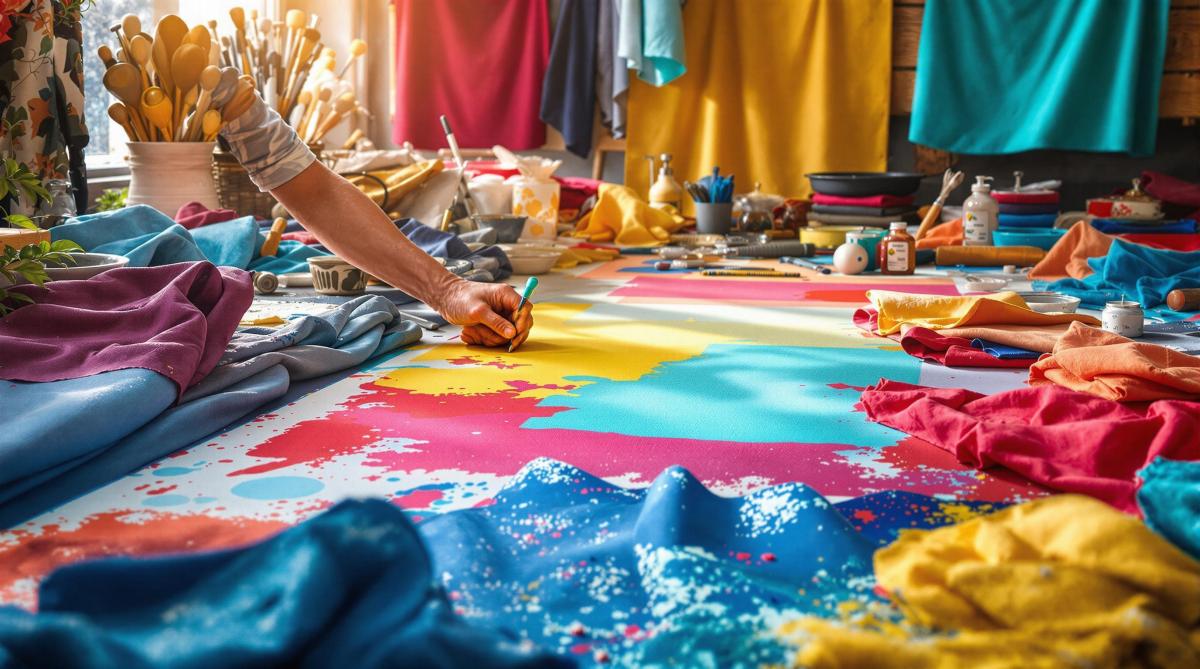
Fabric coatings are the secret to durable, vibrant, and high-quality textile prints. They regulate ink absorption, enhance colors, prevent bleeding, and protect fabrics from wear and environmental factors. Whether you’re printing t-shirts, banners, or upholstery, choosing the right coating makes all the difference. Here’s a quick overview:

  • Types of Coatings: Water-based (eco-friendly, soft feel), solvent-based (durable, weather-resistant), UV-cure (fast drying, glossy finish), and specialty coatings (fire-retardant, anti-microbial, weather-resistant).
  • Application Methods: Knife (precise), roller (high-speed), spray (textured fabrics), and screen (patterns).
  • Fabric Compatibility: Match coatings to fabric types like cotton, polyester, nylon, or blends for optimal results.
  • Usage & Printing Needs: Consider environmental exposure, durability, and print method compatibility (digital, screen, heat transfer).

Proper preparation, controlled work environments, and drying techniques ensure success. For eco-conscious options, water-based coatings are leading the way. Ready to elevate your textile printing? Let’s dive in.

Printing on Fabric: Coated and Uncoated | HP Latex | HP …

HP Latex

Main Coating Types

Fabric coatings are tailored to meet different printing needs. Here’s a breakdown of the main types, their strengths, and best uses.

Water-Based Coatings

Water-based coatings are a common choice for digital textile printing. Made with polymers dispersed in water, they are known for being less toxic and easy to clean up.

Some key benefits include:

  • Low VOC emissions
  • Vivid color output
  • Soft fabric feel
  • Wash resistance

These coatings are suitable for cotton, polyester, and cotton-poly blends, making them perfect for digital printing where precise ink absorption is critical.

Solvent-Based Coatings

Solvent-based coatings are known for their durability and resistance to chemicals. They bond tightly to fabric fibers, creating a tough and long-lasting print surface.

Key features include:

  • Quick drying
  • Strong adhesion
  • High resistance to weather
  • Excellent color fastness

These are the go-to option for outdoor materials and industrial textiles that need to withstand harsh conditions.

UV-Cure Coatings

UV-cure coatings are high-performance solutions that set instantly when exposed to ultraviolet light. They offer:

  • Instant curing for faster production
  • Zero VOCs for safer use
  • A glossy finish for enhanced visuals
  • Chemical resistance for longer product life

Best suited for high-speed production lines, these coatings are ideal when quick turnaround times are required.

Specialty Coatings

For specific needs, there are specialized coatings designed to deliver targeted results:

  • Fire-Retardant Coatings: Comply with safety regulations for public and industrial spaces while keeping fabrics breathable.
  • Anti-Microbial Coatings: Used in medical textiles and sportswear to prevent bacteria and odors.
  • Weather-Resistant Coatings: Shield fabrics from UV rays, water, temperature changes, and mold.

At Miro Printing & Graphics Inc., we choose coatings based on the unique demands of each project, ensuring top-notch print quality and long-lasting results for every application.

Coating Application Methods

Choosing the right coating technique can make a big difference, depending on the type of fabric and the printing requirements. Here’s a breakdown of the main methods to help you decide.

Knife Application

Also called blade coating, this method offers precise control over how thick the coating is applied. A sharp blade spreads the coating evenly across the fabric, making it a go-to for accuracy.

Key details about knife application:

  • Coating thickness: 0.001 to 0.040 inches
  • Excellent edge control
  • Minimal waste
  • Works for both lightweight and heavy fabrics

The blade’s angle matters – a 15° angle gives shallow penetration, while a 45° angle allows for deeper absorption.

Roller Methods

Roller coating systems are built for speed, making them ideal for large-scale operations. This method uses three rollers: one applies the coating, another controls thickness, and the third ensures consistent pressure.

  • Speeds range from 10 to 100 yards per minute, depending on the coating’s viscosity and the type of fabric.
  • Perfect for high-output production.

Spray Techniques

Spray coating is great for fabrics with textures or irregular surfaces. It atomizes the coating into fine particles, ensuring even coverage.

Tips for spray application:

  • Keep the nozzle 8–12 inches from the surface.
  • Use a pressure setting between 25–45 PSI.
  • Move at a steady speed of 2–3 feet per second.
  • Overlap each pass by 50% for consistent coverage.

Screen Methods

Screen coating is ideal for applying patterns or achieving consistent coverage. A mesh screen controls where and how the coating is applied.

Specifications for screen coating:

  • Mesh count: 80–230 threads per inch
  • Screen tension: Around 22–36 psi
  • Squeegee angle: 75° for the best transfer
  • Stroke speed: 1.5–2.5 feet per second

This method is excellent for creating textured effects and precise patterns.

Application Method Speed (yards/min) Coating Thickness Control Pattern Capability Best For
Knife 5–30 Excellent Limited Uniform coverage
Roller 10–100 Good None High-volume production
Spray 40–60 Fair Good Textured fabrics
Screen 30–50 Excellent Excellent Patterned applications

At Miro Printing & Graphics Inc., we tailor these techniques to meet the needs of each project, ensuring the best results for every job.

Selecting Your Coating

Fabric and Coating Matches

Choosing the right coating for your fabric is all about compatibility. Natural fibers usually work best with water-based coatings, while synthetic fabrics often need solvent-based options.

Fabric Type Recommended Coating Advantages Key Considerations
Cotton Water-based acrylic Breathable, soft finish Pre-treatment needed for heavy inks
Polyester Solvent-based urethane Durable, resistant to washing Requires higher curing temperatures
Nylon UV-curable Quick processing, glossy finish Adhesion promoter may be required
Silk Water-based protein Preserves drape Sensitive to curing temperatures
Blended fabrics Hybrid coatings Flexible performance Test on samples before use

Once you’ve matched the coating to the fabric, think about how it will be used.

Usage Requirements

Pick a coating that suits the intended application:

  • Environmental Exposure

    • Indoor: Standard water-based coatings
    • Outdoor: UV-resistant coatings
    • High-moisture areas: Waterproof coatings
  • Durability Needs

    • Light use: Basic protective coatings
    • Heavy wear: Reinforced polymer options
    • Industrial: Chemical-resistant formulations
  • Regulatory Compliance

    • Food contact: FDA-approved coatings
    • Children’s products: CPSIA-compliant options
    • Medical textiles: Antimicrobial certifications

After narrowing down your options, confirm that the coating works with your chosen printing method.

The coating must align with your printing process to ensure smooth application and lasting results.

Printing Method Compatible Coating Types Thickness (mils) Cure Temperature (°F)
Digital inkjet Microporous receptive 1.0-2.0 140-160
Screen printing High-solid content 2.5-4.0 250-300
Heat transfer Heat-resistant polymer 1.5-2.5 330-350
Direct-to-fabric Quick-dry receptive 0.5-1.5 180-200

Pay attention to coating viscosity, drying speed, surface energy, and color retention to ensure compatibility with your printer’s specifications.

At Miro Printing & Graphics Inc., we take the time to evaluate these factors to deliver the ideal coating for every project.

sbb-itb-ce53437

Best Practices for Coating Success

Fabric Preparation Steps

Getting the fabric ready is crucial for good adhesion and print quality. Start by cleaning the fabric to get rid of oils, dirt, and sizing. Always follow the supplier’s instructions to ensure the surface is evenly prepared.

Preparation Step Method Key Considerations
Pre-washing Warm water wash Stick to the recommended water temperature and pH levels for the fabric
Surface Treatment Corona/plasma treatment Boosts the fabric’s surface energy for better coating adhesion
Drying Forced air circulation Removes excess moisture effectively
Heat Setting Calendar pressing Follow temperature and pressure guidelines from the manufacturer

A well-prepared fabric ensures smoother and more predictable coating results.

Work Environment Control

A stable work environment is essential for consistent coating performance. Keep the workspace at steady temperature and humidity levels as specified by the coating manufacturer. Use air filtration systems to minimize dust and other contaminants, which can affect the coating’s quality.

Environmental Factor Recommendation Impact on Coating
Temperature Maintain a steady, recommended level Affects coating flow and viscosity
Humidity Keep within optimal ranges Ensures consistent drying rates
Air Quality Use proper air filtration systems Prevents contamination
Lighting Use appropriate lighting Protects coatings from excessive UV exposure

By controlling these factors, you’ll ensure a cleaner and more reliable coating process.

Proper Drying Methods

The drying process should match the type of coating you’re using. Let the coating settle before starting to dry. For water-based, solvent-based, or UV-cure coatings, follow the recommended settings for temperature, time, and airflow. Finish with a gradual cool-down to reduce tension and secure the final finish. Use an infrared thermometer to monitor conditions and avoid overheating.

Problem-Solving Guide

Once fabrics are prepared and the coating is applied, addressing common issues becomes a key step to achieving the desired results.

Fixing Poor Adhesion

If the coating doesn’t stick well, check the fabric pre-treatment process and consider using an adhesion promoter. When in doubt, reach out to printing experts for advice. These steps help improve adhesion and ensure better print quality.

Coating Coverage Issues

To fix uneven coating, examine variables like speed, pressure, and environmental conditions. Adjust these settings based on the fabric type and coating requirements to achieve consistent coverage.

Preventing Coating Damage

Proper handling and storage are essential to protect coated fabrics. Use strict handling protocols, maintain controlled environments, and take extra care during transportation. These precautions help preserve the coating and prevent damage.

Color Management

Use a reliable color management system to keep colors consistent. Test small swatches and make adjustments as needed. Regularly calibrate equipment and monitor the process to ensure accurate color reproduction across all materials.

At Miro Printing & Graphics Inc., advanced quality control systems help maintain coating consistency and precise color output for every project.

New Developments

Advancements in coating technologies are introducing options that prioritize both performance and eco-conscious practices.

Eco-Friendly Coating Solutions

The push for greener solutions has led to the rise of environmentally conscious fabric coatings. For instance, water-based formulations are now widely used to cut down on VOC emissions while still delivering excellent print quality. These coatings incorporate natural polymers and biodegradable materials, helping to lessen their impact on the environment.

At Miro Printing & Graphics Inc., we’ve embraced these advancements, offering high-quality prints that align with eco-conscious principles.

Conclusion

Fabric coatings play a key role in achieving high print quality and durability. The following insights can guide your coating choices for better, long-lasting results.

Quick Reference Guide

Here are some important factors to consider when selecting a coating:

Consideration Key Points
Fabric Type Ensure the coating is compatible with the specific fabric’s properties.
Print Method Verify the coating supports digital, offset, or large format printing.
Eco-Friendly Options Look into water-based or other environmentally conscious alternatives.
Application Method Decide between knife, roller, spray, or screen techniques.
Drying Needs Factor in the required curing time and conditions for the coating.

This guide highlights the essentials, but expert advice can help bring these considerations to life.

Miro Printing & Graphics Inc. Services

Miro Printing & Graphics Inc. offers advanced fabric printing solutions tailored to meet diverse needs. From their Hackensack, NJ location, they handle everything in-house, including custom projects, bindery, and specialized coating applications.

"With meticulous attention to detail, our print shop has a customized approach that is unmatched by big online printing companies or franchises." – Miro Printing & Graphics Inc.

Their customers consistently share positive feedback. For instance, Julia I. shared:

"Mike and his team completed a complex job in record time for a very reasonable price. I’d approached numerous printers about this job with no success, but these guys just made it work and were super easy to deal with."

Related Blog Posts

https://app.seobotai.com/banner/banner.js?id=67dce2d983b63ee70fa0d889

5 Tips to Prevent Cracking on Folded Prints

Learn essential techniques to prevent cracking on folded prints, ensuring high-quality, durable results for your printed materials.

Avoid cracking on folded prints with these 5 simple tips:

  1. Choose the Right Paper: Always fold along the grain direction for smoother, crack-free folds.
  2. Score Before Folding: Pre-crease the paper to reduce stress on fibers and ensure clean folds.
  3. Use Proper Folding Techniques: Fold slowly, apply even pressure, and avoid common mistakes like folding against the grain.
  4. Apply Protective Finishes: Lamination strengthens paper and prevents cracks, especially for frequently handled prints.
  5. Optimize Printer Settings: Control ink application and adjust settings to keep paper flexible and durable.

These steps ensure your printed materials look professional and last longer. Read on for detailed tips and techniques.

How To Fold Heavy Card Stock without Cracking Toner or …

1. Select Paper Type

When choosing paper, make sure it’s suitable for folding to avoid cracks along the folds. Pay attention to the grain direction – this refers to how the paper’s fibers are aligned. Folding with the grain ensures smoother bends and minimizes the risk of cracking.

How to Find the Grain Direction

Before printing or folding, check the grain direction by:

  • Gently bending the paper both horizontally and vertically.
  • The direction that bends more easily is the grain.
  • Always fold along this direction for the best results.

At Miro Printing & Graphics Inc., we stress the importance of folding with the grain to create polished, long-lasting printed materials. It’s a simple step that makes a big difference in the final product.

2. Score Paper First

Scoring creates a controlled crease in paper, making it easier to fold without cracking. This step ensures clean, precise folds that look professional and hold their shape.

2.1 Scoring Basics

Scoring compresses the paper fibers along the fold line. This guides the fold and reduces stress on the paper, minimizing the risk of cracking.

2.2 Scoring Tools

The right tools make all the difference when it comes to scoring. Professional print shops, like Miro Printing & Graphics Inc. in Hackensack, NJ, use specialized equipment to achieve consistent, high-quality creases.

2.3 Steps to Score Paper

  • Mark the Fold Lines
    Lay your paper on a flat surface and lightly mark where you want to fold.
  • Apply Steady Pressure
    Use your scoring tool to trace the marked line with even pressure. Too much force can damage the paper, while too little won’t create a strong crease.
  • Test Your Score
    Try scoring on a sample piece first. This ensures the crease is effective and doesn’t weaken the paper before you move on to your full project.
sbb-itb-ce53437

3. Master Folding Methods

To achieve flawless folds and avoid cracks, precision is key. Your technique when handling and folding the paper plays a huge role in determining whether you get a smooth crease or visible damage.

3.1 Proper Folding Steps

Folding successfully requires a steady, careful approach. Follow these steps for the best results:

  • Start with a Clean Surface: Use a flat, clean workspace to keep dirt or debris from interfering with your fold.
  • Position the Paper Correctly: Make sure the scored side of the paper faces up. This helps the fold naturally follow the crease.
  • Use Both Hands: Place your fingers on either side of the score line, about 1 inch apart, for better control.
  • Apply Even Pressure: Begin at the center and press outward evenly to avoid bubbles and ensure a smooth fold.
  • Burnish the Fold: Use a bone folder to press down the crease for a sharp, polished finish.

Once you’ve mastered these steps, it’s equally important to understand what NOT to do during the folding process.

3.2 Folding Errors to Avoid

Here are common mistakes and how to prevent them:

Mistake What Happens How to Avoid It
Rushing the Fold Leads to uneven folds or cracks Take your time and fold slowly
Folding Against the Grain Weakens the paper structure Always fold parallel to the grain
Using Too Much Force Damages the paper fibers Apply gentle, steady pressure
Ignoring Score Lines Causes misaligned folds Make sure the fold follows the scored crease
Folding at Odd Angles Creates stress points Stick to 90-degree angles for clean folds

For thicker paper stocks, like 100 lb or higher, extra care is necessary. These materials are less forgiving and more prone to cracking, so fold right after scoring while the fibers are still compressed.

Keep in mind that paper type matters. Coated papers demand a lighter touch, while textured papers might need firmer pressure to get a neat crease. Adjust your technique accordingly for the best outcome.

4. Add Protective Finishes

After mastering folding techniques, the next step to ensure your print lasts longer is applying a protective finish. One popular choice is lamination, which strengthens the paper and helps distribute stress from folds, reducing the chances of cracking.

4.1 Benefits of Lamination

Lamination acts as a shield for your print. It not only strengthens the paper but also protects it from cracking caused by repeated use or changes in humidity.

4.2 Types of Lamination

Lamination finishes vary in flexibility and strength. For designs with sharp or multiple folds, go for a flexible finish. On the other hand, sturdier finishes are ideal for heavier paper stocks or items that will see frequent handling. Choose the type of lamination based on your paper’s weight, the location of folds, and how the item will be used.

For professional lamination services tailored to your design needs, reach out to Miro Printing & Graphics Inc. in Hackensack, NJ. They can help ensure your prints look great and stay durable.

5. Set Up Your Printer

Getting your printer settings right is key to avoiding cracks in folded prints. Just like choosing the right paper and scoring properly, fine-tuned printer settings help keep the paper flexible.

5.1 Control Ink Amount

Too much ink can make the paper stiff and prone to cracking when folded. To keep the fold areas flexible and strong:

  • Reduce color saturation in dark or solid areas.
  • Allow enough drying time before folding.
  • Add subtle patterns or gradients to dark areas to lower the risk of cracking.

By managing how ink is applied, you can improve the durability and appearance of your folded prints.

5.2 Best Printer Settings

Adjusting your printer settings ensures smooth ink application and proper paper handling:

  • Use high-quality print settings to evenly distribute ink.
  • Match the paper type in the printer settings to the paper you’re using.
  • Slow down print speeds to allow better ink settling.
  • Choose color modes that control ink volume effectively.
  • Set the fuser temperature to a moderate level.
  • Pick a resolution that balances detail with ink usage.

For complex folded projects like brochures or presentations, working with a professional can make all the difference. At Miro Printing & Graphics Inc., our team specializes in adjusting printer settings to suit different paper types, ensuring your prints look great and hold up over time.

Conclusion

Avoiding cracks in folded prints starts with choosing the right paper and involves careful scoring, folding, finishing, and printer setup. By applying these five tips, you can maintain the quality and durability of your folded prints.

For more intricate projects, having experts handle the process makes all the difference. As one happy client shared:

"Great customer service that we didn’t get with our old online printer attention to detail is what makes the difference!"

This highlights the importance of precision in every step. A combination of proper material selection and meticulous techniques results in professional, long-lasting prints.

At Miro Printing & Graphics Inc., delivering high-quality folded prints is a priority. One client praised their experience:

"Mike and his team completed a complex job in record time for a very reasonable price. I’d approached numerous printers about this job with no success, but these guys just made it work and were super easy to deal with. I even received a video of my print sample (a mini booklet) for approval before they proceeded with the rest. Best service I’ve ever received from a printer; couldn’t recommend Miro more highly."

Related Blog Posts

https://app.seobotai.com/banner/banner.js?id=67dcb48c83b63ee70fa08be9

How to Ensure Color Accuracy in Proofing

Learn essential steps for achieving accurate color proofing in print projects, from calibration to professional services.

Want your printed colors to match your design perfectly? Here’s how to do it:

  1. Use the Right Color Space: Start with CMYK for print projects to avoid surprises when converting from RGB.
  2. Calibrate Your Devices: Regularly adjust your monitor and printer settings using ICC profiles for consistent color.
  3. Control Your Environment: Work in a neutral space with D50 lighting and avoid sunlight to ensure accurate color perception.
  4. Choose the Right Proofing Paper: Match your proof paper to the final material in weight, finish, and brightness.
  5. Check Digital and Physical Proofs: Use digital proofs to spot issues early, then verify with physical proofs for final accuracy.

For complex projects, professional print services, like Miro Printing & Graphics Inc., offer advanced tools and expertise to ensure perfect color matching.

Key Tip: Proper calibration, standardized lighting, and quality materials are the foundation of accurate proofing.

Let’s break it down step by step.

Beyond Monitor Calibration – Get Prints That Match Your Display

Color Management Basics

Managing colors correctly ensures that what you see on your screen matches the final printed result.

RGB vs CMYK Color Spaces

RGB (Red, Green, Blue) and CMYK (Cyan, Magenta, Yellow, Black) are two different methods for reproducing colors. Screens like monitors and TVs rely on RGB, combining light to create colors. Printers, on the other hand, use CMYK, blending inks to produce colors on paper.

Here’s how they differ:

  • RGB covers a wider range of colors than printers can reproduce.
  • CMYK reflects the limitations of physical printing.
  • Converting from RGB to CMYK often results in less vibrant colors.

For print projects, switch your designs to CMYK early to avoid surprises during proofing.

What Are ICC Profiles?

ICC profiles act as translators, ensuring colors look consistent across devices – whether you’re working on a monitor, a printer, or another device. Using these profiles alongside regular calibration keeps your colors consistent from start to finish.

How to Calibrate Your Devices

To achieve accurate colors, follow these steps:

  • Monitor Calibration: Adjust your monitor monthly. Use a brightness setting of 120–160 cd/m², a 6500K white point, and a gamma of 2.2.
  • Printer Calibration: Run nozzle checks, print test charts, fine-tune density, and create custom ICC profiles for your printer.
  • Environment Setup: Work in a neutral space with D50 lighting, avoid direct sunlight, and maintain 45–55% humidity.

Setting Up Your Proofing Space

Fine-tuning your proofing space is essential for achieving accurate color results. The way your workspace is arranged plays a big role in how you perceive colors, which directly impacts the quality of your proofs.

Lighting Requirements

Getting the lighting right is key to proper color evaluation. Your proofing area should meet these guidelines:

  • Controlled Ambient Light: Keep ambient light at 2,000 lux (±500 lux).
  • Color Temperature: Use lighting fixtures rated at D50 (5000K).
  • Color Rendering Index (CRI): Use bulbs with a CRI of 90 or higher.
  • Light Positioning: Position lights at a 45-degree angle.

Avoid combining different light sources and block any direct sunlight, as these can distort color perception. To minimize reflection issues, paint your walls a neutral gray, ideally Munsell N8.

Monitor Calibration Guide

1. Initial Setup

Allow your monitor to warm up for 30 minutes under stable lighting conditions.

2. Calibration Process

Adjust your monitor to these settings:

  • Brightness: 120-160 cd/m²
  • White Point: D50 (5000K)
  • Gamma: 2.2
  • Contrast Ratio: At least 200:1

3. Verification

Use standard color charts to confirm calibration accuracy and make adjustments if needed. Recalibrate your monitor monthly to ensure consistent performance.

Selecting Proof Paper

Pick proof paper that closely matches your final print material:

  • Weight: Match the paper weight within 10% of the final stock.
  • Finish: Use the same surface finish (matte, gloss, or semi-gloss).
  • Whiteness: Choose paper with similar brightness levels.
  • Opacity: Ensure the opacity matches the final material.

Store proofing paper in a climate-controlled space at 68-72°F (20-22°C) with 45-55% relative humidity. This helps prevent warping or color shifts caused by environmental changes.

For precise color proofing, use standardized proofing papers that meet ISO 12647-7 specifications. These papers ensure consistent and reliable color results across different print jobs.

sbb-itb-ce53437

Color Proofing Methods

Color proofing ensures that digital designs translate accurately into printed materials. Start with digital proofs to identify any issues, then move to physical tests for final verification.

With a calibrated workflow and a color-managed system in place, follow these steps for digital proofing.

Digital Proofing Steps

1. Check the Color Profile

Make sure the design is in CMYK mode, uses the correct ICC profile, converts all images to CMYK, and has properly defined spot colors.

2. Set Up Soft Proofing

Use your design software to simulate print output:

  • Enable proof colors (Ctrl+Y in Adobe software)
  • Choose the right printer profile
  • Turn on black point compensation
  • Set the rendering intent to "Relative Colorimetric"

3. Review Digital Colors

Examine these elements carefully:

  • Ensure brand colors align with specified values
  • Check gradients for smooth blending
  • Inspect overprints and transparency effects
  • Confirm black text settings (100% K for small text vs. rich black for large areas)

Once the digital file is optimized, move on to physical proofs to confirm accuracy.

Physical Proof Creation

Physical proofs offer a hands-on way to verify colors. Follow these steps to create reliable proofs:

  • Print a test sheet with color bars and registration marks
  • Include a gray balance chart to check neutrality
  • Print several copies to confirm consistency
  • Allow prints to dry for 24 hours before evaluation
  • Compare the proofs to the digital file

To ensure precise color matching, use professional tools like:

  • A spectrophotometer to measure color values
  • A densitometer to check ink density
  • Color control strips for monitoring the printing process

If you notice differences between digital and physical proofs, investigate and resolve the discrepancies.

Fixing Proof Differences

Document the differences, including delta E values, viewing conditions, and paper specifications. Common issues may include paper mismatches, calibration drift, or ICC profile errors.

How to Correct Issues

Take these steps to address problems:

  • Adjust specific color channels as needed
  • Update your color management settings
  • Modify output curves if required
  • Create custom printer profiles for better accuracy

Professional Proofing Services

For simple projects, basic in-house proofing might get the job done. But when it comes to achieving accurate color reproduction and high-quality results, professional print services bring specialized expertise and advanced tools to the table. Their controlled environments and attention to detail ensure your materials look exactly as intended.

Why Choose Professional Print Shops?

Print shops offering professional services follow strict color management practices, reducing the risk of errors and delivering consistent results. Here’s what sets them apart:

  • Advanced Equipment: Tools like industrial spectrophotometers and densitometers ensure precise color measurements.
  • Standardized Lighting: D50 viewing booths provide a consistent color temperature for evaluating prints.
  • Precise Color Management: Devices are regularly calibrated, and ICC profiles are standardized for accuracy.
  • Skilled Specialists: Experienced professionals understand the finer details of color reproduction.
  • Rigorous Quality Checks: Systematic procedures ensure consistent color and print quality.

These services catch and fix subtle color variations that might go unnoticed otherwise. They also address key factors like color gamut accuracy, dot gain adjustments, paper compatibility, and ink density.

One standout example of such expertise is Miro Printing & Graphics Inc..

Miro Printing & Graphics Inc.

Miro Printing & Graphics Inc.

Located in Hackensack, NJ, Miro Printing & Graphics Inc. offers a full range of digital and offset printing services with a strong emphasis on color management. Their proofing services include:

  • Digital Proofing: High-resolution proofs that simulate the final print conditions.
  • Press Proofing: Exact color matching using the specified paper stock.
  • Custom ICC Profiles: Tailored profiles for unique project needs.
  • Cross-Platform Accuracy: Consistent color reproduction across different printing technologies.

For businesses that require precise color matching, Miro Printing goes the extra mile with pre-press consultations, multiple proofing options, color correction services, and a detailed archive of color profiles and specifications. Partnering with experts like Miro Printing ensures your printed materials meet your brand standards while saving you time and effort.

Summary

Getting accurate color proofing right takes a mix of skill, a properly set up workspace, and strict process management. A solid understanding of color spaces and ICC profiles is key to ensuring consistent colors across different devices and formats.

A well-prepared workspace is crucial. This includes D50 lighting and monitors that are regularly calibrated. Pairing this with consistent calibration and matching proof materials helps ensure that your prints closely match the original design.

For projects where precision is non-negotiable, professional print services are a game-changer. Companies like Miro Printing & Graphics Inc., with over 30 years of experience, bring the tools and know-how to tackle even the most demanding color requirements while sticking to tight deadlines.

Professional proofing delivers reliable results and brand consistency by focusing on:

  • Regular equipment calibration
  • Standardized viewing conditions
  • Rigorous quality checks

Whether you handle it internally or work with experts like Miro Printing & Graphics Inc., maintaining a detailed proofing process ensures dependable and consistent printed colors every time.

Related Blog Posts

https://app.seobotai.com/banner/banner.js?id=67da20b4cfd1b2222c56c3fe

10 Typography Rules for Print Branding

Learn essential typography rules for print branding to enhance readability, visual appeal, and brand perception in your materials.

Typography is the backbone of effective print branding. It impacts readability, visual appeal, and how your brand is perceived. Here’s a quick summary of the 10 essential rules for creating impactful typography in print materials:

  1. Choose Brand-Appropriate Fonts: Select fonts that reflect your brand’s personality. Pair serif, sans-serif, or display fonts for contrast.
  2. Establish Clear Text Hierarchy: Use different font sizes, weights, and spacing to guide readers through your content.
  3. Set Proper Spacing: Adjust letter, line, and paragraph spacing for a polished look.
  4. Maintain Typography Uniformity: Stick to 2-3 fonts and create a typography style guide for consistency.
  5. Ensure Readability: Use optimal line lengths, contrast, and font sizes for clear communication.
  6. Use Bold and Italics Sparingly: Apply emphasis styles only where necessary to avoid clutter.
  7. Pick Print-Safe Colors: Use high-contrast CMYK colors and adjust for paper types.
  8. Follow Brand Style Rules: Align typography with your brand’s guidelines for cohesive materials.
  9. Prepare Files for Printing: Embed fonts, use proper resolution (300 DPI+), and check color settings.
  10. Check and Adjust Results: Review printed samples for clarity, consistency, and quality.

These principles ensure your typography looks professional, aligns with your brand, and communicates effectively in print materials.

Typography Tutorial – 10 rules to help you rule type

1. Select Brand-Appropriate Fonts

Choose fonts that reflect your brand’s personality while ensuring they are easy to read in print.

Primary and Secondary Fonts

Pick two main fonts:

  • Primary font: Used for headlines and titles.
  • Secondary font: Used for body text and detailed information.

The key is to pair fonts that complement each other but still provide enough contrast. For instance, you might combine a bold serif font for headlines with a clean sans-serif font for body text – or the other way around.

Types of Fonts for Print

Here are three font categories to consider:

  • Serif Fonts: Great for brands that want to convey tradition and authority. Examples include:

  • Sans-Serif Fonts: Ideal for a modern and clean look. Examples include:

  • Display Fonts: Best used sparingly for logos or main headlines. Stick to one display font to maintain consistency.

Technical Details to Keep in Mind

  • Ensure the font includes a full character set and offers various weights (like light, regular, and bold).
  • Obtain the necessary commercial licenses for printing.
  • Convert fonts to outlines before sending files to avoid any issues during production.

Font Size Recommendations

For readability, stick to these guidelines:

  • Body text: 9–12 pt
  • Headlines: 14–24 pt
  • Minimum size: 6 pt (adjust based on how far away the text will be viewed).

Finally, always provide font files along with outlined artwork to avoid production delays.

2. Create Clear Text Hierarchy

A clear text hierarchy helps guide readers through printed materials, making it easier to follow and understand the content. Use these tips to build an organized visual structure based on your font choices.

Size and Weight Hierarchy

Varying size and weight can emphasize different levels of importance:

  • Primary Level: Main headlines (24–36 pt)
  • Secondary Level: Subheadings (18–24 pt)
  • Tertiary Level: Section titles (14–16 pt)
  • Body Text: Regular content (9–12 pt)

Visual Distinction Techniques

Enhance readability by applying these adjustments:

  • Use bold weights for headlines to grab attention.
  • Stick to regular weight for body text for easy reading.
  • Apply light weights for supplementary details.
  • Add more space above headings than below them.
  • Keep paragraph spacing consistent (around 1.5× the text size).
  • Provide wider margins for key text blocks to make them stand out.

Color and Contrast

Choose darker colors for main headlines and gradually lighter shades for supporting text to create a natural flow.

Practical Layout Tips

Whitespace Management

  • Add generous whitespace around headlines to make them pop.
  • Indent important paragraphs or quotes for emphasis.
  • Use consistent spacing to create clear section breaks.

Alignment Structure

  • Keep headings left-aligned to improve readability.
  • Maintain uniform indentation levels throughout.
  • Use hanging punctuation for bullet points to keep lists neat.

3. Set Proper Spacing

Once you’ve established a clear text hierarchy, the next step is to adjust spacing for a polished, readable layout. Good spacing not only improves readability but also enhances the overall visual appeal.

Letter Spacing (Tracking)

Here are some general recommendations for tracking:

  • Headlines (above 24pt): Adjust between -20 to 0
  • Body text (9–12pt): Adjust between 0 to +15
  • Small text (below 9pt): Adjust between +15 to +25

Line Spacing (Leading)

For line spacing, follow these guidelines:

  • Body Text: Set leading to 120–150% of the font size for comfortable reading.
  • Headlines: Use tighter spacing, around 110–120% of the font size.
  • Long-form Text: Increase leading to about 160% to improve readability over extended text blocks.

Paragraph Spacing

When setting up paragraph spacing, aim for consistency:

  • Add space equal to 1.5× the line height between paragraphs.
  • For new sections, use spacing equivalent to 2× the line height.
  • Ensure spacing is uniform throughout the document.

Word Spacing

Word spacing depends on text alignment and its purpose. Use the table below as a guide:

Alignment Recommended Word Spacing Best Use Case
Left Default (100%) Body text
Justified 85–115% Formal documents
Center 90–100% Headlines

Special Considerations

Print-Specific Adjustments

  • Leave at least 0.125 inches of margin to account for trimming during the printing process.
  • Near fold lines, reduce spacing by 0.0625 inches and consider the thickness of the paper stock when adjusting.

Digital File Preparation

  • Follow proper file conversion protocols for digital formats.
  • For complex printing needs, consult with professional print shops like Miro Printing & Graphics Inc. in Hackensack, NJ, to ensure quality results.

4. Keep Typography Uniform

Maintaining consistent typography is key to building a strong brand identity and projecting a professional image. Here’s how to ensure your typography stays uniform:

Font Family Management

Stick to just 2–3 fonts to keep your designs clean and cohesive:

  • Use a maximum of two or three primary fonts.
  • Pair one serif font with one sans-serif font for balance.
  • Add a display font only if it’s absolutely necessary for special occasions or unique designs.

Create a Typography Style Guide

Document key typography details to ensure consistency across all materials. Include these elements:

Element Specification Usage Guidelines
Primary Font Font name & weights For main body text and headlines
Secondary Font Font name & weights For subheadings and callouts
Font Sizes Specific point sizes For various content types
Line Heights Exact measurements Adjust for different text blocks
Letter Spacing Precise values Differentiate headers and body text

A well-documented style guide ensures your typography aligns with your brand identity for every project.

Cross-Platform Consistency

When working on files for different print materials, follow these steps:

  • Convert logos and key elements to outlines.
  • Package fonts with design files to avoid missing assets.
  • Use OpenType fonts for better compatibility.
  • Identify backup fonts to handle fallback scenarios.

These practices help maintain a seamless, polished look across all your print designs.

Version Control

Master templates are your best friend for keeping everything consistent:

  • Develop templates for frequently used materials.
  • Store approved font files in one central location.
  • Document any allowed variations in typography.
  • Keep a changelog to track updates or changes.

Size Relationships

Set clear point sizes for each text element to ensure consistency:

  • Headlines: 24–36 pt
  • Subheadings: 18–24 pt
  • Body Text: 10–12 pt
  • Captions: 8–9 pt

This structure ensures readability and balance throughout your designs.

When preparing typography for print, keep these tips in mind:

  • Use a minimum font size of 8 pt to ensure readability.
  • Test fonts at actual sizes on the paper stock you’ll use to check for clarity.

5. Make Text Easy to Read

Clear and readable text is essential for effective print materials. Here’s how to ensure your text looks great and is easy to read:

Optimal Line Length

Keep line lengths within these ranges for better readability:

  • General print: 45–75 characters
  • Business cards: 35–45 characters
  • Brochures: 60–65 characters

Once you’ve set the line length, adjust the line spacing to improve clarity.

Line Spacing (Leading)

Set line spacing to about 120–150% of the font size. This ensures the text feels open and easy on the eyes.

Contrast and Background

High contrast is key for legibility. Use dark text on light backgrounds and follow these tips:

  • Aim for at least a 70% contrast difference between text and background colors.
  • Avoid placing text over busy patterns or photographs, as it can make reading difficult.

Fine-tune your typography for print with these adjustments:

  • Slightly increase tracking for smaller text sizes, and manually adjust kerning for headlines or logos.
  • Use a heavier font weight for reverse type (light text on dark backgrounds).
  • Keep body text at a minimum size of 8 pt for comfortable reading.

Paper Selection and Typography

The paper you choose impacts how your typography looks. Here’s what to consider:

Paper Type Typography Tips
Coated Gloss Reduce contrast slightly for balance.
Uncoated Increase font weight for better visibility.
Textured Avoid delicate serif fonts.
Recycled Test for ink spread before finalizing.

After selecting your paper, adjust text effects to work with any specialty finishes.

Special Considerations for Print Effects

When using specialty printing techniques, make these adjustments:

  • Embossed text: Use a font size of at least 12 pt.
  • Foil stamping: Avoid using fonts with thin serifs.
  • Spot UV: Ensure text is at least 10 pt.
  • Reverse type: Increase font weight for better readability.

Physical Environment

Think about where the material will be viewed to ensure it remains readable:

  • Indoor settings: Standard contrast and font sizes work well.
  • Outdoor viewing: Increase contrast and text size by 10–15%.
  • Reading distance: Use 6-inch distance for business cards and 18-inch distance for posters.
  • Motion viewing: Opt for larger font sizes for moving visuals.

For professional results, consider working with experts like Miro Printing & Graphics Inc. in Hackensack, NJ. They offer a full range of services – from digital and offset printing to in-house bindery and design – ensuring your typography looks sharp and polished in every print project. You can learn more at Miro Printing & Graphics Inc..

sbb-itb-ce53437

6. Use Bold and Italics Carefully

Using text emphasis thoughtfully can make your print materials more effective and visually appealing. When paired with proper spacing and hierarchy, bold and italic styles can enhance clarity without overwhelming the design. Here’s how to use them effectively:

Bold Text Guidelines

Bold text is ideal for:

  • Section headers and subheadings
  • Key terms or product names (limit to 2 per paragraph)
  • Contact details in business documents
  • Warnings or critical notices

Avoid bolding:

  • Entire sentences or paragraphs
  • Several words close together
  • Text used purely for decoration

Italic Text Applications

Italics are best suited for:

  • Titles of publications
  • Foreign language phrases
  • Highlighting single words for emphasis
  • Scientific terms
  • Photo credits or captions

Adjusting Bold Weight for Different Paper Types

The type of paper you use can affect how bold text appears. Here’s a quick guide:

Paper Type Recommended Bold Weight
Coated Stock Regular bold weight (600)
Uncoated Stock Semi-bold weight (500)
Newsprint Extra bold weight (800)
Specialty Papers Test before production

Combining Emphasis Styles

When mixing bold and italic styles:

  • Avoid combining both styles on the same text
  • Leave at least two lines of space between emphasized sections
  • Limit emphasized text to no more than 10% of the total content
  • Use only one emphasis style per paragraph

Size Relationships

For readability, follow these size tips:

  • Keep bold text within 2 points of the body text size
  • Raise italic text by 0.5 points for better visibility
  • Minimum size for bold text: 7 pt
  • Minimum size for italic text: 8 pt
  • Ensure bold text remains sharp after printing
  • Verify italic angles are clear, even at smaller sizes
  • Test emphasis styles on the actual paper stock you’ll use
  • Add 1-2 points of extra spacing (leading) around emphasized text

Preparing Digital Files

For digital design and production:

  • Use true bold and italic fonts instead of simulated styles
  • Include all font weights in packaged design files
  • Convert emphasized text to outlines for logo files
  • Preview how emphasis styles render in various file formats

7. Choose Print-Safe Colors

Picking the right colors for print is crucial for readability and meeting print standards. Here’s what you need to know.

Color Contrast Requirements

To ensure your text is easy to read:

  • Maintain at least a 4.5:1 contrast ratio between text and background.
  • Use dark shades for body text (80% or higher black).
  • Avoid light text on light backgrounds.
  • Test text colors at their final print size.

CMYK Color Guidelines

When setting up CMYK color values, follow these guidelines:

Text Size Recommended Color Settings
Body Text (8-12pt) Single color, 100% value
Headlines (14pt+) Up to 2 colors, minimum 80% value
Reversed Text Single color, minimum 70% value
Decorative Text Maximum 3 colors, test thoroughly

Paper Stock Considerations

Paper type can affect how colors look in print. Adjust accordingly:

  • Uncoated Paper: Colors may appear darker; reduce values by 10–15%.
  • Coated Stock: Produces more vibrant colors.
  • Recycled Paper: Slight color shifts are possible; test before production.
  • Specialty Papers: Always test for color accuracy.

These adjustments help achieve sharp and consistent results.

Color Registration

Proper color registration is key for small text and detailed designs:

  • Avoid multi-color fonts for text under 12pt.
  • Use single color channels for small text.
  • Add a 0.5pt trap for overlapping colors.
  • Set black text to overprint.

Color Breakdowns

Use these breakdowns for clear and crisp printing:

  • Black Text: 100% K for text under 14pt.
  • Rich Black Text: 40C, 30M, 30Y, 100K (for 14pt+ text).
  • Colored Text: Ensure at least 70% in a single color channel.
  • White Text: Knock out from backgrounds with over 40% density.

Digital File Preparation

When preparing your files for printing:

  • Convert all colors from RGB to CMYK.
  • Embed color profiles and add spot colors as separate channels.
  • Save your color swatches within the project files.

Special Printing Effects

To add flair to your typography, consider these effects:

  • Metallic Inks: Use only for text 14pt or larger.
  • Spot UV: Maintain a minimum stroke width of 2pt.
  • Sans-Serif Fonts: Best for effects on text smaller than 16pt.
  • Embossing: Recommended for sans-serif fonts, 18pt or larger.

These steps ensure that your printed materials look polished and professional.

8. Follow Brand Style Rules

Combine essential typography principles with your brand’s specific guidelines to ensure consistent and polished print results.

Brand Guidelines Integration

Keep your brand’s typography rules well-documented and easy to follow:

  • Include font usage details in a brand style guide.
  • Define clear roles for primary and secondary typefaces.
  • Specify font sizes and weights for different contexts.
  • Set consistent line spacing and kerning values.

Typography Specifications

Element Details
Primary Font Font name, weights, and sizes for various uses
Secondary Font Font name, weights, and allowed combinations
Minimum Size Text: 8pt, Reversed: 10pt
Line Spacing Body: 120-140% of font size
Letter Spacing Headlines: -20 to 0, Body: 0 to +20

Document Templates

Standardize your business documents, marketing materials, corporate communications, and packaging with consistent templates.

Typography Variations

Define how typography can be adjusted within your brand’s framework:

  • Headlines: Use up to two font weights.
  • Body Text: Stick to one weight, with an italic option if needed.
  • Pull Quotes: Apply special formatting aligned with brand rules.
  • Captions: Follow specific size and weight guidelines.

These variations help maintain a professional and cohesive look while simplifying quality control and file management.

Quality Control Process

Check for consistency in fonts, spacing, alignment, hierarchy, and color usage according to your brand’s style guide.

File Management

Streamline your workflow by organizing fonts and templates:

  • Store approved fonts in one central location.
  • Lock templates to prevent unauthorized changes.
  • Document font licenses.
  • Keep backups of all brand fonts and templates.

Brand Evolution

Ensure your typography guidelines stay current as your brand evolves:

  • Update the style guide with any changes.
  • Notify team members about updates.
  • Set deadlines for implementing changes.
  • Archive older versions of guidelines.
  • Adjust templates to reflect updates.

Stick to your brand rules during print production to achieve professional results:

  • Include all necessary font files with print-ready documents.
  • Maintain backup copies of original files.
  • Test print samples before full production.

For expert assistance, local print shops like Miro Printing & Graphics Inc. in Hackensack, NJ, offer pre-press review services to ensure your typography is production-ready.

9. Prepare Files for Printing

Getting your files ready for printing requires careful attention to detail to ensure your typography looks perfect on paper.

Font Embedding and Packaging

When sending files for print, make sure all fonts are properly included:

  • Convert fonts to outlines to avoid missing font issues.
  • Embed fonts in PDFs to maintain consistency.
  • Include all font files used in the design.
  • Convert any special characters to outlines for accurate reproduction.

Resolution Requirements

Set the resolution based on the type of print material to ensure sharp and clear results:

Print Material Minimum DPI Optimal DPI
Business Cards 300 600
Brochures 300 450
Large Format 150 300
Fine Text 600 1200

Color Settings

Adjust color settings to ensure accurate typography in the final print:

  • Use the CMYK color space for all text.
  • Avoid using multiple colors for small text to prevent blurring.
  • Keep reversed text sizes at 10pt or larger for readability.
  • Use rich black (a mix of CMYK values) for deeper, more vibrant blacks.

Pre-flight Checklist

Before sending your files to print, review these key typography elements:

  • Ensure font compatibility across systems.
  • Check for missing characters or symbols.
  • Fix any broken font links.
  • Address text reflow issues that may occur during file conversion.
  • Review transparency effects and ensure they won’t cause problems.
  • Confirm overprint settings are applied correctly.

File Format Standards

Export your files in the correct formats for the type of printing:

  • PDF/X-1a: Ideal for standard commercial printing.
  • PDF/X-4: Suitable for digital printing with transparency.
  • Native files: Include these for last-minute adjustments if needed.

Technical Specifications

Adjust typography based on the printing method to ensure readability and quality:

Print Method Minimum Type Size Reverse Type Size
Digital 6pt 8pt
Offset 4pt 6pt
Screen 12pt 14pt

Production Notes

Include detailed instructions to guide the production team:

  • Specify font substitution preferences.
  • Highlight critical alignment requirements.
  • Note any special finishing effects like embossing or foil stamping.
  • Provide quality control points for final checks.

Miro Printing & Graphics Inc. in Hackensack, NJ, offers pre-press services to ensure your typography meets professional standards. Their in-house team can review your files for potential issues before printing begins.

Version Control

Keep your files organized to avoid confusion:

  • Save both progressive versions and the original files.
  • Clearly label the final print files.
  • Document any production adjustments made along the way.

Before full production, test your files to verify everything is correct:

  • Request digital proofs for review.
  • Check for color accuracy and consistency.
  • Ensure all fonts render properly.
  • Confirm the size and spacing align with your design.
  • Inspect reversed type areas for clarity and readability.

10. Check and Adjust Results

Performing a thorough final check ensures your typography aligns with design standards and meets print specifications.

Visual Inspection

Carefully review printed samples for:

  • Text clarity under different lighting conditions.
  • Color consistency across various paper stocks.
  • Sharpness of small text and any signs of ink bleeding.
  • Line spacing to confirm readability.

Quality Control Steps

  • Use a loupe to verify point sizes and spacing.
  • Match colors against Pantone swatches.
  • Check the registration of multi-color text.
  • Test typography on different types of paper.
  • Assess how coatings affect readability.

Common Adjustments

Problem Fix How to Apply
Ink Spread Increase letter spacing Add 0.5–1pt tracking
Poor Contrast Adjust type weight Move up one weight class
Fill-in Issues Modify reverse type Increase point size by 0.5pt
Rough Edges Adjust anti-aliasing Add a slight stroke (0.25pt)
Gradient Text Simplify color breaks Reduce gradient steps

Be mindful of how environmental factors can influence the final print.

  • Temperature: Maintain between 68–72°F (20–22°C).
  • Humidity: Keep at 45–55% relative humidity.
  • Storage: Store flat to avoid warping.
  • Handling: Use clean, dry hands to prevent smudges or damage.

Digital vs. Physical Review

Comparing digital proofs with physical samples helps ensure quality:

  • View at the actual size and intended distance.
  • Check typography from different angles.
  • Inspect fold areas for distortion.
  • Review binding edges to confirm proper text alignment.

Professional Quality Standards

  • Text edges should remain sharp, even at 300% magnification.
  • Line weights must stay consistent throughout.
  • Character spacing should be uniform across text blocks.

Final Verification Process

To ensure everything is perfect, follow these steps:

  • Conduct a viewing test from a distance.
  • Inspect details under magnification.
  • Compare multiple copies for consistency.
  • Test under various lighting conditions.
  • Check durability by handling and bending samples.

Miro Printing & Graphics Inc. offers expert quality control services, including detailed typography checks using professional-grade equipment. Their skilled team ensures your materials meet industry standards before mass production.

A detailed final review ensures your printed materials are polished and professional, ready to make an impact.

Conclusion

Creating outstanding print typography requires attention to detail and technical know-how. While digital tools simplify design, achieving professional print results still depends on expertise and high-quality equipment.

Typography in print plays a key role in shaping how a brand is perceived. Well-crafted typography can enhance brand recognition and make messages more memorable. On the other hand, poor typography can damage credibility and waste resources.

Why Professional Print Services Matter

Partnering with experienced print professionals ensures your typography looks as intended across all materials. Here’s what professional print services bring to the table:

Feature Typography Impact Business Advantage
Pre-press Review Identifies issues before printing Prevents expensive reprints
Color Management Keeps brand colors consistent Builds stronger brand identity
Paper Selection Matches typography to paper types Improves overall print quality
Quality Control Maintains typography standards Safeguards brand reputation

Miro Printing & Graphics Inc., with over 30 years in the industry, showcases the importance of professional services. Clients like Mike B. highlight their attention to detail:

"Great customer service that we didn’t get with our old online printer attention to detail is what makes the difference!"

This level of service ensures your typography achieves its full potential.

Elevating Typography in Print Branding

Success in print branding goes beyond the basics. It requires:

  • Professional Equipment: Industrial-grade printers ensure consistent quality.
  • Technical Knowledge: Understanding how different printing methods affect typography.
  • Quality Control: Thorough checks to maintain uniform results.
  • Material Expertise: Choosing the right paper and finishes for readability and impact.

With expert guidance, challenges in typography can be tackled effectively. As Julia I., another satisfied client, puts it:

"Best service I’ve ever received from a printer; couldn’t recommend Miro more highly."

What’s Next?

Strong print branding starts with mastering typography principles and working with skilled professionals. By combining technical expertise with professional services, you can avoid common mistakes and ensure your materials consistently reflect your brand’s quality. This approach helps solidify your presence in the market while maintaining your visual identity.

Related Blog Posts

https://app.seobotai.com/banner/banner.js?id=67d8c07fbeb3268b1c6ad0f4

Ultimate Guide to Corporate Certificate Printing

Learn how to design and print professional corporate certificates that reflect your brand identity while preventing counterfeiting.

Corporate certificates are more than just paper – they represent achievements and your brand’s identity. This guide covers everything you need to know about designing, printing, and producing professional certificates that stand out. Here’s what you’ll learn:

  • Design Basics: Focus on clean layouts, branding, and security features like watermarks and UV ink to prevent counterfeiting.
  • Materials: Use premium paper like linen or cotton, and enhance with embossing, foil stamping, or protective coatings.
  • Printing Methods: Choose between digital (best for small runs) or offset printing (ideal for high volume) based on your needs.
  • Personalization: Add names, serial numbers, or QR codes using Variable Data Printing (VDP) for a custom touch.
  • Delivery Options: Combine physical and digital certificates for flexibility and convenience.

Pro Tip: Partner with a reliable print service like Miro Printing & Graphics Inc. to ensure high-quality results, fast turnaround, and secure features.

Whether you’re creating certificates for employee recognition, awards, or milestones, this guide simplifies the process from design to delivery.

How to design custom certificates and awards

Certificate Design Guidelines

Corporate certificates should be visually appealing while incorporating measures to prevent counterfeiting.

Basic Design Components

A well-thought-out layout reflects your brand identity. Place your logo in a prominent position and use whitespace effectively to keep the design clean. Employ typographic hierarchy to guide the viewer’s attention and stick to a small selection of complementary fonts and brand-aligned colors. Once the design is polished, enhance it with built-in security features.

Security Elements

Adding security features is a key step to prevent counterfeiting. Here are some essential options:

Security Feature Purpose Implementation Method
Microtext Deters counterfeiting Incorporate very fine text that’s difficult to replicate into the design.
Guilloche Patterns Adds complex design elements Use advanced graphic techniques to create detailed, interwoven patterns.
UV Fluorescent Ink Enables UV-based verification Apply inks that reveal hidden designs under ultraviolet light.
Custom Watermarks Boosts document authenticity Embed watermarks directly into the paper during the manufacturing process.

For even more protection, you can include features like thermochromic inks that react to heat, holographic foil stamps, unique serial numbers, or QR codes that link to a digital verification system. Just ensure these additions don’t clutter the overall design.

Paper and Material Options

The right paper and materials can elevate the look and feel of a certificate, leaving a lasting impression. High-quality materials not only improve the design but also ensure the certificate remains intact over time.

Paper Types and Specifications

The foundation of any certificate lies in the paper you choose. For corporate certificates, it’s important to focus on options that combine durability with an upscale appearance. Textured papers, like linen, offer a sophisticated touch, while cotton-based paper is favored for its long-lasting quality. Depending on the certificate’s purpose and style, you might also consider classic parchment finishes or modern metallic sheens.

Look for paper that can handle frequent handling and reproduce intricate details clearly. Striking the right balance between sturdiness and print quality ensures a professional result.

Surface Treatments

Surface treatments can enhance the visual appeal and protect the certificate from wear and tear. These finishing techniques add both style and durability.

  • Embossing and Debossing
    These methods create raised or recessed designs, making elements like logos or seals stand out with a three-dimensional effect.
  • Foil Stamping
    Adding metallic foils in shades such as gold, silver, or copper gives certificates a premium look. Miro Printing & Graphics Inc. notes that foil stamping is a top choice for corporate awards and certificates.
  • Protective Coatings
    Coatings not only protect the certificate but also enhance its finish. Glossy UV coatings guard against moisture and fading, while satin or matte finishes provide a more understated elegance.

These thoughtful material and treatment choices set the stage for advanced printing techniques, which will be explored in the next section.

sbb-itb-ce53437

Printing Methods

Choosing the right printing method for corporate certificates is key to creating professional results that reflect your organization’s standards. Different techniques bring their own strengths to the table.

Digital vs. Offset Printing

When deciding between digital and offset printing, it’s important to weigh the differences in quality, cost, and other factors:

Feature Digital Printing Offset Printing
Cost per unit Higher for small runs Lower for large runs (500+)
Setup time Quick (minutes) Longer (hours)
Color accuracy Good Excellent
Variable data Supported Not supported
Minimum order As low as 1 Typically 500+
Production speed Faster for small runs Faster for large runs

Understanding these options helps you make informed decisions and ensures your certificates meet professional standards.

Advanced Printing Techniques

Foil stamping is a popular way to add metallic accents to certificates, giving them an upscale, polished look. This technique, often used by Miro Printing & Graphics Inc., enhances the overall presentation with shiny, elegant details.

Quality Control Steps

Maintaining consistent quality requires a structured and thorough production process.

"Presentation is the first step to a successful, lasting relationship." – Miro Printing & Graphics Inc.

  • Pre-print Verification: Includes color calibration, checking paper stock, and aligning design elements.
  • Production Monitoring: Focuses on maintaining color consistency, ensuring proper registration, and checking surface finishes.
  • Final Quality Assurance: Involves inspecting each certificate, verifying security features, and ensuring packaging meets standards.

Always request proofs and review them carefully before giving the go-ahead for production. These steps help ensure your certificates not only meet but exceed your expectations, aligning perfectly with your brand’s image.

Certificate Personalization and Delivery

Creating certificates combines the craftsmanship of traditional methods with the convenience of digital customization, making the process both efficient and tailored.

Variable Data Printing

Variable Data Printing (VDP) technology makes it possible to customize certificates on a large scale without compromising quality. This approach integrates personalized details directly into the certificate design.

VDP Element Customization Options
Text Fields Names, dates, titles, award details
Unique Identifiers Serial numbers, QR codes, barcodes
Graphics Logos, signatures, department badges
Security Features Microtext, watermarks, holographic elements

By using VDP, even large-scale orders can be handled efficiently while maintaining a polished, professional appearance.

Managing Large Orders

Producing certificates in high volumes involves several key steps:

  • Batch processing ensures smooth workflows.
  • Quality control checkpoints maintain high standards.
  • Organized distribution systems streamline delivery.

For particularly large orders, breaking production into stages can help ensure quality and reduce storage issues. Careful logistical planning ensures certificates arrive in perfect condition.

Digital Certificate Options

In addition to physical certificates, digital certificates provide instant acknowledgment. Features like blockchain verification, digital signatures, and automated tracking make them secure and easy to validate.

Combining physical and digital certificates creates a well-rounded system. Miro Printing & Graphics Inc. offers hybrid solutions that connect printed certificates to their digital counterparts through QR codes. This approach allows recipients to access digital versions immediately, even while waiting for the physical copies, blending tradition with modern convenience.

Once your design and production methods are finalized, the next step is finding the right printing service. A reliable print partner is key to producing high-quality corporate certificates.

Miro Printing & Graphics Inc.

Miro Printing & Graphics Inc.

Located in Hackensack, NJ, Miro Printing & Graphics Inc. offers a range of services:

Service Category Key Offerings
Print Methods Digital printing, Offset printing
Finishing Services Die cutting, Micro-perforation, Creasing/Scoring
Security Features Numbering

With in-house production, they maintain control over quality at every stage of the process.

This is just one example to guide your search for other suitable providers.

When choosing a print provider, focus on the following criteria to ensure quality and security:

  • Technical Capabilities
    Check if they provide both digital and offset printing. This flexibility can help balance costs and handle different order sizes effectively.
  • Security Features
    Look for features that protect against tampering or forgery, such as:

    • Tamper-evident materials
    • Sequential numbering
    • Microprinting
    • Watermarks
    • Holographic elements
  • Quality Control Processes
    A strong quality assurance system is critical. Ask about:

    • Color calibration methods
    • Material testing
    • Multi-point inspections
    • Proof approval procedures
  • Production Capacity
    Evaluate their ability to meet your needs by reviewing:

    • Order size limits (minimum and maximum)
    • Turnaround times for different volumes
    • Rush order options
    • Storage and fulfillment services

Request sample certificates to examine print quality, paper choices, and finishing options. A professional printer should communicate clearly, offer detailed specifications, and guide you through available features.

For the best results, seek out providers with proven expertise in corporate certificate printing.

Conclusion

Key Factors

Producing corporate certificates successfully hinges on four main areas:

Decision Area Key Elements
Design Security features, branding, and layout
Materials Paper quality, durability, and finishes
Production Printing methods and quality control
Distribution Managing orders and personalization

Consistency is crucial, especially for large orders. Partnering with skilled print providers ensures professional results while keeping costs manageable. These focus areas form the foundation of the practices outlined below.

Practical Tips

To ensure your certificate project runs smoothly, consider these tips:

  • Work with a print provider who offers personalized consultations to understand your specific requirements.
  • Confirm their ability to handle intricate projects with fast turnaround times.
  • Check that they follow strict quality control processes.
  • Communicate clearly, provide detailed specifications, and carefully review proofs before finalizing.

Customer Mike B. shared, "Great customer service that we didn’t get with our old online printer – attention to detail is what makes the difference!"

As covered earlier, thoughtful design, high-quality materials, and precise production methods are key to success. Certificates should reflect your brand while balancing quality and cost. Collaborating with experienced print services simplifies the process and delivers polished results.

Related Blog Posts

https://app.seobotai.com/banner/banner.js?id=67d7a9b393055d8174d3bb11

Soft Proofing Techniques for Accurate Colors

Learn essential soft proofing techniques for accurate color representation in print, ensuring consistency and reducing costly errors.

Soft proofing helps you preview how your digital designs will look when printed, saving time and reducing costly mistakes. It relies on calibrated monitors, ICC profiles, and color management software to simulate print colors accurately. Here’s what you need to know:

  • Why It Matters: Ensures consistent colors for branding, photography, packaging, and fine art.
  • Essential Tools:
  • Workspace Setup: Use D50 lighting, neutral gray walls, and avoid glare for accurate color evaluation.
  • Steps:
    1. Calibrate your monitor monthly.
    2. Set up color management software with correct profiles.
    3. Use soft proofing modes to adjust colors for print accuracy.

Advanced Soft Proofing Monitor Calibration

Required Tools

To get started with soft proofing, you’ll need specific hardware and software. Here’s what you’ll need for accurate results.

Monitor Setup

Your monitor should meet these key specifications:

  • Color Gamut: At least 99% Adobe RGB coverage
  • Panel Type: IPS (In-Plane Switching) technology
  • Bit Depth: True 10-bit color (not 8-bit + FRC)
  • Resolution: Minimum 2560 x 1440 (QHD)
  • Uniformity: Delta-E ≤ 2 across the screen

Calibration is crucial. Use tools like the X-Rite i1Display Pro ($279.99), Datacolor SpyderX Elite ($269.99), or Calibrite ColorChecker Display ($289.99) to calibrate your monitor. After calibration, professional software will help manage your settings effectively.

Software Options

Color management software plays a crucial role in soft proofing. Here are some top choices:

Software Key Features Ideal For
Adobe Photoshop Built-in soft proofing, ICC profile support, gamut warning Photo editing and graphic design
Capture One Pro Advanced color tools, tethered shooting, session-based workflow Professional photography
ColorNavigator Hardware calibration, custom profiles, automated scheduling Eizo monitor users

Using ICC profiles with these tools ensures consistent color translation across devices.

ICC Profile Guide

Here are the essential ICC profiles you’ll need:

  • Monitor Profile: Created during calibration
  • Printer Profile: Specific to each printer and paper combination
  • Working Space Profile: Typically Adobe RGB or ProPhoto RGB

Update these profiles every 2–4 weeks for accuracy. Store them in the standard system directories:

  • Windows: C:\Windows\System32\spool\drivers\color
  • macOS: /Library/ColorSync/Profiles

If you’re working with print shops like Miro Printing & Graphics Inc., ask for their custom ICC profiles. These ensure your soft proofs align perfectly with their printing equipment and materials.

Soft Proofing Steps

Workspace Setup

Setting up your workspace correctly is key for accurate soft proofing. Place your calibrated monitor away from direct light to avoid glare or reflections. Aim for ambient lighting at around 500 lux (roughly 50 foot-candles) with a color temperature of 5000K, which aligns with standard D50 viewing conditions.

Your workspace should include:

  • Neutral gray walls (e.g., Munsell N8/)
  • Overhead D50 lighting fixtures
  • Window coverings to block outside light
  • A desktop surface in 18% gray

Software Setup

Adjust these settings in your color management software for accurate results:

  • Color Settings

    • RGB Working Space: Adobe RGB (1998)
    • CMYK Working Space: U.S. Web Coated (SWOP) v2
    • Color Management Policies: Preserve Embedded Profiles
  • Display Settings

    • Brightness: 120 cd/m²
    • White Point: D65 (6500K)
    • Gamma: 2.2
  • Proofing Setup

    • Device to Simulate: Your printer’s ICC profile
    • Rendering Intent: Relative Colorimetric
    • Black Point Compensation: Enabled

Once your software is configured, you’re ready to simulate your printed output.

After preparing your workspace and software, simulate print conditions to preview how your design will look in print. Start by working with your image in Adobe RGB or ProPhoto RGB color space. Enable soft proofing mode (e.g., View > Proof Colors in Photoshop or Ctrl+Y/Cmd+Y). This will adjust your screen to mimic printed colors.

Proofing View Purpose When to Use
Gamut Warning Highlights out-of-gamut colors Initial color check
Paper White Simulates paper color Final proof review
Black Ink Shows rich black details Dark tone evaluation

Make any necessary color adjustments while soft proofing is active. Focus on saturated colors and shadow details, as these areas often differ the most between screen and print.

If you’re using a professional print service like Miro Printing & Graphics Inc., download and apply their specific ICC profiles. This ensures your soft proofing accurately reflects their printing conditions and paper types.

sbb-itb-ce53437

Common Problems and Solutions

Gamut Issues

Color gamut limitations can interfere with soft proofing accuracy. To tackle this, enable gamut warnings in your software. These warnings will highlight out-of-range colors, often as gray or other noticeable markers.

To address these issues, you can:

  • Convert out-of-range colors to fit within the target gamut.
  • Reduce saturation levels to bring colors within range.
  • Switch to a wider gamut color space, such as ProPhoto RGB, for more flexibility.

For spot colors or specific brand hues, creating custom ICC profiles is key. These profiles should reflect your printer’s exact capabilities, especially when working with specialized inks or coated papers.

Lighting conditions also play a role in color accuracy, so it’s important to consider how they might affect your results.

Color Shifting

Inconsistent lighting is a major reason for color shifts. Your workspace lighting often differs from the final viewing environment, causing noticeable changes in how colors appear.

Lighting Condition Impact on Colors Solution
Fluorescent Light Adds a greenish cast Install D50 bulbs
Window Light Changes with time of day Use light-blocking shades
Mixed Light Sources Creates uneven color temp Standardize to one source

For best results, keep your workspace lighting at 5000K and maintain a consistent brightness of 120 cd/m².

Screen vs. Print Differences

Even with proper gamut management and consistent lighting, there are inherent differences between what you see on a screen and what appears in print. These differences arise due to limitations in monitor technology and the physical properties of print media. Common problems include:

  • Shadow Detail Loss: Shadows may appear darker in print than on screen.
  • Highlight Clipping: Bright areas might lose detail.
  • Color Vibrancy: Colors often look more vibrant on screen compared to print.

Here’s how to minimize these issues:

1. Monitor Calibration

Regularly calibrate your monitor to ensure accurate color representation. This step is essential for reliable soft proofing.

2. Paper Selection

Use soft proofing settings that match your actual printing paper. Different paper types can significantly influence the final print:

  • Matte papers tend to reduce contrast and color saturation.
  • Glossy papers enhance blacks and make colors pop.
  • Textured papers can alter how light reflects off the surface, affecting color perception.

3. Profile Management

Always use paper-specific ICC profiles to simulate accurate results. Many professional print shops provide custom ICC profiles tailored to their printer and paper combinations. These profiles are invaluable for ensuring your prints match your expectations.

Quality Control Methods

After preparing soft proofs, thorough quality control ensures that what you see on-screen matches the final printed output as closely as possible.

Monitor Maintenance

Keeping your monitor properly calibrated is key to consistent soft proofs. Tools like the X-Rite i1Display Pro can help you recalibrate monthly for accurate results.

Here are some essential steps to keep your monitor in top condition:

  • Daily Warmup: Let your monitor run for at least 30 minutes before starting color-critical tasks.
  • Weekly Cleaning: Use a microfiber cloth to clean your monitor weekly and avoid dust buildup.
  • Monthly Calibration: Recalibrate your monitor with professional tools to maintain settings like a D65 white point and brightness around 120 cd/m².

Always double-check your monitor’s calibration settings before starting a session to ensure accuracy.

Lighting Standards

Proper lighting is crucial for professional color evaluation. Industry guidelines recommend using D50 (5000K) lighting with a Color Rendering Index (CRI) of 90 or higher.

Lighting Component Specification Purpose
Overhead Lighting D50 (5000K) Ensures consistent color evaluation, separate from monitor calibration
Wall Color Neutral Gray (N8) Minimizes unwanted color reflections
Room Illumination 500–750 lux Provides the right brightness for viewing

Set up your workspace to avoid direct sunlight or glare. Blackout curtains or light-filtering shades can help maintain consistent lighting throughout the day.

With a calibrated monitor and controlled lighting, you can confidently compare on-screen proofs with physical samples to fine-tune color accuracy.

Proof Comparison

Use a structured process to compare soft proofs with physical samples. Here’s how:

  • Work in a controlled environment with calibrated equipment and D50 lighting.
  • Focus on critical areas like shadows, highlights, saturation, and gray balance.
  • Record any differences and note the adjustments needed.

Keep a detailed log of your findings, including:

  • Date and time of the comparison
  • Monitor calibration status
  • Lighting conditions
  • Observed color variations
  • Adjustments made

Many professional print shops, such as Miro Printing & Graphics Inc., are equipped with calibrated viewing stations. These setups often include GTI viewing booths with controlled D50 lighting and neutral gray surrounds, ensuring reliable evaluations for both digital and physical proofs.

Summary

Key Advantages of Soft Proofing

Soft proofing comes with several perks:

  • Save Time: Skip physical proofs and speed up production.
  • Lower Costs: Reduce spending on proof prints and shipping.
  • Eco-Friendly: Cut down on paper waste and transport-related emissions.
  • Instant Adjustments: Make color corrections on the spot during design.
  • Reliable Results: Ensure consistent, predictable color across print runs.

Practical Tips for Better Soft Proofing

  • Use professional tools to calibrate monthly.
  • Set up D50 (5000K) lighting at 500–750 lux.
  • Keep walls painted in neutral gray (N8).
  • Warm up your monitor for 30 minutes before use.
  • Save monitor profiles tailored to different paper types.
  • Log all color adjustments and calibration settings.

These tips can help you streamline your soft proofing workflow and improve results.

For projects where precise color reproduction is a must, working with an experienced print service provider can make a big difference.

About Miro Printing & Graphics Inc.

When accuracy matters, many professionals rely on trusted partners. Miro Printing & Graphics Inc., based in Hackensack, NJ, is a full-service print shop offering digital printing, offset printing, large-format printing, custom projects, and mailing and fulfillment services. Their in-house bindery and design team specialize in color management, helping ensure your printed materials look exactly as intended.

Related Blog Posts

https://app.seobotai.com/banner/banner.js?id=67d770e4a5ba8bcd0fc6bea0

Readability vs. Legibility: Typography Basics

Explore the key differences between legibility and readability in typography, essential for effective print design and clear communication.

Typography for print boils down to two key principles: readability and legibility. While they sound similar, they focus on different aspects of text design:

  • Legibility ensures individual characters are clear and easy to distinguish. Perfect for small text, signage, or headlines.
  • Readability focuses on how smoothly text flows in blocks, making it easier to read long-form content like brochures or books.

Quick Overview: Key Differences

Aspect Legibility Readability
Focus Clarity of individual characters Smooth flow of entire text blocks
Key Elements Font design, spacing, stroke contrast Line length, spacing, text alignment
Applications Headlines, signage Body text, long-form content

To create effective print designs, balance both elements. Use clear fonts like Helvetica for legibility and ensure proper spacing for readability. Keep font sizes between 10–12pt for body text, and test layouts before finalizing.

Legibility Versus Readability in Typography and Design

Legibility: Making Letters Clear

Legibility in typography is all about how easily someone can recognize individual characters and differentiate them from others. While readability focuses on how smoothly text flows as a whole, legibility hones in on the clarity of each letter, number, and symbol in a typeface.

Elements of Clear Legibility

Several factors influence how clear and easy-to-read a typeface will be when used in print:

  • Character Distinction: Letters and numbers must stand apart. For instance, lowercase ‘l’, uppercase ‘I’, and the numeral ‘1’ should be clearly different – especially in small sizes.
  • Stroke Weight: The thickness of a letter’s strokes impacts clarity. Thin strokes can fade out, while overly thick strokes may lose detail. Medium weights are ideal for body text, while heavier strokes suit headlines.
  • Counter Spaces: The open areas inside letters like ‘e’, ‘o’, and ‘p’ need to be large enough to maintain clarity, particularly when printed small or on textured materials.
  • Letter Spacing: Proper kerning avoids crowding. Slightly looser spacing often improves clarity in print.

Fonts Known for Legibility

Some fonts consistently perform well in print due to their clarity and design:

Sans-Serif Fonts

  • Helvetica: A classic choice for clean, professional materials.
  • Futura: Ideal for headlines and display text.
  • Frutiger: Originally designed for airport signage, making it easy to read at various sizes.

Serif Fonts

  • Garamond: A timeless option for body text in books and long documents.
  • Times New Roman: A standard for professional and academic work.
  • Baskerville: Renowned for its sharp clarity in print.

For specific print projects, font choices should align with the material’s purpose and size requirements:

Print Material Recommended Font Size Suggested Fonts
Business Cards 8-12pt Helvetica, Futura
Brochures 10-12pt Garamond, Frutiger
Billboards 12-24 inches Impact, Futura
Legal Documents 10-12pt Times New Roman

Getting the best legibility in print involves more than just picking the right font. Font size, stroke weight, and the printing surface all play a role. Testing different sizes and weights before finalizing a design ensures the text remains clear under all conditions.

These principles of legibility set the stage for creating text that flows effortlessly, a topic we’ll dive into next.

Readability: Making Text Flow

Legibility is about how easy it is to distinguish individual characters, but readability goes a step further – it’s about how smoothly readers can process entire blocks of text.

Text Layout Basics

Here are some essential tips for creating readable text:

  • Line Length and Spacing
    Aim for line lengths of 45–75 characters. Use line spacing (leading) that’s 120–150% of the font size, and set paragraph spacing to about 1.5 times the line spacing.
  • Alignment and Structure
    Stick to left alignment for easier reading. Break content into short paragraphs of 3–4 lines and leave margins of at least 0.75 inches.
  • Visual Hierarchy
    Make headlines stand out clearly from body text by varying font sizes (e.g., 14pt for headlines, 11pt for body text). Keep spacing consistent across all elements to maintain a clean, organized look.

These guidelines also work well for multi-column layouts, ensuring the text remains easy to follow.

Examples of Effective Text Layouts

Different types of print materials call for specific formatting:

Print Material Line Length Leading Margin Size
Business Letter 60–70 chars 120% 1 inch
Magazine Column 35–45 chars 130% 0.5 inches
Book Page 65–75 chars 140% 0.75 inches

Additional tips:

  • Set column gutters to 1.5 times the font size.
  • Match paragraph spacing to the line height.
  • Use double the paragraph spacing for section breaks.

A consistent layout helps readers move through the content naturally. Proper spacing and clear hierarchies make it easier to find key information, especially when paired with easy-to-read fonts.

For professional results, consider working with experts like Miro Printing & Graphics Inc. in Hackensack, NJ. They can help bring your print projects to life with precision and care.

sbb-itb-ce53437

How Legibility and Readability Differ

Legibility and readability play distinct roles in print design, each focusing on different aspects of how text is perceived and understood.

Side-by-Side Comparison

Here’s a breakdown of how these two concepts differ in print design:

Aspect Legibility Readability
Primary Focus Clarity of individual letters Smooth flow of text
Key Elements Font design, character spacing, stroke contrast Line length, paragraph spacing, text alignment
Measurement Speed of recognizing characters Reading comprehension and speed
Optimal Distance Close-up viewing (e.g., business cards, labels) Standard reading distance (e.g., books, magazines)
Font Size Impact Critical for sizes below 12pt Important across all sizes, especially body text
Applications Headlines, signage, small text Body copy, long-form content

These differences guide how designers approach various print projects.

Using Both Together

The balance between legibility and readability depends on the type of print material.

For business cards and labels, prioritize clear fonts with distinct characters, especially at smaller sizes.

When working on magazines and brochures, aim for a balance with readability taking a slight edge. The text should flow naturally while maintaining clear individual characters.

  • Headlines: Use highly legible fonts sized between 18-24pt.
  • Body text: Opt for readable fonts at 10-12pt for smooth reading.
  • Captions: Stick with legible fonts at 8-9pt.

In technical documentation, legibility often takes the lead in areas like data tables and specifications, where readers need to locate specific details quickly. At the same time, readability ensures instructional content is easy to follow.

Consistency is key for multi-page documents. Use uniform typography to maintain rhythm and clarity throughout. Also, consider factors like paper quality, printing methods, and typical reading distance, as these elements influence how legibility and readability function together.

Making Typography Work in Print

When designing for print, precision is everything. For body text, stick to 10–12pt, use 14–16pt for subheadings, and reserve 18–24pt for headlines. These sizes ensure readability across different print materials.

The printing method matters too. Offset printing handles both serif and sans-serif fonts well, while digital printing works best with fonts that have moderate stroke contrast. According to Miro Printing & Graphics Inc., black text should be no smaller than 6pt, and colored or reversed text should be at least 8pt.

Every print project has unique needs, so adjust your typography settings accordingly. While these guidelines help set a strong foundation, sidestepping common errors is just as important.

Common Typography Mistakes

Even the best settings can’t save a design from these common typography missteps:

  • Poor Contrast Choices
    Harsh black-on-white contrast can strain the eyes. Instead, try dark gray (around 80% black) for a softer look. Avoid using small white text on dark backgrounds – it’s hard to read and often prints poorly.
  • Inconsistent Spacing
    Uneven spacing between letters, words, or paragraphs disrupts the reading flow and makes your design look sloppy. Keep spacing consistent to maintain a polished appearance.
  • Overusing Fonts
    Too many fonts can overwhelm the design and cause printing issues. Stick to 2–3 font families to keep things clean and visually balanced.

Conclusion

Typography for print hinges on two key factors: readability and legibility. While legibility is about recognizing individual characters, readability focuses on how smoothly the text flows. Together, these elements ensure effective communication in print.

Your choice of font plays a big role in achieving both. However, even the best typeface won’t work if the layout and spacing are poorly executed. Similarly, a great arrangement can’t fix an unreadable font.

To get the best results in print, keep these tips in mind:

  • Maintain consistent spacing throughout your design.
  • Stick to font sizes between 10–12 pt for body text.
  • Use 2–3 complementary font families to avoid clutter.
  • Create contrast that’s easy on the eyes.
  • Adjust typography settings to match the specific print method you’re using.

These practices help lay the groundwork for polished and professional designs.

Good typography isn’t about rigidly following rules – it’s about balancing readability and legibility to meet your design goals. Whether you’re working on business cards or large-scale prints, these principles are essential for clear and effective communication.

For high-quality results, consider working with a trusted print shop like Miro Printing & Graphics Inc. in Hackensack, NJ. They’ll help ensure your typography choices look sharp and professional across various printing methods and materials. Check them out at Miro Printing & Graphics Inc..

Related Blog Posts

https://app.seobotai.com/banner/banner.js?id=67d61d538b902ec211cf8c73

How Typography Impacts Print Design Success

Explore how typography influences print design, enhancing readability and communication through smart font choices and effective spacing.

Typography can make or break your print design. The right fonts improve readability, guide attention, and enhance your message. Poor typography? It confuses readers and weakens communication.

Key Takeaways:

  • Font Choices Matter: Serif fonts work for books and magazines; sans-serif suits headlines and signage.
  • Spacing and Clarity: Proper kerning, tracking, and leading ensure clean, readable designs.
  • Font Pairing: Combine serif for body text and sans-serif for headings to create balance.
  • Licensing: Always check font licenses for legal use in print projects.
  • Trends: Simple, readable fonts like Helvetica Now are popular, with variable fonts offering flexibility.

Typography isn’t just about aesthetics – it’s about delivering clear, effective messages. Choose wisely, test proofs, and focus on readability to ensure your designs succeed.

Typography Basics in Print Design

Font Types, Sizes, and Spacing

Typography plays a crucial role in creating clean, readable print materials. Key elements to focus on include font size, kerning (spacing between letters), tracking (overall letter spacing), and leading (line spacing). These details not only improve readability but also help guide the reader’s attention effectively.

How Fonts Affect Design Success

Typography choices can make or break your design. Fonts that are too small or have poor spacing – whether between letters or lines – can result in cluttered layouts that are hard to read. By carefully managing these factors, you can create prints that are both visually appealing and easy to navigate.

The Ultimate Guide to Typography

Selecting Fonts for Print Projects

Choosing the right fonts plays a key role in shaping the look and functionality of print projects. Let’s break down the essentials.

Serif vs. Sans-Serif: Print Design Comparison

Understanding the basics of serif and sans-serif fonts can help you make better choices for your print materials. Serif fonts have small strokes at the ends of their letters, which guide the eye and make them ideal for long-form text like books, newspapers, and magazines. They’re perfect for creating a traditional and easy-to-read experience.

On the other hand, sans-serif fonts skip the decorative strokes, giving them a clean, modern look. They work best for headlines, signage, and shorter text blocks. Plus, they’re great for digital-to-print projects where clarity is key, especially at larger sizes.

Font Type Best Print Applications Characteristics
Serif Books, magazines, newspapers Easy on the eyes for long text, classic feel
Sans-serif Headlines, signage, brochures Modern style, clear and sharp at large sizes
Display Posters, logos, headers Bold and eye-catching, best for minimal text

How to Pair Fonts Effectively

Pairing fonts is all about creating balance and contrast. A common approach is to combine a serif font for body text with a sans-serif font for headlines. For instance, using Georgia for the main text and Helvetica for headings creates a polished and readable design.

Here are some tips for pairing fonts:

  • Contrast with purpose: Select fonts that are different enough to stand out but still work well together.
  • Keep it simple: Stick to 2-3 fonts per project to avoid visual clutter.
  • Stay consistent: Use the same fonts across all elements to maintain a cohesive design.

Font Licensing for Print Projects

If you’re working on commercial print projects, understanding font licensing is a must. Most professional fonts require specific licenses, especially for print use. A desktop license usually covers basic print needs, while larger projects or digital distribution may require an extended license.

To avoid issues, check your font licenses carefully, particularly when using professional services like Miro Printing & Graphics Inc. Many providers suggest using trusted font sources like Adobe’s library or Google Fonts to sidestep licensing headaches.

Here’s what to keep in mind about font licensing:

  • Check usage rights: Confirm your license covers your project’s print needs.
  • Keep records: Save proof of any purchased licenses.
  • Embedding permissions: Make sure your license allows embedding fonts in PDFs.

These steps help ensure your designs are both high-quality and legally compliant.

sbb-itb-ce53437

Building Text Hierarchy

Create a clear text hierarchy by using larger, bold fonts for main headlines, slightly smaller and subtler styles for subheadings, and highly legible fonts for body text. This structure ensures captions and footnotes stay supportive without drawing attention away from the main content.

Balancing Text and White Space

Once the hierarchy is in place, balance it with plenty of white space. Proper line spacing and consistent margins help separate ideas and prevent a cluttered look. A good balance between text and white space not only improves readability but also makes the design easier on the eyes.

Ensuring Font Clarity for Printing

Font clarity is essential, no matter the printing method. For digital printing, fonts should stay legible at smaller sizes and have enough weight for sharp reproduction, especially for colored or reversed text. In offset printing, finer details might need heavier font weights or slight letter-spacing adjustments. To avoid surprises, test print proofs with professional print services like Miro Printing & Graphics Inc. to confirm the typography works well in the final product.

Common Typography Errors to Avoid

Poor Letter Spacing

Letter spacing plays a big role in how readable and visually appealing your text is. Pay special attention to kerning, especially in larger headlines. Certain letter pairs, like "VA" or "LT", often need manual adjustments to look right. In body text, aim for consistent spacing – too tight or too loose can make the text hard to read. Also, don’t overlook the spacing of special characters like numbers, hyphens, em dashes, and quotation marks. While you’re at it, make sure there’s enough contrast between the text and its background for better readability.

Text and Background Contrast

The contrast between text and background can make or break readability. Factors like color, paper type, and printing methods all come into play. For instance, glossy paper tends to make colors pop more than matte finishes. Always test print your designs and check how the text stands out under different lighting conditions. This ensures your text remains clear and easy to read.

Simple Font Styles

Modern print design leans heavily toward clean, minimalist typography that prioritizes readability. This shift reflects both aesthetic tastes and practical needs. Sans-serif fonts such as Helvetica Now and Inter are becoming go-to choices due to their flexibility across various print sizes and materials. Local businesses like Miro Printing & Graphics Inc. have noted an increasing preference for these modern, straightforward typefaces.

Key features include:

  • Font weight variations to establish visual hierarchy
  • Consistent spacing to improve readability
  • Clean, simple lines that hold up well across various printing methods

Variable Fonts in Print

Variable fonts are transforming typography by offering design flexibility without sacrificing quality. These fonts allow designers to tweak attributes like weight and width, ensuring the final product looks polished regardless of the print format – whether it’s a business card or a large banner.

Some advantages of variable fonts include:

  • Precise control over font adjustments
  • Smaller file sizes compared to using multiple font weights
  • Consistent appearance across different print sizes

Readable Typography for All Users

Designers are increasingly focusing on accessibility, ensuring typography works for everyone, including individuals with visual impairments. Readability is now a top priority in print design.

Recommended Font Sizes

  • Headlines: 18–24 pt
  • Body text: 11–12 pt
  • Fine print: No smaller than 8 pt

Features for Better Readability

  • Higher contrast between text and background
  • Line spacing (leading) around 1.5 times the font size
  • Clear character spacing to improve letter recognition

To enhance accessibility, designers are favoring fonts with larger x-heights and open counters, which improve legibility while maintaining a polished, professional look. These approaches help ensure your print designs are both functional and visually appealing for a wide range of audiences.

Conclusion: Typography’s Role in Print Success

Typography plays a key role in print design. The right font choices can make your prints not just visually appealing but also memorable and engaging.

"Presentation is the first step to a successful, lasting relationship,"

says Miro Printing & Graphics Inc., emphasizing how well-thought-out typography helps deliver your message clearly. This dedication to detail shines through every phase of their print design process.

Experienced providers like Miro Printing & Graphics Inc. ensure fonts align with both technical requirements and design goals. Their tailored approach is especially valuable for complex projects that demand precision and care.

Good typography improves readability, enhances brand perception, and drives ROI across various print formats. From business cards to brochures to large-format displays, font choices should strike a balance between aesthetics and functionality. This is even more critical as print design continues to adapt to new technologies and accessibility needs.

Working with skilled print professionals ensures your projects are clear, high-quality, and leave a lasting impression. Every typography decision plays a part in achieving print success.

Related Blog Posts

https://app.seobotai.com/banner/banner.js?id=67d4c70be479dbdb23f056fe

Paper Surface Texture Testing Methods

Explore various methods for testing paper surface texture, their advantages, limitations, and applications in ensuring quality print results.

Surface texture directly affects print quality. Choosing the right testing method ensures better print results. Here’s a quick overview of the main methods used to measure paper surface texture:

  • Contact Profilometry: Uses a stylus to measure surface roughness.

    • Pros: High accuracy (±0.01 µm), reliable for quality control.
    • Cons: Risk of surface damage, slower testing.
  • Optical Surface Measurement: Non-contact method using light-based technology.

    • Pros: Fast, non-destructive, creates 3D surface maps.
    • Cons: Expensive equipment, sensitive to environmental conditions.
  • Air Leak Testing: Measures air permeability to assess surface smoothness.

    • Pros: Affordable, quick, easy to use.
    • Cons: Limited to surface-level analysis, less detailed.
  • Digital Imaging Analysis: High-resolution cameras and software for detailed surface mapping.

    • Pros: Extremely precise, automated data handling.
    • Cons: High cost, slower processing.

Quick Comparison

Method Accuracy Speed Cost Range Contact Type Best For
Contact Profilometry ±0.01 µm 8–12 min/sq in $25,000–$45,000 Contact Routine quality checks
Optical Measurement ±0.05 µm 2–4 min/sq in $45,000–$85,000 Non-contact Detailed surface analysis
Air Leak Testing ±0.5 µm 30–60 sec/test $5,000–$15,000 Non-contact Fast production QC
Digital Imaging ±0.1 µm 3–7 min/sq in $75,000–$150,000 Non-contact Specialty paper development

Each method suits different needs. For quick production checks, Air Leak Testing works best. For precise analysis, Digital Imaging or Optical Measurement is ideal. Choose based on your application and budget.

Surface Finish Measurement – Skidded VS. Skidless Surface Roughness Measurement

1. Contact Profilometry Tests

Contact profilometry is a widely used technique for measuring the surface texture of paper. It relies on a diamond-tipped stylus (with a tip radius of 2–5 µm) that moves across the surface at a speed of 0.1–0.5 mm/s. The vertical movements of the stylus are converted into electrical signals, offering a precision of ±0.01 µm.

Advantages of Contact Profilometry

  • High resolution: Detects surface variations as small as 0.005 micrometers.
  • Direct measurement: Provides accurate surface topology through physical contact.
  • Industry standard: Well-established protocols make it a trusted method in the paper industry.

Limitations of Contact Profilometry

  • Risk of surface damage: The stylus may leave marks on delicate paper.
  • Time-consuming: Each scan typically takes 3–5 minutes.
  • Limited coverage: Measures only a narrow path instead of the entire surface.

These factors influence how print shops decide to use this method for specific quality checks.

Common Applications in Print Shops

Professional print shops rely on contact profilometry for tasks such as:

  • Quality control of premium paper stocks
  • Checking coating uniformity
  • Diagnosing print quality issues
  • Comparing new paper suppliers

This method is a key part of quality control in reputable print operations.

Testing Conditions and Process

For accurate results, testing is conducted under controlled conditions: 73°F (23°C) and 50% relative humidity. Technicians take measurements at five locations on each sheet, with three readings per location.

Common Roughness Parameters

The following parameters are typically measured:

Parameter Description Typical Range
Ra Average roughness 0.2–5.0 µm
Rz Mean peak-to-valley height 1.0–15.0 µm
Rq Root mean square roughness 0.3–6.0 µm

Lower roughness values indicate smoother surfaces, ideal for high-resolution printing. Higher values suggest a more textured surface, which may require adjustments in printing techniques or specialized inks.

Importance of Profilometry Records

Print shops maintain detailed records of profilometry data to:

  • Monitor paper quality over time
  • Compare grades and suppliers
  • Fine-tune printing parameters for specific paper types
  • Document quality control processes for ISO certification

These records ensure that paper characteristics align with printing needs, helping to achieve the best possible print quality for customers.

2. Optical Surface Measurement

Optical surface measurement is a non-contact method used to evaluate the texture of paper. By relying on light-based technology, this approach analyzes surface characteristics without physically touching the material, making it ideal for delicate surfaces.

Operating Principles

These systems use focused light beams to scan the paper’s surface. Techniques like laser triangulation or confocal microscopy help generate detailed 3D surface maps. Depending on the equipment, the resolution can range from 0.1 to 1.0 micrometers.

Key Components and Specifications

An optical measurement system typically includes:

  • Light source: High-precision laser (650-670 nm wavelength)
  • Optical sensor: CCD or CMOS detector with 1024 x 1024 pixel resolution
  • Scanning area: 0.39 x 0.39 in to 3.94 x 3.94 in (10 x 10 mm to 100 x 100 mm)
  • Measurement speed: 100,000 points per second

These components work together to deliver precise surface measurements, as outlined in the parameters below.

Measurement Parameters

Parameter Description Range
Sa Average surface roughness 0.1–4.0 µm
Sq Root mean square height 0.15–5.0 µm
Ssk Skewness of height distribution -2.0 to +2.0
Sku Surface kurtosis 2.0–4.0

This setup allows for accurate and efficient analysis of surface features.

Advantages of Optical Measurement

Optical measurement offers several benefits:

  • Non-destructive testing: Keeps the paper surface intact.
  • Fast scanning: Completes surface analysis in under 60 seconds.
  • Comprehensive coverage: Captures entire surface areas, not just single lines.
  • Real-time visualization: Provides immediate 3D surface maps.
  • Digital storage: Simplifies archiving and comparison of results.

Technical Limitations

Despite its strengths, this method has some limitations:

  • Surface reflectivity: Glossy papers can lead to measurement errors.
  • Depth restrictions: Can measure depths up to 500 micrometers only.
  • Environmental sensitivity: Requires stable lighting and vibration-free conditions.
  • High cost: Equipment typically costs between $50,000 and $150,000.

Testing Environment Requirements

To ensure accurate results, testing should be performed in a controlled environment with minimal vibrations and consistent lighting.

Data Analysis Capabilities

Optical systems come with software that can:

  • Generate detailed topographic maps and calculate surface statistics.
  • Perform automated quality control checks.
  • Export data in formats like CSV or XML.
  • Compare results against set reference standards.

Industry Applications

This method is particularly useful in:

  • Quality control during paper manufacturing.
  • Developing specialty paper grades.
  • Assessing coating uniformity.
  • Improving print performance.
  • Researching and creating new paper products.
sbb-itb-ce53437

3. Air Leak Testing

Air leak testing, often called air permeability testing, evaluates the smoothness of a paper’s surface by measuring how quickly air escapes between the paper and a precision metal ring.

Operating Principle

This test determines airflow between a flat metal ring and the paper sample under a set pressure. The time it takes for a specific air volume to pass through or around the paper indicates surface smoothness. A longer escape time suggests a smoother surface, while a shorter time points to a rougher texture.

Testing Equipment Components

An air leak tester typically includes:

  • Measuring head: A metal ring with a 1-inch inner diameter
  • Pressure system: Maintains 49.0 kPa (7.11 psi) contact pressure
  • Air chamber: Holds a calibrated 3.39 fl oz (100 mL) volume
  • Digital timer: Provides 0.01-second resolution
  • Temperature sensor: Tracks ambient conditions

Measurement Parameters

Parameter Range Resolution
Flow Time 0.1–100 seconds 0.01 seconds
Test Pressure 0–50 kPa 0.1 kPa
Surface Area 0.79–3.14 sq in 0.01 sq in
Temperature 68–77°F 0.5°F

These parameters ensure precise and reliable measurements.

Key Advantages

  • Affordable: Equipment costs range from $5,000 to $15,000
  • Easy to use: Requires minimal training
  • Fast results: Tests complete in under 30 seconds
  • Portable: Usable in labs and production settings
  • Standardized: Adheres to established industry norms

Technical Limitations

  • Moisture sensitivity: Paper moisture can affect results
  • Sample flatness: Wrinkled samples may lead to inaccuracies
  • Temperature dependence: Controlled environments are necessary
  • Surface-only analysis: Limited to surface characteristics
  • Edge exclusion: Results don’t account for areas within 0.79 inches (20 mm) of edges

These factors highlight the importance of maintaining strict testing conditions.

Environmental Requirements

For accurate results, testing should occur in:

  • Temperature: 73 ± 2°F
  • Relative humidity: 50 ± 2%
  • A stable, vibration-free surface
  • A clean, dust-free environment

Common Applications

Air leak testing plays a critical role in paper manufacturing and quality control. It helps assess coating uniformity, evaluate print surfaces, classify paper grades, and monitor production processes. Print shops like Miro Printing & Graphics Inc. (https://bergencountyprinters.com) use this method to ensure their paper substrates meet stringent print quality standards.

Data Recording

Modern air leak testers simplify data management by offering features such as:

  • Automatic test result storage
  • Statistical average calculations
  • Quality control report generation
  • Data export in standard formats
  • Historical measurement tracking

Measurement Accuracy

This method delivers consistent results with:

  • Standard deviation: ±2%
  • Measurement uncertainty: ±3%
  • Calibration interval: 12 months
  • Reference standard deviation: <1%

4. Digital Imaging Analysis

Digital imaging analysis uses high-resolution cameras and advanced algorithms to create detailed surface maps, offering a sophisticated way to evaluate paper surface texture.

System Components

Key components of digital imaging systems include:

  • High-resolution camera: 20+ megapixel resolution
  • LED lighting array: Structured illumination at angles between 15°–45°
  • Precision stage: Positioning accuracy of ±0.5 µm
  • Analysis software: Equipped with 3D reconstruction capabilities
  • Calibration standards: Based on NIST-traceable reference materials

Measurement Capabilities

Parameter Range Resolution
Surface Area 0.4–16 sq in 0.0004 sq in
Height Range 0–500 µm 0.1 µm
Lateral Resolution 0.5–10 µm 0.1 µm
Scan Speed 1–5 min/sq in
Data Points Up to 16M/sq in

Advanced Analysis Features

Digital imaging systems offer a detailed view of surface characteristics, including:

  • 3D topography maps for complete surface visualization
  • Calculations of roughness parameters like Ra, Rz, and RSm
  • Waviness analysis to examine surface patterns
  • Automated defect detection
  • Statistical data processing for in-depth analysis

This method complements other non-contact techniques by delivering greater detail and dependability, making it ideal for high-end print applications.

Environmental Requirements

To operate effectively, these systems require:

  • Temperature: 72 ± 1°F
  • Humidity: 45–55%
  • Vibration: Less than 0.1 g
  • Ambient Light: Below 50 lux
  • Clean Room: Class 100,000 or better

Technical Limitations

While highly effective, digital imaging systems come with a few limitations:

  • Sample Size: Restricted to a maximum area of 8 x 8 inches
  • Processing Time: Takes approximately 3–7 minutes per measurement
  • Cost: Systems are priced between $75,000 and $150,000
  • Maintenance: Requires annual calibration
  • Training: Operators need specialized expertise

Even with these constraints, integrated data management tools improve its usability for quality control tasks.

Data Management

The integrated software adds functionality by enabling:

  • Real-time analysis
  • Automated reporting
  • Secure database storage
  • Seamless integration with quality control processes
  • Export options compatible with CAD/CAM systems

Measurement Precision

Digital imaging systems excel in precision, offering:

  • Vertical Resolution: ±0.1 µm
  • Lateral Resolution: ±0.5 µm
  • Repeatability: 99.8%
  • Reproducibility: 99.5%
  • Measurement Uncertainty: ±1%

Industry Applications

Digital imaging analysis elevates traditional testing methods by offering a detailed, high-resolution view crucial for meeting modern print quality standards. This technology is widely used in paper manufacturing and quality control for tasks such as:

  • Verifying coating uniformity
  • Qualifying print surfaces
  • Monitoring production processes
  • Supporting research and development
  • Documenting quality assurance

Its non-contact nature ensures sample integrity while delivering precise surface data, making it indispensable for specialty paper development and premium printing. For example, companies like Miro Printing & Graphics Inc. (https://bergencountyprinters.com) can use this method to improve print surface quality and meet the demands of high-end printing applications.

Method Comparison

Here’s a breakdown of key performance metrics for various testing methods:

Testing Method Accuracy Resolution Sample Size Test Speed Equipment Cost Environmental Requirements Sample Impact
Contact Profilometry ±0.01 µm 0.005 µm Up to 12 x 12 in 8–12 min/sq in $25,000–$45,000 Controlled conditions Contact may damage surface
Optical Surface ±0.05 µm 0.1 µm Up to 24 x 24 in 2–4 min/sq in $45,000–$85,000 Controlled conditions Non-contact
Air Leak ±0.5 µm 0.2 µm 1.5 x 1.5 in 30–60 sec/sample $5,000–$15,000 Controlled conditions Non-contact
Digital Imaging ±0.1 µm 0.1 µm Up to 8 x 8 in 3–7 min/sq in $75,000–$150,000 Controlled conditions Non-contact

Performance Factors

Digital imaging and optical surface methods strike a balance between speed and precision, making them ideal for detailed analysis. Air leak testing, while the fastest option, provides less detailed surface measurements.

From a cost perspective, air leak testing is the most affordable, starting at $5,000. On the other hand, digital imaging systems, though more expensive, provide comprehensive data analysis and non-contact testing, offering greater long-term benefits.

Environmental controls vary by method. Digital imaging requires stricter conditions, while air leak testing is more flexible, handling broader temperature and humidity ranges, making it suitable for shop floor environments.

Application Suitability:

  • High-Volume Production: Air leak testing is well-suited for fast-paced production lines.
  • Research & Development: Digital imaging and optical measurements are ideal for detailed surface analysis.
  • Quality Control: Contact profilometry is reliable for routine inspections.
  • Specialty Papers: Digital imaging ensures precise surface characterization.

Companies like Miro Printing & Graphics Inc. (https://bergencountyprinters.com) use these methods to uphold high-quality standards in their services.

Maintenance Requirements

Consistent maintenance is essential to ensure accurate results. Here’s a comparison of maintenance needs for each method:

Method Calibration Frequency Annual Maintenance Cost Operator Training Time
Contact Profilometry Monthly $2,500–$4,000 16–24 hours
Optical Surface Quarterly $3,500–$6,000 24–32 hours
Air Leak Weekly $800–$1,500 4–8 hours
Digital Imaging Annual $5,000–$8,000 32–40 hours

Data Management Capabilities

The ability to handle and analyze data varies across methods:

  • Digital Imaging: Offers automated data management, making it highly efficient.
  • Optical Surface: Integrates seamlessly with quality control systems.
  • Contact Profilometry: Provides basic data export and storage capabilities.
  • Air Leak Testing: Captures essential measurement data but lacks advanced integration.

Industry Standards Compliance

Each method aligns with specific industry standards:

  • TAPPI T555: Relevant for contact profilometry and optical measurements.
  • ISO 8791-2: Applied to air leak testing.
  • ASTM D7127: Designed for digital imaging analysis.

Choosing the right testing method ensures that print quality and production requirements are met effectively.

Summary and Recommendations

Choose a testing method that aligns with your specific application requirements. Below are tailored suggestions for different scenarios:

For high-volume commercial printing, air leak testing is a practical choice due to its speed and affordability:

  • Ensures fast quality control checks
  • Equipment is relatively inexpensive

When it comes to specialty and fine paper manufacturing, digital imaging analysis stands out for its precision:

  • Ideal for controlling textures, especially in security papers
  • Higher upfront costs are justified by advanced data handling

In research and development, optical surface measurement offers a good balance of precision and sample handling:

  • Non-contact method protects the sample
  • Provides detailed surface insights

For quality assurance, contact profilometry is a dependable option for routine checks:

  • Delivers high accuracy without excessive costs
  • Meets industry-standard measurement needs

Here’s a quick summary of the best methods for each application:

Application Type Recommended Primary Method Backup Method Key Consideration
Production QC Air Leak Digital Imaging Testing speed
R&D Optical Surface Contact Profilometry Resolution detail
Fine Papers Digital Imaging Optical Surface Surface preservation
General QA Contact Profilometry Air Leak Cost-effectiveness

Professional print shops, such as Miro Printing & Graphics Inc., rely on these methods based on the specific needs of their projects. Striking the right balance between speed, precision, and cost is critical. To ensure the best results, always maintain regular calibration and controlled testing environments.

Related Blog Posts

https://app.seobotai.com/banner/banner.js?id=67d3976bbca46a2e63b47d9b

Checklist for Choosing Recycled Paper for Printing

Use this checklist to choose the right recycled paper for printing, balancing quality, cost, and environmental impact effectively.

Looking for eco-friendly printing options? Recycled paper is your answer. It saves energy, water, and reduces emissions, all while meeting professional standards. Here’s a quick checklist to guide your choice:

  • Content: Choose between pre-consumer (higher quality) and post-consumer (better for waste reduction) materials.
  • Quality: Check brightness (80+ for standard, 90+ for high-end), opacity (90%+), and surface finish.
  • Certifications: Look for FSC-certified or chlorine-free options.
  • Print Compatibility: Ensure the paper works with digital, offset, or large-format printing.
  • Cost: Expect a 10-30% price increase compared to standard paper, but bulk purchasing and local suppliers can help manage costs.

For best results, test the paper for print quality, durability, and equipment compatibility before large print jobs. Recycled paper isn’t just a greener choice – it’s a step toward reducing your ecological footprint.

Types of Recycled Paper Content

Understanding the types of recycled paper helps you align your printing needs with eco-friendly practices.

Pre-Consumer vs. Post-Consumer Materials

Pre-consumer materials come from manufacturing leftovers like printer trimmings, unsold publications, and mill scraps. Since these materials require minimal reprocessing, they often result in higher-quality paper.

Post-consumer materials, on the other hand, are sourced from used paper products such as office documents, newspapers, and packaging. While paper made from post-consumer content may differ slightly in brightness or smoothness, it plays a critical role in reducing landfill waste.

Content Percentage Recommendations

The right recycled content depends on your specific project. Here’s a quick guide:

Project Type Recommended Recycled Content Common Material Focus
Business Cards 80–100% Post-consumer
Brochures 50–70% Mixed content
Marketing Materials 30–50% Pre-consumer
High-End Publications 10–30% Pre-consumer
Packaging 90–100% Post-consumer

If you’re aiming for premium print quality, paper with a higher percentage of pre-consumer material might be a better choice. Keep in mind that higher post-consumer content can impact qualities like brightness and surface texture. Balance these factors based on your project needs.

Reducing Waste Through Recycled Paper

Using recycled paper helps preserve natural resources and minimizes landfill waste. Combining pre- and post-consumer materials can strike the right balance between environmental impact and print quality.

Paper Quality Factors

Once you’ve selected recycled paper, it’s essential to check its quality to ensure professional results.

Paper Brightness and Opacity

For standard projects, go for recycled paper with a brightness level of at least 80. For high-end work, aim for a brightness of 90 or higher. Opacity should be 90% or more to avoid text or images showing through on double-sided prints.

"Brightness and opacity are critical factors in ensuring that printed materials are visually appealing and easy to read." – Mike Johnson, Printing Specialist, Miro Printing & Graphics Inc.

After checking brightness and opacity, focus on the paper’s strength and how it performs during printing.

Strength and Print Testing

Before committing to a large print job, put the paper through a series of tests. Look at:

  • Color accuracy, ink absorption, and drying time to ensure the final print matches expectations.
  • Tear resistance, bending, and folding strength to confirm durability.
  • Compatibility with your printing equipment to avoid issues during production.

Always request sample sheets from different batches to make sure the quality stays consistent.

sbb-itb-ce53437

Required Certifications

Checking certifications helps ensure the recycled paper you choose meets environmental standards and aligns with responsible practices.

FSC Certification Standards

The FSC certification guarantees that the paper comes from responsibly managed forests, promoting ethical forestry practices.

"FSC certification is a mark of responsible forestry, ensuring that the paper you use is sourced from forests that are managed sustainably." – Forest Stewardship Council

Chlorine-Free Standards

Chlorine-free certifications show that recycled paper is made without using harmful chlorine compounds. This reduces chemical pollution and supports cleaner production methods. Choosing such paper contributes to eco-friendly bleaching processes.

Price and Supply Factors

Recycled paper offers environmental advantages, but let’s dive into how it impacts costs and supply.

Cost vs Standard Paper

Planning your printing budget is essential when considering recycled paper. Prices typically range from $0.025 to $0.065 per sheet, compared to $0.02 to $0.05 for standard paper – a 10-30% increase.

Why pay more? Here are some key benefits:

  • Lower energy usage during production
  • Positive brand perception, as more consumers prioritize eco-conscious businesses
  • Possible tax breaks for sustainable practices

"Switching to recycled paper not only helps the environment but can also enhance your brand’s reputation among consumers who value sustainability." – Mike Johnson, Sustainability Consultant, EcoPrint Solutions

To manage costs effectively, consider these strategies:

Strategy Advantages
Bulk purchasing agreements Discounts and predictable pricing
Partnering with local suppliers Reduced shipping costs and quick delivery
Long-term contracts Stable pricing and secure supply

Once you’ve assessed costs, focus on building a reliable supply chain.

Supply Chain Options

Local suppliers, like Miro Printing & Graphics Inc. in Hackensack, NJ, bring benefits such as personalized service and quick turnaround times, backed by decades of experience.

When choosing suppliers, look for:

  • Reliable delivery schedules
  • Consistent quality control
  • Capacity to handle urgent orders

For businesses with ongoing paper needs, working with multiple suppliers ensures steady availability and competitive pricing. A mix of local and regional providers can help you manage varying order sizes and delivery requirements efficiently.

Choosing the right recycled paper for your printing process is key to achieving high-quality results. Each printing method has specific requirements, and recycled paper must meet these to perform well.

Digital and Offset Requirements

Digital printing needs recycled paper with a smooth surface and low moisture content to avoid printing problems. Offset printing, on the other hand, is more flexible, often working well with papers that have a standard finish and moisture levels. Here’s a quick comparison:

Requirement Digital Printing Offset Printing
Surface Texture Smooth finish made for digital processes Consistent finish; texture can vary
Moisture Content Lower moisture to prevent issues Standard levels work well
Paper Weight Follow printer-specific recommendations Slightly heavier paper is common
Coating Coating designed for digital printing Standard coating is sufficient

"Using the right type of recycled paper can significantly enhance the quality of your digital prints." – Mike, Owner of Miro Printing & Graphics Inc.

For successful digital printing with recycled paper, follow these steps:

  • Check your printer’s specifications for recycled paper compatibility.
  • Run test prints to ensure quality meets your standards.
  • Store paper in a climate-controlled space to maintain its condition.

Large Format Specifications

Large format printing has its own set of challenges. It requires recycled paper that can handle heavy ink coverage, remain durable, and maintain its shape. Look for paper specifically designed for these demands. Always consult your supplier to ensure the paper is suitable for large format projects.

Working with experienced print providers is essential when using recycled paper. Companies like Miro Printing & Graphics Inc. can guide you toward the best options for your printing needs.

Final Selection Tips

When choosing recycled paper, focus on quality, expert input, proper documentation, and storage needs. These steps will help ensure your paper meets both performance and environmental standards. Here’s what to keep in mind:

Test for Quality
Run test prints to check the paper’s print quality. Professional printers can assist with this process.

Consult Local Experts
Reach out to local professionals, such as Miro Printing & Graphics Inc., who have years of experience in selecting recycled paper.

Check Documentation
Make sure the paper includes the following:

  • FSC certification
  • Percentage of post-consumer content
  • Brightness and opacity details
  • Compatibility with your print method

Ensure Proper Storage
Verify that storage conditions will maintain the paper’s quality over time.

Consideration Action Required
Sample Testing Request test prints on selected paper
Expert Consultation Seek advice from print professionals
Documentation Confirm certifications and specs
Storage Verify suitable storage conditions

For custom printing needs, consider scheduling a consultation with experts. They can offer tailored advice to help you achieve the best results while staying eco-conscious.

Related Blog Posts

https://app.seobotai.com/banner/banner.js?id=67d37905bca46a2e63b44f3b