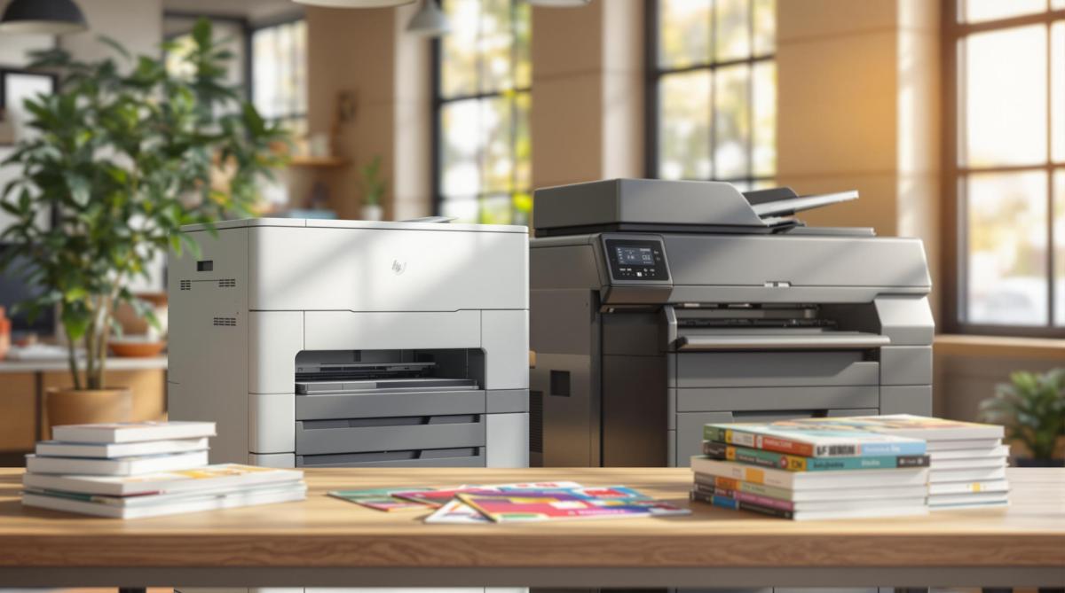
Choosing between digital and offset printing? Explore key factors like cost, quality, and production time to find the best method for your needs.
When deciding between digital and offset printing, the right choice depends on your specific needs. Here’s a quick guide to help you:
Print Quantity & Cost: Digital printing is cost-effective for small runs (1–250 pieces), while offset printing is better for large volumes (500+ pieces).
Image & Text Quality: Digital printing provides sharp, clear results for most projects, but offset excels in fine details and precise color matching.
Production Time: Digital printing offers faster turnaround times, making it ideal for tight deadlines. Offset requires more setup time but is efficient for large-scale jobs.
Variable Data Options: Digital printing supports real-time customization, perfect for personalized projects. Offset is best for static designs.
Color Matching Accuracy: Offset printing ensures exact color matches, ideal for strict brand guidelines. Digital printing uses CMYK, which may have slight color variations.
Choose the method that aligns with your project’s quantity, quality, timeline, and personalization needs.
Offset Printing Vs Digital Printing [ Difference & Best ]
1. Print Quantity and Cost
The number of prints you need plays a big role in determining the most cost-effective printing method. Digital printing is ideal for smaller print runs because it has lower setup costs and no minimum order requirements. Key advantages include:
No minimum order size
Consistent pricing for small runs
Lower setup expenses
No additional plate fees
On the other hand, offset printing becomes more economical for larger print jobs (500+ pieces), even though it has higher initial setup costs.
Here’s a quick comparison:
Print Quantity
Best Method
Cost Factors to Consider
1–250 pieces
Digital Printing
Lower setup costs, no minimum order
250–500 pieces
Depends on Project
Paper type and color needs may influence choice
500+ pieces
Offset Printing
Lower cost per piece at higher volumes
For example, a local restaurant in Hackensack, NJ, printing 200 seasonal menus would save money using digital printing. Meanwhile, a retailer producing 2,500 catalogs would benefit from the cost efficiency of offset printing.
Choosing the right method based on your print volume ensures you get the best value. Once you’ve decided, it’s time to consider image and text quality to fine-tune your selection.
2. Image and Text Quality
Printed materials leave a lasting impact, and both digital and offset printing shine when it comes to producing sharp text and detailed graphics. Once you’ve considered costs, the next big decision revolves around quality.
Digital printing is excellent for producing crisp text and clear graphics. It’s a go-to option for smaller print runs or projects involving variable data, like flyers or brochures you need quickly.
Offset printing stands out when your project requires fine details and precise color accuracy. It’s the perfect choice for items like business cards or wedding invitations that feature intricate designs or delicate typography.
"Great customer service that we didn’t get with our old online printer. Attention to detail is what makes the difference!" – Mike B.
To get the results you’re aiming for, consider your project’s specific needs for graphic detail and color precision. Up next, we’ll dive deeper into how digital and offset printing compare in these areas.
3. Production Time
Production timelines play a big role when choosing between digital and offset printing. With digital printing, setup is almost instant – starting just minutes after file approval. This makes it a great choice for time-sensitive projects like event programs or last-minute promotional materials.
Offset printing, on the other hand, takes longer to set up. Preparing plates and getting the press ready usually takes 1–2 business days. However, once production begins, offset printing handles large orders efficiently, offering lower costs per piece for high-volume jobs.
The complexity of your project can also influence production time. As one client shared:
"Mike and his team completed a complex job in record time for a very reasonable price. I’d approached numerous printers about this job with no success, but these guys just made it work and were super easy to deal with."
When thinking about production time, it’s important to look beyond just printing speed. Factors like file preparation, proofing, finishing, and delivery all come into play. Choosing the right method depends on your timeline and specific needs.
At Miro Printing & Graphics Inc., we provide both digital and offset printing options to meet your deadlines while maintaining high-quality results. Up next, we’ll dive into how variable data capabilities set these methods apart.
sbb-itb-ce53437
4. Variable Data Options
Variable data printing plays a key role in creating personalized marketing materials. With digital printing, you can customize text, graphics, and images in real time without slowing down production. This makes it a great choice for direct mail, promotional items, or documents that need individualized details.
At Miro Printing & Graphics Inc., digital printing ensures every piece can be tailored while maintaining consistent quality. In contrast, offset printing struggles with variable data tasks. Adjusting content on an offset press requires stopping production and creating new plates, which increases both setup time and costs. This makes offset printing better suited for projects with static, unchanging designs.
Here’s a quick comparison of how these methods handle variable data:
Feature
Digital Printing
Offset Printing
Variable Text
Real-time updates possible
Requires press stops to modify content
Personalization
Easily tailored for each piece
Limited by plate-based processes
Setup Requirements
Minimal setup for changes
New setup needed for every variation
Run Size Flexibility
Works well for any quantity
Best for large, uniform runs
Cost Efficiency
Streamlined for personalized content
Higher costs for updates or changes
When planning personalized marketing or custom projects, think about your variable data needs. Digital printing is typically the most efficient choice for these tasks, while offset printing excels in producing high volumes of unchanging designs. Up next, we’ll look at how these methods compare in terms of color matching accuracy.
5. Color Matching Accuracy
Getting colors right is crucial when sticking to strict brand guidelines. Offset printing, like the service provided by Miro Printing & Graphics Inc., uses pre-mixed spot color inks. This allows for precise matches to Pantone or custom colors, ensuring your brand colors stay consistent across large print runs. On the other hand, digital printing relies on CMYK color mixing. While it delivers dependable results, it may not always replicate Pantone colors exactly.
When deciding between the two, think about how important exact color accuracy is for your project. Offset printing is the better choice for corporate materials or marketing pieces where precise brand colors are non-negotiable. With Miro Printing & Graphics Inc.’s expertise in both offset and digital printing, you can count on achieving the best color results tailored to your specific needs.
Digital vs. Offset Print Comparison
Here’s a side-by-side look at how digital and offset printing stack up:
Factor
Digital Printing
Offset Printing
Print Quantity & Cost
Ideal for short runs with no setup fees, keeping costs lower.
Better suited for large runs, as the initial setup costs are offset by volume.
Image & Text Quality
Produces sharp text and vibrant images for most projects.
Excels in detail reproduction, making it perfect for complex designs.
Production Time
Quick turnaround with minimal setup required.
Takes longer to set up but becomes highly efficient for large-scale jobs.
Variable Data Options
Allows real-time personalization, great for tailored content.
Best for static designs with limited customization options.
Color Matching Accuracy
Delivers consistent CMYK colors, though minor variations may occur.
Offers precise color matching, maintaining consistency across large volumes.
At Miro Printing & Graphics Inc. (bergencountyprinters.com), we combine both methods to ensure the best results for your projects. As LycoRed T. shares:
"No matter what the deadline, I sleep at night knowing Miro is on it."
Choose the printing method that fits your project’s needs and let us handle the rest.
Next Steps
Now that you’ve explored the differences between digital and offset printing, it’s time to make an informed decision. Miro Printing & Graphics Inc. (bergencountyprinters.com) offers both options to deliver the results your project needs.
Here’s how to determine the right printing method for your project:
Assess your project’s needs: Think about the quantity, timeline, and budget.
Review your specifications: Consider details like color, paper type, and whether you need variable data printing.
Talk to the experts: Reach out to discuss your project and get tailored recommendations.
"Mike and his team completed a complex job in record time for a very reasonable price…Best service I’ve ever received from a printer; couldn’t recommend Miro more highly."
Choosing experienced professionals ensures you get the guidance and quality you’re looking for. Contact Miro Printing & Graphics Inc. to discuss your project and get advice tailored to your needs.
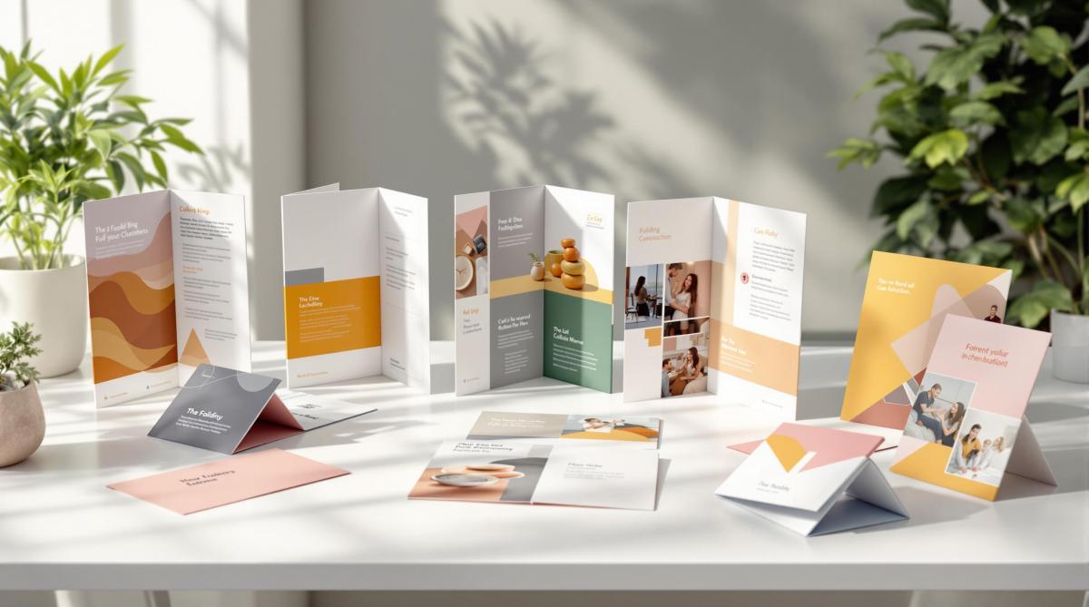
Explore 8 popular folding styles for print materials to enhance presentation and reader engagement, from tri-folds to gate folds.
Want your print materials to stand out? Choosing the right folding style can make all the difference. Whether you’re designing brochures, menus, or newsletters, the fold determines how your content is presented and experienced. Here’s a quick overview of the 8 most common folding styles and their uses:
Half Fold: Simple, 2-panel layout for menus or greeting cards.
Tri-Fold: Compact, 3-panel design ideal for brochures and mailers.
Z-Fold: Logical, zigzag format for maps and technical guides.
Gate Fold: Dramatic reveal with inward-folding panels, great for invitations.
Accordion Fold: Expands like an accordion for catalogs or timelines.
Double Parallel Fold: Neat, 4-panel structure for newsletters or price lists.
Roll Fold: Sequential, step-by-step unfolding for instructions or product inserts.
French Fold: Elegant 4-panel fold, perfect for art prints or premium materials.
Each fold offers unique benefits, from organizing content to creating an engaging reader experience. Consider your content, audience, and budget to choose the best option for your project. Ready to dive deeper? Let’s explore each folding style and its applications.
The Brochure Fold: How to stand out with professional folding
Types of Print Folding Methods
Print folding methods help organize content and grab attention, ranging from straightforward half folds to intricate accordion patterns.
Here’s a breakdown of common folding techniques used in professional printing:
Fold Type
Panel Count
Best Used For
Key Features
Half Fold
2 panels
Menus, greeting cards, programs
Simple and timeless layout
Tri-Fold
3 panels
Brochures, mailers, pamphlets
Compact and easy to carry
Z-Fold
3+ panels
Maps, technical guides, charts
Logical and sequential flow
Gate Fold
3-4 panels
Announcements, invitations
Creates a dramatic reveal
Accordion Fold
4+ panels
Product catalogs, timelines
Great for displaying more content
Double Parallel Fold
4 panels
Newsletters, price lists
Organized and compact structure
Roll Fold
4+ panels
Product inserts, instructions
Unfolds information step by step
French Fold
4 panels
Art prints, premium materials
Sophisticated and polished look
When choosing a folding style, keep these factors in mind:
Content Volume: Pick a fold that fits your amount of information.
Distribution Method: For mailed pieces, go for sturdy designs; for handouts, opt for visually appealing styles.
Reader Interaction: Think about how the fold will guide readers through your content.
Production Costs: Complex folds may require additional setup and increase printing expenses.
Each folding method offers unique ways to present your message effectively. Up next, we’ll dive deeper into the design and applications of these styles.
1. Half Fold
Description and Folding Method
The half fold, also known as the book fold, splits a single sheet into two equal panels that open like a book. This simple design makes it easy for readers to navigate and follow the content.
Common Applications
The half fold works well for print materials that need a clear and straightforward layout. It’s often used for:
Greeting cards
Event programs
Menus
Presentation folders
Announcements
Advantages and Disadvantages
Here’s a quick look at what the half fold offers and where it might fall short:
Advantages
Disadvantages
Affordable to produce
Limited space for detailed content
Professional and sturdy look
May feel too simple for complex designs
Easy-to-read, book-like format
The half fold remains a go-to option for projects that require a clean, professional layout. Up next, let’s take a closer look at the tri-fold and its compact, three-panel structure.
2. Tri-Fold
Description and Folding Method
A tri-fold brochure splits a sheet into three equal sections, creating two parallel folds. To fold it, the right panel is tucked inward first, followed by the left panel folding over it. This creates a neat, six-panel layout that unfolds from left to right.
Common Applications
Tri-folds are a popular choice for various materials, such as:
Marketing brochures
Product catalogs
Service menus
Direct mail pieces
Conference handouts
Real estate listings
Educational materials
Advantages and Disadvantages
Advantages
Disadvantages
Compact size fits in standard #10 envelopes
Limited content space per panel
Six panels allow for organized, structured messaging
Text must be carefully sized for readability
Sleek, professional design
Middle panel width is slightly smaller than the outer panels
Affordable for bulk printing
Fold lines can complicate design placement
Easy to distribute and display
Images spanning panels need careful alignment
To make the most of a tri-fold, plan each panel’s content with purpose. Use the front panel to grab attention, the interior panels for detailed information, and the back panel for contact details or a call to action. This layout ensures your message is clear and professionally presented.
3. Z-Fold
Description and Folding Method
The Z-fold, or zigzag fold, gets its name because the folded sheet resembles the letter "Z" when viewed from the side. It’s created by dividing a sheet into three equal panels. The first panel folds backward, the second forward, allowing the panels to open in sequence.
Common Applications
The Z-fold is a practical choice for various uses, including:
Maps and Floor Plans: Great for displaying large-format geographic or spatial information.
Technical Documentation: Perfect for step-by-step instructions or guides.
Event Programs: Ideal for presenting schedules or timelines.
Product Specifications: Useful for organizing technical details.
Direct Mail Campaigns: Provides an engaging unfolding experience.
Advantages and Disadvantages
Advantages
Disadvantages
All panels are visible when fully opened
Requires precise folding for a clean look
Great for presenting step-by-step content
May not fit standard envelope sizes
Creates a smooth, natural flow across panels
Alignment across folds needs careful planning
Suitable for larger formats
More complex to produce in bulk
Offers creative reveal opportunities
Thicker paper can complicate folding
The Z-fold works well for presenting information in a logical, easy-to-follow format. To make the most of this style, design your content to flow naturally from left to right, using each panel to expand on the previous one. Up next, we’ll dive into the gate fold, which brings a dramatic flair to your print designs.
4. Gate Fold
Description and Folding Method
A gate fold features two outer panels that fold inward to meet in the center, resembling a gate closing. These outer panels are slightly narrower than the center panel, creating a neat, seamless edge when closed. Once opened, it reveals a wide, striking layout perfect for grabbing attention.
Common Applications
Gate folds are often used for printed materials that aim to deliver a memorable reveal. Examples include:
Wedding invitations: Adds a touch of elegance to the presentation.
Real estate brochures: Perfect for showcasing large property images in the center spread.
Product catalogs: Ideal for highlighting luxury items or detailed product features.
Annual reports: Engages readers with a visually appealing way to display achievements and financial data.
Art programs and gallery brochures: Enhances storytelling through creative layouts.
Up next: the accordion fold, another dynamic option for printed designs.
sbb-itb-ce53437
5. Accordion Fold
Description and Folding Method
The accordion fold, often called a pleated fold, creates panels that alternate in direction, expanding and contracting like an accordion. This design allows for a neat, compact layout that can unfold to display multiple sections of content.
Common Applications
Accordion folds are ideal for content that needs to be sequential or easily expandable. They are often used for:
Transit schedules with route maps and timetables
Exhibition guides for navigating museums or galleries
Product manuals with step-by-step instructions
Marketing materials that highlight company stories or product features
Tourist maps that provide detailed, pocket-sized area information
This folding style is a practical choice for a wide range of printed materials. At Miro Printing & Graphics Inc., we specialize in applying this method to create customized print solutions tailored to your specific needs.
6. Double Parallel Fold
Description and Folding Method
A double parallel fold involves folding a sheet twice in the same direction, resulting in four equal, nested panels. This creates a compact and polished layout.
Common Applications
This fold is ideal for materials requiring a clear, organized presentation. At Miro Printing & Graphics Inc., it’s commonly used for:
Corporate annual reports with structured financial data
Real estate brochures highlighting multiple properties
Educational materials and course catalogs
Technical specification sheets
Multi-page event programs
Advantages and Disadvantages
Here’s a breakdown of the strengths and challenges of using a double parallel fold:
Aspect
Details
Advantages
– Offers a clean, organized layout – Naturally separates content into sections – Fits standard envelopes – Ideal for step-by-step information – Compact when folded
Disadvantages
– Limited design flexibility – Requires precise folding for alignment – Not ideal for thick paper stocks – All panels must be the same width – Center panels can be harder to view
This folding style is perfect for presenting information in a logical sequence. The nested panels guide readers smoothly through the content while maintaining a professional look. Up next, learn how the roll fold offers another way to present sequential information effectively.
7. Roll Fold
Description and Folding Method
A roll fold consists of multiple panels that fold one over the other in sequence. Each panel is slightly narrower than the one before it, allowing them to fit neatly together. At Miro Printing & Graphics Inc., we typically create roll folds with three to six panels, though four panels are the most commonly used.
Common Applications
The sequential nature of roll folds makes them a great choice for:
Product catalogs displaying a range of items
Step-by-step guides or instructions
Multi-page restaurant menus
Travel brochures featuring different locations
Healthcare packets with detailed information
These uses take advantage of the fold’s ability to present content in a logical, step-by-step manner.
Advantages and Disadvantages
Roll folds come with both benefits and challenges, which are important to weigh when deciding if this style fits your needs:
Aspect
Details
Advantages
– Perfect for presenting information in order – Each panel flows naturally to the next – Compact when folded – Works well with thin to medium-weight paper – Fits standard envelope sizes
Disadvantages
– Requires careful panel width calculations – Inner panels must be progressively smaller – Limited space for content on inner panels – Design is more complex due to varying panel sizes – Folding precision can increase production costs
The progressively narrowing panels demand accurate design to avoid issues like buckling. This folding style is especially effective for storytelling or content that needs to be read in a specific sequence.
8. French Fold
Description and Folding Method
The French fold involves folding a sheet first horizontally and then vertically, creating four equal panels that open like a book. This method is sometimes called a quarter fold because it divides the sheet into four uniform sections. Miro Printing & Graphics Inc. often uses this technique to achieve a polished, professional finish.
Common Applications
This folding style is commonly used for:
Wedding invitations
Formal announcements
High-end marketing materials
Art gallery programs
Concert programs
Photography portfolios
Holiday greeting cards
Annual reports
Advantages and Disadvantages
Aspect
Details
Advantages
– Creates a polished, high-end look – Offers four panels for organizing content – Opens in both directions for a dynamic design – Great for showcasing large images across panels
Disadvantages
– Requires precise folding, which can raise production costs – May need heavier paper for durability – Designing across panels can be tricky – Limited space for text-heavy designs – Aligning panels perfectly can be challenging
The French fold is a great option for projects that call for an elegant and interactive design. It works especially well for premium print materials where presentation matters.
How to Choose the Right Fold Style
Selecting the right fold style depends on factors like how it presents your content, its usability, and the overall purpose of your project.
Content Volume and Layout
If your material is text-heavy, go for folds with multiple panels, such as tri-fold or z-fold.
For image-focused designs, choose folds that emphasize visuals, like gate folds or French folds.
Purpose and Audience
The fold style should align with the purpose of your project and the preferences of your audience:
Formal presentations: Use French or gate folds for a polished, professional look.
Marketing materials: Tri-folds work well for brochures, while accordion folds are great for catalogs.
Direct mail campaigns: Half folds or roll folds are cost-effective and practical for mailing.
Technical Considerations
Key technical factors can influence your choice of fold:
Factor
How It Affects Your Choice
Paper Weight
Heavier paper may not work with complex folds.
Print Budget
Intricate folds can increase production costs.
Distribution Method
Mailing requirements might limit fold options.
Production Timeline
Complex folds could require more time to produce.
These considerations ensure your project stays within budget and meets deadlines.
Practical Factors
Make sure the piece is durable enough for handling and fits where it will be stored or displayed.
Check if the fold makes the content easy to navigate and understand.
Factor in production volume – larger quantities may favor simpler folds for efficiency.
"Let us know what type of project you are working on, and allow us to offer our expertise… The end result is a finished piece that exceeds your highest expectations but never your budget!" – Miro Printing & Graphics Inc.
Size and Format
The dimensions of your print play a big role in fold selection. Standard sizes are ideal for common fold types, while custom dimensions may require more specialized techniques. Matching the fold to your print size ensures your message is presented effectively.
Conclusion
Choosing the right print folding style can elevate your marketing materials into polished, engaging pieces. A well-thought-out fold not only organizes your content but also creates an interactive experience that draws readers in and leaves a strong impression.
"Presentation is the first step to a successful, lasting relationship." – Miro Printing & Graphics Inc.
When deciding on a folding style, think about your content, the type of paper, how the materials will be distributed, and your production timeline. The goal is to find a fold that blends creative design with practical needs for maximum effect. With decades of experience, our team ensures your finished product strikes the perfect balance between creativity and precision.
Successful print materials bring together visual appeal and functionality. By considering your content layout, audience preferences, and technical factors, you can choose a folding style that complements your message and meets practical requirements. Every fold, when thoughtfully selected and executed, enhances the flow and impact of your printed piece.
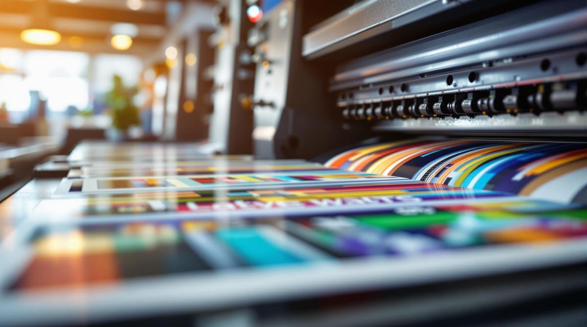
Learn essential image resolution standards for offset printing to ensure high-quality, professional results across various materials.
300 DPI is the gold standard for most offset printing, ensuring clear, crisp results.
DPI vs. PPI: DPI measures print quality (dots on paper), while PPI measures screen resolution (pixels).
Different materials need different resolutions:
Business cards: 300-600 DPI
Posters: 150-300 DPI (lower DPI works for larger, distant prints).
File Formats Matter: Use TIFF for photos, EPS for logos, and PDF/X-1a for mixed content.
Color Mode: Convert images to CMYK for accurate printing; RGB won’t work well for print.
Quick Tip: Always start with high-resolution images and avoid enlarging them to prevent quality loss.
Offset printing demands attention to resolution, file formats, and color settings to achieve polished, high-quality results. Let’s dive into the details to ensure your prints look their best.
DPI and Image Resolution Basics
DPI Explained
DPI, or Dots Per Inch, measures how many ink dots are printed within an inch. The higher the DPI, the sharper the print. For instance, a 300 DPI image packs 90,000 dots per square inch (300 x 300), while a 150 DPI image only has 22,500 dots in the same area. More dots mean greater detail and clarity.
DPI vs. PPI: What’s the Difference?
DPI and PPI (Pixels Per Inch) are often confused, but they refer to different things:
Characteristic
DPI
PPI
Definition
Physical ink dots on paper
Digital pixels on a screen
Primary Use
Measures print output
Measures digital resolution
Typical Range
300-1200 for printing
72-300 for screens
Quality Impact
Affects printed image quality
Affects on-screen image quality
Knowing the difference is crucial for preparing digital files for printing. For example, a 72 PPI image (standard for web use) won’t print well without being adjusted to 300 DPI, which is necessary for professional-quality prints.
Standard DPI for Offset Printing
The required DPI for offset printing depends on the material and viewing distance:
Print Material
Recommended DPI
Viewing Distance
Business Cards
300-600
Close (8-12 inches)
Brochures/Flyers
300
Standard (1-2 feet)
Posters
150-300
Medium (3-6 feet)
Billboards
50-150
Far (20+ feet)
For most offset printing, 300 DPI strikes a good balance between sharpness and file size. However, enlarging a 300 DPI image by 200% reduces its effective resolution to 150 DPI, which can result in noticeable quality loss. Next, we’ll cover how to prepare file formats and color modes for printing.
300 DPI Myth | What Are DPI, PPI & LPI | Printing for …
Print Material Resolution Guide
Understanding DPI is just the start – each type of print material needs specific resolution standards to achieve the best results.
Book and Magazine Standards
Books and magazines require sharp text and clear images. To meet these needs, images should have a resolution of at least 300 DPI at their final printed size. Text is typically vectorized to maintain sharpness, but if it’s part of a raster image (like scanned pages or creative layouts), aim for 300–600 DPI to keep it readable. For example, a 6 × 9-inch book page should include images that measure at least 1,800 × 2,700 pixels when printed at 300 DPI.
Now, let’s take a closer look at the specific resolution needs for marketing materials.
Marketing Material Requirements
Business cards, brochures, and flyers need a balance between sharp text and detailed images. Below are the recommended standards:
Marketing Item
Minimum DPI
Optimal DPI
Notes
Business Cards
300
600
Ensures clear logos and contact details
Brochures/Flyers
300
450
Balances image detail with text clarity
Large Format Print Standards
Large format prints, like posters and banners, can use lower resolutions because they’re viewed from farther away. Here’s a breakdown of specifications:
Print Size
Viewing Distance
Recommended Minimum DPI
Notes on File Size Impact
24" × 36" Poster
3–6 feet
150
Suitable for close-up viewing
3′ × 6′ Banner
6–12 feet
100
Optimized for moderate distances
6′ × 12′ Billboard
20+ feet
50
Works for distant viewing
For example, a trade show banner viewed from 10 feet should use 100 DPI. To ensure logos and text stay crisp at any size, use vector elements whenever possible. Starting with high-resolution source files also gives you more flexibility when scaling up.
sbb-itb-ce53437
Image Preparation Steps
Get your images ready the right way to ensure top-notch quality in offset printing.
File Format Selection
Choosing the right file format is crucial for print quality. Here’s a quick comparison of the best options:
Format
Best Uses
Advantages
File Size Impact
TIFF
Photos and complex images
High-quality, supports layers
Large (100+ MB for high-res files)
EPS
Logos and vector graphics
Scalable without losing sharpness
Small to medium (1-20 MB)
PDF/X-1a
Mixed content documents
Preserves fonts, industry standard
Medium (20-50 MB typical)
When creating PDFs, always embed fonts and stick to the PDF/X-1a standard. After that, convert colors from RGB to CMYK for accurate printing.
CMYK vs RGB Color Modes
Switching from RGB to CMYK is essential for precise color reproduction in offset printing. Follow these steps:
Start with your RGB files.
Convert them to CMYK using the U.S. Web Coated (SWOP) v2 profile.
Keep ink coverage under 300%.
Check each color channel individually.
To ensure color accuracy, calibrate your monitor and use professional color management tools. Keep in mind that RGB colors might look less vibrant in CMYK, so adjust saturation and contrast as needed.
Common Resolution Errors
Resolution issues can ruin print quality if not addressed. Here’s what to look out for:
Error
Impact
Solution
Upscaling low-res images
Pixelation and blur
Reshoot or find higher-resolution images
Incorrect DPI settings
Loss of detail
Set resolution correctly for print size
JPG compression artifacts
Visible degradation
Use uncompressed formats for final files
Mixed resolution elements
Inconsistent quality
Standardize all elements to the same resolution
Use preflight tools in your design software to catch resolution problems early. Check text readability at 100% size and avoid copying and pasting images between applications – always use proper file linking and packaging to maintain quality.
Image Quality Problem-Solving
Fixing Image Clarity Issues
If you’re facing issues with image clarity, here are some common problems and how to address them:
Issue
How to Detect
Solution
Moiré Patterns
Inspect visually at 100% zoom
Adjust screen angles or rescan with a 15° rotation
Edge Blurriness
Use a magnifying glass
Apply selective sharpening; keep images at 2x final size
Halftone Dots
Check with preflight software
Set an appropriate line screen (e.g., 150-175 lpi for coated paper)
Resolution Loss
Measure effective PPI
Ensure a minimum of 300 DPI at the final print size
For sharpening, use the Unsharp Mask tool with these settings:
Amount: 85-125%
Radius: 0.3-0.7 pixels
Threshold: 3-7 levels
Avoid global sharpening filters, as they can introduce unwanted artifacts. Instead, use selective sharpening to enhance specific areas, particularly edges, while keeping backgrounds and skin tones smooth. Alongside clarity, accurate color reproduction is equally important for high-quality prints.
Color Accuracy Solutions
Achieving accurate colors requires careful calibration and preparation. Follow these steps:
1. Monitor Calibration
Use a professional colorimeter to calibrate your monitor. Set the white point to 5000K (D50), gamma to 2.2, and luminance to 120 cd/m².
2. Color Profile Management
Use ICC profiles tailored to your paper type and printing setup. For example:
Enable soft proofing in your design software to preview how the final print will look. Pay close attention to:
Rich blacks: Use C:60 M:40 Y:40 K:100 for a deep black tone.
Maximum ink density: Keep it within 300-320% total.
Spot color conversions: Ensure proper CMYK conversions.
For consistent color evaluation, view prints under D50 lighting conditions. Keep in mind that glossy paper tends to deliver more vibrant colors compared to uncoated stock, so adjust your expectations based on the paper type.
Summary
Resolution Standards Quick Guide
Here’s an overview of key resolution standards for professional offset printing:
Print Material
Minimum DPI
Optimal DPI
Color Mode
Business Cards
300
350-400
CMYK
Brochures & Flyers
300
350
CMYK
Large Format Banners
100-150
200
CMYK
Photo Books
300
400-600
CMYK
Fine Art Prints
400
600+
CMYK
When preparing files for offset printing, follow these guidelines to ensure high-quality results:
Image Size: Use original files that are twice the size of the final print dimensions.
Color Profile: Apply the GRACoL 2013 profile for coated paper.
Total Ink Coverage: Limit coverage to 300-320% for best outcomes.
Safe Resolution: Avoid enlarging images beyond their original size.
These practices support consistent and sharp results in offset printing.
Miro Printing & Graphics Inc. Services
Miro Printing & Graphics Inc. brings over 30 years of experience to offset printing, adhering to strict resolution standards. Their in-house prepress team ensures all files meet quality requirements before printing.
Their services include:
High-resolution commercial printing up to 600 DPI
Professional prepress file optimization
Custom projects tailored to specific resolution needs
Full in-house bindery services
For custom printing needs, their team offers one-on-one consultations to determine the best resolution settings. Based in Hackensack, NJ, they serve businesses across Bergen County, delivering clear images and accurate colors.
For detailed project specifications, reach out to their technical team at mikem@miroprinting.com.
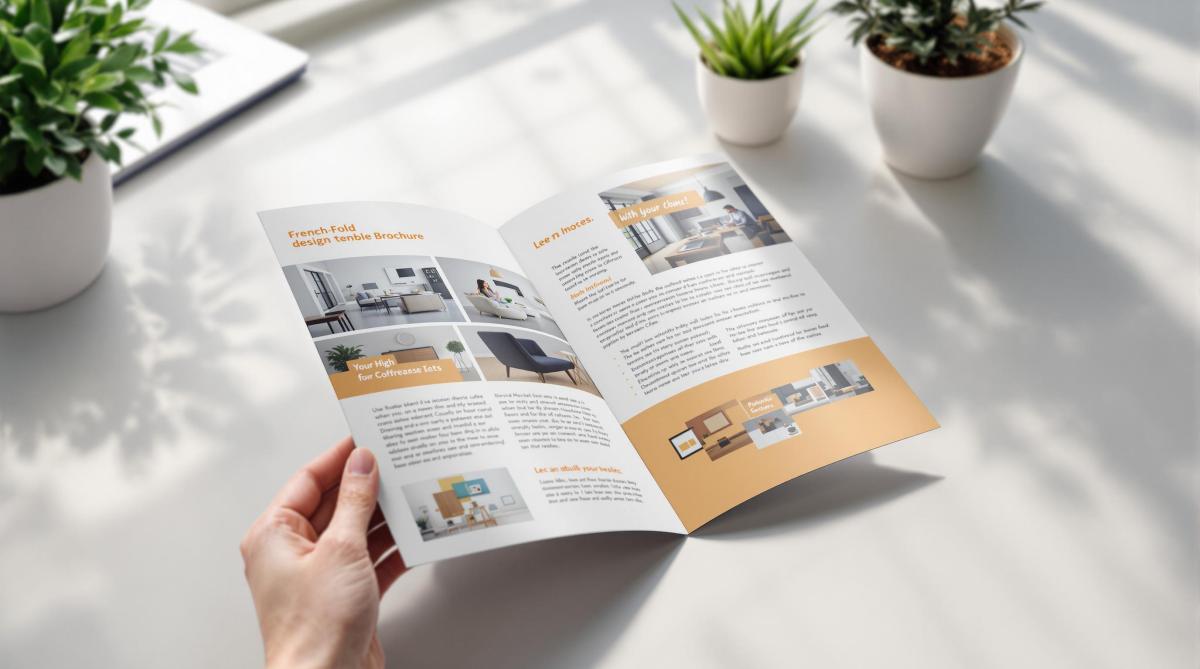
Learn essential tips for designing effective French fold brochures, from layout and image quality to print setup for a professional finish.
French fold brochures are folded twice – horizontally and vertically – creating four panels. They’re perfect for showcasing content in a compact yet engaging way. Here’s what you need to know:
Design Basics: Start with a single sheet, fold it twice, and plan content across panels. Use the front to grab attention and the center spread for visuals or key messaging.
Image Quality: Use 300 DPI resolution, CMYK color mode, and include a 0.125-inch bleed for clean prints.
Layout Tips: Align visuals with fold lines, maintain consistent margins, and ensure critical elements stay away from edges.
Fonts & Colors: Choose brand-aligned fonts and high-contrast colors for readability.
Print Setup: Use proper bleeds, safe zones, and check panel alignments. Request a digital proof before printing.
Partnering with professional printers ensures precise folding and premium quality. Follow these guidelines to create brochures that leave a strong impression.
How to Set Up Artwork For a French Fold Leaflet (What Goes …
Design Planning
Creating a French fold brochure starts with thoughtful planning for both content and visuals. A well-organized layout ensures your design works effectively with the unique structure of this brochure style.
Content Planning
Distribute your key messages strategically across the panels. Use the front panel to grab attention with your most compelling offer or statement. The center spread is ideal for visually striking content – think product showcases, infographics, or a bold brand statement. Remember, a strong presentation creates a lasting first impression.
Image Requirements
High-quality images are crucial for a professional look. Follow these guidelines:
Ensure a resolution of at least 300 DPI for sharp visuals.
Convert images to CMYK color mode for accurate printing.
Add a 0.125-inch bleed beyond trim edges to avoid cutting issues.
Keep critical elements at least 0.25 inches away from fold lines and edges.
These steps ensure your images stay clear and your brochure looks polished and professional.
Layout Design
Panel Organization
Design your panel sequence carefully to create an engaging French fold brochure layout. This step builds on your content planning, ensuring readers can follow a logical flow as they move through adjacent panels. Use consistent margins to clearly define panel boundaries and make transitions between sections smooth. Once your panels are organized, adjust your visuals to align with this structure.
Visual Structure
Create a clear visual hierarchy by focusing on a central point of interest, leaving enough white space, and aligning elements with the fold lines. Use a grid system to ensure consistent spacing, and consider extending color blocks or images across panels for a unified look. These elements should come together seamlessly in your full-spread layout.
Full-spread Layout
Set up a standard letter-size design file with proper bleeds on all edges. Mark fold lines clearly and keep important content away from these areas to avoid problems when folding. The center spread is perfect for showcasing impactful visuals or key messaging that spans multiple panels, whether the brochure is folded or fully opened.
sbb-itb-ce53437
Fonts and Colors
Once your layout is set, it’s time to think about fonts and colors to refine your design.
Color Guidelines
Choose a color palette that reflects your brand’s identity. Combine primary colors with complementary shades to ensure high contrast, making your design visually appealing in both folded and unfolded forms.
Print Production
Print File Setup
When setting up your document for printing, include 0.125-inch bleeds, define safe zones, use CMYK color mode, and ensure images are at 300 DPI. For an 8.5"x11" brochure, make the inner panels about 0.0625 inches narrower to avoid any bunching during folding.
Quality Checks
Before sending your file to print, go through these important checks:
Ensure all text is formatted correctly and free of spelling errors.
Verify that images are properly linked and at full resolution.
Double-check fold lines and panel alignments.
Confirm that color settings and contrast are accurate.
Inspect bleeds and margins to avoid trimming issues.
Request a digital proof to catch any final errors.
Professional Printing
The final step is partnering with a professional printing service to bring your design to life. Once your file meets all quality standards, a skilled printer can ensure your French fold brochures look polished and professional.
Miro Printing & Graphics Inc. is a trusted name with over 30 years of experience. They offer both digital and offset printing, giving you flexibility for different production volumes while maintaining consistent quality. Their in-house bindery services guarantee precise folding and finishing, which is especially important for French fold brochures.
To get the best results, schedule a consultation to discuss your project. Professionals can guide you on paper choices, finishing touches, and timelines. They’ll also help you select the right printing method based on your budget, quantity, and quality requirements.
Summary
Design Guidelines
Creating an effective French fold brochure starts with a clean, organized layout. The design should flow naturally across panels while staying true to your brand’s identity. Use plenty of white space and establish a clear visual hierarchy to make the content easy to read and visually appealing. Select fonts that align with your brand and are easy to read. Don’t forget to follow printer setup requirements, such as bleed, resolution, color mode, and margins, to ensure a professional finish. A great design paired with expert printing can make all the difference.
Print Services
Using professional printing services is key to producing high-quality French fold brochures that stand out. LycoRed T. highlights the excellence of Miro Printing & Graphics Inc.:
"Mike and his team at Miro have delivered stars, comet, and galaxy size projects for Lycored. No matter how little or large, no matter what the deadline, i sleep at night knowing Miro is on it. Truly, a gem printer shop and more in New Jersey."
Miro Printing & Graphics Inc. offers a full range of services, including digital and offset printing, in-house bindery, expert design support, and strict quality control to meet your specific needs.
Their dedication to detail is echoed by satisfied clients like Julia I.:
"Mike and his team completed a complex job in record time for a very reasonable price… Best service I’ve ever received from a printer; couldn’t recommend Miro more highly."
Consider scheduling a consultation to receive expert advice on paper options, finishes, and production timelines.
Learn essential proofing and feedback strategies to ensure error-free printed materials and streamline your production process.
Proofing ensures your printed materials are error-free and meet your expectations. Whether it’s business cards or brochures, catching mistakes early saves time and money. Here’s what you need to know:
Proof Types: Choose between digital proofs (quick and shareable) or physical proofs (accurate colors and paper feel).
Key Steps:
Review design layout and typography.
Check content for spelling, grammar, and technical details.
Verify print specifications like paper type and color settings.
Get client approval before production.
File Preparation: Use proper formats (PDF, TIFF) and ensure images are high resolution (300 DPI). Convert colors to CMYK for printing.
Feedback Management: Collect input using digital, physical, or video proofs. Track revisions and secure final approval to avoid errors.
The Proofing Process
What is a Print Proof?
A print proof allows you to double-check every detail before final production, acting as a safeguard against expensive mistakes. It’s your chance to catch and fix issues related to design, content, or print specifications before it’s too late.
A print proof can help spot problems like:
Inconsistent typography or fonts
Low image resolution or inaccurate colors
Misaligned layouts or uneven spacing
Errors in text or missing content
Incorrect print details like paper type or finishing
Once you understand what to look for, you’ll need to decide between digital and physical proofs based on your project’s needs.
Digital vs. Physical Proofs
Choosing between digital and physical proofs depends on what your project requires. Both have their strengths:
Proof Type
Benefits
Best Used For
Digital Proofs
• Fast turnaround • No shipping costs • Easy to share • Mark up edits electronically
Keep key elements at least 0.25 inches away from trim edges.
Use facing pages for multi-page documents.
Include crop marks and registration marks.
3. Document Setup
Set your document to the final trim size.
Use master pages for consistent elements across pages.
Ensure proper page orientation.
Include printer marks and any required specifications.
These steps will help you create files that are ready for high-quality printing.
sbb-itb-ce53437
Client Feedback Management
Managing client feedback effectively helps avoid costly mistakes, ensuring smooth production and high-quality prints.
Feedback Collection Methods
Miro Printing & Graphics Inc. offers multiple proofing options to gather client input:
Proof Type
Best For
Turnaround Time
Digital PDF
Reviewing text and layout
Same day
Physical Sample
Checking color accuracy and paper stock
1-2 business days
Video Sample
Showcasing complex finishing effects
1 business day
"I even received a video of my print sample (a mini booklet) for approval before they proceeded with the rest. Best service I’ve ever received from a printer; couldn’t recommend Miro more highly." – Julia I.
Revision Tracking
Track every revision with key details like the date, requested changes, who made the request, and the status of implementation.
Stick to clear file naming conventions to avoid confusion:
ProjectName_V1_DATE
ProjectName_V2_DATE_ClientReview
ProjectName_FINAL_DATE_Approved
After documenting revisions, secure written and signed final approval to move forward.
Final Approval Steps
Getting final approval involves clear communication and attention to detail. Typically, the process includes:
Sending a complete proof package.
Requesting written approval via email.
Noting any final adjustments.
Securing signed approval before production begins.
"Mike sent me the proof and I gave it my approval. After I picked up the cards, I saw a mistake that I had overlooked. It was my error and I offered to pay for the reprint. Mike reprinted them for me at NO CHARGE and could not have been nicer about it." – Judy W.
This highlights the importance of reviewing proofs thoroughly while showing how flexibility in handling mistakes can strengthen client relationships. While clients are ultimately responsible for reviewing proofs, addressing oversights with understanding builds trust over time.
Proofing and Feedback Tips
Proof Review Checklist
Here’s a quick checklist to help you spot and fix errors before production begins:
Review Area
Key Elements to Check
Text
Check spelling, grammar, punctuation, and font consistency.
Layout
Verify margins, alignment, spacing, and page numbers.
Graphics
Confirm resolution, color accuracy, and proper placement.
Brand Elements
Ensure correct logo usage, color codes, and typography.
Technical Specs
Check bleed areas, trim marks, and file format.
Miro Printing & Graphics Inc. starts every project with a thorough proof review to maintain high standards. After the initial review, be sure to address common mistakes to further refine your proofs.
Common Proofing Errors
Here are a few common mistakes to watch out for:
Color Discrepancies
Colors on screen often look different in print. For projects where color accuracy is critical, always review a physical proof.
Resolution Problems
Make sure all images are at least 300 DPI. Lower resolutions can result in blurry or pixelated prints.
Missing Elements
Double-check that all key components – like bleed, crop marks, page numbers, contact details, and legal disclaimers – are included and properly placed.
Catching these issues early can save time and prevent costly reprints.
Meeting Print Deadlines
Staying on schedule is just as important as avoiding errors. Use these strategies to keep your project on track:
Plan for Extra Time
Build a 20% buffer into your timeline to account for unexpected delays.
Set Clear Checkpoints
Break your timeline into stages:
Initial review: 24 hours
Revisions: 24-48 hours
Final approval: 24 hours
Keep Communication Open
Regularly touch base with your printing service to ensure everything stays aligned with your goals.
When time is tight, focus on the most important elements first. Create a priority list to separate must-check items from optional tweaks. This ensures critical standards are met, even under pressure.
Conclusion
Effective proofing and managing feedback are key to achieving outstanding print results. By paying close attention to detail and planning carefully, you can ensure your project meets high standards while staying on schedule and within budget.
Proofing goes beyond spotting mistakes – it’s about creating a collaborative process that brings your ideas to life in print. Working with skilled professionals who understand the intricacies of print production can elevate your project beyond simple error corrections.
For businesses aiming for reliable print quality, teaming up with an experienced print shop can make all the difference. With over 30 years of expertise, Miro Printing & Graphics Inc. is ready to help turn your vision into impeccable print work.
Explore the essential guide to fabric coatings for printing, covering types, applications, and best practices for high-quality textile results.
Fabric coatings are the secret to durable, vibrant, and high-quality textile prints. They regulate ink absorption, enhance colors, prevent bleeding, and protect fabrics from wear and environmental factors. Whether you’re printing t-shirts, banners, or upholstery, choosing the right coating makes all the difference. Here’s a quick overview:
Proper preparation, controlled work environments, and drying techniques ensure success. For eco-conscious options, water-based coatings are leading the way. Ready to elevate your textile printing? Let’s dive in.
Printing on Fabric: Coated and Uncoated | HP Latex | HP …
Main Coating Types
Fabric coatings are tailored to meet different printing needs. Here’s a breakdown of the main types, their strengths, and best uses.
Water-Based Coatings
Water-based coatings are a common choice for digital textile printing. Made with polymers dispersed in water, they are known for being less toxic and easy to clean up.
Some key benefits include:
Low VOC emissions
Vivid color output
Soft fabric feel
Wash resistance
These coatings are suitable for cotton, polyester, and cotton-poly blends, making them perfect for digital printing where precise ink absorption is critical.
Solvent-Based Coatings
Solvent-based coatings are known for their durability and resistance to chemicals. They bond tightly to fabric fibers, creating a tough and long-lasting print surface.
Key features include:
Quick drying
Strong adhesion
High resistance to weather
Excellent color fastness
These are the go-to option for outdoor materials and industrial textiles that need to withstand harsh conditions.
UV-Cure Coatings
UV-cure coatings are high-performance solutions that set instantly when exposed to ultraviolet light. They offer:
Instant curing for faster production
Zero VOCs for safer use
A glossy finish for enhanced visuals
Chemical resistance for longer product life
Best suited for high-speed production lines, these coatings are ideal when quick turnaround times are required.
Specialty Coatings
For specific needs, there are specialized coatings designed to deliver targeted results:
Fire-Retardant Coatings: Comply with safety regulations for public and industrial spaces while keeping fabrics breathable.
Anti-Microbial Coatings: Used in medical textiles and sportswear to prevent bacteria and odors.
Weather-Resistant Coatings: Shield fabrics from UV rays, water, temperature changes, and mold.
At Miro Printing & Graphics Inc., we choose coatings based on the unique demands of each project, ensuring top-notch print quality and long-lasting results for every application.
Coating Application Methods
Choosing the right coating technique can make a big difference, depending on the type of fabric and the printing requirements. Here’s a breakdown of the main methods to help you decide.
Knife Application
Also called blade coating, this method offers precise control over how thick the coating is applied. A sharp blade spreads the coating evenly across the fabric, making it a go-to for accuracy.
Key details about knife application:
Coating thickness: 0.001 to 0.040 inches
Excellent edge control
Minimal waste
Works for both lightweight and heavy fabrics
The blade’s angle matters – a 15° angle gives shallow penetration, while a 45° angle allows for deeper absorption.
Roller Methods
Roller coating systems are built for speed, making them ideal for large-scale operations. This method uses three rollers: one applies the coating, another controls thickness, and the third ensures consistent pressure.
Speeds range from 10 to 100 yards per minute, depending on the coating’s viscosity and the type of fabric.
Perfect for high-output production.
Spray Techniques
Spray coating is great for fabrics with textures or irregular surfaces. It atomizes the coating into fine particles, ensuring even coverage.
Tips for spray application:
Keep the nozzle 8–12 inches from the surface.
Use a pressure setting between 25–45 PSI.
Move at a steady speed of 2–3 feet per second.
Overlap each pass by 50% for consistent coverage.
Screen Methods
Screen coating is ideal for applying patterns or achieving consistent coverage. A mesh screen controls where and how the coating is applied.
Specifications for screen coating:
Mesh count: 80–230 threads per inch
Screen tension: Around 22–36 psi
Squeegee angle: 75° for the best transfer
Stroke speed: 1.5–2.5 feet per second
This method is excellent for creating textured effects and precise patterns.
Application Method
Speed (yards/min)
Coating Thickness Control
Pattern Capability
Best For
Knife
5–30
Excellent
Limited
Uniform coverage
Roller
10–100
Good
None
High-volume production
Spray
40–60
Fair
Good
Textured fabrics
Screen
30–50
Excellent
Excellent
Patterned applications
At Miro Printing & Graphics Inc., we tailor these techniques to meet the needs of each project, ensuring the best results for every job.
Selecting Your Coating
Fabric and Coating Matches
Choosing the right coating for your fabric is all about compatibility. Natural fibers usually work best with water-based coatings, while synthetic fabrics often need solvent-based options.
Fabric Type
Recommended Coating
Advantages
Key Considerations
Cotton
Water-based acrylic
Breathable, soft finish
Pre-treatment needed for heavy inks
Polyester
Solvent-based urethane
Durable, resistant to washing
Requires higher curing temperatures
Nylon
UV-curable
Quick processing, glossy finish
Adhesion promoter may be required
Silk
Water-based protein
Preserves drape
Sensitive to curing temperatures
Blended fabrics
Hybrid coatings
Flexible performance
Test on samples before use
Once you’ve matched the coating to the fabric, think about how it will be used.
Usage Requirements
Pick a coating that suits the intended application:
After narrowing down your options, confirm that the coating works with your chosen printing method.
Print Method Compatibility
The coating must align with your printing process to ensure smooth application and lasting results.
Printing Method
Compatible Coating Types
Thickness (mils)
Cure Temperature (°F)
Digital inkjet
Microporous receptive
1.0-2.0
140-160
Screen printing
High-solid content
2.5-4.0
250-300
Heat transfer
Heat-resistant polymer
1.5-2.5
330-350
Direct-to-fabric
Quick-dry receptive
0.5-1.5
180-200
Pay attention to coating viscosity, drying speed, surface energy, and color retention to ensure compatibility with your printer’s specifications.
At Miro Printing & Graphics Inc., we take the time to evaluate these factors to deliver the ideal coating for every project.
sbb-itb-ce53437
Best Practices for Coating Success
Fabric Preparation Steps
Getting the fabric ready is crucial for good adhesion and print quality. Start by cleaning the fabric to get rid of oils, dirt, and sizing. Always follow the supplier’s instructions to ensure the surface is evenly prepared.
Preparation Step
Method
Key Considerations
Pre-washing
Warm water wash
Stick to the recommended water temperature and pH levels for the fabric
Surface Treatment
Corona/plasma treatment
Boosts the fabric’s surface energy for better coating adhesion
Drying
Forced air circulation
Removes excess moisture effectively
Heat Setting
Calendar pressing
Follow temperature and pressure guidelines from the manufacturer
A well-prepared fabric ensures smoother and more predictable coating results.
Work Environment Control
A stable work environment is essential for consistent coating performance. Keep the workspace at steady temperature and humidity levels as specified by the coating manufacturer. Use air filtration systems to minimize dust and other contaminants, which can affect the coating’s quality.
Environmental Factor
Recommendation
Impact on Coating
Temperature
Maintain a steady, recommended level
Affects coating flow and viscosity
Humidity
Keep within optimal ranges
Ensures consistent drying rates
Air Quality
Use proper air filtration systems
Prevents contamination
Lighting
Use appropriate lighting
Protects coatings from excessive UV exposure
By controlling these factors, you’ll ensure a cleaner and more reliable coating process.
Proper Drying Methods
The drying process should match the type of coating you’re using. Let the coating settle before starting to dry. For water-based, solvent-based, or UV-cure coatings, follow the recommended settings for temperature, time, and airflow. Finish with a gradual cool-down to reduce tension and secure the final finish. Use an infrared thermometer to monitor conditions and avoid overheating.
Problem-Solving Guide
Once fabrics are prepared and the coating is applied, addressing common issues becomes a key step to achieving the desired results.
Fixing Poor Adhesion
If the coating doesn’t stick well, check the fabric pre-treatment process and consider using an adhesion promoter. When in doubt, reach out to printing experts for advice. These steps help improve adhesion and ensure better print quality.
Coating Coverage Issues
To fix uneven coating, examine variables like speed, pressure, and environmental conditions. Adjust these settings based on the fabric type and coating requirements to achieve consistent coverage.
Preventing Coating Damage
Proper handling and storage are essential to protect coated fabrics. Use strict handling protocols, maintain controlled environments, and take extra care during transportation. These precautions help preserve the coating and prevent damage.
Color Management
Use a reliable color management system to keep colors consistent. Test small swatches and make adjustments as needed. Regularly calibrate equipment and monitor the process to ensure accurate color reproduction across all materials.
At Miro Printing & Graphics Inc., advanced quality control systems help maintain coating consistency and precise color output for every project.
New Developments
Advancements in coating technologies are introducing options that prioritize both performance and eco-conscious practices.
Eco-Friendly Coating Solutions
The push for greener solutions has led to the rise of environmentally conscious fabric coatings. For instance, water-based formulations are now widely used to cut down on VOC emissions while still delivering excellent print quality. These coatings incorporate natural polymers and biodegradable materials, helping to lessen their impact on the environment.
At Miro Printing & Graphics Inc., we’ve embraced these advancements, offering high-quality prints that align with eco-conscious principles.
Conclusion
Fabric coatings play a key role in achieving high print quality and durability. The following insights can guide your coating choices for better, long-lasting results.
Quick Reference Guide
Here are some important factors to consider when selecting a coating:
Consideration
Key Points
Fabric Type
Ensure the coating is compatible with the specific fabric’s properties.
Print Method
Verify the coating supports digital, offset, or large format printing.
Eco-Friendly Options
Look into water-based or other environmentally conscious alternatives.
Application Method
Decide between knife, roller, spray, or screen techniques.
Drying Needs
Factor in the required curing time and conditions for the coating.
This guide highlights the essentials, but expert advice can help bring these considerations to life.
Miro Printing & Graphics Inc. Services
Miro Printing & Graphics Inc. offers advanced fabric printing solutions tailored to meet diverse needs. From their Hackensack, NJ location, they handle everything in-house, including custom projects, bindery, and specialized coating applications.
"With meticulous attention to detail, our print shop has a customized approach that is unmatched by big online printing companies or franchises." – Miro Printing & Graphics Inc.
Their customers consistently share positive feedback. For instance, Julia I. shared:
"Mike and his team completed a complex job in record time for a very reasonable price. I’d approached numerous printers about this job with no success, but these guys just made it work and were super easy to deal with."
Learn essential techniques to prevent cracking on folded prints, ensuring high-quality, durable results for your printed materials.
Avoid cracking on folded prints with these 5 simple tips:
Choose the Right Paper: Always fold along the grain direction for smoother, crack-free folds.
Score Before Folding: Pre-crease the paper to reduce stress on fibers and ensure clean folds.
Use Proper Folding Techniques: Fold slowly, apply even pressure, and avoid common mistakes like folding against the grain.
Apply Protective Finishes: Lamination strengthens paper and prevents cracks, especially for frequently handled prints.
Optimize Printer Settings: Control ink application and adjust settings to keep paper flexible and durable.
These steps ensure your printed materials look professional and last longer. Read on for detailed tips and techniques.
How To Fold Heavy Card Stock without Cracking Toner or …
1. Select Paper Type
When choosing paper, make sure it’s suitable for folding to avoid cracks along the folds. Pay attention to the grain direction – this refers to how the paper’s fibers are aligned. Folding with the grain ensures smoother bends and minimizes the risk of cracking.
How to Find the Grain Direction
Before printing or folding, check the grain direction by:
Gently bending the paper both horizontally and vertically.
The direction that bends more easily is the grain.
Always fold along this direction for the best results.
At Miro Printing & Graphics Inc., we stress the importance of folding with the grain to create polished, long-lasting printed materials. It’s a simple step that makes a big difference in the final product.
2. Score Paper First
Scoring creates a controlled crease in paper, making it easier to fold without cracking. This step ensures clean, precise folds that look professional and hold their shape.
2.1 Scoring Basics
Scoring compresses the paper fibers along the fold line. This guides the fold and reduces stress on the paper, minimizing the risk of cracking.
2.2 Scoring Tools
The right tools make all the difference when it comes to scoring. Professional print shops, like Miro Printing & Graphics Inc. in Hackensack, NJ, use specialized equipment to achieve consistent, high-quality creases.
2.3 Steps to Score Paper
Mark the Fold Lines
Lay your paper on a flat surface and lightly mark where you want to fold.
Apply Steady Pressure
Use your scoring tool to trace the marked line with even pressure. Too much force can damage the paper, while too little won’t create a strong crease.
Test Your Score
Try scoring on a sample piece first. This ensures the crease is effective and doesn’t weaken the paper before you move on to your full project.
sbb-itb-ce53437
3. Master Folding Methods
To achieve flawless folds and avoid cracks, precision is key. Your technique when handling and folding the paper plays a huge role in determining whether you get a smooth crease or visible damage.
3.1 Proper Folding Steps
Folding successfully requires a steady, careful approach. Follow these steps for the best results:
Start with a Clean Surface: Use a flat, clean workspace to keep dirt or debris from interfering with your fold.
Position the Paper Correctly: Make sure the scored side of the paper faces up. This helps the fold naturally follow the crease.
Use Both Hands: Place your fingers on either side of the score line, about 1 inch apart, for better control.
Apply Even Pressure: Begin at the center and press outward evenly to avoid bubbles and ensure a smooth fold.
Burnish the Fold: Use a bone folder to press down the crease for a sharp, polished finish.
Once you’ve mastered these steps, it’s equally important to understand what NOT to do during the folding process.
3.2 Folding Errors to Avoid
Here are common mistakes and how to prevent them:
Mistake
What Happens
How to Avoid It
Rushing the Fold
Leads to uneven folds or cracks
Take your time and fold slowly
Folding Against the Grain
Weakens the paper structure
Always fold parallel to the grain
Using Too Much Force
Damages the paper fibers
Apply gentle, steady pressure
Ignoring Score Lines
Causes misaligned folds
Make sure the fold follows the scored crease
Folding at Odd Angles
Creates stress points
Stick to 90-degree angles for clean folds
For thicker paper stocks, like 100 lb or higher, extra care is necessary. These materials are less forgiving and more prone to cracking, so fold right after scoring while the fibers are still compressed.
Keep in mind that paper type matters. Coated papers demand a lighter touch, while textured papers might need firmer pressure to get a neat crease. Adjust your technique accordingly for the best outcome.
4. Add Protective Finishes
After mastering folding techniques, the next step to ensure your print lasts longer is applying a protective finish. One popular choice is lamination, which strengthens the paper and helps distribute stress from folds, reducing the chances of cracking.
4.1 Benefits of Lamination
Lamination acts as a shield for your print. It not only strengthens the paper but also protects it from cracking caused by repeated use or changes in humidity.
4.2 Types of Lamination
Lamination finishes vary in flexibility and strength. For designs with sharp or multiple folds, go for a flexible finish. On the other hand, sturdier finishes are ideal for heavier paper stocks or items that will see frequent handling. Choose the type of lamination based on your paper’s weight, the location of folds, and how the item will be used.
For professional lamination services tailored to your design needs, reach out to Miro Printing & Graphics Inc. in Hackensack, NJ. They can help ensure your prints look great and stay durable.
5. Set Up Your Printer
Getting your printer settings right is key to avoiding cracks in folded prints. Just like choosing the right paper and scoring properly, fine-tuned printer settings help keep the paper flexible.
5.1 Control Ink Amount
Too much ink can make the paper stiff and prone to cracking when folded. To keep the fold areas flexible and strong:
Reduce color saturation in dark or solid areas.
Allow enough drying time before folding.
Add subtle patterns or gradients to dark areas to lower the risk of cracking.
By managing how ink is applied, you can improve the durability and appearance of your folded prints.
5.2 Best Printer Settings
Adjusting your printer settings ensures smooth ink application and proper paper handling:
Use high-quality print settings to evenly distribute ink.
Match the paper type in the printer settings to the paper you’re using.
Slow down print speeds to allow better ink settling.
Choose color modes that control ink volume effectively.
Set the fuser temperature to a moderate level.
Pick a resolution that balances detail with ink usage.
For complex folded projects like brochures or presentations, working with a professional can make all the difference. At Miro Printing & Graphics Inc., our team specializes in adjusting printer settings to suit different paper types, ensuring your prints look great and hold up over time.
Conclusion
Avoiding cracks in folded prints starts with choosing the right paper and involves careful scoring, folding, finishing, and printer setup. By applying these five tips, you can maintain the quality and durability of your folded prints.
For more intricate projects, having experts handle the process makes all the difference. As one happy client shared:
"Great customer service that we didn’t get with our old online printer attention to detail is what makes the difference!"
This highlights the importance of precision in every step. A combination of proper material selection and meticulous techniques results in professional, long-lasting prints.
At Miro Printing & Graphics Inc., delivering high-quality folded prints is a priority. One client praised their experience:
"Mike and his team completed a complex job in record time for a very reasonable price. I’d approached numerous printers about this job with no success, but these guys just made it work and were super easy to deal with. I even received a video of my print sample (a mini booklet) for approval before they proceeded with the rest. Best service I’ve ever received from a printer; couldn’t recommend Miro more highly."
Learn essential steps for achieving accurate color proofing in print projects, from calibration to professional services.
Want your printed colors to match your design perfectly? Here’s how to do it:
Use the Right Color Space: Start with CMYK for print projects to avoid surprises when converting from RGB.
Calibrate Your Devices: Regularly adjust your monitor and printer settings using ICC profiles for consistent color.
Control Your Environment: Work in a neutral space with D50 lighting and avoid sunlight to ensure accurate color perception.
Choose the Right Proofing Paper: Match your proof paper to the final material in weight, finish, and brightness.
Check Digital and Physical Proofs: Use digital proofs to spot issues early, then verify with physical proofs for final accuracy.
For complex projects, professional print services, like Miro Printing & Graphics Inc., offer advanced tools and expertise to ensure perfect color matching.
Key Tip: Proper calibration, standardized lighting, and quality materials are the foundation of accurate proofing.
Let’s break it down step by step.
Beyond Monitor Calibration – Get Prints That Match Your Display
Color Management Basics
Managing colors correctly ensures that what you see on your screen matches the final printed result.
RGB vs CMYK Color Spaces
RGB (Red, Green, Blue) and CMYK (Cyan, Magenta, Yellow, Black) are two different methods for reproducing colors. Screens like monitors and TVs rely on RGB, combining light to create colors. Printers, on the other hand, use CMYK, blending inks to produce colors on paper.
Here’s how they differ:
RGB covers a wider range of colors than printers can reproduce.
CMYK reflects the limitations of physical printing.
Converting from RGB to CMYK often results in less vibrant colors.
For print projects, switch your designs to CMYK early to avoid surprises during proofing.
What Are ICC Profiles?
ICC profiles act as translators, ensuring colors look consistent across devices – whether you’re working on a monitor, a printer, or another device. Using these profiles alongside regular calibration keeps your colors consistent from start to finish.
How to Calibrate Your Devices
To achieve accurate colors, follow these steps:
Monitor Calibration: Adjust your monitor monthly. Use a brightness setting of 120–160 cd/m², a 6500K white point, and a gamma of 2.2.
Printer Calibration: Run nozzle checks, print test charts, fine-tune density, and create custom ICC profiles for your printer.
Environment Setup: Work in a neutral space with D50 lighting, avoid direct sunlight, and maintain 45–55% humidity.
Setting Up Your Proofing Space
Fine-tuning your proofing space is essential for achieving accurate color results. The way your workspace is arranged plays a big role in how you perceive colors, which directly impacts the quality of your proofs.
Lighting Requirements
Getting the lighting right is key to proper color evaluation. Your proofing area should meet these guidelines:
Color Temperature: Use lighting fixtures rated at D50 (5000K).
Color Rendering Index (CRI): Use bulbs with a CRI of 90 or higher.
Light Positioning: Position lights at a 45-degree angle.
Avoid combining different light sources and block any direct sunlight, as these can distort color perception. To minimize reflection issues, paint your walls a neutral gray, ideally Munsell N8.
Monitor Calibration Guide
1. Initial Setup
Allow your monitor to warm up for 30 minutes under stable lighting conditions.
2. Calibration Process
Adjust your monitor to these settings:
Brightness: 120-160 cd/m²
White Point: D50 (5000K)
Gamma: 2.2
Contrast Ratio: At least 200:1
3. Verification
Use standard color charts to confirm calibration accuracy and make adjustments if needed. Recalibrate your monitor monthly to ensure consistent performance.
Selecting Proof Paper
Pick proof paper that closely matches your final print material:
Weight: Match the paper weight within 10% of the final stock.
Finish: Use the same surface finish (matte, gloss, or semi-gloss).
Whiteness: Choose paper with similar brightness levels.
Opacity: Ensure the opacity matches the final material.
Store proofing paper in a climate-controlled space at 68-72°F (20-22°C) with 45-55% relative humidity. This helps prevent warping or color shifts caused by environmental changes.
For precise color proofing, use standardized proofing papers that meet ISO 12647-7 specifications. These papers ensure consistent and reliable color results across different print jobs.
sbb-itb-ce53437
Color Proofing Methods
Color proofing ensures that digital designs translate accurately into printed materials. Start with digital proofs to identify any issues, then move to physical tests for final verification.
With a calibrated workflow and a color-managed system in place, follow these steps for digital proofing.
Digital Proofing Steps
1. Check the Color Profile
Make sure the design is in CMYK mode, uses the correct ICC profile, converts all images to CMYK, and has properly defined spot colors.
2. Set Up Soft Proofing
Use your design software to simulate print output:
Set the rendering intent to "Relative Colorimetric"
3. Review Digital Colors
Examine these elements carefully:
Ensure brand colors align with specified values
Check gradients for smooth blending
Inspect overprints and transparency effects
Confirm black text settings (100% K for small text vs. rich black for large areas)
Once the digital file is optimized, move on to physical proofs to confirm accuracy.
Physical Proof Creation
Physical proofs offer a hands-on way to verify colors. Follow these steps to create reliable proofs:
Print a test sheet with color bars and registration marks
Include a gray balance chart to check neutrality
Print several copies to confirm consistency
Allow prints to dry for 24 hours before evaluation
Compare the proofs to the digital file
To ensure precise color matching, use professional tools like:
A spectrophotometer to measure color values
A densitometer to check ink density
Color control strips for monitoring the printing process
If you notice differences between digital and physical proofs, investigate and resolve the discrepancies.
Fixing Proof Differences
Document the differences, including delta E values, viewing conditions, and paper specifications. Common issues may include paper mismatches, calibration drift, or ICC profile errors.
How to Correct Issues
Take these steps to address problems:
Adjust specific color channels as needed
Update your color management settings
Modify output curves if required
Create custom printer profiles for better accuracy
Professional Proofing Services
For simple projects, basic in-house proofing might get the job done. But when it comes to achieving accurate color reproduction and high-quality results, professional print services bring specialized expertise and advanced tools to the table. Their controlled environments and attention to detail ensure your materials look exactly as intended.
Why Choose Professional Print Shops?
Print shops offering professional services follow strict color management practices, reducing the risk of errors and delivering consistent results. Here’s what sets them apart:
Advanced Equipment: Tools like industrial spectrophotometers and densitometers ensure precise color measurements.
Standardized Lighting: D50 viewing booths provide a consistent color temperature for evaluating prints.
Precise Color Management: Devices are regularly calibrated, and ICC profiles are standardized for accuracy.
Skilled Specialists: Experienced professionals understand the finer details of color reproduction.
Rigorous Quality Checks: Systematic procedures ensure consistent color and print quality.
These services catch and fix subtle color variations that might go unnoticed otherwise. They also address key factors like color gamut accuracy, dot gain adjustments, paper compatibility, and ink density.
One standout example of such expertise is Miro Printing & Graphics Inc..
Located in Hackensack, NJ, Miro Printing & Graphics Inc. offers a full range of digital and offset printing services with a strong emphasis on color management. Their proofing services include:
Digital Proofing: High-resolution proofs that simulate the final print conditions.
Press Proofing: Exact color matching using the specified paper stock.
Custom ICC Profiles: Tailored profiles for unique project needs.
Cross-Platform Accuracy: Consistent color reproduction across different printing technologies.
For businesses that require precise color matching, Miro Printing goes the extra mile with pre-press consultations, multiple proofing options, color correction services, and a detailed archive of color profiles and specifications. Partnering with experts like Miro Printing ensures your printed materials meet your brand standards while saving you time and effort.
Summary
Getting accurate color proofing right takes a mix of skill, a properly set up workspace, and strict process management. A solid understanding of color spaces and ICC profiles is key to ensuring consistent colors across different devices and formats.
A well-prepared workspace is crucial. This includes D50 lighting and monitors that are regularly calibrated. Pairing this with consistent calibration and matching proof materials helps ensure that your prints closely match the original design.
For projects where precision is non-negotiable, professional print services are a game-changer. Companies like Miro Printing & Graphics Inc., with over 30 years of experience, bring the tools and know-how to tackle even the most demanding color requirements while sticking to tight deadlines.
Professional proofing delivers reliable results and brand consistency by focusing on:
Regular equipment calibration
Standardized viewing conditions
Rigorous quality checks
Whether you handle it internally or work with experts like Miro Printing & Graphics Inc., maintaining a detailed proofing process ensures dependable and consistent printed colors every time.
Learn essential typography rules for print branding to enhance readability, visual appeal, and brand perception in your materials.
Typography is the backbone of effective print branding. It impacts readability, visual appeal, and how your brand is perceived. Here’s a quick summary of the 10 essential rules for creating impactful typography in print materials:
Choose Brand-Appropriate Fonts: Select fonts that reflect your brand’s personality. Pair serif, sans-serif, or display fonts for contrast.
Establish Clear Text Hierarchy: Use different font sizes, weights, and spacing to guide readers through your content.
Set Proper Spacing: Adjust letter, line, and paragraph spacing for a polished look.
Maintain Typography Uniformity: Stick to 2-3 fonts and create a typography style guide for consistency.
Ensure Readability: Use optimal line lengths, contrast, and font sizes for clear communication.
Use Bold and Italics Sparingly: Apply emphasis styles only where necessary to avoid clutter.
Pick Print-Safe Colors: Use high-contrast CMYK colors and adjust for paper types.
Follow Brand Style Rules: Align typography with your brand’s guidelines for cohesive materials.
Prepare Files for Printing: Embed fonts, use proper resolution (300 DPI+), and check color settings.
Check and Adjust Results: Review printed samples for clarity, consistency, and quality.
These principles ensure your typography looks professional, aligns with your brand, and communicates effectively in print materials.
Typography Tutorial – 10 rules to help you rule type
1. Select Brand-Appropriate Fonts
Choose fonts that reflect your brand’s personality while ensuring they are easy to read in print.
Primary and Secondary Fonts
Pick two main fonts:
Primary font: Used for headlines and titles.
Secondary font: Used for body text and detailed information.
The key is to pair fonts that complement each other but still provide enough contrast. For instance, you might combine a bold serif font for headlines with a clean sans-serif font for body text – or the other way around.
Types of Fonts for Print
Here are three font categories to consider:
Serif Fonts: Great for brands that want to convey tradition and authority. Examples include:
Display Fonts: Best used sparingly for logos or main headlines. Stick to one display font to maintain consistency.
Technical Details to Keep in Mind
Ensure the font includes a full character set and offers various weights (like light, regular, and bold).
Obtain the necessary commercial licenses for printing.
Convert fonts to outlines before sending files to avoid any issues during production.
Font Size Recommendations
For readability, stick to these guidelines:
Body text: 9–12 pt
Headlines: 14–24 pt
Minimum size: 6 pt (adjust based on how far away the text will be viewed).
Finally, always provide font files along with outlined artwork to avoid production delays.
2. Create Clear Text Hierarchy
A clear text hierarchy helps guide readers through printed materials, making it easier to follow and understand the content. Use these tips to build an organized visual structure based on your font choices.
Size and Weight Hierarchy
Varying size and weight can emphasize different levels of importance:
Primary Level: Main headlines (24–36 pt)
Secondary Level: Subheadings (18–24 pt)
Tertiary Level: Section titles (14–16 pt)
Body Text: Regular content (9–12 pt)
Visual Distinction Techniques
Enhance readability by applying these adjustments:
Use bold weights for headlines to grab attention.
Stick to regular weight for body text for easy reading.
Apply light weights for supplementary details.
Add more space above headings than below them.
Keep paragraph spacing consistent (around 1.5× the text size).
Provide wider margins for key text blocks to make them stand out.
Color and Contrast
Choose darker colors for main headlines and gradually lighter shades for supporting text to create a natural flow.
Practical Layout Tips
Whitespace Management
Add generous whitespace around headlines to make them pop.
Indent important paragraphs or quotes for emphasis.
Use consistent spacing to create clear section breaks.
Alignment Structure
Keep headings left-aligned to improve readability.
Maintain uniform indentation levels throughout.
Use hanging punctuation for bullet points to keep lists neat.
3. Set Proper Spacing
Once you’ve established a clear text hierarchy, the next step is to adjust spacing for a polished, readable layout. Good spacing not only improves readability but also enhances the overall visual appeal.
Letter Spacing (Tracking)
Here are some general recommendations for tracking:
Headlines (above 24pt): Adjust between -20 to 0
Body text (9–12pt): Adjust between 0 to +15
Small text (below 9pt): Adjust between +15 to +25
Line Spacing (Leading)
For line spacing, follow these guidelines:
Body Text: Set leading to 120–150% of the font size for comfortable reading.
Headlines: Use tighter spacing, around 110–120% of the font size.
Long-form Text: Increase leading to about 160% to improve readability over extended text blocks.
Paragraph Spacing
When setting up paragraph spacing, aim for consistency:
Add space equal to 1.5× the line height between paragraphs.
For new sections, use spacing equivalent to 2× the line height.
Ensure spacing is uniform throughout the document.
Word Spacing
Word spacing depends on text alignment and its purpose. Use the table below as a guide:
Alignment
Recommended Word Spacing
Best Use Case
Left
Default (100%)
Body text
Justified
85–115%
Formal documents
Center
90–100%
Headlines
Special Considerations
Print-Specific Adjustments
Leave at least 0.125 inches of margin to account for trimming during the printing process.
Near fold lines, reduce spacing by 0.0625 inches and consider the thickness of the paper stock when adjusting.
Digital File Preparation
Follow proper file conversion protocols for digital formats.
For complex printing needs, consult with professional print shops like Miro Printing & Graphics Inc. in Hackensack, NJ, to ensure quality results.
4. Keep Typography Uniform
Maintaining consistent typography is key to building a strong brand identity and projecting a professional image. Here’s how to ensure your typography stays uniform:
Font Family Management
Stick to just 2–3 fonts to keep your designs clean and cohesive:
Use a maximum of two or three primary fonts.
Pair one serif font with one sans-serif font for balance.
Add a display font only if it’s absolutely necessary for special occasions or unique designs.
Create a Typography Style Guide
Document key typography details to ensure consistency across all materials. Include these elements:
Element
Specification
Usage Guidelines
Primary Font
Font name & weights
For main body text and headlines
Secondary Font
Font name & weights
For subheadings and callouts
Font Sizes
Specific point sizes
For various content types
Line Heights
Exact measurements
Adjust for different text blocks
Letter Spacing
Precise values
Differentiate headers and body text
A well-documented style guide ensures your typography aligns with your brand identity for every project.
Cross-Platform Consistency
When working on files for different print materials, follow these steps:
Convert logos and key elements to outlines.
Package fonts with design files to avoid missing assets.
Use OpenType fonts for better compatibility.
Identify backup fonts to handle fallback scenarios.
These practices help maintain a seamless, polished look across all your print designs.
Version Control
Master templates are your best friend for keeping everything consistent:
Develop templates for frequently used materials.
Store approved font files in one central location.
Document any allowed variations in typography.
Keep a changelog to track updates or changes.
Size Relationships
Set clear point sizes for each text element to ensure consistency:
Headlines: 24–36 pt
Subheadings: 18–24 pt
Body Text: 10–12 pt
Captions: 8–9 pt
This structure ensures readability and balance throughout your designs.
Print-Specific Considerations
When preparing typography for print, keep these tips in mind:
Use a minimum font size of 8 pt to ensure readability.
Test fonts at actual sizes on the paper stock you’ll use to check for clarity.
5. Make Text Easy to Read
Clear and readable text is essential for effective print materials. Here’s how to ensure your text looks great and is easy to read:
Optimal Line Length
Keep line lengths within these ranges for better readability:
General print: 45–75 characters
Business cards: 35–45 characters
Brochures: 60–65 characters
Once you’ve set the line length, adjust the line spacing to improve clarity.
Line Spacing (Leading)
Set line spacing to about 120–150% of the font size. This ensures the text feels open and easy on the eyes.
Contrast and Background
High contrast is key for legibility. Use dark text on light backgrounds and follow these tips:
Aim for at least a 70% contrast difference between text and background colors.
Avoid placing text over busy patterns or photographs, as it can make reading difficult.
Print-Specific Adjustments
Fine-tune your typography for print with these adjustments:
Slightly increase tracking for smaller text sizes, and manually adjust kerning for headlines or logos.
Use a heavier font weight for reverse type (light text on dark backgrounds).
Keep body text at a minimum size of 8 pt for comfortable reading.
Paper Selection and Typography
The paper you choose impacts how your typography looks. Here’s what to consider:
Paper Type
Typography Tips
Coated Gloss
Reduce contrast slightly for balance.
Uncoated
Increase font weight for better visibility.
Textured
Avoid delicate serif fonts.
Recycled
Test for ink spread before finalizing.
After selecting your paper, adjust text effects to work with any specialty finishes.
Special Considerations for Print Effects
When using specialty printing techniques, make these adjustments:
Embossed text: Use a font size of at least 12 pt.
Foil stamping: Avoid using fonts with thin serifs.
Spot UV: Ensure text is at least 10 pt.
Reverse type: Increase font weight for better readability.
Physical Environment
Think about where the material will be viewed to ensure it remains readable:
Indoor settings: Standard contrast and font sizes work well.
Outdoor viewing: Increase contrast and text size by 10–15%.
Reading distance: Use 6-inch distance for business cards and 18-inch distance for posters.
Motion viewing: Opt for larger font sizes for moving visuals.
For professional results, consider working with experts like Miro Printing & Graphics Inc. in Hackensack, NJ. They offer a full range of services – from digital and offset printing to in-house bindery and design – ensuring your typography looks sharp and polished in every print project. You can learn more at Miro Printing & Graphics Inc..
sbb-itb-ce53437
6. Use Bold and Italics Carefully
Using text emphasis thoughtfully can make your print materials more effective and visually appealing. When paired with proper spacing and hierarchy, bold and italic styles can enhance clarity without overwhelming the design. Here’s how to use them effectively:
Bold Text Guidelines
Bold text is ideal for:
Section headers and subheadings
Key terms or product names (limit to 2 per paragraph)
Contact details in business documents
Warnings or critical notices
Avoid bolding:
Entire sentences or paragraphs
Several words close together
Text used purely for decoration
Italic Text Applications
Italics are best suited for:
Titles of publications
Foreign language phrases
Highlighting single words for emphasis
Scientific terms
Photo credits or captions
Adjusting Bold Weight for Different Paper Types
The type of paper you use can affect how bold text appears. Here’s a quick guide:
Paper Type
Recommended Bold Weight
Coated Stock
Regular bold weight (600)
Uncoated Stock
Semi-bold weight (500)
Newsprint
Extra bold weight (800)
Specialty Papers
Test before production
Combining Emphasis Styles
When mixing bold and italic styles:
Avoid combining both styles on the same text
Leave at least two lines of space between emphasized sections
Limit emphasized text to no more than 10% of the total content
Use only one emphasis style per paragraph
Size Relationships
For readability, follow these size tips:
Keep bold text within 2 points of the body text size
Raise italic text by 0.5 points for better visibility
Minimum size for bold text: 7 pt
Minimum size for italic text: 8 pt
Print Production Tips
Ensure bold text remains sharp after printing
Verify italic angles are clear, even at smaller sizes
Test emphasis styles on the actual paper stock you’ll use
Add 1-2 points of extra spacing (leading) around emphasized text
Preparing Digital Files
For digital design and production:
Use true bold and italic fonts instead of simulated styles
Include all font weights in packaged design files
Convert emphasized text to outlines for logo files
Preview how emphasis styles render in various file formats
7. Choose Print-Safe Colors
Picking the right colors for print is crucial for readability and meeting print standards. Here’s what you need to know.
Color Contrast Requirements
To ensure your text is easy to read:
Maintain at least a 4.5:1 contrast ratio between text and background.
Use dark shades for body text (80% or higher black).
Avoid light text on light backgrounds.
Test text colors at their final print size.
CMYK Color Guidelines
When setting up CMYK color values, follow these guidelines:
Text Size
Recommended Color Settings
Body Text (8-12pt)
Single color, 100% value
Headlines (14pt+)
Up to 2 colors, minimum 80% value
Reversed Text
Single color, minimum 70% value
Decorative Text
Maximum 3 colors, test thoroughly
Paper Stock Considerations
Paper type can affect how colors look in print. Adjust accordingly:
Uncoated Paper: Colors may appear darker; reduce values by 10–15%.
Coated Stock: Produces more vibrant colors.
Recycled Paper: Slight color shifts are possible; test before production.
Specialty Papers: Always test for color accuracy.
These adjustments help achieve sharp and consistent results.
Color Registration
Proper color registration is key for small text and detailed designs:
Avoid multi-color fonts for text under 12pt.
Use single color channels for small text.
Add a 0.5pt trap for overlapping colors.
Set black text to overprint.
Color Breakdowns
Use these breakdowns for clear and crisp printing:
Black Text: 100% K for text under 14pt.
Rich Black Text: 40C, 30M, 30Y, 100K (for 14pt+ text).
Colored Text: Ensure at least 70% in a single color channel.
White Text: Knock out from backgrounds with over 40% density.
Digital File Preparation
When preparing your files for printing:
Convert all colors from RGB to CMYK.
Embed color profiles and add spot colors as separate channels.
Save your color swatches within the project files.
Special Printing Effects
To add flair to your typography, consider these effects:
Metallic Inks: Use only for text 14pt or larger.
Spot UV: Maintain a minimum stroke width of 2pt.
Sans-Serif Fonts: Best for effects on text smaller than 16pt.
Embossing: Recommended for sans-serif fonts, 18pt or larger.
These steps ensure that your printed materials look polished and professional.
8. Follow Brand Style Rules
Combine essential typography principles with your brand’s specific guidelines to ensure consistent and polished print results.
Brand Guidelines Integration
Keep your brand’s typography rules well-documented and easy to follow:
Include font usage details in a brand style guide.
Define clear roles for primary and secondary typefaces.
Specify font sizes and weights for different contexts.
Set consistent line spacing and kerning values.
Typography Specifications
Element
Details
Primary Font
Font name, weights, and sizes for various uses
Secondary Font
Font name, weights, and allowed combinations
Minimum Size
Text: 8pt, Reversed: 10pt
Line Spacing
Body: 120-140% of font size
Letter Spacing
Headlines: -20 to 0, Body: 0 to +20
Document Templates
Standardize your business documents, marketing materials, corporate communications, and packaging with consistent templates.
Typography Variations
Define how typography can be adjusted within your brand’s framework:
Headlines: Use up to two font weights.
Body Text: Stick to one weight, with an italic option if needed.
Pull Quotes: Apply special formatting aligned with brand rules.
Captions: Follow specific size and weight guidelines.
These variations help maintain a professional and cohesive look while simplifying quality control and file management.
Quality Control Process
Check for consistency in fonts, spacing, alignment, hierarchy, and color usage according to your brand’s style guide.
File Management
Streamline your workflow by organizing fonts and templates:
Store approved fonts in one central location.
Lock templates to prevent unauthorized changes.
Document font licenses.
Keep backups of all brand fonts and templates.
Brand Evolution
Ensure your typography guidelines stay current as your brand evolves:
Update the style guide with any changes.
Notify team members about updates.
Set deadlines for implementing changes.
Archive older versions of guidelines.
Adjust templates to reflect updates.
Print Production Standards
Stick to your brand rules during print production to achieve professional results:
Include all necessary font files with print-ready documents.
Maintain backup copies of original files.
Test print samples before full production.
For expert assistance, local print shops like Miro Printing & Graphics Inc. in Hackensack, NJ, offer pre-press review services to ensure your typography is production-ready.
9. Prepare Files for Printing
Getting your files ready for printing requires careful attention to detail to ensure your typography looks perfect on paper.
Font Embedding and Packaging
When sending files for print, make sure all fonts are properly included:
Convert fonts to outlines to avoid missing font issues.
Embed fonts in PDFs to maintain consistency.
Include all font files used in the design.
Convert any special characters to outlines for accurate reproduction.
Resolution Requirements
Set the resolution based on the type of print material to ensure sharp and clear results:
Print Material
Minimum DPI
Optimal DPI
Business Cards
300
600
Brochures
300
450
Large Format
150
300
Fine Text
600
1200
Color Settings
Adjust color settings to ensure accurate typography in the final print:
Use the CMYK color space for all text.
Avoid using multiple colors for small text to prevent blurring.
Keep reversed text sizes at 10pt or larger for readability.
Use rich black (a mix of CMYK values) for deeper, more vibrant blacks.
Pre-flight Checklist
Before sending your files to print, review these key typography elements:
Ensure font compatibility across systems.
Check for missing characters or symbols.
Fix any broken font links.
Address text reflow issues that may occur during file conversion.
Review transparency effects and ensure they won’t cause problems.
Confirm overprint settings are applied correctly.
File Format Standards
Export your files in the correct formats for the type of printing:
PDF/X-1a: Ideal for standard commercial printing.
PDF/X-4: Suitable for digital printing with transparency.
Native files: Include these for last-minute adjustments if needed.
Technical Specifications
Adjust typography based on the printing method to ensure readability and quality:
Print Method
Minimum Type Size
Reverse Type Size
Digital
6pt
8pt
Offset
4pt
6pt
Screen
12pt
14pt
Production Notes
Include detailed instructions to guide the production team:
Specify font substitution preferences.
Highlight critical alignment requirements.
Note any special finishing effects like embossing or foil stamping.
Provide quality control points for final checks.
Miro Printing & Graphics Inc. in Hackensack, NJ, offers pre-press services to ensure your typography meets professional standards. Their in-house team can review your files for potential issues before printing begins.
Version Control
Keep your files organized to avoid confusion:
Save both progressive versions and the original files.
Clearly label the final print files.
Document any production adjustments made along the way.
Print Testing
Before full production, test your files to verify everything is correct:
Request digital proofs for review.
Check for color accuracy and consistency.
Ensure all fonts render properly.
Confirm the size and spacing align with your design.
Inspect reversed type areas for clarity and readability.
10. Check and Adjust Results
Performing a thorough final check ensures your typography aligns with design standards and meets print specifications.
Visual Inspection
Carefully review printed samples for:
Text clarity under different lighting conditions.
Color consistency across various paper stocks.
Sharpness of small text and any signs of ink bleeding.
Be mindful of how environmental factors can influence the final print.
Print Environment Considerations
Temperature: Maintain between 68–72°F (20–22°C).
Humidity: Keep at 45–55% relative humidity.
Storage: Store flat to avoid warping.
Handling: Use clean, dry hands to prevent smudges or damage.
Digital vs. Physical Review
Comparing digital proofs with physical samples helps ensure quality:
View at the actual size and intended distance.
Check typography from different angles.
Inspect fold areas for distortion.
Review binding edges to confirm proper text alignment.
Professional Quality Standards
Text edges should remain sharp, even at 300% magnification.
Line weights must stay consistent throughout.
Character spacing should be uniform across text blocks.
Final Verification Process
To ensure everything is perfect, follow these steps:
Conduct a viewing test from a distance.
Inspect details under magnification.
Compare multiple copies for consistency.
Test under various lighting conditions.
Check durability by handling and bending samples.
Miro Printing & Graphics Inc. offers expert quality control services, including detailed typography checks using professional-grade equipment. Their skilled team ensures your materials meet industry standards before mass production.
A detailed final review ensures your printed materials are polished and professional, ready to make an impact.
Conclusion
Creating outstanding print typography requires attention to detail and technical know-how. While digital tools simplify design, achieving professional print results still depends on expertise and high-quality equipment.
Typography in print plays a key role in shaping how a brand is perceived. Well-crafted typography can enhance brand recognition and make messages more memorable. On the other hand, poor typography can damage credibility and waste resources.
Why Professional Print Services Matter
Partnering with experienced print professionals ensures your typography looks as intended across all materials. Here’s what professional print services bring to the table:
Feature
Typography Impact
Business Advantage
Pre-press Review
Identifies issues before printing
Prevents expensive reprints
Color Management
Keeps brand colors consistent
Builds stronger brand identity
Paper Selection
Matches typography to paper types
Improves overall print quality
Quality Control
Maintains typography standards
Safeguards brand reputation
Miro Printing & Graphics Inc., with over 30 years in the industry, showcases the importance of professional services. Clients like Mike B. highlight their attention to detail:
"Great customer service that we didn’t get with our old online printer attention to detail is what makes the difference!"
This level of service ensures your typography achieves its full potential.
Elevating Typography in Print Branding
Success in print branding goes beyond the basics. It requires:
Professional Equipment: Industrial-grade printers ensure consistent quality.
Technical Knowledge: Understanding how different printing methods affect typography.
Quality Control: Thorough checks to maintain uniform results.
Material Expertise: Choosing the right paper and finishes for readability and impact.
With expert guidance, challenges in typography can be tackled effectively. As Julia I., another satisfied client, puts it:
"Best service I’ve ever received from a printer; couldn’t recommend Miro more highly."
What’s Next?
Strong print branding starts with mastering typography principles and working with skilled professionals. By combining technical expertise with professional services, you can avoid common mistakes and ensure your materials consistently reflect your brand’s quality. This approach helps solidify your presence in the market while maintaining your visual identity.
Learn how to design and print professional corporate certificates that reflect your brand identity while preventing counterfeiting.
Corporate certificates are more than just paper – they represent achievements and your brand’s identity. This guide covers everything you need to know about designing, printing, and producing professional certificates that stand out. Here’s what you’ll learn:
Design Basics: Focus on clean layouts, branding, and security features like watermarks and UV ink to prevent counterfeiting.
Materials: Use premium paper like linen or cotton, and enhance with embossing, foil stamping, or protective coatings.
Printing Methods: Choose between digital (best for small runs) or offset printing (ideal for high volume) based on your needs.
Personalization: Add names, serial numbers, or QR codes using Variable Data Printing (VDP) for a custom touch.
Delivery Options: Combine physical and digital certificates for flexibility and convenience.
Pro Tip: Partner with a reliable print service like Miro Printing & Graphics Inc. to ensure high-quality results, fast turnaround, and secure features.
Whether you’re creating certificates for employee recognition, awards, or milestones, this guide simplifies the process from design to delivery.
How to design custom certificates and awards
Certificate Design Guidelines
Corporate certificates should be visually appealing while incorporating measures to prevent counterfeiting.
Basic Design Components
A well-thought-out layout reflects your brand identity. Place your logo in a prominent position and use whitespace effectively to keep the design clean. Employ typographic hierarchy to guide the viewer’s attention and stick to a small selection of complementary fonts and brand-aligned colors. Once the design is polished, enhance it with built-in security features.
Security Elements
Adding security features is a key step to prevent counterfeiting. Here are some essential options:
Security Feature
Purpose
Implementation Method
Microtext
Deters counterfeiting
Incorporate very fine text that’s difficult to replicate into the design.
Guilloche Patterns
Adds complex design elements
Use advanced graphic techniques to create detailed, interwoven patterns.
UV Fluorescent Ink
Enables UV-based verification
Apply inks that reveal hidden designs under ultraviolet light.
Custom Watermarks
Boosts document authenticity
Embed watermarks directly into the paper during the manufacturing process.
For even more protection, you can include features like thermochromic inks that react to heat, holographic foil stamps, unique serial numbers, or QR codes that link to a digital verification system. Just ensure these additions don’t clutter the overall design.
Paper and Material Options
The right paper and materials can elevate the look and feel of a certificate, leaving a lasting impression. High-quality materials not only improve the design but also ensure the certificate remains intact over time.
Paper Types and Specifications
The foundation of any certificate lies in the paper you choose. For corporate certificates, it’s important to focus on options that combine durability with an upscale appearance. Textured papers, like linen, offer a sophisticated touch, while cotton-based paper is favored for its long-lasting quality. Depending on the certificate’s purpose and style, you might also consider classic parchment finishes or modern metallic sheens.
Look for paper that can handle frequent handling and reproduce intricate details clearly. Striking the right balance between sturdiness and print quality ensures a professional result.
Surface Treatments
Surface treatments can enhance the visual appeal and protect the certificate from wear and tear. These finishing techniques add both style and durability.
Embossing and Debossing
These methods create raised or recessed designs, making elements like logos or seals stand out with a three-dimensional effect.
Foil Stamping
Adding metallic foils in shades such as gold, silver, or copper gives certificates a premium look. Miro Printing & Graphics Inc. notes that foil stamping is a top choice for corporate awards and certificates.
Protective Coatings
Coatings not only protect the certificate but also enhance its finish. Glossy UV coatings guard against moisture and fading, while satin or matte finishes provide a more understated elegance.
These thoughtful material and treatment choices set the stage for advanced printing techniques, which will be explored in the next section.
sbb-itb-ce53437
Printing Methods
Choosing the right printing method for corporate certificates is key to creating professional results that reflect your organization’s standards. Different techniques bring their own strengths to the table.
Digital vs. Offset Printing
When deciding between digital and offset printing, it’s important to weigh the differences in quality, cost, and other factors:
Feature
Digital Printing
Offset Printing
Cost per unit
Higher for small runs
Lower for large runs (500+)
Setup time
Quick (minutes)
Longer (hours)
Color accuracy
Good
Excellent
Variable data
Supported
Not supported
Minimum order
As low as 1
Typically 500+
Production speed
Faster for small runs
Faster for large runs
Understanding these options helps you make informed decisions and ensures your certificates meet professional standards.
Advanced Printing Techniques
Foil stamping is a popular way to add metallic accents to certificates, giving them an upscale, polished look. This technique, often used by Miro Printing & Graphics Inc., enhances the overall presentation with shiny, elegant details.
Quality Control Steps
Maintaining consistent quality requires a structured and thorough production process.
"Presentation is the first step to a successful, lasting relationship." – Miro Printing & Graphics Inc.
Pre-print Verification: Includes color calibration, checking paper stock, and aligning design elements.
Production Monitoring: Focuses on maintaining color consistency, ensuring proper registration, and checking surface finishes.
Final Quality Assurance: Involves inspecting each certificate, verifying security features, and ensuring packaging meets standards.
Always request proofs and review them carefully before giving the go-ahead for production. These steps help ensure your certificates not only meet but exceed your expectations, aligning perfectly with your brand’s image.
Certificate Personalization and Delivery
Creating certificates combines the craftsmanship of traditional methods with the convenience of digital customization, making the process both efficient and tailored.
Variable Data Printing (VDP) technology makes it possible to customize certificates on a large scale without compromising quality. This approach integrates personalized details directly into the certificate design.
VDP Element
Customization Options
Text Fields
Names, dates, titles, award details
Unique Identifiers
Serial numbers, QR codes, barcodes
Graphics
Logos, signatures, department badges
Security Features
Microtext, watermarks, holographic elements
By using VDP, even large-scale orders can be handled efficiently while maintaining a polished, professional appearance.
Managing Large Orders
Producing certificates in high volumes involves several key steps:
Batch processing ensures smooth workflows.
Quality control checkpoints maintain high standards.
Organized distribution systems streamline delivery.
For particularly large orders, breaking production into stages can help ensure quality and reduce storage issues. Careful logistical planning ensures certificates arrive in perfect condition.
Digital Certificate Options
In addition to physical certificates, digital certificates provide instant acknowledgment. Features like blockchain verification, digital signatures, and automated tracking make them secure and easy to validate.
Combining physical and digital certificates creates a well-rounded system. Miro Printing & Graphics Inc. offers hybrid solutions that connect printed certificates to their digital counterparts through QR codes. This approach allows recipients to access digital versions immediately, even while waiting for the physical copies, blending tradition with modern convenience.
Print Service Selection
Once your design and production methods are finalized, the next step is finding the right printing service. A reliable print partner is key to producing high-quality corporate certificates.
Located in Hackensack, NJ, Miro Printing & Graphics Inc. offers a range of services:
Service Category
Key Offerings
Print Methods
Digital printing, Offset printing
Finishing Services
Die cutting, Micro-perforation, Creasing/Scoring
Security Features
Numbering
With in-house production, they maintain control over quality at every stage of the process.
This is just one example to guide your search for other suitable providers.
Print Provider Evaluation
When choosing a print provider, focus on the following criteria to ensure quality and security:
Technical Capabilities
Check if they provide both digital and offset printing. This flexibility can help balance costs and handle different order sizes effectively.
Security Features
Look for features that protect against tampering or forgery, such as:
Tamper-evident materials
Sequential numbering
Microprinting
Watermarks
Holographic elements
Quality Control Processes
A strong quality assurance system is critical. Ask about:
Color calibration methods
Material testing
Multi-point inspections
Proof approval procedures
Production Capacity
Evaluate their ability to meet your needs by reviewing:
Order size limits (minimum and maximum)
Turnaround times for different volumes
Rush order options
Storage and fulfillment services
Request sample certificates to examine print quality, paper choices, and finishing options. A professional printer should communicate clearly, offer detailed specifications, and guide you through available features.
For the best results, seek out providers with proven expertise in corporate certificate printing.
Conclusion
Key Factors
Producing corporate certificates successfully hinges on four main areas:
Decision Area
Key Elements
Design
Security features, branding, and layout
Materials
Paper quality, durability, and finishes
Production
Printing methods and quality control
Distribution
Managing orders and personalization
Consistency is crucial, especially for large orders. Partnering with skilled print providers ensures professional results while keeping costs manageable. These focus areas form the foundation of the practices outlined below.
Practical Tips
To ensure your certificate project runs smoothly, consider these tips:
Work with a print provider who offers personalized consultations to understand your specific requirements.
Confirm their ability to handle intricate projects with fast turnaround times.
Check that they follow strict quality control processes.
Communicate clearly, provide detailed specifications, and carefully review proofs before finalizing.
Customer Mike B. shared, "Great customer service that we didn’t get with our old online printer – attention to detail is what makes the difference!"
As covered earlier, thoughtful design, high-quality materials, and precise production methods are key to success. Certificates should reflect your brand while balancing quality and cost. Collaborating with experienced print services simplifies the process and delivers polished results.