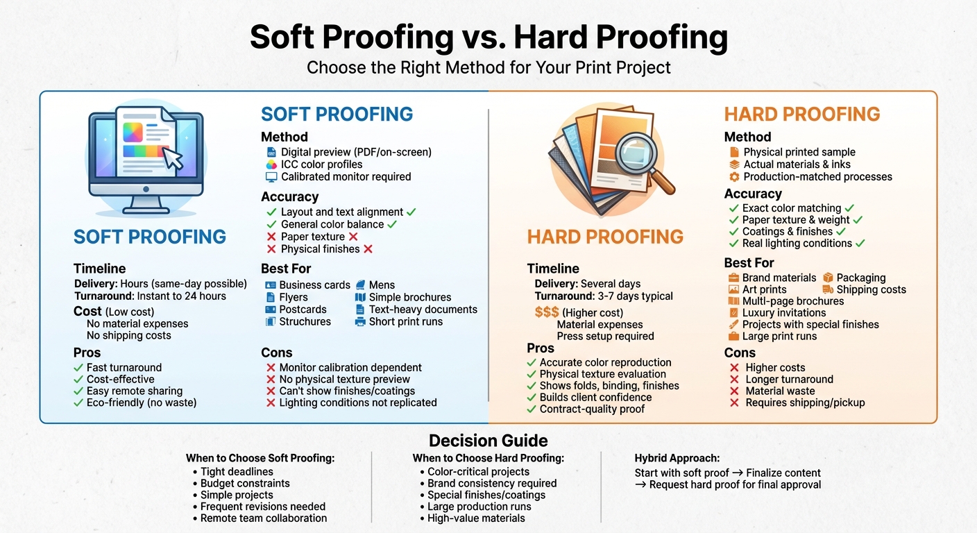
Looking to understand the difference between holographic and lenticular printing? Here’s the quick breakdown:
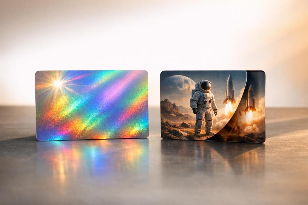
- Holographic Printing: Uses lasers to create 3D images on foil or film. Commonly seen on credit cards and security labels, it’s great for anti-counterfeiting but requires specific lighting to display properly.
- Lenticular Printing: Combines interlaced images with plastic lenses to create effects like motion or depth. Vibrant under normal light, it’s ideal for marketing materials, postcards, and retail displays.
Quick Comparison:
| Feature | Holographic Printing | Lenticular Printing |
|---|---|---|
| Technology | Laser interference on foil/plates | Interlaced images with plastic lenses |
| Lighting Needs | Requires directed light | Works under standard ambient light |
| Durability | Thin and delicate | Durable and mail-safe |
| Best For | Security (e.g., IDs, banknotes) | Marketing, packaging, retail displays |
| Cost | High for production | High setup, cost-effective at scale |
Holographic printing excels in security applications, while lenticular printing is better for eye-catching marketing. Choose based on your project’s goals and environment.
Holographic vs Lenticular Printing: Side-by-Side Comparison
Holographic Printing and Lenticular Printing UK
What is Holographic Printing?
Holographic printing is a laser-based technique that captures the full light field of an object – its amplitude and phase – to create a three-dimensional, light-responsive image on a flat surface. This process relies on splitting laser beams to replicate the intricate 3D details of the object.
Here’s how it works: a laser beam is divided into two parts. The object beam reflects off the subject, while the reference beam illuminates the holographic film. When these two beams intersect, they form microscopic interference fringes that store the object’s complete 3D information. Tracy V. Wilson describes it this way:
"Large-scale holograms… are two-dimensional surfaces that show absolutely precise, three-dimensional images of real objects. You don’t even have to wear special glasses… to see the images in 3-D."
What makes holograms fascinating is their dynamic nature. The image appears to shift as the lighting or viewing angle changes, creating natural parallax and color variations – no special glasses required. This effect happens because the interference fringes scatter light to reconstruct the original light waves, giving the illusion of depth.
The origins of holographic printing date back to 1948, when Hungarian physicist Dennis Gabor invented the technique, earning him a Nobel Prize for his groundbreaking discovery. The process requires an ultra-fine-grain film capable of capturing light variations at scales smaller than a single wavelength.
Key Features of Holographic Printing
Holographic printing stands out for its striking visuals and its effectiveness in security. The laser-recorded interference patterns are incredibly hard to replicate, making holograms a go-to choice for anti-counterfeiting measures.
Beyond security, holograms deliver mesmerizing 3D effects without the need for special viewing tools. As you move around a hologram, the perspective naturally shifts. Interestingly, even a tiny fragment of a hologram can still display the entire image, though in lower resolution.
Steven Waxman, a printing consultant, highlights their security applications:
"These holograms are specifically used to thwart forgery and tampering… They’re also used on software packages, banknotes, passports, stock certificates, and anywhere else that identity theft or the theft of intellectual or financial property might occur."
Holographic printing isn’t just about security – it’s also a favorite for premium packaging, authenticity labels, and artistic displays. The color-shifting effect, which creates a rainbow-like appearance as the viewing angle changes, is a hallmark of reflection holograms. These holograms are designed to work under white light, with the diffraction of light through the interference patterns creating their vivid colors. While high-end holograms require precise laser lighting for the best results, mass-produced versions are tailored to be visible under everyday lighting conditions.
What is Lenticular Printing?
Lenticular printing is a fascinating technique that uses plastic sheets embedded with tiny lenses – called lenticules – to create images that appear to move, transform, or have depth when viewed from different angles. Unlike the laser-based process used in holographic printing, lenticular printing relies on a straightforward optical mechanism. This simplicity doesn’t take away from its precision or the striking visual effects it produces.
Here’s how it works: multiple images are sliced into narrow strips, digitally interlaced, and then printed or laminated onto a lenticular lens sheet. Each lens ridge reveals just one strip of the image, so as you tilt the printed piece, you see different visuals emerge.
As JohnsByrne puts it:
"Lenticular is a printing method that adds dimension and/or motion to images which are normally static and flat. The ‘magic’ is actually an optical illusion."
One of the standout benefits of lenticular printing is its ability to function under regular lighting. Unlike holograms, which can appear faint or "ghosted" on foil material, lenticular images remain vibrant and fully visible. This makes them ideal for everyday uses like postcards, promotional items, and product packaging.
Key Features of Lenticular Printing
Lenticular printing is incredibly versatile, offering a range of effects depending on how the lenses are oriented and how the images are sequenced. For example, the lenses can create "flip" effects, where one image transforms into another, or 3D depth effects that give the illusion of space and dimension. For handheld prints, top-to-bottom tilting typically triggers animation, while vertical lens arrangements create parallax, allowing each eye to see a slightly different image – your brain then interprets this as depth.
The density of the lenses, measured in lines per inch (LPI), plays a big role in the final product. Low LPI (20–40) is ideal for large-scale applications like billboards, while high LPI (100–150) works best for smaller, handheld items. This flexibility makes lenticular printing suitable for a wide range of uses.
Durability is another major advantage. The plastic lens not only enhances the visual effect but also protects the print, making it tough enough to withstand mailing or frequent handling. This durability is particularly useful for retail displays and promotional materials in high-traffic areas.
Lenticular printing has proven to be highly effective in marketing. For instance, Verizon saw a dramatic boost in a direct mail campaign by replacing a standard offer with a lenticular credit card. The response rate jumped from under 0.5% to 8%, with the promotional effect lasting up to three months. Common uses include postcards that showcase before-and-after transformations, movie posters with animated elements, collectible trading cards with 3D visuals, and retail signage that changes messages as people walk by. Even postage stamps have embraced this technique – take the United States Postal Service’s August 2018 "The Art of Magic" stamp, which reveals a white rabbit popping out of a black top hat when tilted.
How Holographic and Lenticular Printing Work
Both holographic and lenticular printing deliver visually stunning effects, but their processes couldn’t be more different. Let’s break down how each technique creates its unique magic.
The Holographic Printing Process
Holographic printing begins with a laser beam split into two parts: the object beam and the reference beam. These beams pass through lens systems to spread the light. The object beam reflects off the subject being captured and onto a special holographic film, while the reference beam hits the film directly without interacting with the object.
When these two beams meet on the film, they create an interference pattern – a bit like ripples colliding in water. This pattern encodes both the intensity and phase of the light waves, unlike traditional photography, which only captures brightness. As Tracy V. Wilson puts it:
"Each interference fringe is like a curved, microscopic mirror. Light that hits it follows the law of reflection… the interference fringes of a hologram act like a diffraction grating".
Once the hologram is developed, the interference fringes are transformed into refractive index variations through a bleaching process. When illuminated with the right light source, these fringes reconstruct the original light waves, creating a three-dimensional image.
One of the most fascinating aspects of holography is its resilience. Even if you break a holographic plate into pieces, each fragment can still recreate the entire 3D image – though with reduced clarity. However, creating a hologram demands extreme stability. Even minor disruptions, like body heat or a breath, can ruin the recording.
The Lenticular Printing Process
Lenticular printing takes a much simpler approach to creating dynamic visuals. It starts by interlacing multiple images into thin strips. This interlaced image is then printed on the back of a plastic lens sheet or laminated to it.
The lens sheet is made up of tiny, repeating convex ridges called lenticules. Each lenticule acts as a magnifying glass, showing only specific slices of the interlaced image depending on your viewing angle. Precision is key – misaligned lenticules can result in blurry or ghosted visuals. As you shift your perspective, the lenticules reveal different image slices, creating effects like motion or depth. These lenses range from 40 to 150 lines per inch (LPI), with higher LPIs used for smaller items and lower LPIs for larger displays. Modern advancements even allow up to 60 video frames to be embedded in a single print.
The orientation of the lenticules determines the effect. Vertical lenticules create a 3D effect by delivering different images to each eye, tricking the brain into perceiving depth. Horizontal lenticules, on the other hand, are perfect for animations or flip effects, activated by tilting the print up and down. Unlike holograms, lenticular prints are easy to view under normal lighting, making them ideal for everyday applications.
sbb-itb-ce53437
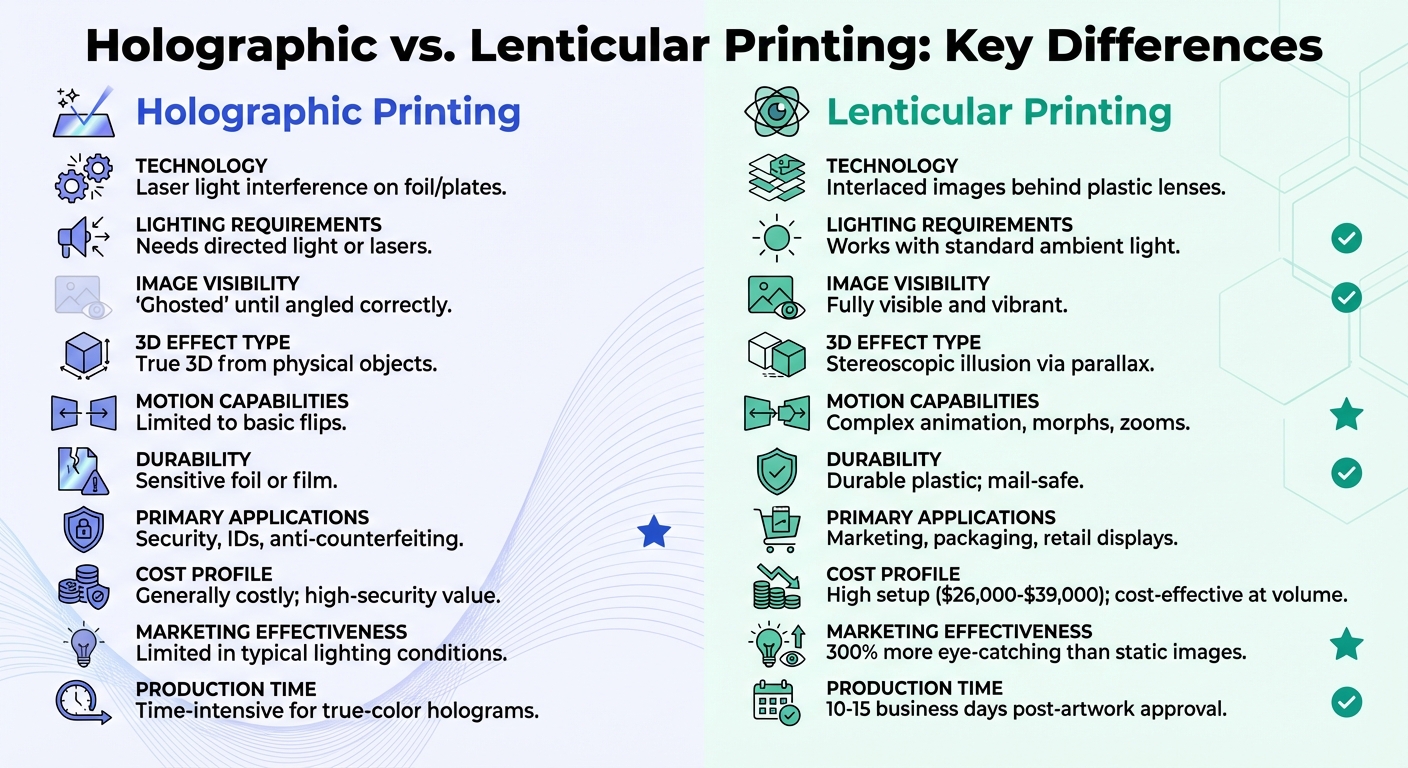
Key Differences Between Holographic and Lenticular Printing
Although both holographic and lenticular printing techniques are known for their striking visual effects, they rely on entirely different processes. Holographic printing uses laser interference on foil or photographic plates to create a genuine 3D image. On the other hand, lenticular printing involves layering interlaced digital images beneath a plastic lens sheet, producing optical illusions like depth, motion, or transformation. These technical distinctions lead to notable differences in their performance and cost.
One of the most obvious differences lies in how they interact with light. Holograms require specific lighting conditions to counteract their "ghosted" appearance, only becoming visible when viewed from precise angles. In contrast, lenticular prints maintain their vibrancy under everyday ambient lighting, which makes them more practical for marketing and promotional purposes.
Durability is another key factor. Lenticular prints are sturdy enough to be mailed without protective envelopes, while holograms, often applied as thin transparent foils, are more fragile. This difference influences their applications: holograms are primarily used in high-security contexts like banknotes and passports due to their resistance to forgery. Meanwhile, lenticular prints are favored for packaging, posters, and retail displays, where they can handle frequent physical interaction.
Cost is another area where these methods diverge. Holographic printing tends to be expensive but is often justified by its critical role in security. Lenticular printing, while requiring a hefty initial investment – ranging from $26,000 to $39,000 – becomes more economical when produced in large quantities. However, as Andrew Roblett, Joint MD of Riot of Colour, bluntly put it:
"Lenticular is long-winded, incredibly time-consuming and there isn’t much profit!".
Comparison Table: Holographic vs. Lenticular Printing
| Feature | Holographic Printing | Lenticular Printing |
|---|---|---|
| Technology | Laser light interference on foil/plates | Interlaced images behind plastic lenses |
| Lighting Requirements | Needs directed light or lasers | Works with standard ambient light |
| Image Visibility | "Ghosted" until angled correctly | Fully visible and vibrant |
| 3D Effect Type | True 3D from physical objects | Stereoscopic illusion via parallax |
| Motion Capabilities | Limited to basic flips | Complex animation, morphs, zooms |
| Durability | Sensitive foil or film | Durable plastic; mail-safe |
| Primary Applications | Security, IDs, anti-counterfeiting | Marketing, packaging, retail displays |
| Cost Profile | Generally costly; high-security value | High setup; cost-effective at volume |
Pros and Cons of Each Printing Technique
Now that we’ve gone over the technical aspects, let’s dive into the strengths and weaknesses of holographic and lenticular printing. Each method comes with distinct trade-offs depending on the intended use.
Holographic printing stands out for its unbeatable security features. Its near-impossible replication makes it ideal for anti-counterfeiting and authentication purposes. Plus, holograms deliver a precise 3D perspective, letting viewers see objects from different angles without needing special glasses. That said, holograms depend heavily on directed light to display their full detail. Without proper lighting, they can appear faint or "ghosted", which limits their practicality in everyday marketing settings.
Lenticular printing, on the other hand, thrives in marketing and promotional environments. Its vibrant images perform well under standard ambient lighting, making it a popular choice for retail displays and direct mail campaigns. Lenticular prints are also hard to miss – studies show they’re 300% more likely to grab attention compared to static images. Durability is another strong suit; thanks to their plastic lens construction, lenticular postcards can be mailed without envelopes and still arrive intact.
When it comes to cost, the two methods differ significantly. Holographic printing has steep initial costs, starting in the thousands, with mass production requiring an investment of at least $20,000. Lenticular printing, while also pricey, demands an upfront investment of $26,000–$39,000 for professional equipment. However, lenticular printing becomes more cost-effective for runs exceeding 500 pieces. Another consideration is production time: true-color holograms require extensive labor and time, whereas lenticular projects typically take 10–15 business days after artwork approval.
Andrew Roblett from Riot of Colour shared his perspective on lenticular printing, saying:
"Lenticular is long-winded, incredibly time-consuming and there isn’t much profit!"
Lenticular printing also demands precise alignment to avoid ghosting, adding to its complexity. These factors play a key role in determining the best fit for specific applications.
Comparison Table: Pros and Cons
| Aspect | Holographic Printing | Lenticular Printing |
|---|---|---|
| Visual Impact | Precise 3D details with a rainbow foil effect | Motion and depth fully visible; 300% more eye-catching than static images |
| Lighting Needs | Requires directed light | Performs well under normal ambient lighting |
| Durability | High for security; delicate foil may limit use | Extremely durable; can be mailed without envelopes |
| Production Complexity | Very high; laser recording is demanding | High; requires precise alignment and specialized software |
| Production Time | Time-intensive for true-color holograms | Typically 10–15 business days post-artwork approval |
| Setup Cost | Starts at $20,000 for mass production | $26,000–$39,000 for professional equipment |
| Best For | Security, anti-counterfeiting, and authentication | Marketing campaigns, packaging, and retail displays |
| Main Limitation | Sensitive to lighting conditions | High setup costs and labor-intensive production |
| Marketing Effectiveness | Limited in typical lighting conditions | Proven success in direct mail campaigns |
Best Use Cases for Holographic and Lenticular Printing
Both holographic and lenticular printing shine in specific areas, thanks to their unique characteristics.
Holographic Printing Use Cases
Holographic printing is a standout in security and authentication. It’s widely used by financial institutions for banknotes, credit cards, and stock certificates. Government agencies rely on it for securing driver’s licenses – like those issued by the Maryland Vehicle Association – passports, and election security seals. Its advanced security features make it a trusted choice for creating FIPS-compliant labels.
Beyond security, holographic printing plays a big role in protecting brand integrity. Companies in software, luxury goods, and sports equipment industries use holograms to combat counterfeiting and safeguard intellectual property. For consumers, seeing a hologram on packaging signals trust and authenticity, making it a powerful tool for building confidence in a brand.
Lenticular Printing Use Cases
Lenticular printing thrives in marketing and consumer engagement. It’s particularly effective in direct mail campaigns, as lenticular postcards are durable enough to be mailed without envelopes. In retail, large-format posters and displays – especially in high-traffic locations like airports – grab attention with their dynamic, eye-catching effects that shift as people move past.
This technology is also gaining traction in product packaging. A great example is Roche Pharmaceuticals, which used a lenticular insert in a home blood test kit to visually demonstrate the device’s functionality. For movie promotions, lenticular printing has made a splash too. Riot of Colour created a massive 16 ft x 8 ft lenticular poster for the Avatar DVD release, displayed in HMV‘s Oxford Street window in London. At the time, it was believed to be the largest lenticular poster ever made.
What sets lenticular printing apart is how its effects change with viewing angles, encouraging interaction. This makes it ideal for showcasing product functionality, illustrating before-and-after transformations, and creating memorable, engaging brand experiences.
Conclusion
Deciding between holographic and lenticular printing comes down to the purpose of your project. Holographic printing is ideal for applications where security is the top priority, such as credit cards, driver’s licenses, and product authentication labels. This method uses laser light interference to create highly detailed 3D images that are difficult to counterfeit. On the other hand, lenticular printing shines in settings where visual appeal and engagement are key. By using plastic lens arrays, it creates striking effects like motion, flips, and 3D depth that are fully visible under normal lighting.
The technical differences between these methods are worth noting. Holograms require specific lighting to reveal their intricate details, while lenticular prints are vibrant and attention-grabbing in any setting, reportedly drawing 300% more attention than static images. Additionally, lenticular prints are durable enough for direct mail campaigns, even without envelopes.
When making your choice, think about the environment where your materials will be viewed and how your audience will interact with them. For projects focused on security and tamper resistance, holographic printing is the clear choice. If you’re aiming for dynamic, eye-catching visuals for product packaging, displays, or marketing campaigns, lenticular printing delivers the engaging effects you need.
Both technologies serve distinct purposes, and understanding their unique strengths will help you choose the right approach to meet your project goals.
FAQs
What makes holographic printing better than lenticular printing?
Holographic printing creates a 360-degree visual experience, where the image shifts and changes as you move around it. This dynamic effect offers a level of interaction and visual intrigue that lenticular printing – limited to showing motion or depth within a fixed angle – simply can’t match.
What sets holographic printing apart is its use of precise laser-based embossing, which results in sharp, high-contrast visuals. This makes it an excellent choice for decorative designs or security features, such as those used to prevent counterfeiting. If you’re aiming for an eye-catching, interactive display or need to add a layer of authenticity, holographic printing delivers. On the other hand, lenticular printing is better suited for simpler effects, like creating a sense of 3D depth or small animations within a limited viewing range.
What are the lighting requirements for holographic prints compared to lenticular prints?
Holographic prints need very specific lighting to showcase their full 3D effect. They depend on a controlled light source, like a laser or focused illumination in a dim setting, to bring out their vibrant depth and shifting colors. If the lighting is too bright or scattered, the holographic effect can weaken or even vanish altogether.
In contrast, lenticular prints are far more flexible when it comes to lighting. Thanks to their lens array, they refract ambient light, meaning they perform well under normal room lighting. You can light them from the front or back without requiring any special equipment, making them a practical choice for everyday environments.
What is the most budget-friendly printing method for large-scale marketing campaigns?
For large-scale marketing campaigns, lenticular printing tends to be the more cost-effective route. It works with standard digital files and avoids the need for specialized lighting or expensive custom equipment. This simplicity makes it easier to produce in bulk, which helps bring down the per-unit cost.
On the other hand, holographic printing requires a more intricate setup, including specialized materials, which drives up expenses. This can make it a less practical option for high-volume projects. If your goal is to create eye-catching prints for a large audience without breaking the bank, lenticular printing is usually the smarter pick.
Related Blog Posts
- Foil Stamping vs Metallic Ink: Key Differences
- Die-Cutting vs Laser Cutting: Material Differences
- UV Printing vs. Lamination: Which Protects Better?
- Matte vs Gloss Lamination: Key Differences
https://app.seobotai.com/banner/banner.js?id=694b4d7612e0ddc125f23354