When preparing images for printing, sharpness is critical for achieving high-quality results. Sharpness ensures details like text, edges, and textures appear clear and defined, avoiding blurry or unpolished prints. Here’s how to check and optimize image sharpness for professional prints:
- Resolution Matters: Aim for at least 300 PPI for clear prints. Check file resolution in Photoshop or similar tools.
- Inspect Details: Zoom in to 100% to evaluate edges, textures, and text clarity. Look for halos or noise that may indicate over-sharpening.
- Test Print: Print a small section of your image to check sharpness on the intended paper type and printer settings.
- Tailored Sharpening: Apply sharpening adjustments based on the paper and print size. Glossy paper retains sharpness better than matte or textured materials.
- Use Tools: Software like Photoshop or Capture One helps refine sharpness with features like Unsharp Mask, High Pass filters, and noise reduction.
Sharpness issues, such as oversharpening or low resolution, can significantly affect the final print. Testing and proper adjustments ensure your prints meet expectations, whether for personal projects or professional use.
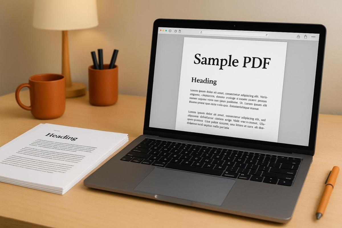
Soft Proofing, Image Sharpening and Sizing for Print by Joshua Holko
Image Sharpness Basics
Getting the sharpness of an image just right is a key step in achieving professional-quality prints.
What Is Image Sharpness?
At its core, image sharpness is all about how well-defined the edges and contrasts are in a photo. When someone refers to an image as "sharp", they’re usually talking about how clearly the boundaries between different elements stand out. This clarity is crucial for details to appear crisp and precise under ideal conditions.
Sharpness hinges on how quickly tones shift from light to dark at the edges of objects. A sharp edge will show a sudden transition between light and dark, while a softer edge will have a more gradual change, often with gray tones blending in between. This is why sharp images make fine details – like strands of hair, fabric textures, or the clean edges of text – stand out so vividly.
While resolution determines the maximum amount of detail an image can hold, focus decides which parts of the image appear crisp. For instance, an image captured at 6,000 x 4,000 pixels will showcase far more detail than one taken at 2,000 x 1,500 pixels, assuming both are printed at the same size. However, even with high resolution, poor focus can leave an image looking soft and lacking that sharp edge definition essential for professional prints.
What Affects Image Sharpness
A variety of factors come into play when determining how sharp a printed image will appear. Understanding these elements can help you make informed choices throughout your editing and printing process.
- Equipment quality: High-end cameras and lenses, especially when used at their optimal aperture settings, capture finer details with minimal noise.
- Image editing: Post-processing can either enhance or harm sharpness. Over-sharpening can create unnatural halos around edges, while under-sharpening leaves the image looking dull. File formats matter too – RAW files retain full sharpness, while lower-quality JPEGs can soften details due to compression.
- Print size and viewing distance: The sharpness you see depends on the relationship between print size and resolution. For example, an image that looks sharp at 4" x 6" might lose clarity if enlarged without enough pixels per inch (PPI).
- Printing methods and materials: Smooth, glossy papers used in digital printing tend to preserve fine details, while textured materials or certain printing methods can soften edges.
- Output sharpening: This final step involves applying sharpening tailored to the specific print process and paper type, ensuring the image looks its best in its final form.
Tools and Methods for Checking Image Sharpness
When it comes to professional prints, ensuring image sharpness is non-negotiable. To capture every detail and maintain quality across various formats, you need the right mix of tools and techniques.
Technical Measurement Tools
If you’re after precision, Modulation Transfer Function (MTF) is the gold standard. It measures how well an imaging system reproduces contrast at different spatial frequencies. Essentially, MTF charts break down sharpness into percentages – 100% means perfect contrast, while anything less highlights areas of blur.
Another method involves slanted-edge algorithms, which analyze the transition between light and dark areas along diagonal edges in test images. The sharper the transition, the crisper the image looks.
For a more comprehensive approach, Imatest software is a favorite among photography studios and print shops. It not only measures MTF and noise levels but also generates detailed quality reports. This ensures consistency across cameras and printing workflows, making it a go-to for professionals.
While these tools provide objective metrics, pairing them with visual assessments gives a fuller picture.
Visual Inspection Methods
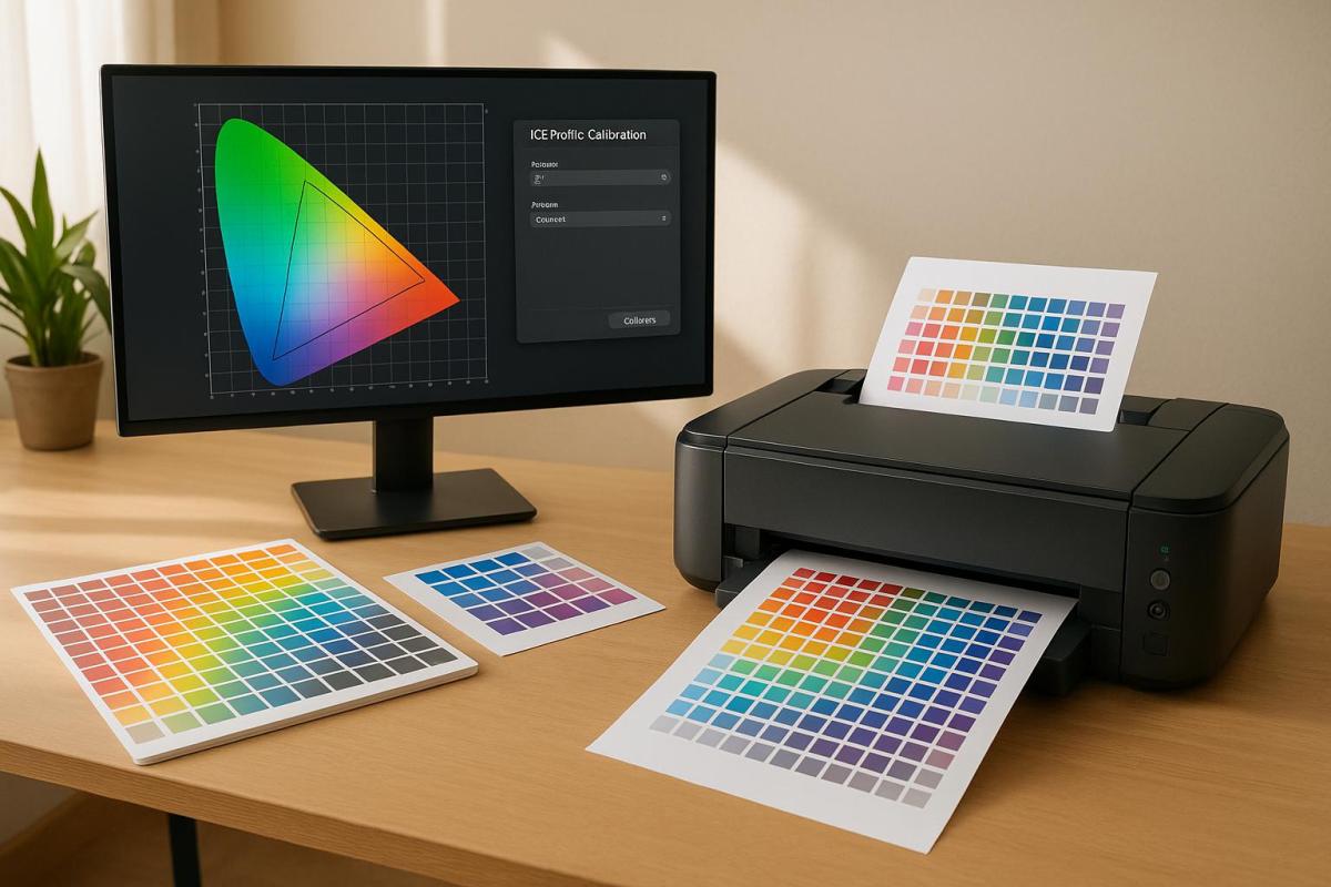
Start with a calibrated monitor to ensure what you see on the screen matches what will appear in print. An uncalibrated display can hide subtle sharpness issues or lead to unnecessary tweaks that might degrade quality.
Inspect images at 100% zoom or use digital magnifiers to evaluate edge clarity. This level of detail helps you spot halos, blending, or any lack of definition in critical areas. For instance, fine textures like fabric or individual hairs should be distinct and clean.
To refine your evaluations further, specialized software can make a big difference.
Software for Sharpness Assessment
Adobe Photoshop is a powerhouse for sharpness checks. Its tools like Unsharp Mask and Smart Sharpen let you preview adjustments in real time. The High Pass filter is particularly handy for isolating contrast transitions, making it easier to spot areas that need improvement. Plus, the Print Preview feature simulates how your image will look on different paper types.
For those seeking free alternatives, GIMP offers similar tools. Its Unsharp Mask and High Pass filter functions allow you to identify and address soft areas effectively.
If you’re working with RAW files, Capture One is a standout choice. Its Clarity and Structure adjustments enhance local contrast without introducing artifacts. The Focus Mask overlay is another useful feature, highlighting sharp areas in color to confirm that key subjects are in focus.
Many professional print services also use specialized software that integrates these methods. These tools automatically flag images that don’t meet sharpness requirements for specific print sizes and paper types, ensuring consistent quality across large projects.
Step-by-Step Guide to Check Image Sharpness for Printing
Follow these steps to ensure your images are sharp and ready for professional-quality printing.
Check Image Resolution and File Details
Start by examining your image’s resolution and file details. On Windows, right-click the file and select "Properties." On a Mac, choose "Get Info." This will show the pixel dimensions and file size – larger file sizes typically indicate higher resolution.
For precise measurements, open your image in Adobe Photoshop and navigate to Image > Image Size. Here, you’ll find the pixels per inch (PPI) value. For printing, aim for at least 300 PPI.
If you’re using GIMP, go to Image > Print Size to check the pixel dimensions and PPI. If the PPI is below 300, you’ll need to resize the image or find a higher-resolution version.
Also, don’t overlook the color mode. While many printers handle RGB files, converting your images to CMYK is often recommended for consistent color reproduction in print.
Examine Details at 100% Zoom
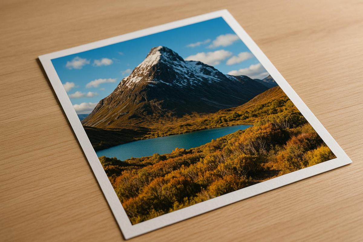
Once the resolution is confirmed, inspect your image visually by zooming in to 100%. This gives you a clear view of fine details. For portraits, focus on features like the eyes and hair. For landscapes, check the edges of trees, buildings, and horizon lines. If your image includes text, ensure the edges are sharp and well-defined.
Look closely at edge transitions. Sharp images will have clean, crisp edges, while soft or blurry edges could indicate focus issues or excessive processing. Keep an eye out for digital artifacts, such as halos around high-contrast areas, which could signal over-sharpening.
Tools like Photoshop’s Navigator can help you quickly move around the image while maintaining the 100% zoom level.
After this digital check, move on to a physical test print to confirm the sharpness translates well to paper.
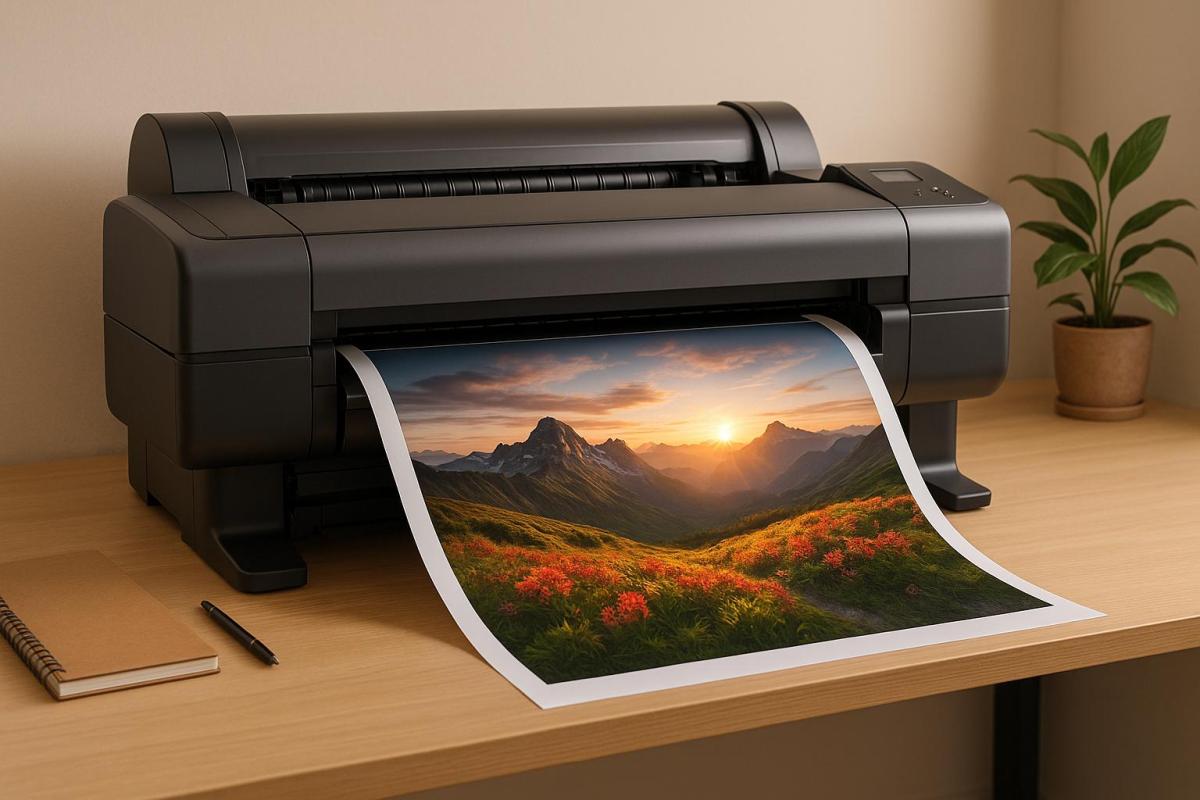
Print a Test Section
To ensure your image looks as sharp in print as it does on screen, create a test print. Select a section of the image that includes fine details or text and print it at actual size using your intended paper and printer settings. Different paper types can impact how sharp the image appears, so testing with your chosen materials is crucial.
Inspect your test print under good lighting, such as natural daylight or high-quality LED lights. Use a magnifying glass or loupe to check for clean edges and retained detail. If the print appears softer than expected, consider applying output sharpening based on the paper type and intended viewing distance.
For critical projects, professional print services like Miro Printing & Graphics Inc. can provide test printing options. This allows you to evaluate sharpness across various paper stocks and printing methods before committing to a full print run.
High-resolution images for printing typically require a minimum of 300 PPI.
sbb-itb-ce53437
Common Sharpness Problems and How to Fix Them
When it comes to printing, achieving sharp and professional-looking images can be tricky. Various factors can impact sharpness during the printing process, but understanding these challenges – and knowing how to address them – can help you consistently produce crisp, high-quality results.
Oversharpening and Digital Artifacts
Oversharpening can ruin an image by creating unnatural halos around high-contrast edges and introducing noise that becomes glaringly obvious in print. Bright edges may develop dark outlines, and dark edges can gain bright halos, resulting in prints that look artificial. To prevent this, try sharpening your image in smaller, gradual steps rather than applying heavy adjustments all at once. In Photoshop, the Unsharp Mask filter is a great tool – set the Amount between 50-150%, Radius between 0.5-2.0 pixels, and Threshold between 0-5 levels. For output sharpening, Smart Sharpen is another solid option, especially with noise reduction enabled.
If sharpening reveals digital noise – grainy textures in smooth areas like skies or skin tones – reduce noise before sharpening. Photoshop’s Camera Raw filter provides excellent noise reduction tools to clean up your image.
Also, watch out for edge artifacts, which can appear as jagged or uneven edges around text and graphics. If you spot these, lower the sharpening amount or increase the threshold to protect smoother areas from over-enhancement.
Lastly, ensure your file’s resolution is adequate – poor resolution can limit sharpness no matter how well you edit.
Low-Resolution Files
Low-resolution images (below 150 PPI) tend to look soft and pixelated when printed. While upsampling – increasing the resolution – can sometimes help, it’s not a magic fix. Photoshop’s "Preserve Details 2.0" algorithm works well for photos, while "Bicubic Smoother" is better for illustrations or graphics. However, remember that upsampling can’t add detail that wasn’t there to begin with.
The quality of your source file plays a huge role. A sharp, well-exposed image at 200 PPI will often outperform a blurry 300 PPI image. Additionally, file compression can reduce sharpness. JPEGs with high compression lose fine details and develop visible artifacts, so whenever possible, work with uncompressed TIFF files or save JPEGs at maximum quality settings.
For critical projects, starting with a higher-resolution capture or scan is often a better approach than trying to salvage a low-resolution file.
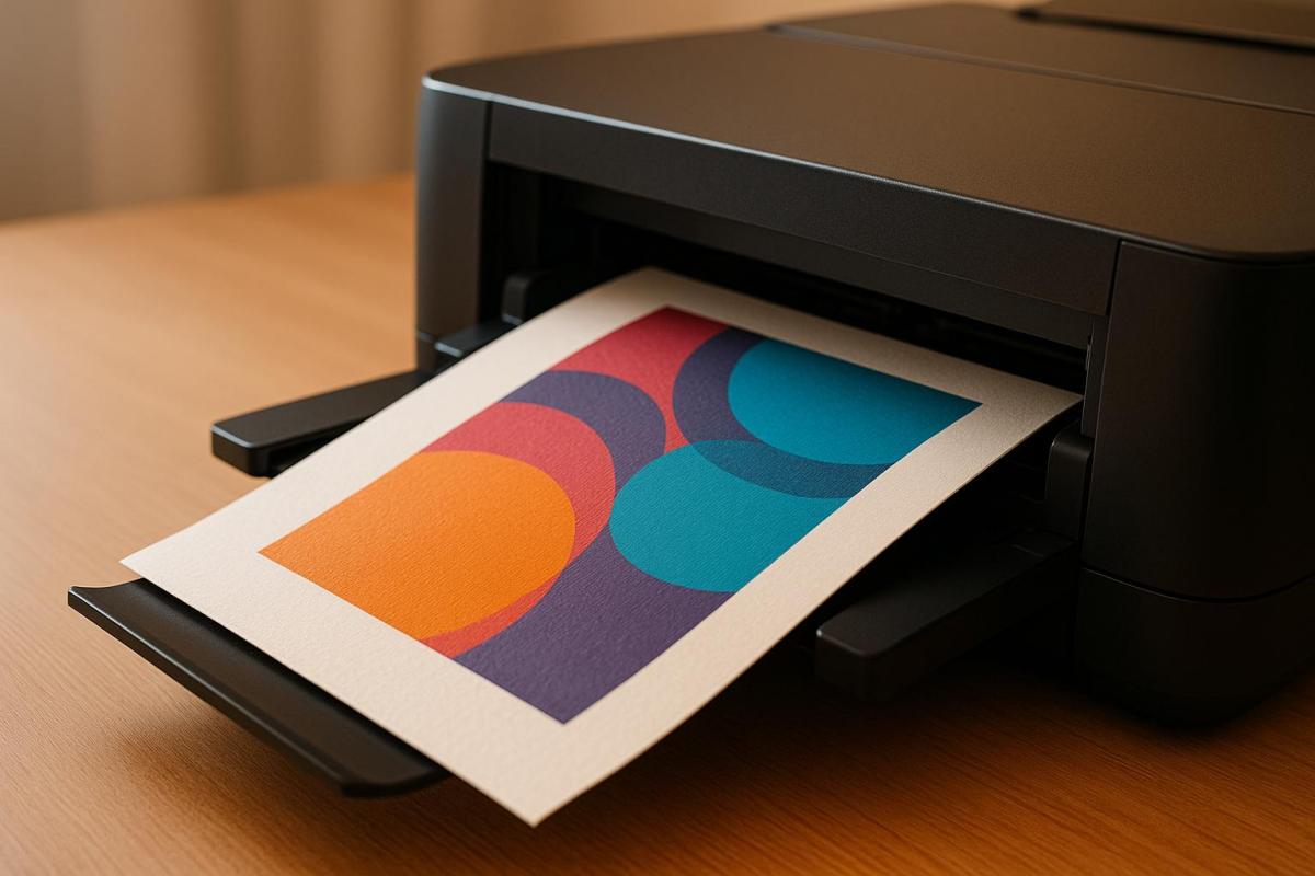
How Print Materials Affect Sharpness
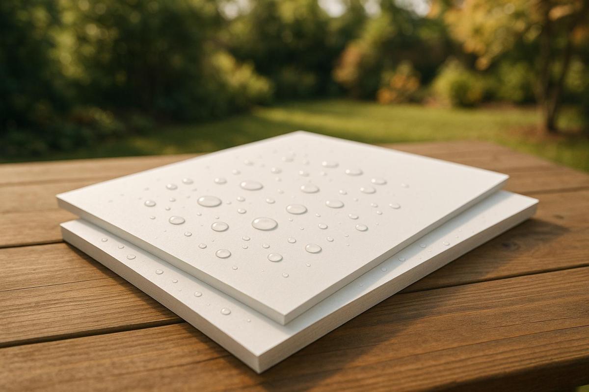
Your choice of print material significantly impacts how sharp your images appear. For instance, paper finishes make a big difference – glossy papers reflect light and enhance detail and contrast, while matte papers absorb light, softening the image but also masking minor sharpness issues.
Paper texture and ink absorption also play a role. Smooth, coated papers like photo paper preserve fine details, while textured or uncoated papers allow ink to spread, softening the edges. Coated papers keep ink on the surface, resulting in sharper prints.
Don’t forget about viewing distance. Prints meant for close-up viewing benefit from glossy papers that highlight every detail, while images displayed on walls can use matte papers without any noticeable sharpness loss.
Before committing to a final print, test your image on the paper stock you plan to use. A print that looks sharp on glossy paper might require extra sharpening for matte paper, and an image that seems oversharpened on gloss might look just right on a textured surface. Testing ensures your final product meets your expectations.
Adding Sharpness Checks to Your Print Workflow
Image sharpness plays a key role in delivering professional-quality prints. By integrating sharpness checks into your workflow, you can maintain consistent quality from the digital file to the final print, avoiding costly mistakes and reprints. When sharpness becomes a standard part of your process rather than an afterthought, you’ll save time and see better results. These checks complement earlier steps, like verifying resolution and inspecting images on-screen, ensuring your work transitions smoothly to the printing stage.
Creating Standard Sharpness Checks
A consistent sharpness protocol helps you achieve reliable and repeatable results. Start by creating a checklist to guide your process. For example:
- Confirm a minimum resolution of 300 PPI at the final print size.
- Inspect image details at 100% zoom to catch any issues.
- Look for oversharpening or artifacts that could degrade quality.
It’s also helpful to document the optimal sharpening settings for different project types. For instance, smaller prints like business cards may require stronger sharpening, while larger formats like banners benefit from a more subtle approach.
Using standardized test strips can also streamline your workflow. These strips act as a reference point, letting you quickly compare your current project to a benchmark with proven sharpness.
Another useful practice is naming files to reflect the sharpening applied and the intended print material (e.g., "BusinessCard_Sharp_Gloss.tif"). This makes it easy to identify the file’s preparation at a glance.
Lastly, enable soft proofing in your editing software. This feature simulates how your image will look on specific paper types, providing a more accurate preview than a standard RGB display. It’s an effective way to spot potential sharpness issues before printing.
Working with Professional Print Services
Once you’ve established internal sharpness standards, collaborating with professional print services can elevate your results even further. An experienced print shop, like Miro Printing & Graphics Inc. in Hackensack, NJ, offers a range of services – digital, offset, and large-format printing – along with expert advice on optimizing sharpness for different materials and methods.
Professional printers bring a level of expertise that’s hard to match. They understand how various inks interact with different paper stocks and how specific printing processes can affect sharpness. By communicating your sharpness requirements clearly, you can benefit from their tailored recommendations. Many print shops can even handle output sharpening as part of their workflow, ensuring your images look just as crisp on paper as they do on screen.
Following your printer’s file preparation guidelines – covering aspects like resolution, color space, and sharpening techniques – can reduce guesswork and improve your final results. Additionally, post-press processes like binding, cutting, and finishing can influence the perceived sharpness of your product, so understanding these interactions is crucial.
Partnering with a professional print service is often a worthwhile investment. It minimizes waste, enhances the quality of your prints, and saves you the time and effort of troubleshooting sharpness issues on your own. When image clarity is essential to your project’s success, working with experienced professionals is the best way to ensure your prints stand out.
Conclusion: Getting Sharp Images for Professional Prints
Creating sharp, professional-quality prints isn’t just about capturing a high-resolution image. It’s about understanding how sharpness transitions from your screen to the printed page and carefully managing every step of the process.
The steps outlined earlier ensure that your digital file is ready to meet the demands of printing. Paper absorbs ink, which can soften images and blur fine details. An image that looks crisp on your screen at 72 PPI might appear pixelated or lack clarity in print. This makes sharpness a key factor in distinguishing a professional print from one that falls short.
FAQs
What mistakes should I avoid when sharpening images for printing?
When preparing images for printing, there are a few common pitfalls to steer clear of:
- Over-sharpening: This can lead to halos around edges and amplify noise, leaving the image looking artificial and harsh.
- Using the same sharpening settings for all images without accounting for their individual characteristics and needs.
- Skipping the step of resizing the image to the correct resolution before sharpening. This misstep can result in prints that are either too soft or overly sharp.
For the best outcomes, always view your image at 100% zoom while fine-tuning the sharpening settings. Tailor these adjustments to the specific image and its intended print size to produce sharp, professional-quality prints without any distracting artifacts.
How does the type of paper impact the sharpness of a printed image?
The paper you select can significantly impact the sharpness and clarity of your printed images. Coated papers, such as those with gloss or satin finishes, have smooth surfaces that absorb ink efficiently. This reduces ink spread, resulting in crisp, detailed prints – perfect for projects where precision and sharpness are key.
In contrast, uncoated or textured papers absorb more ink, which can soften edges and reduce detail. While these papers offer a distinctive, artistic feel, they might not be ideal for prints that demand high levels of detail. Choosing the right paper ensures your prints align with both your quality expectations and aesthetic preferences.
Can Photoshop or similar tools help preview how sharp an image will look when printed?
When preparing images for print, tools like Photoshop can be incredibly helpful for previewing and fine-tuning sharpness. Features like Unsharp Mask and Smart Sharpen are designed to enhance edges and bring out fine details, giving you a good idea of how the final print will look.
For even better accuracy, try using soft proofing. This feature lets you simulate how your image will interact with your specific printer and paper type, helping you ensure the sharpness meets your expectations. Keep in mind that resolution and print size are also key factors in achieving the desired level of sharpness.
Related Blog Posts
- Large Format Printing: DPI vs. PPI Explained
- Image Resolution Standards for Offset Printing
- Common Post-Press Quality Issues and Fixes
- Best DPI Settings for Photo Printing
https://app.seobotai.com/banner/banner.js?id=68c5f27b119e7220d7dda8b5