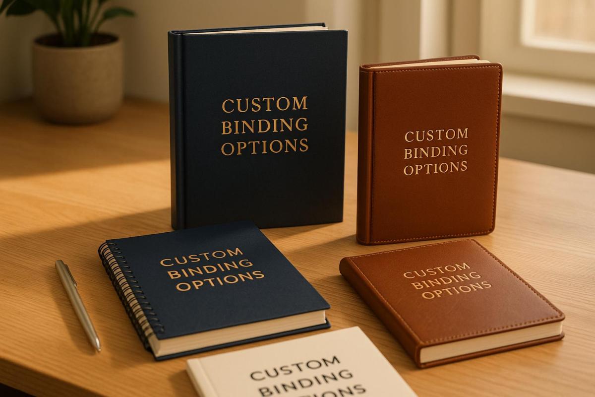
Image Resolution Standards for Offset Printing

Learn essential image resolution standards for offset printing to ensure high-quality, professional results across various materials.

  • 300 DPI is the gold standard for most offset printing, ensuring clear, crisp results.
  • DPI vs. PPI: DPI measures print quality (dots on paper), while PPI measures screen resolution (pixels).
  • Different materials need different resolutions:
    • Business cards: 300-600 DPI
    • Posters: 150-300 DPI (lower DPI works for larger, distant prints).
  • File Formats Matter: Use TIFF for photos, EPS for logos, and PDF/X-1a for mixed content.
  • Color Mode: Convert images to CMYK for accurate printing; RGB won’t work well for print.

Quick Tip: Always start with high-resolution images and avoid enlarging them to prevent quality loss.

Offset printing demands attention to resolution, file formats, and color settings to achieve polished, high-quality results. Let’s dive into the details to ensure your prints look their best.

DPI and Image Resolution Basics

DPI Explained

DPI, or Dots Per Inch, measures how many ink dots are printed within an inch. The higher the DPI, the sharper the print. For instance, a 300 DPI image packs 90,000 dots per square inch (300 x 300), while a 150 DPI image only has 22,500 dots in the same area. More dots mean greater detail and clarity.

DPI vs. PPI: What’s the Difference?

DPI and PPI (Pixels Per Inch) are often confused, but they refer to different things:

Characteristic DPI PPI
Definition Physical ink dots on paper Digital pixels on a screen
Primary Use Measures print output Measures digital resolution
Typical Range 300-1200 for printing 72-300 for screens
Quality Impact Affects printed image quality Affects on-screen image quality

Knowing the difference is crucial for preparing digital files for printing. For example, a 72 PPI image (standard for web use) won’t print well without being adjusted to 300 DPI, which is necessary for professional-quality prints.

Standard DPI for Offset Printing

The required DPI for offset printing depends on the material and viewing distance:

Print Material Recommended DPI Viewing Distance
Business Cards 300-600 Close (8-12 inches)
Brochures/Flyers 300 Standard (1-2 feet)
Posters 150-300 Medium (3-6 feet)
Billboards 50-150 Far (20+ feet)

For most offset printing, 300 DPI strikes a good balance between sharpness and file size. However, enlarging a 300 DPI image by 200% reduces its effective resolution to 150 DPI, which can result in noticeable quality loss. Next, we’ll cover how to prepare file formats and color modes for printing.

300 DPI Myth | What Are DPI, PPI & LPI | Printing for …

Understanding DPI is just the start – each type of print material needs specific resolution standards to achieve the best results.

Book and Magazine Standards

Books and magazines require sharp text and clear images. To meet these needs, images should have a resolution of at least 300 DPI at their final printed size. Text is typically vectorized to maintain sharpness, but if it’s part of a raster image (like scanned pages or creative layouts), aim for 300–600 DPI to keep it readable. For example, a 6 × 9-inch book page should include images that measure at least 1,800 × 2,700 pixels when printed at 300 DPI.

Now, let’s take a closer look at the specific resolution needs for marketing materials.

Marketing Material Requirements

Business cards, brochures, and flyers need a balance between sharp text and detailed images. Below are the recommended standards:

Marketing Item Minimum DPI Optimal DPI Notes
Business Cards 300 600 Ensures clear logos and contact details
Brochures/Flyers 300 450 Balances image detail with text clarity

Large Format Print Standards

Large format prints, like posters and banners, can use lower resolutions because they’re viewed from farther away. Here’s a breakdown of specifications:

Print Size Viewing Distance Recommended Minimum DPI Notes on File Size Impact
24" × 36" Poster 3–6 feet 150 Suitable for close-up viewing
3′ × 6′ Banner 6–12 feet 100 Optimized for moderate distances
6′ × 12′ Billboard 20+ feet 50 Works for distant viewing

For example, a trade show banner viewed from 10 feet should use 100 DPI. To ensure logos and text stay crisp at any size, use vector elements whenever possible. Starting with high-resolution source files also gives you more flexibility when scaling up.

sbb-itb-ce53437

Image Preparation Steps

Get your images ready the right way to ensure top-notch quality in offset printing.

File Format Selection

Choosing the right file format is crucial for print quality. Here’s a quick comparison of the best options:

Format Best Uses Advantages File Size Impact
TIFF Photos and complex images High-quality, supports layers Large (100+ MB for high-res files)
EPS Logos and vector graphics Scalable without losing sharpness Small to medium (1-20 MB)
PDF/X-1a Mixed content documents Preserves fonts, industry standard Medium (20-50 MB typical)

When creating PDFs, always embed fonts and stick to the PDF/X-1a standard. After that, convert colors from RGB to CMYK for accurate printing.

CMYK vs RGB Color Modes

Switching from RGB to CMYK is essential for precise color reproduction in offset printing. Follow these steps:

  1. Start with your RGB files.
  2. Convert them to CMYK using the U.S. Web Coated (SWOP) v2 profile.
  3. Keep ink coverage under 300%.
  4. Check each color channel individually.

To ensure color accuracy, calibrate your monitor and use professional color management tools. Keep in mind that RGB colors might look less vibrant in CMYK, so adjust saturation and contrast as needed.

Common Resolution Errors

Resolution issues can ruin print quality if not addressed. Here’s what to look out for:

Error Impact Solution
Upscaling low-res images Pixelation and blur Reshoot or find higher-resolution images
Incorrect DPI settings Loss of detail Set resolution correctly for print size
JPG compression artifacts Visible degradation Use uncompressed formats for final files
Mixed resolution elements Inconsistent quality Standardize all elements to the same resolution

Use preflight tools in your design software to catch resolution problems early. Check text readability at 100% size and avoid copying and pasting images between applications – always use proper file linking and packaging to maintain quality.

Image Quality Problem-Solving

Fixing Image Clarity Issues

If you’re facing issues with image clarity, here are some common problems and how to address them:

Issue How to Detect Solution
Moiré Patterns Inspect visually at 100% zoom Adjust screen angles or rescan with a 15° rotation
Edge Blurriness Use a magnifying glass Apply selective sharpening; keep images at 2x final size
Halftone Dots Check with preflight software Set an appropriate line screen (e.g., 150-175 lpi for coated paper)
Resolution Loss Measure effective PPI Ensure a minimum of 300 DPI at the final print size

For sharpening, use the Unsharp Mask tool with these settings:

  • Amount: 85-125%
  • Radius: 0.3-0.7 pixels
  • Threshold: 3-7 levels

Avoid global sharpening filters, as they can introduce unwanted artifacts. Instead, use selective sharpening to enhance specific areas, particularly edges, while keeping backgrounds and skin tones smooth. Alongside clarity, accurate color reproduction is equally important for high-quality prints.

Color Accuracy Solutions

Achieving accurate colors requires careful calibration and preparation. Follow these steps:

1. Monitor Calibration

Use a professional colorimeter to calibrate your monitor. Set the white point to 5000K (D50), gamma to 2.2, and luminance to 120 cd/m².

2. Color Profile Management

Use ICC profiles tailored to your paper type and printing setup. For example:

3. Soft Proofing

Enable soft proofing in your design software to preview how the final print will look. Pay close attention to:

  • Rich blacks: Use C:60 M:40 Y:40 K:100 for a deep black tone.
  • Maximum ink density: Keep it within 300-320% total.
  • Spot color conversions: Ensure proper CMYK conversions.

For consistent color evaluation, view prints under D50 lighting conditions. Keep in mind that glossy paper tends to deliver more vibrant colors compared to uncoated stock, so adjust your expectations based on the paper type.

Summary

Resolution Standards Quick Guide

Here’s an overview of key resolution standards for professional offset printing:

Print Material Minimum DPI Optimal DPI Color Mode
Business Cards 300 350-400 CMYK
Brochures & Flyers 300 350 CMYK
Large Format Banners 100-150 200 CMYK
Photo Books 300 400-600 CMYK
Fine Art Prints 400 600+ CMYK

When preparing files for offset printing, follow these guidelines to ensure high-quality results:

  • Image Size: Use original files that are twice the size of the final print dimensions.
  • Color Profile: Apply the GRACoL 2013 profile for coated paper.
  • Total Ink Coverage: Limit coverage to 300-320% for best outcomes.
  • Safe Resolution: Avoid enlarging images beyond their original size.

These practices support consistent and sharp results in offset printing.

Miro Printing & Graphics Inc. Services

Miro Printing & Graphics Inc. brings over 30 years of experience to offset printing, adhering to strict resolution standards. Their in-house prepress team ensures all files meet quality requirements before printing.

Their services include:

  • High-resolution commercial printing up to 600 DPI
  • Professional prepress file optimization
  • Custom projects tailored to specific resolution needs
  • Full in-house bindery services

For custom printing needs, their team offers one-on-one consultations to determine the best resolution settings. Based in Hackensack, NJ, they serve businesses across Bergen County, delivering clear images and accurate colors.

For detailed project specifications, reach out to their technical team at mikem@miroprinting.com.

Related Blog Posts

https://app.seobotai.com/banner/banner.js?id=67e0c2c3a2808c1172f2f399

How Fonts Impact Brand Identity

Explore how font choices shape brand identity, influence perceptions, and enhance visual consistency across all mediums.

Fonts play a crucial role in how people perceive your brand. They shape first impressions, communicate your values, and create a consistent visual identity. Here’s a quick breakdown:

  • Why Fonts Matter: Fonts influence emotions and help customers remember your brand.
  • Font Types:
    • Serif: Trust and tradition.
    • Sans-serif: Modern and clean.
    • Script: Elegant and personal.
    • Display: Bold and unique.
  • Key Considerations:
    • Legibility: Easy to read anywhere.
    • Consistency: Align with your brand’s tone.
    • Versatility: Works across digital and print.

The right font system, paired with professional help, ensures your brand looks polished and cohesive everywhere.

Brand Identity Design: How To Use Fonts In Your Brand

The Psychology Behind Fonts

Fonts do more than just display text – they influence emotions and shape how people perceive brands. Here’s a closer look at how different font types and styles impact customer impressions.

4 Main Font Types and Their Effects

  • Serif Fonts: These fonts give off a sense of trust, tradition, and authority. Think of brands that want to exude professionalism and heritage.
  • Sans-serif Fonts: Clean and modern, sans-serif fonts are often used to communicate efficiency and simplicity.
  • Script Fonts: Known for their elegant and flowing style, script fonts add a personal and sophisticated touch.
  • Display Fonts: These bold and attention-grabbing fonts are perfect for headlines that showcase a brand’s unique personality.

How Font Styles Influence Customer Perception

  • Weight and Size

    • Bold fonts radiate confidence and strength.
    • Light fonts feel refined and delicate.
    • Large fonts grab attention instantly.
    • Small fonts create a sense of intimacy and subtlety.
  • Spacing and Structure

    • Wide spacing suggests openness and approachability.
    • Tight spacing conveys urgency and focus.
    • Rounded shapes feel friendly and warm.
    • Angular designs reflect precision and professionalism.

To ensure your font choices align perfectly with your brand’s identity, work with professionals like Miro Printing & Graphics Inc. They can help maintain consistency across all mediums, from business cards to large-scale displays.

sbb-itb-ce53437

Matching Fonts to Your Brand

Define Your Brand’s Character

Start by defining your brand’s personality. Your fonts should reflect your core values and resonate with your audience. Think about these key aspects:

  • Professional vs. Casual: Is your brand more formal and polished, or laid-back and approachable?
  • Traditional vs. Modern: Does your brand focus on heritage and timelessness, or does it emphasize forward-thinking and new ideas?
  • Luxury vs. Accessible: Should your typography communicate exclusivity or make your brand feel welcoming and inclusive?

For example, a law firm might choose classic serif fonts to project trust and authority. In contrast, a tech startup might go for clean sans-serif fonts to highlight efficiency and forward-thinking. Once you’ve nailed down these traits, use them to shape your visual style and pick fonts that align with your brand.

Font Selection Checklist

When choosing fonts to represent your brand, evaluate them against these criteria:

Selection Criteria Key Considerations
Legibility Ensure the font is easy to read at any size or on any platform.
Versatility It should work well in both digital and print formats.
Brand Alignment The font must reflect your brand’s values and personality.
Technical Requirements Check for compatible file formats and licensing agreements.
Cross-platform Performance Make sure the font looks consistent across different devices.

Building a Complete Font System

Setting Up Font Rankings

Organizing your fonts with a clear hierarchy helps structure your content and guide readers effectively. Start by assigning roles to primary, secondary, and tertiary fonts:

Font Level Purpose Typical Uses
Primary Brand identity and focus Logos, headlines, main titles
Secondary Supporting content Body text, subheadings, brochures
Tertiary Accents and details Captions, footnotes, callouts

Decide on size ranges and weights for each level. For example, primary fonts might range from 24pt to 48pt, while body text is usually best between 10pt and 12pt. Keep consistent spacing ratios between text levels for a polished look.

Once your hierarchy is ready, make sure your fonts are optimized for different platforms and uses.

Making Fonts Work Everywhere

After setting up your font hierarchy, ensure they perform well across all mediums. For digital use, check readability on various devices and browsers. For print, test how fonts appear in offset printing and at smaller sizes. Save your fonts in multiple file formats (like TTF, OTF, and WOFF) to ensure they work on different platforms without issues.

Working with Print Experts

When your font system is ready, team up with print professionals to finalize everything. Companies like Miro Printing & Graphics Inc. specialize in delivering polished results for both print and design needs.

Share your font files, brand guidelines, color specifications, and examples of past materials to ensure your printed materials are consistent and high-quality.

Conclusion: The Power of Font Selection

Main Takeaways

Choosing the right font can shape how customers perceive your brand and helps reinforce its personality. Typography plays a key role in creating instant visual recognition and ensuring a strong, cohesive presence across all marketing materials.

Here are some important principles to keep in mind:

  • Brand Consistency: Maintain a clear font hierarchy across all touchpoints.
  • Visual Impact: Pick fonts that reflect your brand’s tone and style.
  • Technical Compatibility: Ensure your fonts perform well in both digital and print formats.

Next Steps for Better Typography

To put these principles into action, refine your approach to typography. As Miro Printing & Graphics Inc. puts it:

"Presentation is the first step to a successful, lasting relationship"

And as client Mike B. shares:

"Great customer service and attention to detail made the difference!"

Here’s how you can take your typography to the next level:

  • Share your brand guidelines with your printing partners.
  • Test fonts across various platforms to ensure they work seamlessly.
  • Confirm font file compatibility to maintain consistent quality.
  • Collaborate with design experts to fine-tune your typography choices.

Related Blog Posts

https://app.seobotai.com/banner/banner.js?id=67e0a53fa2808c1172f2c600

French Fold Brochures: Design Tips

Learn essential tips for designing effective French fold brochures, from layout and image quality to print setup for a professional finish.

French fold brochures are folded twice – horizontally and vertically – creating four panels. They’re perfect for showcasing content in a compact yet engaging way. Here’s what you need to know:

  • Design Basics: Start with a single sheet, fold it twice, and plan content across panels. Use the front to grab attention and the center spread for visuals or key messaging.
  • Image Quality: Use 300 DPI resolution, CMYK color mode, and include a 0.125-inch bleed for clean prints.
  • Layout Tips: Align visuals with fold lines, maintain consistent margins, and ensure critical elements stay away from edges.
  • Fonts & Colors: Choose brand-aligned fonts and high-contrast colors for readability.
  • Print Setup: Use proper bleeds, safe zones, and check panel alignments. Request a digital proof before printing.

Partnering with professional printers ensures precise folding and premium quality. Follow these guidelines to create brochures that leave a strong impression.

How to Set Up Artwork For a French Fold Leaflet (What Goes …

Design Planning

Creating a French fold brochure starts with thoughtful planning for both content and visuals. A well-organized layout ensures your design works effectively with the unique structure of this brochure style.

Content Planning

Distribute your key messages strategically across the panels. Use the front panel to grab attention with your most compelling offer or statement. The center spread is ideal for visually striking content – think product showcases, infographics, or a bold brand statement. Remember, a strong presentation creates a lasting first impression.

Image Requirements

High-quality images are crucial for a professional look. Follow these guidelines:

  • Ensure a resolution of at least 300 DPI for sharp visuals.
  • Convert images to CMYK color mode for accurate printing.
  • Add a 0.125-inch bleed beyond trim edges to avoid cutting issues.
  • Keep critical elements at least 0.25 inches away from fold lines and edges.

These steps ensure your images stay clear and your brochure looks polished and professional.

Layout Design

Panel Organization

Design your panel sequence carefully to create an engaging French fold brochure layout. This step builds on your content planning, ensuring readers can follow a logical flow as they move through adjacent panels. Use consistent margins to clearly define panel boundaries and make transitions between sections smooth. Once your panels are organized, adjust your visuals to align with this structure.

Visual Structure

Create a clear visual hierarchy by focusing on a central point of interest, leaving enough white space, and aligning elements with the fold lines. Use a grid system to ensure consistent spacing, and consider extending color blocks or images across panels for a unified look. These elements should come together seamlessly in your full-spread layout.

Full-spread Layout

Set up a standard letter-size design file with proper bleeds on all edges. Mark fold lines clearly and keep important content away from these areas to avoid problems when folding. The center spread is perfect for showcasing impactful visuals or key messaging that spans multiple panels, whether the brochure is folded or fully opened.

sbb-itb-ce53437

Fonts and Colors

Once your layout is set, it’s time to think about fonts and colors to refine your design.

Color Guidelines

Choose a color palette that reflects your brand’s identity. Combine primary colors with complementary shades to ensure high contrast, making your design visually appealing in both folded and unfolded forms.

When setting up your document for printing, include 0.125-inch bleeds, define safe zones, use CMYK color mode, and ensure images are at 300 DPI. For an 8.5"x11" brochure, make the inner panels about 0.0625 inches narrower to avoid any bunching during folding.

Quality Checks

Before sending your file to print, go through these important checks:

  • Ensure all text is formatted correctly and free of spelling errors.
  • Verify that images are properly linked and at full resolution.
  • Double-check fold lines and panel alignments.
  • Confirm that color settings and contrast are accurate.
  • Inspect bleeds and margins to avoid trimming issues.
  • Request a digital proof to catch any final errors.

Professional Printing

The final step is partnering with a professional printing service to bring your design to life. Once your file meets all quality standards, a skilled printer can ensure your French fold brochures look polished and professional.

Miro Printing & Graphics Inc. is a trusted name with over 30 years of experience. They offer both digital and offset printing, giving you flexibility for different production volumes while maintaining consistent quality. Their in-house bindery services guarantee precise folding and finishing, which is especially important for French fold brochures.

To get the best results, schedule a consultation to discuss your project. Professionals can guide you on paper choices, finishing touches, and timelines. They’ll also help you select the right printing method based on your budget, quantity, and quality requirements.

Summary

Design Guidelines

Creating an effective French fold brochure starts with a clean, organized layout. The design should flow naturally across panels while staying true to your brand’s identity. Use plenty of white space and establish a clear visual hierarchy to make the content easy to read and visually appealing. Select fonts that align with your brand and are easy to read. Don’t forget to follow printer setup requirements, such as bleed, resolution, color mode, and margins, to ensure a professional finish. A great design paired with expert printing can make all the difference.

Using professional printing services is key to producing high-quality French fold brochures that stand out. LycoRed T. highlights the excellence of Miro Printing & Graphics Inc.:

"Mike and his team at Miro have delivered stars, comet, and galaxy size projects for Lycored. No matter how little or large, no matter what the deadline, i sleep at night knowing Miro is on it. Truly, a gem printer shop and more in New Jersey."

Miro Printing & Graphics Inc. offers a full range of services, including digital and offset printing, in-house bindery, expert design support, and strict quality control to meet your specific needs.

Their dedication to detail is echoed by satisfied clients like Julia I.:

"Mike and his team completed a complex job in record time for a very reasonable price… Best service I’ve ever received from a printer; couldn’t recommend Miro more highly."

Consider scheduling a consultation to receive expert advice on paper options, finishes, and production timelines.

Related Blog Posts

https://app.seobotai.com/banner/banner.js?id=67df52c087fa49042c758fc6

Ultimate Guide to Proofing and Feedback

Learn essential proofing and feedback strategies to ensure error-free printed materials and streamline your production process.

Proofing ensures your printed materials are error-free and meet your expectations. Whether it’s business cards or brochures, catching mistakes early saves time and money. Here’s what you need to know:

  • Proof Types: Choose between digital proofs (quick and shareable) or physical proofs (accurate colors and paper feel).
  • Key Steps:
    1. Review design layout and typography.
    2. Check content for spelling, grammar, and technical details.
    3. Verify print specifications like paper type and color settings.
    4. Get client approval before production.
  • File Preparation: Use proper formats (PDF, TIFF) and ensure images are high resolution (300 DPI). Convert colors to CMYK for printing.
  • Feedback Management: Collect input using digital, physical, or video proofs. Track revisions and secure final approval to avoid errors.

The Proofing Process

What is a Print Proof?

A print proof allows you to double-check every detail before final production, acting as a safeguard against expensive mistakes. It’s your chance to catch and fix issues related to design, content, or print specifications before it’s too late.

A print proof can help spot problems like:

  • Inconsistent typography or fonts
  • Low image resolution or inaccurate colors
  • Misaligned layouts or uneven spacing
  • Errors in text or missing content
  • Incorrect print details like paper type or finishing

Once you understand what to look for, you’ll need to decide between digital and physical proofs based on your project’s needs.

Digital vs. Physical Proofs

Choosing between digital and physical proofs depends on what your project requires. Both have their strengths:

Proof Type Benefits Best Used For
Digital Proofs • Fast turnaround
• No shipping costs
• Easy to share
• Mark up edits electronically
• Text-heavy projects
• Basic layout checks
• Tight deadlines
Physical Proofs • Exact color matching
• Feel the paper stock
• Verify finishing effects
• Confirm sizing
• Color-sensitive designs
• Custom finishes
• Premium marketing materials

“I even received a video of my print sample (a mini booklet) for approval before they proceeded with the rest.” – Julia I.

Proofing Steps

Using a clear process ensures you don’t miss anything important. Here’s a step-by-step guide:

  1. Initial Design Review
    Check that all design elements are properly aligned and positioned. Make sure images are high-resolution and cropped correctly.
  2. Content Verification
    Carefully review all text for mistakes. Pay close attention to:

    • Spelling and grammar
    • Contact details
    • Dates, times, and schedules
    • Pricing or product specifications
  3. Technical Specifications Check
    Confirm all print requirements are correct, such as:

    • Paper type or stock
    • Color settings
    • Finishing details
    • Size and folding marks
  4. Client Review and Approval
    Get final approval from the client to avoid costly errors after production starts.

How To Check A Printers’ Proof

Properly setting up print-ready files helps you avoid expensive reprints and maintain high-quality standards.

File Formats and Resolution

Choose the right file type and resolution for your project:

File Type Best Used For Minimum Resolution
PDF/X-1a Most print projects 300 DPI
TIFF Image-heavy materials 300 DPI
EPS Vector graphics/logos Vector-based
JPEG Simple photo prints 300 DPI

For large format prints, like banners or posters, a resolution of 150 DPI works fine due to the typical viewing distance.

Once your file type is set, adjust the color settings to ensure accurate printing.

Color Settings

Convert files to CMYK to maintain color consistency during printing.

1. Color Mode Selection

  • Always use CMYK for print production.

2. Color Profiles

  • Coated paper: FOGRA39 (ISO 12647-2:2004)
  • Uncoated paper: FOGRA29
  • Newspaper: ISOnewspaper26v4

3. Special Considerations

For spot colors, use Pantone. When defining rich black, use the following breakdown:

  • C: 60%
  • M: 40%
  • Y: 40%
  • K: 100%

Next, focus on text and layout to ensure your file looks polished and professional.

Text and Layout Rules

"Presentation is the first step to a successful, lasting relationship." – Miro Printing & Graphics Inc.

Follow these tips to create clear, professional text and layouts:

1. Font Requirements

  • Use a minimum font size of 6pt for single-color text and 8pt for reverse type.
  • Convert all fonts to outlines or paths.
  • Include font files if you’re sending native files.
  • Stick to PostScript Type 1 or OpenType fonts for compatibility.

2. Layout Specifications

  • Add a 0.125-inch bleed on all sides.
  • Keep key elements at least 0.25 inches away from trim edges.
  • Use facing pages for multi-page documents.
  • Include crop marks and registration marks.

3. Document Setup

  • Set your document to the final trim size.
  • Use master pages for consistent elements across pages.
  • Ensure proper page orientation.
  • Include printer marks and any required specifications.

These steps will help you create files that are ready for high-quality printing.

sbb-itb-ce53437

Client Feedback Management

Managing client feedback effectively helps avoid costly mistakes, ensuring smooth production and high-quality prints.

Feedback Collection Methods

Miro Printing & Graphics Inc. offers multiple proofing options to gather client input:

Proof Type Best For Turnaround Time
Digital PDF Reviewing text and layout Same day
Physical Sample Checking color accuracy and paper stock 1-2 business days
Video Sample Showcasing complex finishing effects 1 business day

"I even received a video of my print sample (a mini booklet) for approval before they proceeded with the rest. Best service I’ve ever received from a printer; couldn’t recommend Miro more highly." – Julia I.

Revision Tracking

Track every revision with key details like the date, requested changes, who made the request, and the status of implementation.

Stick to clear file naming conventions to avoid confusion:

  • ProjectName_V1_DATE
  • ProjectName_V2_DATE_ClientReview
  • ProjectName_FINAL_DATE_Approved

After documenting revisions, secure written and signed final approval to move forward.

Final Approval Steps

Getting final approval involves clear communication and attention to detail. Typically, the process includes:

  1. Sending a complete proof package.
  2. Requesting written approval via email.
  3. Noting any final adjustments.
  4. Securing signed approval before production begins.

"Mike sent me the proof and I gave it my approval. After I picked up the cards, I saw a mistake that I had overlooked. It was my error and I offered to pay for the reprint. Mike reprinted them for me at NO CHARGE and could not have been nicer about it." – Judy W.

This highlights the importance of reviewing proofs thoroughly while showing how flexibility in handling mistakes can strengthen client relationships. While clients are ultimately responsible for reviewing proofs, addressing oversights with understanding builds trust over time.

Proofing and Feedback Tips

Proof Review Checklist

Here’s a quick checklist to help you spot and fix errors before production begins:

Review Area Key Elements to Check
Text Check spelling, grammar, punctuation, and font consistency.
Layout Verify margins, alignment, spacing, and page numbers.
Graphics Confirm resolution, color accuracy, and proper placement.
Brand Elements Ensure correct logo usage, color codes, and typography.
Technical Specs Check bleed areas, trim marks, and file format.

Miro Printing & Graphics Inc. starts every project with a thorough proof review to maintain high standards. After the initial review, be sure to address common mistakes to further refine your proofs.

Common Proofing Errors

Here are a few common mistakes to watch out for:

  • Color Discrepancies
    Colors on screen often look different in print. For projects where color accuracy is critical, always review a physical proof.
  • Resolution Problems
    Make sure all images are at least 300 DPI. Lower resolutions can result in blurry or pixelated prints.
  • Missing Elements
    Double-check that all key components – like bleed, crop marks, page numbers, contact details, and legal disclaimers – are included and properly placed.

Catching these issues early can save time and prevent costly reprints.

Meeting Print Deadlines

Staying on schedule is just as important as avoiding errors. Use these strategies to keep your project on track:

  • Plan for Extra Time
    Build a 20% buffer into your timeline to account for unexpected delays.
  • Set Clear Checkpoints
    Break your timeline into stages:

    • Initial review: 24 hours
    • Revisions: 24-48 hours
    • Final approval: 24 hours
  • Keep Communication Open
    Regularly touch base with your printing service to ensure everything stays aligned with your goals.

When time is tight, focus on the most important elements first. Create a priority list to separate must-check items from optional tweaks. This ensures critical standards are met, even under pressure.

Conclusion

Effective proofing and managing feedback are key to achieving outstanding print results. By paying close attention to detail and planning carefully, you can ensure your project meets high standards while staying on schedule and within budget.

Proofing goes beyond spotting mistakes – it’s about creating a collaborative process that brings your ideas to life in print. Working with skilled professionals who understand the intricacies of print production can elevate your project beyond simple error corrections.

For businesses aiming for reliable print quality, teaming up with an experienced print shop can make all the difference. With over 30 years of expertise, Miro Printing & Graphics Inc. is ready to help turn your vision into impeccable print work.

Related Blog Posts

https://app.seobotai.com/banner/banner.js?id=67de660e5be0e6a74ea92853

Ultimate Guide to Fabric Coatings for Printing

Explore the essential guide to fabric coatings for printing, covering types, applications, and best practices for high-quality textile results.

Fabric coatings are the secret to durable, vibrant, and high-quality textile prints. They regulate ink absorption, enhance colors, prevent bleeding, and protect fabrics from wear and environmental factors. Whether you’re printing t-shirts, banners, or upholstery, choosing the right coating makes all the difference. Here’s a quick overview:

  • Types of Coatings: Water-based (eco-friendly, soft feel), solvent-based (durable, weather-resistant), UV-cure (fast drying, glossy finish), and specialty coatings (fire-retardant, anti-microbial, weather-resistant).
  • Application Methods: Knife (precise), roller (high-speed), spray (textured fabrics), and screen (patterns).
  • Fabric Compatibility: Match coatings to fabric types like cotton, polyester, nylon, or blends for optimal results.
  • Usage & Printing Needs: Consider environmental exposure, durability, and print method compatibility (digital, screen, heat transfer).

Proper preparation, controlled work environments, and drying techniques ensure success. For eco-conscious options, water-based coatings are leading the way. Ready to elevate your textile printing? Let’s dive in.

Printing on Fabric: Coated and Uncoated | HP Latex | HP …

HP Latex

Main Coating Types

Fabric coatings are tailored to meet different printing needs. Here’s a breakdown of the main types, their strengths, and best uses.

Water-Based Coatings

Water-based coatings are a common choice for digital textile printing. Made with polymers dispersed in water, they are known for being less toxic and easy to clean up.

Some key benefits include:

  • Low VOC emissions
  • Vivid color output
  • Soft fabric feel
  • Wash resistance

These coatings are suitable for cotton, polyester, and cotton-poly blends, making them perfect for digital printing where precise ink absorption is critical.

Solvent-Based Coatings

Solvent-based coatings are known for their durability and resistance to chemicals. They bond tightly to fabric fibers, creating a tough and long-lasting print surface.

Key features include:

  • Quick drying
  • Strong adhesion
  • High resistance to weather
  • Excellent color fastness

These are the go-to option for outdoor materials and industrial textiles that need to withstand harsh conditions.

UV-Cure Coatings

UV-cure coatings are high-performance solutions that set instantly when exposed to ultraviolet light. They offer:

  • Instant curing for faster production
  • Zero VOCs for safer use
  • A glossy finish for enhanced visuals
  • Chemical resistance for longer product life

Best suited for high-speed production lines, these coatings are ideal when quick turnaround times are required.

Specialty Coatings

For specific needs, there are specialized coatings designed to deliver targeted results:

  • Fire-Retardant Coatings: Comply with safety regulations for public and industrial spaces while keeping fabrics breathable.
  • Anti-Microbial Coatings: Used in medical textiles and sportswear to prevent bacteria and odors.
  • Weather-Resistant Coatings: Shield fabrics from UV rays, water, temperature changes, and mold.

At Miro Printing & Graphics Inc., we choose coatings based on the unique demands of each project, ensuring top-notch print quality and long-lasting results for every application.

Coating Application Methods

Choosing the right coating technique can make a big difference, depending on the type of fabric and the printing requirements. Here’s a breakdown of the main methods to help you decide.

Knife Application

Also called blade coating, this method offers precise control over how thick the coating is applied. A sharp blade spreads the coating evenly across the fabric, making it a go-to for accuracy.

Key details about knife application:

  • Coating thickness: 0.001 to 0.040 inches
  • Excellent edge control
  • Minimal waste
  • Works for both lightweight and heavy fabrics

The blade’s angle matters – a 15° angle gives shallow penetration, while a 45° angle allows for deeper absorption.

Roller Methods

Roller coating systems are built for speed, making them ideal for large-scale operations. This method uses three rollers: one applies the coating, another controls thickness, and the third ensures consistent pressure.

  • Speeds range from 10 to 100 yards per minute, depending on the coating’s viscosity and the type of fabric.
  • Perfect for high-output production.

Spray Techniques

Spray coating is great for fabrics with textures or irregular surfaces. It atomizes the coating into fine particles, ensuring even coverage.

Tips for spray application:

  • Keep the nozzle 8–12 inches from the surface.
  • Use a pressure setting between 25–45 PSI.
  • Move at a steady speed of 2–3 feet per second.
  • Overlap each pass by 50% for consistent coverage.

Screen Methods

Screen coating is ideal for applying patterns or achieving consistent coverage. A mesh screen controls where and how the coating is applied.

Specifications for screen coating:

  • Mesh count: 80–230 threads per inch
  • Screen tension: Around 22–36 psi
  • Squeegee angle: 75° for the best transfer
  • Stroke speed: 1.5–2.5 feet per second

This method is excellent for creating textured effects and precise patterns.

Application Method Speed (yards/min) Coating Thickness Control Pattern Capability Best For
Knife 5–30 Excellent Limited Uniform coverage
Roller 10–100 Good None High-volume production
Spray 40–60 Fair Good Textured fabrics
Screen 30–50 Excellent Excellent Patterned applications

At Miro Printing & Graphics Inc., we tailor these techniques to meet the needs of each project, ensuring the best results for every job.

Selecting Your Coating

Fabric and Coating Matches

Choosing the right coating for your fabric is all about compatibility. Natural fibers usually work best with water-based coatings, while synthetic fabrics often need solvent-based options.

Fabric Type Recommended Coating Advantages Key Considerations
Cotton Water-based acrylic Breathable, soft finish Pre-treatment needed for heavy inks
Polyester Solvent-based urethane Durable, resistant to washing Requires higher curing temperatures
Nylon UV-curable Quick processing, glossy finish Adhesion promoter may be required
Silk Water-based protein Preserves drape Sensitive to curing temperatures
Blended fabrics Hybrid coatings Flexible performance Test on samples before use

Once you’ve matched the coating to the fabric, think about how it will be used.

Usage Requirements

Pick a coating that suits the intended application:

  • Environmental Exposure

    • Indoor: Standard water-based coatings
    • Outdoor: UV-resistant coatings
    • High-moisture areas: Waterproof coatings
  • Durability Needs

    • Light use: Basic protective coatings
    • Heavy wear: Reinforced polymer options
    • Industrial: Chemical-resistant formulations
  • Regulatory Compliance

    • Food contact: FDA-approved coatings
    • Children’s products: CPSIA-compliant options
    • Medical textiles: Antimicrobial certifications

After narrowing down your options, confirm that the coating works with your chosen printing method.

The coating must align with your printing process to ensure smooth application and lasting results.

Printing Method Compatible Coating Types Thickness (mils) Cure Temperature (°F)
Digital inkjet Microporous receptive 1.0-2.0 140-160
Screen printing High-solid content 2.5-4.0 250-300
Heat transfer Heat-resistant polymer 1.5-2.5 330-350
Direct-to-fabric Quick-dry receptive 0.5-1.5 180-200

Pay attention to coating viscosity, drying speed, surface energy, and color retention to ensure compatibility with your printer’s specifications.

At Miro Printing & Graphics Inc., we take the time to evaluate these factors to deliver the ideal coating for every project.

sbb-itb-ce53437

Best Practices for Coating Success

Fabric Preparation Steps

Getting the fabric ready is crucial for good adhesion and print quality. Start by cleaning the fabric to get rid of oils, dirt, and sizing. Always follow the supplier’s instructions to ensure the surface is evenly prepared.

Preparation Step Method Key Considerations
Pre-washing Warm water wash Stick to the recommended water temperature and pH levels for the fabric
Surface Treatment Corona/plasma treatment Boosts the fabric’s surface energy for better coating adhesion
Drying Forced air circulation Removes excess moisture effectively
Heat Setting Calendar pressing Follow temperature and pressure guidelines from the manufacturer

A well-prepared fabric ensures smoother and more predictable coating results.

Work Environment Control

A stable work environment is essential for consistent coating performance. Keep the workspace at steady temperature and humidity levels as specified by the coating manufacturer. Use air filtration systems to minimize dust and other contaminants, which can affect the coating’s quality.

Environmental Factor Recommendation Impact on Coating
Temperature Maintain a steady, recommended level Affects coating flow and viscosity
Humidity Keep within optimal ranges Ensures consistent drying rates
Air Quality Use proper air filtration systems Prevents contamination
Lighting Use appropriate lighting Protects coatings from excessive UV exposure

By controlling these factors, you’ll ensure a cleaner and more reliable coating process.

Proper Drying Methods

The drying process should match the type of coating you’re using. Let the coating settle before starting to dry. For water-based, solvent-based, or UV-cure coatings, follow the recommended settings for temperature, time, and airflow. Finish with a gradual cool-down to reduce tension and secure the final finish. Use an infrared thermometer to monitor conditions and avoid overheating.

Problem-Solving Guide

Once fabrics are prepared and the coating is applied, addressing common issues becomes a key step to achieving the desired results.

Fixing Poor Adhesion

If the coating doesn’t stick well, check the fabric pre-treatment process and consider using an adhesion promoter. When in doubt, reach out to printing experts for advice. These steps help improve adhesion and ensure better print quality.

Coating Coverage Issues

To fix uneven coating, examine variables like speed, pressure, and environmental conditions. Adjust these settings based on the fabric type and coating requirements to achieve consistent coverage.

Preventing Coating Damage

Proper handling and storage are essential to protect coated fabrics. Use strict handling protocols, maintain controlled environments, and take extra care during transportation. These precautions help preserve the coating and prevent damage.

Color Management

Use a reliable color management system to keep colors consistent. Test small swatches and make adjustments as needed. Regularly calibrate equipment and monitor the process to ensure accurate color reproduction across all materials.

At Miro Printing & Graphics Inc., advanced quality control systems help maintain coating consistency and precise color output for every project.

New Developments

Advancements in coating technologies are introducing options that prioritize both performance and eco-conscious practices.

Eco-Friendly Coating Solutions

The push for greener solutions has led to the rise of environmentally conscious fabric coatings. For instance, water-based formulations are now widely used to cut down on VOC emissions while still delivering excellent print quality. These coatings incorporate natural polymers and biodegradable materials, helping to lessen their impact on the environment.

At Miro Printing & Graphics Inc., we’ve embraced these advancements, offering high-quality prints that align with eco-conscious principles.

Conclusion

Fabric coatings play a key role in achieving high print quality and durability. The following insights can guide your coating choices for better, long-lasting results.

Quick Reference Guide

Here are some important factors to consider when selecting a coating:

Consideration Key Points
Fabric Type Ensure the coating is compatible with the specific fabric’s properties.
Print Method Verify the coating supports digital, offset, or large format printing.
Eco-Friendly Options Look into water-based or other environmentally conscious alternatives.
Application Method Decide between knife, roller, spray, or screen techniques.
Drying Needs Factor in the required curing time and conditions for the coating.

This guide highlights the essentials, but expert advice can help bring these considerations to life.

Miro Printing & Graphics Inc. Services

Miro Printing & Graphics Inc. offers advanced fabric printing solutions tailored to meet diverse needs. From their Hackensack, NJ location, they handle everything in-house, including custom projects, bindery, and specialized coating applications.

"With meticulous attention to detail, our print shop has a customized approach that is unmatched by big online printing companies or franchises." – Miro Printing & Graphics Inc.

Their customers consistently share positive feedback. For instance, Julia I. shared:

"Mike and his team completed a complex job in record time for a very reasonable price. I’d approached numerous printers about this job with no success, but these guys just made it work and were super easy to deal with."

Related Blog Posts

https://app.seobotai.com/banner/banner.js?id=67dce2d983b63ee70fa0d889

5 Tips to Prevent Cracking on Folded Prints

Learn essential techniques to prevent cracking on folded prints, ensuring high-quality, durable results for your printed materials.

Avoid cracking on folded prints with these 5 simple tips:

  1. Choose the Right Paper: Always fold along the grain direction for smoother, crack-free folds.
  2. Score Before Folding: Pre-crease the paper to reduce stress on fibers and ensure clean folds.
  3. Use Proper Folding Techniques: Fold slowly, apply even pressure, and avoid common mistakes like folding against the grain.
  4. Apply Protective Finishes: Lamination strengthens paper and prevents cracks, especially for frequently handled prints.
  5. Optimize Printer Settings: Control ink application and adjust settings to keep paper flexible and durable.

These steps ensure your printed materials look professional and last longer. Read on for detailed tips and techniques.

How To Fold Heavy Card Stock without Cracking Toner or …

1. Select Paper Type

When choosing paper, make sure it’s suitable for folding to avoid cracks along the folds. Pay attention to the grain direction – this refers to how the paper’s fibers are aligned. Folding with the grain ensures smoother bends and minimizes the risk of cracking.

How to Find the Grain Direction

Before printing or folding, check the grain direction by:

  • Gently bending the paper both horizontally and vertically.
  • The direction that bends more easily is the grain.
  • Always fold along this direction for the best results.

At Miro Printing & Graphics Inc., we stress the importance of folding with the grain to create polished, long-lasting printed materials. It’s a simple step that makes a big difference in the final product.

2. Score Paper First

Scoring creates a controlled crease in paper, making it easier to fold without cracking. This step ensures clean, precise folds that look professional and hold their shape.

2.1 Scoring Basics

Scoring compresses the paper fibers along the fold line. This guides the fold and reduces stress on the paper, minimizing the risk of cracking.

2.2 Scoring Tools

The right tools make all the difference when it comes to scoring. Professional print shops, like Miro Printing & Graphics Inc. in Hackensack, NJ, use specialized equipment to achieve consistent, high-quality creases.

2.3 Steps to Score Paper

  • Mark the Fold Lines
    Lay your paper on a flat surface and lightly mark where you want to fold.
  • Apply Steady Pressure
    Use your scoring tool to trace the marked line with even pressure. Too much force can damage the paper, while too little won’t create a strong crease.
  • Test Your Score
    Try scoring on a sample piece first. This ensures the crease is effective and doesn’t weaken the paper before you move on to your full project.
sbb-itb-ce53437

3. Master Folding Methods

To achieve flawless folds and avoid cracks, precision is key. Your technique when handling and folding the paper plays a huge role in determining whether you get a smooth crease or visible damage.

3.1 Proper Folding Steps

Folding successfully requires a steady, careful approach. Follow these steps for the best results:

  • Start with a Clean Surface: Use a flat, clean workspace to keep dirt or debris from interfering with your fold.
  • Position the Paper Correctly: Make sure the scored side of the paper faces up. This helps the fold naturally follow the crease.
  • Use Both Hands: Place your fingers on either side of the score line, about 1 inch apart, for better control.
  • Apply Even Pressure: Begin at the center and press outward evenly to avoid bubbles and ensure a smooth fold.
  • Burnish the Fold: Use a bone folder to press down the crease for a sharp, polished finish.

Once you’ve mastered these steps, it’s equally important to understand what NOT to do during the folding process.

3.2 Folding Errors to Avoid

Here are common mistakes and how to prevent them:

Mistake What Happens How to Avoid It
Rushing the Fold Leads to uneven folds or cracks Take your time and fold slowly
Folding Against the Grain Weakens the paper structure Always fold parallel to the grain
Using Too Much Force Damages the paper fibers Apply gentle, steady pressure
Ignoring Score Lines Causes misaligned folds Make sure the fold follows the scored crease
Folding at Odd Angles Creates stress points Stick to 90-degree angles for clean folds

For thicker paper stocks, like 100 lb or higher, extra care is necessary. These materials are less forgiving and more prone to cracking, so fold right after scoring while the fibers are still compressed.

Keep in mind that paper type matters. Coated papers demand a lighter touch, while textured papers might need firmer pressure to get a neat crease. Adjust your technique accordingly for the best outcome.

4. Add Protective Finishes

After mastering folding techniques, the next step to ensure your print lasts longer is applying a protective finish. One popular choice is lamination, which strengthens the paper and helps distribute stress from folds, reducing the chances of cracking.

4.1 Benefits of Lamination

Lamination acts as a shield for your print. It not only strengthens the paper but also protects it from cracking caused by repeated use or changes in humidity.

4.2 Types of Lamination

Lamination finishes vary in flexibility and strength. For designs with sharp or multiple folds, go for a flexible finish. On the other hand, sturdier finishes are ideal for heavier paper stocks or items that will see frequent handling. Choose the type of lamination based on your paper’s weight, the location of folds, and how the item will be used.

For professional lamination services tailored to your design needs, reach out to Miro Printing & Graphics Inc. in Hackensack, NJ. They can help ensure your prints look great and stay durable.

5. Set Up Your Printer

Getting your printer settings right is key to avoiding cracks in folded prints. Just like choosing the right paper and scoring properly, fine-tuned printer settings help keep the paper flexible.

5.1 Control Ink Amount

Too much ink can make the paper stiff and prone to cracking when folded. To keep the fold areas flexible and strong:

  • Reduce color saturation in dark or solid areas.
  • Allow enough drying time before folding.
  • Add subtle patterns or gradients to dark areas to lower the risk of cracking.

By managing how ink is applied, you can improve the durability and appearance of your folded prints.

5.2 Best Printer Settings

Adjusting your printer settings ensures smooth ink application and proper paper handling:

  • Use high-quality print settings to evenly distribute ink.
  • Match the paper type in the printer settings to the paper you’re using.
  • Slow down print speeds to allow better ink settling.
  • Choose color modes that control ink volume effectively.
  • Set the fuser temperature to a moderate level.
  • Pick a resolution that balances detail with ink usage.

For complex folded projects like brochures or presentations, working with a professional can make all the difference. At Miro Printing & Graphics Inc., our team specializes in adjusting printer settings to suit different paper types, ensuring your prints look great and hold up over time.

Conclusion

Avoiding cracks in folded prints starts with choosing the right paper and involves careful scoring, folding, finishing, and printer setup. By applying these five tips, you can maintain the quality and durability of your folded prints.

For more intricate projects, having experts handle the process makes all the difference. As one happy client shared:

"Great customer service that we didn’t get with our old online printer attention to detail is what makes the difference!"

This highlights the importance of precision in every step. A combination of proper material selection and meticulous techniques results in professional, long-lasting prints.

At Miro Printing & Graphics Inc., delivering high-quality folded prints is a priority. One client praised their experience:

"Mike and his team completed a complex job in record time for a very reasonable price. I’d approached numerous printers about this job with no success, but these guys just made it work and were super easy to deal with. I even received a video of my print sample (a mini booklet) for approval before they proceeded with the rest. Best service I’ve ever received from a printer; couldn’t recommend Miro more highly."

Related Blog Posts

https://app.seobotai.com/banner/banner.js?id=67dcb48c83b63ee70fa08be9

8 Metrics to Track Direct Mail Success

Learn how to measure the success of your direct mail campaigns through 8 essential metrics for optimizing engagement and profitability.

Direct mail is still a powerful way to reach customers, but tracking its success is essential. Here are 8 key metrics to measure and improve your campaigns:

  • Response Rate: Percentage of recipients who respond to your mail.
  • Conversion Rate: How many responses turn into actual sales.
  • ROI (Return on Investment): Revenue generated compared to campaign costs.
  • Cost Per Acquisition (CPA): The cost to acquire each new customer.
  • Customer Lifetime Value (CLV): Total revenue a customer generates over time.
  • Average Purchase Amount (APA): How much customers spend per order.
  • Customer Actions: Interactions like website visits, QR code scans, or offer redemptions.
  • Mail Response Tracking: Linking responses to sales for deeper insights.

Why These Metrics Matter:

  • Understand your audience and improve targeting.
  • Refine your design and offers for better engagement.
  • Measure profitability and long-term customer value.

Quick Formula Reference:

Metric Formula
Response Rate (Responses ÷ Total Mail Sent) × 100
Conversion Rate (Conversions ÷ Responses) × 100
ROI [(Revenue – Campaign Cost) ÷ Campaign Cost] × 100
CPA Campaign Cost ÷ New Customers Acquired
CLV Avg. Purchase Value × Purchase Frequency × Customer Lifespan
APA Total Revenue ÷ Number of Orders

Use these metrics to optimize your direct mail campaigns and drive measurable results.

1. Response Rate

Response rate shows how well your campaign is performing. It tells you the percentage of recipients who took a specific action after getting your mailer.

Formula:
Response Rate = (Number of Responses ÷ Total Pieces Mailed) × 100

For example, if you send out 10,000 mailers and get 300 responses, your response rate is 3%. Here are some industry averages to keep in mind:

Campaign Type Average Response Rate
House Lists 5.1% – 9%
Prospect Lists 1% – 4.4%
Letter-sized Envelopes 3.5% – 7.2%
Postcards 2.5% – 5%
Catalogs 3.9% – 6.1%

To improve your response rates, try these strategies:

  • Track responses by demographics, location, or customer type to spot trends.
  • Compare how different formats – like postcards or letters – perform.
  • Consider delivery timing and seasonal factors to maximize engagement.

You can also use tools like:

  • Personalized QR codes to make tracking easier.
  • Campaign-specific phone numbers for direct responses.
  • Custom landing page URLs to monitor web traffic.
  • Unique offer codes to tie responses to specific mailers.

Even if response rates seem low, they can still be profitable if you’re converting high-value customers. To really understand your campaign’s success, dig deeper into conversion rates.

2. Conversion Rate

While response rates measure engagement, conversion rates show how many responses actually turn into sales. This metric helps you understand the real business impact of your campaign.

Formula:
Conversion Rate = (Number of Conversions ÷ Number of Responses) × 100

For example, if you receive 300 responses and 75 of them result in purchases, your conversion rate is 25%. This data helps evaluate:

  • Offer appeal: How attractive your promotion is to recipients.
  • Call-to-action clarity: Whether your instructions effectively encourage action.
  • Audience targeting: If you’re reaching the right people with your message.

Here’s how average conversion rates vary across industries:

Industry Average Conversion Rate
Retail 3.5% – 5.2%
Financial Services 4.7% – 6.8%
Healthcare 3.2% – 4.9%
Real Estate 2.8% – 4.4%
Nonprofit 5.3% – 8.1%

How to Improve Conversion Rates:

  • Track the customer journey: Follow the path from receiving your mail to making a purchase.
  • Experiment with offers: Test different promotions to see which drive more sales.
  • Segment your audience: Use tailored messaging for specific groups.
  • Refine landing pages: Ensure your digital touchpoints encourage conversions.

Keep in mind, a higher conversion rate doesn’t always mean better profits. For instance, a 5% rate with high-value sales can be more profitable than a 15% rate with low-value transactions. Pair your conversion data with ROI and cost per acquisition to get the full picture.

3. ROI (Return on Investment)

ROI is a key metric for evaluating the financial success of your direct mail campaign. It shows how much revenue you generate for every dollar spent.

Formula:
ROI = [(Revenue – Campaign Cost) ÷ Campaign Cost] × 100

When calculating ROI, make sure to account for all campaign-related costs, such as:

  • Design and artwork creation
  • Printing expenses (Consider working with experienced providers like Miro Printing & Graphics Inc. in Hackensack, NJ for quality and cost efficiency)
  • Mailing list acquisition or rental
  • Postage and handling
  • Tracking system setup
  • Labor and management time

Example ROI Calculation:
Campaign Cost: $10,000

  • Printing and materials: $3,500
  • Design services: $1,200
  • Mailing list: $1,800
  • Postage (for 5,000 pieces): $2,750
  • Tracking setup: $750

Revenue Generated: $45,000

ROI:
[($45,000 – $10,000) ÷ $10,000] × 100 = 350% ROI

Average ROI by Industry:

Industry Average Direct Mail ROI
E-commerce 112% – 185%
B2B Services 165% – 240%
Local Services 95% – 140%
Subscription-based 180% – 265%

Tips to Improve ROI:

  • Experiment with formats like postcards, letters, or catalogs
  • Regularly clean and update your mailing lists
  • Schedule mailings during high-demand seasons
  • Track repeat customer revenue alongside immediate sales

Pro tip: Instead of focusing on a single campaign, monitor ROI across multiple mailings. This helps identify trends, such as seasonal performance, and ensures your strategy continues to improve over time. A clear understanding of ROI is essential for refining your direct mail campaigns.

4. Cost Per Acquisition

Cost Per Acquisition (CPA) measures how efficiently you’re bringing in new customers. It works hand-in-hand with ROI and gives you a clear picture of your campaign’s profitability, alongside response and conversion rates.

Formula:
CPA = Total Campaign Cost ÷ Number of New Customers Acquired

What to Include in Your CPA Calculation:

To get an accurate CPA, factor in these costs:

  • Design and printing
  • Mailing list expenses
  • Postage and handling
  • Labor
  • Tracking and analytics tools
  • Discounts or promotional offers

Average CPA Benchmarks for Direct Mail Campaigns

Knowing industry benchmarks can help you gauge your performance. Here’s a quick look:

Business Type Average CPA Range
Retail $39 – $98
Financial Services $225 – $425
Healthcare $125 – $300
Real Estate $175 – $350
Professional Services $150 – $275

Tips to Improve CPA

Efficient CPA management requires strategic adjustments. Here are some practical ways to optimize:

  • Refine Your Mailing List
    Remove duplicates, outdated addresses, and inactive contacts. A cleaner list means better targeting and less waste.
  • Experiment with Formats
    Different formats come with varying costs:

    • Postcards: $0.75–$1.25 each
    • Letter packages: $1.50–$3.00 each
    • Catalogs: $3.00–$5.00 each
  • Segment Your Audience
    Divide recipients into groups based on:

    • Purchase history
    • Location
    • Demographics
    • Interests
  • Track Seasonal Trends
    CPA can vary depending on the time of year. For instance, retail campaigns often perform better during Q4 holiday sales, while B2B campaigns may see stronger results in Q1 and Q2.

Managing and Monitoring CPA

  • Set CPA goals that align with your customer lifetime value.
  • Partner with reliable print services, like Miro Printing & Graphics Inc. (bergencountyprinters.com), to save on bulk printing while maintaining quality.
  • Use multi-channel tracking to ensure conversions are attributed correctly.
  • Review CPA data monthly to identify patterns and fine-tune your strategy.

A higher CPA isn’t always a bad thing if your customer lifetime value and retention rates make up for it. Focus on long-term profitability rather than just the upfront cost of acquiring a customer.

5. Customer Lifetime Value

Customer Lifetime Value (CLV) measures the long-term revenue potential of customers generated through direct mail campaigns.

How to Calculate CLV for Direct Mail Campaigns

The formula for CLV is straightforward:

CLV = Average Purchase Value × Average Purchase Frequency × Average Customer Lifespan

Component How to Calculate Example
Average Purchase Value Total Revenue ÷ Number of Orders $250 per order
Purchase Frequency Orders per Year 3.5 orders annually
Customer Lifespan Years of Active Purchasing 4.2 years

Breaking these components down helps you create more targeted and effective campaign strategies.

Using CLV to Shape Campaign Strategy

Customers with a higher CLV are often more engaged. They’re more likely to respond to personalized direct mail, make repeat purchases, interact with your brand across multiple channels, and even refer others.

Improving Direct Mail Campaigns with CLV Insights

Once you’ve calculated CLV, use the data to refine your direct mail approach and keep customers engaged over time.

Here’s how you can segment your mailings:

  • Purchase history: Tailor offers based on what they’ve bought before.
  • Location: Adjust messaging to suit regional preferences.
  • Demographics: Use age, income, or other factors to personalize content.
  • Response patterns: Focus on what has worked in the past.

To enhance the customer experience, consider adding:

  • Personalized offers: Make customers feel valued with tailored deals.
  • Exclusive discounts: Reward loyalty with special pricing.
  • Follow-up campaigns: Keep the conversation going with timely outreach.

Budgeting Around CLV

Use CLV to guide your spending. Focus your budget on segments with higher lifetime value to maximize returns, ensuring your cost per acquisition stays aligned with the revenue you expect over time.

Tips for Tracking and Analyzing CLV

To make the most of your CLV data, keep an eye on:

  • Trends over time: Are your campaigns driving higher CLV?
  • Format comparisons: Which types of direct mail perform best?
  • Acquisition channels: Where are your most valuable customers coming from?
  • Seasonal shifts: Does CLV change during specific times of the year?

Finally, consider working with a professional printing service to ensure your direct mail pieces are well-crafted and delivered on time. High-quality materials can leave a lasting impression on your audience.

sbb-itb-ce53437

6. Average Purchase Amount

The Average Purchase Amount (APA) tracks how much customers spend on direct mail orders. It’s a key metric for understanding purchasing behavior and refining marketing strategies.

Calculating Average Purchase Amount

The formula is simple:

Total Revenue ÷ Number of Orders = APA

Breaking down this data by specific categories can provide deeper insights. For example, you can analyze APA by:

  • Campaign type (e.g., promotional vs. non-promotional)
  • Customer segments (new vs. returning customers)
  • Seasonal trends
  • Geographic regions
  • Types of offers

Strategies to Boost Average Purchase Amount

Want to increase how much customers spend? Here are a few proven methods:

  • Strategic Pricing Tiers: Encourage higher spending with tactics like free shipping for orders over a certain amount, volume discounts, or tiered rewards.
  • Bundle Offers: Combine related products into bundles, offer discounts for bulk purchases, or create special bundles exclusively for direct mail campaigns.
  • Cross-Selling: Suggest related or complementary products and services during the purchase process to increase order value.

Keeping an eye on trends is essential for refining your approach. Here’s what to monitor:

Metric What to Track Why It Matters
Baseline APA Regular order values without promotions Establishes normal spending patterns
Promotional APA Order values during special offers Shows how effective promotions are
Seasonal APA Purchase amounts during different seasons Highlights peak spending periods
Segment APA Purchase amounts by customer type Identifies high-value customer segments

Impact on Campaign Design

These insights can directly influence your campaign strategies. For example, you can adjust:

  • Offer structures
  • Product placement in mailers
  • Minimum purchase requirements
  • Discount thresholds
  • Timing for follow-up campaigns

Focus your messaging on the value of the offer, rather than just the price. This helps maintain strong purchase amounts while also fostering customer loyalty.

Monitoring Tools

Accurate tracking ensures your strategies are working and helps fine-tune future campaigns. Use tools like:

  • Unique tracking codes for each campaign
  • Campaign-specific landing pages
  • Dedicated phone numbers
  • Custom order forms
  • POS system integration

These tools make it easier to measure success and adapt your approach for better results.

7. Customer Actions

Tracking customer actions provides a closer look at how recipients interact with your campaign. These actions, whether physical or digital, add depth to the response and conversion metrics, giving a clearer picture of overall performance.

Key Customer Actions to Watch

Physical Interactions

  • Opening rates
  • Time spent reviewing materials
  • Redeeming offers
  • Retention of materials
  • Sharing with others

Digital Actions

  • Visits to your website through unique URLs
  • Scans of QR codes
  • Phone calls tracked via specific numbers
  • Replies to emails
  • Engagement on social media platforms

How to Track These Actions

For Physical Interactions

  • Use unique codes and URLs to track responses.
  • Create personalized URLs (PURLs) for recipients.
  • Include return postcards for easier feedback tracking.

For Digital Engagement

  • Set up dedicated campaign landing pages.
  • Add UTM parameters to track online activity.
  • Use call tracking software to monitor phone responses.
  • Analyze digital engagement with analytics tools.
  • Integrate data into your CRM for a complete view.

Analyzing Response Channels

Channel Type Tracking Method Key Metrics
Phone Tracking Numbers Call volume, duration
Web Custom URLs Visits, conversions
In-Store Promo Codes Redemptions
Digital QR Codes Engagement levels

This breakdown helps pinpoint which channels are driving the most engagement.

What You Can Learn from Behavior Patterns

By studying customer actions, you can uncover:

  • When responses peak
  • The channels your audience prefers
  • Which calls-to-action work best
  • Geographic trends in engagement
  • Demographic insights

Ensuring Accurate Attribution

To link actions to your campaign effectively, you’ll need:

  • Clear tracking tools
  • Consistent data collection processes
  • Regular reviews of the data
  • Monitoring across all channels
  • Tracking response timing

Making the Most of Action Insights

Leverage what you learn from customer actions to:

  • Fine-tune where and how you place CTAs
  • Adjust how offers are presented
  • Streamline response mechanisms
  • Improve the timing of follow-ups
  • Better integrate efforts across multiple channels

Align these efforts with your campaign goals to keep improving over time.

8. Mail Response Tracking

Mail response tracking connects direct mail campaigns to sales, helping you measure how effective your efforts are. By analyzing responses, you gain insights that can improve messaging and targeting, allowing for quick adjustments to your strategy.

A good tracking system captures both immediate and delayed responses. This data helps marketers fine-tune their approach, improve design elements, and allocate resources more effectively. For example, Miro Printing & Graphics Inc. provides tracking tools that let businesses study response trends over time, enabling smarter, data-driven campaign improvements.

Measurement Tools and Support

To truly understand the impact of your direct mail campaigns, having the right measurement tools and expert guidance is crucial. Advanced tracking systems and professional support make it easier to assess performance and refine strategies. Miro Printing & Graphics Inc. offers mailing and fulfillment services that help businesses accurately track key metrics like response rates, conversion rates, and ROI.

Their customized approach ensures that every campaign’s goals are closely aligned with the data collected, transforming it into actionable insights for better decision-making.

Some standout features include:

  • Real-time performance tracking to stay updated on campaign progress.
  • Clear response attribution to understand what’s driving results.
  • Integration with existing business metrics for a unified view of performance.
  • Tailored reporting that focuses on the most relevant KPIs for your campaign.

Summary

Tracking 8 key metrics – from response rates to customer lifetime value – can help fine-tune your direct mail campaigns for measurable growth. Using data to guide decisions ensures smarter marketing investments and better outcomes.

Here’s how to make it happen:

  • Set clear benchmarks: Use industry standards and past performance to establish goals.
  • Monitor performance: Leverage integrated tracking systems for real-time updates.
  • Analyze trends: Look for patterns in your campaigns to pinpoint what works.
  • Adjust tactics: Use the insights from metrics to refine your strategies.

Working with experienced print providers can simplify tracking and provide actionable insights. Their knowledge can help you turn complex data into practical improvements for your campaigns.

By focusing on these metrics, you can:

  • Target the right audience more effectively
  • Improve how your messaging resonates
  • Boost your campaign ROI
  • Build stronger connections with your customers

Think of metrics as tools for ongoing improvement. They turn raw data into strategies that fuel smarter growth.

Related Blog Posts

https://app.seobotai.com/banner/banner.js?id=67db5e558d9574929cf1098f

How to Ensure Color Accuracy in Proofing

Learn essential steps for achieving accurate color proofing in print projects, from calibration to professional services.

Want your printed colors to match your design perfectly? Here’s how to do it:

  1. Use the Right Color Space: Start with CMYK for print projects to avoid surprises when converting from RGB.
  2. Calibrate Your Devices: Regularly adjust your monitor and printer settings using ICC profiles for consistent color.
  3. Control Your Environment: Work in a neutral space with D50 lighting and avoid sunlight to ensure accurate color perception.
  4. Choose the Right Proofing Paper: Match your proof paper to the final material in weight, finish, and brightness.
  5. Check Digital and Physical Proofs: Use digital proofs to spot issues early, then verify with physical proofs for final accuracy.

For complex projects, professional print services, like Miro Printing & Graphics Inc., offer advanced tools and expertise to ensure perfect color matching.

Key Tip: Proper calibration, standardized lighting, and quality materials are the foundation of accurate proofing.

Let’s break it down step by step.

Beyond Monitor Calibration – Get Prints That Match Your Display

Color Management Basics

Managing colors correctly ensures that what you see on your screen matches the final printed result.

RGB vs CMYK Color Spaces

RGB (Red, Green, Blue) and CMYK (Cyan, Magenta, Yellow, Black) are two different methods for reproducing colors. Screens like monitors and TVs rely on RGB, combining light to create colors. Printers, on the other hand, use CMYK, blending inks to produce colors on paper.

Here’s how they differ:

  • RGB covers a wider range of colors than printers can reproduce.
  • CMYK reflects the limitations of physical printing.
  • Converting from RGB to CMYK often results in less vibrant colors.

For print projects, switch your designs to CMYK early to avoid surprises during proofing.

What Are ICC Profiles?

ICC profiles act as translators, ensuring colors look consistent across devices – whether you’re working on a monitor, a printer, or another device. Using these profiles alongside regular calibration keeps your colors consistent from start to finish.

How to Calibrate Your Devices

To achieve accurate colors, follow these steps:

  • Monitor Calibration: Adjust your monitor monthly. Use a brightness setting of 120–160 cd/m², a 6500K white point, and a gamma of 2.2.
  • Printer Calibration: Run nozzle checks, print test charts, fine-tune density, and create custom ICC profiles for your printer.
  • Environment Setup: Work in a neutral space with D50 lighting, avoid direct sunlight, and maintain 45–55% humidity.

Setting Up Your Proofing Space

Fine-tuning your proofing space is essential for achieving accurate color results. The way your workspace is arranged plays a big role in how you perceive colors, which directly impacts the quality of your proofs.

Lighting Requirements

Getting the lighting right is key to proper color evaluation. Your proofing area should meet these guidelines:

  • Controlled Ambient Light: Keep ambient light at 2,000 lux (±500 lux).
  • Color Temperature: Use lighting fixtures rated at D50 (5000K).
  • Color Rendering Index (CRI): Use bulbs with a CRI of 90 or higher.
  • Light Positioning: Position lights at a 45-degree angle.

Avoid combining different light sources and block any direct sunlight, as these can distort color perception. To minimize reflection issues, paint your walls a neutral gray, ideally Munsell N8.

Monitor Calibration Guide

1. Initial Setup

Allow your monitor to warm up for 30 minutes under stable lighting conditions.

2. Calibration Process

Adjust your monitor to these settings:

  • Brightness: 120-160 cd/m²
  • White Point: D50 (5000K)
  • Gamma: 2.2
  • Contrast Ratio: At least 200:1

3. Verification

Use standard color charts to confirm calibration accuracy and make adjustments if needed. Recalibrate your monitor monthly to ensure consistent performance.

Selecting Proof Paper

Pick proof paper that closely matches your final print material:

  • Weight: Match the paper weight within 10% of the final stock.
  • Finish: Use the same surface finish (matte, gloss, or semi-gloss).
  • Whiteness: Choose paper with similar brightness levels.
  • Opacity: Ensure the opacity matches the final material.

Store proofing paper in a climate-controlled space at 68-72°F (20-22°C) with 45-55% relative humidity. This helps prevent warping or color shifts caused by environmental changes.

For precise color proofing, use standardized proofing papers that meet ISO 12647-7 specifications. These papers ensure consistent and reliable color results across different print jobs.

sbb-itb-ce53437

Color Proofing Methods

Color proofing ensures that digital designs translate accurately into printed materials. Start with digital proofs to identify any issues, then move to physical tests for final verification.

With a calibrated workflow and a color-managed system in place, follow these steps for digital proofing.

Digital Proofing Steps

1. Check the Color Profile

Make sure the design is in CMYK mode, uses the correct ICC profile, converts all images to CMYK, and has properly defined spot colors.

2. Set Up Soft Proofing

Use your design software to simulate print output:

  • Enable proof colors (Ctrl+Y in Adobe software)
  • Choose the right printer profile
  • Turn on black point compensation
  • Set the rendering intent to "Relative Colorimetric"

3. Review Digital Colors

Examine these elements carefully:

  • Ensure brand colors align with specified values
  • Check gradients for smooth blending
  • Inspect overprints and transparency effects
  • Confirm black text settings (100% K for small text vs. rich black for large areas)

Once the digital file is optimized, move on to physical proofs to confirm accuracy.

Physical Proof Creation

Physical proofs offer a hands-on way to verify colors. Follow these steps to create reliable proofs:

  • Print a test sheet with color bars and registration marks
  • Include a gray balance chart to check neutrality
  • Print several copies to confirm consistency
  • Allow prints to dry for 24 hours before evaluation
  • Compare the proofs to the digital file

To ensure precise color matching, use professional tools like:

  • A spectrophotometer to measure color values
  • A densitometer to check ink density
  • Color control strips for monitoring the printing process

If you notice differences between digital and physical proofs, investigate and resolve the discrepancies.

Fixing Proof Differences

Document the differences, including delta E values, viewing conditions, and paper specifications. Common issues may include paper mismatches, calibration drift, or ICC profile errors.

How to Correct Issues

Take these steps to address problems:

  • Adjust specific color channels as needed
  • Update your color management settings
  • Modify output curves if required
  • Create custom printer profiles for better accuracy

Professional Proofing Services

For simple projects, basic in-house proofing might get the job done. But when it comes to achieving accurate color reproduction and high-quality results, professional print services bring specialized expertise and advanced tools to the table. Their controlled environments and attention to detail ensure your materials look exactly as intended.

Why Choose Professional Print Shops?

Print shops offering professional services follow strict color management practices, reducing the risk of errors and delivering consistent results. Here’s what sets them apart:

  • Advanced Equipment: Tools like industrial spectrophotometers and densitometers ensure precise color measurements.
  • Standardized Lighting: D50 viewing booths provide a consistent color temperature for evaluating prints.
  • Precise Color Management: Devices are regularly calibrated, and ICC profiles are standardized for accuracy.
  • Skilled Specialists: Experienced professionals understand the finer details of color reproduction.
  • Rigorous Quality Checks: Systematic procedures ensure consistent color and print quality.

These services catch and fix subtle color variations that might go unnoticed otherwise. They also address key factors like color gamut accuracy, dot gain adjustments, paper compatibility, and ink density.

One standout example of such expertise is Miro Printing & Graphics Inc..

Miro Printing & Graphics Inc.

Miro Printing & Graphics Inc.

Located in Hackensack, NJ, Miro Printing & Graphics Inc. offers a full range of digital and offset printing services with a strong emphasis on color management. Their proofing services include:

  • Digital Proofing: High-resolution proofs that simulate the final print conditions.
  • Press Proofing: Exact color matching using the specified paper stock.
  • Custom ICC Profiles: Tailored profiles for unique project needs.
  • Cross-Platform Accuracy: Consistent color reproduction across different printing technologies.

For businesses that require precise color matching, Miro Printing goes the extra mile with pre-press consultations, multiple proofing options, color correction services, and a detailed archive of color profiles and specifications. Partnering with experts like Miro Printing ensures your printed materials meet your brand standards while saving you time and effort.

Summary

Getting accurate color proofing right takes a mix of skill, a properly set up workspace, and strict process management. A solid understanding of color spaces and ICC profiles is key to ensuring consistent colors across different devices and formats.

A well-prepared workspace is crucial. This includes D50 lighting and monitors that are regularly calibrated. Pairing this with consistent calibration and matching proof materials helps ensure that your prints closely match the original design.

For projects where precision is non-negotiable, professional print services are a game-changer. Companies like Miro Printing & Graphics Inc., with over 30 years of experience, bring the tools and know-how to tackle even the most demanding color requirements while sticking to tight deadlines.

Professional proofing delivers reliable results and brand consistency by focusing on:

  • Regular equipment calibration
  • Standardized viewing conditions
  • Rigorous quality checks

Whether you handle it internally or work with experts like Miro Printing & Graphics Inc., maintaining a detailed proofing process ensures dependable and consistent printed colors every time.

Related Blog Posts

https://app.seobotai.com/banner/banner.js?id=67da20b4cfd1b2222c56c3fe

Ultimate Guide to USPS Bulk Mailing Discounts

Learn how to save on postage costs with USPS bulk mailing discounts, requirements, and best practices for effective campaigns.

Want to save on your mailings? USPS bulk mail offers discounted rates for businesses sending large volumes of mail. Here’s what you need to know:

  • Who qualifies? Businesses sending at least 200 pieces or 50 pounds of Marketing Mail, 500 pieces of First-Class Mail, or 50 copies of Periodicals.
  • Why use bulk mail? It’s cheaper per piece, offers predictable delivery times, better tracking, and a professional look.
  • How to get started? Apply for a bulk mail permit (Form 3615, $265 fee) and prepare mail according to USPS standards (sorting, address formatting, and size requirements).
  • Additional savings: Use presort services, automation-ready mail, or drop shipping to cut costs further.

Bulk mailing is ideal for marketing campaigns and business communications. Partnering with a mailing service provider can simplify the process and ensure compliance with USPS rules.

Top 10 Ways to Optimize your USPS Permit Accounts

USPS

USPS Bulk Mail Requirements

Following USPS bulk mail requirements can help you save money and ensure your mailings are processed efficiently. These guidelines are designed to maintain consistent quality and reliable delivery.

Volume & Physical Requirements

To qualify for bulk mail rates, your mailings need to meet specific volume and preparation standards:

  • Minimum Quantities:
    • First-Class Mail: At least 500 pieces
    • USPS Marketing Mail: At least 200 pieces or 50 pounds
    • Periodicals: At least 50 copies

Physical Standards:

  • Size: Letters must be between 3.5" × 5" and 6.125" × 11.5"
  • Thickness: From 0.007" to 0.75" for automation-compatible mail
  • Weight: Maximum of 3.5 ounces for letter-size pieces using letter rates
  • Aspect Ratio: Length divided by height must fall between 1.3 and 2.5

Additional Requirements:

  • A valid bulk mail permit
  • An active postal account with sufficient funds
  • Properly formatted addresses
  • Pre-sorted mail by ZIP Code
  • Standardized mailpiece design

Once you meet these requirements, you can select the mail class that suits your needs.

Mail Classes and Options

Pick the right mail class based on your budget and delivery goals:

Mail Class Delivery Time Key Features
First-Class Mail 1-3 business days Priority handling, includes free forwarding
USPS Marketing Mail 3-10 business days Affordable, great for promotional materials
Periodicals 3-9 business days Discounted rates for approved publications
Bound Printed Matter 2-8 business days Ideal for catalogs and similar items

Additional Features:

  • Discounts for automation-ready mail
  • Drop Shipping: Save by delivering mail closer to its final destination
  • Presort Services: Options for both automated and manual sorting
  • Extra Services: Tracking, insurance, and delivery confirmation

Consider working with mailing service providers like Miro Printing & Graphics Inc. to ensure compliance and make the most of these cost-saving opportunities.

Getting Started with Bulk Mail

Bulk Mail Permit Application

To send USPS bulk mail, you’ll need to get a bulk mail permit. Here’s how:

  1. Fill out Form 3615 with your business details, the type of mailing you plan to send, your expected volume, and your payment preference.
  2. Pay the required fees:
    • $265 for the permit fee
    • $265 for the presort fee (if needed)
    • $65 setup fee
  3. Choose a payment method:
    • Permit Imprint Account: Prepay your mailings.
    • Postage Meter: Use an approved postage meter.
    • Precanceled Stamps: Buy special stamps for bulk mail.

Once your permit is approved and your payment method is set, you can start preparing your mail according to USPS guidelines.

Mail Preparation Rules

Follow these rules to ensure your mail meets USPS standards.

Address Format Requirements:

  • Use CASS-certified software to verify addresses.
  • Include ZIP+4® codes for accuracy.
  • Leave at least 0.5 inches of clear space around the address.
  • Print addresses in black ink on a white or light-colored background.

Physical Preparation:

  • Align all mail pieces in the same direction.
  • Bundle mail securely using rubber bands or straps.
  • Use USPS-approved trays or sacks for transport.
  • Properly label and tag the trays with USPS-approved tags.

Sorting Requirements:

Sorting your mail helps you qualify for discounts. Here’s a breakdown:

Sort Level Piece Minimum Savings
5-Digit 150 pieces Highest savings
3-Digit 150 pieces Medium savings
AADC 150 pieces Basic savings
Mixed AADC No minimum Minimal savings

Documentation Required:

Make sure to include the following:

  • A completed Postage Statement (Form 3600 series).
  • Proof of CASS/PAVE certification.
  • Documents showing your sorting levels.
  • Optional endorsement line specifications, if applicable.

If this process feels overwhelming, professional mailing services can help. Companies like Miro Printing & Graphics Inc. specialize in handling permit applications and ensuring USPS compliance, making bulk mailing easier for businesses.

sbb-itb-ce53437

Bulk Mail Cost Savings

Current Bulk Mail Prices

Sending bulk mail can significantly lower postage costs for large mailings across different classes. The exact amount you save depends on factors like the type of mail, presorting rules, and how much you’re sending. For the most accurate information, check the latest USPS guidelines or speak with a mailing professional.

Presort and Automation Benefits

Once you’re familiar with the rates, you can cut costs further by preparing your mail to meet USPS standards. This includes using barcodes, machine-readable fonts, clear processing zones, and standardized sizes. Meeting these requirements can make your mail eligible for additional discounts through proper presorting.

USPS Discount Programs

USPS also runs special promotions that can reduce rates even more for certain types of mailings. To take full advantage of these offers, consider partnering with a full-service mailing provider like Miro Printing & Graphics Inc. Their expertise can help ensure your mail meets all USPS guidelines and qualifies for the best discounts.

Best Practices for Bulk Mailing

Building on USPS discount strategies, these tips can help improve the effectiveness of your bulk mailing campaigns.

Keep Your Mailing List Accurate

A clean and precise mailing list is key to getting the most out of your efforts. Here’s how to keep your list in top shape:

  • Regularly update your list with NCOA (National Change of Address) processing.
  • Eliminate duplicate entries using matching tools.
  • Use USPS address validation tools to confirm deliverability.
  • Remove inactive addresses if there’s been no response over a long period.

Track and Measure Results

Monitoring performance metrics allows you to fine-tune your campaigns. Use the following metrics to evaluate success:

Metric What It Measures Ideal Range
Delivery Rate Percentage of mail delivered 98–99%
Response Rate Percentage of recipients who respond 1–5%
Return Mail Rate Percentage of undeliverable mail Under 1%
Cost per Response Cost divided by the number of responses $1–5

Using Intelligent Mail barcodes (IMb) can give you detailed insights into delivery performance and timing. These metrics help identify areas for improvement and guide future campaign strategies.

Partner with Mailing Experts

Consider working with professionals like Miro Printing & Graphics Inc. in Hackensack, NJ. They provide full-service mailing and fulfillment solutions, ensuring your mailings are error-free and meet USPS standards. Their in-house bindery and design teams also ensure your materials are polished and professional.

For better delivery rates and responses, aim to schedule mailings mid-week and avoid sending them around major holidays.

Conclusion

Key Points Review

Here’s a quick recap of the main ideas we covered:

  • Meeting presort requirements can lead to big savings on postage costs.
  • Using Intelligent Mail barcodes improves tracking accuracy, making delivery more reliable.
  • A polished, professional presentation helps strengthen your brand image.
  • Flexible mailing options make it possible to handle both small and large-scale mailing needs with ease.

These points can help you take the first steps toward saving money with bulk mailing.

Steps to Get Started with USPS Bulk Mailing Discounts

If you’re ready to take advantage of USPS bulk mailing discounts, here’s what to do:

  1. Assess Your Mailing Needs
    Look at how often and how much you send mail. This will help you decide if bulk mailing is the right fit for your business.
  2. Obtain the Necessary Permits
    Apply for a USPS bulk mail permit either online or at your local post office. Be sure to check the latest fees and requirements.
  3. Work with Experts
    Partner with a mailing service provider like Miro Printing & Graphics Inc. in Hackensack, NJ. They offer full-service mailing solutions to simplify the process and ensure everything meets USPS standards.

Related Blog Posts

https://app.seobotai.com/banner/banner.js?id=67da0dd431389773b3fef1c4

10 Typography Rules for Print Branding

Learn essential typography rules for print branding to enhance readability, visual appeal, and brand perception in your materials.

Typography is the backbone of effective print branding. It impacts readability, visual appeal, and how your brand is perceived. Here’s a quick summary of the 10 essential rules for creating impactful typography in print materials:

  1. Choose Brand-Appropriate Fonts: Select fonts that reflect your brand’s personality. Pair serif, sans-serif, or display fonts for contrast.
  2. Establish Clear Text Hierarchy: Use different font sizes, weights, and spacing to guide readers through your content.
  3. Set Proper Spacing: Adjust letter, line, and paragraph spacing for a polished look.
  4. Maintain Typography Uniformity: Stick to 2-3 fonts and create a typography style guide for consistency.
  5. Ensure Readability: Use optimal line lengths, contrast, and font sizes for clear communication.
  6. Use Bold and Italics Sparingly: Apply emphasis styles only where necessary to avoid clutter.
  7. Pick Print-Safe Colors: Use high-contrast CMYK colors and adjust for paper types.
  8. Follow Brand Style Rules: Align typography with your brand’s guidelines for cohesive materials.
  9. Prepare Files for Printing: Embed fonts, use proper resolution (300 DPI+), and check color settings.
  10. Check and Adjust Results: Review printed samples for clarity, consistency, and quality.

These principles ensure your typography looks professional, aligns with your brand, and communicates effectively in print materials.

Typography Tutorial – 10 rules to help you rule type

1. Select Brand-Appropriate Fonts

Choose fonts that reflect your brand’s personality while ensuring they are easy to read in print.

Primary and Secondary Fonts

Pick two main fonts:

  • Primary font: Used for headlines and titles.
  • Secondary font: Used for body text and detailed information.

The key is to pair fonts that complement each other but still provide enough contrast. For instance, you might combine a bold serif font for headlines with a clean sans-serif font for body text – or the other way around.

Types of Fonts for Print

Here are three font categories to consider:

  • Serif Fonts: Great for brands that want to convey tradition and authority. Examples include:

  • Sans-Serif Fonts: Ideal for a modern and clean look. Examples include:

  • Display Fonts: Best used sparingly for logos or main headlines. Stick to one display font to maintain consistency.

Technical Details to Keep in Mind

  • Ensure the font includes a full character set and offers various weights (like light, regular, and bold).
  • Obtain the necessary commercial licenses for printing.
  • Convert fonts to outlines before sending files to avoid any issues during production.

Font Size Recommendations

For readability, stick to these guidelines:

  • Body text: 9–12 pt
  • Headlines: 14–24 pt
  • Minimum size: 6 pt (adjust based on how far away the text will be viewed).

Finally, always provide font files along with outlined artwork to avoid production delays.

2. Create Clear Text Hierarchy

A clear text hierarchy helps guide readers through printed materials, making it easier to follow and understand the content. Use these tips to build an organized visual structure based on your font choices.

Size and Weight Hierarchy

Varying size and weight can emphasize different levels of importance:

  • Primary Level: Main headlines (24–36 pt)
  • Secondary Level: Subheadings (18–24 pt)
  • Tertiary Level: Section titles (14–16 pt)
  • Body Text: Regular content (9–12 pt)

Visual Distinction Techniques

Enhance readability by applying these adjustments:

  • Use bold weights for headlines to grab attention.
  • Stick to regular weight for body text for easy reading.
  • Apply light weights for supplementary details.
  • Add more space above headings than below them.
  • Keep paragraph spacing consistent (around 1.5× the text size).
  • Provide wider margins for key text blocks to make them stand out.

Color and Contrast

Choose darker colors for main headlines and gradually lighter shades for supporting text to create a natural flow.

Practical Layout Tips

Whitespace Management

  • Add generous whitespace around headlines to make them pop.
  • Indent important paragraphs or quotes for emphasis.
  • Use consistent spacing to create clear section breaks.

Alignment Structure

  • Keep headings left-aligned to improve readability.
  • Maintain uniform indentation levels throughout.
  • Use hanging punctuation for bullet points to keep lists neat.

3. Set Proper Spacing

Once you’ve established a clear text hierarchy, the next step is to adjust spacing for a polished, readable layout. Good spacing not only improves readability but also enhances the overall visual appeal.

Letter Spacing (Tracking)

Here are some general recommendations for tracking:

  • Headlines (above 24pt): Adjust between -20 to 0
  • Body text (9–12pt): Adjust between 0 to +15
  • Small text (below 9pt): Adjust between +15 to +25

Line Spacing (Leading)

For line spacing, follow these guidelines:

  • Body Text: Set leading to 120–150% of the font size for comfortable reading.
  • Headlines: Use tighter spacing, around 110–120% of the font size.
  • Long-form Text: Increase leading to about 160% to improve readability over extended text blocks.

Paragraph Spacing

When setting up paragraph spacing, aim for consistency:

  • Add space equal to 1.5× the line height between paragraphs.
  • For new sections, use spacing equivalent to 2× the line height.
  • Ensure spacing is uniform throughout the document.

Word Spacing

Word spacing depends on text alignment and its purpose. Use the table below as a guide:

Alignment Recommended Word Spacing Best Use Case
Left Default (100%) Body text
Justified 85–115% Formal documents
Center 90–100% Headlines

Special Considerations

Print-Specific Adjustments

  • Leave at least 0.125 inches of margin to account for trimming during the printing process.
  • Near fold lines, reduce spacing by 0.0625 inches and consider the thickness of the paper stock when adjusting.

Digital File Preparation

  • Follow proper file conversion protocols for digital formats.
  • For complex printing needs, consult with professional print shops like Miro Printing & Graphics Inc. in Hackensack, NJ, to ensure quality results.

4. Keep Typography Uniform

Maintaining consistent typography is key to building a strong brand identity and projecting a professional image. Here’s how to ensure your typography stays uniform:

Font Family Management

Stick to just 2–3 fonts to keep your designs clean and cohesive:

  • Use a maximum of two or three primary fonts.
  • Pair one serif font with one sans-serif font for balance.
  • Add a display font only if it’s absolutely necessary for special occasions or unique designs.

Create a Typography Style Guide

Document key typography details to ensure consistency across all materials. Include these elements:

Element Specification Usage Guidelines
Primary Font Font name & weights For main body text and headlines
Secondary Font Font name & weights For subheadings and callouts
Font Sizes Specific point sizes For various content types
Line Heights Exact measurements Adjust for different text blocks
Letter Spacing Precise values Differentiate headers and body text

A well-documented style guide ensures your typography aligns with your brand identity for every project.

Cross-Platform Consistency

When working on files for different print materials, follow these steps:

  • Convert logos and key elements to outlines.
  • Package fonts with design files to avoid missing assets.
  • Use OpenType fonts for better compatibility.
  • Identify backup fonts to handle fallback scenarios.

These practices help maintain a seamless, polished look across all your print designs.

Version Control

Master templates are your best friend for keeping everything consistent:

  • Develop templates for frequently used materials.
  • Store approved font files in one central location.
  • Document any allowed variations in typography.
  • Keep a changelog to track updates or changes.

Size Relationships

Set clear point sizes for each text element to ensure consistency:

  • Headlines: 24–36 pt
  • Subheadings: 18–24 pt
  • Body Text: 10–12 pt
  • Captions: 8–9 pt

This structure ensures readability and balance throughout your designs.

When preparing typography for print, keep these tips in mind:

  • Use a minimum font size of 8 pt to ensure readability.
  • Test fonts at actual sizes on the paper stock you’ll use to check for clarity.

5. Make Text Easy to Read

Clear and readable text is essential for effective print materials. Here’s how to ensure your text looks great and is easy to read:

Optimal Line Length

Keep line lengths within these ranges for better readability:

  • General print: 45–75 characters
  • Business cards: 35–45 characters
  • Brochures: 60–65 characters

Once you’ve set the line length, adjust the line spacing to improve clarity.

Line Spacing (Leading)

Set line spacing to about 120–150% of the font size. This ensures the text feels open and easy on the eyes.

Contrast and Background

High contrast is key for legibility. Use dark text on light backgrounds and follow these tips:

  • Aim for at least a 70% contrast difference between text and background colors.
  • Avoid placing text over busy patterns or photographs, as it can make reading difficult.

Fine-tune your typography for print with these adjustments:

  • Slightly increase tracking for smaller text sizes, and manually adjust kerning for headlines or logos.
  • Use a heavier font weight for reverse type (light text on dark backgrounds).
  • Keep body text at a minimum size of 8 pt for comfortable reading.

Paper Selection and Typography

The paper you choose impacts how your typography looks. Here’s what to consider:

Paper Type Typography Tips
Coated Gloss Reduce contrast slightly for balance.
Uncoated Increase font weight for better visibility.
Textured Avoid delicate serif fonts.
Recycled Test for ink spread before finalizing.

After selecting your paper, adjust text effects to work with any specialty finishes.

Special Considerations for Print Effects

When using specialty printing techniques, make these adjustments:

  • Embossed text: Use a font size of at least 12 pt.
  • Foil stamping: Avoid using fonts with thin serifs.
  • Spot UV: Ensure text is at least 10 pt.
  • Reverse type: Increase font weight for better readability.

Physical Environment

Think about where the material will be viewed to ensure it remains readable:

  • Indoor settings: Standard contrast and font sizes work well.
  • Outdoor viewing: Increase contrast and text size by 10–15%.
  • Reading distance: Use 6-inch distance for business cards and 18-inch distance for posters.
  • Motion viewing: Opt for larger font sizes for moving visuals.

For professional results, consider working with experts like Miro Printing & Graphics Inc. in Hackensack, NJ. They offer a full range of services – from digital and offset printing to in-house bindery and design – ensuring your typography looks sharp and polished in every print project. You can learn more at Miro Printing & Graphics Inc..

sbb-itb-ce53437

6. Use Bold and Italics Carefully

Using text emphasis thoughtfully can make your print materials more effective and visually appealing. When paired with proper spacing and hierarchy, bold and italic styles can enhance clarity without overwhelming the design. Here’s how to use them effectively:

Bold Text Guidelines

Bold text is ideal for:

  • Section headers and subheadings
  • Key terms or product names (limit to 2 per paragraph)
  • Contact details in business documents
  • Warnings or critical notices

Avoid bolding:

  • Entire sentences or paragraphs
  • Several words close together
  • Text used purely for decoration

Italic Text Applications

Italics are best suited for:

  • Titles of publications
  • Foreign language phrases
  • Highlighting single words for emphasis
  • Scientific terms
  • Photo credits or captions

Adjusting Bold Weight for Different Paper Types

The type of paper you use can affect how bold text appears. Here’s a quick guide:

Paper Type Recommended Bold Weight
Coated Stock Regular bold weight (600)
Uncoated Stock Semi-bold weight (500)
Newsprint Extra bold weight (800)
Specialty Papers Test before production

Combining Emphasis Styles

When mixing bold and italic styles:

  • Avoid combining both styles on the same text
  • Leave at least two lines of space between emphasized sections
  • Limit emphasized text to no more than 10% of the total content
  • Use only one emphasis style per paragraph

Size Relationships

For readability, follow these size tips:

  • Keep bold text within 2 points of the body text size
  • Raise italic text by 0.5 points for better visibility
  • Minimum size for bold text: 7 pt
  • Minimum size for italic text: 8 pt
  • Ensure bold text remains sharp after printing
  • Verify italic angles are clear, even at smaller sizes
  • Test emphasis styles on the actual paper stock you’ll use
  • Add 1-2 points of extra spacing (leading) around emphasized text

Preparing Digital Files

For digital design and production:

  • Use true bold and italic fonts instead of simulated styles
  • Include all font weights in packaged design files
  • Convert emphasized text to outlines for logo files
  • Preview how emphasis styles render in various file formats

7. Choose Print-Safe Colors

Picking the right colors for print is crucial for readability and meeting print standards. Here’s what you need to know.

Color Contrast Requirements

To ensure your text is easy to read:

  • Maintain at least a 4.5:1 contrast ratio between text and background.
  • Use dark shades for body text (80% or higher black).
  • Avoid light text on light backgrounds.
  • Test text colors at their final print size.

CMYK Color Guidelines

When setting up CMYK color values, follow these guidelines:

Text Size Recommended Color Settings
Body Text (8-12pt) Single color, 100% value
Headlines (14pt+) Up to 2 colors, minimum 80% value
Reversed Text Single color, minimum 70% value
Decorative Text Maximum 3 colors, test thoroughly

Paper Stock Considerations

Paper type can affect how colors look in print. Adjust accordingly:

  • Uncoated Paper: Colors may appear darker; reduce values by 10–15%.
  • Coated Stock: Produces more vibrant colors.
  • Recycled Paper: Slight color shifts are possible; test before production.
  • Specialty Papers: Always test for color accuracy.

These adjustments help achieve sharp and consistent results.

Color Registration

Proper color registration is key for small text and detailed designs:

  • Avoid multi-color fonts for text under 12pt.
  • Use single color channels for small text.
  • Add a 0.5pt trap for overlapping colors.
  • Set black text to overprint.

Color Breakdowns

Use these breakdowns for clear and crisp printing:

  • Black Text: 100% K for text under 14pt.
  • Rich Black Text: 40C, 30M, 30Y, 100K (for 14pt+ text).
  • Colored Text: Ensure at least 70% in a single color channel.
  • White Text: Knock out from backgrounds with over 40% density.

Digital File Preparation

When preparing your files for printing:

  • Convert all colors from RGB to CMYK.
  • Embed color profiles and add spot colors as separate channels.
  • Save your color swatches within the project files.

Special Printing Effects

To add flair to your typography, consider these effects:

  • Metallic Inks: Use only for text 14pt or larger.
  • Spot UV: Maintain a minimum stroke width of 2pt.
  • Sans-Serif Fonts: Best for effects on text smaller than 16pt.
  • Embossing: Recommended for sans-serif fonts, 18pt or larger.

These steps ensure that your printed materials look polished and professional.

8. Follow Brand Style Rules

Combine essential typography principles with your brand’s specific guidelines to ensure consistent and polished print results.

Brand Guidelines Integration

Keep your brand’s typography rules well-documented and easy to follow:

  • Include font usage details in a brand style guide.
  • Define clear roles for primary and secondary typefaces.
  • Specify font sizes and weights for different contexts.
  • Set consistent line spacing and kerning values.

Typography Specifications

Element Details
Primary Font Font name, weights, and sizes for various uses
Secondary Font Font name, weights, and allowed combinations
Minimum Size Text: 8pt, Reversed: 10pt
Line Spacing Body: 120-140% of font size
Letter Spacing Headlines: -20 to 0, Body: 0 to +20

Document Templates

Standardize your business documents, marketing materials, corporate communications, and packaging with consistent templates.

Typography Variations

Define how typography can be adjusted within your brand’s framework:

  • Headlines: Use up to two font weights.
  • Body Text: Stick to one weight, with an italic option if needed.
  • Pull Quotes: Apply special formatting aligned with brand rules.
  • Captions: Follow specific size and weight guidelines.

These variations help maintain a professional and cohesive look while simplifying quality control and file management.

Quality Control Process

Check for consistency in fonts, spacing, alignment, hierarchy, and color usage according to your brand’s style guide.

File Management

Streamline your workflow by organizing fonts and templates:

  • Store approved fonts in one central location.
  • Lock templates to prevent unauthorized changes.
  • Document font licenses.
  • Keep backups of all brand fonts and templates.

Brand Evolution

Ensure your typography guidelines stay current as your brand evolves:

  • Update the style guide with any changes.
  • Notify team members about updates.
  • Set deadlines for implementing changes.
  • Archive older versions of guidelines.
  • Adjust templates to reflect updates.

Stick to your brand rules during print production to achieve professional results:

  • Include all necessary font files with print-ready documents.
  • Maintain backup copies of original files.
  • Test print samples before full production.

For expert assistance, local print shops like Miro Printing & Graphics Inc. in Hackensack, NJ, offer pre-press review services to ensure your typography is production-ready.

9. Prepare Files for Printing

Getting your files ready for printing requires careful attention to detail to ensure your typography looks perfect on paper.

Font Embedding and Packaging

When sending files for print, make sure all fonts are properly included:

  • Convert fonts to outlines to avoid missing font issues.
  • Embed fonts in PDFs to maintain consistency.
  • Include all font files used in the design.
  • Convert any special characters to outlines for accurate reproduction.

Resolution Requirements

Set the resolution based on the type of print material to ensure sharp and clear results:

Print Material Minimum DPI Optimal DPI
Business Cards 300 600
Brochures 300 450
Large Format 150 300
Fine Text 600 1200

Color Settings

Adjust color settings to ensure accurate typography in the final print:

  • Use the CMYK color space for all text.
  • Avoid using multiple colors for small text to prevent blurring.
  • Keep reversed text sizes at 10pt or larger for readability.
  • Use rich black (a mix of CMYK values) for deeper, more vibrant blacks.

Pre-flight Checklist

Before sending your files to print, review these key typography elements:

  • Ensure font compatibility across systems.
  • Check for missing characters or symbols.
  • Fix any broken font links.
  • Address text reflow issues that may occur during file conversion.
  • Review transparency effects and ensure they won’t cause problems.
  • Confirm overprint settings are applied correctly.

File Format Standards

Export your files in the correct formats for the type of printing:

  • PDF/X-1a: Ideal for standard commercial printing.
  • PDF/X-4: Suitable for digital printing with transparency.
  • Native files: Include these for last-minute adjustments if needed.

Technical Specifications

Adjust typography based on the printing method to ensure readability and quality:

Print Method Minimum Type Size Reverse Type Size
Digital 6pt 8pt
Offset 4pt 6pt
Screen 12pt 14pt

Production Notes

Include detailed instructions to guide the production team:

  • Specify font substitution preferences.
  • Highlight critical alignment requirements.
  • Note any special finishing effects like embossing or foil stamping.
  • Provide quality control points for final checks.

Miro Printing & Graphics Inc. in Hackensack, NJ, offers pre-press services to ensure your typography meets professional standards. Their in-house team can review your files for potential issues before printing begins.

Version Control

Keep your files organized to avoid confusion:

  • Save both progressive versions and the original files.
  • Clearly label the final print files.
  • Document any production adjustments made along the way.

Before full production, test your files to verify everything is correct:

  • Request digital proofs for review.
  • Check for color accuracy and consistency.
  • Ensure all fonts render properly.
  • Confirm the size and spacing align with your design.
  • Inspect reversed type areas for clarity and readability.

10. Check and Adjust Results

Performing a thorough final check ensures your typography aligns with design standards and meets print specifications.

Visual Inspection

Carefully review printed samples for:

  • Text clarity under different lighting conditions.
  • Color consistency across various paper stocks.
  • Sharpness of small text and any signs of ink bleeding.
  • Line spacing to confirm readability.

Quality Control Steps

  • Use a loupe to verify point sizes and spacing.
  • Match colors against Pantone swatches.
  • Check the registration of multi-color text.
  • Test typography on different types of paper.
  • Assess how coatings affect readability.

Common Adjustments

Problem Fix How to Apply
Ink Spread Increase letter spacing Add 0.5–1pt tracking
Poor Contrast Adjust type weight Move up one weight class
Fill-in Issues Modify reverse type Increase point size by 0.5pt
Rough Edges Adjust anti-aliasing Add a slight stroke (0.25pt)
Gradient Text Simplify color breaks Reduce gradient steps

Be mindful of how environmental factors can influence the final print.

  • Temperature: Maintain between 68–72°F (20–22°C).
  • Humidity: Keep at 45–55% relative humidity.
  • Storage: Store flat to avoid warping.
  • Handling: Use clean, dry hands to prevent smudges or damage.

Digital vs. Physical Review

Comparing digital proofs with physical samples helps ensure quality:

  • View at the actual size and intended distance.
  • Check typography from different angles.
  • Inspect fold areas for distortion.
  • Review binding edges to confirm proper text alignment.

Professional Quality Standards

  • Text edges should remain sharp, even at 300% magnification.
  • Line weights must stay consistent throughout.
  • Character spacing should be uniform across text blocks.

Final Verification Process

To ensure everything is perfect, follow these steps:

  • Conduct a viewing test from a distance.
  • Inspect details under magnification.
  • Compare multiple copies for consistency.
  • Test under various lighting conditions.
  • Check durability by handling and bending samples.

Miro Printing & Graphics Inc. offers expert quality control services, including detailed typography checks using professional-grade equipment. Their skilled team ensures your materials meet industry standards before mass production.

A detailed final review ensures your printed materials are polished and professional, ready to make an impact.

Conclusion

Creating outstanding print typography requires attention to detail and technical know-how. While digital tools simplify design, achieving professional print results still depends on expertise and high-quality equipment.

Typography in print plays a key role in shaping how a brand is perceived. Well-crafted typography can enhance brand recognition and make messages more memorable. On the other hand, poor typography can damage credibility and waste resources.

Why Professional Print Services Matter

Partnering with experienced print professionals ensures your typography looks as intended across all materials. Here’s what professional print services bring to the table:

Feature Typography Impact Business Advantage
Pre-press Review Identifies issues before printing Prevents expensive reprints
Color Management Keeps brand colors consistent Builds stronger brand identity
Paper Selection Matches typography to paper types Improves overall print quality
Quality Control Maintains typography standards Safeguards brand reputation

Miro Printing & Graphics Inc., with over 30 years in the industry, showcases the importance of professional services. Clients like Mike B. highlight their attention to detail:

"Great customer service that we didn’t get with our old online printer attention to detail is what makes the difference!"

This level of service ensures your typography achieves its full potential.

Elevating Typography in Print Branding

Success in print branding goes beyond the basics. It requires:

  • Professional Equipment: Industrial-grade printers ensure consistent quality.
  • Technical Knowledge: Understanding how different printing methods affect typography.
  • Quality Control: Thorough checks to maintain uniform results.
  • Material Expertise: Choosing the right paper and finishes for readability and impact.

With expert guidance, challenges in typography can be tackled effectively. As Julia I., another satisfied client, puts it:

"Best service I’ve ever received from a printer; couldn’t recommend Miro more highly."

What’s Next?

Strong print branding starts with mastering typography principles and working with skilled professionals. By combining technical expertise with professional services, you can avoid common mistakes and ensure your materials consistently reflect your brand’s quality. This approach helps solidify your presence in the market while maintaining your visual identity.

Related Blog Posts

https://app.seobotai.com/banner/banner.js?id=67d8c07fbeb3268b1c6ad0f4