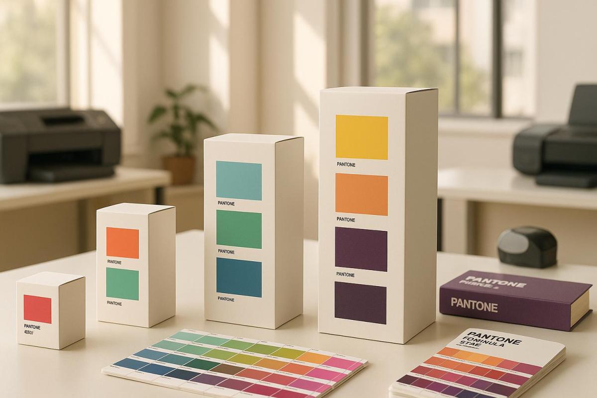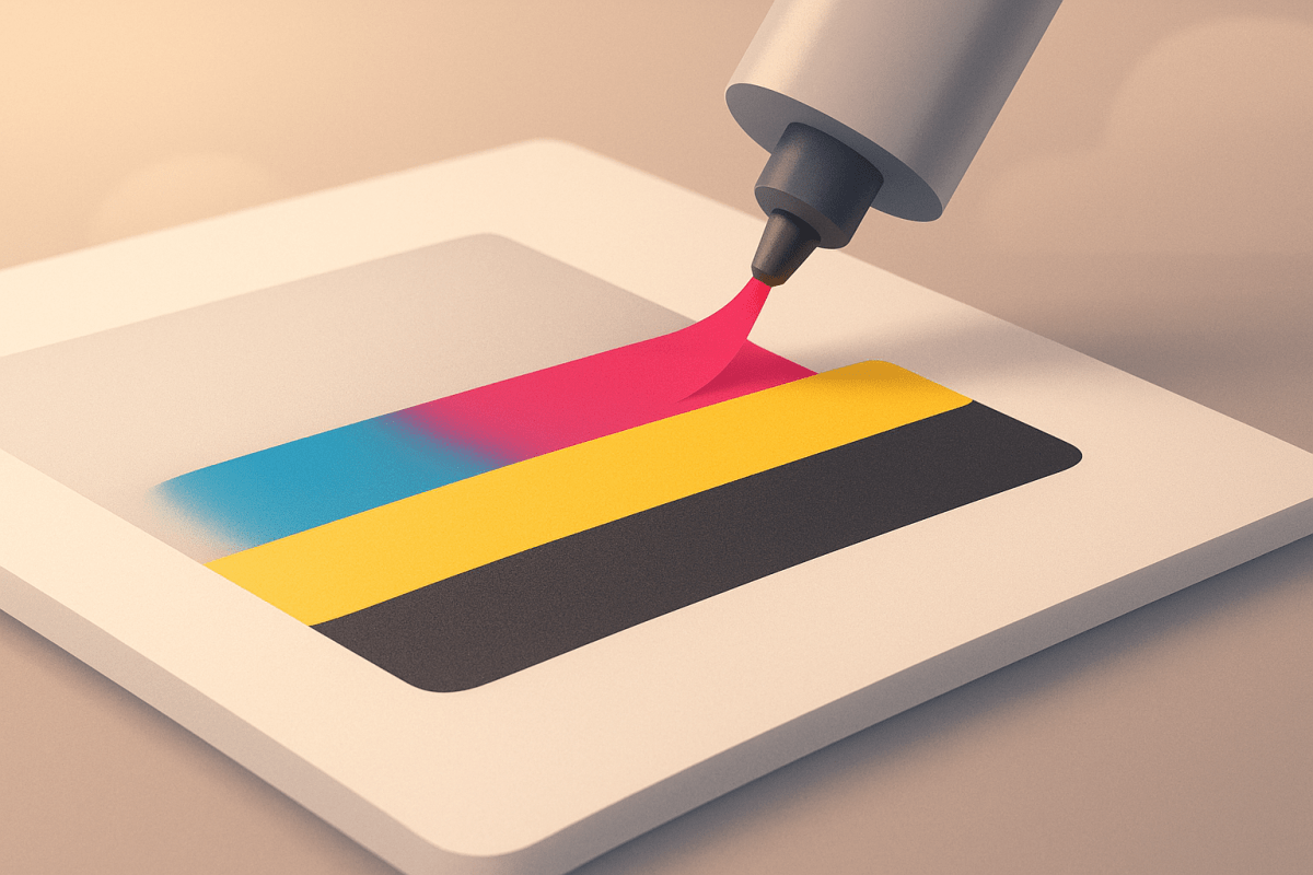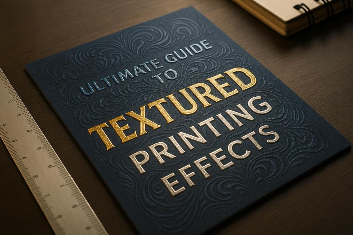
Textured printing transforms flat designs into tactile, eye-catching prints by adding raised, embossed, or patterned surfaces. It’s perfect for creating premium business materials, personal projects, or specialty items. Here’s what you’ll learn:
- What It Is: Printing with physical depth using embossing, UV coating, or foil.
- Benefits: Adds durability, luxury, and engagement to prints.
- Methods: Embossing, debossing, UV finishes, and foil stamping.
- Materials: Works on paper, plastic, metal, and more.
- Applications: Business cards, packaging, wedding invites, and signage.
| Technique | Effect | Best Use |
|---|---|---|
| Embossing | Raised texture | Luxury packaging, cards |
| Debossing | Sunken texture | Minimalist designs |
| UV Coating | Gloss, matte, or soft-touch finishes | Durable, standout prints |
| Foil Stamping | Metallic accents | Elegant, shiny designs |
Textured printing combines creativity with practicality, making designs pop visually and physically. Ready to explore? Let’s dive into the details.
Printing Methods – Embossing and Debossing Technique – Smart Hospitality Supplies
Textured Printing Methods
Textured printing takes designs to the next level by incorporating tactile elements that add depth and character. Here’s a closer look at some popular techniques to help you bring your creative ideas to life.
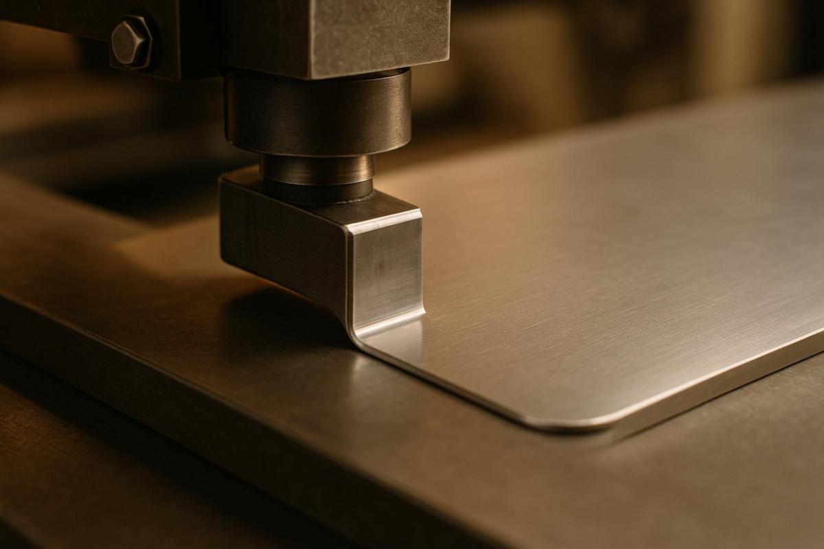
Emboss and Deboss Techniques
Embossing and debossing are all about creating three-dimensional effects using pressure and specially designed dies. Here’s a quick comparison of the two:
| Feature | Embossing | Debossing |
|---|---|---|
| Effect | Raised surface | Sunken surface |
| Dies Required | Two (male and female) | One |
| Cost | Higher | Lower |
| Back Impact | May show on reverse | Minimal back effect |
| Common Uses | Luxury packaging, business cards | Minimalist designs, corporate materials |
Both methods can be applied without ink or foil, creating a subtle texture known as blind embossing or debossing, perfect for understated elegance.
UV Coating Options
UV coating has introduced exciting possibilities in textured printing, offering a variety of finishes that enhance both appearance and durability. This technique uses ultraviolet light to instantly cure special coatings, making it ideal for heavier paper stocks (80 lbs. or more). Some of the most popular finishes include:
- High-gloss for a bold, shiny effect
- Matte for a smooth, understated look
- Soft-touch for a velvety feel
- Textured patterns for a tactile, distinctive design
With 72% of American consumers stating that packaging design influences their purchase decisions, UV coating is a powerful tool for creating memorable, high-quality prints.
Foil and Flock Printing
Foil and flock printing add a layer of sophistication and texture to your designs. Foil printing uses metallic or pigmented foils applied with heat and pressure, while flock printing involves synthetic fibers (typically 0.5 to 2.0 millimeters) to create a plush, three-dimensional texture.
The success of foil stamping depends on precise temperature control. Here’s a breakdown of common foil types and their ideal applications:
| Foil Type | Temperature Range | Best Applications |
|---|---|---|
| Universal Series | 105–130°C | Standard papers, films |
| Semi-Matte Series | 95–120°C | Special papers, varnished surfaces |
| Pearlescent Series | 105–130°C | Laminated materials, films |
Minimalist designs featuring finishes like rose gold, bronze, and holographic effects are currently in high demand. These techniques not only enhance the visual appeal but also make your designs stand out with a tactile edge.
Materials for Textured Printing
When it comes to textured printing, the materials you choose play a huge role in the final look and feel of your project. Both the surface and any additional coatings or finishes will shape the visual appeal and tactile experience of your printed piece.
Print Surfaces
The surface material is the backbone of any textured print. The weight and type of paper – or even alternative materials – can significantly impact the durability and overall effect. Here’s a quick guide to selecting the right paper weight and textures for different uses:
| Paper Weight (gsm) | Best Applications | Recommended Textures |
|---|---|---|
| 120–180 | Brochures, paper bags, flexible items | Linen, Laid, Felt |
| 180–240 | Gift cards, luxury paper bags | Hyacinth, Pearl series |
| 240–300 | Business cards, invitations, tags | Linen, Felt, Embossed |
| 300–400 | Luxury packaging, watch boxes | Metallic Fancy, Pearl series |
Beyond paper, modern UV flatbed printers allow textured effects on materials like wood, acrylic, glass, plastic, and even metal. This versatility opens up endless possibilities for creating unique designs.
Interestingly, studies suggest that adding tactile elements to printed materials can enhance information retention. Once you’ve chosen the right surface, the next step is to refine the texture and durability with specialized additives.
Print Additives
Additives are the finishing touch that can elevate your textured prints, enhancing both their appearance and longevity. Depending on your project, different types of varnish can create specific effects:
| Varnish Type | Visual Effect | Tactile Quality | Best Uses |
|---|---|---|---|
| Gloss | High shine, vivid colors | Smooth | Electronics packaging |
| Matte | Non-reflective | Velvety | Luxury goods |
| Soft-Touch | Subtle sheen | Ultra-smooth | Premium cosmetics |
| Satin | Gentle luster | Balanced feel | Food packaging |
For an eco-friendly approach, consider water-based or bio-based varnishes. These options not only meet environmental standards but also provide excellent protection against moisture and UV damage. Plus, they’re increasingly cost-effective, making them a smart choice for sustainable printing without compromising quality.
sbb-itb-ce53437
Common Uses for Textured Printing
Business Materials
Textured printing turns ordinary business materials into unforgettable brand statements. For instance, textured paper has been shown to increase response rates by 17% and make business cards 15% more memorable, thanks to how strongly our brains respond to touch. Abercrombie & Fitch tapped into this power with their fragrance collection, using rigid boxes with subtle cloth-like patterns to emphasize their brand’s elegance. This tactile appeal isn’t just for businesses – it can also bring a unique touch to personal projects.
Personal Projects
When it comes to personal projects, textured printing adds a whole new dimension. Around 80% of wedding invitations use textured paper, creating a combination of visual appeal and tactile engagement that leaves a lasting impression. But textured printing doesn’t stop at weddings; its versatility shines in specialty applications as well.
Specialty Products
Textured printing is essential in crafting functional and accessible specialty products. For example, ADA-compliant signage often incorporates raised textures produced by UV flatbed printers, ensuring accessibility requirements are met. Renathing uses textured embossing on luxury paper bags to highlight a minimalist, high-quality aesthetic. And for those looking for eco-conscious options, recycled or biodegradable materials used in texturing align with the growing demand for environmentally responsible products. Whether for business, personal, or specialty uses, textured printing consistently elevates the quality and impact of the final product.
Planning Your Print Project
File Setup
Setting up your files correctly is key to getting the tactile effects you’re aiming for. Always prepare your files in the CMYK color space to ensure accurate color reproduction for textured printing.
For embossing or foil stamping projects, you’ll need two separate mask files. Use vector shapes for the elements you want to emboss or stamp – this ensures crisp edges and precise details. Keep the design area solid white, while embossed details should be solid black, with color values set to 100%K (C:0% M:0% Y:0% K:100%). This setup clearly defines the texture elements. Double-check that all mask graphics align perfectly with your original design.
If your project involves specialty finishes like spot UV varnishes, fluorescent inks, or metallic effects, create distinct spot colors for them. Apply overprint settings to these elements to avoid knockout issues with other print plates.
| Effect Type | File Requirements | Key Considerations |
|---|---|---|
| Embossing/Debossing | Two mask files, vector shapes | Maintain exact positioning |
| Foil Stamping | Separate foil layer, spot color | Consider metallic effects |
| Spot UV | Designated spot color, overprint settings | Avoid knockout issues |
| Digital Embellishments | CMYK color space, consistent spot colors | Use a single swatch per effect |
Once your files are print-ready, the next step is executing the print process.
Print Process
Textured printing projects are highly customized, and each one requires a unique approach depending on the design goals, expectations, and overall scope. On average, the print timeline stretches to at least 3–4 weeks, depending on the project’s complexity.
Keep in mind that specialty papers can increase costs. For instance, recycled materials are about 30% more expensive than standard FSC-certified papers. On the other hand, using high-bulking paper can lower delivery costs by up to 10%.
The printing method you choose will also impact the final result. Digital printing is faster and better suited for short runs, but it may struggle with heavily textured papers. Litho printing, which uses wet inks and rubber rollers, is generally more effective for textured materials.
To get the best outcome:
- Request samples and proofs before committing to full production.
- Run print tests to see how the finished product will look.
- Choose the paper weight carefully based on the project’s purpose.
- Plan for extra production time when layering multiple textures.
Next Steps
Summary
Textured printing demands thoughtful preparation and a focus on details to achieve the best results. Before diving into your project, pay close attention to these key areas:
- File Preparation: Ensure your design files are set to 300 DPI and use the CMYK color mode for sharp, vibrant prints.
- Material Selection: Pick the right paper weight, texture, and finish to complement your design.
- Quality Control: Request samples and conduct test prints to verify that the final outcome aligns with your expectations.
These steps lay the groundwork for a successful textured printing project. Collaborating with experienced professionals can further enhance the process and bring your ideas to life.
| Project Phase | Key Considerations | Impact on Quality |
|---|---|---|
| Design Setup | CMYK color space, 300 DPI | Sharp, accurate colors |
| File Preparation | Embedded fonts, proper spacing | Professional appearance |
| Material Selection | Paper weight and texture compatibility | Durability and polished finish |
| Quality Testing | Sample prints, proofing | Consistency and accuracy |
Miro Printing & Graphics Inc. Services
Once you’ve covered the basics, working with a professional partner can elevate your project to the next level. Miro Printing & Graphics Inc., based in Hackensack, NJ, specializes in textured printing solutions tailored to your needs. Their offerings include:
- Digital and Offset Printing: Capable of handling projects of all sizes.
- In-House Bindery: Comprehensive finishing services for a polished final product.
- Design Consultation: Expert advice to fine-tune your design files for the best results.
- Material Guidance: Support in selecting the perfect paper and finishes.
- Thorough Quality Control: Proofing and testing at every stage to ensure consistency.
To kick off your project, consider preparing:
- Clear objectives and a timeline.
- High-resolution (300 DPI) design files.
- Preferences for materials or sample options.
- A budget that accounts for specialty papers and finishes.
For personalized assistance, reach out to Miro Printing & Graphics Inc. to discuss your textured printing goals. Their expertise can help turn your vision into a reality.
FAQs
What should I consider when selecting materials for textured printing projects?
When selecting materials for textured printing, start by considering the kind of texture you’re aiming for. Materials such as linen paper or embossed finishes can bring a sense of depth and a touchable quality that enhances your design.
You’ll also want to ensure the material is suited to your printing method. Some textures might need tweaks in ink application or longer drying times to achieve the desired outcome. Finally, think about the durability needed for the project. If the printed piece is meant to last, opt for materials that can withstand wear and tear while maintaining their textured appeal.
What’s the difference between embossing and debossing in terms of cost and appearance?
Embossing and debossing are two textured printing techniques that add a unique touch to designs, but they stand apart in both appearance and cost. Embossing creates a raised effect, lifting the design above the material’s surface. This results in a bold, tactile, and attention-grabbing look. In contrast, debossing pushes the design into the material, producing a recessed, engraved effect that exudes simplicity and elegance.
When it comes to cost, embossing tends to be pricier. This is because it requires a two-part die to achieve the raised effect, with molds often starting at around $300. Debossing, however, uses a single-plate setup, making it a more budget-friendly option. The choice between the two techniques boils down to your aesthetic goals and budget: embossing delivers a striking, three-dimensional finish, while debossing offers a subtle, sophisticated appeal.
What are the advantages of using UV coating in textured printing, and how does it improve print durability?
UV coating brings a range of advantages to textured printing, improving both the look and lifespan of printed materials. This glossy protective layer not only makes colors pop but also shields prints from scratches, moisture, and fading. As a result, your prints stay vibrant and intact for much longer.
The process involves curing the coating with ultraviolet light, which hardens it almost instantly. This creates a sleek, premium finish. Plus, UV coatings are a safer choice for the environment – they’re solvent-free and don’t emit harmful volatile organic compounds (VOCs), offering a more responsible solution for printing projects.
Related posts
- Ultimate Guide to Post-Press Finishing
- Ultimate Guide to Paper Finishes and Textures
- Foil Stamping vs Metallic Ink: Key Differences
- How Foil Stamping Works: Step-by-Step Guide
https://app.seobotai.com/banner/banner.js?id=6826b5340209458b3ff520c7