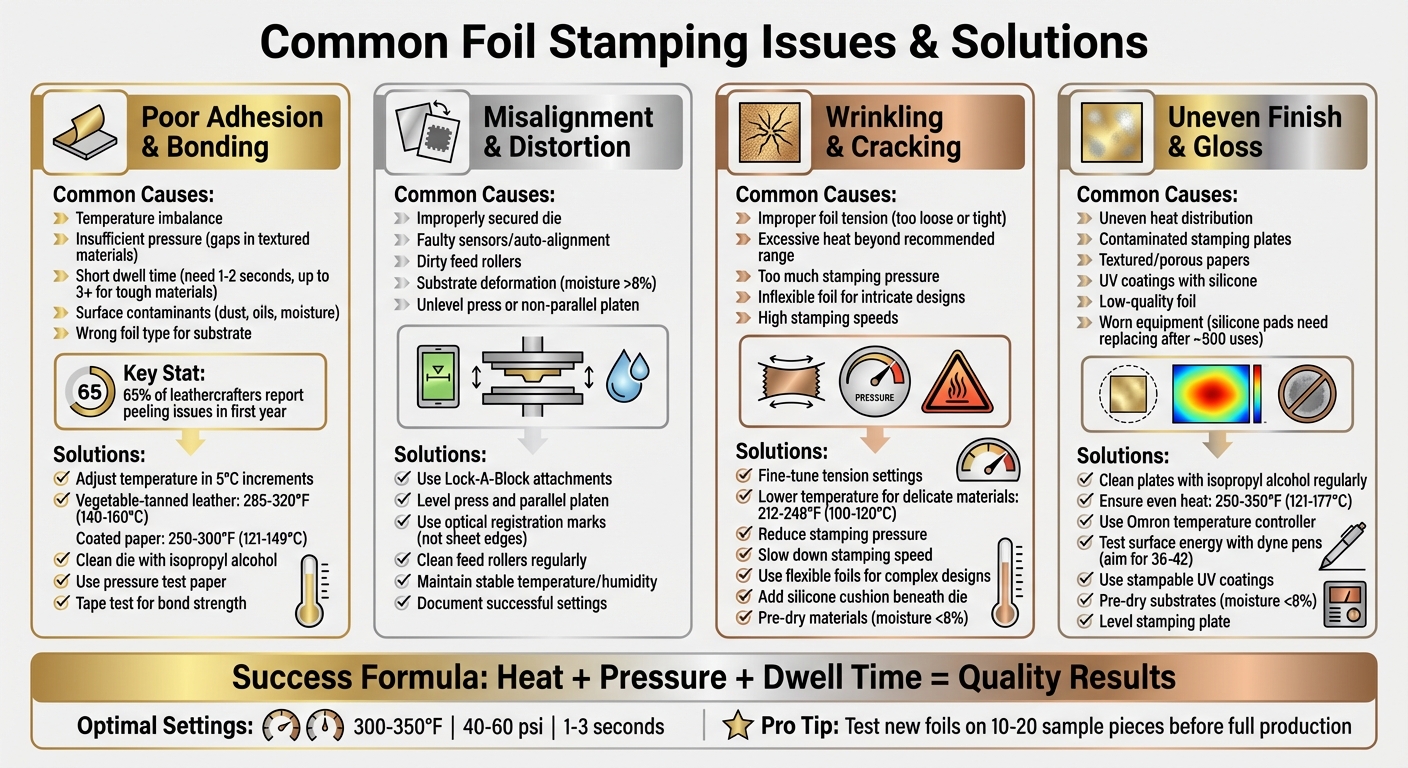
Foil stamping can transform materials into luxurious, metallic-finished products, but achieving perfection often comes with challenges. Issues like peeling foil, misalignment, smudges, or cracking are common. These problems typically arise from imbalances in heat, pressure, or dwell time, as well as substrate incompatibility or environmental factors. Here’s a quick summary of solutions:
- Peeling or Poor Adhesion: Adjust heat, pressure, or dwell time; ensure clean dies and substrates; match foil type to material.
- Misalignment: Secure dies properly, maintain press calibration, and use optical registration for precise placement.
- Wrinkling or Cracking: Fine-tune foil tension, lower heat for delicate materials, and select flexible foils for intricate designs.
- Uneven Finish: Ensure even heat distribution, clean plates regularly, and test foil compatibility with substrates.
Regular maintenance, testing, and precise adjustments can significantly improve foil stamping results. Keep reading for detailed solutions to each problem.
Foil Stamping Troubleshooting Guide: Common Issues and Solutions
Poor Adhesion and Bonding Failures
What Causes Poor Adhesion
Issues like foil peeling or uneven transfer often signal specific problems in the process. A temperature imbalance is one of the most common causes. If the heat is too low, the adhesive layer on the foil doesn’t activate properly. On the flip side, too much heat can melt the foil, leading to "foil fill-in", where fine details are lost. Pressure issues can also cause trouble. If the die doesn’t make full contact with textured materials, gaps form, and the foil fails to bond.
Another factor is insufficient dwell time, which refers to the duration the die remains in contact with the substrate. Most commercial applications require about 1–2 seconds, but tougher materials may need 3 seconds or more. Substrate incompatibility adds further challenges. Rough or heavily textured papers make it hard for the foil to reach the material’s "valleys", while coatings like UV varnishes can repel the foil entirely.
Surface contaminants – like dust, oils, or moisture – are another major problem. These interfere with the chemical bond between the foil and substrate, particularly on materials like leather. Using the wrong foil type, such as one designed for paper on leather, or applying foil over non-toner-based inks, can also lead to bonding failures. For thermal toner foiling, a minimum temperature of 300°F (149°C) is necessary to ensure proper adhesion. Additionally, dirty or worn dies with adhesive residue can result in patchy or uneven transfers.
Interestingly, over 65% of leathercrafters report issues like peeling or patchy impressions during their first year of foil stamping. This highlights how common adhesion challenges are, even for those committed to mastering the craft.
Understanding these causes lays the groundwork for making precise adjustments, as detailed below.
How to Fix Adhesion Problems
Fixing adhesion problems means addressing the root causes through careful adjustments in temperature, pressure, and preparation techniques. Start by tweaking the temperature in 5°C increments to find the sweet spot without scorching the material. Different materials require different temperature ranges – vegetable-tanned leather works best at 285–320°F (140–160°C), while coated paper performs better at 250–300°F (121–149°C). For moisture-prone materials like leather, pre-heating the substrate at 140°F (60°C) for 10 minutes can improve foil bonding.
Keep your die clean by wiping it with isopropyl alcohol to remove adhesive residue or dust that could interfere with heat transfer. Use pressure test paper to ensure the die applies even pressure across the surface – uneven pressure is a leading cause of incomplete foil transfer. For textured or porous materials like recycled paper, increasing the dwell time or pressure helps the foil settle into the material’s crevices.
"Pressure does not replace heat. Operators often try to fix transfer problems by increasing impression. That usually introduces new defects instead of solving the root cause." – Puget Bindery
To check bond strength, use medium-tack masking tape; a clean removal indicates a secure bond. For added assurance, wipe the foiled area five times with a cloth moistened with rubbing alcohol – the pigment should stay intact. Always let the foil cool to room temperature before peeling the carrier film to ensure the bond has fully set.
For intricate designs like fine-line stamping on paper, use hard make-ready boards, such as epoxy glass or phenolic board. These materials help achieve a sharp, precise transfer and complement other strategies for addressing foil-related issues.
sbb-itb-ce53437
Misalignment and Design Distortion
What Causes Misalignment
Misalignment often arises from setup mistakes or poor material handling. If the stamping die isn’t properly secured to its reference point during installation, the entire design can shift out of place. On top of that, faulty sensors or inaccurate auto-alignment systems can fail to detect these errors, leading to repeated feed and placement issues.
Mechanical feed problems are another common culprit. Dirty feed rollers, low-precision encoders, or even the thermal expansion of foil can throw off feed distances. Loose cores and shafts can also cause the foil to drift during operation, creating alignment issues.
Material conditions add another layer of complexity. Substrate deformation, often caused by unstable storage temperatures or high humidity, can lead to warping that disrupts feeding alignment. To avoid this, paper or plastic substrates should have moisture levels below 8%. For digitally printed sheets, traditional mechanical grippers often struggle because they depend on the sheet’s edge rather than optical registration marks, making precise alignment harder to achieve.
"Something with drop-dead, tight registration can be a challenge because of the way digital printing equipment uses optical registration." – Sean Hurley, MCD
Press equipment can also contribute to misalignment. A press that isn’t level or has a platen that isn’t parallel can create uneven pressure, leading to distorted designs or "haloing" effects around images. Additionally, the thermal expansion of metal dies can alter dimensions, further affecting alignment.
How to Maintain Proper Alignment
Preventing misalignment starts with meticulous setup and ongoing maintenance. Secure die mounting is critical. High-quality die bonding tape or specialized tools like "Lock-A-Block" attachments can keep the die firmly in place during stamping. Ensuring that the press is level and the platen is parallel to the stamping plate is another essential step – it not only prevents pressure-induced distortion but also reduces makeready time.
For digital printing, rely on registration marks printed or stamped onto the material rather than aligning by the sheet’s edge. Regularly cleaning feed rollers and calibrating alignment sensors can help minimize cumulative errors during production.
"Having a second honeycomb is great, so that you can start setting up your next job. Having the press maintained and the platen parallel will reduce your makeready times." – Andy Dvorsky, Dvorsky Press Services
Environmental control is just as important. Maintaining stable temperature and humidity levels prevents substrate warping before the material even reaches the press. For highly detailed designs, using hard make-ready boards like epoxy glass or phenolic board ensures crisp, distortion-free stamps. Testing alignment with makeready sheets from previous runs can also save time and reduce waste before using costly final substrates.
Documenting successful settings – such as temperature, pressure, and feed increments – makes it easier to replicate results for future jobs. For intricate designs with varying surface areas, spacer paper can help balance pressure across the platen. These steps are key to achieving consistent, high-quality results in foil stamping.
At Miro Printing & Graphics Inc., we follow these practices to deliver precise, flawless foil stamping every time.
Foil Wrinkling, Curling, and Cracking
What Causes Wrinkling and Cracking
Just like with adhesion and alignment issues, maintaining proper foil tension and controlled conditions is key to achieving flawless results. Wrinkling and curling often happen when the foil doesn’t lay flat during stamping. If the foil tension is too loose, it can sag and form creases. On the flip side, too much tension can lead to breakage. Excessive heat is another common culprit. When temperatures go beyond the recommended range, the foil can melt outside the design edges and scorch, leading to curling and distorted edges. Cracking, which shows up as splits or a brittle texture, is usually caused by too much stamping pressure or using a foil that isn’t flexible enough for intricate designs. High stamping speeds can also play a role by not allowing enough bonding time.
"Foil cracking, where the foil appears broken or brittle on the substrate, can significantly affect the aesthetics of the stamped product. This issue often stems from using a foil that’s not flexible enough for the substrate or the design’s intricacies." – Metallic Elephant
Improper handling of materials, like failing to lay the foil flat or misaligning the stamping plate, can make these problems worse. For designs with large solid areas, trapped gas between the foil and substrate can create bubble-like wrinkles. Using a fine-screened die can help release these trapped gases. Addressing these challenges requires specific adjustments, which are outlined in the prevention tips below.
How to Prevent Wrinkling and Cracking
Start by fine-tuning the tension settings to keep the foil tight but not overly stretched. If wrinkles appear, increase the rewind or brake tension to ensure the web path stays straight. Temperature control is just as important – if you notice wrinkling or bleeding, gradually lower the heat until the edges stay sharp and the foil lies flat. For delicate materials like thin leather or synthetics, reduce the temperature to around 212–248°F (100–120°C) and use thermal barrier paper to avoid scorching.
To address cracking, reduce the stamping pressure slightly until the foil transfers cleanly. Avoid the temptation to fix transfer issues by increasing pressure, as this often introduces new defects. Slowing down the stamping speed can also help with intricate designs, giving the foil more time to bond properly. Choosing the right foil is critical too – opt for softer, more flexible options for complex designs or tricky substrates. For UV-coated materials, use "stampable" UV coatings instead of silicone-based ones, and check the surface compatibility with a dyne test (aim for a level between 36 and 42).
For substrates that are prone to crushing under pressure, placing a silicone cushion or leather padding beneath the die can act as a buffer. Pre-drying materials to keep their moisture levels below 8% can also prevent steam-related bubbling during the heated stamping process. These steps ensure a smooth, defect-free finish.
At Miro Printing & Graphics Inc., we apply these techniques to deliver the premium quality our clients expect every time.
Uneven Foil Finish and Gloss
What Affects Foil Finish Quality
Patchy foil finishes and inconsistent gloss often stem from a few key factors. One major issue is uneven heat distribution. If the stamping head’s temperature isn’t consistent, some areas of the foil will bond properly, while others remain dull or incomplete. Even a slight temperature difference can create noticeable imperfections.
Another common cause is contamination on the stamping plates. Dust, oils, or residues from inks can interfere with the foil’s ability to adhere evenly. Bertrand Hayoz from Bobst highlights this challenge:
"A tiny piece of dust or something on the foil stamp or on the sheet, and the picky customer rejects the sheet"
The type of paper or coating used also plays a role. Textured or porous papers can prevent the foil from making solid contact, while coatings, particularly UV coatings with silicone, can repel the foil.
Additionally, low-quality foil or choosing the wrong material for the job can lead to inconsistent results. Worn-out equipment, such as deformed stamping plates or old silicone pads, can also contribute. Silicone pads, in particular, may need replacing after about 500 uses in certain applications to maintain even pressure across the design.
Addressing these issues is essential for achieving a flawless finish. The following steps can help ensure consistent results.
How to Get Consistent Finish
Start by cleaning your stamping plates regularly. Use isopropyl alcohol to remove dust, oils, or other contaminants that can interfere with the foil application. This simple maintenance step can prevent many common problems.
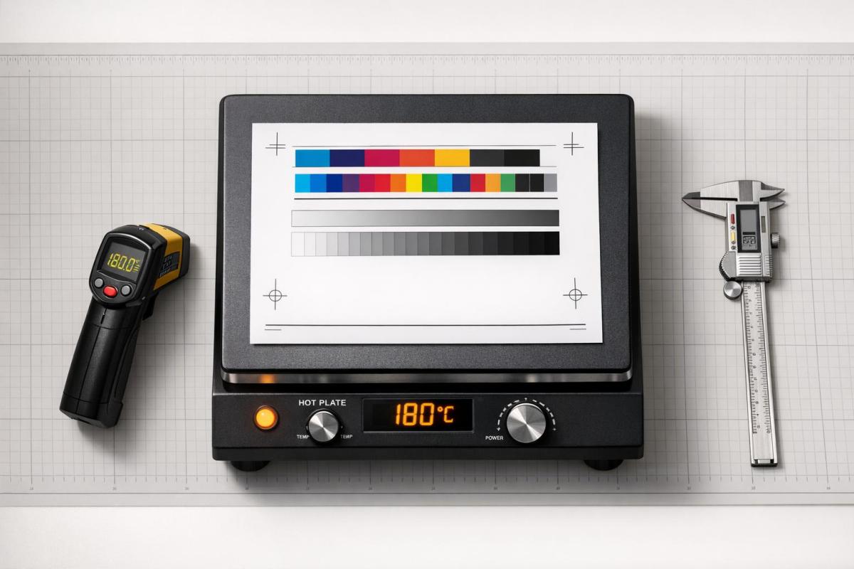
Next, focus on temperature control. Ensure even heat distribution across the stamping mold by using tools like an Omron temperature controller for precise calibration. Most hot stamping foils work best at temperatures between 250°F and 350°F (121°C to 177°C). For laminator-based foiling, a minimum of 300°F is often required.
Using high-quality foil that’s compatible with the substrate is another crucial factor. For coated stocks, testing surface energy with dyne pens can help determine if specialty foils or "stampable" UV coatings are needed. Additionally, pre-drying substrates to maintain moisture levels below 8% can prevent bubbling caused by steam.
Finally, make sure your stamping plate is level. For uneven surfaces, consider adding silicone cushioning to evenly distribute pressure and improve the finish.
At Miro Printing & Graphics Inc., we adhere to strict quality control standards and regularly calibrate our equipment to ensure every project delivers a flawless, eye-catching foil finish.
Selecting Equipment and Materials
Matching Foils to Substrates
Choosing the right foil for your substrate is a key step in achieving the best results. Each substrate has unique surface properties, so using a foil with the correct adhesive chemistry and release characteristics is essential. This choice directly affects how well the foil adheres and the overall finish of the stamped product.
- Smooth surfaces like coated papers and SBS (Solid Bleached Sulfate) boards are highly efficient at transferring heat, making them the easiest to stamp.
- Textured or porous materials like uncoated or recycled stocks demand foils with stronger adhesive properties to ensure proper contact and transfer.
- Synthetic materials and laminates act as thermal barriers, requiring specialty foils designed for low-surface-energy substrates.
To check surface energy, dyne pens can be a useful tool, especially for UV-coated or plastic substrates. For metallized films, a surface energy above 40 mN/m (dynes) is ideal for proper adhesion. If stamping on UV coatings, low dyne levels may indicate the need for specialty foils or UV coatings specifically made for stamping.
Before full-scale production, always test new foils on 10–20 pieces of the actual material to confirm adhesion consistency. Store foils in a controlled environment to avoid issues caused by extreme humidity or temperature, such as color inconsistencies or performance degradation. Proper environmental controls also help manage substrate moisture, preventing problems during the stamping process. These steps ensure smoother production and better results.
Machine Maintenance and Calibration
Precise machine settings, along with regular maintenance, are essential for consistent foil stamping quality. Neglecting upkeep can lead to poor results and increased waste. Andy Dvorsky from Dvorsky Press Services emphasizes:
"Reducing waste requires the right state of mind, the right operators, regular maintenance of the machines, cleanliness and making sure that counters are working – all of that has an effect".
Key maintenance tasks include calibrating temperature zones and leveling the platen to ensure even heat distribution and uniform pressure. For reference, standard temperatures for stamping range between 90°C–110°C (194°F–230°F) for paper and 120°C–140°C (248°F–284°F) for leather. Proper calibration minimizes setup times and avoids damaging paper fibers from excessive pressure. Additionally, regular lubrication and allowing cooling periods after extended use can prevent overheating.
Cleanliness is equally important. Keeping stamping plates and work surfaces free of debris helps eliminate defects. These practices align with earlier discussions on addressing alignment and adhesion challenges, ensuring consistent, high-quality outcomes.
With proper maintenance, hot foil stamping machines can typically last 5 to 10 years. At Miro Printing & Graphics Inc., strict maintenance protocols and regular calibrations are followed to deliver top-notch results on every project.
Overcoming Hot Foiling Troubles
Conclusion: Getting Better Foil Stamping Results
Achieving consistent, high-quality foil stamping results boils down to mastering the balance of heat, pressure, and dwell time. As Puget Bindery puts it:
"Hot foil stamping is not just a decorative process. It is a controlled transfer of material using heat, pressure, and time. When one variable drifts, quality drops."
Typically, most setups run optimally at 300–350°F with 40–60 psi of pressure. However, success also depends on tailoring your approach to the materials you’re working with. For instance, coated substrates tend to allow for smoother transfers, while textured stocks may call for specialized foils. Testing new foils on actual production samples before committing to a full run can help avoid expensive errors.
Regular equipment maintenance and calibration are essential for smooth operations. Cleaning dies, leveling platens, and ensuring temperature zones are properly calibrated can prevent many common issues like misalignment or poor adhesion. Even simple steps, like performing a tape test, can confirm that the foil adheres properly.
FAQs
How do I know if my foil is compatible with my substrate?
To determine if a material is suitable for foil, check that it can withstand heat between 212–392°F, allows proper adhesion (smooth, non-porous surfaces are ideal), and holds its shape under pressure. Materials like heavily coated or textured papers often struggle with foil application. It’s always a good idea to test beforehand to ensure compatibility.
What’s the fastest way to dial in heat, pressure, and dwell time?
The fastest way to dial in the heat, pressure, and dwell time for foil stamping is to begin with the suggested temperature range for your foil – usually between 250°F and 350°F. Run a few test stamps and tweak the settings as needed. If the foil appears faint, try increasing the temperature or pressure slightly. On the other hand, if you notice peeling or blurring, reduce these settings. Adjust the dwell time in small increments to ensure a clean transfer without burning or uneven finishes.
When should I switch foil types instead of changing machine settings?
When your current foil isn’t delivering the color or finish you need, or if its adhesive or release properties don’t work well with your material, it’s time to switch. Using the right foil ensures proper adhesion and maintains quality without requiring extra tweaks to your machine settings.
Related Blog Posts
https://app.seobotai.com/banner/banner.js?id=699503c0efc60cc2af07ed58