Future of Large Format Printing Hardware

AI, UV/latex inks, hybrid 3D systems and eco-focused hardware are reshaping large format printing, boosting efficiency, sustainability, and market growth.

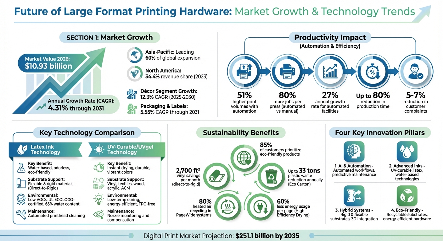
The large format printing industry is evolving with AI integration, eco-conscious solutions, and new ink technologies leading the charge. By 2026, the market is projected to hit $10.93 billion, growing at an annual rate of 4.31% through 2031. Here’s what you need to know:

  • AI and Automation: Tasks like color correction and error checking are now automated, reducing production time by up to 80% and increasing efficiency. Tools like HP‘s Auto Alert Agent (AAA) 2.0 and Canon‘s UVgel systems improve quality and reduce waste.
  • Advanced Ink Technologies: UV-curable and latex inks are reshaping printing with faster drying, better durability, and lower environmental impact. Canon’s UVgel 860 and HP’s Latex R530 are standout examples.
  • Hybrid and 3D Printing: Modern systems handle both rigid and flexible materials, offering textured finishes and multi-layer printing for diverse applications like signage and interior design.
  • Eco-Friendly Practices: Water-based inks, recyclable substrates, and energy-efficient hardware are now industry standards, driven by customer demand for sustainable solutions.
  • Market Growth: Asia-Pacific leads market expansion, while North America maintains a strong presence. Décor and packaging are among the fastest-growing application segments.

The industry is shifting toward modular hardware, remote management tools, and subscription-based financing models, making upgrades more accessible and future-focused. Print shops leveraging these advancements can reduce costs, improve output, and meet growing customer demands.

Quick Comparison of Key Ink Technologies

Feature Latex Ink Technology UV-Curable / UVgel Technology
Key Benefit Water-based, odorless Instant drying, vibrant colors
Substrate Support Flexible & rigid materials Vinyl, textiles, wood, acrylic
Eco Impact Low VOCs, recyclable inks Energy-efficient curing
Maintenance Automated cleaning Nozzle monitoring

The future of large format printing lies in speed, efficiency, and sustainability, offering businesses the tools to stay competitive in a rapidly changing market.

Large Format Printing Industry Growth and Technology Trends 2025-2031

Large Format Printing Industry Growth and Technology Trends 2025-2031

Major Technology Developments in Large Format Printing

The landscape of large format printing is evolving at a rapid pace, thanks to advancements in artificial intelligence, ink technologies, and hybrid printing systems. These breakthroughs are redefining quality, reducing manual labor, and broadening the scope of applications – shaping the future of printing hardware.

AI and Automation in Printing Workflows

Artificial intelligence is reshaping every step of the printing process, from preparation to final output. Tasks like error checking, color correction, and layout adjustments, which once required significant manual effort, are now handled in minutes by automated prepress software. Tools like "Preflight" use AI to recommend optimal print modes based on customer needs, while machine-learning algorithms monitor production in real time.

The impact on productivity is undeniable. Print shops leveraging automation report 51% higher print volumes and produce 80% more jobs per press compared to those relying on manual workflows. Automated facilities also experience an average growth rate of 27% annually, far exceeding the industry norm.

Real-time quality control systems, such as HP’s Auto Alert Agent (AAA) 2.0 and Canon’s UVgel DynamicMotion Control, use machine vision to monitor nozzle performance and media alignment. These systems correct errors on the fly, eliminating the need to halt production. For instance, Elanders, a printing company, implemented HP’s AAA 2.0 in March 2024. Andreas Organzidis, Head of Color Digital Printing at Elanders, highlighted its impact:

"By using AAA 2.0, we experience a significant reduction in production time, saving 1 hour for every 80,000 impressions. This not only enhances our operational efficiency but also drastically reduces customer complaints and returns by 5-7%."

  • Andreas Organzidis, Head of Color Digital Printing, Elanders

AI-powered tools can cut prepress and production times by up to 80%, with automated color profiling reducing a 50-minute task to under 5 minutes. In industries like architecture and engineering, automation has slashed lead times from three days to just 20 minutes. Additionally, Autonomous Mobile Robots (AMRs), developed with MoviĜo Robotics, now handle media transfers between storage and presses, saving up to two hours per press daily.

Remote management tools like HP PrintOS Production Hub enable operators to oversee production and prioritize urgent tasks from anywhere, addressing challenges like labor shortages. This shift to edge computing ensures real-time error detection and immediate productivity gains without relying on cloud-based systems.

These advancements lay the groundwork for innovations in ink systems that emphasize both efficiency and sustainability.

UV-Curable and Latex Ink Technology

Modern ink technologies are revolutionizing large format printing by enhancing durability, speeding up production, and supporting a wide range of materials – all while addressing environmental concerns.

Canon’s UVgel 860 gel set, introduced in September 2025, delivers odorless, quick-drying prints with exceptional durability. Its FullBeam Curing system, featuring 11-foot-wide LED arrays, ensures consistent light exposure and a wider color range. This technology achieves production speeds of up to 2,271 square feet per hour without compromising quality.

HP’s Latex R530, launched in March 2025, offers a game-changing approach to direct-to-rigid printing. By eliminating the traditional "Print & Mount" process – where vinyl is printed and then manually adhered to rigid boards – it significantly reduces material waste and labor costs. On average, users save approximately 2,700 square feet of self-adhesive vinyl per month.

Feature Latex Ink Technology UV-Curable / UVgel Technology
Key Benefit Water-based, odorless, eco-friendly Instant drying, durable, vibrant colors
Substrate Support Flexible and rigid (Direct-to-Rigid) Supports vinyl, textiles, wood, acrylic, ACM
Environmental Low VOCs, UL ECOLOGO-certified Low-temp curing, energy-efficient
Maintenance Automated printhead cleaning Nozzle monitoring and compensation

Both systems emphasize sustainability. Latex inks are water-based, odorless, and can include up to 65% reclaimed water in their production. UV-curable technologies use low-temperature curing to cut energy consumption while keeping VOC emissions minimal. This aligns with the growing demand for sustainable practices, as 85% of Print Service Provider customers now prioritize eco-friendly products.

"The HP Latex R530 printer is the only all-in-one compact HP Latex solution, allowing seamless adaptation between rigid and flexible applications."

  • Daniel Martinez, Global Head and General Manager, HP Large Format Business

Maintenance has also become more efficient. Automated features like ink recirculation, printhead cleaning, and nozzle performance monitoring reduce downtime and manual intervention. Many systems now offer modular upgrades, such as white ink modules, enabling print shops to expand their capabilities as needed.

Smart Substrates and 3D Printing Integration

The line between traditional large format printing and 3D production is becoming increasingly blurred. Hybrid printing platforms now handle both flexible and rigid materials, with some systems accommodating substrates up to 2 inches thick. This opens up opportunities in areas like interior design, architectural projects, and custom manufacturing.

Canon’s Colorado XL-series, unveiled in September 2025, exemplifies this trend. This hybrid platform, measuring 11 feet wide, incorporates UVgel 860 technology and FLXture for creating textured finishes on rigid materials like ACM panels and polypropylene.

"The 3.2m graphics market is evolving fast, and customers need more than incremental improvements – they need a platform that can truly transform the way they work."

  • Kiyoshi Oka, Executive Vice President and General Manager, Canon U.S.A., Inc.

The addition of white ink capabilities on transparent and colored media is unlocking new creative possibilities, enabling multi-layered and dimensional designs. Print shops are also expanding into 3D and "direct-to-shape" printing, offering services beyond flat graphics.

Sustainability continues to drive innovation in substrates. Recyclable options, such as cardboard for trade show displays and PVC-free or paper-based materials, are gaining traction. This shift is especially relevant in the construction sector, which accounts for roughly 40% of energy use in the EU and is increasingly focused on circular, recyclable solutions.

Environmental Considerations in Large Format Printing Hardware

The printing industry faces growing pressure to shrink its environmental footprint, prompting hardware manufacturers to develop solutions that reduce waste, lower emissions, and promote circular systems. With 85% of print service provider customers now prioritizing sustainable products and practices, focusing on environmental performance has shifted from being a bonus to an essential competitive factor. This push for sustainability aligns closely with the technological advancements already shaping the industry.

Eco-Friendly Inks and Recyclable Substrates

The move from solvent-based to water-based inks and UVgel technologies has significantly improved the environmental impact of large format printing. Take HP Latex inks, for instance – they are made of 65% water, contain no solvents, and produce odor-free prints that are safe for indoor environments. These inks boast UL ECOLOGO and UL GREENGUARD Gold certifications, making them ideal for spaces where air quality is a priority.

Canon’s UVgel 860 technology, launched in September 2025, offers another eco-conscious option. Its TPO-free and VCL-free gel inks cure at low temperatures using LED arrays, eliminating the need for high-heat drying and reducing VOC emissions. Additionally, Canon has introduced recyclable UVgel ink bags, packaged in cardboard boxes instead of plastic cartridges, as part of its Colorado XL-series.

HP has taken sustainability a step further with its Eco Carton technology, which swaps out plastic ink cartridges for 100% recyclable cardboard containers. For high-volume operations, this innovation can cut plastic waste by up to 33 tons annually. HP also runs the HP Planet Partners program, a free recycling initiative for used ink bags, printheads, and cartridges, supporting a closed-loop system.

Substrate manufacturers are also stepping up, offering PVC-free alternatives. One example is Xanita aspect, a paper-based board made entirely from post-consumer waste paper. It delivers strong performance without the environmental downsides of traditional plastic-heavy substrates. With the construction sector accounting for about 40% of energy use and 36% of greenhouse gas emissions in the EU, the demand for recyclable materials in building projects continues to grow.

"Sustainability is already affecting your bottom line – whether you realize it or not."

  • Richard Bottrill, Head of Engineering and Sustainability, Pearce Signs

Energy-Efficient Printing Equipment

Beyond advancements in inks, hardware innovations are playing a key role in improving environmental efficiency. Modern printers now feature energy-saving technologies, such as ENERGY STAR and EPEAT Gold certifications, along with optimized drying systems and intelligent sleep modes that reduce power consumption during idle times.

HP’s High Efficiency Drying (HED) technology, found in its PageWide systems, recycles up to 80% of heated air, cutting energy use per page by as much as 60%. Canon’s L-COA PRO II image processing engine further boosts efficiency by enabling faster start-up times, reducing energy usage during warm-up or idle periods.

LED curing systems have also made a big impact. Canon’s UVgel FullBeam Curing uses an 11-foot-wide LED array to deliver consistent UV light across the print width while consuming much less energy than traditional mercury vapor lamps. This low-temperature curing method also prevents warping or distortion in heat-sensitive materials, reducing waste.

Automated maintenance features add another layer of sustainability. Systems like automated white ink recirculation minimize sediment buildup, reducing the need for energy-intensive cleaning cycles. This can save print shops approximately 8–10 labor hours per week, translating to over $20,000 in annual labor cost savings, while also cutting down on wasted energy and materials.

Additionally, modular designs like Canon’s Colorado XL-series allow businesses to upgrade features – such as adding white ink capabilities – without replacing entire machines. This approach extends the life of equipment, reduces electronic waste, and supports a more sustainable lifecycle.

"Sustainability is a cornerstone of our business strategy, inspiring us to engineer presses and solutions that maximize product longevity, minimize paper waste, and reduce energy consumption."

  • Barbara McManus, Global Head and General Manager of PageWide Industrial, HP Inc.
Feature Environmental Benefit Hardware Example
Water-Based Inks 100% solvent-free; safe for indoor use; odorless HP Latex 630/700/800 Series
Eco Carton Technology Reduces plastic waste by up to 33 tons/year HP Latex 2700 Series
High Efficiency Drying Up to 60% less energy usage per page HP PageWide Advantage 2200
UVgel FullBeam Curing Low-energy LED curing; consistent dosing Canon Colorado XL-series
White Ink Recirculation Prevents waste and reduces cleaning cycles HP Latex 800W / 2700W

For print shops, environmental certifications can open doors to contracts in sectors where sustainability is a top priority. Industries like healthcare, education, and government increasingly require UL GREENGUARD Gold-certified materials, making eco-conscious hardware a valuable business asset. These energy-efficient innovations are paving the way for more sustainable printing practices across the board.

Market Growth and Future Developments

The large format printing hardware market is on a steady growth path. Projections estimate the market will reach between $10.36 billion and $13.48 billion by 2030–2031, with a compound annual growth rate (CAGR) of 3%–5.5%. This growth is fueled by trends like digitized packaging, customized textiles, and eye-catching commercial signage.

The Asia-Pacific region is anticipated to lead the charge, driving approximately 60% of the global market’s expansion through 2029. North America, however, held its ground in 2023, claiming a 34.4% revenue share. Among application segments, décor is expected to grow the fastest, with a projected 12.3% CAGR between 2025 and 2030. Packaging and labels, spurred by e-commerce and the demand for quicker SKU changes, are set to grow at a 5.55% CAGR through 2031.

Ink technology remains a dominant force in the market. Ink-based systems accounted for 61.3% of revenue in 2023 and are projected to capture 91.5% by 2025. Latex inks, in particular, are on track to be the fastest-growing segment, with a 6.05% CAGR through 2031. Their appeal lies in being odor-free, eco-friendly, and eliminating warm-up times. These developments are paving the way for advancements in production inkjet presses.

High-Speed Production Inkjet Presses

High-speed production inkjet presses are becoming a go-to solution for print shops managing high-volume jobs while maintaining quality. These systems offer quick job changeovers and produce results comparable to offset printing, making them a compelling alternative to older solvent-based machines. It’s estimated that high-speed inkjet presses will add an extra 0.9% to the market’s overall CAGR.

Recent product launches highlight the innovation in this space. In April 2025, Konica Minolta unveiled the Accuriolet 30000 B2 HS-UV inkjet press, which features reduced RIP time and automatic double-sided printing. Earlier that year, in January, Canon introduced the imagePROGRAF TZ-5320, capable of printing up to four pages per minute while consuming less energy. These advanced systems support modular workflows and handle a variety of substrates, enabling quicker turnaround times and allowing businesses to diversify without the need for multiple machines. This flexibility is driving essential hardware upgrades.

Hardware Upgrades for Better Output

To stay competitive in an evolving market, print shops are upgrading their hardware. Switching to UV-curable or latex systems eliminates the need for volatile solvents, enabling immediate curing and reducing finishing times. This shift boosts production efficiency and throughput.

Take, for example, OK To Colour, a print services provider in the UK. They upgraded to the Canon Colorado M3W, a roll-to-roll UVgel printer. This move enhanced automation, minimized maintenance, and reduced turnaround times, enabling the company to handle larger volumes with ease. Similarly, Simpsons Printing adopted the Fujifilm Acuity Prime LED flatbed printer, bringing production in-house. This upgrade not only lowered outsourcing costs but also improved efficiency for high-volume banner orders.

Subscription-based financing models are also making these upgrades more accessible. Companies like Ricoh and Epson now offer leasing options that spread the cost of industrial printers – ranging from $100,000 to $500,000 – over several years. Considering that annual operating expenses, including ink, service, and energy, can account for up to 40% of the initial hardware cost, these financing options provide a practical way to manage cash flow during upgrades.

AI-powered hardware is another game-changer. Systems integrated with platforms like HP PrintOS offer predictive maintenance and automated job routing, which can cut operating costs by 10% to 35%. Remote diagnostics and monitoring further reduce expenses by up to 25%, minimizing unplanned downtime and extending equipment lifespan. These advancements are helping businesses maximize the value of their investments while staying ahead in the competitive printing market.

How Advanced Hardware Benefits Print Shops

Modern hardware is reshaping the print industry, making operations smoother and opening doors to new opportunities. Upgrading from older equipment to advanced systems allows print shops to offer more services, improve workflows, and boost profitability.

More Customization and Flexibility

With today’s technology, print shops can tackle projects that used to require multiple machines or outsourcing. Hybrid printers like the Canon Colorado XL and HP Latex R530 handle both rigid materials – such as foam board, acrylic, and wood – and flexible substrates like vinyl and fabric.

Advanced ink systems also bring exciting possibilities. For instance, white ink allows printing on transparent, colored, or metallic surfaces. On top of that, printers now support specialty media like Washi, bamboo, and thick fine art paper. This means print shops can offer unique, high-end products that stand out. Aaron Brill, Product Manager at Epson America, Inc., highlights this advantage:

"Specialty media can take a print project from basic to extraordinary, bringing out vibrant colors and transforming it into a visually striking and impactful print."

Innovative features like "FLXture" can replicate textures like leather, wood, or fabric, while "FLXfinish" lets operators switch between matte and gloss effects without changing inks or media. For short-run jobs, digital printers are a game-changer, eliminating expensive setup processes and making on-demand projects more affordable. This is especially beneficial for clients needing quick, localized campaigns.

Better Business Efficiency and Customer Satisfaction

Advanced hardware doesn’t just expand creative possibilities – it also makes day-to-day operations more efficient. Automated systems help reduce labor costs, minimize errors, and speed up production. Features like AI-powered nozzle monitoring, automated media tracking, and self-correcting color management cut down on downtime and material waste. In fact, modern printers can often be managed by a single operator, helping businesses navigate labor shortages.

These improvements are driving growth. For example, Elanders, a global printing company, adopted HP’s AAA 2.0 machine-learning algorithm in March 2024. Andreas Organzidis, Head of Color Digital Printing at Elanders, shared their experience:

"By using AAA 2.0 we experience a significant reduction in production time, saving 1 hour for every 80,000 impressions. This not only enhances our operational efficiency, but also drastically reduces customer complaints and returns by 5-7%."

Speed is another key factor. Advanced ink systems like Epson UltraChrome GS3 enable same-day lamination, meeting the increasing demand for fast turnarounds. Direct-to-rigid printing eliminates the need for the traditional "Print & Mount" process, saving about 2,700 ft² of self-adhesive vinyl per month while cutting costs and waste. David Bistrovic, Product Manager at Epson America, Inc., underscores the importance of speed:

"In a sign shop, speed isn’t just about quick printing, it’s the backbone of efficiency. Faster output means jobs move through the print process efficiently, giving shops the ability to meet deadlines, handle high-volume orders and potentially acquire additional business."

These advancements also align with the industry’s push toward sustainability and smarter automation.

Case Study: Technology at Miro Printing & Graphics Inc.

The benefits of advanced hardware are evident in real-world applications. Take Miro Printing & Graphics Inc. in Hackensack, NJ, for example. This full-service print shop uses cutting-edge equipment to produce a wide range of high-quality products. Their large-format printing capabilities include banners, posters, and custom signage, while their in-house bindery services handle cutting, folding, and binding.

Miro’s setup allows them to choose between digital and offset printing, ensuring the most efficient method is used for each project. For large-format jobs, they produce items like car magnets and door hangers, taking full advantage of modern substrate and ink technologies. Their ability to handle both standard and custom projects showcases the versatility of today’s printing systems.

Preparing for the Future of Printing

The large format printing industry is undergoing rapid changes, and keeping up means adopting the technologies that are reshaping the landscape. The digital print market is projected to reach $251.1 billion by 2035, a nearly 50% increase compared to 2025. Companies investing in advanced hardware now will be better positioned to capture market share, while those that hesitate may find themselves outpaced by competitors already leveraging high-productivity equipment. These shifts highlight the growing importance of AI-driven solutions.

AI and automation are no longer optional – they’re essential. Jordan Gorski, Vice President of Global Standards and Certifications at PRINTING United Alliance, emphasizes this point:

"Automation in print is no longer a luxury – it’s a necessity"

With tools like predictive maintenance and real-time error detection, print shops can streamline operations, allowing smaller teams to handle larger workloads with greater efficiency.

Sustainability, once a differentiator, is now an expectation. Customers increasingly demand eco-friendly practices, making it crucial to upgrade to hardware that supports water-based latex inks and recyclable substrates. Offering environmentally responsible options without sacrificing quality or speed gives print shops a clear edge in a competitive market.

To stay ahead, print shops must focus on future-proofing their operations. Modular, field-upgradable platforms are a smart solution, enabling businesses to add capabilities as needed without incurring significant upfront costs. This flexibility allows them to adapt quickly to shifting market demands.

Additionally, adopting standardized color management systems, such as G7 or G7+ certification, ensures consistent output – something that’s often required by major brands. Integrating web-to-print portals and remote monitoring solutions is also key to meeting customer expectations, especially as the global web-to-print market is expected to approach $40 billion by 2027.

FAQs

How is AI transforming large format printing for better efficiency?

AI is transforming the world of large format printing by automating essential processes, cutting down on manual labor, and boosting efficiency across the board. With features like predictive insights, proactive maintenance, and optimized print settings, AI helps create smarter workflows. The result? Less downtime and consistently high-quality prints.

AI-powered tools are also simplifying prepress tasks, such as spotting errors, correcting colors, and fine-tuning layouts. This not only speeds up production but also reduces waste. These advancements are making large format printing faster, more dependable, and better tailored to meet customer expectations – paving the way for exciting progress in the industry.

What are the environmental advantages of modern ink technologies in large format printing?

Modern advancements in ink technology for large format printing are making strides toward being more environmentally friendly by focusing on sustainability and safety. For instance, water-based inks are gaining popularity as they emit fewer harmful chemicals compared to traditional solvent or UV-based inks. This shift not only benefits the environment but also promotes better health by steering clear of hazardous substances like heavy metals and phthalates.

On top of that, newer ink formulations allow for the use of PVC-free, eco-conscious materials that align with strict environmental regulations. These improvements are helping the printing industry shrink its ecological impact while addressing the increasing demand for greener solutions. With these innovations, the industry is taking meaningful steps toward adopting more responsible and sustainable practices.

Why is the Asia-Pacific region experiencing rapid growth in the large format printing market?

The Asia-Pacific region is experiencing rapid growth in the large format printing market, thanks to its fast-growing economies and expanding industrial sectors. This surge is largely driven by the rising need for signage, packaging solutions, and advertising materials, especially in countries undergoing significant urbanization and large-scale infrastructure development.

On top of that, advancements in printing technologies, such as UV-curable inks, are transforming the industry. The presence of leading manufacturers like Seiko Epson, Canon, and Fujifilm is also pushing innovation and making these technologies more accessible. These elements position Asia-Pacific as a major force in shaping the future of large format printing.

Related Blog Posts

https://app.seobotai.com/banner/banner.js?id=69755eac12006df3517a0002

Checklist for Direct Mail Compliance

Direct mail compliance checklist covering USPS rules, address validation (CASS, NCOALink), required disclosures, privacy (CCPA/CPRA), design specs, documentation, and audits.

Direct mail compliance ensures your mail reaches recipients without delays or extra costs. Non-compliance can lead to rejected mail, higher postage fees, or even canceled mailing accounts. Here’s what you need to know:

  • USPS Standards: Choose the correct mail class (e.g., Marketing Mail, First-Class Mail), meet sorting and barcode requirements, and ensure proper documentation for discounts.
  • Address Accuracy: Use CASS-certified software to validate addresses and comply with Move Update requirements, reducing undeliverable mail.
  • Legal Disclosures: Follow FTC rules for truthful advertising and include required disclaimers for solicitations, sweepstakes, or government-like mail.
  • Privacy Laws: Protect personal data, honor opt-out requests, and comply with laws like California’s CCPA/CPRA.
  • Design Compliance: Ensure mailpiece dimensions, barcodes, and content meet USPS standards to avoid penalties or processing issues.
Direct Mail Compliance Checklist: 5 Essential Requirements

Direct Mail Compliance Checklist: 5 Essential Requirements

USPS Regulations and Mailing Standards

USPS

USPS regulations are the backbone of any compliant direct mail campaign. From choosing the right mail class to ensuring proper sorting and documentation, these rules dictate not only whether your mail reaches its destination but also how much you’ll spend on postage.

Mail Classes and Permits

Choosing the right mail class is crucial because it impacts both cost and delivery speed. USPS Marketing Mail is the go-to option for sending printed materials like flyers, newsletters, catalogs, and ads. It’s a cost-effective choice, but it comes with specific requirements: a minimum of 200 pieces or 50 pounds per mailing, with each piece weighing less than 16 ounces. Keep in mind, this class is strictly for domestic mail and cannot be used for international deliveries.

For mail that’s more personal, like invoices or correspondence, First-Class Mail is often required. While it’s pricier than Marketing Mail, it offers faster delivery and includes perks like automatic forwarding and return services. Marketing Mail doesn’t include these services unless you specifically add ancillary service endorsements, which come at an extra cost.

If you’re a small business aiming to reach specific neighborhoods, Every Door Direct Mail (EDDM) is a practical option within the Marketing Mail category. EDDM lets you target geographic areas without needing a mailing list or a permit imprint, making it a simple and efficient choice. Other mail classes include Periodicals, which are reserved for authorized publications like newspapers and magazines, and Package Services and USPS Ground Advantage, designed for larger parcels and items.

Postage Rates and Automation Discounts

Postage rates are heavily influenced by how well your mail is sorted. The more precise the sortation, the better the discount. For example, mail sorted to the 5-Digit level gets the highest discounts, while less refined levels, like Mixed AADC (Automated Area Distribution Center), result in higher rates. To qualify for these automation discounts, your mail must meet USPS barcoding standards and include presort and price documentation generated by PAVE-certified or MAC-certified software.

Mailpieces must also adhere to USPS dimension and aspect ratio standards to qualify for machinable or automated rates, which are far cheaper than nonmachinable rates. Using certified software ensures your documentation complies with USPS formats – this is a non-negotiable requirement for claiming automation discounts. For large mailings, specifically those with 10,000 pieces or more, presort and price documentation is mandatory, even if each piece has postage affixed.

For added efficiency, the Full-Service Automation option requires submitting postage statements and mailing documentation electronically through the PostalOne! system. This simplifies the acceptance process while ensuring compliance with USPS verification standards.

Required USPS Documentation

Proper documentation is essential to support discount claims and ensure compliance. Always include a completed electronic postage statement when claiming discounts or using a permit imprint. This statement must detail how the mail was prepared, the price levels applied, the volume of mail, and the associated postage data.

A USPS Qualification Report is also required. This report should include key details such as the mailer’s name, mailing ID code, processing date, mail class, and the DMM (Domestic Mail Manual) standard used for preparation. For bundled mail, make sure all pieces are “faced” – arranged so that addresses are visible and oriented in the same direction.

It’s important to keep detailed records to back up your claims. For example, publishers sending Periodicals need to maintain entry listings for at least two months after mailing to validate In-County and Outside-County price claims. If your documentation is incomplete or doesn’t allow for verification, the USPS can refuse your mailing. Be ready to provide additional information to the postmaster if needed.

Address List Compliance and Validation

When it comes to direct mail, accuracy isn’t just a nice-to-have – it’s a must. Following USPS regulations for mail classes and documentation is just the start. Ensuring your address list is clean and up-to-date is critical for success. The USPS enforces strict standards for address accuracy, and failing to meet these can lead to losing discounts, higher postage costs, or even wasted mail that never reaches its destination. To stay on track, it’s essential to follow guidelines for recipient consent and regularly update your mailing list to align with USPS standards.

CASS Certification and Address Verification

The Coding Accuracy Support System (CASS) is the USPS’s tool for verifying address accuracy. Using CASS-certified software allows you to check your addresses against the USPS database, which is essential if you’re claiming presorted or automation rates. Here’s how often you need to verify:

  • Presorted rates: 5-digit ZIP Codes must be verified within 12 months before mailing.
  • Automation prices: Complete addresses need verification within 95 days.
  • Carrier route codes: These require updates within 90 days of the mailing date.

These timelines also tie into the USPS Move Update Requirements, which help keep your list current and compliant.

If you’re buying or renting a mailing list, check its National Deliverability Index (NDI) to understand what percentage of the addresses are deliverable. For targeted campaigns, aim for as close to 100% as possible. For smaller lists, you can manually verify addresses using the USPS website or Publication 65, but this approach isn’t practical for large-scale campaigns.

People have the legal right to opt out of receiving unwanted mail, and ignoring their requests can hurt both your budget and your reputation. The USPS has specific rules for "Pandering Advertisements" (DMM 508.10) and "Sexually Oriented Advertisements" (DMM 508.11), which allow recipients to block certain types of mail. Honoring removal requests isn’t just good practice – it’s essential to avoid unnecessary postage costs and maintain trust with your audience.

To prevent mailing to outdated or incorrect addresses, rely on NCOALink. This database includes roughly 160 million permanent change-of-address records. Processing your list through NCOALink ensures you’re not wasting resources on mail that won’t reach its destination.

USPS Move Update Requirements

Keeping your address list up-to-date is no small task, especially when you consider that 17% of Americans move each year – that’s about 45 million people annually. The USPS Move Update standard is designed to help mailers stay ahead of these changes. For discounted First-Class Mail and USPS Marketing Mail, addresses must be updated within 95 days before mailing.

"The Move Update standard is a means of reducing the number of mailpieces in a mailing that require forwarding or return by the periodic matching of a mailer’s address records with change-of-address orders received and maintained by the Postal Service." – USPS

There are a few ways to meet this requirement. Pre-mailing methods like NCOALink are particularly effective for first-time mailings to addresses you haven’t recently verified. If you mail to your list at least once every 95 days, you can use post-mailing options like Address Change Service (ACS) or Ancillary Service Endorsements (ASE) to stay compliant. Keep in mind, the Postal Service charges fees for electronic or automated address corrections provided through ACS. However, these fees might be waived if you’re using Full-Service ACS. When you submit your postage statement, your signature confirms that you’ve met both Move Update and ZIP Code accuracy requirements.

Content and Design Compliance

When creating direct mail campaigns, it’s crucial to adhere to strict content and design standards that meet both mailing and legal requirements. After confirming the accuracy of your mailing list, ensure your content complies with legal guidelines. The Federal Trade Commission (FTC) enforces rules on truth-in-advertising, which apply to all forms of direct mail. According to the FTC, "Under the Federal Trade Commission Act: Advertising must be truthful and non-deceptive; Advertisers must have evidence to back up their claims; and Advertisements cannot be unfair". This means any claims you make – be it about product benefits, pricing, or performance – must be supported by verifiable evidence before your mail goes out. Additionally, it’s essential to familiarize yourself with the specific rules surrounding advertising claims.

Truthful Advertising Standards

The FTC requires that all claims in your advertising are substantiated and clearly communicated. They assess your mail from the perspective of a "reasonable consumer", considering the overall context, including text, visuals, and layout, to determine the message being conveyed. This includes both explicit statements and implicit messages. For instance, if your mail includes a picture of a complete book set but you’re only offering an abridged version, omitting that detail is considered deceptive. Violations of these standards can be costly, with civil penalties exceeding $50,000 per violation. Further, companies under a cease and desist order risk fines of $53,088 per day, per advertisement for continued violations.

Required Disclosures and Terms

In addition to making accurate claims, some direct mail pieces require specific legal disclosures to clarify the nature of the offer. These disclosures often have strict formatting requirements. For example:

  • If your mail resembles a bill or invoice but is actually a solicitation, you must include the following disclaimer in 30-point boldface capital letters:
    "THIS IS NOT A BILL. THIS IS A SOLICITATION. YOU ARE UNDER NO OBLIGATION TO PAY THE AMOUNT STATED ABOVE UNLESS YOU ACCEPT THIS OFFER".
  • Sweepstakes mailings must clearly state: "No purchase necessary" and "A purchase will not increase the odds of winning" in the body text, rules, and entry form.
  • If the mailing implies any government affiliation, it must include a disclaimer: "THIS IS NOT A GOVERNMENT DOCUMENT" in 12-point bold type, placed in the upper-right quadrant below the postage.
Disclosure Category Text Size
Bill-like Solicitations "THIS IS NOT A BILL. THIS IS A SOLICITATION…" 30-point bold caps
Gov. Connection (Envelope) "THIS IS NOT A GOVERNMENT DOCUMENT." 12-point bold caps
Sweepstakes "No purchase necessary"; "Purchase will not increase odds" Conspicuous (varies)
Facsimile Checks Not a negotiable instrument; No cash value Must be on face

Product Representation and Imagery

Your visuals must accurately represent the product or service being advertised. According to the FTC, "An ad is deceptive if it contains a statement – or omits information – that: Is likely to mislead consumers acting reasonably under the circumstances; and Is ‘material’ – that is, important to a consumer’s decision to buy or use the product". Fine print cannot be used to contradict or undermine the primary message of the ad. For instance, a claim like "Lose 10 pounds in one week without dieting" cannot be justified by a small disclaimer stating "Diet and exercise required." Disclosures must be clear and conspicuous, placed near the claims they qualify, and use contrasting colors to ensure readability, even when photocopied.

If your advertising includes claims such as "Made in USA", environmental claims, or health-related statements about supplements or medications, the FTC has additional rules requiring specific evidence to back them up. All visual representations must also align with these claims and be thoroughly supported by documentation.

Privacy and Data Protection

Direct mail campaigns often require collecting, storing, and processing personal information like names, addresses, and purchase histories. Mismanaging this data can lead to serious consequences, including costly breaches. In 2023, the global average cost of a data breach hit $4.45 million. Ensuring compliance in both mailing design and documentation is essential to protect personal data throughout your campaign.

CAN-SPAM Compliance for Digital Elements

If your direct mail campaign includes digital components – like QR codes leading to email sign-ups or follow-up email campaigns – you must comply with the CAN-SPAM Act. This law governs all commercial electronic messages and includes these key requirements:

  • Emails must clearly identify as advertisements.
  • A valid postal address must be included.
  • Recipients must have an easy, single-page option to unsubscribe.
  • Opt-out requests must be honored within 10 business days.
  • The unsubscribe link must remain active for at least 30 days after the email is sent.

"Each separate email found in violation of the CAN-SPAM Act can result in penalties of up to $53,088." – Federal Trade Commission

If you use third-party services for digital follow-ups, it’s your responsibility to ensure their compliance. Also, avoid offering incentives, such as discounts or coupons, for "forward to a friend" features. Doing so could make your company legally responsible as the sender under CAN-SPAM rules.

CCPA/CPRA Requirements for California Recipients

California’s privacy laws – the CCPA and its amendment, the CPRA – impose strict requirements on businesses. These laws apply to companies that meet specific criteria, such as earning over $26.625 million in gross annual revenue (starting January 1, 2025) or handling the personal information of 100,000 or more California residents. For direct mail campaigns, "personal information" typically includes names and postal addresses.

Under these regulations, California residents have several rights:

  • The right to know what data is collected about them.
  • The right to request corrections or deletion of their data.
  • The right to opt out of the sale or sharing of their personal information.

If you work with third-party mailing services, you must include written agreements prohibiting them from using or disclosing your address lists for purposes beyond the campaign. Failing to include these provisions could classify the sharing of address lists as a "sale" under CPRA. Non-compliance can result in fines of $2,500 per unintentional violation and $7,500 per intentional violation, with each affected consumer considered a separate violation.

Additionally, ensure your website features a "Do Not Sell or Share My Personal Information" link. Online opt-out requests must also align with your physical mailing lists.

Secure Data Storage and Processing

Protecting stored data isn’t just about meeting regulations – it’s a critical practice to prevent breaches. The Federal Trade Commission suggests a five-step approach to data security: "TAKE STOCK. SCALE DOWN. LOCK IT. PITCH IT. PLAN AHEAD.".

  • Take Stock: Identify all locations where your address lists are stored – this includes computers, laptops, flash drives, digital copiers, and even file cabinets.
  • Scale Down: Only collect and retain the data necessary for your campaign, and limit employee access to those who genuinely need it.
  • Lock It: Store paper records in locked cabinets or secure rooms. For electronic data, use encryption (e.g., Transport Layer Security) during storage and transmission. Avoid sending address lists unencrypted and implement multi-factor authentication for remote access.
  • Pitch It: When data is no longer needed, securely dispose of it. Shred or burn paper records and use data wipe utilities to permanently erase digital files before discarding hardware.
  • Plan Ahead: Before outsourcing, vet the security measures of your mailing service. Include strict contractual requirements, and verify compliance through audits or site visits.

Record-Keeping and Audits

Keeping thorough records not only fulfills USPS requirements but also provides crucial proof of compliance. Without well-organized documentation, even a legitimate mailing could face delays, rejection, or penalties. It’s important to know what documents to keep, how long to keep them, and how to access them quickly when needed. Let’s break down the key documentation you’ll need to support your mailing claims.

Proof of Documentation and Compliance

Every mailing must include records that confirm its accuracy and back up any postage claims. For permit imprint mailings and those claiming discounts, electronic postage statements are required. These must be paired with USPS Qualification Reports, which detail everything from preparation and pricing to volume and postage data. For periodicals, you’ll need to keep entry listings that show the number of mailed copies and their price levels for at least two months after mailing. For large-volume mailings, retain full bundle details – including product or edition codes and pricing – for 90 days, and address any changes immediately.

If you’re a large-volume mailer, be ready to provide complete bundle details within three working days if the USPS requests them. Additionally, any corrections to a postage statement must be documented and updated right away, either by you or your mailing agent.

Record Type Minimum Retention Period Response Time if Requested
Full bundle detail (large-volume jobs) 90 days 3 working days
Periodicals detailed entry listings 2 months
Electronic postage statements Accompanies each mailing Immediate

Table: USPS documentation requirements.

Once you’ve established proper record-keeping, it’s essential to conduct regular audits to ensure everything stays on track.

Internal Compliance Audits

In addition to meeting USPS documentation standards, routine audits are critical for maintaining compliance. A good rule of thumb is to conduct these audits quarterly, aligning with the 90-day retention requirement for large-volume mailings. These reviews should confirm that all necessary records are complete, properly formatted, and can be retrieved within the USPS’s required three-day window.

During audits, check the following:

  • Address list hygiene: Ensure compliance with CASS certification and Move Update standards.
  • USPS Qualification Reports: Verify they include essential details like the mailer’s name, mailing ID code, processing date, and mail class.
  • Certifications: Confirm current PAVE or MAC certification for your mailing systems.

If your documentation doesn’t meet USPS requirements, a postmaster may request additional information. Failing to provide this could lead to rejected mailings, which can disrupt your schedule. To avoid setbacks, establish a reliable system for quick record retrieval and keep all campaigns running smoothly.

Working with a Mailing Service Partner

Ensuring compliance with direct mail regulations can be a daunting task, especially when navigating complex USPS rules and industry standards. This is where teaming up with a skilled mailing service provider can make all the difference. These experts take on the heavy lifting, streamlining compliance processes and reducing the chances of costly mistakes. From address validations to documentation, they can manage the intricate details, leaving you free to focus on other aspects of your campaign.

Certified mailing partners are well-versed in USPS requirements, handling tasks like sorting, preparing specialized containers, and completing postage statements with precision. This level of preparation helps avoid delays and eliminates the high costs of reworking non-compliant mailings. However, it’s important to note that, as the Federal Trade Commission emphasizes, "The law makes clear that even if you hire another company to handle your email marketing, you can’t contract away your legal responsibility to comply with the law". While the responsibility ultimately falls on you, working with a qualified partner can substantially lower your compliance risks.

Mailing and Fulfillment Services

Certified providers bring expertise in ensuring address accuracy, managing permits, and preparing mail to meet USPS presort standards. They maintain Full-Service Certification (FSC), ensuring all mail meets quality benchmarks and passes MERLIN (Mail Evaluation Readability Lookup Instrument) verification. Additionally, they utilize Intelligent Mail barcodes (IMb), which not only reduce postage costs but also enable precise tracking. If your campaign targets California residents, ensure your partner can handle CCPA/CPRA requirements, such as processing deletion requests and managing opt-out preferences.

Custom Printing and Post-Press Services

Compliance doesn’t stop at mailing preparation – it extends to the design and printing of your mailpieces. A reliable service provider will review designs against DMM physical standards before printing begins, helping to avoid costly reprints. This review includes checking dimensions, barcode placement, and ensuring all necessary elements are properly displayed.

For example, Miro Printing & Graphics Inc., based in Hackensack, NJ, offers a full range of printing and post-press services tailored to meet compliance needs. Their capabilities include digital, offset, and large-format printing, complemented by in-house bindery services like folding and die-cutting. For campaigns featuring Customized MarketMail (CMM) formats with unique shapes or special features, their specialized die-cutting and finishing services ensure your mailpieces meet USPS "Mailability" standards while standing out in the mailbox. They also provide design support to ensure your mailpieces meet all physical and disclosure requirements from the outset. Partnering with Miro Printing & Graphics Inc. ensures that every step – design, printing, and fulfillment – meets USPS compliance standards seamlessly.

Conclusion

Meeting direct mail compliance standards is not just a formality – it’s a necessity. Falling short of USPS regulations can result in undelivered mail, loss of automation discounts, or even accusations of mail fraud. The USPS Delivers guide emphasizes the risks clearly: "Mistakes in design can mean your mail doesn’t qualify for automation discounts – or in the worst case, prevent your pieces from going through the mail at all".

The compliance checklist addresses critical areas such as USPS standards, CASS-certified address validation, required disclaimers, privacy protocols, and design specifications to qualify for automation discounts. By adhering to these guidelines, you ensure your direct mail is handled correctly – from its design and address accuracy to its legal disclosures and required documentation. These steps not only guarantee timely delivery but also help you avoid unnecessary penalties or delays.

For businesses looking to streamline this process, certified mailing experts offer valuable assistance. For example, Miro Printing & Graphics Inc., based in Hackensack, NJ, provides comprehensive services to make compliance easier. Their team evaluates mailpiece designs to ensure they align with DMM physical standards before printing, oversees CASS-certified address validation, and manages mailing permits and documentation. With in-house bindery services and expertise in Customized MarketMail formats, they help ensure your campaigns meet USPS "mailability" standards and all other regulatory requirements.

FAQs

What are the main USPS requirements for direct mail compliance?

To make sure your direct mail meets USPS standards, pay attention to these important aspects:

  • Addressing: Write addresses clearly and legibly, using the correct format to avoid delivery issues.
  • Postage and Markings: Reserve enough space for postage stamps and any required USPS markings.
  • Mailpiece Design: Stick to USPS rules for size, shape, and weight to keep your mail compliant.
  • Automation Standards: Ensure your mail meets USPS automation readability standards for faster processing.
  • Postage Payment: Apply the proper postage based on the mail type and class.

Following these steps helps ensure your mail gets delivered smoothly, without unnecessary delays or extra charges.

What steps can businesses take to protect personal data in direct mail campaigns?

To keep personal data safe during direct mail campaigns, businesses need to implement robust security measures. Start by assessing the personal information you collect – only keep what’s absolutely necessary. Protect this data using tools like encryption, secure storage systems, and strict access controls to prevent breaches or unauthorized access. When data is no longer needed, ensure it’s disposed of securely to avoid any chance of misuse.

Following U.S. regulations, such as USPS mailing standards, is another critical step to ensure data is managed securely and accurately. It’s also smart to have a response plan in place for potential security issues, which can help reduce risks if an incident occurs. By combining strong data practices with regulatory compliance, businesses can better protect personal information throughout their campaigns.

When creating direct mail advertising, it’s essential to follow legal guidelines for truthful marketing. Make sure every claim in your materials is accurate, honest, and backed by solid evidence. Avoid misleading statements or over-the-top promises that you can’t prove.

Your ads should also be straightforward and easy to understand. Clearly present terms and conditions without burying important details or leaving out key information. Misleading or omitting crucial facts can lead to serious legal trouble, so focus on being transparent and upfront in your messaging.

Related Blog Posts

https://app.seobotai.com/banner/banner.js?id=69740e1d12006df3517955b3

Accessible Print Design: Key Principles

Practical guidelines for legible, inclusive printed materials—typography, contrast, spacing, paper, and binding choices that improve readability for all.

Accessible print design ensures that everyone can effectively read printed materials, regardless of physical or cognitive challenges. It prioritizes features like legibility, clarity, and usability over aesthetics. By following these principles, you can make your designs easier to read for all audiences, including those with visual impairments, dyslexia, or color vision deficiencies.

Key Takeaways:

  • Typography: Use sans-serif fonts like Arial or Verdana, with a minimum size of 12pt (16pt for low vision).
  • Spacing: Ensure generous line spacing (125–150% of font size) and limit line lengths to ~60 characters.
  • Contrast: Stick to high-contrast color pairs (e.g., black text on white or yellow backgrounds) and avoid placing text over images.
  • Paper: Choose matte or uncoated paper to reduce glare and improve readability.
  • Layout: Use left-aligned text, wide margins, and clear visual hierarchy for better navigation.
  • Binding: Opt for spiral or Wire-O bindings to allow pages to lie flat, aiding usability.

Accessible design benefits everyone by improving readability and usability. Whether you’re designing for general audiences or specific groups, these adjustments can help ensure your message is clear and inclusive.

Accessible Print Design Guidelines: Typography, Color Contrast, and Layout Best Practices

Accessible Print Design Guidelines: Typography, Color Contrast, and Layout Best Practices

Accessible Graphic Design Basics: Fonts and Readability

Typography and Font Selection

Typography forms the backbone of accessible print design. The fonts you pick, their sizes, and how they’re spaced all play a major role in how easily readers can absorb your message. Poor typography can make even the simplest content hard to read – even for those without visual impairments. Thoughtful typographic choices, on the other hand, make your content approachable for everyone. These decisions align with the broader principles of accessible design discussed earlier.

Choosing Readable Fonts

For body text, stick with sans-serif fonts like Arial, Verdana, Open Sans, or Roboto. These fonts are clean and easy to read, unlike decorative or script fonts, which can obscure word shapes and slow comprehension. Sans-serif fonts are particularly effective because their clear, distinct characters make word recognition faster.

Medium-weight fonts are ideal for readability. Avoid fonts that are too thin or text written entirely in uppercase, as both can make it harder for the eye to distinguish words. When you need to emphasize something, opt for bold or heavy weights rather than italics.

"The human eye recognizes the shape of words, and a word in all capitals is harder to recognize." – Ministry of Social Development

For headings or chapter titles, display fonts like Helvetica Neue Bold work well, but they shouldn’t be used for body text. If you’re using a less common font, compare its x-height (the height of lowercase letters like "x" or "a") to Arial at the same point size. If the new font appears smaller, increase its size to ensure it remains legible.

Once you’ve chosen the right font, focus on sizing and spacing to further enhance readability.

Font Size and Line Spacing

For general audiences, use a minimum font size of 12pt. If your material is intended for readers with low vision or learning disabilities, bump it up to 16pt. Line spacing is equally important – set it to at least 25–30% of the font size. This ensures that readers can easily move from one line to the next without losing their place.

Aim for line spacing that’s about 1.5 to 2 times the space between words. This creates a clean, structured layout. Keep your line lengths to approximately 60 characters for optimal readability, and always align text to the left. Left alignment prevents uneven spacing and avoids distracting "rivers" of white space running through the text.

"Leading is the space between lines of text and should be at least 25 to 30 percent of the point size. This lets readers move more easily to the next line of text." – Accessibility Hub, York University

Proper sizing and spacing set the stage for clear communication, but avoiding common typography pitfalls is just as important.

Common Typography Mistakes

When aesthetics overshadow function, readability often suffers. Overusing italics can distort the shape of words, making them harder to recognize. Similarly, underlined text and all-capital letters reduce word recognition by turning words into uniform blocks.

Tight character spacing is another common issue – it crowds letters together, making text harder to read. Use generous tracking to prevent this. Avoid placing text over images or patterned backgrounds, as this compromises the contrast needed for legibility.

Thin fonts are another challenge; they lack the contrast needed for clear reading. If you’re using a lighter font, increase its weight or size to improve visibility. Delicate fonts, especially under poor lighting, can fade into the background. Additionally, digital proofs with artificial font smoothing (antialiasing) can reduce contrast by up to 30%. For print-ready files, stick with auto or default smoothing settings.

When choosing typefaces, ensure that numerals are easy to distinguish from letters. Use wide margins and clear paragraph spacing to minimize visual clutter. For maximum readability, stick to black text on white backgrounds. If you decide to use color, limit it to titles or headlines where high contrast can be maintained.

Color Contrast and Readability

When it comes to making printed materials accessible, choosing the right colors plays a key role. Effective color contrast ensures that your text is easy to read, particularly for individuals with visual impairments or color vision deficiencies. The focus should be on luminance contrast – the difference between light and dark values – rather than relying on hue or saturation. Without sufficient contrast, text can blend into the background, creating barriers for readers. Below, we’ll explore high-contrast color combinations, ways to reduce glare, and essential contrast ratio standards to guide your print design.

High-Contrast Color Combinations

For maximum readability, stick to high-contrast color pairs like black or dark blue text on white or yellow backgrounds (or the reverse). These combinations work well for body text, while colored text should be reserved for titles or headlines.

Avoid combinations that lack sufficient contrast, such as red text on a black background. For individuals with protanopia (red-blindness), red can appear up to 55% darker, making it nearly invisible. Similarly, pairing red with blue can create a distracting shimmering effect, known as "chromatic aberration", because these colors focus differently on the retina.

"For people with color vision deficiency who are not able to distinguish certain shades of color, hue and saturation have minimal or no effect on legibility… the inability to distinguish certain shades of color does not negatively affect light-dark contrast perception."
W3C

Never rely on color alone to convey important information. Use additional design elements like font weight, size, or shapes to make your content accessible to readers with color vision deficiencies. It’s worth noting that approximately 1 in 12 men (8%) and 1 in 200 women (0.5%) experience some form of color vision deficiency.

Reducing Glare and Eye Strain

While high contrast is important, too much contrast – like pure black text on a pure white background – can strain the eyes of some readers, particularly those with Irlen syndrome. To reduce this effect, consider using dark gray text instead of black and opt for off-white or warm white paper rather than bright white.

"Slightly temper the contrast between your text and background color. For example: don’t use pure black text on a pure white background. Stark contrast can result in blurred or moving text for people with Irlen syndrome."
Digital.gov

The type of paper you use also impacts readability. Matte or uncoated paper reduces light reflection, making it easier to read, while glossy or coated finishes can create glare that’s challenging for readers with visual impairments.

"Using an uncoated paper stock will result in easier reading of both text and images as it reduces the glare of the page when compared to coated or glossy papers."
– Max Graham, Senior Designer at Scope

Additionally, avoid placing text over busy backgrounds, textures, or watermarks. These elements can create visual distractions that reduce perceived contrast and make reading more difficult.

Contrast Ratio Guidelines

To ensure accessibility, follow these contrast ratio standards for text:

Text Type WCAG Level AA (Minimum) WCAG Level AAA (Enhanced)
Standard Text (under 18pt) 4.5:1 7:1
Large Text (18pt+ or 14pt bold) 3:1 4.5:1

The 4.5:1 ratio is designed to accommodate individuals with moderate visual impairments, such as 20/40 vision, while the 7:1 ratio supports those with more severe contrast sensitivity loss, like 20/80 vision. Smaller text or lighter font weights require even higher contrast to remain legible.

"The 4.5:1 ratio is used… to account for the loss in contrast that results from moderately low visual acuity, congenital or acquired color deficiencies, or the loss of contrast sensitivity that typically accompanies aging."
– W3C

Before finalizing your design, test your color choices using tools like the WebAIM Color Contrast Checker or APCA. Always review a printed proof at full size to ensure the design translates well from screen to paper. Testing your design in grayscale is another effective way to confirm that your visual hierarchy is clear, even without color.

Page Layout and Structure

When it comes to presenting information, the way you arrange content on a page is just as important as the colors and typography you choose. A thoughtful layout not only helps readers navigate the page but also enhances their understanding of the material. A well-organized structure naturally guides the reader’s eye, while a cluttered or confusing layout can lead to frustration and disengagement. This organization works in harmony with the typography and color strategies we’ve already discussed.

Creating Clear Visual Hierarchy

A strong visual hierarchy is essential for directing attention to the most important information. Size, weight, and placement play a huge role in establishing this flow. For instance, the most critical elements should stand out by being larger or more prominent. Consistent use of heading structures – like using H1 for main titles, H2 for major sections, and H3 for subsections – makes it easier for readers to scan the page and quickly grasp its purpose before diving into the details.

Consistency is key. Placing headers, page numbers, and navigation markers in predictable locations helps readers orient themselves and find what they’re looking for without unnecessary effort.

Using Margins and Spacing

White space, or the empty space around text and images, is more than just a design choice – it’s a functional necessity. It prevents the page from feeling overcrowded and makes it easier to distinguish between different elements. Generous use of white space, along with wide binding margins, is particularly helpful for readers who use vision aids. Wide margins also ensure that pages can open fully without cutting off text, making the content more accessible.

Another critical factor is line spacing, or leading. For optimal readability, the space between lines should be set to 120% to 150% of the font size. This spacing creates breathing room for the text, reducing visual strain and making it easier to follow.

Text Alignment and Columns

For body text, always use left-aligned text with a ragged right edge. This alignment creates a consistent starting point for the reader’s eye, which is especially important for Western languages that are read left to right. Avoid justified text, as it can create distracting “rivers” of white space – gaps that disrupt the reading flow.

Keep line lengths to around 60 characters. Lines that are too long can make it hard for readers to find the start of the next line, while overly short lines can feel disjointed. If you’re working with wider pages, consider using columns to manage line length. Just make sure there’s enough gutter space (the margin between columns) to keep the text visually separate. Lastly, avoid breaking words with hyphens at the end of lines, as this can disrupt the flow for readers, particularly those with learning disabilities.

Layout Element Accessibility Recommendation Reason
Text Alignment Left-aligned, ragged right Provides a consistent starting point for the eye
Line Length ~60 characters Makes it easier to track from one line to the next
Leading 120% to 150% of font size Improves readability by adding sufficient spacing between lines
Justification Avoid Prevents distracting rivers of white space
Margins Wide/Generous Reduces visual strain and makes the page easier to navigate

Paper Selection and Physical Specifications

In creating accessible print designs, the physical qualities of your printed materials are just as crucial as the content itself. Paper type, weight, and binding methods can significantly impact the usability of your design, especially for readers with visual impairments or physical limitations.

Choosing the Right Paper Stock

Using uncoated paper can make a big difference in readability. Max Graham, Senior Designer at Scope, highlights this advantage:

"Using an uncoated paper stock will result in easier reading of both text and images as it reduces the glare of the page when compared to coated or glossy papers."

The color of the paper is equally important. Off-white or warm white paper is generally better than bright white, which can create a harsh contrast. For readers with conditions like Irlen syndrome, bright white paper can make text appear to "move", causing unnecessary strain.

Paper weight also plays a role in accessibility. Heavier paper stock offers better usability, as it allows readers to apply more pressure when turning pages. This is particularly helpful for those who may not use a standard finger-and-thumb grip.

Binding Options That Enhance Usability

Binding methods can greatly influence how easy it is to use a printed document. Spiral and Wire‑O bindings are standout choices because they allow pages to lay completely flat and even rotate 360°. This feature is especially beneficial for readers using magnifiers or those with limited hand mobility. As noted by York University’s Accessibility Hub:

"Flat pages work best for vision aids such as magnifiers."

For shorter documents (up to 64 pages), saddle stitching provides a budget-friendly option that also supports a lay-flat design. Just make sure to include wide binding margins – between 0.5 and 0.75 inches – to prevent text from being obscured.

Perfect binding, commonly used in paperbacks, offers a polished look but has a downside: it doesn’t lie flat. This makes it less practical for readers who may find it difficult to hold a book open for extended periods.

Avoiding Ink Bleed-Through

To maintain clarity in double-sided prints, thicker paper is essential. Thicker stock prevents ink from showing through to the other side, which can disrupt readability.

Opt for smooth, dull-finish paper with a weight of at least 24 pounds to avoid ink bleed-through. Additionally, aim for a 70% contrast ratio to ensure text remains easy to read.

By carefully selecting paper weight, finish, and binding, you can ensure that your typography and color choices remain effective across the entire document. These details work hand-in-hand with typography and color guidelines to produce print designs that prioritize accessibility.

At Miro Printing & Graphics Inc., we incorporate these principles into every project, offering a variety of paper stocks and binding options to meet diverse accessibility requirements.

Designing for Specific Audiences

Readers come with diverse needs, and tailoring your print materials can make a big difference in how accessible they are. Below are adjustments designed specifically for low vision, dyslexic, and autistic readers, building on the core design principles we’ve already covered.

Designing for Low Vision Users

In the U.S., 2.3% of individuals aged 16 and older experience visual disabilities, and as of 2009, more than 1.3 million people were legally blind. To make print materials easier to read for these users, consider the following adjustments:

  • Font Choice and Size: Stick to sans serif fonts like Arial, Verdana, Helvetica, or APHont. These fonts have clean letter shapes and a larger x-height (the height of the lowercase "x"), which improves readability. Use a minimum size of 12pt for standard text and 18pt for large print.
  • Line and Letter Spacing: Keep lines between 125–150% leading and limit each line to 60 characters or fewer.
  • Emphasis: Use bold text for emphasis. Avoid italics or all-caps, as they can make letters harder to distinguish.
  • Graphics and Contrast: Use high-contrast graphics with clear outlines, and separate text from images. A simple way to test contrast is to print your design in black and white or desaturate it digitally – if the content remains clear, the contrast level is sufficient.

Design Considerations for Dyslexic Readers

Dyslexic readers benefit from specific design tweaks that improve letter recognition and reduce visual strain. Here’s how to make your materials more accessible:

  • Font Selection: Choose fonts that clearly differentiate similar-looking letters such as "b", "d", "p", and "q." Humanist sans serif fonts like Verdana, Tahoma, or Atkinson Hyperlegible work well.
  • Spacing Adjustments: Increase letter and word spacing to improve readability. The Neurodiversity Design System highlights how this can help reduce visual distractions like the "river" or "swirl" effects:

    "By opening up the letter spacing, increasing the gap between each word and improving line height, these experiences [river and swirl effects] can be greatly reduced, and reading is improved for everyone."

  • Font Size and Leading: Use a font size between 12–18pt and increase leading by 25–30%.
  • Emphasis and Layout: Stick to bold or heavy fonts for emphasis. Avoid italics and all-caps. Keep layouts clean with plenty of white space to reduce visual clutter.

Supporting Autistic Readers

For autistic readers, a structured and predictable layout helps reduce cognitive load and sensory overwhelm. Here are some key strategies:

  • Consistent Layout: Keep the placement of text, icons, and images consistent throughout the document.
  • Headers and Grouping: Use clear headers and logical groupings to make information easier to process.
  • Language Simplicity: Write in plain language with an active voice. Avoid technical jargon and overly complex terms.
  • Spacing and Margins: Include generous margins and space between paragraphs to avoid a cluttered appearance.
  • Graphics and Visuals: Use simple, high-contrast graphics or icons to support comprehension. Avoid relying solely on color to convey meaning – add patterns or text labels to ensure accessibility for readers with color blindness.

Conclusion and Practical Applications

Accessible print design ensures your message connects with everyone, breaking down barriers and fostering clear communication. The key principles we’ve discussed – such as readable typography, high contrast, clean layouts, thoughtful paper choices, and audience-specific adjustments – work together seamlessly to create materials that are easy to understand and inclusive. These elements combine typography, color contrast, layout, and material choices into a unified strategy for accessible design. As Alta Planning + Design aptly puts it:

"Accessible documents support goals of reaching the maximum number of people, and eliminating barriers to use. By creating printed materials that adhere to these accessibility guidelines, we are more effectively communicating to our target audiences; ensuring that our important messages are being heard."

To truly bring these principles to life, collaborating with a professional print service can make all the difference. While you might have the design skills, producing materials that meet accessibility standards often requires specialized tools and techniques. From choosing the best paper stock and finishes to achieving the precise binding methods that accessibility demands, these technical details go beyond the capabilities of standard office printers.

Miro Printing & Graphics Inc. provides the expertise and equipment needed to create fully accessible printed materials. Their in-house bindery services include options like plastic coil binding and perfect binding, which are particularly useful for individuals with motor disabilities. They’ll also guide you in selecting the right paper stock and finish, verify color contrast through physical proofs, and ensure your final product aligns with the accessibility standards you’ve designed for.

When tackling your next print project, apply these accessibility principles. Test contrast by printing in black and white, evaluate readability using printed proofs, and offer accessible alternatives where needed. With nearly 30% of people in the United States living with a disability, designing for accessibility isn’t just considerate – it’s an essential part of effective communication.

FAQs

What fonts work best for accessible print design?

Choosing the right font plays a key role in making print materials accessible to everyone, including those with visual impairments or reading disabilities. Fonts like Arial, Verdana, Tahoma, Helvetica, and APHont are excellent options because they are straightforward and lack decorative features that can make reading more difficult.

For large print materials, aim for a font size of at least 18 points for body text, with even larger sizes for headings to ensure better visibility. Avoid using ornate or heavily stylized fonts, as well as italics or thin strokes, since these can make text harder to read. Combining a clean font with strong contrast between the text and background further improves accessibility.

Focusing on simplicity and readability in your font choices ensures that your printed materials are inclusive and easy to read for a diverse audience.

Why is color contrast important for readability in print design?

Color contrast plays a key role in making printed text easy to read, especially for people with visual impairments or low vision. When there’s a strong contrast between the text and its background, the content becomes easier to distinguish, reducing eye strain and improving readability. A classic example is dark text on a light background – like black text on white or pale-colored paper – which remains a dependable option for clarity.

For accessibility, a contrast ratio of at least 4.5:1 is recommended for standard text. When contrast is too low, it can create challenges for readers, making information harder to access. Thoughtful use of color contrast not only enhances the visual appeal of print materials but also ensures they are inclusive and accessible to a wider audience.

Why does the type of paper matter for accessibility in printed materials?

The type of paper you choose can make a big difference in how accessible and comfortable printed materials are for everyone, including those with visual or motor challenges. For instance, non-glossy or matte paper helps reduce glare, making it easier to read – especially for people who are sensitive to light. Similarly, using off-white or warm white paper instead of bright white can ease eye strain and improve contrast, which is particularly beneficial for individuals with low vision or dyslexia.

Paper thickness matters, too. Thicker paper prevents ink from bleeding through and adds durability. It’s also easier to handle, which can be a huge help for people with motor disabilities or those who rely on tactile feedback. By paying attention to these details, you can ensure your printed materials are more user-friendly and accessible to a wider audience.

Related Blog Posts

https://app.seobotai.com/banner/banner.js?id=6973581312006df351792af3

Custom Banner Printing: Size and Shape FAQs

Learn banner size and shape basics: viewing-distance text rules, standard vs custom sizes, shape options, finishing margins, and material choices.

When printing banners, size and shape are critical for visibility and effectiveness. Here’s what you need to know:

  • Text Visibility Rule: For every 10 feet of viewing distance, text should be at least 1 inch tall.
  • Standard Sizes: Common options like 2’x4′, 3’x6′, or 4’x8′ fit various settings – from store shelves to outdoor events.
  • Custom Sizes: Sizes can range from small (1’x2′) to large (up to 8’x20′), but larger banners may require seams.
  • Shape Options: Rectangular banners are versatile, while flag or teardrop shapes are ideal for windy outdoor areas.
  • Finishing Details: Grommets, pole pockets, and hems affect design margins – leave a 2-inch safe zone around edges.
  • Material Choices: Vinyl (13 oz or 18 oz) suits most uses, while mesh works for windy conditions, and double-sided banners prevent light bleed.

Measure your display area carefully, consider viewing distance, and work with professionals for precise results.

Standard Banner Sizes and Their Uses

Banner Size Guide: Dimensions, Viewing Distance, and Best Use Cases

Banner Size Guide: Dimensions, Viewing Distance, and Best Use Cases

Common Sizes and Where to Use Them

Standard banner sizes are tailored to fit specific environments, making them versatile for various settings. For example, a 4′ x 8′ banner works perfectly outdoors – think parking lots, festivals, or open fields. On the other hand, a 2′ x 6′ banner is great for indoor events, fitting neatly across standard table fronts at trade shows or conferences. If you’re targeting outdoor advertising, a 3′ x 8′ banner is commonly used in places like street displays or parks.

Smaller banners, like the 2′ x 4′, are ideal for close-range indoor promotions. They’re perfect for store shelf call-outs, trade show logos, or checkout counter displays where the audience is just a few feet away. The 3′ x 6′ banner offers a middle-ground option, making it a good choice for market stalls or shop window displays . For large-scale impact, 8′ x 20′ banners are designed to cover building sides, construction sites, or tall fences, ensuring your message is visible even from a significant distance.

Banner Size Best Use Case Viewing Distance
2′ x 4′ Store shelves, trade show logos, indoor promotions Up close (5–15 feet)
3′ x 6′ Table displays, shop windows, market stalls Close range (10–20 feet)
4′ x 8′ Parking lots, festivals, outdoor events Medium distance (30–50 feet)
3′ x 8′ Street advertising, parks, outdoor signage Medium distance (30–50 feet)
8′ x 20′ Building sides, construction sites, tall fences Long distance (100+ feet)

These standard sizes not only cater to a wide range of display needs but also simplify the production and installation process.

Why Standard Sizes Make Sense

Opting for standard banner sizes can save you time and money. Print shops often stock these dimensions, making production faster and more cost-efficient. While standard sizes typically take 1–5 business days to produce, custom-sized banners require additional setup and come with higher costs .

"Choosing the appropriate banner dimensions is the most crucial step before creating a design. Skipping this step can lead to potential problems during installation." – Nermae De Asis, 48HourPrint.com

Another advantage of standard sizes is their design convenience. Many print shops provide free templates with preset bleeds and margins, making it easier to create a polished and professional banner.

Custom Banner Sizes: What’s Possible

What Limits Custom Sizes

Custom banners can be tailored to almost any size, but there are practical limits dictated by equipment capabilities, materials, and local rules. Typically, banners start as small as 1′ x 2′ or 2′ x 2′, with tabletop retractable banners being even more compact at 11.5" x 16". For larger displays, standard equipment can handle sizes up to 8′ x 20′ or 20′ x 10′.

Digital printers generally max out at 52 inches in width for a single piece, meaning larger banners require seams and additional finishing work like stitching and hemming.

Other factors like viewing distance, the space available, and your budget also influence banner size. Oversized banners can dominate a space in an unflattering way, and their larger dimensions can significantly increase costs for materials, ink, and labor. Additionally, local zoning regulations may impose restrictions on the maximum allowable size.

Given these constraints, taking precise measurements is key to ensuring your banner fits perfectly.

Getting Your Measurements Right

Getting the dimensions right is crucial for a banner that fits well and grabs attention. Before placing an order, measure the installation area carefully. Always present the dimensions in Width by Height (W x H) format, where the width is listed first.

To account for finishing touches like grommets, leave a 2-inch margin around all edges. For artwork, vector files such as AI, EPS, or PDF are ideal since they can scale to any size without losing quality. If you’re using raster files like JPEGs, follow these resolution standards: 100% scale at 100 dpi, 50% scale at 200 dpi, or 25% scale at 300 dpi.

Square and Rectangular Banners

Square and rectangular banners are go-to choices for custom printing, thanks to their versatility and ease of use. These shapes naturally align with architectural features like walls, fences, and building exteriors, making installation straightforward with options like grommets, pole pockets, or hems.

Horizontal banners – such as a 3′ x 10′ design – are perfect for outdoor spaces like fences or building walls, especially when showcasing longer text. On the other hand, vertical banners – like a 6′ x 2′ format – are well-suited for pole displays, narrow indoor areas, and concise messaging like logos or short phrases.

These standard rectangular shapes also help keep costs manageable. They’re easier to produce, ship, and store, plus they work seamlessly with widely available mounting hardware.

If you’re looking to stand out further, exploring non-standard shapes can make your banner design more distinctive.

Non-Standard Shapes

While rectangles and squares cover most needs, unique shapes can serve specific purposes. Flag banners – such as feather, teardrop, and angled styles – are especially effective in high-motion outdoor settings like roadsides or trade shows. Feather flags, for instance, provide ample vertical space for text, while teardrop flags stay taut within their frames, ensuring visibility even in windy conditions.

For interactive displays, breakaway banners feature a two-piece design with a Velcro strip in the center, often used in athletic events. Wall stickers, on the other hand, can be custom-cut into nearly any shape to match your branding or message.

That said, custom shapes come with added complexity and higher costs. Designers often rely on 3D modeling tools to perfect these designs before printing, minimizing the risk of errors. Additionally, mounting these banners requires careful planning, as non-standard shapes need specialized hardware to maintain proper tension and avoid distorting the message.

Choosing a dynamic banner shape not only impacts the design but also influences finishing and mounting decisions. These considerations play a key role in ensuring your banner’s overall effectiveness.

How Finishing Options Affect Banner Dimensions

Common Finishing Methods

The finishing choices you make for your banner can significantly influence how much of its surface is available for your design. For instance, grommets, typically spaced every 2 feet, provide sturdy mounting points for ropes, zip ties, or bungees. However, they require a consistent 2-inch safe zone from all edges to ensure that text and graphics remain unobstructed .

Another popular option is pole pockets, which create a sleeve along the top or side of the banner for inserting a pole or rod. These come in standard sizes – 2 inches for poles with a 1-inch diameter and 4 inches for poles with a 2-inch diameter. Keep in mind that the material used for the pole pockets won’t be visible in the final design, so you’ll need to account for this extra material during the design process.

Reinforced edges and hemming are essential for durability, especially for outdoor banners. Heat-welded hems form a strong, permanent bond, often more reliable than sewn edges. Adding webbing – nylon strips sewn into the hem – further reinforces the banner, reducing the risk of grommets tearing out in windy conditions. These reinforcements can add bulk to the edges, potentially obscuring parts of your design if not accounted for during layout.

Each finishing method impacts the design process, so careful planning is crucial to ensure your artwork fits seamlessly.

Designing Around Finishing

To avoid issues with finishing elements, always adhere to the 2-inch margin guideline mentioned earlier when placing text and logos . This ensures critical design elements remain clear and unaffected.

For retractable banner stands, anticipate losing up to 6 inches of artwork at the bottom where the banner connects to the base, as well as an additional 0.5 inches at the top for the hanger. Adjust your design accordingly to avoid cutting off important details.

Before submitting your artwork, convert fonts to outlines to prevent any unexpected shifts during production. If your banner requires extra material for attachment – such as a flex face banner needing 6 inches on all sides for frame mounting – be sure to include these measurements in your file dimensions.

"If extra material is needed beyond the graphic, it must be included in the file. Gregory, Inc. is not liable for missing margin material if not included."

It’s also worth noting that large-format printing typically has a tolerance of 1/8 inch per foot when cutting to size. Building some flexibility into your design can help accommodate these minor variations.

How Material Choice Affects Size and Shape

The material you choose for your banner plays a big role in determining its size options and durability in various conditions. Vinyl stands out as one of the most versatile materials, supporting dimensions from 2’x2′ to 10’x50′. The material’s weight, measured in ounces per square yard, is a key factor in deciding its suitability for specific applications.

Let’s dive into how different vinyl weights and other materials perform under various conditions.

Vinyl Banners: 13 oz vs. 18 oz Vinyl

Standard 13 oz vinyl is a reliable choice for most indoor and outdoor uses. It strikes a good balance between durability and cost, with an outdoor lifespan of about 2–3 years. This option works well for banners within the common size range of 2’x2′ to 10’x50′, making it a popular pick for general advertising.

Heavy-duty 18 oz vinyl, on the other hand, is built for tougher conditions. With a lifespan of 3–5 years outdoors, it’s ideal for high-stress environments like pole-mounted banners exposed to strong winds. For banners wider than 9.5 feet, regardless of weight, multiple pieces must be welded together, and double-sided printing isn’t an option for these larger sizes.

For specific environmental needs, materials like mesh and double-sided vinyl offer specialized solutions.

Mesh and Double-Sided Banners

Mesh banners, weighing 8 oz, are designed for large outdoor setups. Their perforated structure allows wind to pass through, preventing the banner from acting like a sail, which could lead to tears or hardware damage. Although mesh banners have about 70% opacity, they’re a top choice for windy locations like fence wraps, where solid vinyl might not hold up as well.

Double-sided banners require a different approach to material selection. To prevent light bleed and maintain image clarity, blockout vinyl – typically a 13 oz material labeled as DSS – is essential. Without this layer, the reverse image can show through, reducing the banner’s readability. These banners are great for displays viewed from multiple angles, such as hanging signs in retail spaces or banners suspended from ceilings. However, they’re limited to standard sizes and aren’t available in the oversized dimensions used for single-sided banners.

Choosing the Right Banner Size and Shape

When selecting a banner, think about where it will be displayed, how far viewers will be from it, and its purpose. A good rule of thumb is the 1-inch-per-10-feet rule: for every 10 feet of viewing distance, the font height should be at least 1 inch . For instance, if your banner will be viewed from 50 feet away, the text should be at least 5 inches tall.

The banner’s location also influences its dimensions. Smaller banners, like 2′ x 3′ or 4′ x 2′, are great for close-range displays such as checkout counters or window signage . For high-traffic areas like busy streets or intersections, bigger banners – 8′ x 4′ to 10′ x 5′ – stand out better amidst the visual clutter . In malls, vertical banners (e.g., 2′ x 6′ or 4′ x 6′) work well since they’re often viewed from below. Horizontal banners, on the other hand, are ideal for storefronts and fences . Tailoring your banner size and shape to the setting ensures it grabs attention, whether in a quiet retail spot or at a lively event.

Before placing an order, measure your display space carefully. For example, trade show booths, which are typically 10′ x 10′, pair well with banners sized 4′ x 4′ or 8′ x 4′. To boost readability, aim for 30%–50% of the banner space to remain as whitespace . Using sans-serif fonts, such as Helvetica or Arial, also helps keep the design clean and easy to read on larger banners. Precise measurements and thoughtful design margins, as previously discussed, are crucial for creating an effective banner.

Working with experts can make all the difference. Clients often praise Miro Printing & Graphics Inc., based in Hackensack, NJ, for their attention to detail. Their team ensures your design scales perfectly, avoiding common issues like distorted images or cropped text during production . They also offer personalized consultations tailored to your needs and budget, along with pre-press services like layout adjustments, color correction, and design assistance.

"I even received a video of my print sample… for approval before they proceeded with the rest. Best service I’ve ever received from a printer." – Julia I.

"Miro Printing & Graphics Inc. will work with a professional, personal approach to better understand your company’s needs. The end result is a finished piece that exceeds your highest expectations but never your budget!" – Miro Printing & Graphics Inc.

FAQs

How can I choose the right banner size for my event?

Choosing the right banner size for your event involves a few important considerations. Start by thinking about the purpose of the banner and the location where it will be displayed. Be sure to measure the available space to ensure the banner fits well and can be easily seen from the intended viewing distance.

Another key factor is whether the banner will be used indoors or outdoors. Outdoor banners often need to be larger to grab attention in open spaces. Also, consider your audience and how far away they’ll be when reading the banner. A size that makes your message clear and readable from a distance is essential for making an impact.

By keeping these factors in mind – purpose, location, and viewing distance – you’ll be able to choose a banner size that works perfectly for your event.

What are the advantages of choosing unique banner shapes?

Choosing distinctive banner shapes can instantly set your display apart, grabbing attention more effectively than traditional rectangular designs. Custom shapes bring a fresh visual element while strengthening your brand identity by leaving a lasting impression. Plus, they can be designed to fit unique spaces or align with specific themes, ensuring your message is showcased in the most eye-catching and impactful way.

How does the material you choose impact a banner’s durability?

The choice of material is key to how well a banner holds up, particularly against weather, water, and regular wear. Vinyl and mesh vinyl are standout options for outdoor banners. They’re waterproof and can endure harsh conditions, often lasting more than three years. Meanwhile, fabric banners, though they offer a polished and attractive look, don’t hold up as long. They’re best suited for indoor settings or short-term displays.

To ensure durability, think about where the banner will be placed and select a material that aligns with its purpose.

Related Blog Posts

https://app.seobotai.com/banner/banner.js?id=6972bc8812006df351784588

Common CMYK Proofing Errors and Fixes

Fix CMYK proofing errors—RGB workflows, uncalibrated monitors, out-of-gamut colors, low-res images, missing bleeds, and skipped proofs—to get accurate print color.

Printing mistakes can ruin your project and cost you time and money. Avoid this by understanding the most frequent CMYK proofing errors and how to fix them. Here’s what you need to know:

  • RGB vs. CMYK: Designing in RGB leads to dull, inaccurate colors in print. Always start in CMYK mode.
  • Monitor Calibration: An uncalibrated monitor distorts colors. Use a hardware colorimeter to match screen and print colors.
  • Resolution Issues: Low-resolution images (<300 DPI) result in blurry prints. Use high-resolution assets from the start.
  • Gamut Warnings: Ignoring out-of-gamut colors creates muted or inaccurate tones. Use soft-proofing tools to adjust colors.
  • Skipping Proofs: Bypassing soft or physical proofs risks errors like misaligned bleeds, truncated text, or color shifts.

How to Make Artwork Proof Sheets in InDesign and Why It’s a Good Idea

InDesign

Working in RGB Instead of CMYK Mode

A common mistake in print design happens before the creative process even begins: working in RGB instead of CMYK. Many designers stick with RGB (Red, Green, Blue) because it’s the default in most software. But while RGB is perfect for screens, it’s not suited for print. CMYK (Cyan, Magenta, Yellow, Key/Black) is the color mode designed for printed materials. Since these two systems handle colors differently, converting from RGB to CMYK often leads to noticeable color inconsistencies.

Here’s why this happens and how to avoid it.

How RGB to CMYK Conversion Alters Colors

RGB operates on an additive color model – it creates colors by combining light, with all three channels at full intensity producing white. CMYK, on the other hand, uses a subtractive model, layering pigments on white paper to block light. The problem? RGB has a broader color range, or gamut, than CMYK can physically replicate with ink.

"The ‘gamut,’ or range, of colors in the RGB (light-based, additive) spectrum far exceeds the gamut of the CMYK color space. In fact, some colors in the RGB model will never be achieved with CMYK printing colors alone." – Printingforless

When you convert an RGB file to CMYK, the software compresses the vibrant RGB colors into CMYK’s smaller gamut. This process, known as gamut clipping, often dulls or shifts colors. For example, navy blue might lean toward purple or gray, neon green could lose its vibrancy, and bright orange may appear muddy. Metallic shades like silver and gold also tend to lose their luster, printing as flat gray or brownish tones. Overall, the printed version will likely look darker and less vibrant than the on-screen design.

Starting in CMYK Mode

The best way to avoid these issues is to set your document to CMYK from the very beginning. In Adobe programs, go to File > Document Color Mode > CMYK and apply the appropriate ICC profile for your project. For example:

  • GRACoL: Ideal for sheetfed printing (brochures, custom projects).
  • SWOP: Commonly used for web press printing (magazines).

If you’re working in Adobe InDesign, selecting "Print" as your document intent automatically sets the workspace to CMYK, reducing the risk of unexpected color changes during export. Don’t forget to convert all high-resolution images to CMYK at 300 DPI with embedded color profiles before placing them into your layout.

Using Soft-Proofing Tools to Preview Colors

Even when designing in CMYK, soft-proofing tools can help you visualize how your colors will appear in print. In Adobe Photoshop or Illustrator, enable "Proof Colors" (View > Proof Colors, or press Ctrl+Y on Windows, Cmd+Y on Mac) to see a CMYK preview without permanently converting your file.

Soft-proofing can also highlight "out-of-gamut" colors – those vibrant RGB tones that CMYK inks can’t reproduce. To identify these, turn on gamut warnings (View > Gamut Warning), which will mark problematic colors. You can then use an HSL (Hue, Saturation, Lightness) adjustment layer to tweak hues and bring them within the printable range. Additionally, enabling "Black Point Compensation" in your proof setup ensures shadow details remain clear and don’t become overly dark or muddy.

Overlooking Gamut Warnings and Out-of-Gamut Colors

Even when working in CMYK mode, certain colors can exceed the printable range. Gamut warnings – available in design tools like Adobe Photoshop and Lightroom – serve as visual alerts for these unprintable colors. Ignoring them is a common yet avoidable error in CMYK proofing. Let’s break down what these warnings mean and how to address them effectively.

What Gamut Warnings Indicate

Gamut warnings highlight colors that a printer cannot reproduce accurately, often resulting in tones that look muted or dull in the final print.

"Programs like Lightroom and Photoshop… provide you gamut warnings that show you if certain tones in your soft proof preview may run into limitations. In other words, the printer might or might not be able to achieve those tones." – James Theopistos, FinerWorks

Designer Bogdan Sandu adds, "Many vibrant screen colors simply can’t be reproduced in print, particularly bright blues and saturated magentas." Tackling these issues early can save you from disappointing outcomes.

Adjusting Colors for CMYK Printing

Soft-proofing tools are your first line of defense for spotting out-of-gamut colors. Once identified, you can manually tweak these colors. A common approach is to use an HSL adjustment layer to lower saturation until the gamut warning disappears. If desaturation makes the color appear too muted, consider shifting the hue slightly toward a nearby shade that falls within the CMYK range.

For colors integral to your brand identity – like a specific neon green or metallic gold – using a Pantone spot color can be a better solution. This involves adding a fifth ink to the printing process, ensuring precise reproduction of those critical colors.

Using Printer ICC Profiles for Soft Proofing

Once your manual adjustments are complete, it’s essential to ensure your soft-proofing setup aligns with your printing conditions. Gamut warnings are most accurate when paired with the correct ICC profile for your printer and paper type. For instance, uncoated paper absorbs more ink than coated stock, limiting the range of printable colors.

In Adobe programs, you can access soft-proofing via View > Proof Setup > Custom and select the appropriate ICC profile, such as GRACoL for coated paper or U.S. Web Uncoated v2 for uncoated materials. Enabling options like "Simulate Paper Color" and "Black Point Compensation" helps account for the paper’s texture and contrast.

For further refinement, Adobe Acrobat Pro offers the Output Preview tool under Print Production, allowing you to check for gamut issues using your simulation profile. When setting the rendering intent, "Relative Colorimetric" is generally ideal for preserving in-gamut colors while clipping those outside the range. For photographs, the "Perceptual" rendering intent often works better, as it adjusts all colors proportionally to maintain their visual harmony.

Poor Monitor Calibration and Color Profiles

When your monitor isn’t properly calibrated, the colors you see on-screen may not match what appears in print. This happens because an uncalibrated display can distort white and black levels, leading to prints that look too dark, washed out, or have unexpected color shifts compared to your digital design. One of the biggest culprits? Brightness. Consumer monitors are often set to brightness levels above 200 cd/m², but print-matching standards recommend a much lower range – between 80 and 120 cd/m². This mismatch is why a design that looks vibrant on your monitor might appear dull and muddy when printed.

"If your prints are too dark, your monitor is too bright." – D Fosse, Community Expert, Adobe

Another issue is excessive contrast on monitors, which can mislead your perception of colors and make it harder to predict how your work will translate to print. Designer Bogdan Sandu sums it up perfectly:

"Without calibration, you’re essentially designing blindfolded, hoping colors will somehow translate correctly from the digital world to physical media"

Even environmental factors, like bright walls, direct sunlight, or colored ambient lighting, can affect how you perceive colors – yes, even on a calibrated display. To avoid these pitfalls, you’ll need to take specific steps to align your screen with print standards.

Calibrating Your Monitor for Accurate Previews

Relying on your computer’s built-in calibration tools won’t cut it. For precise results, invest in a hardware colorimeter like the Datacolor Spyder or Calibrite ColorChecker. These devices, which cost around $100 to $160, measure your monitor’s color output and create a custom ICC profile tailored to your display.

Before starting calibration, let your monitor warm up for at least 30 minutes to stabilize the backlight. Then, adjust your settings to these targets:

Setting Target Value Purpose
Gamma 2.2 Ensures standard contrast for photography
White Point D65 (6500K) or D50 (5000K) Sets color temperature; D50 aligns better with paper white
Luminance 80–120 cd/m² Matches screen brightness to paper’s reflective properties

One important note: don’t rely on physical test prints to adjust your monitor. Only a hardware device can provide the accurate measurements needed to create a reliable ICC profile. Once calibrated, make sure to integrate these settings into your design software to maintain consistency.

Applying Standard Color Profiles

A calibrated monitor is just the first step. To ensure your designs print as expected, you’ll also need to use the correct color profiles in your software. Adobe Bridge can help synchronize color settings across Photoshop, Illustrator, and InDesign – selecting "U.S. Prepress Defaults" ensures consistency. For soft-proofing, load the ICC profile specific to your printer and paper type via Adobe’s Proof Setup (View > Proof Setup > Custom).

For commercial printing in North America, GRACoL profiles are the standard for sheetfed offset printing, while SWOP 3 or SWOP 5 profiles are better suited for high-volume web press jobs like magazines. In Europe, FOGRA profiles are commonly used. These profiles bridge the gap between your monitor and the printing press, ensuring colors translate accurately.

Maintaining Calibration Settings Over Time

Monitor performance changes over time. LCD backlights, for instance, dim by about 10% to 15% each year, which can lead to gradual color drift. To keep your monitor accurate, recalibrate regularly – weekly for professional studios, monthly for design agencies, and every two to four weeks for freelancers.

"Calibration isn’t about perfection, it’s about consistency." – Marketing Admin, American Color Imaging

To preserve your calibration settings, disable features like auto-brightness, blue light filters, and dynamic contrast modes. Work in a dimly lit environment with neutral gray walls to minimize reflections and maintain color accuracy. And even with a perfectly calibrated monitor, always use soft-proofing tools to preview how your chosen ink and paper will affect the final CMYK output.

Bypassing Soft-Proofing and Physical Proofs

Skipping proofing steps during CMYK printing can lead to some of the most expensive mistakes in the process. The differences between digital colors and printed results are significant – prints tend to appear darker and less vibrant. Without proofing, you risk errors like misaligned bleeds, cut lines, low-resolution images (what looks sharp at 72 DPI on a screen can appear blurry in print), and shadow detail loss from excessive ink coverage [7, 15]. For large print runs, such mistakes can waste materials, time, and even harm your professional reputation if the final product falls short.

This highlights why both digital and physical proofing are essential.

Benefits of Soft-Proofing

Soft-proofing offers a digital preview of how your design will look when printed on a specific printer and paper type. By using ICC profiles, it accounts for factors like paper whiteness and CMYK’s limited color range [13, 24]. Programs like Adobe Photoshop or Acrobat allow you to enable options such as "Simulate Paper Color" and "Simulate Black Ink." These settings adjust your monitor’s display to mimic the contrast and saturation limitations of the final print [15, 24].

"Soft proofing is a way to help minimize these differences beforehand because it gives you an accurate representation on your screen before you even print." – James Theopistos, FinerWorks

Another handy feature of soft-proofing is the use of gamut warnings. These alerts highlight colors that can’t be reproduced in print, giving you the chance to make adjustments early in the process. This saves time and avoids the delays of waiting for physical samples.

Ordering Printed Proofs

While soft-proofing catches many potential issues, only a printed proof can confirm how ink interacts with the paper. Physical proofs allow you to evaluate the texture and appearance of the paper stock – something digital screens simply can’t replicate [7, 11]. For projects where color accuracy is critical or for large-scale print runs, a physical proof ensures details like ink registration, bleed lines, and transparency flattening are handled correctly.

"The only way to absolutely guarantee color replication is to get a hard copy proof so you can double check colors against any swatches you’re using." – PsPrint

Printed proofs also help identify technical problems that soft-proofing might miss, such as incorrect pagination in booklets or missing elements caused by unflattened transparencies. While soft-proofing flags issues like unprintable colors, only a physical proof can verify whether your file meets the required 300 DPI for sharp print quality – images downloaded at 72 DPI will look blurry in print. Spending a little on a proof print is a small price compared to the cost of reprinting an entire job.

Comparing Proofs to Final Output

Once you have a physical proof, let it dry for 24 hours before reviewing it. This drying time allows the ink to settle, stabilizing the colors. To ensure accuracy, compare the proof to your digital file under standardized lighting conditions. Use D50 (5000K) lighting with a Color Rendering Index (CRI) of at least 90 to avoid issues like metamerism, where colors can appear differently under various light sources [4, 23]. If precision is vital, you can measure color differences using Delta E values – anything above 5 indicates noticeable shifts between the proof and the final print.

Additionally, check that your proof adheres to the Total Area Coverage (TAC) limits: 300–340% for coated paper, 280–300% for uncoated paper, and 240–260% for newsprint. Exceeding these limits can result in muddy or washed-out shadow details. If you notice any problems, adjust your file and order another proof before committing to the full print run. Combining soft-proofing for initial adjustments with hard-proofing for final checks ensures consistency and avoids costly errors [4, 24].

Environmental Factors and Press Control Issues

Even if your digital files are flawless, the printing environment itself can throw unexpected challenges your way. Things like temperature changes, humidity levels, and poorly maintained equipment can all impact color accuracy and print quality. These factors highlight the need to focus not just on digital preparation but also on controlling the physical environment where printing happens.

Controlling Temperature and Humidity

The climate in your print shop plays a huge role in how ink behaves and how paper holds up. Ideally, you want to maintain a temperature of 70°F ± 10°F (21°C ± 5°C) and keep relative humidity between 40% and 60%, or even more precisely, 45% to 55% for digital printing. If humidity gets too high, paper can absorb moisture, leading to curling, wrinkling, ink smudging, and poor toner adhesion. On the other hand, air that’s too dry – below 40% humidity – can make paper brittle, cause static electricity (making sheets stick together), and result in ink drying too quickly for proper adhesion.

"Changes in temperature and humidity can negatively affect the viscosity or thickness of the ink as it’s laid down on the substrate. In turn, this can negatively affect your color reproduction." – Shelby Sapusek, Color Management Consultant, ColorCasters, LLC

To keep things stable, let your paper acclimate to the room by leaving it in the printing area for several hours before use. Use tools like a hygrometer or smart sensors (e.g., SensorPush) to monitor conditions in real time. Also, place printers away from heat sources or doors that are frequently opened, as sudden temperature changes can cause condensation on both equipment and paper, potentially damaging your prints.

Maintaining Press Equipment

Even with perfect files and a controlled environment, equipment precision is key. Proper press maintenance ensures that CMYK colors align correctly. If your press is out of registration, even the best-prepared files will produce blurry images or fuzzy text. Press shafts and cutting tools have their own error tolerances, and without regular maintenance, you might see uneven borders or design elements cut off entirely.

For sharp black text, always set it to 100% K (black only) instead of mixing CMYK inks. Regularly check press alignment to make sure everything stays in proper registration. Additionally, review preflight reports from your print provider to catch potential issues, especially with complex layers or transparency during the Raster Image Processing (RIP) stage.

Selecting Consistent Paper Stock

Switching paper types mid-project can lead to unexpected color shifts. For example, uncoated papers typically experience 30–40% dot gain, while coated papers show a lower dot gain of 15–25%. This variance affects how ink spreads on the paper, which can lead to muddy midtones or washed-out shadows if not properly managed.

Store your paper in a climate-controlled space to avoid warping or moisture absorption. Always ensure that your proofing paper matches the final production stock in terms of weight, finish, and opacity. If the proofing paper differs, the final output may not match your expectations. Coated papers keep ink on the surface for brighter, more vibrant colors, while uncoated papers absorb ink, giving a softer, more muted look. Adjust your RIP settings to account for the specific thickness and coating of your paper stock to maintain consistent results throughout the print run.

Quick Reference: Common CMYK Proofing Errors and Fixes

Common CMYK Proofing Errors and Quick Fixes Reference Guide

Common CMYK Proofing Errors and Quick Fixes Reference Guide

When working on a project, this quick reference can help you troubleshoot efficiently. The table below outlines common CMYK proofing errors, how they can affect your final print, and quick solutions to address them.

Error Impact Fix Table

Common Error Potential Impact on Final Print Quick Fix
Designing in RGB mode Colors appear dull, muddy, or shift during conversion Switch to CMYK mode at the start of the project.
Low Resolution (<300 DPI) Images look blurry, pixelated, or "soft" Use high-resolution assets; avoid upscaling small images.
Missing Bleeds White borders show up after trimming Add a 0.125" (3mm) bleed to all edges.
CMYK Black Text Text appears blurry due to registration issues Set fine text to 100% Black (K) only.
Blues Turning Purple Skies or logos shift to unintended purple hues Ensure at least a 30-point difference between Cyan and Magenta values.
CMYK Neutral Grays Grays take on pink, blue, or brown tones Use only Black (K) percentages for gray tones.
Unflattened Layers Graphics go missing or show "box" artifacts Flatten transparencies and export as PDF/X-1a or PDF/X-4.
Uncalibrated Monitor Screen colors don’t match printed results Calibrate monitor with hardware (D50/5000K white point).
Out-of-Gamut Colors Vibrant areas lose detail and saturation Use soft-proofing tools and adjust colors with HSL.
Safe Zone Violation Text or logos get trimmed off Keep critical elements at least 0.25" inside the trim line.

This table serves as a quick guide to avoid common pitfalls in the proofing process. By addressing these issues early, you can ensure your final print matches your design intentions and avoid unexpected surprises. For more detailed explanations and solutions, refer back to the earlier sections.

CMYK Proofing Services at Miro Printing & Graphics Inc.

At Miro Printing & Graphics Inc. in Hackensack, NJ, precision and consistency are at the heart of their CMYK proofing services. With a solid foundation in color management, they use ICC profiles to ensure digital designs transition seamlessly to print – no matter the substrate or printing method. Whether you’re working on brochures through digital printing or large-format banners, their approach guarantees accurate color reproduction across the board.

For projects where color precision is non-negotiable, Miro offers contract proofs. These hard-copy proofs act as both a formal agreement and a reliable color reference, ensuring the proofing system mirrors the final press results. This is especially critical for brand-specific marketing materials where maintaining exact color fidelity is a must.

Miro also integrates its in-house bindery capabilities into the proofing process. When producing booklets, catalogs, or presentation folders, they carefully manage imposition to ensure pages are in the correct order after folding and binding. This attention to detail prevents issues like text slipping outside safe zones or artwork misaligning during trimming. By combining proofing with finishing, Miro ensures every project meets the highest pre-press standards.

Their pre-press process is meticulous: all files are converted to CMYK, set at a minimum resolution of 300 DPI, and include a 0.125" bleed. These guidelines apply to everything from business cards and door hangers to oversized posters.

With expertise in both digital and offset printing, Miro customizes their proofing solutions to fit your project’s needs and budget. By handling everything in-house – from file review to final binding – they minimize communication gaps and reduce the risk of proofing errors. This full-service approach ensures your project is executed with precision from start to finish.

Conclusion

Mistakes in CMYK proofing can lead to expensive reprints and even jeopardize brand integrity. To avoid these pitfalls, start your designs in CMYK, address gamut warnings promptly, calibrate your monitors, use both digital and physical proofs, and manage environmental factors effectively. These steps help ensure that your on-screen design translates seamlessly to the final printed piece. This approach not only boosts quality but also keeps project budgets on track.

Printing expenses can take up a significant chunk of your budget, making it far more economical to catch errors during prepress. As Allen Glazer, a seasoned expert in high-volume print production, wisely notes:

"If you don’t catch a mistake in prepress, it will be much more costly to fix down the line".

For professional results, stick to 300 DPI resolution, include 0.125" bleeds, and use vector text whenever possible. Physical proofs remain invaluable for ensuring precise ink-to-paper accuracy, especially for projects where color fidelity is non-negotiable.

FAQs

How can I make sure my monitor shows colors accurately for printing?

To make sure your monitor shows colors accurately for printing, start by using a hardware calibration tool like the X-Rite i1Display Pro or Datacolor SpyderX. Calibration aligns your monitor’s color output with a standard profile, such as D50 lighting, which mimics the conditions under which prints are typically viewed. This adjustment ensures your screen displays colors closer to the CMYK color space used in printing.

Next, apply ICC profiles tailored to your monitor, printer, and paper type. These profiles help translate digital colors into printed results with greater precision. Combine this step with a color-managed workflow in software like Adobe Photoshop or InDesign to maintain consistency throughout the process. Also, work in a well-lit environment with neutral lighting – daylight-balanced or D50 light is ideal – to see colors more accurately while editing and proofing.

By calibrating your monitor, using ICC profiles, and working under controlled lighting, you can achieve prints that closely match what you see on your screen.

What are the advantages of using soft-proofing tools for CMYK printing?

Soft-proofing tools allow you to preview how colors will appear in the final printed piece. This process helps identify and address potential color problems before production starts, ensuring better color accuracy.

By spotting issues in advance, soft-proofing minimizes the risk of errors, saves time, and cuts down on expensive reprints. It’s a key practice for achieving consistent quality in CMYK printing.

Why should I design in CMYK instead of RGB for print projects?

Designing in CMYK mode right from the beginning is key to ensuring accurate color reproduction for printed materials. Unlike RGB (Red, Green, Blue), which is tailored for digital screens and offers a broader color range, CMYK (Cyan, Magenta, Yellow, and Black) is the standard for printing. If you start your design in RGB and later convert it to CMYK, you might encounter unexpected color shifts or changes.

By working in CMYK from the start, you can get a closer match between the colors on your screen and the final printed piece. This approach reduces the risk of surprises and saves time by cutting down on revisions. It’s a straightforward way to keep your colors consistent and meet professional printing standards.

Related Blog Posts

https://app.seobotai.com/banner/banner.js?id=69716d250a871bef4ae16ed8

Fogra Standards for Proof-to-Print Matching

Fogra standards and ISO 12647 define measurable color targets, ICC profiles, viewing conditions and measurements to ensure reliable proof-to-print matching.

Fogra standards ensure accurate color reproduction in printing by providing measurable benchmarks. They align with ISO standards (like ISO 12647) to eliminate guesswork and disputes, making proofs legally binding and color-accurate. These standards cover various printing methods, including offset, digital, and textile printing. Fogra-certified workflows help maintain consistency, from proofing to final prints, by using tools like ICC profiles, spectrophotometers, and standardized lighting. As of 2026, over 430 companies and 1,600 systems are Fogra-certified globally.

Key takeaways:

  • Main standards: FOGRA39 (offset), FOGRA51/52 (OBA papers), PSD (digital printing).
  • Tools: Fogra Media Wedge, ISO 3664 lighting, ICC profiles.
  • Benefits: Precision, fewer disputes, and compliance with ISO 12647.

Fogra simplifies color communication, ensuring consistent results across all stages of printing.

de FOGRA 39 a FOGRA 51. APRENDE, CONVIERTE y MIGRA a la nueva ISO 12647 de IMPRESIÓN

FOGRA

How Fogra Standards Control Color Quality

Fogra Standards Comparison Chart: FOGRA39 vs FOGRA51 vs FOGRA52 vs PSD

Fogra Standards Comparison Chart: FOGRA39 vs FOGRA51 vs FOGRA52 vs PSD

Fogra standards bring precision to color matching by setting clear, measurable criteria. Instead of relying on subjective visual judgments, these standards establish target values and tolerances for every aspect of color reproduction, ensuring consistency across the board. They bridge the gap between device-dependent values (like CMYK percentages) and device-independent color measurements (such as CIELAB), creating a direct link between digital files and printed results.

This scientific approach takes the uncertainty out of the equation. When a print or proof is evaluated against Fogra standards, the data either meets the defined tolerances or it doesn’t – no room for debate. The characterization data precisely maps ink percentages to color values, leaving no guesswork.

Main Fogra Standards Explained

Different printing processes and paper types demand tailored standards. FOGRA39 has been the go-to standard for sheet-fed offset printing on coated paper (Paper Type 1 and 2), working hand-in-hand with the ISO Coated v2 ICC profile. However, with modern papers incorporating high levels of Optical Brightening Agents (OBAs), FOGRA39 has struggled to address the resulting visual inconsistencies.

Enter FOGRA51 (PSO Coated v3), designed specifically for premium coated papers with OBAs. This standard requires M1 measurement conditions to account for the brightening agents, ensuring accurate visual matches. Similarly, FOGRA52 (PSO Uncoated v3) addresses uncoated stock with OBAs, replacing older standards like FOGRA27 and FOGRA47.

For digital printing, the ProcessStandard Digital (PSD) was developed to guarantee consistent color accuracy and reliable performance over long runs – essential for maintaining quality on digital presses. Fogra has also expanded its reach with specialized standards like FOGRA60 for metal decoration and FOGRA58 for textile printing.

How Fogra Standards Connect to ISO 12647

Fogra standards align seamlessly with the globally recognized ISO 12647 framework, which sets universal benchmarks for print quality. While ISO 12647 provides the overarching guidelines, Fogra translates these into practical, real-world applications. Their characterization data and certification processes help printers achieve ISO compliance with measurable accuracy.

"The contract proofing standard (ISO 12647) has established itself worldwide as the tool for colour communication and has put an end to the diffuse situation with various manufacturer-specific processes and specifications."
– Dr. Andreas Kraushaar, Head of Prepress, Fogra

ISO 12647 is divided into eight parts, covering everything from offset lithography (Part 2) to digital proofing (Part 7) and validation prints (Part 8). For instance, when a printer uses FOGRA51 characterization data, they adhere to ISO 12647-2 standards for offset lithography. The Fogra data provides critical metrics like L_a_b* values for solids and overprints, Tone Value Increase (TVI) targets, and hue angle specifications, making ISO compliance both achievable and measurable.

Companies such as Miro Printing & Graphics Inc. rely on these standards to deliver consistent, color-accurate proofs and final prints, ensuring quality every step of the way.

What You Need for Accurate Proof-to-Print Matching

Getting proof-to-print matching right is all about maintaining precise color standards, like those outlined by Fogra. To achieve this, you need the right tools, controlled lighting, and reliable measurement instruments. The essentials include standardized lighting, accurate ICC profiles, and dependable measurement devices. These elements work together to remove the guesswork, ensuring that what you see on a proof matches the final printed result. Let’s dive into how standardized viewing, ICC profiles, and objective measurements keep color consistency on point.

Why Standardized Viewing Conditions Matter

Lighting can play tricks on your eyes. A proof might look one way under fluorescent office lights, another under natural daylight, and completely different under incandescent bulbs. These shifts can lead to costly mistakes and unhappy clients. That’s why ISO 3664:2009 specifies D50 (5000K) illumination for all color-critical evaluations in the graphic arts industry.

"Colours are actions of light… Misjudgements due to incorrect lighting almost immediately lead to complaints and thus to increased costs." – Fogra

Certified viewing cabinets go beyond simply providing the right color temperature. They are evaluated on factors like color rendition, metamerism (how colors change under different light sources), UV energy levels, and even how evenly the light spreads across the viewing area. For companies pursuing certification, Fogra charges $1,100 for non-members ($770 for members) to audit a single viewing cabinet. Each additional cabinet costs $410 for non-members ($287 for members).

To ensure that staff involved in color approvals can accurately assess colors, the Farnsworth-Munsell 100 Hue Test is used to evaluate their ability to distinguish subtle differences in hue.

Using ICC Profiles for Color Accuracy

ICC profiles are the link between your digital files and the final printed product. By simulating exact printing conditions – whether for offset, digital, or large-format printing – they ensure consistent color reproduction across different devices and materials. Without the right profile, you’re left guessing how colors will turn out.

To get started, download the appropriate Fogra characterization data (e.g., FOGRA51, FOGRA52, or PSD) and embed it into your PDF/X files. These profiles need to be used consistently throughout your prepress workflow. Make sure your software handles PDF color transformations correctly and that your RIP (Raster Image Processor) respects the embedded profiles. For soft proofing, monitors must meet ISO 12646 and ISO 14861 standards to ensure that what you see on screen aligns with the intended print output.

Objective measurements can then confirm the color accuracy achieved digitally, providing an extra layer of confidence.

Measurement Tools for Color Verification

Accurate color measurement is non-negotiable. Spectrophotometers are the go-to tools for this, measuring the actual color values of prints and comparing them to reference data. They detect even slight color shifts and ensure compliance with ISO standards. These devices follow ISO 13655 guidelines, which specify proper measurement conditions, including the backing material (white or black) and illumination modes (M0, M1, or M2).

The Fogra Media Wedge CMYK V3 is a key tool for verifying proof accuracy. This control bar includes carefully defined color patches that represent critical values and tonal ranges. When measured with a spectrophotometer, it provides objective proof that your output meets ISO 12647-7 tolerances.

Tool/Technology Relevant Standard Purpose
Viewing Cabinets ISO 3664:2009 D50 lighting for color evaluation
Media Wedge CMYK V3 ISO 12647-7 Control bar for color verification
Spectrophotometer ISO 13655 Physical measurement of color values
Softproof Monitor ISO 12646 / 14861 Consistent on-screen color display
Proofing Substrates ISO 12647-7 Certified paper for print simulation

In digital printing workflows that follow ProcessStandard Digital (PSD), continuous monitoring for color drift is essential. You can use handheld spectrophotometers or integrate inline measurement systems directly into your press for automated checks. Basic PSD certification costs $3,625 for non-members ($2,537.50 for members), while recertification fees are $2,800 for non-members ($1,960 for members).

How to Apply Fogra Standards in Your Printing Workflow

Applying Fogra standards involves a step-by-step approach that ensures consistent color accuracy from the initial file preparation to the final printed product. By setting up clear checkpoints at each stage where color variations can occur, you create a reliable and repeatable workflow that builds client confidence. Here’s a breakdown of the workflow to maintain color consistency throughout production.

Workflow Steps from Data to Final Print

Start with data preparation: Export your files as PDF/X-4, embedding the appropriate Fogra profile (such as FOGRA51, FOGRA52, or a relevant legacy profile). This ensures that color intent is preserved across all software and RIPs in your workflow.

For contract proofing under ISO 12647-7, include the Fogra Media Wedge CMYK V3 on every proof. This wedge is essential for verifying compliance with color tolerances. Make sure to use proofing substrates that meet ISO 12647-7 standards. When working with modern bright white papers (like those under FOGRA51/52), set your spectrophotometer to M1 measurement mode to account for optical brighteners and UV content.

If you’re creating design proofs that don’t require full contract-level accuracy, you can follow ISO 12647-8 (Validation Print). This approach offers slightly broader tolerances while still delivering consistent and predictable color results.

Throughout the production process, frequent calibration is crucial. Regularly calibrate proofing printers and monitors to maintain alignment with the standards. For digital printing environments using ProcessStandard Digital (PSD), rely on drift detection tools – either handheld or inline – to catch color shifts early and prevent issues before they escalate.

"Prerequisites for professional colour communication are perfect print data, colour-accurate proof prints and correct matching conditions." – Fogra

By following these steps, you can ensure that every printed piece meets the stringent color standards required for reliable proof-to-print matching. This structured workflow also prepares you to take full advantage of certified proofing systems.

Benefits of Certified Proofing Systems

Using FograCert Contract Proofing Systems simplifies compliance with ISO 12647-7. These systems include pre-approved hardware, software, inks, and papers, eliminating the need for you to individually test and validate each component.

For companies aiming for ProcessStandard Digital (PSD) certification, the framework offers clear guidelines and objective testing through PSD PrintCheck. As of early 2026, Fogra has certified around 430 companies, 1,600 systems, and 110 individuals.

"The Fogra PSD certification is more and more a requirement of our customers. Our employees have a clear work quality standard and we have a clear criterion towards our customers." – Ulrich Schätzl, CEO of Schätzl Druck & Medien GmbH & Co. KG

The PSD Colour Data service takes automation a step further by verifying color accuracy for each print job. Using inline or handheld measurement devices, this system checks the Fogra Media Wedge and provides quality feedback (rated A, B, or C) within 2 to 4 working days. This fully digital verification process reduces manual effort and labor costs while maintaining objective quality standards. At $120 per print combination for non-members (or $84 for members), it’s a cost-effective way to document consistent quality throughout your production runs.

Fixing Common Proof-to-Print Problems

What Causes Color Mismatches

Color mismatches often arise due to issues with substrates, measurement settings, or viewing conditions. For instance, using non-OBA paper when the standard calls for OBA-rich paper (like FOGRA52) can alter the white point, resulting in a warmer proof.

Measuring papers with optical brighteners in M0 mode instead of M1 can also cause noticeable color shifts, introducing blue or yellow hues. Similarly, viewing conditions that don’t meet ISO 3664 standards – such as inconsistent 5000K lighting or insufficient UV content – can disrupt accurate color comparisons.

Software can also play a role. Standard ICC conversions in tools like Photoshop may inadvertently add too much magenta when working with FOGRA52 profiles, while specialized device-link profiles handle these conversions more accurately. Additionally, uncalibrated monitors or printing presses make achieving a reliable color match nearly impossible.

"Complications and complaints are usually caused by print data that has not been prepared correctly." – Fogra

Addressing these problems requires aligning substrates, measurement settings, and viewing conditions, as outlined below.

How to Fix Color Matching Issues

To resolve these mismatches, start by ensuring your proofing substrate matches the required standard. For FOGRA51/52, use proofing papers with optical brighteners. Verify accuracy with the Fogra Media Wedge CMYK V3 and measure using a spectrodensitometer to meet ISO 12647-7 tolerances.

Check that the measurement backing complies with ISO 13655 standards, as an incorrect backing can distort readings. When proofing, use the Absolute Colorimetric rendering intent to accurately replicate the source’s white point on your proofing paper. Avoid Perceptual rendering, which prioritizes visually "pleasing" results over precision.

Ensure your viewing booth maintains consistent 5000K lighting by using a reliable color temperature indicator. If color discrepancies persist, consider using the Farnsworth-Munsell 100 Hue Test to evaluate the color discrimination abilities of personnel. These adjustments integrate smoothly into Fogra-based workflows, helping to achieve consistent and accurate results.

Conclusion

Fogra standards serve as the foundation for achieving consistent proof-to-print accuracy. By replacing manufacturer-specific methods with globally recognized benchmarks, these standards ensure that proofs align with legal requirements and ISO 12647-7 color-accuracy guidelines. This structured approach supports every stage of a high-quality printing workflow.

But it’s not just about accuracy. Adopting standards like ProcessStandard Digital (PSD) can lead to practical benefits, such as quicker setup times, less waste from plate remakes, and fewer disagreements between print providers and their clients. As Ron Ellis, a consultant and author, succinctly puts it:

"Standards aid efficiency and efficiency leads to profits".

These certifications reinforce trust across the industry in Fogra’s reliability.

Managing the entire workflow effectively is crucial. This involves using standardized viewing conditions that comply with ISO 3664 and verifying substrates with tools like the Fogra Media Wedge CMYK V3. Dr. Andreas Kraushaar, Head of Prepress at Fogra, highlights this importance:

"Prerequisites for professional colour communication are perfect print data, colour-accurate proof prints and correct matching conditions".

For print providers aiming to secure top-tier contracts with global brands, Fogra certification offers verifiable proof of quality. Automated tools, such as PSD Colour Data, further simplify the process by reducing manual tasks and delivering feedback within just 2-4 working days, making quality assurance both faster and more efficient.

FAQs

What are Fogra standards, and how do they ensure color accuracy in digital printing?

Fogra standards are globally recognized guidelines designed to ensure consistent and precise color reproduction in digital printing. Among these is the ProcessStandard Digital (PSD), which defines clear target values and tolerances for achieving color accuracy. Certifications like PSD PrintCheck and PSD Color Data play a key role in this process, utilizing tools such as the Fogra MediaWedge to objectively measure and verify color consistency across print jobs.

Following Fogra standards allows printers to maintain dependable proof-to-print matching, ensuring the final printed product mirrors the original design. This level of accuracy is particularly crucial for projects where color fidelity is non-negotiable, such as branding materials or premium-quality prints.

What are the key tools for ensuring color consistency based on Fogra standards?

Achieving reliable proof-to-print results with Fogra standards relies on using the right tools to standardize color and maintain precision. Key resources include Fogra characterization data tailored for inks and substrates, test forms to assess image quality, and measurement backings aligned with ISO 13655 standards. Fogra also offers soft-proof lighting guidelines to ensure on-screen proofs are evaluated under ideal viewing conditions.

For digital printing, the ProcessStandard Digital (PSD) handbook outlines a comprehensive workflow to maintain consistent color throughout the production process. Tools like the Fogra Media Wedge CMYK V3 and FOGRACert certification play a critical role in ensuring proofs meet strict tolerances, guaranteeing accurate color reproduction on the final print.

By incorporating these tools and guidelines, you can achieve consistent, professional-quality results where the proof aligns seamlessly with the final printed product.

What is the connection between Fogra standards and ISO 12647 for printing quality?

Fogra standards align with the ISO 12647 guidelines, including ISO 12647-7, which focuses on proofing. These standards help printers and proof providers meet internationally recognized benchmarks for color accuracy and consistency.

Adhering to Fogra standards allows certified providers to ensure dependable proof-to-print matching, delivering consistent, high-quality results across various printing processes.

Related Blog Posts

https://app.seobotai.com/banner/banner.js?id=697038c00a871bef4adda7db

How to Allocate Direct Mail Budgets for ROI

Learn how to split direct mail budgets across postage, printing, design, and lists; target, personalize, test and measure to boost response rates and ROI.

Direct mail campaigns can deliver an impressive 112% ROI, outperforming many digital methods. To achieve this, it’s vital to allocate your budget effectively and focus on key areas like postage, printing, design, and mailing lists. Here’s what you need to know:

  • Postage: Often the largest expense, ranging from $0.31 to $0.58 per piece. Marketing Mail is cheaper but slower, while First-Class Mail is faster but costs more.
  • Printing: Costs vary by format, from $0.05 to $1.00 per piece, depending on materials and methods (digital vs. offset printing).
  • Design: Professional services cost $150 to $1,000 per project, but templates or in-house work can lower expenses.
  • Mailing Lists: High-quality lists cost $0.03 to $0.30 per record and determine up to 40% of your campaign’s success.

Targeting the right audience, such as repeat customers or those undergoing life changes, boosts response rates. Personalization – like using names or tailored offers – can increase engagement by up to 500%. Testing small batches before scaling ensures better results and minimizes risks.

To measure success, track metrics like ROI, response rates, and cost per acquisition (CPA). Tools like QR codes or unique URLs help connect offline campaigns to online conversions. By carefully managing costs and analyzing performance, direct mail can become a reliable revenue driver.

Direct Mail Strategies to Boost ROI & Cut Costs

Breaking Down Direct Mail Costs

To manage your budget effectively, it’s essential to know exactly where your money is going. Postage often takes the largest chunk, sometimes surpassing what you spend on printing. Beyond that, you’ll need to factor in costs for design, production, and mailing lists. Let’s break it down.

On average, marketers spend between $0.65 and $3.00 per piece for a complete direct mail campaign.

Printing and Production Expenses

Printing costs can vary widely. For instance, postcards typically cost $0.03 to $0.08 per piece, brochures range from $0.06 to $0.18 per piece, and personalized envelope packages can climb to $0.17 to $0.50 or more. Overall, printing expenses usually fall between $0.05 and $1.00 per piece, depending on factors like paper weight, color options, finishing touches, volume, and the printing method used.

  • Digital printing is ideal for smaller print runs and allows for cost-effective personalization through Variable Data Printing (VDP).
  • Offset printing, on the other hand, becomes more cost-efficient for large-scale campaigns, though it requires a higher upfront investment in printing plates.

Printing larger quantities in a single run can significantly reduce your per-piece costs by spreading setup expenses across the total volume.

Postage Expenses

Postage is almost always the biggest expense in any direct mail campaign. Keith Goodman, VP of Corporate Marketing & Sales at Modern Postcard, puts it plainly:

"In almost every campaign, the cost-per-piece of the printing will be a smaller percentage of the overall cost than the postage".

For delivery, Marketing Mail rates start at around $0.31 per piece and take 10–15 business days. If you need faster delivery, First-Class Mail costs between $0.40 and $0.58 per piece, with delivery times of 3–5 business days.

If timing isn’t critical, Marketing Mail can save you a significant amount. To keep costs low, ensure your mailpieces weigh less than 3.3 oz and meet standard USPS dimensions, such as 6"x9" postcards. This helps you avoid extra per-pound surcharges or costly "flat" fees.

Design and Mailing List Expenses

Design and mailing lists are other key contributors to your budget:

  • Design Costs: Professional design services range from $100 to $300 per hour or $150 to $1,000 per project, depending on the complexity. You can save by using pre-made templates or handling design in-house, but weigh these savings against the time and quality needed for your campaign.
  • Mailing List Costs: Consumer mailing lists generally cost between $0.03 and $0.10 per record, while specialty lists targeting specific behaviors can cost $0.30 or more per record. Given that the quality of your list determines about 40% of your campaign’s success, investing in a high-quality list is crucial. To cut waste and take advantage of USPS automation discounts, ensure your list is CASS-certified and updated through NCOA.

Targeting the Right Audience

Once you’ve got a handle on direct mail costs, the next step is making sure your message lands in the hands of the people most likely to respond.

Focus your resources on those who are most likely to engage. For example, house lists – your current and past customers – typically achieve a 9% response rate, compared to just 5% for prospect lists. That difference can significantly impact your campaign’s overall profitability.

Finding Your Most Profitable Segments

Your existing customers are a goldmine. They’re already familiar with your brand and have made purchases, making them far more likely to buy again than someone who’s never interacted with your business. Dive into your customer data to identify key groups like repeat buyers, recent purchasers, or those with a high lifetime value (LTV). These segments often justify a larger share of your budget because they’re more likely to convert.

Life events also present prime opportunities. People going through major changes – like moving, getting married, or having a baby – are often ready to make new purchasing decisions. Campaigns that tie into these events can see a 200% boost in performance compared to standard campaigns. By combining behavioral data (like browsing history or past purchases) with demographic details like age or income, you can refine your targeting even further.

Using Personalization to Increase Returns

Personalization doesn’t have to break the bank, thanks to tools like Variable Data Printing (VDP). This technology allows you to customize images, offers, and messages for each recipient without racking up significant costs. Even small touches, like adding a recipient’s name, can increase response rates by 135%. Including additional personal details can push those rates up to 500%.

Take thredUP as an example. They saw a 25% increase in order rates by using personalized HTML retention postcards aimed at customers who were at risk of disengaging. Anthony Marino, President of thredUP, shared:

"We’ve seen a 25% increase in order rate from the customers we target with Lob campaigns."

You can also integrate personalized QR codes or unique URLs (pURLs) to track individual responses. This not only connects your direct mail efforts to online activity but also gives you precise data to measure performance.

Dividing Your Budget Across Campaign Components

Direct Mail Budget Allocation Breakdown by Campaign Size

Direct Mail Budget Allocation Breakdown by Campaign Size

Once you’ve analyzed costs, the next step is dividing your budget wisely to get the best return on investment. Typically, you’ll need to allocate funds across production, postage, design, and data services.

Direct mail campaigns generally involve four main expense categories: creative design, production and printing, mailing and postage, and list and data services. Here’s a typical budget allocation:

  • 40-50% for production and printing
  • 30-40% for postage
  • 10-20% for design and list acquisition

Creative and strategy services usually account for about 10% of the overall budget.

Budget allocation can shift depending on campaign volume. Let’s look at an example:

Campaign Component 6,000 Postcards 20,000 Letters 40,000 Letters
Mailing List $900 (19%) $3,000 (16%) $6,000 (23%)
Design $605 (13%) $726 (4%) $726 (3%)
Printing $540 (12%) $1,400 (8%) $2,400 (9%)
Postage/Mailing $2,580 (56%) $13,400 (72%) $17,200 (65%)
Total Cost $4,625 $18,526 $26,326

Notice how design costs shrink as a percentage of the total budget when volume increases. For instance, in a 500,000-piece letter campaign, the cost per unit drops to between $0.44 and $0.50, thanks to bulk discounts and production efficiencies.

After dividing your budget, it’s crucial to test your approach before fully scaling the campaign.

Testing and Adjusting Your Budget

Testing is a key step before committing to a large-scale campaign. Set aside a portion of your budget to experiment with different creative elements, offers, and formats. While testing can result in higher costs per piece for smaller batches, it’s a smart investment to validate your strategy.

Alan Sherman, VP of Marketing Strategy at IWCO Direct, highlights the importance of bold testing:

"We find that ‘bolder’ testing, such as changing package format, leads to greater lifts in response vs. smaller iterative changes, such as changing a headline".

Focus your test budget on meaningful changes that can deliver measurable results. Once you’ve identified what resonates with your audience, you can scale up with confidence and refine your budget allocation based on real performance data.

Measuring Results and Improving Future Campaigns

Once your campaign is live, it’s time to monitor its impact and ensure your budget was well spent. Start by tracking key metrics like the Response Rate, which shows the percentage of recipients who engage with your campaign – whether that’s scanning a QR code, visiting a personalized URL, or calling a dedicated number. You can calculate this by dividing the number of responses by the number of delivered mail pieces. Another critical metric is the Conversion Rate, which measures how many of those responders take the final action you’re aiming for, like making a purchase or signing up for a service.

Return on Investment (ROI) is the ultimate measure of success. Calculate it using the formula: ((Total Revenue – Total Campaign Cost) / Total Campaign Cost) × 100. To assess how efficiently your campaign brings in customers, track Cost Per Acquisition (CPA), which is the total campaign cost divided by the number of new customers. Additionally, the Average Order Value (AOV) can reveal how much each customer spends per transaction, with direct mail often increasing AOV by building trust.

Metrics to Track

Beyond basic engagement, other metrics can provide deeper insights. For example, Customer Lifetime Value (CLV) estimates the total revenue a customer will generate over their relationship with your business, which can help justify a higher initial CPA. Another useful measure is Revenue Per Mailpiece, calculated by dividing total revenue by the number of delivered mailers. This gives a quick snapshot of your campaign’s overall effectiveness.

To directly attribute sales to specific mailers, use trackable elements like unique coupon codes, QR codes, or dedicated phone numbers. For purchases that don’t use these tracking methods, match-back analysis can compare your mailing list with transaction records to identify sales driven by your campaign.

Metric Formula Purpose
Response Rate (Responses ÷ Delivered Pieces) × 100 Measures initial engagement and interest
Conversion Rate (Conversions ÷ Responses) × 100 Evaluates how effectively responders complete your goal
CPA Total Campaign Cost ÷ New Customers Assesses cost efficiency of acquiring customers
ROI ((Revenue – Cost) ÷ Cost) × 100 Shows overall profitability of the campaign

These metrics aren’t just numbers – they’re tools to refine your strategy and make smarter budget decisions for future campaigns.

Working with Professional Print Services

Your campaign’s performance data can also guide how you choose partners for future projects. For example, Miro Printing & Graphics Inc. offers mailing and fulfillment services that include automated inserting, addressing, and CASS certification. This certification ensures addresses are accurate, reduces undeliverable mail, and helps you qualify for USPS automation discounts. Their Every Door Direct Mail (EDDM) service is another powerful tool, allowing you to target specific geographic areas without needing to buy mailing lists.

Miro Printing & Graphics Inc. also provides an in-house bindery, offering services like UV coating, die cuts, folding, and assembly – all handled in one location. This streamlined approach eliminates delays and reduces the hassle of managing multiple vendors. When you consider the "soft costs" – like the time your staff spends coordinating with various providers – working with a full-service print shop that handles everything from design to mailing can save both time and money.

Conclusion

The strategies for cost management, precise targeting, and continuous testing all come together to create a powerful framework for direct mail success.

Think of every dollar spent on direct mail as an investment in growth. With careful planning, you can estimate profitability and customer acquisition costs before even sending out your first piece. This mindset transforms direct mail from being just another expense into a scalable channel for driving revenue. Studies consistently show that well-executed direct mail campaigns turn costs into measurable profits.

The secret lies in balancing thorough preparation with ongoing adjustments. Start by conducting a break-even analysis to determine the minimum response rate you need. Then, allocate part of your budget to test different creative approaches, offers, and audience segments. As Mike Gunderson, Founder and President of Gundir, wisely notes:

"We test because we can’t know for sure until we do. Calculators are no substitute for being in-market".

This philosophy is the backbone of any effective direct mail strategy. It ensures you avoid scaling campaigns that don’t perform while identifying the audience segments worth investing in more heavily.

Don’t overlook hidden costs like undeliverable mail or added administrative tasks. Keep your mailing lists accurate with tools like CASS certification and NCOA updates to ensure your materials reach the right people. Partnering with a full-service provider, such as Miro Printing & Graphics Inc., can also streamline production and reduce overhead costs. Over time, these efficiencies add up, and as your campaign scales, the cost per piece typically decreases.

Finally, track your campaign’s performance using tools like unique promo codes, QR codes, or personalized URLs. These tools bridge your offline efforts with online conversions, helping you measure both immediate returns and long-term customer value. By taking a long-term perspective, you can justify higher initial spending on prospects who are likely to become loyal, repeat customers. With detailed planning, consistent testing, and precise measurement, direct mail can evolve into a reliable and scalable engine for business growth.

FAQs

How can I allocate my direct mail budget to maximize ROI?

To get the most out of your direct mail campaign, it’s crucial to allocate your budget wisely across key areas: postage, printing, and design. A typical breakdown might look like this: 30% for postage, 45% for printing, and 25% for design and creative work. This balance ensures you’re investing in quality materials and effective messaging without overspending.

Looking to save on postage? Options like presorted mail or lighter formats, such as postcards, can help cut costs. For printing, opt for materials that are both affordable and durable. If you’re using variable data printing, focus it on elements that drive engagement, like personalized offers. When it comes to design, make sure your materials feature bold headlines, clear calls-to-action, and visuals that align with your brand identity. Companies like Miro Printing & Graphics Inc. offer professional printing and in-house design services to help you achieve both quality and cost efficiency.

To keep track of your spending, calculate the cost per piece by dividing your total budget by the number of mailers. Use this data to fine-tune your allocations. After your campaign wraps up, analyze the results to optimize your budget for future mailings.

What are the best ways to target the right audience for a successful direct mail campaign?

Targeting the right audience is the foundation of any successful direct mail campaign. Start by building a clear and detailed profile of your ideal customer. Combine demographics – like age, income, and marital status – with psychographics, which include interests, lifestyle choices, and purchasing motivations. You can also fine-tune your targeting by looking at recent behaviors, such as past purchases or activity on your website.

Once you’ve defined your audience, focus on using a high-quality mailing list that matches your customer profile. Whether you choose a professional list provider or opt for USPS Every Door Direct Mail (EDDM) to target specific geographic areas, having an accurate and up-to-date list is critical. A clean list ensures your mail reaches the right people and minimizes wasted time and resources.

Don’t forget to personalize and segment your mailings. Craft messages that resonate by tailoring them to factors like purchase history, individual preferences, or even local events. Personalization helps create a stronger connection with your audience, boosting response rates and delivering better returns on your investment.

Miro Printing & Graphics Inc. offers support at every stage of the process – from acquiring the right mailing list to designing, printing, and mailing your materials. They make it easy to ensure your campaign reaches the right people effectively and efficiently.

How do I track the success of my direct mail campaign to ensure a strong ROI?

To gauge how well your direct mail campaign is working, focus on tracking a few key metrics. Start with the response rate (responses divided by the number of mailers sent) and the conversion rate (conversions divided by responses). Then, look at cost per acquisition to see how much you’re spending to gain each customer, and measure the revenue generated per mailer to understand the financial impact of your efforts.

Once you’ve gathered these numbers, calculate your ROI with this formula: (Revenue – Cost) ÷ Cost × 100%. This will show you if your campaign is delivering a worthwhile return on your investment. By regularly reviewing these metrics, you can fine-tune your approach and improve the performance of future campaigns.

Related Blog Posts

https://app.seobotai.com/banner/banner.js?id=697019680a871bef4add889f

How to Prepare Files for Die-Cutting

Step-by-step die-cut file checklist: create vector die lines on a separate spot-color layer, add 0.125 in bleed and safe margins, set overprint, and export a print-ready PDF.

Die-cutting transforms flat designs into unique shapes like folders, boxes, or tags. To ensure precision and avoid errors, proper file preparation is essential. Here’s what you need to know:

  • Die Lines: These vector guides indicate where cuts, folds, and perforations occur. Use high-contrast spot colors (e.g., 100% Magenta) and set strokes to "Overprint" to prevent gaps.
  • Document Setup: Add a 0.125-inch bleed and maintain safe margins of at least 0.125 inches for key content like text or logos.
  • Vector Paths: Always create die lines as vector paths in software like Adobe Illustrator. Keep them on a separate, locked layer labeled clearly (e.g., "Die Lines").
  • Exporting: Save your file as a print-ready PDF with CMYK color mode, 300 dpi resolution, and outlined text. Double-check settings in Adobe Acrobat to ensure accuracy.

Mistakes like missing bleeds or incorrect die lines can disrupt production. Following these steps ensures your design translates perfectly to the final product.

Die-Cutting File Preparation Checklist: 4-Step Process for Print-Ready Files

Die-Cutting File Preparation Checklist: 4-Step Process for Print-Ready Files

Die Lines and Why They Matter

What Are Die Lines?

Think of a die line as a blueprint for your design – a vector guide that shows exactly where cuts, folds, and perforations will happen. It’s what turns a flat, printed sheet into a finished product with your desired shape or structure. This is especially crucial for intricate designs involving curves or internal cutouts, as precision is key.

"A dieline is the art file that shows where cuts, perforations and folds need to be made. This dieline is a vector object that should be delivered to your printer in your art files." – Adam Fox, Solutions Analyst, Suttle-Straus

Die lines serve as the template for creating physical dies. These dies use sharp blades for clean cuts, dull blades for scoring, and blades with small nicks for perforations. By following the die line, every detail of your design can be executed with precision.

On top of the basics, ensuring proper color separation is another step that guarantees production accuracy.

Using Spot Colors for Die Lines

Spot colors are essential for keeping die lines separate from the rest of your design. Assign specific spot color swatches, such as "Die Cut", "Score", or "Perf", to clearly indicate finishing instructions. High-contrast colors like 100% Magenta or Cyan are great choices because they stay visible during proofing.

"Creating a spot color in the file that is titled with the name of the operation (die cut, score, or perf) is the ideal way to start. That way when the file is processed, the spot color will stand out from the rest of the design." – Adam Fox, Solutions Analyst, Suttle-Straus

You can also use different line styles to make instructions crystal clear: solid lines for cuts, dashed lines for folds, and dot-dash lines for perforations.

Line Weight and Overprint Settings

For die lines to be effective, their weight should fall between 0.25 pt and 0.5 pt – thick enough to be visible but not overwhelming. Set the die line strokes to "Overprint" to avoid knockout gaps, which ensures the print remains seamless despite the typical 1–2 mm production variance.

Always create die lines as vector paths using software like Adobe Illustrator. Cutting machines rely on the mathematical precision of vectors, something raster images simply can’t provide.

How to prepare a PDF file with a die-cut line for printing

Setting Up Your Document

Getting your document setup right is the backbone of successful die cutting. Every detail, from dimensions to margins, plays a role in ensuring your design aligns perfectly with production standards and delivers high-quality results.

Document Size and Bleed Requirements

Start by setting your document to the final trim size. For example, if you’re designing an 8.5" x 11" brochure, that’s your base canvas. Then, add a bleed of 0.125 inches on all sides. This extra space ensures there are no unwanted white edges if the cut shifts slightly during production.

In Photoshop, increase the canvas size by 0.25 inches overall to account for the bleed. Most printing processes have a mechanical tolerance of 1/32" to 1/16", with some manufacturers noting a variance of 1–2 mm. The bleed compensates for these natural shifts, keeping your design intact.

Once the bleed is set, establish safe margins to protect key design elements.

Safe Margins for Important Content

Always keep essential content – like text, logos, and key graphics – at least 0.125 inches inside the trim line. This "safe zone" ensures your important elements remain intact, even with slight cutting variances.

"Any text that extends beyond this margin will fall outside the mechanical tolerances of our paper-cutting equipment and may get cut off inadvertently." – ProPrint Digital

In Adobe Illustrator, you can add guides 1/8 inch inside the trim line to mark this safe zone visually. If your design includes borders, leave at least 0.25 inches of white space between the trim line and the border. For designs with folds, maintain a 1/8-inch margin on both sides of each fold line to prevent text from being obscured by the crease.

Using Vector Formats for Die Lines

Once your dimensions and margins are set, focus on creating die lines using vector formats. Vectors are resolution-independent, meaning they provide the precision needed for cutting equipment to follow exact paths, regardless of size.

Use Adobe Illustrator’s vector tools to draw die lines. Stick to line weights between 0.25 pt and 0.5 pt – thick enough to be recognized by prepress software but not so thick they cause confusion. Always place die lines on a separate, locked layer labeled clearly as "Die Lines" or "CUT" to differentiate them from your CMYK artwork. This ensures they don’t accidentally print while still serving as a precise guide for cutting equipment.

Creating Die Lines in Adobe Illustrator

Adobe Illustrator

Once your document is set up correctly, it’s time to create the die lines that will guide the cutting process. Adobe Illustrator’s vector tools are perfect for this task, offering precision and ease when you follow these steps.

Creating Spot Swatches for Die Cuts

Start by opening the Swatches panel (Window > Swatches). Click on "New Swatch" and give it a name, like Die Cut. Set the Color Type to Spot Color – this ensures it’s recognized as a finishing instruction. Choose a bright, high-contrast color, such as 100% Magenta or Cyan, to make it stand out. Ensure this color isn’t used anywhere else in your design. Set the Color Mode to CMYK and apply this spot color to the stroke of your die line.

Next, open the Attributes panel (Window > Attributes) and check the Overprint Stroke box. This step helps avoid unwanted white gaps caused by slight registration shifts during production.

Drawing Die Lines with the Pen Tool

With your spot swatch ready, switch to the dedicated die line layer. Use the Pen Tool to draw a fully closed vector path that outlines the final shape of your product. Set the stroke weight to 1 pt, which is the standard for digital die-cutting paths.

Different line styles communicate specific instructions:

  • Solid lines: Indicate cuts.
  • Dashed lines: Represent valley folds or creases.
  • Dot-dash lines: Mark mountain folds.

For smoother results, use rounded corners and joins to avoid jagged edges. You can refine your paths using the Direct Selection Tool or the Simplify command (Object > Path > Simplify) to reduce unnecessary anchor points. Always ensure your paths are completely closed – open paths can cause errors in cutting software.

Organizing Layers for Die Lines and Artwork

Once your die lines are complete, organize your layers to keep everything clear. Place the die line layer above your CMYK artwork and label it Die Line. Use separate layers for your main artwork, labeled Artwork. If your project includes additional finishing processes, create individual layers for each, such as FOIL, EMBOSS, SCORE, or PERF.

Finally, lock your layers to prevent accidental changes. When everything is ready, export your design as a print-ready PDF to ensure smooth production.

Exporting and Checking Your File

Exporting as a Print-Ready PDF

To prepare your design for professional printing, export it as an Adobe PDF that maintains vector quality and supports printing workflows. In Adobe Illustrator, navigate to File > Save As and choose Adobe PDF as the format. Make sure your color mode is set to CMYK unless you’re working with specific Pantone colors. Set all raster effects and images to a resolution of 300 dpi. Add a 0.125-inch bleed on all sides to avoid unwanted white borders after trimming. Convert all text into outlines by selecting Type > Create Outlines, and remove any embedded color profiles.

"All designs need to be exported as PDF… This essential step makes sure that any color or image reaching the edge of your design extends past the trim area, eliminating the risk of unsightly white borders when the edges are cut and trimmed off." – Susan Han, CEO, QinPrinting

Once exported, open the file in Adobe Acrobat to double-check that all settings are accurate.

Checking the File for Errors

After exporting your PDF, it’s time to verify its accuracy. Open the file in Adobe Acrobat Pro and go to Print Production > Output Preview. Check the Separations list to confirm that your spot color (e.g., "Die Cut") is listed as a separate plate. To ensure overprint settings are correct, toggle the spot color plate off. If the underlying artwork remains visible without gaps or knockouts, your overprint setup is working as intended.

Run a preflight check to catch any technical issues, such as open paths, duplicates, or overlapping elements that might disrupt the cutting process. Finally, inspect the bleed area and confirm that all critical content is positioned at least 0.125 inches inside the die line to account for mechanical tolerances.

Creating a Die-Only File (If Needed)

Some print shops may request two separate PDFs: one with the full artwork and die lines, and a second "die-only" file containing just the cutting paths. Creating this die-only file is straightforward. Hide or delete the artwork layer, leaving only the die line layer visible against a white background. Export this as a separate PDF, ensuring you use clear file names like "Project_Print.pdf" and "Project_DieLine.pdf" to avoid confusion. This additional file acts as a precise guide for the die-maker, reducing the risk of production errors.

Final Tips for Die-Cut File Preparation

To ensure precision in your die-cut projects, always use vector paths for your die lines. Rasterized or pixelated edges can’t be read accurately by cutting equipment, which could lead to errors. Keep your die lines on a separate, clearly labeled layer – something like "Die Lines" or "DO NOT PRINT" works well. This prevents them from merging with your CMYK artwork. Assign a dedicated spot color to these lines and set them to overprint in your attributes panel to maintain the integrity of your design.

When creating die lines, don’t forget to account for production variances. Mechanical tolerances of 1/32" to 1/16" and manufacturing variances of 1 mm to 2 mm are common in the die-cutting process. Make sure your design includes safe margins, and verify that all background elements extend fully into the bleed area to avoid any unwanted gaps or white edges.

Before submitting your files, take an extra step to check your work in Adobe Acrobat Pro. Use the Print Production > Output Preview tool to confirm that your spot color shows up as a separate plate and that overprint is correctly applied.

Mistakes like missing bleeds, misplaced text, or active die lines in the final prepress PDF are frequent culprits behind failed die-cut projects. Avoid these by double-checking every detail.

For more complex designs, such as packaging or structural layouts, it’s a smart move to request a 1:1 mockup or CAD sample before moving into mass production. This helps confirm that everything fits and folds as intended. Finally, consider teaming up with a professional print shop like Miro Printing & Graphics Inc.. They can provide expert prepress reviews, structural templates, and advice on material tolerances, saving you from unexpected costs and delays.

FAQs

What mistakes should I avoid when preparing files for die-cutting?

When preparing files for die-cutting, there are a few key things to keep in mind to avoid common pitfalls. First, always work with vector file formats like AI, EPS, or SVG. Unlike raster files such as JPG or PNG, vector formats provide the precision needed for clean and accurate cutting. Be sure to designate your cut lines using a distinct spot color (like magenta), set to a 0.25 pt stroke, and place them on a separate, clearly labeled layer.

It’s also important to include a bleed area by extending your artwork 0.125 in to 0.25 in beyond the cut line. This ensures there are no unwanted white edges after cutting. At the same time, keep critical design elements well away from the edges to prevent accidental trimming. When you’re ready to finalize, export your file as a PDF with bleed and spot colors intact.

To avoid surprises, consider running a test cut on your material to confirm everything is aligned perfectly. If you’re feeling uncertain, Miro Printing & Graphics Inc. offers services to review your files, verify proper setup, and even perform test cuts to guarantee your project turns out just right.

How do I properly set up my files for die-cutting?

To get your files ready for die-cutting, here’s what you need to do:

  • Set up a dedicated layer for cut lines: In a vector editing program like Adobe Illustrator, create a separate layer specifically for cut lines. Give it a clear name, such as "CUT LINES", to avoid confusion.
  • Use closed paths and a spot color: Outline each cut shape using closed paths with a stroke weight of 0.25 pt and no fill. Choose a bright spot color like magenta or green for the stroke and label it "CUT."
  • Include bleed and safe margins: Extend your artwork 0.125 in beyond the cut line to account for bleed. Keep key elements at least 0.125 in inside the cut line to prevent them from being trimmed.
  • Export a print-ready PDF: Save your file as a PDF using settings like PDF/X-1a or PDF/X-4. Make sure to include bleed, crop marks, and preserve the spot color.

When submitting to your printer, provide two PDFs: one showing only the cut lines and another with the full artwork but without the cut lines. This ensures accurate production and avoids any issues during die-cutting at Miro Printing & Graphics Inc.

Why should I use vector paths instead of raster images for die-cut lines?

Using vector paths guarantees that your die-cut lines are sharp, scalable, and maintain their resolution no matter the size. This precision is crucial for die-cutting machines to accurately follow the design. On the other hand, raster images, made up of pixels, can lead to blurry or jagged edges when resized or processed by the machine.

By relying on vector paths, you ensure your design is executed with clean, exact lines, minimizing the risk of errors or misalignment during the cutting process. This approach delivers professional, polished results that stay true to your original vision.

Related Blog Posts

https://app.seobotai.com/banner/banner.js?id=696ecb730a871bef4add3c4e

Study: Substrate Properties and Adhesion Failures

Top 10 nm of substrate surface control ink adhesion: surface energy, roughness, contamination, and pretreatments to prevent adhesive, cohesive, or substrate failures.

Your print quality heavily depends on substrate properties. The top 10 nanometers of a substrate’s surface determine whether ink adheres successfully or fails due to peeling, uneven coverage, or weak bonding. Key factors include:

  • Surface Energy: Ink must spread (not bead) on a substrate. For example, water-based inks struggle with low-energy surfaces like polyethylene (28–32 mN/m) without treatment.
  • Surface Roughness: Rough textures can improve adhesion by creating physical anchors, but incomplete ink penetration weakens bonds.
  • Surface Chemistry: Additives, contamination, or oxidation can interfere with bonding, even on high-energy materials like stainless steel.

Failures occur at three levels:

  1. Adhesive Failure: Ink separates cleanly from the substrate, often due to low surface energy or contamination.
  2. Cohesive Failure: Ink splits internally, indicating weak ink structure.
  3. Substrate Failure: The substrate itself tears, showing the bond exceeds the material’s strength.

To improve adhesion:

  • Chemical Treatments: Plasma or flame treatments increase surface energy by adding polar chemical groups.
  • Mechanical Treatments: Sandblasting adds texture for better mechanical anchoring.
  • Pretreatments: Align surface energy with ink type (e.g., water-based inks need 45–48 dynes/cm).

Proper surface preparation ensures ink adhesion, better print quality, and durability. Always test surface energy and address contamination before printing.

The Science Behind Surface Pretreatments for Adhesion to Plastics – Adhesives, Coatings, Inks

Types of Adhesion Failure and What They Mean

Three Types of Adhesion Failure in Printing: Visual Identification Guide

Three Types of Adhesion Failure in Printing: Visual Identification Guide

Understanding where adhesion fails – whether at the interface, within the ink, or in the substrate – helps pinpoint the root cause of print quality issues. Spotting the failure location can often be done with a simple visual check, but more challenging cases may require advanced tools like SEM (Scanning Electron Microscopy) or XPS (X-ray Photoelectron Spectroscopy) to identify the exact problem. Let’s break down the main types of adhesion failure and what they reveal about your printing process.

Adhesive Failure: Separation at the Interface

Adhesive failure happens when the ink separates cleanly from the substrate, leaving the surface spotless with no ink residue. This type of failure signals that the bond between the ink and the substrate was the weakest link.

The most common cause? Poor wetting. If the substrate’s surface energy is too low or contaminated with substances like silicone or surfactants, the ink won’t form a strong chemical bond. Variations in surface energy also play a key role in adhesion performance.

"Chemistry and roughness at the bonding interface can compromise the adhesion of a system with good viscoelastic properties."
– Michaeleen Pacholski, Ph.D., The Dow Chemical Co.

When the interfacial bond is stronger than the ink’s internal strength, the failure shifts to a different mode: cohesive failure.

Cohesive Failure: Internal Material Breakdown

Cohesive failure occurs when the ink or adhesive splits internally, leaving behind ink residue on both the substrate and the tool used to remove it. This failure type suggests that the interfacial bond is solid, but the ink’s internal structure is weak.

The root cause often lies in the ink’s formulation – issues like insufficient curing or inadequate crosslinking can compromise its strength. Interestingly, the energy required to cause cohesive failure is far greater than the theoretical surface energy because most of it is absorbed through deformation of the ink’s bulk material.

But if both the adhesive and ink remain intact, the substrate itself might be the problem.

Substrate Failure: When the Material Breaks

Substrate failure happens when the substrate tears or breaks before the adhesive bond gives way. In these cases, fragments of the substrate – like paper fibers or bits of cardboard – stick to the removed ink. This indicates that the bond strength exceeds the structural integrity of the substrate.

For example, recycled materials like paper or corrugated cardboard often exhibit weaker adhesion due to poor fiber quality rather than surface chemistry issues. In heavy-duty applications, substrate failure shows that the bond is stronger than the material itself.

Failure Type What You See What It Means Weakest Link
Adhesive Clean substrate; all ink gone Poor bonding at the surface Interface between ink and substrate
Cohesive Ink residue on both surfaces Strong bond, weak ink structure Internal structure of the ink
Substrate Substrate fragments attached Bond stronger than the material The substrate itself

How Surface Texture and Energy Affect Adhesion

Adhesion is influenced by two critical substrate properties: surface texture and surface energy.

Surface Roughness and Physical Anchoring

Let’s start with surface texture. Imagine surface roughness as a landscape of peaks and valleys. When ink seeps into these tiny irregularities, it forms a mechanical interlock, creating a strong physical anchor that enhances the bond. The rougher the surface, the greater the potential bonding area. However, this only works if the ink can flow into those valleys. If the ink is too thick (high viscosity) or the surface features are too deep, air can become trapped, reducing the contact area and weakening the bond.

Surface roughness is measured on two scales:

  • Macroscale features: Larger than 10 µm, often caused by fiber dispersion or irregularities in the base paper.
  • Microscale features: Smaller than 10 µm, influenced by pigment particles and binder types.

"If the adhesive can wet the entire surface, including all of the peaks and valleys, the contact area and bond strength will increase; if the adhesive cannot wet out the entire substrate, the contact area decreases and bond strength suffers."
– Michaeleen Pacholski, Ph.D., The Dow Chemical Co.

In non-impact printing methods like inkjet, substrate roughness plays a major role in the final image quality. For example, Atomic Force Microscopy revealed that glossy photo paper has an average roughness of 9.71 nm, while satin paper is significantly rougher at 312.1 nm – over 30 times rougher. Additionally, pigment-based inks (with particle sizes around 100 nm) can fill surface pores, improving gloss. Dye-based inks, made up of single molecules, often can’t fill these low spots as effectively.

Surface Energy and Ink Spreading

Surface energy determines how well ink spreads over a substrate at a molecular level. For ink to spread spontaneously, the substrate’s surface energy must be higher than the ink’s surface tension. High-energy substrates encourage wetting, while low-energy materials often need treatments to improve ink adhesion. For instance, standard topcoats for label films typically have surface energies between 38 and 45 mN/m. Materials like metal and glass naturally promote wetting due to their high surface energy, whereas low-energy plastics like polyethylene and polypropylene require additional treatment to achieve better ink spread.

Surface energy isn’t just about its total value – it also depends on its composition. The balance of polar and dispersive forces in a substrate can predict how well adhesion will perform. Surface analysis usually focuses on the top 10 nm of the material, where these molecular interactions occur. A contact angle below 60° between the liquid and substrate generally indicates good wetting.

One challenge with very high surface energy materials is their tendency to attract low-energy contaminants like oils or surfactants from the environment. These contaminants can lower the surface energy and reduce adhesion. Even stainless steel, with surface energies ranging from 34 to over 250 mN/m, can experience reduced adhesion over time due to surface oxidation or airborne contamination.

Understanding these factors helps in choosing and treating substrates effectively for optimal adhesion.

Chemical Treatments to Improve Adhesion

When surface texture alone doesn’t solve adhesion challenges, chemical treatments can step in to improve ink bonding. These treatments alter the substrate’s surface by introducing polar chemical groups, making it more receptive to inks and coatings.

Plasma and Flame Treatments

Both plasma and flame treatments work by increasing surface energy, adding oxygen-containing chemical groups like hydroxyl, carboxyl, and carbonyl to the substrate. These polar groups enable stronger adhesive bonds.

Plasma treatment uses ionized gas to activate the surface. In February 2024, researchers from Masaryk University, in collaboration with Effetec s.r.o., demonstrated that a quick 1–5 second plasma treatment on PMMA substrates boosted peel force from about 0.15 N/mm to 0.34 N/mm. This method works particularly well for transparent materials like polycarbonate and PMMA, as it enhances adhesion without compromising clarity or causing visible defects. For tougher polymers like PEEK, atmospheric plasma treatment increased tensile shear strength from 7 MPa to 13 MPa.

Flame treatment achieves similar results through thermal oxidation. A 2015 study by Dow Chemical evaluated flame-treated HDPE bottles from Berlin Packaging and Inhance Products, showing an increase in surface oxygen content from 0.2% to nearly 10%. While flame treatment typically penetrates 5–10 nanometers deep, air plasma treatments can exceed that depth, reaching beyond 10 nanometers.

Both treatments are time-sensitive due to hydrophobic recovery, so printing should occur within hours of treatment.

Treatment Type Substrate Example Adhesion Before Adhesion After Time Required
Plasma (HDCSBD) PMMA 0.15 N/mm 0.34 N/mm 1–5 seconds
Plasma (Argon) PEEK 7 MPa 13 MPa Not specified
Flame HDPE 0.2% oxygen 10% oxygen Not specified

While chemical treatments modify the surface chemistry, combining them with mechanical treatments can further enhance adhesion.

Mechanical Treatments: Sandblasting and Other Methods

Mechanical treatments, like sandblasting, add surface texture by creating peaks and valleys that improve mechanical interlocking. This increased roughness complements chemical modifications, leading to significantly better adhesion.

For example, in a study on wood-polymer composites, mechanical abrasion alone provided limited improvement. However, when combined with corona discharge treatment (a plasma method), pull-off strength jumped from 0.2 MPa on untreated surfaces to 3.4 MPa – a 17-fold increase.

The downside of mechanical methods is the potential for material loss or surface damage. For delicate 3D-printed parts or precision components, plasma treatment offers a safer alternative, improving adhesion without the abrasion-related risks.

Applying Adhesion Science to Printing

Understanding adhesion science at the molecular level can make a noticeable difference in print quality. Factors like surface energy, chemical compatibility, and contamination control play a crucial role in determining the success of a print job – especially when dealing with tricky materials.

Selecting Substrates for Better Adhesion

To achieve good adhesion, it’s essential to match the substrate’s surface energy with the ink’s properties. When surface energy and tension don’t align, ink can bead up instead of spreading evenly. Ideally, the substrate’s surface energy should be higher than the ink’s surface tension to ensure proper wetting and adhesion.

Chemical compatibility also plays a big role. For example, when inks and substrates share similar chemical structures – like using acrylic adhesives on PMMA – van der Waals forces can create stronger bonds. Interestingly, the top 10 nanometers of a substrate’s surface are what really dictate molecular bonding.

However, contaminants such as silicone or surfactants can weaken these bonds. High-energy surfaces like metal and glass are particularly prone to contamination, while porous materials like recycled cardboard may fail because loose fibers reduce adhesion strength. In cases where the substrate’s natural properties aren’t up to the task, pretreatments can help bridge the gap and improve adhesion.

Using Pretreatments to Strengthen Print Adhesion

Pretreatments are often used to adjust substrate properties to meet the needs of specific inks. For example, solvent-based inks typically require substrates with surface energies around 36–38 dynes/cm, water-based inks need 45–48 dynes/cm, and UV inks perform best on surfaces with 60+ dynes/cm. To stabilize their properties, substrates should be conditioned in the printing environment for at least 24 hours before use.

In January 2018, a study published in Applied Adhesion Science by researchers from the University of the Philippines highlighted how ink formulation impacts adhesion on polyethylene (PE) films. They developed a water-based ink that achieved 100% adhesion on untreated PE by incorporating specific defoamers to eliminate microfoam defects. While surfactants enhanced gloss, the study found that excessive additives could migrate to the ink–substrate interface, reducing adhesion overall.

To avoid costly mistakes, verifying surface energy is a must. Tools like Dyne pens or contact angle measurement systems can confirm whether a substrate meets the required energy levels. This is especially important since material properties can vary due to factors like processing aids or storage conditions.

Substrate Considerations for Specialized Printing

Specialized printing projects, such as large-format graphics or printed electronics, come with their own challenges. For rough materials like corrugated cardboard, surface roughness can affect how ink fills microscopic valleys. In these cases, the ink needs to have low enough viscosity to penetrate surface voids rather than bridging over them.

For printed electronics, substrate properties are critical to the performance of the final device. In December 2024, researchers from Boise State University and Idaho National Laboratory, including Timothy L. Phero and James A. Smith, used laser-induced spallation to study the adhesion of silver films printed on aluminum alloy substrates. Their findings showed that sintering conditions significantly influence adhesion strength and the reliability of additively manufactured electronic devices.

Both surface and bulk properties matter when it comes to adhesion. While surface chemistry and roughness affect initial bonding, bulk properties like flexibility and modulus determine whether the bond can handle mechanical stress or environmental changes over time. For example, increasing a substrate’s surface energy from 20.5 to 53.6 mN/m can improve tack by 300–500%. Additionally, for acrylic pressure-sensitive adhesives, adhesion energy can increase by more than 300% after 24 hours of contact with stainless steel due to molecular rearrangement. These examples highlight why careful substrate preparation is key to achieving durable, high-quality prints.

At Miro Printing & Graphics Inc. (bergencountyprinters.com), we integrate these principles into our printing processes to deliver outstanding results for every project.

Conclusion: Understanding Substrate Properties and Adhesion

When it comes to successful printing, everything boils down to what happens within the top 10 nanometers of a substrate’s surface. Dr. Michaeleen Pacholski from The Dow Chemical Co. puts it perfectly:

"For PSAs, the intimate contact of the adhesive molecules with the molecules at the surface of the substrate can strongly affect overall performance".

This highlights why surface chemistry and roughness are far more critical to adhesion than the bulk properties of the substrate.

Take surface energy, for instance. For ink to properly wet a surface, the substrate’s surface energy must be higher than the ink’s surface tension. A clear example is water-based inks, which have a surface tension of about 73 mN/m. These inks struggle to bond with polyethylene films, which typically have a surface energy of just 28–32 mN/m. Boosting the surface energy significantly improves tack, making proper substrate preparation a must. However, even the best preparation can be undone by minor contaminants.

Even tiny traces of silicone or surfactants can disrupt molecular adhesion. Advanced surface analysis tools like X-ray photoelectron spectroscopy (XPS), which examines the top 10 nanometers, and secondary ion mass spectrometry (SIMS), which focuses on the top 2 nanometers, reveal just how much these ultra-thin layers influence adhesion. Understanding and controlling these factors is key to achieving top-tier print quality.

These findings tie directly into earlier discussions on substrate selection and pretreatment. Matching the ink chemistry to the substrate, managing surface roughness, using the right pretreatments, and verifying surface energy before production are all crucial steps. When done right, these measures ensure prints stick properly, colors spread evenly, and the final products meet high-quality standards.

FAQs

How do plasma and flame treatments improve substrate adhesion?

Plasma and flame treatments improve how well surfaces bond by cleaning off contaminants, subtly etching the surface, and adding polar functional groups. These modifications boost the surface’s free energy and wettability, helping inks and adhesives spread more evenly and stick more securely.

The result? A smoother application and stronger adhesion – key factors for high-quality printing and long-lasting performance across a range of uses.

How does surface energy affect ink adhesion to different materials?

Surface energy is a key factor in how effectively ink sticks to a material. For ink to adhere properly, the material’s surface energy must be higher than that of the ink. This ensures the ink spreads evenly across the surface, forming a strong and stable bond.

When materials have low surface energy, the ink may not spread well, resulting in poor adhesion and potential printing flaws. To achieve top-notch printing results, it’s essential to select and prepare substrates with the right surface energy.

Why is it important to understand substrate roughness for improving print quality?

Understanding substrate roughness plays a key role in how ink behaves on a surface. The texture of the substrate influences how ink is absorbed and spreads, which in turn affects color consistency, image clarity, and the final look of the print, including its gloss and durability.

When you fine-tune substrate roughness, you can produce sharper, more polished results. This ensures the printed product not only looks great but also stands the test of time in terms of quality and appearance.

Related Blog Posts

https://app.seobotai.com/banner/banner.js?id=696da17e0a871bef4ad3b4f4

Common Challenges with ISO 17972 Adoption

Explore workflow, software, and training hurdles in ISO 17972 adoption and practical fixes: CxF-compatible tools, system upgrades, and staff training.

ISO 17972 is a standard that ensures accurate color communication in the printing industry. While its adoption offers benefits like improved color consistency and reduced errors, many businesses encounter challenges, such as:

  • Workflow Issues: Miscommunication between brands and printers often leads to errors and inefficiencies.
  • Technology Gaps: Legacy systems and software incompatibility with ISO 17972 can hinder implementation.
  • Training Needs: Teams often lack the knowledge to interpret spectral data and use the standard effectively.

To overcome these obstacles, businesses should upgrade to compatible systems, invest in process control software, and provide structured training for their teams. Though implementation may take 3–12 months, the long-term gains include better color precision, fewer reprints, and stronger client relationships.

Beyond ISO 12647: New ISO standards for the printing industry Webinar

Common Challenges in Adopting ISO 17972

ISO 17972 aims to improve color communication, but adopting it isn’t always straightforward. Print businesses often face technical and organizational obstacles that can slow down implementation. Understanding these challenges is key to navigating them effectively. Below, we break down the main hurdles and offer practical insights.

Inconsistent Workflow Communication

A major issue lies in fragmented communication between printers and brands. The use of varied tools and file formats often leads to manual data entry, increasing the likelihood of errors. On top of that, print requirements are frequently described in vague terms like "superior quality", which leaves room for inconsistent interpretations among stakeholders. This lack of clarity can result in costly physical proofs and production delays. Cindy Cooperman, VP of Brand Global Strategic Accounts at X-Rite, highlights the burden of this process:

"The sample and proofing process is burdensome and cost prohibitive, as the requirements continue to expand. Costs can quickly add up when considering the expense to produce, ship, evaluate, and store hundreds and thousands of print proofs and samples."

To tackle these issues, standards like the Print Requirements Exchange (PRX, ISO 20616-1) and Print Quality Exchange (PQX, ISO 20616-2) have been introduced. These frameworks help standardize how print requirements flow from buyers to printers and how quality attributes are reported back for review.

Software and Hardware Compatibility Problems

Technical limitations also pose a challenge. Many legacy systems and proprietary formats lack native XML support, which is essential for ISO 17972. Additionally, the wide range of color management tools available – each with its own methods for data handling – complicates integration. Some measurement tools and software currently in use don’t even support ISO 17972.

Specific parts of the standard, like ISO 17972-4:2018 for spot color characterization, have their own constraints. For instance, it applies only to isotropic (paper-like) substrates and requires precise ink and paper combinations from the characterization process, limiting its use in complex packaging environments. While vendors like Chromachecker, MeasureColor, Techkon, and X-Rite provide solutions aligned with these standards, upgrading existing systems often demands significant investment and careful planning.

Training and Knowledge Gaps

One of the most underestimated challenges is the human factor. ISO 17972 defines file formats but doesn’t specify the processes or methodologies needed to interpret the data. This lack of direction can confuse teams transitioning from manual workflows to more objective, data-driven ones. Eddy Hagen, an independent consultant and author at Insights4print.ceo, emphasizes the importance of clear communication:

"If you want your print jobs to be executed perfectly to your wishes, you need to communicate those wishes clearly and unambiguously. Communicating your brand colors is best done scientifically: as Lab-values or even spectral values."

Without adequate training and guidance, teams often struggle to replace subjective press checks with objective workflows based on spectral and XML data. These knowledge gaps can slow down adoption and lead to mistakes that compromise the benefits of standardization. Bridging these gaps is crucial for achieving the consistent results promised by ISO 17972.

How to Overcome ISO 17972 Adoption Challenges

3-Step Guide to Overcoming ISO 17972 Adoption Challenges

3-Step Guide to Overcoming ISO 17972 Adoption Challenges

Adopting ISO 17972 can feel overwhelming, but the right strategies – upgrading technology, refining workflows, and ensuring proper training – can bridge the gaps in communication, compatibility, and skills.

Use Process Control Software

Process control software that supports the Color Exchange Format (CxF) is a game-changer for streamlining workflows and cutting reliance on physical samples. By using digital spectral data, you ensure consistency and enable global sharing, which can significantly reduce turnaround times.

Software aligned with ISO 17972-4 (CxF/X-4) allows you to embed spot color data directly into PDF/X-4 files. This creates a secure "job bag" that retains all essential color information during file transmission. As Ray Cheydleur, Printing and Imaging Product Portfolio Manager at X-Rite, explains:

"X-Rite’s CxF3, and now ISO CxF, ensures an accurate and efficient exchange of digital standards, measurements and metadata."

Advanced tools like the ORIS CxF Toolbox and CxF CLOUD can even predict ink behavior during overprinting or sequence changes. When choosing software, make sure it processes full spectral data instead of just L*a*b* values to maximize accuracy.

Upgrade Software and Systems

Older systems often fall short when it comes to supporting ISO 17972. Many legacy tools lack native XML support, making it crucial to transition to PDF/X-4 workflows. Unlike earlier PDF versions, PDF/X-4 fully supports the spot color and overprint features defined by the standard.

Start by conducting a thorough compatibility audit of your workflow. Ensure that your design tools can import full spectral data – many older applications are limited to handling L*a*b* values. Similarly, confirm that your RIPs and proofing systems can accurately interpret and reproduce embedded CxF data. This includes ensuring proper communication of device settings, filter adjustments, and substrate details.

While upgrading systems does require upfront investment, the improvements in accuracy and efficiency often justify the cost in the long run.

Train Staff on ISO Standards

Even the best technology won’t deliver results if your team doesn’t know how to use it effectively. ISO 17972 defines file formats but doesn’t specify how to interpret the data, making structured training essential. Laurel Brunner, Managing Director of Digital Dots Limited, emphasizes this point:

"With the adoption of ISO 17972-1:2015, a new dimension has now been added to standards compliance that will help everyone in the color workflow more easily produce color quality within expected tolerances."

Tailor training programs to your specific workflow needs. For example, focus on Part 3 for output target data and Part 4 for spot colors. Staff should also develop a strong understanding of X-Rite’s Color Exchange Format version 3 (CxF3), which serves as the backbone of ISO 17972. This knowledge helps shift workflows from subjective, manual methods to objective, data-driven processes based on spectral and XML data.

Consider collaborating with industry organizations or vendors that offer certification programs in color management and ISO standards. Hands-on training that covers practical scenarios – like interpreting spectral data, setting up measurement conditions, and resolving compatibility issues – can be especially effective. Pairing training with workflow audits ensures that both technical and operational improvements are reinforced. Regular refresher courses can also keep your team’s skills sharp as technologies and standards evolve.

At Miro Printing & Graphics Inc., ongoing training and workflow audits play a critical role in maintaining quality and consistency for every project.

Benefits of Adopting ISO 17972

Adopting ISO 17972 can bring meaningful improvements to print businesses. While implementing the standard may pose initial challenges, it ultimately reshapes how companies manage color, collaborate with stakeholders, and stand out in a competitive industry. These advancements directly affect both operational efficiency and client satisfaction.

Improved Color Accuracy and Consistency

ISO 17972 takes color precision to the next level by using spectral measurement data rather than relying solely on Lab or CMYK values. This approach captures the entire visible spectrum of a color, providing a more comprehensive profile. Unlike physical swatches that can fade or get damaged, digital spectral definitions remain intact and are embedded directly into PDF/X-4 or PDF/X-6 files, ensuring long-term reliability.

This level of accuracy has a noticeable impact on production. Traditional CMYK can only match about 55% of PANTONE Spot colors, while digital CMYK raises that to 65%. By incorporating Extended Gamut Printing (ECG) – which adds orange, green, and violet to the CMYK palette – businesses can achieve up to 90% accuracy in matching PANTONE Spot colors. This reduces waste, reprints, and rejected jobs. Dan Gillespie, Director of Technical Services at Alder Technology, highlights the importance of spectral definitions:

"We need the spectral definitions – we can’t continue to use named colors with variable target values and we can’t accurately print spot color tints and overprints without them."

Enhanced Communication Between Stakeholders

ISO 17972 creates a standardized framework for color communication, ensuring that brand owners, designers, and print providers are all on the same page. Ray Cheydleur, Printing and Imaging Product Portfolio Manager at X-Rite Pantone, explains its significance:

"ISO CxF/X (ISO 17972-1:2015) with additional parts provides a framework for exchanging everything from target data to spot color tone values. It ensures an accurate and efficient exchange of digital standards, measurements, and metadata."

This universal approach eliminates confusion in the production process. All relevant color data – such as spot colors, tolerances, substrate specifications, and measurement conditions – is securely included in the digital job file. With everyone working from the same data, disputes over color matching are minimized, and production timelines improve. INX Subject Matter Experts emphasize this benefit:

"The ability to achieve color faster means less waste, fewer minutes (or hours) spent adjusting color, more productive time for presses, the ability to do color-consistent reorders."

This clarity not only boosts efficiency but also strengthens your competitive edge.

Competitive Market Advantage

Once businesses overcome the initial hurdles of adopting ISO 17972 – such as compatibility, training, and communication – they are well-positioned to thrive in the market. Certification signals a commitment to quality and reliability, which resonates with clients. In a printing industry projected to be worth $494.53 billion in 2023, adhering to internationally recognized standards can set a business apart.

Clients often prefer working with providers who meet global standards, as it reflects a dedication to excellence and best practices. ISO compliance also simplifies the process of competing for international contracts and building cross-border partnerships. Furthermore, the use of standardized color data ensures consistent reorders, which is essential for maintaining strong, long-term client relationships.

For print service providers like Miro Printing & Graphics Inc., adopting ISO 17972 can enhance production precision, streamline operations, and solidify their reputation in the competitive U.S. market.

Conclusion

Implementing ISO 17972 can be a challenging endeavor for print businesses, often involving hurdles like workflow communication gaps, software compatibility issues, and the need for staff training. However, with focused investments in technology, employee development, and process refinement, these challenges can be effectively addressed.

The process typically takes between 3 to 12 months to complete. To start, conduct a gap analysis to identify areas needing attention, then phase the implementation to prioritize critical aspects. This phased strategy not only helps manage financial constraints but also eases the learning curve for employees. As Fujifilm highlights:

"Achieving ISO certification can improve internal processes, enhance market competitiveness and build customer trust".

Strong leadership plays a pivotal role in ensuring a smooth transition. Top management must dedicate adequate resources and promote a culture of ongoing improvement. Designating an internal ISO champion to oversee the project ensures someone maintains a comprehensive perspective throughout the process. Additionally, involving employees early on is crucial – when staff understand how standardized workflows will simplify their roles, resistance to change often diminishes.

The rewards are considerable. Businesses can expect enhanced color accuracy, reduced waste, and stronger client relationships. For example, companies like Miro Printing & Graphics Inc. have seen significant improvements in operational efficiency and market positioning by adopting ISO 17972. Maintaining certification requires regular internal audits and management reviews over a three-year period. With proper preparation and dedication, the long-term advantages far outweigh the initial investment, setting the stage for sustained success.

FAQs

How can businesses enhance communication in their printing workflows?

To enhance communication within printing workflows, businesses can consolidate project details into a single, cloud-based platform accessible to all team members in real time. This approach keeps designers, production staff, sales teams, and clients on the same page, whether they’re working remotely or following flexible schedules. A strong management system that incorporates tools for file sharing, collaboration, and job tracking can significantly reduce errors, streamline proof approvals, and eliminate the back-and-forth of lengthy email threads.

Equally important is integrating software systems to ensure information flows smoothly. Linking tools like digital proofing platforms and automation modules allows production data, client feedback, and cost information to be shared automatically, minimizing manual tasks. Consistent file naming practices, regular cross-department check-ins, and aligning workflows with ISO 17972 standards can further cut down on miscommunication and help projects stay on schedule.

What steps can businesses take to make their legacy systems compatible with ISO 17972?

To bring legacy systems in line with ISO 17972 standards, start by thoroughly assessing your current hardware, software, and workflows. Compare them against the standard’s requirements, paying close attention to areas like color measurement, data exchange formats, and printing conditions. This evaluation will help pinpoint gaps that need addressing. Potential upgrades might involve incorporating ICC profile support, updating color measurement tools, or implementing middleware to ensure compatibility.

After making the necessary updates, integrate these new processes into your daily operations. Create clear workflows for essential tasks such as RGB-to-CMYK conversions, proof verification, and quality control checks. Ensure your team is well-trained on these updated procedures. To maintain compliance and deliver consistent, high-quality results, make regular equipment calibration and periodic audits a routine part of your operations. These steps will help your legacy systems meet ISO 17972 standards while continuing to provide the reliability your clients depend on.

Why is ISO 17972 training important for successful implementation?

Training on ISO 17972 plays a key role in helping employees grasp the technical requirements of the standard. This knowledge ensures the standard is applied correctly, minimizing errors and inconsistencies. Without proper training, businesses may encounter challenges like uneven processes, quality problems, or even resistance to new practices.

Providing thorough training helps organizations transition more smoothly, uphold high-quality print production standards, and establish more efficient workflows. The result? Improved operations and strengthened client trust through consistently dependable outcomes.

Related Blog Posts

https://app.seobotai.com/banner/banner.js?id=696d77d30a871bef4ad391f3