Standard Booklet Sizes for Printing

Choosing the right booklet size is crucial for readability, cost, and usability. Explore popular sizes and their best uses for effective printing.

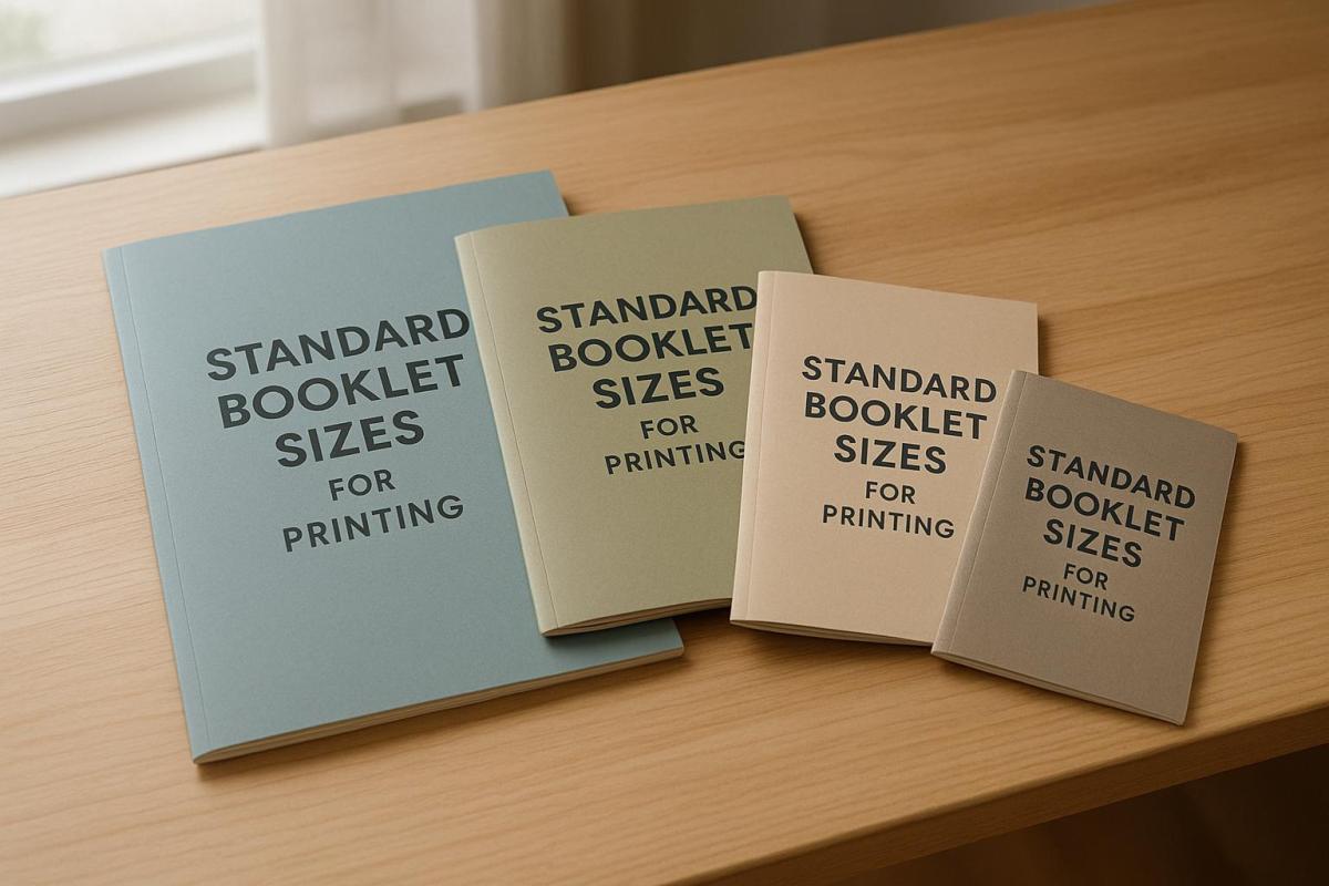
When printing booklets, choosing the right size impacts readability, cost, and usability. Common booklet sizes include:

  • 5.5″ x 8.5″ (Half-Letter): Compact and portable, ideal for event programs, product catalogs, and promotional materials.
  • 8.5″ x 11″ (Letter): Offers more space, suitable for reports, manuals, and detailed presentations.
  • 6″ x 9″: A balanced option, often used for novels, training materials, and portfolios.
  • A5 (5.83″ x 8.27″): Similar to half-letter, popular for international projects.
  • A4 (8.27″ x 11.69″): Larger format, great for content-heavy designs and global audiences.

Smaller booklets are easier to carry and economical, while larger ones accommodate detailed visuals and text. Production and mailing costs vary by size, with standard formats like 5.5″ x 8.5″ and 8.5″ x 11″ being cost-effective in the U.S.

For custom sizes, consider your budget, audience, and content needs. Custom formats stand out but may increase production costs. Partnering with an experienced printer ensures high-quality results tailored to your project.

Designing Booklets: Choosing a Booklet Size

Standard Booklet Sizes

When it comes to printing booklets, certain dimensions have become widely used because they balance practicality, cost, and visual appeal. Here’s a breakdown of the most popular sizes and what they’re best suited for.

5.5″ x 8.5″ (Half-Letter)

This size, often referred to as half-letter or digest, is a favorite in the US. Its compact design makes it easy to carry while still offering enough space for visuals and text. That’s why it’s a go-to for product catalogs and promotional materials. It’s also a practical choice for event programs, as it fits conveniently into a purse or pocket. Many novels, memoirs, and non-fiction books also fall into this size category.

8.5″ x 11″ (Letter)

The letter size, 8.5″ x 11″, provides more room, making it ideal for content that requires clarity and detail. It’s commonly used for reports, manuals, handbooks, and technical documents, where clear text and diagrams are essential. This size is also perfect for professional business presentations and annual reports, offering a polished and organized look.

6″ x 9″ and Square Formats

The 6″ x 9″ size is a middle ground between the compact half-letter and the larger letter dimensions. It’s often chosen for portfolios, lookbooks, or marketing materials that need a sleek, sophisticated feel. Square formats, such as 6″ x 6″ or 8″ x 8″, stand out visually and are popular for art books, photography portfolios, and brand-focused designs.

A5 (5.83″ x 8.27″) and A4 (8.27″ x 11.69″)

International sizes like A5 and A4 are gaining traction in the US, especially among businesses with global audiences. A5, at 5.83″ x 8.27″, is similar to half-letter in its portable and personal feel. Meanwhile, A4 offers even more space than the standard letter size, making it ideal for detailed catalogs, comprehensive reports, and educational materials. A5 works well for projects needing a smaller, approachable format, while A4 is better for content-heavy designs.

The choice between US standard and international sizes depends on your audience and project goals. For US-focused projects, 5.5″ x 8.5″ and 8.5″ x 11″ are familiar and practical. On the other hand, international formats like A5 and A4 can add a global touch and ensure consistency for worldwide use. These dimensions provide a solid foundation for customizing your booklet to fit your needs and budget.

How to Choose the Right Size

Selecting the right booklet size is about finding the sweet spot between your content needs, how your audience will use it, and what your budget allows. The size you choose influences not only the design but also how practical and cost-effective the booklet will be.

Content and Layout Requirements

The type and amount of content you have should guide your size decision. If you’re working on detailed reports, technical manuals, or catalogs packed with charts and diagrams, a larger format like 8.5″ x 11″ is ideal. It ensures everything – from text to visuals – remains clear and easy to read. Larger sizes are also better for content with intricate visuals, as they preserve detail and impact.

For simpler materials such as event programs, product brochures, or promotional handouts, smaller formats like 5.5″ x 8.5″ are a better fit. This size encourages concise, focused messaging that’s quick for readers to digest.

If your project is heavy on visuals – like photography portfolios, art books, or architectural showcases – larger formats allow images to stand out. On the other hand, text-heavy booklets can work well in smaller sizes, as long as the content is well-organized and the font remains legible.

Purpose and Target Audience

Think about who will use your booklet and in what setting. For materials like trade show handouts, networking guides, or quick-reference booklets, portability is key. Smaller formats are easy to carry and more practical for these scenarios.

Larger formats, like 8.5″ x 11″, work best for professional settings such as boardroom presentations or client meetings. They make a strong impression and are ideal for discussing complex information like real estate brochures, corporate reports, or detailed product catalogs.

Educational materials and training manuals need a balance between portability and readability. A 6″ x 9″ size often works well, offering enough space for clear explanations and diagrams while still being easy to handle for students or employees.

Also, consider where your audience will encounter your booklet. Compact, visually appealing formats are perfect for busy trade shows, while larger, more detailed catalogs can be sent directly to prospects who are likely to spend more time reviewing them.

Budget and Mailing Costs

The size of your booklet has a direct impact on printing and shipping costs, so your budget plays a big role. Standard sizes like 5.5″ x 8.5″ and 8.5″ x 11″ are often more economical because they reduce production waste. Even small changes to these dimensions can lead to higher costs.

Mailing costs also increase with size and weight. For example, as of August 2024, USPS flat mail (large envelopes) starts at $1.50 for up to 1 ounce, with an additional $0.27 for every extra ounce. Standard letter-sized booklets are cheaper to mail than larger formats because of the way they’re processed. If your booklet can fold down to fit letter-size dimensions, you’ll save significantly on postage.

The size of your print run also affects costs. Ordering 25 booklets might cost $3–$5 per piece, but ordering 1,000 could drop the price to $0.40–$0.60 per booklet. Larger print runs make bigger formats more affordable, though rush orders will add extra charges.

"The size you select should resonate with your book’s purpose, content type, and target audience, so we’re often asked for guidance as a commercial printer on this small but crucial decision." – Thomas Group Printing

Booklet Size Comparison Chart

Choosing the right booklet size can make a big difference in your project’s impact and cost. Below is a side-by-side comparison of standard booklet sizes, highlighting their uses, advantages, and limitations to help you make an informed decision.

Size Best Uses Advantages Disadvantages Cost Considerations
5.5″ x 8.5″ Event programs, promotional booklets, product catalogs, zines Portable; fits standard envelopes; economical for printing and mailing Limited space for content; requires concise design Most affordable for printing and shipping
8.5″ x 11″ Reports, manuals, presentations, detailed catalogs Offers maximum content space; professional look; great for visuals Less portable; higher mailing and production costs Expensive to print and ship
6″ x 9″ Novels, biographies, non-fiction books, training materials Standard book size; good balance of readability and cost Moderate space; average portability Balanced printing and mailing costs
A5 (5.83″ x 8.27″) International publications, technical manuals, academic materials Compact and internationally recognized Less common in the U.S.; may need custom setup Slightly higher costs due to non-standard sizing in the U.S.
A4 (8.27″ x 11.69″) International reports, technical documentation, academic papers Larger international standard; great for detailed content Rare in U.S.; higher costs and mailing challenges Most expensive due to non-standard U.S. sizing

Key Insights on Booklet Sizes

The 5.5″ x 8.5″ size stands out for its portability and cost efficiency. It’s perfect for projects like product catalogs or zines where compactness and affordability are priorities.

If your project requires more room for visuals and detailed text, the 8.5″ x 11″ format provides the space you need. This size is ideal for professional reports, technical manuals, and catalogs loaded with charts, diagrams, or extensive information.

For a balance between compactness and content space, the 6″ x 9″ format is a reliable choice. Widely recognized as the standard for novels and non-fiction books, it offers a good mix of readability and cost-effectiveness. It’s also a popular size for training materials and educational booklets.

Cost and Mailing Considerations

Printing costs can vary significantly between formats. For instance, a 6″ x 9″ booklet with 60 full-color pages and saddle-stitch binding costs about $5.50 per unit, while increasing the page count to 92 raises the cost to $11.88. On the other hand, 1,000 perfect-bound 5.5″ x 8.5″ booklets with 80 pages cost roughly $3.97 each, while printing just 250 units increases the cost to around $5.89 per booklet.

"The thicker the paper and the more color images (and ink) you use, the more it can cost." – Zoe Fisher, Marketing Assistant, PrintingCenterUSA

Mailing costs also depend on size. Smaller formats like 5.5″ x 8.5″ are generally cheaper to mail due to their lighter weight, which often qualifies them for lower postage rates. Larger sizes, such as 8.5″ x 11″, may incur higher shipping fees and could fall into more expensive postal rate categories.

A5 and A4 Formats for Global Use

If your project targets an international audience, A5 and A4 formats are worth considering. While these sizes align with global standards, they can increase costs in the U.S. due to custom setups and mailing challenges.

Final Thoughts on Choosing a Format

Smaller booklets are great for delivering focused, concise content, while larger formats are better suited for detailed information. The 6″ x 9″ size often strikes the best balance, offering enough space for content while keeping production and mailing costs reasonable. Use this guide to weigh the trade-offs and select the format that best fits your project’s needs and budget.

sbb-itb-ce53437

Custom Booklet Sizes

When you’re looking to make a statement with your printed materials, custom booklet sizes can provide the flexibility and creativity needed to leave a lasting impression. Moving beyond standard dimensions, custom sizes allow you to tailor your booklets to meet specific needs and stand out from the crowd.

Benefits of Custom Sizes

Choosing custom dimensions for your booklets comes with several perks:

  • They offer unique shapes and sizes that align perfectly with specific design goals.
  • Square booklets, being less common than rectangular ones, naturally draw attention and set your materials apart.
  • Custom dimensions help reinforce your brand identity, making your booklet distinct and memorable.
  • These sizes are ideal for matching your brand’s visual style or accommodating particular design elements.

Custom booklet sizes can be grouped into categories based on their purpose:

  • Small Custom Booklets: Sizes like 9.5″ x 4.75″ or 8.0″ x 9.0″ are perfect for portable materials such as event programs, product brochures, or promotional handouts.
  • Medium Custom Formats: Dimensions like 12.0″ x 9.0″ provide a flexible option for educational materials, retail catalogs, or company profiles.
  • Large Custom Booklets: Larger sizes, such as 17.0″ x 11.0″ or 11.0″ x 17.0″, are excellent for impactful presentations, where large visuals and detailed information take center stage.
  • Extra-Wide Formats: Unique dimensions like 22.0″ x 8.5″ or 18.0″ x 6.0″ are ideal for panoramic layouts or timelines, making them a standout choice for artistic displays or detailed marketing campaigns.

These options not only enhance the visual appeal of your materials but also ensure they serve their intended purpose effectively.

Custom Printing Considerations

Printing custom-sized booklets involves more than just picking dimensions. Here are some key factors to keep in mind:

  • Cost implications: Custom sizes generally cost more than standard ones, so budget accordingly.
  • Paper stock selection: Use thinner paper for internal pages and thicker, more durable stock for the cover.
  • Binding methods: Leave enough space for binding to avoid cutting off important content. Saddle stitching is a budget-friendly option for booklets with fewer pages.
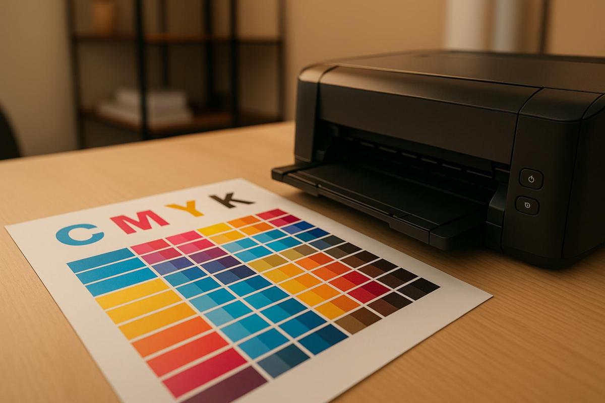
  • File preparation: Ensure your files are formatted correctly, use high-resolution images, and work in CMYK color mode for accurate printing.
  • Consult your printer early: Getting input from your printer during the design phase can help avoid costly mistakes.
  • Order quantity: Printing larger quantities can significantly lower the cost per unit.
  • Quality control: Always request a proof to check for errors. Images should have a resolution of at least 300 dpi for sharp, professional results.

Booklet Printing at Miro Printing & Graphics Inc.

Choosing the right booklet size is just one piece of the puzzle – what truly brings your vision to life is expert printing and finishing.

Since its founding in 1994 in Hackensack, NJ, Miro Printing & Graphics Inc. has been delivering professional-grade booklet printing for over 30 years. Their expertise spans both standard and custom projects, ensuring each booklet is produced to the highest standards.

"With meticulous attention to detail, our print shop has a customized approach that is unmatched by larger print providers."

Printing and Finishing Options

Miro Printing & Graphics Inc. offers a range of printing solutions, including digital and offset printing, to accommodate diverse project needs. Digital printing is perfect for short runs and tight deadlines, while offset printing provides consistent, cost-effective results for larger orders. What sets them apart is their fully in-house bindery, which keeps every step of production under one roof. This approach not only reduces delays but also ensures strict quality control.

Their post-press services cover a wide array of finishing options, including:

  • Binding methods like perfect binding, plastic coil, and comb binding
  • Collating, cutting, creasing, and die cutting
  • Drilling, folding, micro-perforation, and numbering
  • Padding and direct mailing services

These capabilities allow them to handle everything from economical production of standard formats to the intricate demands of custom designs. Whether it’s a simple saddle-stitched booklet or a catalog with unique finishes, they deliver professional results every time.

Custom Projects and Design Support

Miro Printing & Graphics Inc. goes beyond printing by offering layout and design support to create polished interiors and eye-catching covers. Their design team collaborates with clients throughout the process, from initial concept to final production, ensuring tailored solutions for even the most unique booklet projects.

"Let us know what type of project you are working on, and allow us to leverage our expertise."

For more complex projects, they provide proofs for review before moving to final production, giving clients the chance to ensure every detail is just right.

Customer testimonials highlight their dedication to quality and service. One client praised their exceptional customer service and attention to detail, while another shared how Miro completed a challenging job quickly and at a fair price – even going the extra mile to provide a video of a print sample for approval.

Conclusion

Selecting the right booklet size plays a key role in how well your content connects with readers, impacts your budget, and achieves the desired outcome. Standard formats each serve specific purposes, so your choice should reflect the type of content you’re presenting, the needs of your audience, and the resources you have available.

Smaller formats are ideal for portable, quick reads. Medium sizes shine in educational materials and profiles, while larger formats are perfect for bold, impactful presentations. Extra-wide layouts, on the other hand, are designed to showcase intricate visuals or artistic content.

For those looking to balance cost and efficiency, the 5.5″ x 8.5″ size is often the most economical for larger print runs, offering a good mix of affordability and printing ease. Careful planning and proper file preparation can also help you avoid unnecessary expenses, such as rush orders or reprints.

Beyond size, the quality of execution is equally important. Miro Printing & Graphics Inc., with over 30 years of experience, offers both digital and offset printing options, along with comprehensive finishing services. Their in-house bindery ensures consistent quality, while their design team provides layout assistance to help you make the most of your chosen format.

Once you’ve decided on the size, expert printing and attention to detail are essential for bringing your project to life. Whether it’s a small promotional booklet or a detailed product catalog, combining thoughtful size selection with professional printing ensures your booklet meets its purpose and delivers the impact you’re aiming for. This seamless approach – from choosing the right format to final production – ensures your vision becomes a reality.

FAQs

What should I consider when deciding between US standard and international booklet sizes?

When choosing between US standard and international booklet sizes, it’s important to consider your audience, the booklet’s purpose, and how it will be printed. In the United States, 8.5" x 11" is a popular size, commonly used for catalogs, instruction manuals, and business documents. Meanwhile, international sizes like A4 (8.27" x 11.7") are favored worldwide, especially for formal publications or materials targeting global audiences.

You’ll also want to think about the availability of printing services and materials for the size you select. Additionally, some design or layout requirements may naturally fit better with one format over the other. If you’re unsure, reaching out to a professional print shop, such as Miro Printing & Graphics Inc., can provide guidance tailored to your project’s needs.

How do custom booklet sizes affect production and mailing costs compared to standard sizes?

When opting for custom booklet sizes, be prepared for potentially higher production and mailing expenses compared to standard options. Why? Custom sizes often demand specialized printing setups, unique cutting processes, and adjustments to meet mailing requirements. All these extra steps can drive up both material and labor costs.

If you’re thinking about going the custom route, it’s worth balancing the appeal of a distinctive design against the likelihood of increased expenses. For those working within tighter budgets, sticking with standard booklet sizes is usually a more economical and efficient choice.

Why is the 6" x 9" booklet size a great choice for educational materials and training manuals?

The 6" x 9" booklet size is a favorite choice for educational materials and training manuals because it offers the ideal mix of ease of reading and portability. Its compact dimensions make it simple to carry around, while still providing enough room for detailed text, diagrams, and visuals.

This format is also widely recognized and convenient for readers, fitting easily into bags or sitting neatly on desks. Whether you’re creating step-by-step guides or reference materials, the 6" x 9" size delivers a polished, professional appearance without being cumbersome.

Related posts

https://app.seobotai.com/banner/banner.js?id=687c359f84572425aed90198

How to Choose Colors for Die-Cut Labels

Learn how to select colors for die-cut labels that enhance brand identity, ensure readability, and influence customer behavior effectively.

Choosing the right colors for die-cut labels can directly impact how customers perceive your product and whether they choose to buy it. Here’s what you need to know:

  • Color Psychology Matters: Colors evoke emotions and influence purchasing decisions. For example, red grabs attention and encourages impulse buys, while blue builds trust. Studies show 85% of buying decisions are influenced by color alone.
  • Align Colors with Your Brand: Your label’s colors should represent your brand’s personality and values. Consistency across platforms increases brand recognition by up to 80%.
  • Consider Printing Methods: Digital printing is cost-effective for small runs but may not match Pantone colors perfectly. Offset printing offers better color accuracy, especially for custom shades.
  • Material Impacts Color: Paper absorbs ink differently than vinyl or metallic materials. Test your colors on the actual label material to ensure they appear as intended.
  • Ensure Readability: High-contrast combinations (e.g., black text on white) improve visibility. Avoid relying solely on color to convey meaning – use text or symbols for accessibility.
  • Test Before Printing: Always request printed proofs to check colors under various lighting conditions and ensure accuracy.

Brand Identity and Customer Appeal

Your die-cut labels should immediately reflect your brand’s personality. The colors you select act as a visual shortcut, communicating everything your brand stands for. This choice goes beyond personal preference – it’s a strategic decision that shapes how customers perceive your brand.

Matching Colors to Your Brand

Your brand colors serve as an instant identifier for your audience. They should clearly express your values and the essence of your business. The goal isn’t to rely on clichés but to use colors that genuinely represent your brand.

"It’s far more important for colors to support the personality you want to portray instead of trying to align with stereotypical color associations", says Hillary Weiss, Creative Director.

Start by defining your brand personality. Are you bold and forward-thinking? Reliable and trustworthy? Fun and approachable? This foundation will guide your color choices. For example, one founder opted for a soft light blue to reflect his personal story and authenticity.

Consistency is key – using the same colors across platforms can increase brand recognition by up to 80%. Take Parachute, the bedding company, as an example. They use a consistent palette of dark charcoal grey, light blush pink, cream, and white across their website, social media, storefronts, and products. These muted tones create a sense of calm, perfectly aligning with their brand promise.

Don’t be afraid to break industry norms if it fits your brand. Monzo, a digital bank in the UK, chose a bold coral pink for its debit cards. This vibrant choice stands out in the typically conservative finance sector, signaling innovation and youthfulness. On their digital platforms, they balance this with blues and greys to convey trust and professionalism.

Also, think about how your colors compare to competitors. Over 33% of brands use blue as their main color, which might make it harder to stand out. Blueland, an eco-friendly cleaning brand, avoided the common green associated with eco-products. Instead, they chose blue to emphasize water conservation, paired with yellow as a secondary color to add vibrancy.

Once you’ve nailed down your brand colors, it’s time to explore how they influence customer behavior.

How Colors Affect Customer Behavior

Colors don’t just define your brand – they also shape how customers feel and act. They trigger emotional responses, which makes understanding color psychology essential for influencing buying decisions.

Warm colors like red, orange, and yellow evoke energy, excitement, and warmth. On the other hand, cool colors like blue, green, and purple inspire calmness and relaxation. For instance, red is known to encourage impulse purchases, while navy blue tends to promote more thoughtful, budget-conscious decisions.

Major companies use these principles to great effect. Coca-Cola’s red and McDonald’s yellow are iconic examples of colors that spark immediate emotional connections and drive purchases.

However, color preferences can vary based on demographics and cultural context. What appeals to millennials might not resonate with baby boomers. Similarly, colors that symbolize positivity in one culture might carry negative meanings in another. Kevin Kaminyar, CEO of Yellow Tree Marketing, shared how customer feedback shaped his brand’s color strategy:

"I asked [my clients] what popped into their head when they looked at different colors, and yellow was overwhelmingly positive. They brought up kindness, warmth, empathy – and that aligned with my brand".

Testing your color choices with real customers is a smart way to remove guesswork. Dan Antonelli, head of marketing agency Kickcharge, emphasizes this approach:

"We use a more research-driven approach about the use of color that’s already in the market".

This kind of research ensures your colors will have the desired effect on customer behavior.

Keep in mind that 85% of customers cite color as a major reason for choosing one brand over another. Even small details, like the colors on your die-cut labels, can have a big impact on customer decisions. Choose colors that not only look appealing but also actively strengthen your brand and encourage sales.

Printing Methods and Material Compatibility

The method you choose for printing your die-cut labels plays a big role in how your colors appear. Each technique has its own strengths and limitations, which can either enhance or compromise the vibrancy and accuracy of your design. Knowing these differences is key to maintaining your brand’s visual identity.

Printing Process Limitations

Different printing processes handle colors in unique ways, directly affecting the final output. For instance, digital printing transfers the design straight onto the surface, while offset printing involves metal plates and rubber rollers to apply the ink. Offset printing uses oil-based inks that soak into the paper, creating deep and lasting color saturation. On the other hand, digital printing applies ink to the surface, which can make colors appear brighter but may compromise durability over time.

When it comes to color precision, offset printing has the upper hand. It uses the Pantone Matching System to mix custom inks, ensuring highly accurate colors. Digital printing, however, relies on the standard CMYK color model, which may not perfectly replicate all Pantone shades. If your branding depends on exact Pantone colors, offset printing is the better choice. However, for projects with a broad color range or lower print volumes, digital printing offers a more budget-friendly solution.

There’s also UV printing, a specialized form of digital printing. It uses UV light to quickly dry specially formulated inks, resulting in sharper details and better color matching compared to traditional digital methods.

Color Selection for Different Label Materials

The material you print on also has a big impact on how your colors turn out. Different surfaces absorb and reflect ink in ways that can either enhance or alter your design.

Paper labels are the most predictable option. Standard paper stocks absorb ink well and provide reliable color saturation, making them a great choice for testing color combinations. Higher-quality paper can further improve color consistency and fidelity.

Vinyl and plastic materials, however, pose unique challenges. These non-absorbent surfaces don’t take in ink like paper does, which can lead to more vibrant but less durable colors. While these materials can deliver bold visual effects, they may also be more prone to scratching or wear over time.

Offset printing shines when working with a variety of materials. It can handle everything from paper and cardboard to plastic, including thicker stocks, while still delivering a polished, professional look. Digital printing, in contrast, works best with standard paper types that are compatible with inkjet technology.

Metallic and foil substrates add another layer of complexity. Metallic surfaces can amplify vibrancy with their reflective qualities, while clear substrates allow underlying colors to influence the final appearance.

To avoid surprises, it’s important to prepare your design in the CMYK color space from the start. This ensures your colors stay within the printable range and minimizes unexpected shifts when converting from RGB to CMYK. Additionally, collaborating with your printer early in the process can make a big difference. Professional printers, such as Miro Printing & Graphics Inc., can guide you in choosing the right materials and fine-tuning your colors to suit your project’s needs.

Visibility and Readability

Die-cut labels need to perform well in a variety of environments, under different lighting, and from various viewing angles. Ensuring that your labels are easy to read isn’t just a design choice – it’s essential for effectively communicating your message to your audience.

High-Contrast Color Combinations

The readability of your label heavily depends on the contrast between the text and its background. High contrast not only makes the text pop but also strengthens your branding.

Based on the Web Content Accessibility Guidelines (WCAG 2.1), body text should achieve a contrast ratio of at least 4.5:1 to ensure readability for most people.

"The visual presentation of text and images of text [to have] a contrast ratio of at least 4.5:1." – WCAG 2.1

Classic color pairings, like black text on a white background, provide excellent readability. On the flip side, combinations like yellow text on a white background lack the necessary contrast. Complementary colors – opposites on the color wheel, such as blue and orange or purple and yellow – offer a vibrant yet readable option when used thoughtfully. Similarly, saturated colors against neutral backgrounds improve visibility, especially for labels meant to be seen from a distance.

For fonts, stick to bold, clean styles that remain legible even when scaled down. Avoid thin or overly decorative fonts that can lose clarity at smaller sizes.

Before finalizing your design, use a color contrast checker to validate your choices. These tools calculate contrast ratios with precision, eliminating guesswork.

But readability isn’t just about contrast – it’s also about accessibility for users with color vision deficiencies.

Accessible Color Design

Accessibility goes beyond contrast, requiring designs that work for everyone. Millions of people live with color vision deficiencies, including approximately 8% of men and 0.5% of women of European descent who experience red-green color blindness. To address this, use additional visual cues like text, icons, or patterns to complement color.

Never rely solely on color to convey critical information. For example, if red indicates "stop" or "danger", pair it with clear text, symbols, or patterns. Becky Kinkead, Marketing Design and UX Manager at Litmus, underscores this point:

"If color is the only way you’re conveying meaning such as using red for errors and green for success, users experiencing color blindness might not be able to interpret your design at all. Accessibility is about making sure the experience works for everyone."

Incorporate secondary elements like bold text, underlining, patterns, icons, or descriptive labels to reinforce your message. For instance, if your label uses color to distinguish product categories, adding clear text labels or unique shapes can significantly enhance clarity.

Avoid color combinations that are difficult for color-blind users to differentiate, such as green/red, green/blue, green/black, green/brown, green/gray, light green/yellow, blue/purple, and blue/gray.

To test your design for accessibility, view it in grayscale. If the label remains understandable without color, it’s more likely to work for those with color vision deficiencies. Saturated colors also tend to create stronger contrast than pastels, making them easier to see in various lighting conditions.

For a more thorough evaluation, involve individuals with color vision deficiencies during the testing phase. Their feedback can reveal potential issues that digital tools might overlook.

Professional printing services, like Miro Printing & Graphics Inc., can provide expert advice on accessibility and help you test your designs under different lighting conditions to ensure maximum readability.

As Dana Randall, Head of Accessible UI Design at Level Access, puts it:

"We fail at our jobs when we create things that are difficult to use or unpleasant to engage with. With that lens, we may forget that not all people experience color the way we do, which is why we need to check our work through an experience beyond our own."

sbb-itb-ce53437

Testing and Final Color Selection

Once you’ve chosen colors based on branding, printing methods, and accessibility, the next step is to physically test them. This process ensures that all your earlier considerations – like material and printing limitations – translate effectively into the final product. Digital screens can’t fully capture how colors will appear on actual label materials, so physical testing is essential to confirm color accuracy.

Getting Printed Proofs

Printed proofs are a must before committing to a full production run. These proofs let you see how your colors and overall design will look on the chosen material under real-world conditions. Keep in mind that converting colors from RGB to CMYK can sometimes lead to unexpected shifts. Proofs also allow you to check other critical details like label fit, barcode readability, and the unwind direction. Skipping this step could result in costly errors, so reviewing a physical sample ensures your design is ready for production without surprises.

Testing Colors Under Different Lighting

Once you’ve reviewed your printed proofs, it’s time to test your label colors under various lighting conditions. Colors can appear drastically different depending on the light source – whether it’s fluorescent office lighting, incandescent bulbs, or natural daylight. Some industries, like automotive manufacturing, even use specialized light booths to simulate different lighting environments and spot subtle color variations. Testing under these conditions helps detect issues like metamerism, where colors match in one light but differ in another. Always evaluate your labels under key lighting scenarios and consistent viewing angles to ensure they look consistent wherever they’re displayed.

Working with Professional Printers

If you notice any inconsistencies, professional printers can help fine-tune your design. Collaborating with an experienced printing company, such as Miro Printing & Graphics Inc., can make a significant difference in achieving high-quality results. These experts bring valuable knowledge about color management, material compatibility, and quality control, which can be challenging to manage on your own.

Professional printers often adhere to industry standards like Pantone matching, ISO 12647, and G7 Master Printer certifications to guarantee reliable color reproduction. Epsen Hillmer Graphics Company highlights the importance of this process:

"Color management ensures that colors remain consistent across different devices and media by creating profiles that define how each device reproduces colors. This allows for accurate color conversion between devices. Maintaining consistent colors across all platforms, whether for logos, websites, or marketing materials, is crucial for brand recognition."

To ensure accuracy, provide your printer with physical color swatches and a detailed brand style guide that includes exact color codes. Professional printers can also recommend materials, suggest adjustments for better print results, and even simulate lighting conditions during the proofing stage. This collaboration is especially important when working with specialty materials, metallic inks, or intricate die-cut designs that demand precise alignment.

Conclusion: Creating Effective Die-Cut Labels

Crafting impactful die-cut labels involves striking the right balance between your brand’s color identity, printing techniques, and accessibility.

Start with your brand’s core identity by creating a detailed brand style guide. This should include defined color palettes in formats like RGB, CMYK, and Pantone to ensure consistent color reproduction across both digital and print mediums. Pair these guidelines with printing methods and materials that align with your chosen colors for seamless execution.

Choose materials that support accurate color reproduction. The material you select plays a critical role in how colors appear. Combine this with the use of spot colors for elements like logos or key branding features to achieve greater precision and consistency.

Testing is non-negotiable. Physical proofs let you see how your design looks on the actual material under various lighting conditions. This step is essential for catching potential issues and making adjustments before moving into full production. It’s a practical way to ensure your labels meet the intended design and color standards.

Collaborate with experienced printers for the best results. Partnering with skilled printers can elevate your project through advanced color management, finishing techniques, and accurate color matching. As Penmar Industries highlights:

"Professional printers have experienced staff who understand the intricacies of label printing. They can offer valuable insights on design considerations, materials, finishes, and printing techniques to achieve the best results for your specific product".

Companies like Miro Printing & Graphics Inc. provide end-to-end support, from design consultation to final production. Their expertise in digital and offset printing, along with specialty finishes, ensures that your vision translates perfectly onto the final label.

FAQs

How can I pick the best colors for my die-cut labels to reflect my brand’s personality?

When picking colors for your die-cut labels, start by reflecting on your brand’s personality and the message you want to send. Do you want to evoke trust, energy, or sophistication? This is where color psychology comes into play. For instance, blue is often associated with trust and dependability, while red exudes energy and passion.

It’s also smart to factor in industry trends and what appeals to your target audience. A good rule of thumb for creating a balanced color scheme is the 60-30-10 rule: dedicate 60% to a dominant color, 30% to a complementary secondary color, and 10% to an accent or neutral shade. Once you’ve narrowed down your palette, test your selections on the materials and finishes you’ll use for your labels to make sure they look as good in reality as they do in your design.

Need help perfecting your label design? Miro Printing & Graphics Inc. offers custom printing services to bring your vision to life.

What are the pros and cons of using digital printing versus offset printing for accurate colors on die-cut labels?

Digital printing works best for smaller print runs, thanks to its quick setup, faster production times, and lower overall costs. That said, it may fall short in terms of color range and can sometimes lack the precise color matching that offset printing provides.

Offset printing, by contrast, shines when it comes to color accuracy and sharp, detailed results. It’s the go-to option for large-volume projects or jobs that demand exact color consistency. However, this level of quality comes with higher setup costs and longer production timelines, making it less practical for smaller orders or projects with tight deadlines.

How can I make sure my die-cut labels are easy to read for people with color blindness?

To make your die-cut labels more accessible to people with color blindness, choose high-contrast color combinations that are easier to differentiate. Don’t depend solely on color to communicate key information – include clear text labels or symbols as extra indicators. Adding textures or patterns to separate areas can also enhance usability, ensuring your labels are inclusive. These thoughtful design elements not only improve accessibility but also help your labels remain effective and visually appealing to a wider audience.

Related posts

https://app.seobotai.com/banner/banner.js?id=687aeb478b14326f7937ad4c

Spot Colors vs Process Colors: Cost Comparison

Explore the cost differences between spot and process colors, and learn how to choose the right printing method for your project.

Choosing between spot and process colors impacts your budget and design quality. Here’s the quick takeaway:

  • Spot colors use pre-mixed inks (like Pantone) for precise and consistent colors, ideal for branding, logos, and special effects (e.g., metallics). They cost more due to custom inks and separate printing plates for each color.
  • Process colors (CMYK) combine four standard inks – cyan, magenta, yellow, and black – to create a wide range of colors. It’s affordable for detailed designs, photographs, and large print runs, but color accuracy can vary.

Key Points:

  • Spot colors are best for exact color matching, special finishes, and small-color designs.
  • Process colors suit multi-color designs, gradients, and high-volume printing.
  • Spot colors have higher setup costs but may become cost-effective for large runs.
  • Process colors are more budget-friendly for most projects, especially with intricate details.

Quick Comparison:

Feature Spot Colors Process Colors (CMYK)
Color Matching Precise and consistent Less precise
Setup Costs High (separate plates for each color) Lower (only 4 plates)
Ink Costs Higher (custom inks) Lower (standard inks)
Best For Branding, logos, special effects Photos, gradients, high volumes
Cost Efficiency Small runs = expensive; large runs = better per unit Ideal for most print jobs

Tip: For mixed needs, consider combining both methods – process colors for photos and spot colors for logos or brand elements.

Spot Colors: How They Work and What They Cost

What Spot Colors Are and When to Use Them

Spot colors are pre-mixed inks created using the Pantone Matching System. Unlike process colors, which combine different inks during printing, spot colors rely on individual ink formulas mixed beforehand to achieve precise color consistency.

The Pantone system includes over 2,000 colors, each identified by a unique number, like Pantone 186 or Pantone 294. This standardization ensures that a specific spot color will appear the same whether it’s printed in New York or Los Angeles.

Spot colors are applied directly to paper using premixed ink and separate printing plates. This method produces vibrant and consistent results. Spot colors are especially useful for matching exact brand colors or achieving special effects that CMYK printing can’t replicate. For example, metallic gold, fluorescent pink, or rich navy blue often require spot color printing to maintain their intended look.

Next, let’s explore what drives the cost of spot colors.

What Makes Spot Colors Expensive

The main reason spot colors are costly is the need for separate printing plates. Each spot color requires its own lithographic film and printing plate. This means printers must set up individual color stations for every spot color, significantly increasing setup time and material costs. The more spot colors you include, the higher the overall expense.

Setup costs add up quickly because printers have to prepare separate color stations, mix custom ink formulas, and calibrate each color individually. This process is far more time-intensive than setting up a standard four-color CMYK job. For smaller print runs, these setup costs make up a larger portion of the total expense.

Ink prices also play a role. Spot color inks are generally pricier than CMYK inks because they’re formulated with specific ingredients to meet exact standards. Specialty inks, like metallics or fluorescents, are even more expensive due to their unique manufacturing processes.

When you add spot colors to an existing CMYK job, it creates additional color separations, further increasing costs. For instance, if your design uses CMYK and you add a spot color for your logo, you’re essentially introducing a fifth color to the process.

Now that we’ve covered the costs, let’s look at the types of projects where spot colors shine.

Best Projects for Spot Colors

Corporate branding materials are a prime example of where spot colors excel. Items like business cards, letterhead, and marketing brochures benefit from the precise color matching that spot colors provide. Companies often prioritize brand consistency, making the added expense worthwhile to maintain a professional visual identity.

Logo-heavy designs are another great fit for spot colors. Logos often rely on specific brand colors that must stay consistent across all applications. Spot colors ensure accurate reproduction every time, reinforcing brand recognition and credibility.

Designs with fewer than four colors can sometimes be more affordable with spot colors than with CMYK printing. For example, a two-color brochure using black text and one spot color for accents may cost less than setting up a full four-color process.

Specialty applications requiring effects like metallic or fluorescent finishes must use spot colors. CMYK printing simply can’t replicate these effects. Wedding invitations with gold accents, safety signs with fluorescent orange, or luxury packaging with silver highlights all rely on spot color printing.

One notable example is Utopia, a tableware company, which collaborated with B&B Press in 2018 to produce their Eat & Drink Brochure. They combined spot color printing with CMYK, incorporating gold ink to create a sophisticated design that helped the brochure stand out. This showcases how spot colors can elevate the quality and appeal of printed materials.

Fine detail work also benefits from spot colors. Designs featuring small fonts, reverse type, or intricate lines (as thin as 0.5-point) print more sharply with spot colors than with process colors. The solid ink coverage ensures crisp, well-defined edges for even the most delicate design elements.

Process Colors: How They Work and What They Cost

What Process Colors Are and When to Use Them

Process colors rely on four standard inks – cyan, magenta, yellow, and black (CMYK) – to create a wide range of colors. This is done by printing millions of tiny, overlapping dots that combine visually to produce thousands of hues.

This technique, also known as 4-color process printing or full-color printing, works through a subtractive process. Each ink absorbs specific wavelengths of light while reflecting others, resulting in the desired colors on the printed material.

Process colors are particularly effective for reproducing photographs and designs with intricate shading and gradients. Illustrator and graphic designer James Weinberg highlights this distinction:

"Process colors are best for photographic reproduction, or something that has a lot of shading and nuance in it. Spot color lends itself to more of a graphic approach."

Because of this, process color printing is a favorite for projects like magazines, catalogs, and brochures that feature images and complex color transitions. However, it does have limitations. Certain vibrant tones – such as metallics and fluorescents – cannot be accurately achieved with CMYK alone, often requiring spot color inks for precise results.

Now, let’s take a closer look at why this method is so cost-effective.

What Makes Process Colors Affordable

One of the biggest cost advantages of process colors is their efficiency. No matter how many colors a design includes, only four printing plates – cyan, magenta, yellow, and black – are needed. This reduces setup expenses compared to spot color printing, which requires a separate plate for each additional color.

Printers use the same four-color setup for all CMYK jobs, eliminating the need for custom ink mixing or extra plates. This consistency keeps production costs low and streamlines the printing process.

When it comes to large print runs, process colors shine even brighter. Offset printing with CMYK becomes increasingly economical as the number of prints rises, with the cost per unit dropping significantly as volume increases.

Another factor that contributes to affordability is material efficiency. The standardized CMYK ink system allows printers to buy inks in bulk, lowering costs compared to the custom formulations required for spot colors. This means even highly detailed designs can be printed without additional expenses.

That said, color printing is still more expensive than black-and-white. For example, printing a black-and-white page on a laser printer typically costs around 5–8 cents, while a color page averages 12–15 cents.

Despite this, for high-volume and detailed projects, process colors remain a budget-friendly option.

Best Projects for Process Colors

Process color printing is ideal for projects that involve photography, large print volumes, or designs with multiple colors.

Materials featuring photographs – such as magazines, product catalogs, and annual reports – benefit from CMYK’s ability to handle subtle color shifts and smooth gradients. This makes it a go-to choice for visually rich marketing pieces.

For high-volume jobs, such as direct mail campaigns, newsletters, and promotional flyers, process colors are an economical solution. The cost per unit decreases significantly with larger quantities, making it a practical choice for bulk printing.

Multi-color designs that don’t require exact color matching – like posters, brochures, and advertisements – are also well-suited for process printing. This method delivers vibrant visuals without the higher costs associated with spot colors.

However, there’s an important trade-off to consider. With process colors, slight variations in color are more likely between different print runs. This makes them less suitable for projects where precise color consistency is crucial, such as corporate branding materials or packaging.

For projects with tight budgets or complex designs featuring gradients and shadows, process colors strike a great balance between quality and cost savings.

Understanding Spot and Process Colors for Printing

sbb-itb-ce53437

Direct Cost Comparison: Spot Colors vs Process Colors

When weighing the costs of spot colors against process colors, the key differences come down to setup expenses and ink costs. Each approach has its own pricing structure, which can have a big impact on your budget.

Setup Costs and Printing Plates

One of the most noticeable cost differences lies in setup requirements, particularly when it comes to printing plates. Spot color printing demands a separate plate for every color in your design. So, if your project uses five spot colors, you’ll need five individual plates, which can quickly drive up setup costs. On the other hand, process color printing relies on just four plates – Cyan, Magenta, Yellow, and Black (CMYK) – no matter how many colors appear in the final design. This makes it a more budget-friendly option for designs with lots of colors or intricate details.

Spot color printing also involves additional labor. Switching inks on a press requires cleaning the machinery, mixing new inks, and recalibrating the equipment, all of which are billable tasks that add to the overall cost. Pantone inks, in particular, need to be mixed manually, further increasing expenses. These setup factors are crucial when evaluating the ongoing costs of ink and materials.

Ink Costs and Material Expenses

Once setup is accounted for, ink and material costs take center stage. Specialty spot colors, like fluorescent shades, tend to be pricier than standard CMYK inks. In fact, some printers estimate that each color change can add roughly $200 to the total cost. Mixing Pantone colors also requires extra time, which contributes to higher expenses.

While process inks are generally more affordable, they may not perfectly replicate every hue. For simpler designs with just two or three colors, spot printing might actually be cheaper than using a full CMYK process. However, if three spot colors are used, the overall cost will likely surpass that of CMYK. That said, the enhanced print quality and precise color accuracy from spot colors may justify the extra investment.

Print volume is another critical factor in determining cost efficiency. While spot colors come with higher upfront expenses, the cost per unit decreases as order quantities grow, making them a smart choice for large-scale projects. Traditional printing methods often require a bigger initial investment but can deliver lower per-unit costs for high-volume orders.

For substantial print runs, spot color printing may eventually become more economical due to the reduced cost per unit. However, for most commercial projects, using four spot colors is typically more expensive than the standard four-color process in offset printing.

How to Choose the Right Method for Your Project

Once you’ve weighed the costs and quality considerations, it’s time to decide which printing method best suits your project. This choice directly impacts both your budget and the overall quality of your printed materials, so it’s worth taking the time to align the method with your specific goals.

Key Factors to Consider

Color accuracy is often the most important factor. When exact color matching is non-negotiable – like for logos or corporate branding – spot colors are the go-to option. Experts note that while process colors (CMYK) excel at gradients and subtle variations, spot colors deliver unmatched precision for flat, solid hues.

Think about project complexity as well. If your design includes detailed imagery, such as photographs or gradients, process colors handle these elements better. On the other hand, designs with bold, distinct colors – like t-shirt graphics – are better suited to spot colors, as they ensure clear separation between hues.

Your budget also plays a big role. Spot colors are often cost-effective for designs with three or fewer colors. However, if your project involves more colors, the CMYK process typically becomes the more economical choice. Keep in mind that specialty colors, such as metallics or fluorescents, cannot be achieved with CMYK, making spot colors essential for those needs.

Finally, consider print volume. Spot colors involve higher setup costs, but for large print runs, the per-unit cost decreases significantly, potentially making it a more budget-friendly option over time.

By carefully evaluating these factors, many projects find success using a combination of both methods.

Using Both Methods Together

Combining spot and process colors can be a smart approach for some projects. For example, company brochures often use process colors for photos and product images, while spot colors ensure logos and branding remain consistent. This hybrid method allows you to achieve both vibrant image reproduction and precise brand representation.

However, coordinating the two methods requires careful planning. Discuss your technical requirements with your printer early in the process, as each method has unique setup needs. While this adds some complexity, the payoff is worth it for projects where brand consistency and visual quality are top priorities.

Tips for U.S. Printing Projects

When printing in the U.S., a few practical tips can help you achieve the best results while keeping costs in check.

  • Start conversations early with your printer. Roger P. Gimbel, EDP of Gimbel & Associates, advises:

    "Jobs will run more smoothly when designers share concepts with their printers before submitting files."

  • Paper choice matters. Uncoated paper is more affordable but produces softer, muted colors, while coated paper enhances vibrancy by reflecting more light. For budget-conscious projects, uncoated stock paired with CMYK printing can reduce costs without sacrificing professionalism. For consistent branding, specify two ink colors in your guidelines and communicate them clearly to your printer.
  • Always reference physical samples. Seattle Printworks recommends:

    "The best results will always come from looking at a physical piece of paper with ink on it: a Pantone swatch is best."

  • Be strategic with color use. Only use color printing where it adds real value to your project. Printing sample pages before committing to a full run can save you from costly errors.

For projects where brand consistency or premium quality is a must, spot colors often make the most sense. If your content relies heavily on photographic elements and vibrant colors aren’t critical, CMYK processing can help you cut costs without compromising on professionalism.

Conclusion: Key Takeaways

When it comes to choosing between spot colors and process colors, it all boils down to your project’s specific needs and financial constraints. Spot colors deliver unmatched precision but come with a higher price tag due to custom inks and additional plates. On the other hand, process colors (CMYK) are more budget-friendly, relying on a standard four-ink system.

If your design requires three colors or fewer, spot colors can be a cost-effective option. However, for projects involving a broader color palette, CMYK printing often proves to be the more efficient choice.

The economics of color printing also depend on the scale of your project. Spot colors may involve higher setup costs, but they become more affordable for large print runs. Conversely, process colors are ideal for smaller runs, offering better unit pricing. As Roger P. Gimbel, EDP, explains:

"If your project doesn’t require eye-popping treatments and loud colors, it’s highly likely you can execute your design vision using the standard four-color process and keep your costs down."

Planning is crucial when managing these cost differences. Engaging your printer early in the design process can help you make smarter decisions about color selection, avoiding unnecessary expenses. Use color printing strategically – apply it where it truly enhances your project. You might also consider a hybrid approach, combining spot and process colors to meet specific needs, such as maintaining precise brand colors while incorporating photographic elements.

Keep in mind that ink costs are relatively minor compared to setup expenses. The number of plates and setup requirements often play a much larger role in determining your overall budget. Whether you prioritize the precision of spot colors or the flexibility of process colors, aligning your choice with your project’s creative and financial priorities will ensure the best outcome. Thoughtful evaluation and planning are key to balancing quality and cost effectively.

FAQs

What factors should I consider when choosing between spot colors and process colors for my printing project?

When deciding between spot colors and process colors, it all comes down to the needs of your project. Spot colors are the go-to choice when you need precise color matching, making them ideal for things like logos or branding materials where consistency is key. These colors are mixed individually, ensuring they remain uniform across different prints.

On the flip side, process colors – better known as CMYK – work best for designs that include detailed, full-color images, gradients, or a wide range of shades. They combine cyan, magenta, yellow, and black to create a spectrum of colors, making them a practical option for intricate designs.

Think about what matters most for your project. If perfect color accuracy and consistency are non-negotiable, spot colors are worth considering. But if your design is more complex with multiple colors, process colors are often the more budget-friendly and flexible option. Your final decision will hinge on the specifics of your design, your budget, and the result you’re aiming for.

How can I save money by using both spot and process colors in a printing project?

When looking to cut costs while using both spot and process colors, try to keep the number of spot colors to one or two. Reserve these for crucial shades, such as brand-specific colors or distinctive tones that need to stand out. For everything else, rely on process colors (CMYK), which are better suited for covering a wider color spectrum where exact matching isn’t as critical.

Using too many spot colors can drive up expenses because of the additional plates and inks required. Striking the right balance between spot and process colors can help you manage costs effectively while still delivering high-quality visuals.

When should you use spot colors instead of process colors for printing?

Process colors, often referred to as CMYK, are a go-to option for creating a broad spectrum of colors by combining cyan, magenta, yellow, and black inks. While versatile, they fall short when it comes to achieving exact color matches or delivering special effects like metallic, fluorescent, or custom shades. For these specific needs, spot colors are the preferred solution.

Spot colors use pre-mixed inks, ensuring precision and consistency. They’re perfect for projects that require brand-specific colors, vivid neon tones, or metallic finishes – areas where CMYK struggles to deliver. When accuracy is a top priority, like in logos or premium designs, spot colors provide the reliability you need.

Related posts

https://app.seobotai.com/banner/banner.js?id=6879caf3b461ccae51a93890

Pantone Colors for Metallic Printing

Explore the world of Pantone Metallic colors, their applications in luxury design, and how to achieve stunning metallic prints.

Pantone Metallic colors are designed to bring precision and a reflective shine to printed designs, making them ideal for creating high-end visuals. With 655 metallic shades split into two categories – standard metallics and Premium Metallics – these colors ensure consistent reproduction and a polished finish. They are often used in packaging, business cards, and luxury branding to grab attention and add a premium feel.

Key Highlights:

  • 655 metallic shades: Includes 354 high-luster packaging metallics and 301 traditional spot colors.
  • Why use metallics?: Adds a premium look, enhances visibility, and strengthens brand identity. Studies show 70% of consumers prefer eye-catching packaging.
  • Best materials: Coated papers amplify shine, while heavier papers (100 lb or more) ensure stability.
  • Printing methods: Offset printing for large runs, digital printing for small jobs, and metallic foil stamping for bold finishes.
  • Pantone Metallics Guide: A tool for precise color selection, featuring eco-friendly ink formulas and examples with specialty coatings.

Pantone Metallics stand out for their ability to ensure consistent, reflective, and vibrant finishes, making them a go-to choice for luxury designs and branding. For the best results, early collaboration with skilled printers is recommended.

Pantone Metallics Guide GG1507C

Pantone

Understanding the Pantone Metallics Guide

The Pantone Metallics Guide serves as a reliable resource for selecting metallic colors with precision. It removes uncertainty and ensures consistent results across various printing projects.

Features of the Pantone Metallics Guide

This guide includes 655 metallic colors, all neatly organized for easy reference. The colors are arranged chromatically, and there’s an index at the back to help you quickly find specific shades. Each color swatch comes with detailed ink formulations and is printed on 100 lb (148 gsm) coated paper. There’s even an indicator page to show the optimal lighting conditions for accurate color evaluation.

It also provides examples of how metallic colors look when paired with gloss aqueous and specialty coatings, giving designers a clear sense of their application.

The guide is divided into two categories: 354 high-luster packaging metallic colors and 301 traditional metallic spot colors. Packaging metallics, known for their high-gloss finish, are perfect for premium packaging designs, while traditional metallics work best for commercial graphics. To streamline its offerings, Pantone combined its regular and Premium Metallics into a single, unified guide.

These features make the guide a practical tool for keeping up with evolving design needs.

The latest edition reflects modern design trends by introducing 54 new colors, including those featuring Rose Gold ink. Rose gold’s warm and elegant tone strikes a balance between classic gold and contemporary copper, giving designers a flexible option for trendy metallic effects.

Additionally, the updated guide incorporates eco-friendly ink formulas and ensures more consistent ink density, addressing both environmental concerns and practical challenges in printing.

These updates solidify the Pantone Metallics Guide as an indispensable resource for producing consistent, high-quality metallic finishes across all types of projects.

Key Factors for Metallic Printing Success

Creating impressive metallic prints hinges on the right combination of materials, techniques, and problem-solving strategies. Below, we’ll explore material selection, printing methods, and solutions to common challenges.

Choosing the Right Paper and Materials

The foundation of successful metallic printing lies in selecting the right paper. Coated papers are a top choice because their smooth surfaces evenly distribute metallic particles, amplifying the shine. The coating also prevents ink from soaking into the paper too quickly, which helps preserve the metallic effect.

Paper weight matters too. Heavier papers – typically 100 lb (148 gsm) or more – offer better stability during printing, reducing the chances of curling or warping. While uncoated papers can be used, they tend to absorb more ink, resulting in a more muted metallic finish. For maximum reflectivity, smooth and glossy surfaces are ideal, though textured papers can create unique, varied effects.

Once the materials are in place, the choice of printing method becomes the next critical step.

Best Printing Methods for Metallic Colors

The printing method you choose significantly influences the final result. For large-scale projects, offset printing is a reliable option. Its plate-based system ensures even ink application and precise color reproduction, making it perfect for runs of 1,000 or more. It’s also well-suited for handling the thicker consistency of metallic inks.

For smaller quantities or personalized projects, digital printing is a better fit. It’s especially useful for items like custom greeting cards or flyers where flexibility is key.

If you’re after bold, dramatic metallic effects, consider metallic foil stamping or metallic ink printing. Foil stamping uses heat and pressure to transfer metallic foil onto paper, producing a shiny, long-lasting finish. On the other hand, metallic ink printing involves inks infused with metal particles, offering a broader range of colors. However, this method may require multiple layers to achieve the desired effect.

Here’s a quick comparison of common methods:

Method Best For Finish Quality Cost Detail Level
Foil Stamping High-end projects, embossing Shiny and durable Higher Great for bold designs
Metallic Ink Subtle, detailed designs Softer shine Lower Excellent for detail
Offset Printing Large quantities Consistent, polished Moderate High detail and precision
Digital Printing Small runs, personalization Good for small jobs Lower setup costs Very good detail

Common Metallic Printing Problems and Solutions

Metallic printing can be tricky, with several potential pitfalls. One frequent issue is uneven ink coverage, often caused by metallic particles settling in the ink. To avoid this, stir the ink thoroughly before use and periodically agitate cartridges during longer print runs.

Printer nozzle clogging is another common challenge, particularly in digital printers. Metallic particles can accumulate and block the nozzles, so running cleaning cycles between jobs and adjusting print settings for thicker inks can help.

Residual metallic ink can also contaminate equipment, complicating future print jobs. Thorough cleaning after each run is essential to prevent leftover ink from interfering with subsequent projects.

For optimal results, apply multiple thin layers of ink rather than a single thick coat. Adjusting print speed and pressure – especially when working with silver inks – can enhance the metallic finish.

If you’re using metallic inks in offset presses, you may need to tweak the fountain solution. These inks often require a different balance of ink and water. Adding a water-resistant compound, available through most ink suppliers, can improve ink performance and prevent over-emulsification.

Temperature and curing times are equally important. Proper curing ensures that metallic particles set correctly, maintaining their reflective qualities. Test prints are invaluable here, allowing you to fine-tune settings, adjust formulations, and perfect techniques before committing to a full production run.

sbb-itb-ce53437

Pantone Metallics vs Other Color Systems

Choosing the right color system for metallic finishes can significantly influence the final look, cost, and overall impact of your project.

Pantone Metallics rely on pre-mixed spot colors, ensuring consistent results across different print runs. With 655 metallic shades available, this system offers designers a broad range to create striking finishes. These inks form solid, opaque layers, which are crucial for achieving smooth and reflective metallic effects.

On the other hand, CMYK – which uses cyan, magenta, yellow, and black inks – works well for reproducing photos and intricate images. However, it falls short when it comes to replicating the reflective properties of metallic finishes.

"Why should I use Pantone colors in my packaging? Pantone’s system ensures consistent colors, eliminating mismatches common with CMYK. This precision is vital for brands emphasizing detail." – Christal Wong

This quote underscores why Pantone is often the go-to choice for projects that demand precise color fidelity.

Interestingly, about 30% of the 1,114 spot colors in Pantone’s main library cannot be accurately reproduced using CMYK. While CMYK is typically more cost-effective for large-scale printing with multiple colors and gradients, Pantone printing becomes more economical for projects requiring exact color matching or metallic finishes. However, it’s worth noting that Pantone’s setup costs can be higher, particularly for short runs, as each spot color involves dedicated plates and precise ink mixing.

Beyond metallic effects, Pantone provides additional tools tailored to various design needs. For instance:

  • The Pantone Formula Guide offers an extensive range of standard colors, organized chromatically, perfect for general design work.
  • The Pantone Color Bridge helps designers see how spot colors translate into CMYK.
  • The FHI range caters to textiles, featuring a variety of shades suited for apparel and home décor.

Comparison Table: Pantone Metallics vs Other Systems

System Best Applications Color Accuracy Cost Metallic Capability Setup Complexity
Pantone Metallics Logos, branding, luxury packaging Exceptional consistency Higher, with multiple colors True metallic effects (655 shades) Moderate – requires special plates
CMYK Photos, gradients, detailed images Good but can vary Budget-friendly for high volumes Cannot replicate metallic finishes Low – standard process
Pantone Formula Guide Solid brand colors, general design Outstanding consistency Higher per color No metallic options Moderate – spot color setup
Foil Stamping Premium logos, text elements Excellent reflectivity Highest setup costs Superior shine and texture High – needs custom dies

When deciding between these options, Pantone Metallics stands out for projects requiring exact brand color matching and eye-catching metallic effects. For example, if you’re working on luxury packaging, Pantone Metallics ensures the kind of visual appeal that resonates with consumers. In fact, with the global luxury packaging market expected to hit $78.9 billion by 2025, studies show that 70% of consumers are more likely to choose a product with visually striking packaging.

For projects that prioritize precise metallic finishes, Pantone Metallics is the clear winner. However, if you’re working on designs with intricate, multi-tonal images or need to stick to a tighter budget, CMYK might be the better option for non-metallic elements.

Using Pantone Metallics in Design and Print Workflows

Working with Pantone Metallics requires careful planning from start to finish. The secret to success lies in understanding how these unique colors behave throughout the design and production process, while leveraging the right tools to maintain consistency.

Using Pantone Connect for Metallic Colors

Pantone Connect

Pantone Connect acts as a vital link between digital design and physical printing, making metallic color selection more accurate and efficient. Seamlessly integrating with Adobe Illustrator, Photoshop, and InDesign, this tool grants designers access to the full spectrum of metallic shades with ease.

One standout feature is its connection to PantoneLIVE, a digital library that previews how colors will appear on different materials and substrates. This is especially critical for metallics, as their appearance can vary drastically – popping vibrantly on coated paper but appearing more muted on uncoated stock.

Pantone Connect also helps designers navigate ink limitations and substrate compatibility. It offers practical insights into which metallic shades work best with specific materials, reducing the risk of costly reprints.

Another key component is the Pantone Matching System (PMS), which assigns numeric codes to each metallic color, creating a universal standard. For instance, specifying Pantone 8003 C for a rich metallic gold ensures that printers across the country can reproduce the exact shade, eliminating guesswork.

For physical reference, the Pantone Formula Guide remains indispensable. The Coated & Uncoated set is particularly valued for its precise color definitions and user-friendly organization, making it a go-to resource for designers and printers alike.

This seamless integration between digital tools and physical references sets the stage for real-world applications, as seen in the following examples.

Real Examples of Metallic Pantone Colors in Use

The practical application of metallic Pantone colors demonstrates their ability to elevate designs. Take Pantone 9580 U, for example, which was used in the packaging for a luxury retail brand. Printed on 250 gsm uncoated white kraft paper, this metallic shade reinforced the brand’s premium image through impeccable color matching on textured stock.

In another instance, Pantone 10360 C was chosen for a rigid box design with soft-touch lamination – a finish that can sometimes alter the look of metallic inks. Through meticulous testing and adjustments, the final product achieved the desired luxurious finish while maintaining the integrity of the metallic effect.

These successes highlight the importance of thorough workflow practices. Designers often conduct early material tests using actual paper samples instead of relying solely on digital previews. Additionally, they maintain close collaboration with ink suppliers, providing specific Pantone codes and physical samples to ensure the final outcome meets expectations.

How Miro Printing & Graphics Inc. Handles Metallic Printing

When it comes to translating design into print, Miro Printing & Graphics Inc. sets a high standard for metallic printing. Based in Hackensack, NJ, this full-service print shop combines offset printing expertise with tailored project management, making them well-equipped for challenging metallic jobs.

Their process starts with early consultations during the design phase. Rather than waiting for finalized files, Miro’s team collaborates with clients to address paper selection, ink compatibility, and potential challenges posed by metallic inks. This proactive approach helps avoid issues like color shifting or adhesion problems that can occur with certain substrates.

Miro’s in-house bindery services add another layer of precision. Post-press operations such as cutting, scoring, and folding can impact the appearance of metallic inks, especially along fold lines where the metallic particles may separate. By managing these processes internally, Miro ensures the final product maintains its intended metallic effect.

Color accuracy is a top priority for Miro. They rely on physical samples and regular press checks to achieve consistent results. Routine calibration of equipment – from monitors to presses – ensures accurate color reproduction. Additionally, they use ICC profiles embedded in client files to maintain uniformity across different devices and platforms.

For projects requiring both digital and offset versions, Miro advises creating two sets of color specifications: a CMYK approximation for proofs and digital use, and the precise Pantone Metallic for final offset production. This dual approach ensures consistency across all formats.

Miro’s portfolio includes custom projects like presentation folders and premium business cards, showcasing the striking impact of metallic accents. Their technical expertise and end-to-end services allow them to handle complex metallic printing projects seamlessly, ensuring the final product aligns with the designer’s vision.

Summary and Key Points

Pantone Metallic inks elevate designs, turning them into sophisticated materials that strengthen brand identity and capture consumer attention. These inks deliver a level of technical precision and visual appeal that standard printing methods simply can’t match.

Benefits of Metallic Printing

Metallic printing has a powerful effect on how consumers perceive products. Research shows that visually captivating packaging, especially with metallic elements, often becomes a standout feature that influences purchasing decisions.

Pantone offers an impressive range of 655 metallic colors, giving designers plenty of room to experiment. These inks can be layered with transparent coatings or paired with halftones to create subtle gradients and richer metallic finishes.

Another advantage is the cost efficiency of metallic ink printing compared to techniques like foil stamping, particularly for smaller coverage areas. This flexibility allows for creative visual effects that leave a lasting impression, whether on premium wine labels or festive holiday packaging. To put it in perspective, the global luxury packaging market is expected to hit $78.9 billion by 2025, growing at a 4.7% annual rate.

These technical and aesthetic benefits underline the importance of selecting the right print partner for metallic printing projects.

Choosing the Right Print Partner

Achieving the full potential of Pantone Metallic inks requires working with a skilled print provider. These inks demand expertise in areas like substrate selection, ink compatibility, and post-press handling. Miro Printing & Graphics Inc., based in Hackensack, NJ, is a prime example of a provider that excels in this space. Their services include offset printing, in-house bindery, and custom project management, all tailored to address challenges like color shifts and adhesion issues.

Engaging a print partner early in the design process is crucial. Factors such as paper choice and ink compatibility need to be addressed upfront to avoid costly reprints. Experienced providers also ensure consistent results by calibrating equipment, using ICC profiles for accurate color reproduction, and conducting regular press checks. This combination of technical expertise and advanced tools is what separates standard printing from exceptional metallic results.

FAQs

How can Pantone Metallic colors elevate packaging and luxury branding?

Pantone Metallic colors can elevate your packaging and luxury branding by adding a sleek, eye-catching finish that exudes elegance and sophistication. These shimmering tones create a sense of exclusivity, helping your products stand out on crowded shelves and leaving a memorable impression on customers.

Using Pantone Metallics in your designs allows you to emphasize key details like logos, accents, or text, ensuring your brand projects a polished and upscale image. This approach works particularly well in industries such as cosmetics, fashion, or gourmet foods, where visual appeal plays a crucial role in shaping brand identity.

What are the best tips for choosing paper and printing techniques to create stunning metallic finishes?

To create eye-catching metallic finishes, begin by choosing premium metallic or coated paper with a smooth texture and the right weight for your project. The paper’s reflective quality is crucial for amplifying the metallic effect, so pick one that works well with your design and color scheme.

When it comes to printing, UV and offset printing are your best options for achieving bold, long-lasting metallic effects. These methods provide accurate color application and help preserve the shine of metallic tones. It’s always a good idea to test your design on the selected paper to ensure the final outcome aligns with your vision.

How can the Pantone Metallics Guide help ensure consistent and vibrant metallic finishes in printing projects?

The Pantone Metallics Guide is a go-to resource for creating eye-catching metallic finishes with consistency. It offers a well-defined selection of metallic colors paired with detailed ink formulations, making it easier to achieve precise color matching across different printing projects.

This guide is particularly useful for designers and printers aiming to maintain consistent results, even when working with various materials or printing methods. The result? Metallic prints that always look sleek and professional.

Related posts

https://app.seobotai.com/banner/banner.js?id=6879979a75a0518b7c35026d

G7 Method: Ensuring Color Consistency in Printing

Learn how the G7 Method standardizes color calibration in printing, ensuring consistent quality across various devices and materials.

The G7 Method is a standardized calibration process for printing that ensures consistent color reproduction across various devices and materials. Developed in 2006, it focuses on grayscale accuracy using a Neutral Print Density Curve (NPDC), making it applicable to any CMYK printing system. This approach eliminates subjective adjustments, reduces color variation, and simplifies achieving uniform results for branding and print quality.

Key Takeaways:

  • What It Does: Ensures consistent color output by standardizing gray balance.
  • How It Works: Uses NPDC to maintain neutral tonality across devices.
  • Why It Matters: Prevents color inconsistencies that can harm brand perception.
  • Certification: Print shops can achieve G7 Master Qualification to validate quality.

G7 is widely used in modern printing, including large-format systems, and helps reduce waste, improve efficiency, and maintain brand integrity. Regular calibration and monitoring are essential to sustain consistent results over time. For businesses, G7 certification signals a commitment to reliable, high-quality printing.

G7 Basics – A Simpl(er) Explanation for Neutral Print Density Curves (NPDC)

How the G7 Method Works

The G7 Method operates on the idea that neutral tonality is the foundation of accurate color reproduction. Unlike older calibration methods that depended on mechanical tweaks and subjective judgment, G7 uses precise color data to establish a standardized process that works across all CMYK printing devices.

Neutral Print Density Curve (NPDC)

At the heart of the G7 Method lies the Neutral Print Density Curve (NPDC). This curve ensures consistent neutral tonality between any two G7-calibrated printing systems, regardless of their technology. The NPDC separates data for CMY (composite) and K (black), offering precise control over how neutral grays are rendered across different devices.

One of the key challenges NPDC addresses is tonal value increases (TVIs), often referred to as dot gain. Traditional calibration methods struggled with varying TVIs across computer-to-plate (CtP) systems and other devices. G7 bypasses this by mapping neutral density directly to halftone dot percentages, avoiding reliance on inconsistent TVI curves.

To implement NPDC, technicians compare the device-generated curve to the ‘ideal’ standard, make adjustments to the RIP (Raster Image Processor), and then revalidate the NPDC to ensure accuracy. This process ensures that the G7 target (P2P target) produces uniform measurement data across various printing systems. The result? Consistent gray balance across all devices.

Gray Balance and Tonality

Gray balance is a critical element of the G7 Method. The process defines gray balance and tonality in relation to the color of the paper or substrate, ensuring that neutral grays appear the same across different printing systems. This eliminates the color casts that often occur with traditional calibration techniques, leading to sharper, more accurate images.

To achieve proper gray balance, adjustments are made to screen values to counteract variations in primary ink absorption. Without these adjustments, gray balance errors can cause noticeable color shifts. As industry experts Steve Upton and Pat Herold explain:

"Gray balance and consistent tone curving is so important to image perception that a print job separated for one printing condition (say SWOP) will look VERY SIMILAR when printed using a different printing system (such as sheet fed GRACoL) when both presses have been gray balanced and toned using G7."

The G7 Grayscale Compliance process zeroes in on achieving neutral gray balance for all printed materials. This involves defining specific percentages of cyan, magenta, and yellow ink needed for gray balance, along with precise a* and b* values in the Lab color space. These detailed specifications set G7 apart from older calibration practices.

G7 vs. Older Calibration Methods

The G7 Method represents a significant shift from traditional calibration approaches. Older methods depended heavily on mechanical adjustments tied to press variability – a flawed strategy, as presses rarely operate identically unless they are identical machines in perfect condition.

Traditional techniques focused on mechanical print attributes like density and dot gain, which can vary widely across presses due to differences in substrate, mechanical setup, ink properties, and other factors. While these attributes are helpful for monitoring individual presses, they fall short when it comes to ensuring consistent color reproduction across multiple systems.

G7 revolutionized this process by using color measurements instead of mechanical attributes to achieve color consistency. It provides a unified target and set of aims for all devices in a printing facility, focusing on color rather than machine-specific characteristics. This makes G7 applicable to any CMYK printing device.

Another major difference is G7’s reliance on grayscale calibration. Unlike traditional methods that primarily targeted individual color channels, G7 recognizes that accurate gray balance is the key to achieving consistent and accurate color reproduction across all hues and tones. By focusing on neutral tonality, G7 eliminates the guesswork and subjectivity that plagued older density-based calibration techniques.

Using G7 for Large Format Printing

Large format printing comes with its own set of challenges, especially when it comes to maintaining consistent color output. Variations in substrates, inks, and environmental conditions can make it tricky to achieve uniform results. That’s where the G7 method steps in. By building on the principles of Neutral Print Density Curve (NPDC) and gray balance, G7 provides a structured way to ensure consistent color across wide-format printing systems.

Tools and Setup Requirements

To implement G7 for large format printing, you’ll need the following tools and equipment:

  • Calibration Software: This software handles G7 targets and communicates with measurement devices. For instance, Curve+ supports a range of instruments and target types.
  • Spectrophotometer: Essential for precise color measurement. Make sure your software is compatible with various spectrophotometers to future-proof your setup.
  • G7 Targets: Standardized test patterns with specific color patches. Depending on your system, you might use the standard P2P target or smaller options like miniP2P or microP2P.
  • Raster Image Processor (RIP): Your RIP must be capable of applying tone curves and making color corrections based on G7 measurements.

These tools are crucial for accurate measurements and NPDC corrections. Once everything is set up, proper procedures and routine maintenance will help you achieve and sustain consistent results.

G7 Calibration Steps

The G7 calibration process is designed to establish a neutral gray balance across your printing system. Here’s how it works:

  1. Choose the Right Target: Start by selecting a P2P target that fits your setup, such as P2P51, P2P25Xa, or P2P51 Randomized.
  2. Print and Measure the Initial Target: Use your current settings to print the target and establish baseline measurements.
  3. Analyze Results: Examine the gray balance measurements to identify any deviations from G7 standards. Pay close attention to the gray balance patches, as they are central to the process.
  4. Apply Correction Curves: Calibration software will generate NPDC curves based on your measurements. Apply these curves to your RIP to account for factors like ink absorption and substrate differences.
  5. Reprint and Verify: Print the P2P target again with the correction curves applied. Measure the patches to confirm that your system meets G7 specifications.
  6. Repeat if Necessary: Continue making adjustments until your system falls within G7 tolerances.

In December 2023, TKO Graphix highlighted the importance of their G7 Master Qualification, emphasizing how it ensures consistent and vibrant color profiles for their large format prints.

"By adhering to this standardized color process, we ensure that our client’s vision aligns seamlessly with the end product we produce."
– TKO Graphix

Once your system is calibrated, regular checks will help maintain these results.

Keeping Colors Consistent Over Time

Calibration isn’t a one-and-done process. Over time, factors like ink aging, environmental shifts, and equipment wear can cause your system to drift from its calibrated state. Regular recalibration is essential to keep things consistent.

Conditions such as temperature, humidity, and media variations can impact ink flow and color output. Additionally, both printers and monitors naturally drift over time, making periodic adjustments necessary.

To address these challenges, establish a calibration schedule based on your production needs. High-production environments might require weekly recalibration, while lower-volume operations could get by with monthly checks. Consistency in your routine is key to maintaining quality.

Monitoring your system through process control adds another layer of reliability. G7 Expert Trainer Ron Ellis from Ron Ellis Consulting puts it this way:

"Calibration is important, but I often tell my customers – that’s the easy part. Maintaining the calibration is the real challenge."

For example, one company uses a Techkon SpectroDrive to streamline their process. By placing a sheet on the console, they can gather all the necessary data in just 8 seconds to confirm if their prints meet G7 standards. This live data not only helps with immediate adjustments but can also be used for trend analysis.

Finally, regular color audits are a great way to ensure consistency. Compare new prints to established reference standards or previous batches to catch any drift before it becomes noticeable to clients. These ongoing checks and adjustments make it easier to maintain high-quality results over time.

G7 Method Pros and Cons

The G7 method comes with a mix of benefits and challenges that print shops need to weigh carefully. By understanding these factors, you can make smarter decisions about adopting the method and prepare your team for what’s ahead.

Benefits of G7 Calibration

The G7 method has become the go-to approach for ensuring consistent color quality in the printing industry. Its ability to work seamlessly across offset, digital, and large-format systems makes it widely applicable.

One of the standout benefits is its potential to cut costs and boost efficiency. By reducing waste from trial-and-error color matching and limiting reprints, G7 helps streamline operations and save time.

Javier Robles, Director of Technical Service – Digital at INX International, highlights its role in maintaining quality:

"G7 calibrated printing is important because it helps guarantee quality assurance across multiple printing devices."

For agencies and brand managers, G7 offers peace of mind. Its standardization ensures that the final printed product matches the original design, preserving the integrity of campaigns.

Additionally, these improvements naturally lead to happier clients. G7-certified printers are trusted to deliver consistent, high-quality results. As Kiran Deshpande, G7 Expert at Idealliance, explains:

"Regardless of how, when, or where a product is printed, the basis of G7® allows for visual consistency every time."

However, while the G7 method offers clear benefits, it also presents challenges that must be addressed.

G7 Challenges and Limits

One of the biggest hurdles is getting everyone on board. Implementing G7 can feel disruptive to some team members, making organizational buy-in a critical step. Success requires alignment across management, production, and prepress teams.

Before diving into G7, your printing process needs to be fine-tuned and validated for consistent performance. This often involves tackling issues with tooling, materials, and prepress workflows – efforts that can demand significant time and resources.

Ongoing maintenance is another challenge. Keeping the process within specifications requires regular monitoring and attention. Many print shops find value in hiring a G7 Expert or training an internal G7 Professional to oversee the implementation. While this adds upfront costs, it can lead to smoother operations and better long-term outcomes.

Advantages Challenges
Works across various printing technologies Requires buy-in from all team members
Reduces waste and cuts costs Printing process must be optimized first
Simplifies workflows and reduces manual adjustments Demands ongoing monitoring and maintenance
Improves customer satisfaction Requires time and resource investment
Ensures consistent brand colors May involve hiring or training G7 specialists

G7 and ISO Standards

The G7 method doesn’t replace ISO standards – it complements them. It provides practical steps for meeting ISO requirements, making compliance more manageable. Unlike methods focused solely on mechanical attributes like dot gain or density, G7 emphasizes gray balance and how it affects visual appearance. This makes the process more intuitive and visually driven.

"G7® methodology specifies requirements for print color that can be applied to any printing technology, substrate, or ink set."

This flexibility allows print shops to meet ISO standards across different equipment and materials while maintaining the visual consistency G7 is known for. According to ISO estimates, over 50,000 printers worldwide use G7 workflows. The method has proven its value in supporting standardization and delivering the high-quality results clients expect. Weighing these benefits and challenges is key for print shops aiming to build a reliable, ISO-compliant, G7-calibrated workflow.

sbb-itb-ce53437

G7 Certification for Print Shops

Earning G7 certification is a way for print shops to showcase their dedication to quality and precision. This globally acknowledged standard sets businesses apart in an industry where dependable color reproduction is crucial for upholding brand consistency.

What is G7 Certification?

G7 certification is a globally accepted benchmark for consistent color quality in printing. It acts as a universal calibration method across various systems, including digital, offset, and large-format printing. The program offers three levels of compliance:

  • G7 Grayscale Compliance: Focuses on achieving a neutral gray balance in printed materials.
  • G7 Targeted Compliance: Includes solid ink measurements for primary and secondary colors.
  • G7 Colorspace Compliance: The highest level, ensuring alignment with an entire Reference Print Condition.

For print shops, this certification brings tangible benefits: happier customers, increased repeat business, and stronger brand loyalty. It also helps cut down on waste and boosts press efficiency.

Getting G7 Certified

The G7 certification process provides a structured path for print shops, though it requires careful planning and investment. The certification, known as G7 Master Facility Qualification, is granted by Idealliance and confirms that a facility’s equipment and systems meet G7 standards for gray balance and consistent print quality.

There are two main ways to achieve certification:

  1. Send an employee to a G7 Expert Training program.
  2. Hire a G7 Expert consultant to oversee the qualification process.

To become G7 Master Qualified, a print shop must have a G7 Expert on-site to review and submit calibration data to Idealliance. The costs associated with certification depend on the facility’s requirements and the number of devices involved. Here’s a breakdown of typical fees:

Certification Component Cost
New G7 Master Submission Application Fee $800/facility
Renewal G7 Master Submission Application Fee $550/facility
Grayscale or Targeted Compliance $100/device
Colorspace Compliance $150/device

G7 certifications are valid for one year and must be renewed annually by a G7 Expert or G7 Professional.

According to Idealliance:

"For business owners, the benefits of being a G7 Master Facility are simple. Your print products are consistent, which helps maintain the integrity of your customers’ brand – and turns these customers into repeat customers. Your customer base will increase due to print buyers actively seeking out suppliers who are G7 certified. And lastly, your costs will go down because of reduced paper waste and ink consumption."

G7 at Miro Printing & Graphics Inc.

For companies like Miro Printing & Graphics Inc., G7 certification is a cornerstone of their operations. This full-service print shop in Hackensack, NJ, uses G7 standards to ensure consistent color quality across various printing methods. Whether it’s business cards, brochures, banners, or posters, G7 certification guarantees that colors remain uniform across different technologies and materials.

The certification supports their commitment to precise color management and simplifies the supply chain for clients who demand consistent branding across multiple projects. It also reduces production time, making it particularly useful for custom projects and complex campaigns.

In competitive markets like northern New Jersey, G7 certification is a clear marker of expertise and process control. It not only enhances a company’s reputation but also aligns with broader industry trends. For example, the printing industry was valued at $494.53 billion in 2023. As the sector evolves, standards like G7 continue to play a key role in delivering reliable, high-quality results.

Conclusion

The G7 Method transforms how color consistency is managed by relying on gray balance and neutral print density curves to maintain uniformity across different technologies, materials, and devices. This approach not only meets production standards but also safeguards brand identity, ensuring that colors remain true to their intended appearance. It’s a level of precision that builds trust and reinforces brand integrity.

Julie Thysse, Preflight and Color Management Manager, describes it best:

"Color management is what a printer does to accurately reproduce your brand colors across all print media. Clings, brochures, letters, displays, packaging, and signage are all made from different substrates on different print devices that use different inks. Color management is all about achieving consistent visual similarity across all those variables".

G7 simplifies workflows while ensuring consistent brand colors across all materials, regardless of printing method or location. This consistency is crucial, especially when studies show that up to 80% of instant judgments about products are based entirely on color.

G7 certification acts as a hallmark of quality for both print providers and their clients. The certification offers three levels of compliance – Grayscale, Targeted, and Colorspace – each demonstrating varying degrees of precision. At the highest level, G7 Master Colorspace Qualification ensures that color variations are imperceptible to the human eye, making it ideal for projects that demand absolute accuracy.

Whether using digital presses, offset printers, or large-format systems, G7 provides a universal framework for achieving predictable and consistent results. This standardization not only simplifies supply chain management but also makes it easier for businesses to collaborate with multiple vendors while maintaining high-quality output.

For businesses that depend on flawless color reproduction, working with G7-certified facilities like Miro Printing & Graphics Inc. ensures that brand colors are treated with the utmost care and precision. In a $494.53 billion printing industry, G7 certification sets apart providers who prioritize accuracy and consistency, making it a critical factor in delivering reliable results.

FAQs

What is the G7 Method, and how does it ensure consistent color quality in printing?

What Is the G7 Method?

The G7 Method is a color calibration technique that helps achieve consistent and accurate color reproduction, no matter the printing technology or material. By focusing on midtones and balancing grayscale, it ensures a uniform look across different printers, substrates, and inks.

This approach relies on neutral print density curves to standardize the way colors and tones appear, making it independent of specific devices. The result? Fewer color discrepancies between proofs and final prints, leading to predictable and reliable outcomes for every print job. It’s especially useful in large format printing, where maintaining consistent color is absolutely essential.

What is the process for a print shop to achieve G7 certification, and why is it important?

What Is G7 Certification?

G7 certification is a process led by a certified G7 Expert to fine-tune a print system, ensuring it meets the G7 grayscale standard. This standard emphasizes precise control of midtones, which helps achieve consistent and accurate color reproduction across various devices and materials. The certification process involves calibrating the system, submitting calibration data for review, and maintaining regular quality checks to ensure ongoing compliance.

Why does this matter? G7 certification offers several key advantages. It guarantees consistent color across all print jobs, enhances a print shop’s reputation for reliability, cuts down on material waste, and strengthens customer confidence by consistently delivering high-quality results. For companies like Miro Printing & Graphics Inc., earning G7 certification highlights their dedication to providing top-notch large-format and other printing services.

What makes maintaining a neutral gray balance essential in the G7 Method, and how is it different from traditional calibration techniques?

Maintaining a neutral gray balance is at the heart of the G7 Method, as it ensures consistent color reproduction no matter the printing process or material. By honing in on the visual appearance of grayscale tones, the G7 Method delivers stable and predictable color results that work smoothly across a range of devices and substrates.

What sets the G7 Method apart from traditional calibration techniques is its focus on how colors appear to the human eye rather than relying solely on mechanical measurements like ink density or dot gain. This makes it particularly effective for large-format printing, where achieving consistent, professional-quality results is absolutely essential.

Related posts

https://app.seobotai.com/banner/banner.js?id=6878476e2685a2f677e71faf

Glow-in-the-Dark Printing: How It Works

Learn how glow-in-the-dark printing utilizes phosphorescent inks for vibrant designs, enhancing visibility and creativity in various applications.

Glow-in-the-dark printing uses phosphorescent inks to create luminous designs that absorb light and release it in the dark. This technique is ideal for safety signage, marketing materials, and event decorations, combining functionality with striking visual effects.

Key Highlights:

  • Phosphorescent inks store light and glow in the dark, with strontium aluminate pigments offering brighter and longer-lasting effects.
  • Screen printing is the primary method, often requiring a white underbase for maximum glow.
  • Works well on textiles, paper, and plastics, with green being the brightest glow color.
  • Applications range from safety signs and promotional items to fashion and event materials.

Glow-in-the-dark printing is a practical way to make designs stand out and improve visibility in low-light conditions.

Materials and Inks Required

Phosphorescent Inks: How They Work

Phosphorescent inks are the backbone of glow-in-the-dark printing. These inks contain pigments that absorb light and then gradually release it as a glow over time. Here’s how it works: when light hits the pigment, its electrons get excited to higher energy levels. As these electrons return to their normal state, they release the stored energy in the form of a glow.

The pigment type plays a big role in determining how bright and long-lasting the glow will be. Today’s advanced inks use strontium aluminate, which is up to 10 times more effective than the older zinc sulfide. For the most intense glow, strontium aluminate mixed with europium and dysprosium is the top choice. The glow can last anywhere from a few minutes to several hours, though brightness typically decreases to about 10% within two hours.

To get the best results, expose the pigments to direct sunlight for 20–30 minutes. However, be cautious not to overexpose them, as this can lead to color fading over time. These specifics highlight the importance of choosing the right materials for achieving the desired glow effect.

Suitable Materials for Glow-in-the-Dark Printing

Choosing the right material – or substrate – is just as important as selecting the ink. The substrate affects both the brightness and the duration of the glow. Common materials include paper, textiles, and plastics. Because phosphorescent ink is transparent, the base color of the material has a big impact on how well the glow appears.

For textiles, white fabrics or materials with a white base deliver the best results. Printing directly on dark fabrics without a white underbase can result in a faint or barely noticeable glow. To maximize brightness, apply a white base layer before using the phosphorescent ink. The thickness of the ink application also matters – a thicker layer typically produces a brighter and longer-lasting glow, as long as the material can handle it without cracking or peeling.

Paper works well for items like posters, promotional materials, and signage. Its absorbent surface helps the ink adhere and perform effectively. Plastics, on the other hand, are ideal for outdoor uses and safety signs because they offer durability and allow for smooth, even ink distribution, which ensures consistent glow effects.

Environmental factors such as UV exposure, moisture, and chemicals can affect how long the glow lasts. For outdoor applications, it’s important to use durable materials and proper curing methods. Color also makes a difference – green glows are perceived as the brightest, followed by blue, while red tends to appear dimmer.

If you need help selecting the best materials and inks for your project, Miro Printing & Graphics Inc. provides expert advice tailored to specialized needs.

Printing Methods and Techniques

Screen Printing Process

When it comes to achieving the best glow effect, the screen printing process plays a crucial role, especially when using plastisol or water-based inks. The key is in the preparation and layering.

Start with a white underbase – this reflects light and enhances the glow. Once the underbase is cured, evenly apply the glow-in-the-dark ink. For a stronger glow, apply multiple layers to increase the pigment density. Avoid mixing glow ink with regular white ink, as this can weaken the glow effect.

It’s essential to maintain the correct curing temperatures. Many modern inks, like Rapid Cure Glow in the Dark Ink, are designed to cure at lower temperatures and are non-phthalate. After curing, expose the print to light to charge the pigments effectively.

For water-based glow inks, take extra care during printing. Spritzing a fine mist over the ink after the flood stroke can prevent it from thickening during the process.

Once you’ve optimized the printing process, refine your design to maximize the glow effect.

Design Guidelines for Glow Effects

A good design is just as important as the printing technique when it comes to glow-in-the-dark prints. Phosphorescent inks behave differently in various lighting conditions, so understanding their properties is key. While the standard glow color is yellow-green, other options like pink, red, blue, and violet are also available. Printing glow designs on a white base ensures the brightest results.

Focus on bold shapes that look great in both daylight and darkness. Glow inks work best when applied in thicker layers, so avoid intricate line work or small text, as these may not glow effectively.

Color choices can significantly influence the final look. Pairing a white underbase with different phosphorescent ink colors can create striking effects. For instance, using a fluorescent underbase can enhance visibility during the day while still delivering a strong glow at night.

When planning your design, keep in mind that glow-in-the-dark prints typically have a shelf life of 6–12 months. This makes them ideal for short-term campaigns, seasonal events, or temporary signage rather than long-term use.

Lastly, consider the environment where the glow effect will be viewed. These prints shine brightest in complete darkness or low-light settings. If your design will be seen in areas with ambient lighting, ensure it works well in both lit and dark conditions.

Always consult your ink manufacturer’s instructions, as application thickness, curing temperatures, and charging methods can vary between brands. Following these guidelines will help you create prints that truly stand out.

Printing Glow (Phosphorescent) Inks

sbb-itb-ce53437

Commercial Applications and Uses

Glow-in-the-dark printing is making waves across various industries, offering businesses a standout way to grab attention and create memorable experiences. By leveraging its unique properties, companies can deliver impactful results across different sectors.

Retail and Marketing Materials

Retailers are increasingly turning to glow-in-the-dark printing to stand out in competitive markets. This technique is used for posters, banners, brochures, and packaging, ensuring visibility in low-light settings and outdoor ads that remain prominent after dark.

It’s also a favorite for point-of-purchase (POP) displays, gift boxes, tags, clings, maps, and even business cards. As one expert puts it:

"Simply put, glow-in-the-dark offers a unique way to engage with consumers and other target markets in a way that is Anything but Ordinary".

Fashion brands have embraced this technology for creating eye-catching designs on T-shirts, hoodies, and hats, especially for concerts and nighttime events. It’s also effective for short-term promotions like postcards, direct mail campaigns, and greeting cards, though its 6–12 month shelf life makes it better suited for temporary campaigns rather than long-term branding efforts.

Event and Entertainment Applications

Glow-in-the-dark printing doesn’t just shine in retail – it also transforms event and entertainment spaces. From decorations and costumes to giveaways, this technology adds a visually striking element that lingers in guests’ memories. Music festivals and concert venues often use glow-in-the-dark merchandise, wristbands, and promo materials to enhance the atmosphere and assist with crowd management in dimly lit venues.

Screen-printed glow-in-the-dark transfers are a hit for Halloween parties, birthday celebrations, and band merchandise, allowing groups to stand out in dark settings. Corporate events also benefit from its versatility, using it on name badges, directional signs, and promotional items to capture attention in low-light environments.

Safety and Emergency Products

Glow-in-the-dark printing isn’t just about aesthetics – it plays a critical role in safety. Phosphorescent inks are commonly used for safety messages like exit signs in offices, public buildings, and venues such as stadiums, cinemas, and theaters.

In the U.S., building codes emphasize its importance. The International Building Code requires photoluminescent egress path markings in high-rise buildings, while the NFPA 101 Life Safety Code mandates their use in assembly spaces, educational facilities, and other large structures. These markings, which include signs and floor indicators, are low-maintenance and cost-effective, requiring no electrical connections or ongoing upkeep.

Strontium aluminate, a material known for its brightness and long-lasting glow, is the go-to choice for safety applications. Glow-in-the-dark tape, for instance, releases 80–85% of its stored energy within 30 minutes of being removed from a light source, making it invaluable during emergencies.

Applications extend beyond exit signs to include staircase nosing, door frames, stair edges, and emergency equipment locations, providing a comprehensive wayfinding system. Even the home décor market has jumped on board, with glow-in-the-dark elements like wall art, furniture, and stickers becoming popular in children’s bedrooms for both aesthetic charm and practical nighttime navigation.

For businesses exploring glow-in-the-dark printing, professional services like Miro Printing & Graphics Inc. in Hackensack, NJ, can guide you through the process, whether you’re working on promotional materials, safety signage, or custom projects requiring specialized techniques and materials.

Best Practices for Quality Results

Building on our technical guide, here are some proven strategies to ensure your glow effects stand out. Whether you’re designing safety signs or eye-catching promotional materials, these tips can help you achieve the best results from your investment.

Maximizing Glow Brightness and Duration

To create long-lasting and vibrant glow effects, focus on proper charging and maintenance techniques. The brightness and duration of glow-in-the-dark prints rely on several controllable factors.

Direct sunlight can fully charge prints in just 30 minutes. If sunlight isn’t an option, strong LED or incandescent bulbs positioned close to the print work as effective alternatives.

"Charging your glow in the dark creations is the key to unlocking their mesmerizing potential." – The Night Sky

The ink application technique plays a crucial role in the glow’s intensity. A base layer of bright, vibrant inks enhances the effect, while darker or muted inks can dull the glow. Additionally, applying a thicker layer of ink increases phosphorescent density, resulting in a stronger glow.

Regular maintenance is essential for preserving the glow. Recharging prints under suitable light sources ensures they remain effective over time. However, be cautious – overexposure to sunlight can lead to color fading and diminish the glow’s longevity.

Protective measures help maintain the luminescent properties. Framing the prints shields them from dust, moisture, and physical damage, all of which can reduce the glow effect. When cleaning is necessary, use a dry cloth and avoid harsh chemicals that could strip away the luminescent material. Handle the prints gently to prevent damage to the phosphorescent surface.

For safety applications, where brightness is critical, materials like strontium aluminate doped with europium and dysprosium offer the longest and brightest glow available. This makes them ideal for emergency signage, where visibility is paramount.

These technical refinements highlight the importance of precision and expertise in achieving standout results.

Working with Professional Print Services

While following these best practices is key, professional print services can elevate your glow-in-the-dark projects to the next level. Their expertise ensures a seamless blend of UV inks and phosphorescent compounds, applied using specialized screen printing techniques.

Technical expertise is invaluable for achieving high-quality results. Professionals use advanced machinery and premium materials to produce sharp, vibrant images that retain their glow over time. Since phosphorescent compounds can create a slightly grainy texture, experienced printers know how to minimize this effect while maximizing glow performance.

Specialized equipment and materials also make a big difference. Professional printers have access to specialty inks and a variety of glow formulations tailored to different uses. Their high-grade phosphorescent materials and precision equipment ensure consistent and even application.

Customization and scalability are additional advantages. Professional services offer a range of customization options, allowing businesses to create unique, tailored designs. Whether you’re producing a small batch of promotional items or large-scale safety signage, professional printers can handle projects of any size while maintaining consistent quality.

For those in the New Jersey area, Miro Printing & Graphics Inc. in Hackensack provides comprehensive printing solutions, including custom glow-in-the-dark projects. With expertise in digital, offset, and large-format printing, along with in-house bindery services, they offer the technical skills needed for successful results.

Conclusion

Glow-in-the-dark printing turns ordinary materials into striking, light-emitting designs by using phosphorescent inks and screen printing techniques. These inks absorb light and release it gradually, creating a glowing effect that’s perfect for both marketing and safety applications.

Key Points Summary

The effectiveness of glow-in-the-dark printing hinges on a few important factors. Phosphorescent inks store light energy and emit it over time, with the classic yellow-green glow being the brightest and most reliable. Other colors like pink, red, blue, and violet are available, but they tend to have a less intense glow. For the best results, it’s recommended to print on white backgrounds, as darker surfaces can reduce the luminescent effect.

This printing method is versatile and can be applied across various industries. It’s commonly used for direct mail campaigns, postcards, Halloween promotions, gift cards, credit cards, packaging, retail displays, book covers, and greeting cards. It’s especially beneficial for safety products, where visibility in low-light environments is critical.

Planning is essential for success. Glow-in-the-dark inks have a shelf life of 6–12 months, so timing your orders is crucial. These inks can also be combined with others to create layered, mixed-media designs for added visual impact. For artwork preparation, vector-based tools like Adobe Illustrator or InDesign are highly recommended.

This technique elevates standard prints into glowing, attention-grabbing designs. With these basics covered, you’re ready to turn your creative ideas into reality.

Getting Started with Your Project

Glow-in-the-dark printing offers a unique way to make your designs unforgettable. To get started, proper planning and collaboration with experienced professionals are key. These experts can help navigate the technical aspects of phosphorescent inks and screen printing to ensure your project’s success.

Think about how adding glow-in-the-dark elements could boost your brand’s visibility and leave a lasting impression on your audience. Whether you’re creating safety signage, promotional materials, or distinctive packaging, this technique provides a way to stand out in any lighting condition.

For those ready to dive in, Miro Printing & Graphics Inc. in Hackensack, NJ, offers a full range of printing services, including custom glow-in-the-dark projects. With expertise in digital, offset, and large-format printing, as well as in-house bindery services, they have the tools and knowledge to bring your glowing designs to life.

Start your glow-in-the-dark printing project today and discover how this technique can take your brand’s visibility to the next level. Traditional printing just can’t compare!

FAQs

What makes glow-in-the-dark inks unique, and how do they work?

Glow-in-the-dark inks, often called phosphorescent inks, have a fascinating ability to absorb and store light energy, which they later release as a soft, glowing light in darkness. This glowing effect is powered by materials known as phosphors. When exposed to light, these phosphors trap the energy and then slowly release it over time, creating the signature glow.

What sets phosphorescent inks apart from fluorescent ones is their ability to keep glowing even after the light source is gone. Fluorescent inks, on the other hand, only glow when exposed to UV light and stop immediately once the light is removed. Modern glow-in-the-dark inks typically rely on zinc sulfide or strontium aluminate as their phosphors. Among the two, strontium aluminate is especially favored for its brighter glow and longer-lasting effect.

These inks have become a favorite in both creative and commercial applications, offering a striking and memorable touch to any design.

How can I keep glow-in-the-dark prints bright and long-lasting?

To keep your glow-in-the-dark prints shining bright and lasting longer, ensure they’re well-charged. Expose them to direct sunlight or a strong artificial light source for at least 30 minutes. This simple step boosts both their glow intensity and how long they stay illuminated.

For extra protection, apply a clear topcoat. This creates a barrier that guards the glow layer against moisture, scratches, and general wear. Be mindful when handling these prints – avoid exposing them to harsh conditions, and clean them gently if needed. Regularly recharging them will also help maintain their glowing effect over time.

What factors should you consider when selecting materials for glow-in-the-dark printing?

When choosing materials for glow-in-the-dark printing, it’s crucial to pick substrates that support strong ink adhesion and ensure lasting durability. The texture and surface energy of the material play a big role in how well the glow-in-the-dark ink sticks and holds up over time.

You’ll also want to make sure the substrate works well with phosphorescent compounds and UV inks used in the process. This compatibility helps maintain a bright, long-lasting glow without sacrificing the overall appearance. Think about factors like the material’s toughness, surface feel, and how the printed item will be used – especially if it’s meant for outdoor settings or heavy use.

Related posts

https://app.seobotai.com/banner/banner.js?id=68773914896c57272c5b6670

Top Folding Machines for High-Volume Printing

Explore top folding machines for high-volume printing, highlighting speed, efficiency, and features to boost productivity in your business.

Folding machines are essential for businesses managing large-scale printing tasks. They boost productivity, reduce errors, and allow for faster turnaround times. Choosing the right folding machine depends on your needs, such as speed, paper handling, fold types, and automation. Here’s a quick breakdown:

  • Stahlfolder TH/KH Series: High-speed industrial machine with modular design, supports various fold types, and handles multiple paper weights.
  • Formax FB 390: Air-feed technology processes 35,000 sheets per hour, ideal for coated and glossy paper.
  • Tamerica TPF-42: Reliable, mid-range option for heavier paper stocks, folding up to 8,000 sheets per hour.
  • Neopost Inserters: Combines folding and inserting for mail-heavy operations, with models processing up to 12,000 envelopes per hour.

Quick Comparison

Model Speed Fold Types Paper Size Best For
Stahlfolder TH/KH Up to 230 m/min Multiple, including signatures Various Industrial-scale printing
Formax FB 390 35,000 sheets/hour 7 standard types 3″ x 5″ to 14″ x 20″ Coated/glossy paper
Tamerica TPF-42 8,000 sheets/hour 7 types 3.5″ x 5″ to 11″ x 17″ Mid-sized operations, heavier stocks
Neopost Inserters Up to 12,000 envelopes/hour 5 types Envelopes High-volume mailing tasks

Each machine offers specific strengths, from industrial-grade precision to cost-effective solutions for smaller businesses. Match your production volume and paper requirements to the right model for the best results.

Formax FD 390 Folding Machine

Formax

1. Stahlfolder TH/KH Series by Heidelberg

Stahlfolder

The Stahlfolder TH/KH series represents Heidelberg’s premier solution for high-volume commercial printing. By combining buckle fold and knife fold technologies, this system is built to handle a wide variety of folding tasks with precision and efficiency.

Folding Speed

The Stahlfolder KH 82 delivers impressive results, reaching speeds of up to 230 m/min with its automated cross-fold unit. This design not only doubles productivity but also slashes setup times by 80% – a game-changer for businesses managing high-volume printing demands.

Supported Fold Types

Thanks to its modular setup, the TH/KH series supports a broad spectrum of folding applications, such as signatures, package inserts, and flyers. The parallel fold units feature buckle plates with swing deflectors or combination options, accommodating up to eight plates. Additionally, the cross-fold units are available in six configurations, ensuring flexibility to meet diverse production needs.

Paper Size and Weight Compatibility

The TH/KH series excels in versatility, efficiently handling a wide range of paper sizes and weights. Whether you’re working with lightweight promotional materials or heavier commercial documents, this system delivers reliable performance. Its adaptability is further enhanced by scalable automation and modular design, making it a versatile choice for various printing requirements.

Automation and Modularity

Both the TH and KH machines are designed for seamless expansion, with patented Stahlfolder technology boosting overall productivity. The market has responded positively – over 400 Stahlfolder KH 82 machines have been installed, making it the top-selling fully automatic combination folding machine.

"We will continue to use our experience from 70 years of folding machines to expand our portfolio for industrial postpress with regard to digital integration." – Michael Neugart, Head of Heidelberg Postpress

This dedication to innovation ensures that the TH/KH series remains a leading choice for businesses aiming to enhance efficiency and stay ahead in the competitive world of commercial printing.

2. Formax FB 390 Air Feed Paper Folder

The Formax FB 390 Air Feed Paper Folder is designed to handle high-volume document processing, making it a solid choice for mailrooms and print shops. With its advanced air feed system, it ensures reliable performance across a variety of tasks, from routine office needs to specialized printing jobs. Let’s break down its key features.

Folding Speed

The FB 390 can process up to 35,000 sheets per hour, thanks to its air feed technology, which surpasses the efficiency of traditional friction-based systems. Its hopper holds up to 350 sheets, minimizing interruptions and keeping production running smoothly. To help track productivity, the machine includes a 5-digit counter, which accurately records the number of sheets processed during each session.

Supported Fold Types

This paper folder supports seven standard fold types: Letter Fold, Z-Fold, Half-Fold, French Fold, Fold Out, Double Letter Fold, and Double Parallel Fold. It also handles the specialized Engineering Fold (Short Z Fold).

With this variety, the FB 390 is versatile enough for everything from business letters to marketing materials and technical documents. Operators can manually set up the machine to select the specific fold type required for each project.

Paper Size and Weight Compatibility

The FB 390 works with paper sizes ranging from 3″ x 5″ to 14″ x 20″ and supports paper weights up to 65 lbs. This makes it suitable for lightweight flyers, standard office documents, and heavier marketing materials – all without requiring adjustments to the machine.

This flexibility allows businesses to handle a wide range of projects with one machine, while maintaining consistent folding quality regardless of paper type or thickness.

Automation and Modularity

Although fold selection is done manually, the FB 390 incorporates helpful automation features like an outfeed stacker, which simplifies the handling of folded documents. Additionally, an optional perforator/scorer attachment for 20–28 lb paper expands its capabilities even further.

The machine’s simple, durable design makes it easy to operate, even for those with limited experience, while still being robust enough for continuous use in demanding commercial environments.

3. Tamerica TPF-42 Commercial Paper Folding Machine

Tamerica

The Tamerica TPF-42 Commercial Paper Folding Machine is a dependable choice for mailrooms and copy shops that need consistent performance in high-demand folding tasks. Its standout feature is its ability to handle heavier paper stocks while maintaining steady output, making it ideal for large-scale operations.

Folding Speed

The TPF-42 delivers impressive speed, folding up to 8,000 sheets per hour for single folds and 7,000 sheets per hour for more intricate folding patterns. This level of efficiency makes it well-suited for high-volume environments where speed and reliability are critical.

Supported Fold Types

With the ability to perform seven different fold types, including single folds, double folds, and Z-folds, the TPF-42 offers exceptional flexibility. It’s designed to handle a variety of materials, such as heavier card stock, glossy sheets, and brochures, making it a versatile tool for creating marketing materials and other professional documents.

Paper Size and Weight Compatibility

The TPF-42 accommodates paper sizes ranging from 3.5″ x 5″ to 11″ x 17″, covering everything from standard business documents to larger-format materials. Popular sizes like 5″ x 7″ are also supported, making it a practical choice for invitations, promotional cards, and more. Its capability to manage heavier, premium-grade paper stocks ensures consistent performance, even with challenging materials.

Operation and Ease of Use

Built with durability and ease of operation in mind, the TPF-42 is designed for busy workplaces. Its straightforward controls reduce the need for extensive training, allowing users to achieve efficient and reliable folding, even under demanding conditions.

sbb-itb-ce53437

4. Neopost Commercial Paper Inserters

Neopost

Neopost Commercial Paper Inserters, marketed under the Quadient brand, offer a streamlined solution for businesses that need reliable folding and inserting capabilities for high-volume tasks. These machines are particularly suited for environments like billing departments, direct mail operations, and large-scale correspondence management, where efficiency and precision are crucial.

Folding Speed

Neopost inserters are designed to handle high-speed processing, catering to various business needs. For example:

  • DS-75i model: Processes up to 3,800 envelopes per hour.
  • DS-65 folder inserter: Handles up to 2,400 envelopes per hour.
  • DS-160HP: Reaches speeds of up to 4,500 envelopes per hour.

Quadient also offers options for different operational scales:

  • Small business models: Up to 2,500 envelopes per hour.
  • Mid-level units: Around 4,300 envelopes per hour.
  • Production-grade systems: Capable of processing up to 12,000 envelopes per hour.

Supported Fold Types

Neopost inserters feature PowerFold™ technology, which accommodates five key fold types: no fold, single fold, letter fold, zig-zag fold, and double parallel fold. This versatility ensures they meet the common needs of invoices, letters, and marketing materials.

Automation and Modularity

These machines are built with automation and flexibility in mind. Features like automated job changeovers and a modular design make them adaptable to various needs. With support for up to 17 document feeders and optional software modules, they simplify mail center operations and save time. Additionally, the Automated Insertion Management System (AIMS) provides real-time tracking and enhances overall efficiency.

The benefits of these features are evident in real-world use cases. For instance:

"With our Quadient folder inserter, we have a reduction in manual mail assembly processes as well as an increase in employee and user satisfaction." – Janet Lee Preston, Business Professional, United Parcel Service

Another user, Heath Card from the Mashantucket Pequot Tribal Nation, shared:

"With our Quadient folder inserter, we have increased productivity and decreased labor costs."

From small businesses handling up to 20,000 envelopes monthly to large-scale operations processing over 1 million envelopes per month, Neopost inserters provide scalable solutions for a wide range of needs. Next, we’ll explore how these features compare to competing folding systems in our analysis of their advantages and limitations.

Advantages and Disadvantages

After our detailed machine-by-machine breakdown, let’s take a broader look at the overall benefits and trade-offs of folding machines. When it comes to high-volume printing, each type of folding machine has its strengths and challenges, depending on factors like budget, operational needs, and production goals.

Speed and Efficiency

One of the biggest advantages of folding machines is the massive boost in productivity compared to manual folding. For example, even a basic letter folding machine can process over 3,000 documents per hour. This is especially important in direct mail campaigns, which boast a 4.4% response rate, far outpacing email’s 0.12%.

High-performance machines, like those in the Heidelberg Stahlfolder series, are designed for industrial-scale operations. These machines deliver precision and speed, even with complex fold patterns, making them ideal for environments where consistency is critical. However, their sophisticated features come with a need for skilled operators and regular maintenance, which may not be practical for smaller businesses.

Cost and Return on Investment

The cost of folding machines varies widely, with entry-level models priced between $100 and $500, mid-range machines from $500 to $2,500, and high-end systems starting at $2,500. The return on investment largely depends on how much you’re producing daily. For businesses folding between 2,000 and 5,000 pieces a day, machines in the $500–$2,900 range are typically a good fit.

Manual folding machines are a budget-friendly choice for small-batch production, offering low upfront costs and minimal maintenance. On the other hand, automatic machines – while more expensive initially – provide faster processing and greater consistency for large-scale tasks. It’s all about aligning the machine’s capabilities with your production needs.

Paper Handling and Versatility

The type of feed system a folding machine uses can make a big difference in its performance. Friction-feed machines are best for uncoated paper and are reliable for standard office documents. However, if you’re working with glossy or coated paper, air-feed systems are the better option – though they come with a starting price of $5,000.

For instance, the Formax FB 390’s air-feed technology is excellent for handling tricky paper types that would jam a friction-feed system. That said, this feature comes with higher operational and maintenance costs. Meanwhile, for businesses primarily working with standard paper weights and sizes, the Tamerica TPF-42 offers solid performance at a more accessible price point.

Ease of Use and Training

The complexity of a folding machine often determines how much training and maintenance it requires. Desktop machines are straightforward and need minimal upkeep, making them accessible to almost anyone. In contrast, production-grade machines demand skilled operators and regular preventative maintenance to avoid costly downtime.

Take the Neopost Commercial Paper Inserters as an example. Their PowerFold™ technology and modular design offer incredible versatility, but operators must undergo thorough training to make the most of these features. On the flip side, basic folding machines can be operated with minimal instruction, making them ideal for less specialized staff.

Feature Entry-Level ($100-$500) Mid-Range ($500-$2,500) High-End ($2,500+)
Speed 1,000–3,000 sheets/hour 3,000–8,000 sheets/hour 8,000–20,000+ sheets/hour
Fold Types 2–4 standard folds 4–8 fold options 12+ programmable folds
Paper Compatibility 20–24 lb standard paper 16–32 lb various stocks 12–80+ lb all paper types
Automation Level Manual Semi-automatic operation Fully automated
Care Minimal cleaning required Regular lubrication needed Professional service required
Training Time 15–30 minutes 2–4 hours 1–2 days

Matching Machines to Volume

Choosing a machine that matches your production volume is essential. For example, a government office using an MBM 206M paper folder for $2,833.60 achieved an output of 10,500 letters per hour. Meanwhile, a printing company with a Pitney Bowes FD40 tabletop folder, priced at $3,480.40 with an additional $485/year for maintenance, processed 20,000 letters per hour.

These examples highlight how selecting the right machine can directly impact efficiency and cost-effectiveness. Businesses handling fewer than 1,000 pieces daily often find entry-level machines sufficient. However, operations exceeding 10,000 pieces per day typically require industrial-grade equipment to meet demand without sacrificing performance.

Long-Term Costs

For high-volume operations, managing ongoing costs is just as important as the initial purchase price. Machines designed for heavy workloads, such as those handling up to 100,000 pieces per month, typically cost between $2,400 and $4,800+. While these systems represent a significant investment, their efficiency often offsets labor costs and increases throughput.

Regular maintenance, including cleaning and lubrication, is essential for all folding machines to prevent breakdowns and downtime. However, the complexity and frequency of maintenance vary depending on the machine, which can influence long-term expenses and staffing requirements.

Conclusion

Selecting the right folding machine is all about matching your production requirements with the right balance of speed, functionality, and cost. The machines we’ve covered cater to a variety of operational needs, from mid-sized businesses to large-scale enterprises. Here’s a quick recap of their strengths and ideal use cases.

For high-output environments, the Formax FD 38X shines with its impressive capacity of 20,100 sheets per hour and an easy-to-use color touchscreen interface. With a price range of $4,500–$6,000, it supports seven programmed folds and allows for 12 custom fold jobs, making it a great choice for businesses needing both efficiency and adaptability.

The Stahlfolder TH/KH Series is a powerhouse for industrial-scale operations. Known for its precision and durability, this machine is perfect for facilities handling massive monthly volumes. While it requires a higher initial investment and skilled operators, the consistent performance makes it worthwhile for large-scale production.

For mid-sized operations looking for reliable performance without overspending, the Tamerica TPF-42 offers excellent value. Its friction-feed technology works well with standard paper, delivering dependable results. Meanwhile, the Formax FB 390 uses an air-feed system, making it ideal for coated or glossy stocks by minimizing jams often seen with friction-feed machines.

If your enterprise deals with complex mailing tasks, the Neopost Commercial Paper Inserters are worth considering. These machines combine folding, inserting, and sealing functions into one system. However, they do require thorough operator training to achieve peak performance.

It’s also worth noting that direct mail boasts a 4.4% response rate compared to email’s 0.12%, underscoring the value of investing in folding equipment that enhances productivity.

Ultimately, focus on long-term reliability rather than just upfront costs. Machines priced between $2,500 and $6,000 often strike the right balance between speed, features, and durability, helping you maintain quality while reducing labor expenses.

At Miro Printing & Graphics Inc., we’re dedicated to helping you streamline your operations with dependable, high-performance equipment tailored to your needs.

FAQs

What should I look for in a folding machine for high-volume printing?

When choosing a folding machine for high-volume printing, it’s crucial to prioritize speed and efficiency to keep up with demanding workloads. Look into the machine’s paper handling abilities, including the range of paper types and sizes it can accommodate, ensuring it aligns with your specific production needs.

It’s also wise to focus on features that reduce interruptions, such as easy maintenance and long-lasting construction. A dependable feed system and intuitive controls can further streamline operations, making the machine a reliable partner in fast-paced production settings.

How does the feed system in a folding machine impact its performance with different types of paper?

The feed system in a folding machine is crucial for managing different types of paper effectively. Here’s a quick breakdown:

  • Friction feed systems rely on rollers to pull paper into the machine. They work best with uncoated or standard paper, making them a solid choice for everyday office documents.
  • Air feed systems use suction to handle glossy or coated papers, which tend to slip or jam in friction-based systems.
  • For high-volume tasks, pile feed systems draw paper from a stacked pile, boosting efficiency and reducing the likelihood of jams.

Picking the right feed system for your paper type is key to achieving precise, clean folds while avoiding operational hiccups. Think about the type of paper you’ll use most often to ensure smooth performance.

What factors should you consider when evaluating the long-term costs of high-volume folding machines?

When considering the long-term costs of high-volume folding machines, you need to think beyond just the initial purchase price. Key factors like maintenance costs, potential downtime, and the machine’s durability play a big role in the overall expense. Regular servicing and easy access to spare parts can go a long way in preventing unexpected breakdowns, which helps avoid costly interruptions to your workflow.

While machines with a higher upfront price tag might seem expensive at first, they often prove to be a smarter investment in the long run. Why? They typically require fewer repairs, last longer, and operate more efficiently. Choosing a dependable machine can save you money over time by reducing disruptions and keeping your high-volume printing operations running smoothly.

Related posts

https://app.seobotai.com/banner/banner.js?id=68759e5e922d8ced135fdd8b

CMYK Print Defects: Misregistration vs. Banding

Learn about misregistration and banding in CMYK printing, their causes, effects, and effective troubleshooting techniques to enhance print quality.

Misregistration and banding are two common issues in CMYK printing that can ruin print quality. Misregistration occurs when the cyan, magenta, yellow, and black color layers fail to align properly, leading to blurry images, fuzzy text, or overlapping colors. Banding, on the other hand, appears as horizontal or vertical streaks caused by uneven ink distribution or pressure issues.

Key Differences:

  • Misregistration: Results in misaligned colors and blurred visuals; often caused by mechanical errors or environmental conditions.
  • Banding: Creates streaks or lines, disrupting gradients; typically due to clogged nozzles, uneven ink flow, or file errors.

Both defects harm the professional appearance of printed materials and can lead to wasted resources. Fixing them involves regular printer maintenance, proper file preparation, and high-quality materials. Professional print services can help prevent and resolve these issues with advanced tools and expertise.

Troubleshooting Image Quality Problems on Konica Bizhub C754e Color Copiers #konicaminolta #color

Konica Bizhub C754e

What is Misregistration?

Misregistration happens when the cyan, magenta, yellow, and black layers in a print don’t align correctly. The result? Blurry images, overlapping colors, and fuzzy text that can ruin the professional look of both color and black-and-white prints. This issue is particularly problematic in high-precision printing methods like flexographic printing, where even tiny misalignments can lead to noticeable distortions and blurred visuals.

What Causes Misregistration

Several factors can lead to misregistration, and they often work together to create the problem. Common culprits include:

  • Mechanical issues: Vibrations, dirty print heads, and uneven surfaces can disrupt alignment.
  • Environmental conditions: Changes in humidity and temperature can affect the printing process.
  • Paper quality: Poor-quality paper or improper loading can throw off alignment.
  • Operator errors: Incorrect settings or improper handling during setup can also contribute.

On the technical side, issues like incorrectly positioned sensors or uneven tension levels can prevent the image carrier from making proper contact with the substrate, further worsening the problem.

How to Spot and Fix Misregistration

Once you understand what misregistration is and what causes it, the next step is to identify and fix it. Look for these signs:

  • Blurry or doubled images
  • Gaps or overlaps in colors
  • Shadows or unintended outlines around printed elements

A quick way to check alignment is by examining registration marks. When properly aligned, these marks appear sharp and clear. Misregistration, however, creates additional color shadows around them.

Here’s how you can address misregistration effectively:

  • Enable unidirectional printing: Adjust your printer settings so the print head moves in just one direction. This can help improve color alignment.
  • Perform regular maintenance: Run printhead alignment and cleaning functions to prevent clogs. Ensure ink cartridges are installed correctly, and keep your printer’s firmware updated.
  • Optimize your design: Use 100% black (K) for body text and small details, flatten effects, and convert text to outlines before exporting. Avoid using thin colored lines or hairline borders; instead, maintain a minimum line weight of 0.25 points.

For instance, Veesham Printing Press tackled a client’s misregistration issue by tweaking their invitation file. The thin gold border was thickened, and rich black text was converted to 100% K. The result? A crisp, clean print without any registration problems.

To prevent misregistration in the first place, follow these tips:

  • Use high-quality printing paper.
  • Keep your printer clean and free of dust.
  • Ensure proper calibration of color settings and profiles.

What is Banding?

Banding is a common issue in inkjet printing. Unlike misregistration, which impacts color alignment, banding disrupts the even flow of colors and tones across printed materials. As Jason Darrah from Prisco explains:

"Banding is a defect in inkjet printing that will appear as horizontal or vertical lines, streaks or bands in the printed output."

This makes it important to understand and address banding to maintain high-quality prints – whether you’re producing business cards, brochures, or large format displays.

Banding Defined

Banding refers to uneven color distribution on printed materials, creating visible interruptions that disrupt smooth color transitions. It’s especially noticeable in areas like gradients, solid colors, and photographs, where smooth tonal shifts are critical.

There are several types of banding, each with unique characteristics:

  • Distance banding: Uniform light or dark horizontal lines caused by improper media advancement.
  • Skew banding: Similar lines appearing on just one side due to uneven media movement.
  • Blocked nozzle banding: Light horizontal lines caused by completely clogged printhead nozzles.
  • Deflected nozzle banding: Streaks resulting from ink being jetted at incorrect angles due to partial blockages.

More complex forms include chromatic banding, which shows alternating color bands during bidirectional printing, and gloss banding, where light reflects unevenly. Vertical banding appears as darker vertical lines when ink drops are inconsistent in size or placement, while gradient banding affects large gradients due to limitations in halftone levels.

What Causes Banding?

Banding can result from various factors, often working together to create visible defects. The most common causes include:

  • Printhead issues: Clogged or deflected nozzles, misaligned printheads, or inconsistent media advancement can disrupt the flow of ink.
  • Ink supply problems: Uneven ink distribution, incorrect viscosity, or delivery system issues can lead to color density variations.
  • Environmental factors: Temperature and humidity fluctuations can affect ink flow, contributing to banding.

File preparation and software errors also play a significant role. Graphic designer Ali Raza Shah highlights:

"The main cause of color banding is excessive editing of images using editing software. Too much saturation, saturation, dehazing, etc — such software is the Lightroom can push the color boundaries beyond what is mathematically possible."

Color mode mismatches are another culprit. Motion designer Shubham Kale explains:

"Addressing color banding in print requires selecting the appropriate color mode to align with your printer. The disparity between RGB (suited for digital displays) and CMYK (ideal for printing) color modes can lead to inaccuracies."

Additionally, insufficient bit depth in images can cause banding. Abdullah Nisar emphasizes:

"Increasing bit depth is crucial for achieving smooth gradients and avoiding color banding, which is particularly important for high-quality prints or digital artwork intended for professional use."

Even printer heater issues can contribute to banding. Understanding these causes is key to diagnosing and resolving the problem.

How to Spot and Fix Banding

Spotting banding is usually straightforward. Look for horizontal or vertical lines, uneven gradients, streaks in solid color areas, or alternating light and dark bands. These defects are most noticeable in large solid areas, gradients, and photos.

To fix banding, start by identifying its type, as each requires a specific approach:

  • Printhead-related banding: Run nozzle checks and clean the printheads to ensure they’re functioning properly.
  • File preparation fixes: Convert images to CMYK before printing to match the printer’s color mode, use high bit depth images (16-bit or higher), and ensure images are high resolution (at least 300 dpi).
  • Gradient banding: Apply mild noise or dithering in Photoshop or Illustrator to smooth transitions.

For hardware-related banding, check the printer’s mechanics. Ensure the paper advances correctly and that the printheads overlap properly. Verify that the printer’s heater is working consistently, as temperature fluctuations can cause banding.

Regular calibration and testing are essential for long-term prevention. Perform test prints frequently, calibrate your printer to match the color profiles of your paper, and use proper bleed and crop marks to avoid edge banding.

To minimize future banding issues, maintain your equipment. Clean printheads and perform calibration checks regularly. Additionally, use high-resolution images in CMYK mode and ensure fonts are embedded or outlined to avoid unexpected issues during printing.

sbb-itb-ce53437

Misregistration vs. Banding: Main Differences

Misregistration and banding are two common issues that can seriously impact print quality, but they stem from entirely different problems and show up in unique ways. Knowing how to tell them apart is essential for diagnosing and fixing these issues effectively.

Misregistration happens when colors or design elements in a print don’t align properly, leading to blurred images or overlapping hues. This issue often points to mechanical problems, like poorly mounted plates or worn-out gears, and is most frequently seen in flexographic printing. On the other hand, banding refers to streaks or lines caused by inconsistent ink density or pressure. It’s typically linked to problems like clogged inkjet nozzles or media advancement errors, making it more common in inkjet printing systems.

The way these problems appear also differs. Misregistration shows up as misaligned colors or visible slivers of unprinted paper, while banding creates streaks that disrupt smooth gradients. These visual clues make it easier to pinpoint the issue and find the right solution.

To address misregistration, focus on mechanical precision – properly mount plates and check for worn components. For banding, technical adjustments like adding noise to gradients or re-rasterizing problem areas can help. The table below breaks down the key differences between these two issues.

Comparison Table

Attribute Misregistration Banding
Definition Misaligned ink colors or design elements Inconsistent ink density or pressure
Appearance Blurred images, halo effects, paper slivers Horizontal or vertical streaks
Primary Cause Faulty registration during printing Ink density or pressure inconsistencies
Most Common in Flexographic printing Inkjet printing systems
Impact on Quality Reduces sharpness and clarity Creates distracting streaks
Quick Fix Reinstall toner cartridges, calibrate settings Add noise, re-rasterize gradients

Professional Print Services for Quality Control

Professional print shops play a vital role in preventing and addressing issues like misregistration and banding. With their specialized equipment and expertise, these facilities can detect problems early and implement precise solutions, ensuring high-quality results for final printed products.

How Print Shops Handle Defects

Professional printing facilities rely on a comprehensive approach to handle misregistration and banding. Regular maintenance, calibration, and quality checks are key to their process. This includes tasks like cleaning rollers and plates and comparing printed materials to their original designs to ensure accuracy in color, text, layout, and overall design integrity.

When it comes to banding, print shops take extra measures. They monitor and adjust ink density levels during the print run and maintain consistent pressure on the press to ensure even ink distribution. These adjustments require advanced tools and expertise that most businesses simply don’t have in-house.

But professional print shops don’t stop at fixing problems – they actively troubleshoot other commercial printing issues, such as color inconsistencies, blurry images, or paper quality concerns. This proactive approach not only ensures top-tier results but also helps avoid costly reprints.

To achieve such precision, print service providers often employ advanced, tailored solutions designed to maintain the integrity of every project.

Miro Printing & Graphics Inc. Services

Miro Printing & Graphics Inc., based in Hackensack, NJ, exemplifies these high standards of quality control. Their services eliminate misregistration and banding by leveraging advanced digital printing, offset printing, and large-format printing technologies. These professional-grade tools ensure consistent quality throughout production.

Their offset printing services are particularly effective for tackling misregistration. This method allows for precise color alignment and even ink application, making it ideal for high-volume projects where color accuracy is essential. Similarly, their digital printing services are designed to minimize banding, ensuring smooth, professional results.

Miro Printing & Graphics Inc. also excels in creating customized projects tailored to meet specific quality standards. Their team understands how different printing methods can impact defect prevention and works closely with clients to recommend the best approach for each unique project.

In addition to printing, their in-house bindery services – such as booklet making, collating, cutting, and binding – are carried out with the same meticulous attention to quality. This ensures that the final product upholds the high standards set during the printing process.

Their computer layout and design services further enhance quality by addressing potential issues before printing even begins. By optimizing color saturation levels and ensuring proper file alignment, they reduce the risk of misregistration and other defects at the source.

To round out their offerings, Miro Printing & Graphics Inc. provides mailing and fulfillment services, managing projects from start to finish. This end-to-end approach ensures consistent quality control throughout every stage of production, minimizing the chances of defects impacting the final product.

Conclusion

Grasping the impact of misregistration and banding is essential when it comes to CMYK printing. These issues can undermine the quality of your prints and tarnish your brand’s reputation. Whether it’s misaligned colors or visible streaks, such flaws can make your materials look unprofessional and harm the perception of your business.

With nearly 30% of print jobs failing due to inconsistent quality, addressing these problems quickly is key. Ignoring them can lead to wasted resources, project delays, and strained client relationships. It’s clear that poor print quality isn’t just a technical issue – it can ripple out to affect your bottom line.

Professional printing services offer a solution. Through advanced quality control practices like prepress inspections, precise color management, and controlled production environments, they ensure consistent, high-quality results. These are processes that are often difficult for individual businesses to replicate on their own.

By working with expert print providers, businesses can not only cut costs through improved efficiency but also build trust with clients by delivering polished, reliable materials. For companies in New Jersey, services like Miro Printing & Graphics Inc. bring state-of-the-art technology and expertise to the table. From optimizing designs in the prepress stage to conducting rigorous final inspections, they help businesses eliminate defects and turn potential setbacks into opportunities.

To truly prevent misregistration and banding, you need more than just knowledge – you need the meticulous quality control that professional printing services provide.

FAQs

What’s the difference between misregistration and banding in CMYK printing, and how can I prevent them at home?

Misregistration and banding are two issues that can significantly impact the quality of CMYK prints. Let’s break down what they are and how to address them.

Misregistration happens when the color layers in a print don’t align as they should, resulting in blurry or offset images. To avoid this, start by calibrating your printer settings accurately. Double-check that the paper is correctly aligned in the tray, and opt for high-quality paper and ink. Routine printer maintenance, like cleaning and alignment checks, can also go a long way in preventing this problem.

Banding shows up as unwanted lines or streaks across your prints. This issue often stems from clogged printheads, using the wrong type of paper, or incorrect print settings. To reduce banding, regularly clean the printheads, choose paper that’s compatible with your printer, and adjust the print settings to match the media you’re using. Printing frequently can also help by keeping the ink from drying out and clogging the nozzles.

By staying on top of these simple maintenance tasks, you can ensure your prints come out sharp and streak-free every time.

What regular maintenance can help prevent CMYK print defects like misregistration and banding?

To steer clear of common CMYK print issues like misregistration and banding, keeping your printing equipment in top shape is key. Regularly clean and inspect your machinery to clear out dust or debris that might disrupt alignment. Proper calibration is also a must to ensure precise registration and consistent color output.

Another essential step is monitoring and adjusting ink density during the print run, as uneven ink application can result in noticeable banding. On the digital side, always conduct pre-flight checks on your files to catch any potential errors before they reach the printer. These straightforward practices can make a big difference in delivering smooth, high-quality prints every time.

How do professional print services prevent and fix common defects like misregistration and banding?

Professional print services bring both expertise and top-notch tools to tackle issues like misregistration and banding. Their advanced printing equipment is designed for precise alignment and consistent color output, ensuring every detail is spot on. Behind the scenes, skilled technicians fine-tune the machines and keep a close eye on the process to guarantee excellent results.

On top of that, these print shops follow strict quality control protocols and stick to regular maintenance schedules. This approach not only reduces the chances of defects but also allows them to quickly address any hiccups that might come up. The result? Smooth, accurate, and visually stunning prints every single time.

Related posts

https://app.seobotai.com/banner/banner.js?id=6874a0f26002c02a8239670e

5 Image Compression Techniques for Print

Explore five essential image compression techniques for print to optimize quality and file size, ensuring stunning results in your projects.

When preparing images for print, choosing the right compression method is key to balancing file size and quality. High-resolution images (300 DPI for sharp prints) often result in large file sizes, which can slow workflows. Compression helps reduce these sizes while maintaining visual fidelity. Here’s a breakdown of five common techniques:

  • JPEG: A lossy format ideal for photos, offering up to a 10:1 compression ratio. Best for smooth gradients but not suitable for sharp-edged graphics or text.
  • PNG: A lossless format preserving image quality, great for logos and text but limited by its RGB color model and larger file sizes.
  • TIFF: A lossless format supporting CMYK, perfect for high-quality commercial printing. Offers excellent detail retention but results in larger files.
  • RLE (Run-Length Encoding): A lossless method effective for graphics with uniform colors, like logos or icons. Not suitable for detailed photos.
  • Anti-Aliasing: Not a compression method but improves visual quality by smoothing edges. Useful for diagonal lines and curves in print.

Quick Comparison:

Technique Compression Type Best Use Cases File Size Print Quality
JPEG Lossy Photos, smooth gradients Small May degrade with edits
PNG Lossless Logos, text-heavy graphics Large Preserves quality
TIFF Lossless High-quality prints Large Excellent detail retention
RLE Lossless Logos, uniform color graphics Varies No quality loss
Anti-Aliasing N/A Smoothing edges, curves Slightly larger Improves edge smoothness

Selecting the right method depends on your project needs. For photos, JPEG works well. For sharp graphics, PNG or TIFF is better. RLE suits simple designs, while anti-aliasing enhances visual quality. Always balance file size with print quality for the best results.

1. JPEG Compression

Compression Type (Lossy/Lossless)

JPEG relies on lossy compression, which shrinks file sizes by permanently removing some image data during the process. This method, based on Discrete Cosine Transform (DCT), takes advantage of the human eye’s reduced sensitivity to slight color changes compared to brightness differences. However, repeated editing and saving of JPEG files can lead to further compression and a noticeable decline in image quality. To avoid this, it’s a good idea to keep an original copy in a lossless format before making edits.

One of JPEG’s strengths is its adjustable compression, allowing users to find the right balance between image quality and file size. On average, JPEG achieves a 10:1 compression ratio with minimal loss in quality, though in some cases, files can be compressed to just 5% of their original size.

These compression traits influence how JPEG is used in print applications, as discussed below.

Suitability for Print Applications

JPEG’s lossy compression makes it particularly suitable for certain types of print projects. It performs well with photographs and images featuring smooth tonal gradients. However, it’s less effective for graphics with sharp edges, text, or line art, as artifacts introduced by compression can become noticeable in these areas. For commercial printing, JPEG is ideal for photographic content, but for logos, text-heavy designs, or line drawings, lossless formats like TIFF are often a better choice.

"While often associated with web graphics, JPEGs can be optimized for 4-color printing with the right settings." – Modern Postcard

To avoid color inconsistencies, convert images to CMYK instead of RGB before printing. Also, ensure the resolution is set between 300–350 PPI at the final print size for the best results. For images containing text, a resolution of 400 DPI is recommended to maintain sharpness.

Impact on Image Quality

JPEG compression inevitably reduces image quality, which can be a critical factor in printing. Lower quality settings may significantly shrink file sizes but often at the expense of color accuracy and fine details. To prepare print-ready JPEGs, always save files at the highest quality setting possible to retain detail.

When exporting JPEGs from image editing software, opt for the Maximum quality setting and choose the "Baseline Standard" format. This approach minimizes compression artifacts and helps preserve the finer details of the image.

File Size Reduction

JPEG’s compression is highly efficient, typically achieving ratios between 10:1 and 20:1. This makes it excellent for reducing storage demands and speeding up file transfers. However, aggressive compression can introduce visible artifacts, especially in images with sharp contrasts, intricate details, or text. In such cases, switching to a lossless format like TIFF is a better option, even though it results in larger file sizes.

Thanks to its widespread compatibility, JPEG simplifies the printing process across various hardware and software platforms, making it a go-to choice for many workflows.

2. PNG Compression

Compression Type (Lossy/Lossless)

PNG, or Portable Network Graphics, uses lossless compression. This means it retains all image data, making it ideal for files that might undergo multiple edits or resizing. PNG also supports a wide range of color depths, which adds to its versatility. While lossless compression can reduce file sizes by up to 90% without sacrificing quality, the typical reduction is closer to 5% to 25% when compared to older formats like GIF. Unlike formats that prioritize file size over quality, PNG focuses on maintaining image precision.

Suitability for Print Applications

Although PNG is excellent for maintaining image quality, it’s not the best choice for professional printing. The primary reason is its reliance on the RGB color model, which limits its ability to deliver accurate colors in commercial print projects. That said, PNG works well for home or office printers where high-quality outputs are needed. It’s particularly useful for images with sharp edges, such as logos or diagrams. However, for projects requiring precise color matching, formats like TIFF, PSD, or PDF, which support CMYK color models, are better suited.

Impact on Image Quality

One of PNG’s greatest strengths is its ability to preserve image quality through its lossless compression. It can handle up to 16 million colors and maintains image integrity even after multiple edits. This makes it a top choice for images requiring transparency, such as web graphics. However, when it comes to printing, the RGB-only color model can lead to noticeable differences between on-screen colors and printed results.

File Size Reduction

While PNG excels at preserving quality, its file sizes can be significantly larger compared to lossy formats like JPEG. In fact, PNG files can be up to 10 times larger than their JPEG counterparts. The actual compression efficiency depends on the content of the image – PNG often achieves modest size reductions while keeping all details intact. For workflows involving printing, where storage and transfer speed are critical, the larger file sizes of PNG demand careful planning and management.

3. TIFF Compression

Compression Type (Lossy/Lossless)

TIFF files rely on lossless compression. This format accommodates both uncompressed and lossless compression methods, with the widely-used LZW (Lempel-Ziv-Welch) algorithm being a standout choice. LZW reduces file size while maintaining the original image quality. Another option is ZIP compression, which also provides lossless results but requires more processing time. These features make TIFF a reliable choice for workflows where preserving image integrity is critical, particularly in print applications.

Suitability for Print Applications

TIFF is a go-to format for commercial printing due to its versatility with color spaces like RGB, CMYK, and grayscale. The inclusion of CMYK support is especially important for professional printing, ensuring precise color reproduction on press. With support for up to 32 bits per channel, TIFF offers exceptional color depth and smooth gradients. It also supports advanced print features such as clipping paths, spot color channels, and vector text, ensuring high-quality results at any resolution.

For print projects, a resolution of at least 150 DPI is recommended, though 300 DPI is preferred for superior results. Using the Adobe RGB98 color profile is also advised, as it covers a broader color spectrum, ensuring vibrant and accurate colors. At Miro Printing & Graphics Inc., TIFF files are a staple for high-end projects, where precision and detail preservation are non-negotiable.

Impact on Image Quality

One of TIFF’s greatest strengths is its ability to maintain image quality and metadata, even after multiple edits. Unlike other formats, TIFF files can be saved and re-saved without introducing artifacts or quality degradation.

"TIFF files are true powerhouses in the realm of graphic design and photography…They offer unparalleled image quality, versatility, and preservation of every intricate detail, making them an ideal choice for professionals." – Nate Torres, Imaginated.com

File Size Reduction

While TIFF prioritizes image quality over file size, it still offers effective compression options depending on the image content and bit depth. For instance, LZW compression can shrink 8-bit TIFF files by up to 62%. However, for 16-bit files, ZIP compression is often more effective, achieving around a 16% reduction for a 36MP image.

Compression Method 8-bit TIFF 16-bit TIFF
LZW Compression Up to 62% reduction May increase file size
ZIP Compression Similar to LZW ~16% reduction
No Compression Largest file size Largest file size

Simpler images tend to compress better than complex ones. Smaller files also transfer and decompress more quickly, which is particularly beneficial in prepress workflows. These advantages make TIFF an invaluable tool for tasks requiring both efficiency and uncompromised image quality.

4. Run-Length Encoding (RLE)

Compression Type (Lossy/Lossless)

Run-Length Encoding (RLE) is a lossless compression method that works by simplifying consecutive identical values into a single value paired with a count. This means RLE can perfectly reconstruct the original data without any loss. The process involves scanning the data and replacing sequences of repeated values with a single instance of the value and its frequency. When decompressed, the stored count ensures that each character or pixel is restored exactly as it was. This straightforward yet effective approach makes RLE a reliable choice for specific use cases, especially in print workflows.

Suitability for Print Applications

RLE’s lossless nature makes it particularly effective for images with large blocks of uniform color, such as logos, icons, line drawings, and pixel art. These types of graphics tend to have high redundancy, which RLE can compress efficiently. However, it’s not ideal for continuous-tone images, like photographs, which lack repetitive patterns and contain a wide range of colors. Common file formats that leverage RLE include Truevision TGA, PackBits, PCX, and ILBM, as well as widely-used formats like BMP and TIFF, which are integral to many print workflows.

Impact on Image Quality

Since RLE is a lossless method, it preserves the original image quality during both compression and decompression. Every pixel and color is maintained exactly as in the original file, which is critical for print applications that demand sharp edges and precise color fidelity. Additionally, its simplicity allows for faster processing compared to more complex compression methods, an advantage for commercial printing environments where speed and accuracy are essential.

File Size Reduction

The effectiveness of RLE in reducing file size depends heavily on the image content. For images with high redundancy, the compression results can be significant. Take this example of a scan line:

WWWWWWWWWWWWBWWWWWWWWWWWWBBBWWWWWWWWWWWWWWWWWWWWWWWWBWWWWWWWWWWWWWW

Using RLE, it compresses to:

12W1B12W3B24W1B14W

This reduces 67 characters to just 18, showcasing its efficiency. Preprocessing images to create longer runs of identical bytes can further improve compression rates. For graphics with low color diversity, RLE can achieve compression rates exceeding 90%. However, for images lacking repetitive patterns, alternative methods like LZ-based algorithms often perform better, achieving up to 83.08% space savings compared to RLE’s 24.21% in certain cases.

At Miro Printing & Graphics Inc., RLE compression is particularly beneficial for clients submitting designs like logos and technical illustrations with substantial areas of uniform color. This efficiency is invaluable for maintaining high-quality outputs while meeting the fast-paced demands of commercial printing workflows.

sbb-itb-ce53437

Screen to print: how I prepare images in Photoshop

Photoshop

5. Anti-Aliasing Methods

When it comes to image processing for print, anti-aliasing plays a key role in improving visual quality rather than compressing data.

Compression Type (Lossy/Lossless)

Anti-aliasing isn’t your typical compression method. Instead, it’s a process designed to smooth out pixelated edges in digital images. By sampling multiple points within each pixel and averaging their color values, anti-aliasing softens edges and creates the illusion of smoother lines. This blending of edge pixels with surrounding colors technically makes anti-aliasing a lossy process since the original sharp pixel boundaries are permanently altered. While it enhances the image’s appearance, it can also lead to increased file sizes due to the added color data.

Suitability for Print Applications

In print applications, anti-aliasing is especially useful for images with diagonal lines, curves, or intricate graphics. It helps eliminate the jagged edges that often occur due to the square structure of digital pixels. For commercial printing, enabling anti-aliasing is crucial when preparing images with diagonal or curved elements, ensuring smoother edges in the final print.

However, there are exceptions. For small type, it’s better to disable anti-aliasing to maintain sharp vector quality. If rasterizing text, use resolutions between 1,200 and 2,400 ppi to reduce aliasing effects.

Impact on Image Quality

Anti-aliasing greatly enhances the overall quality of printed materials by smoothing harsh, pixelated edges and creating seamless transitions between contrasting areas. That said, its success hinges on proper execution. Mistakes like incorrect gray values can lead to abrupt "cliffs" where voxel sizes are reduced too early or too late, causing visible voxel lines. Poor gray blending can also introduce artifacts, undermining the smooth transitions that anti-aliasing aims to achieve. Overusing blur settings can further reduce the benefits, making careful adjustments essential.

File Size Considerations

One trade-off with anti-aliasing is the increase in file size, as it adds intermediate colors to smooth out edges. However, this increase is often justified for print projects where quality is paramount. At Miro Printing & Graphics Inc., this balance between file size and visual quality is critical, particularly for materials like logos, technical illustrations, and graphics with diagonal elements. The enhanced edge smoothness achieved through anti-aliasing ensures a professional finish, making it a worthwhile choice for high-end commercial printing workflows.

Comparison Chart

Each technique comes with its own set of advantages and limitations. The chart below provides a quick overview to help you understand how they stack up against each other.

Technique Compression Type File Size Reduction Best Use Cases Print Quality Impact Key Considerations
JPEG Lossy Compresses files to 10% of their original size Photographic images, web graphics Quality degrades with repeated saves Not ideal for text or sharp lines
PNG Lossless Reduces file size to 50–65% of the original Graphics, logos, images with text Preserves perfect image quality Supports transparency but produces larger files
TIFF Lossless Compresses to about 65–80% of the original size with LZW Commercial printing, archival storage Provides the highest quality output Preferred for professional printing due to detail retention
RLE Lossless Varies; optimal for uniform areas Simple graphics, logos with solid colors No quality loss Best for images with large areas of uniform color
Anti-Aliasing Not a compression method N/A Enhancing diagonal lines, curves, and details Smooths jagged edges Focuses on visual enhancement, not file size reduction

This chart highlights some important distinctions for print applications. For instance, PNG and TIFF allow for transparency, unlike JPEG. Additionally, TIFF supports both 8-bit and 16-bit RGB color depths along with indexed color options, making it the go-to choice for commercial printing where preserving every detail is critical. While PNG is excellent for graphics and text-heavy images, JPEG is a better option when a smaller file size is more important than pristine quality.

At Miro Printing & Graphics Inc., we focus on achieving the perfect balance between file size and quality. This ensures our digital, offset, and large-format printing services meet the highest professional standards while maintaining efficient workflows.

Conclusion

Selecting the right compression method plays a crucial role in achieving high-quality prints. The choice you make impacts the sharpness, color accuracy, and overall presentation of the final product. Opting for lossless formats like TIFF or PNG ensures every detail is preserved, while lossy formats like JPEG might work better for projects where file size and speed take priority over absolute precision.

It’s all about striking the right balance between file size and quality based on your project’s requirements. For example, marketing materials might allow for minor detail loss to streamline processing, but fine art prints or product catalogs demand top-notch fidelity. Advances in technology now make it possible to significantly reduce file sizes – sometimes by as much as 98% – without compromising on quality. Working with experienced professionals can make navigating these choices much easier.

FAQs

When it comes to printing, lossless image formats like PNG and TIFF are your best bet. These formats preserve the original quality of your images, even after compression, ensuring that your prints come out sharp, detailed, and true to the original.

For professional printing, TIFF stands out because it supports CMYK color profiles, which are crucial for achieving accurate color reproduction. Another advantage of both formats is that they allow for editing without any loss in quality, making them dependable options for high-resolution printing tasks.

What’s the difference between RGB and CMYK color models, and how does it impact print quality?

The RGB and CMYK color models each serve distinct purposes, and selecting the right one can make all the difference in achieving high-quality prints. RGB (Red, Green, Blue) is tailored for digital screens, offering a broader and more vibrant range of colors. But here’s the catch: RGB doesn’t directly translate to printing because printers rely on the CMYK (Cyan, Magenta, Yellow, Black) model, which operates within a narrower color range.

When converting RGB images to CMYK for printing, certain colors might shift or lose their vibrancy due to the differences in these color spectrums. To avoid surprises and ensure your printed materials look as expected, it’s best to either start your design in CMYK or handle the conversion process with care. This approach helps preserve color accuracy and ensures consistency in the final printed result.

Why does file size matter when choosing an image compression method for print projects?

File size is a key factor when it comes to the quality of your printed images. Compress an image too much, and you risk losing important details, which can make your prints look blurry or pixelated. Conversely, larger files preserve more pixel data, resulting in sharp and clear prints – especially critical for larger formats or prints that will be closely examined.

Finding the right balance between file size and image quality is crucial. It allows your prints to maintain a polished, professional appearance without causing unnecessary storage or processing issues. This balance is particularly important for commercial printing, where clarity and detail can make all the difference.

Related posts

https://app.seobotai.com/banner/banner.js?id=6874508e6002c02a8238c91c

Common CMYK Color Issues in Printing

Learn how to avoid common CMYK color issues in printing, from mismatches to banding, ensuring vibrant, accurate results in your projects.

In printing, CMYK color issues often arise due to misunderstandings about how colors on screens (RGB) differ from printed materials (CMYK). Unlike RGB, which uses light to create vibrant colors, CMYK relies on ink to subtract light, leading to a smaller color range. Here’s what you need to know to avoid common problems:

  • Screen-to-Print Mismatches: RGB colors may not translate accurately to CMYK. Calibrate your monitor regularly and use soft proofing tools to preview how designs will print.
  • Banding and Streaks: Caused by clogged printheads or misaligned printers. Regular maintenance and using high-resolution images (300 DPI) can help.
  • Brightness Problems: Prints may look too light or dark due to ink saturation, paper type, or incorrect settings. Aim for saturation levels between 150%-250% and choose the right paper.
  • Wrong Color Profiles: Always design in CMYK mode and use the correct ICC profiles to prevent color shifts.
  • Paper and Storage Issues: Paper type, humidity, and temperature affect print quality. Store paper in controlled conditions (68–76°F, 35–55% humidity).

Pro Tip: Collaborating with professional print shops ensures accurate colors, proper calibration, and fewer errors. They also provide printed proofs to catch problems early.

Focus on preparation, monitor calibration, and proper file setup to achieve consistent, high-quality prints.

Why wont my colours print correctly?! CMYK printing tutorial

1. Screen Colors Don’t Match Printed Colors

One of the most annoying challenges in printing is when the colors on your screen look completely different once printed. This happens because screens and printers rely on two different color systems: RGB for monitors and CMYK for printers.

RGB (red, green, blue) uses light emission to create over 16 million colors. It’s perfect for screens, which emit light directly. On the other hand, printers use CMYK (cyan, magenta, yellow, and black) inks in a subtractive color model. These inks absorb certain wavelengths of light from the white paper, and the colors we see are the result of reflected light.

The problem? RGB can display a much broader range of colors than CMYK can replicate. Vibrant hues like neon greens or electric blues that look stunning on your monitor are simply out of reach for traditional CMYK inks.

This fundamental difference makes accurate monitor calibration a must if you want your printed work to match your digital design. Most monitors aren’t calibrated correctly straight out of the box, which means the colors you see on-screen often don’t align with what comes out of the printer. Calibration adjusts your monitor’s brightness, contrast, gamma, and color temperature to meet industry standards. For instance, the recommended brightness level is 120 candela . Experts suggest recalibrating your monitor monthly to ensure consistent accuracy.

Soft proofing is another handy technique. With tools like Adobe Photoshop or Lightroom, you can simulate how your RGB design will look when converted to CMYK. As Visual Communications Expert Charles Kent explains:

"CMYK is more accurate for printing, it presents a higher probability that colours will be printed correctly"

Other factors also play a role in how colors turn out. The type of paper (glossy or matte), the printer’s quality, and even the ink’s saturation can all affect the final result. Glossy paper, for example, reflects light differently than matte, which can make colors appear more vibrant. Similarly, different printing methods – whether offset, digital, or screen printing – each come with their own quirks.

If your project is intended for print, it’s smart to design in CMYK from the beginning. This approach helps reduce surprises later. Using ICC color profiles can also standardize colors across devices, ensuring consistency. And don’t forget to consult with your print shop – they can provide insights into how their equipment and materials might influence your design.

2. Banding and Streaks in Printed Materials

Ever noticed those distracting horizontal or vertical lines ruining an otherwise flawless print? These imperfections, known as banding and streaking, can make even the most polished designs look unprofessional. Knowing what causes these issues is the first step to keeping your prints looking sharp.

Banding and streaking typically happen when printer heads are misaligned or clogged, preventing proper ink distribution. This results in gaps or lines on the print. Uneven paper movement can also lead to irregular coverage patterns . Additionally, variations in ink droplet size or placement can create visible streaks, especially in areas with gradients or solid colors.

The good news? Regular calibration and maintenance can help prevent these problems. Trisha Olivar, a printing expert from Compandsave.com, emphasizes the importance of calibration:

Regular printer calibration fine-tunes ink flow and printhead positioning.

She also warns against neglecting this step:

Skipping calibration can cause common printing errors like streaks, banding, or misalignment. A simple calibration corrects these issues for a clean output.

To keep your printer in top shape, make sure to clean the printheads regularly. Use the automatic cleaning function or a lint-free cloth with distilled water. Align the printheads through your printer’s settings, and replace ink cartridges before they run completely dry.

Another tip: always use high-resolution images. Files with at least 300 DPI prevent pixelation and banding, especially when enlarged. For large-format prints like banners, a resolution between 150 and 300 DPI is ideal, depending on how far the print will be viewed from .

If banding does occur, don’t panic. Troubleshooting steps include recalibrating media advance settings, checking paper loading, cleaning printheads, and adjusting heat or vacuum settings if your printer has those options.

Professional print shops, such as Miro Printing & Graphics Inc., rely on high-quality equipment and routine maintenance to avoid these issues. Their use of commercial-grade printers ensures fewer problems with banding and streaking compared to standard desktop printers.

3. Prints Look Too Light or Too Dark

Beyond color mismatches and banding, brightness inconsistencies can throw a wrench in your design plans. Prints that come out looking washed out or overly dark often result from issues like ink density, paper choice, or incorrect color adjustments.

Ink saturation is a key factor here. If saturation drops below 10%, the ink might not even show up on the final print. On the flip side, levels above 90% can make colors blend into solid, indistinguishable blocks. Striking the right balance is crucial.

For optimal results, aim for a saturation range of 150%-250%. As noted by PrintNinja.com:

We recommend your color choices, even your darkest sections, stay within the 150%-250% range. This area will show a lot of color flexibility, while preventing the muddied look when colors approach 300% and above.

Paper choice also plays a big role in how your prints turn out. Uncoated or recycled papers tend to absorb ink quickly, often making prints appear darker than expected. If you’re aiming for sharper, more vibrant results, silk or gloss papers are better options since they control ink absorption more effectively.

Environmental conditions can further complicate things. Low humidity, for instance, can prevent ink from setting properly, leading to faint or washed-out prints. On the other hand, high humidity can cause uneven ink absorption, resulting in prints with inconsistent brightness. Keeping your printing environment stable is key to avoiding these problems.

Another factor to consider is the contrast difference between screens and prints. Monitors can achieve contrast ratios as high as 2,000:1, while glossy prints max out at around 300:1. This explains why prints often look "flatter" compared to their on-screen counterparts. As expert D Fosse advises:

You want monitor white to be a close visual match to paper color. You want to ‘see’ paper white on screen…if it looks right, it is right.

Running test prints can help you catch potential issues before committing to a full print run, saving both time and money.

Professional print shops, such as Miro Printing & Graphics Inc., are well-equipped to handle these challenges. Using calibrated equipment and controlled environments, they ensure your prints meet the intended specifications. Their expertise with different paper stocks and ink formulations can make a noticeable difference in the final product.

To get the best results, store your paper in a cool, dry place and adjust ink density settings carefully. And remember, what looks perfect on your monitor may require fine-tuning during the actual printing process.

4. Wrong Color Profiles and Modes

One common printing mistake happens before the file even reaches the printer: using the wrong color mode. If you submit an RGB file, it will be automatically converted to CMYK, which often leads to unexpected color shifts. To avoid this, selecting the correct color mode from the start is essential.

Greg Simmons, Senior Creative Director at UPrinting, explains the difference clearly:

RGB is light-based and CMYK is ink on paper.

To keep your colors consistent and avoid surprises, start your design in CMYK mode. If you’re working with RGB images, convert them to CMYK early in the process to see any color changes on your screen. Greg Simmons advises:

To get a better idea of what will ultimately print, you should change your images to CMYK to see for yourself some of the subtle color shifts. Even though the change is on-screen, it will get you closer to envisioning the end result.

For print projects, always work in CMYK mode from the beginning. If you need to convert existing RGB images, use Adobe Photoshop by creating a copy of the image and selecting Image > Mode > CMYK Color. Also, make sure all images are in CMYK at 300ppi resolution.

By converting your files to CMYK before printing, you ensure more accurate results. Professional print shops, like Miro Printing & Graphics Inc., are familiar with these technical details and can assist with color profile setup. While prepress teams can handle conversions for you, preparing files correctly in advance leads to better outcomes.

Arcgel Hinggo, Prepress Manager at UPrinting, emphasizes how the industry relies on CMYK:

Printing industry machines are built to recognize CMYK. If you don’t switch, that’s okay. Our prepress team will do it for you as it is literally impossible to print in RGB.

When preparing your files, use a color profile that matches your printer’s specifications. If you’re unsure, the US Web Coated SWOP v2 profile is a reliable standard. Finally, run a preflight check to catch any issues and ensure high-quality print results.

sbb-itb-ce53437

5. Paper and Environmental Problems

The quality of CMYK printing isn’t just about perfect color profiles or meticulous file preparation – it also heavily depends on the type of paper used and how it’s stored. Even the most carefully prepared files can produce disappointing results if the wrong paper is chosen or if it’s kept in poor conditions.

The type of paper significantly influences how CMYK colors appear in the final print. For example, uncoated paper tends to absorb more ink, which can make colors look darker and less vibrant. On the other hand, coated paper minimizes ink absorption, resulting in brighter and more vivid colors. This means the same CMYK values can look entirely different when printed on newsprint versus glossy magazine paper. This is similar to how printer calibration affects output quality, as discussed earlier.

Paper brightness also plays a role. Measured on a scale from 0 to 100, brightness impacts how vivid colors appear. A design that looks sharp and vibrant on bright white paper might appear muted or dull on cream-colored or recycled stock.

Environmental conditions further complicate print quality. Fluctuations in temperature and humidity can cause paper to expand or contract, leading to alignment issues known as misregistration. High humidity can encourage mold growth and weaken the paper, while low humidity can make it brittle and prone to cracking. Since paper is hygroscopic – meaning it absorbs and releases moisture – it performs best when stored at 45–55% relative humidity and around 72°F, maintaining a moisture content of 4–6%.

Lori Slovik, a technology manager for Domtar printing papers, highlights a common issue faced in printing environments:

"We see a lot of Monday morning breakdowns, with people calling in because their copiers are jamming or the toner isn’t transferring uniformly, and that is often due to paper being stored in uncontrolled environments over the weekend."

Proper storage is key to avoiding these problems. Paper should be kept in a controlled environment between 68–76°F (20–24.4°C) with humidity levels between 35–55%. To protect it, leave paper wrapped in its original packaging until it’s ready to use, store reams flat rather than upright, and opt for solid shelving instead of wire racks. Allowing paper to acclimate for at least 24 hours before printing can also prevent issues like paper shock.

Professional print shops, such as Miro Printing & Graphics Inc., go the extra mile by maintaining climate-controlled storage areas. This ensures paper stays stable, preventing problems like wavy or tight edges that could disrupt feeding into a press. Their focus on proper handling and storage helps maintain high-quality output, efficiency, and productivity.

In addition to paper storage, keeping the surrounding environment clean is equally important. Dust and lint can clog print heads, so using air filtration systems, ensuring proper ventilation, and shielding printers from direct sunlight are essential steps.

To maintain print quality, always run test prints, adjust printer settings to match the paper type, and reseal any unused paper to protect it. By managing paper and environmental conditions effectively, you can prevent many common printing issues and ensure consistent, high-quality results.

6. How Professional Print Shops Help with Color Issues

Teaming up with a professional print shop can make all the difference when it comes to getting your project just right. These experts have the know-how, tools, and processes to tackle CMYK color challenges before they even become a problem.

The secret lies in their advanced equipment and precise calibration routines. Unlike home or office printers, professional setups are designed to align monitor displays with printed results, ensuring consistent color accuracy. Regular calibration and high-quality printers that precisely deposit ink help maintain this consistency throughout the process – bringing the CMYK principles we’ve discussed into action.

Another key advantage is soft proofing, which allows for pre-production adjustments. Using specialized color management software, print shops can simulate how your design will look in CMYK, giving you the chance to tweak and refine before anything gets printed.

Experienced technicians keep a close eye on every step of the printing process, quickly addressing any issues that might arise. They’re skilled in working with halftone dots, using AM for standard printing or FM for sharper, more detailed images. Additionally, they rely on controlled lighting environments to ensure accurate color perception, eliminating variables that could throw off the final result.

By blending state-of-the-art equipment with expert oversight, professional print shops maintain the high standards needed for flawless results. For instance, Miro Printing & Graphics Inc. offers a full range of services, from design consultations to final binding, all while ensuring color consistency at every stage.

What’s more, professional shops often provide printed proofs before full production, cutting down on waste and avoiding costly reprints. When DIY printing goes wrong, the expenses tied to reprints, wasted time, and potential damage to your brand can far outweigh the investment in professional services.

How to Prevent CMYK Color Problems

Addressing CMYK color issues starts with taking proactive steps to ensure consistent, accurate printing. By focusing on preparation and precision at every stage – from your workstation to the final print – you can save time, money, and avoid unnecessary frustration.

Monitor calibration is the first step toward achieving accurate colors. Your monitor needs to display colors as close as possible to what will appear on paper. Using a hardware calibration tool like the X-Rite i1Display or Datacolor Spyder can help you achieve precise results. If these tools are out of your budget, you can use built-in calibration software. For Windows, search "Calibrate Display Color" in your system settings. On macOS, the Display Calibrator Assistant provides a similar feature. While these software options aren’t as precise as hardware tools, they’re a great starting point. Make sure to calibrate in a room with consistent, dim lighting for the best results.

Environmental factors can also influence color perception. Ensure your workspace has uniform lighting, and keep your monitor clean and free of dust or screen films. It’s also a good idea to let your monitor warm up for 20–30 minutes before calibrating, as this can impact color accuracy.

To maintain consistency, use the correct ICC profiles for both your monitor and printer. This ensures colors translate accurately from screen to print. Recalibration is essential – aim to recalibrate every two to four weeks, or even weekly if you’re working on critical projects.

Proper file preparation is another key to avoiding CMYK issues. Always set up your files in CMYK mode from the beginning, and use soft proofing to preview how your designs will look when printed. Before committing to full production, request test prints. These samples allow you to see how your colors translate to paper and make any necessary adjustments.

Finally, working with a reliable print shop can make a big difference. Experienced professionals, like those at Miro Printing & Graphics Inc., can help identify potential problems early and offer guidance to optimize your designs. Their expertise in digital, offset, and large-format printing can complement your efforts in calibration, file preparation, and environmental control, ensuring your designs look their best in print.

Conclusion

Getting CMYK color right is essential for prints that truly represent your brand and vision. Issues like color shifts between screen and print, banding, incorrect brightness, and even environmental factors can all affect your final product. But the good news? With the proper techniques and attention to detail, these problems can be avoided entirely. This highlights the importance of effective color management.

Industry data backs this up: over half of design professionals recommend using CMYK instead of RGB for print projects to ensure consistent and accurate colors. Why? Because vibrant, reliable colors grab attention and convey a sense of quality and trustworthiness. On the flip side, inaccurate colors can distort a product’s appearance and negatively influence consumer perceptions and buying decisions.

"CMYK is the industry standard for printing because of the science behind the color space and the substrate. Ink on paper must use the CMYK color space to achieve the optimum results by creating an unlimited number and shades of color. CMYK will produce full, dark, rich and vibrant colors to bring your project on paper to life!"

The solution? Start with the right preparation and seek professional input. Design in CMYK from the beginning and regularly calibrate your monitor for accurate color representation. Always request printed proofs before committing to large production runs. These steps not only ensure color precision but also help avoid costly reprints and mismatched results.

At Miro Printing & Graphics Inc., we specialize in digital, offset, and large-format printing, catching potential color issues early in the process. From providing color profiles and file checks to offering expert advice, we ensure your designs look as good on paper as they do on screen. Our full-service approach – from initial design consultations to final bindery – supports you every step of the way.

"In the world of CMYK printing, precision is paramount. While many companies may claim to offer high-quality printing, not all processes deliver the same level of color accuracy."

FAQs

How can I make sure the colors on my screen look the same when printed?

To ensure your printed materials match the colors you see on your screen, start by calibrating your monitor with a hardware calibration tool. This step helps your screen display colors as accurately as possible. Then, make sure to use the appropriate ICC profiles for your specific printer and paper combination. These profiles are essential for translating on-screen colors into printed results.

For even greater precision, consider using the soft proofing feature in design tools like Photoshop. Soft proofing allows you to preview how your colors will look once printed, giving you the chance to spot and fix any issues before hitting "print." By following these practices, you can minimize color inconsistencies and achieve more dependable print results.

How can I avoid banding and streaks in my printed materials?

To reduce banding and streaks in your prints, make sure your design files are high resolution and set to CMYK color mode. Incorporate smooth gradients, and if banding persists, try adding a touch of noise to the gradients. Adjusting dither settings can also enhance the overall print quality.

Taking care of your printer is just as important. Replace ink cartridges before they run dry, and keep the printer clean to prevent problems like fuser oil contamination. These simple steps can go a long way in delivering sharp, professional-looking prints consistently.

Why is it important to use the right color profiles and modes when preparing files for printing?

When it comes to printed materials, choosing the right color profiles and modes is key to ensuring consistent and precise colors. While RGB works great for digital screens, CMYK is the go-to color mode for printing because it more accurately reflects how colors appear on physical surfaces.

Managing colors correctly helps your final print look as close to your original design as possible, preventing surprises like unexpected color changes or muted tones. This level of care is especially critical for professional projects where every detail matters.

Related posts

https://app.seobotai.com/banner/banner.js?id=687434a96002c02a8238929e