Choosing the right paper for your booklet is crucial for its feel, look, and durability. This guide simplifies paper weight, finish, and type so you can make informed decisions for your project. Here’s what you need to know:
- Paper Weight: Interior pages typically use lighter text weights (60–100 lb), while covers require heavier, sturdier stocks (80–130 lb). GSM (grams per square meter) and points (thickness in thousandths of an inch) help compare options.
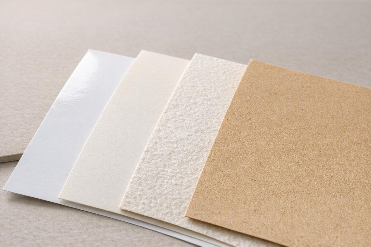
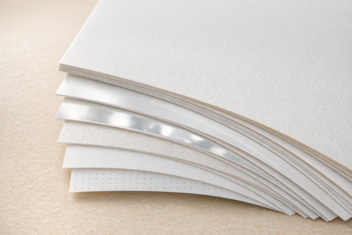
- Finishes: Gloss enhances colors and images but can glare; matte is glare-free and great for text; silk balances both. Uncoated paper is ideal for writing.
- Paper Types: Coated papers are durable and vibrant, while uncoated papers are natural and writable. Opaque papers work best for double-sided printing.
- Practical Tips: For catalogs, pair gloss cover with lighter gloss text. For event programs, matte cover with matte text works well. Heavier cover stocks need scoring to avoid cracking during folding.
The right combination of weight, finish, and type ensures your booklet looks professional and serves its purpose effectively. Whether you’re printing a product catalog or a manual, these choices matter. For expert help, consult a trusted print shop like Miro Printing & Graphics Inc.
Paper Guide: Paper Types for Printing – Choosing the Right One
Paper Weight Basics
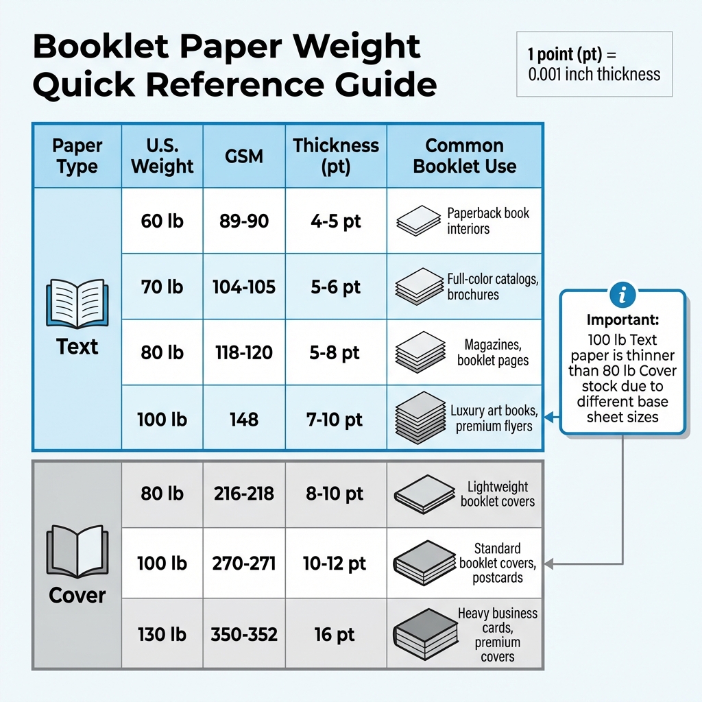
Booklet Paper Weight Comparison Guide: Text vs Cover Stock
Paper weight plays a big role in giving your booklet a polished, professional appearance. In the U.S., paper weight is measured in pounds (lb or #), which refers to the weight of 500 uncut sheets in their original size. However, this can get a bit tricky because the "basic size" changes depending on the paper type. For instance, Bond paper is measured at 17″ x 22″, Text paper at 25″ x 38″, and Cover stock at 20″ x 26″.
Here’s an important tip: a higher number doesn’t always mean thicker paper across different categories. OKI Data Americas explains it well:
"Higher values don’t always equate to heavier/thicker print media. For example, a sheet of 100lb Text paper is actually much thinner than an 80lb Cover stock".
This difference comes down to the varying base sheet sizes used for different paper types.
To simplify comparisons, printers often use GSM (Grams per Square Meter), a more consistent measurement. For example, 100 lb Text paper is about 148 GSM, while 100 lb Cover paper is roughly 270 GSM.
Another way to measure paper thickness is in "Points" (pt), where 1 point equals 1/1000th of an inch (0.001").
The sections below explore the best choices for interior and cover pages, keeping these weight concepts in mind.
Text Weight Papers for Interior Pages
Text weight papers, ranging from 60 lb to 100 lb, are flexible and easy to handle, making them great for booklet interiors. They fold easily and help keep the booklet’s overall bulk manageable.
- 60 lb text: A common choice for paperback book interiors and high-volume magazines. It’s cost-effective but may show ink bleed-through, especially with heavy color printing.
- 70 lb text: Offers better opacity, making it ideal for full-color catalogs and brochures where sharp images and minimal ghosting are important.
- 80 lb text: A versatile option often used for magazines, corporate reports, and product catalogs. It balances durability and flexibility.
- 100 lb text: A heavier option for luxury art books, premium flyers, and high-end brochures, giving interior pages a more substantial feel.
"The right paper weight can transform a simple brochure into a compelling tactile experience, endorsing professionalism without saying a word."
- Olivia Gray, Marketing Advocate, PrintingCenterUSA
For thinner booklets (12 pages or fewer), 100 lb text paper prevents a flimsy feel. For booklets over 40 pages, an 80 lb text stock keeps the booklet manageable and easier to flip through. If you’re mailing booklets, light-to-mid-weight papers (80–100 lb text) strike a balance between durability and lower postage costs.
Cover Weight Papers for Booklet Covers
While interior pages benefit from lighter text weights, covers need sturdier paper. Cover weight papers, also called cardstock, are thicker and more rigid than text weight papers. They typically range from 80 lb to 130 lb and provide both protection and a premium feel for your booklet.
- 80 lb cover: The lightest option, good for smaller booklets, brochures, and lightweight projects. It’s stiffer than text weight but still flexible.
- 100 lb cover: The go-to option for professional booklet covers, postcards, and invitations. It feels sturdy and premium without being overly rigid.
- 130 lb cover: A heavy-duty choice for business cards, premium covers, and projects requiring maximum durability.
"Thicker paper feels more formal and substantial."
- Natalie Wiley, Content Marketing Supervisor, Printivity
Using a separate cover stock instead of a "self-cover" (where the same paper is used for both the interior and exterior) enhances stiffness and gives the booklet a more professional look. Keep in mind, heavier cover stocks must be scored before folding to avoid cracking.
| Paper Type | U.S. Weight | GSM | Thickness | Common Booklet Use |
|---|---|---|---|---|
| Text | 60 lb | 89–90 | 4–5 pt | Paperback book interiors |
| Text | 70 lb | 104–105 | 5–6 pt | Full-color catalogs, brochures |
| Text | 80 lb | 118–120 | 5–8 pt | Magazines, booklet pages |
| Text | 100 lb | 148 | 7–10 pt | Luxury art books, premium flyers |
| Cover | 80 lb | 216–218 | 8–10 pt | Lightweight booklet covers |
| Cover | 100 lb | 270–271 | 10–12 pt | Standard booklet covers, postcards |
| Cover | 130 lb | 350–352 | 16 pt | Heavy business cards, premium covers |
When picking paper weights, always decide between "Text" and "Cover" categories first. This avoids confusion and ensures you’re making an accurate comparison. For designs with heavy ink coverage, choose a thicker stock or a coated finish to prevent ghosting or ink bleed-through.
Paper Finishes and Coatings
Once you’ve picked the right paper weight, the next step is deciding on the finish. The finish plays a big role in how your booklet looks and feels. It can influence everything from the way colors pop to how easy it is to flip through pages without dealing with glare. Ann O’Brien from Dazzle Printing sums it up perfectly:
"The defining characteristics of matte or gloss papers could ultimately be the right choice for a project for reasons other than simply how the uncoated paper feels to the touch."
There are four main finish options: gloss, silk, matte, and uncoated. Each offers unique advantages. Coated papers – like gloss, silk, and matte – come with a sealant that protects against moisture and oils, making them more durable. On the other hand, uncoated paper skips the sealant, leaving a natural, textured surface.
Gloss, Silk, and Matte Finishes
Gloss finish creates a shiny, reflective surface thanks to its thick coating. This finish keeps ink from being absorbed into the paper, which makes colors vibrant and photos sharp. It’s an excellent choice for photography books and marketing materials, though its high shine can cause glare and show fingerprints.
Matte finish offers a smooth, glare-free surface that’s resistant to smudges. It’s perfect for text-heavy projects like booklets and programs. Matte paper also delivers excellent color clarity and is a popular choice for corporate reports, educational materials, and even wedding programs with softer color palettes.
Silk finish sits somewhere between gloss and matte. It provides a soft sheen that enhances visuals without being overly reflective. This makes it a go-to option for brochures and product catalogs.
| Finish | Appearance | Feel | Best Use Case | Color Impact |
|---|---|---|---|---|
| Gloss | Shiny and reflective | Smooth and slick | Magazines, photo books | Vibrant and sharp |
| Silk | Subtle sheen | Soft and smooth | Product catalogs, brochures | Polished but clear |
| Matte | Flat with no glare | Smooth and muted | Text-heavy books, programs | Crisp and understated |
| Uncoated | Natural with no sheen | Rough and porous | Workbooks, journals | Soft and subdued |
Coated vs. Uncoated Paper
Coated papers are designed to slow ink absorption, which helps prevent smudging and ensures sharp, clean images. In contrast, uncoated papers absorb ink more quickly, giving them a softer, more organic look.
Uncoated paper is especially great for projects that involve writing, like journals, workbooks, or coloring books. As Printing for Less explains:
"Nothing beats uncoated paper when it comes to writing, so in most cases, don’t use a coated, glossy, or heavily textured paper."
Additionally, uncoated paper tends to be a more budget-friendly option. However, it does have its downsides – it’s less resistant to moisture and can pick up dirt more easily compared to coated papers. For booklets that will be handled frequently, coated paper offers better protection. If you’re looking for extra durability, a UV high-gloss coating can be added to booklet covers for scratch resistance. Just remember, UV coatings and laminates only work on smooth, coated papers and aren’t suitable for surfaces that need to be written on.
When deciding on a finish, think about the purpose of your booklet. If you’re creating a photography-heavy catalog, gloss is the way to go for its vibrant color payoff. For text-heavy manuals or workbooks, matte or uncoated paper ensures better readability and functionality.
For expert advice tailored to your project, consider contacting Miro Printing & Graphics Inc. Based in Hackensack, NJ, their full-service print shop offers a variety of high-quality finishes and printing options to bring your vision to life.
Next, let’s explore how these finishes work with different paper types and the impact of opacity on double-sided printing.
sbb-itb-ce53437
Paper Types and Opacity
After exploring paper weight and finish, let’s dive into how paper type and opacity can further enhance the quality and functionality of your booklet.
Choosing the right paper type is essential, especially for double-sided printing. The most common options include offset paper, text paper, book paper, and opaque paper.
Offset paper is an uncoated option often used for copiers. Its rough texture and high ink absorption make it ideal for projects like workbooks or forms that require writing.
Book paper comes in both coated and uncoated varieties. Uncoated book paper is thicker and more opaque than standard bond paper, making it a great choice for newsletters and catalogs. Coated book paper, available in finishes like gloss, matte, or silk, delivers vibrant colors and is perfect for magazines. Meanwhile, text paper is a versatile option for interiors, offering a premium feel with textures like linen or vellum.
Opaque paper is a specialized uncoated stock designed to minimize light transmission. Its thickness makes it perfect for double-sided projects like newsletters and catalogs, where preventing show-through is crucial.
Selecting the Right Paper Type
The paper you choose should align with your booklet’s purpose. For booklets that include writing sections, uncoated options like offset or opaque paper are excellent choices.
If your project involves high-end brochures or photography-heavy booklets, coated book paper is the way to go. The coating prevents the ink from soaking into the fibers, allowing it to sit on the surface for sharper images and vibrant colors. However, coated papers aren’t ideal for writing, as ink can smudge on glossy surfaces.
Text paper, with its premium textures like linen or vellum, is well-suited for corporate booklets or annual reports. On the other hand, uncoated book paper offers better opacity than bond paper while being more cost-effective.
| Paper Type | Common Applications | Features |
|---|---|---|
| Offset / Uncoated | Flyers, forms, internal docs | High ink absorption; rough texture; great for writing |
| Text Paper | Brochures, annual reports | Premium feel; flexible; textured options like linen |
| Uncoated Book | Newsletters, catalogs | Thicker and more opaque than bond paper |
| Coated Book | Magazines, high-end catalogs | Gloss, matte, or silk finish; enhances color quality |
Understanding paper types naturally brings us to the critical role of opacity in double-sided printing.
Opacity and Double-Sided Printing
Opacity plays a key role in ensuring your design looks clean and professional on both sides of the page. It measures how much light passes through the paper. A 100% opaque paper blocks all light, preventing text or images on one side from showing through to the other.
For double-sided printing, high opacity is a must. Without it, reverse-side content can create a distracting "ghosting" effect. As The Happy Printers explains:
"Opacity means no light is going through the paper, which means you can print on both sides and not have it show through".
Several factors affect opacity. Heavier and thicker papers generally offer better opacity. Coated papers tend to block more light than uncoated ones, and rougher finishes usually outperform smoother surfaces. Even the paper color matters – darker or tinted papers provide higher opacity than bright white sheets.
If your booklet includes heavy ink coverage or large images, consider using a thicker stock or a specific opaque grade to avoid ghosting. For saddle-stitched booklets, keep binding limits in mind: 100# text can handle around 60 pages, while 80# text can stretch to 64 pages.
For a professional finish, Miro Printing & Graphics Inc. in Hackensack, NJ offers full-service printing expertise to ensure your booklet is visually appealing and easy to read on every page.
Matching Paper to Your Booklet Project
Pairing the right cover and interior paper can turn your booklet into something that stands out and leaves a lasting impression.
Recommended Paper Combinations
When designing catalogs, consider using an 80# or 100# Gloss Cover with 70# or 80# Gloss Text for the interior. This combination ensures vibrant colors and keeps mailing costs manageable with lighter paper weights.
For event programs, especially those where attendees might jot down notes, an 80# Matte Cover paired with 100# Matte Text is ideal. This setup offers a glare-free, smooth finish and prevents smudging.
Durability is key for product guides and manuals. Use 80#–100# Cover stock with 60#–70# Uncoated Text. These materials provide sturdiness and are perfect for Spiral or Wire-O binding, which allows the booklet to lay flat for easy use.
Premium magazines require a more luxurious feel. A 100# Gloss Cover with 80# or 100# Gloss Text interior pages gives a polished, high-end look that grabs attention. As Olivia Gray from PrintingCenterUSA explains:
"The right paper weight can transform a simple brochure into a compelling tactile experience, endorsing professionalism without saying a word".
By combining weight, finish, and binding options, these paper pairings ensure your booklet meets both practical and aesthetic goals.
| Booklet Type | Cover Stock | Interior Stock | Finish | Binding |
|---|---|---|---|---|
| Catalogs | 80# or 100# Gloss Cover | 70# or 80# Gloss Text | Gloss | Saddle-Stitch / Perfect Bound |
| Event Programs | 80# Matte Cover | 100# Matte Text | Matte or Uncoated | Saddle-Stitch |
| Product Manuals | 80# or 100# Cover Stock | 60# or 70# Uncoated Text | Uncoated | Spiral / Wire-O |
| Premium Magazines | 100# Gloss Cover | 80# or 100# Gloss Text | Gloss | Saddle-Stitch |
Your paper choices should also align with printing and binding methods to ensure a flawless final product.
Printing Methods and Binding Considerations
The type of printing you choose can significantly impact the final look and feel of your booklet. Offset printing is ideal for projects requiring a wide variety of paper stocks and finishes. It delivers consistent colors and sharp details, making it a great choice for high-end or textured papers. Additionally, for large production runs, offset printing becomes more cost-effective as the price per unit decreases.
On the other hand, digital printing works well for smaller projects or those needing personalization. However, it may not handle specialty paper types as effectively as offset printing. If your booklet involves unique textures or heavier paper weights, offset printing might be the better choice.
Binding also plays a role in your paper selection. Perfect binding, which uses adhesive to create a flat spine, typically requires a minimum of 28 pages to achieve a square spine. For added durability, PUR adhesive is 50% stronger than standard EVA adhesive, allowing the spine to flex without cracking.
Miro Printing & Graphics Inc., based in Hackensack, NJ, offers both digital and offset printing along with in-house binding options like saddle-stitching, perfect binding, plastic coil binding, and comb binding. Their expertise ensures your booklet is professionally crafted, tailored to your budget and timeline, and perfectly complements your paper choices.
Conclusion
When selecting paper for your project, focus on three key aspects: weight, finish, and purpose. For interior pages, opt for lighter stock compared to the cover to ensure a balanced feel. If your booklet has a high page count, lighter paper prevents it from becoming too bulky, making it easier to handle. Glossy finishes are ideal for image-heavy designs, as they can increase reader engagement by up to 30%. On the other hand, matte or silk finishes work better for text-dense content, reducing glare and improving readability. For workbooks or manuals where users may need to write, uncoated paper is a must to avoid smudging.
Before committing to a full print run, always request physical samples to ensure the paper aligns with your vision. Think about how your booklet will be used: glossy paper works well for visually-driven catalogs, while matte is better suited for text-focused materials like presentations.
Partnering with a seasoned print shop can make all the difference. With over 30 years of experience since its founding in 1994, Miro Printing & Graphics Inc. offers personalized consultations to help you make the best choices.
Whether you’re designing catalogs, event programs, or high-end magazines, selecting the right paper can transform your booklet into a standout piece. For expert advice and a free estimate, reach out to Miro Printing & Graphics Inc. in Hackensack, NJ.
FAQs
What’s the difference between text weight and cover weight paper for booklets?
The key distinction between text weight and cover weight paper comes down to their thickness and intended use. Text weight paper is thinner and lighter, making it a great choice for the inner pages of a booklet. It’s easy to handle, allowing for smooth page turns while maintaining a sleek, polished feel.
In contrast, cover weight paper is thicker and more rigid, crafted specifically for covers or projects that need extra durability. Its sturdy build not only protects the internal pages but also gives the booklet a refined, professional finish.
What’s the best finish for my booklet project?
Choosing the right finish for your booklet is all about the impression you want to leave. A glossy finish delivers a shiny, vibrant look that amplifies colors and makes images stand out – perfect for photo-centric or promotional materials. If you’re aiming for a more subtle and polished vibe, a matte finish offers a smooth, non-reflective surface, which works well for text-heavy or sophisticated designs.
Another factor to consider is the type of coating – uncoated, matte, or glossy. Each option affects the texture and durability of your booklet. Coated papers, whether glossy or matte, provide a more polished feel, but your final decision should match the style and purpose of your project.
Why does paper opacity matter for double-sided printing?
When it comes to double-sided printing, paper opacity plays a key role. It determines how much of the text or images from one side of the page can be seen on the other. If the paper has low opacity, you might notice a distracting show-through effect, which can make the content less readable and give your booklet a less professional appearance.
Opting for paper with higher opacity can solve this issue. It helps ensure your booklet looks clean and polished, especially if you’re working with pages full of dense text or vibrant graphics. Paying attention to this detail can significantly improve the overall quality and readability of your printed materials.
Related Blog Posts
- Ultimate Guide to Paper Types for Business Printing
- Ultimate Guide to Paper Finishes and Textures
- How to Choose the Right Paper for Custom Prints
- Checklist for Choosing Recycled Paper for Printing
https://app.seobotai.com/banner/banner.js?id=6976b02012006df3517b2225