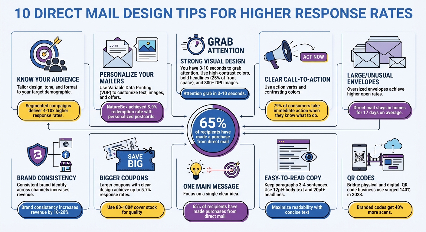
Direct mail campaigns only have a few seconds to grab attention and drive action. Designing effective mailers requires a sharp focus on your audience, clear messaging, and thoughtful visuals. Here are the key takeaways to improve your response rates:
- Know Your Audience: Tailor your design, tone, and format based on your target demographic.
- Personalization: Use data to customize text, images, and offers for your recipients.
- Strong Visuals: Prioritize bold headlines, high-contrast colors, and clean layouts.
- Clear Call-to-Action (CTA): Keep your CTA simple, direct, and visually prominent.
- Envelope Design: Use larger or unique envelopes to stand out in the mail stack.
- Brand Consistency: Ensure your mailers reflect your brand’s visual identity.
- Bigger Coupons: Increase coupon size for better visibility and ease of use.
- One Main Message: Focus on a single, clear idea to avoid overwhelming recipients.
- Readable Copy: Use short, simple sentences and legible fonts.
- QR Codes: Bridge physical and digital with scannable codes for easy access to online content.
These strategies combine targeted insights, polished design, and actionable elements to create mailers that grab attention and drive results.
10 Direct Mail Design Tips to Boost Response Rates
How to Improve Your Direct Mail Marketing (With Examples!)
sbb-itb-ce53437
1. Know Your Target Audience
Every design starts with knowing exactly who you’re speaking to. A campaign aimed at business executives will naturally look and feel different from one created for casual weekend shoppers. The format, imagery, tone, and materials you choose should align with what your audience expects and finds appealing.
"The best-looking mail piece will underperform if built for the wrong audience. Design should follow strategy, not the other way around." – Lob
To get it right, dive into the data. Look at factors like geography, lifecycle stage, purchase history, and interests. These insights help you create a message that truly resonates. In fact, segmented campaigns can deliver response rates that are 4 to 10 times higher.
Even the format of your mailer should reflect both your goals and what your audience will connect with. For example, a polished, professional design works well for B2B campaigns, while a bold, seasonal theme might grab the attention of everyday consumers. This tailored approach ensures your design feels relevant from the start.
At Miro Printing & Graphics Inc., we understand how critical these audience insights are. They guide every visual and strategic decision we make, helping us create mailers that grab attention and spark action. When you truly understand your audience, your mailer becomes more than just a piece of paper – it becomes a meaningful connection.
2. Personalize Your Mailers
When you truly understand your audience, personalization can turn ordinary mailers into messages that strike a chord. And it goes beyond just adding a name – using Variable Data Printing (VDP), you can tailor text, images, and offers based on real customer data.
Take NatureBox, for example. They sent 50,000 personalized postcards to customers who hadn’t engaged in a while. These postcards included details like individual reward balances, unique promo codes, and product recommendations. The result? An 8.9% redemption rate, a 35% jump in orders per customer, and 60% higher revenue per customer. Similarly, Bite Squad reached out to 20,000 inactive customers with personalized postcards, leading to an 18% redemption rate and 3,600 redeemed coupons.
Want to make your mailer stand out? Incorporate local imagery or custom maps to create an instant connection. For instance, Canon Solutions America personalized mailers with recipient names in full color, boosting response rates by 135%. When they added even more detailed, data-driven personalization, response rates skyrocketed by up to 500%.
Tailor your approach based on your audience. High-value loyal customers might appreciate detailed booklets, while a simple postcard could work better for first-time prospects. Automating mailings based on specific triggers – like cart abandonment or upcoming subscription renewals – can also be a game-changer. To bridge the gap between physical and digital, include unique QR codes or Personalized URLs (PURLs) that direct recipients to customized landing pages.
At Miro Printing & Graphics Inc., we make it simple to create personalized campaigns at scale with our VDP capabilities and mailing services. Combine this targeted approach with smart design strategies, and you’ll see engagement soar.
3. Create a Strong Visual Design
You’ve got 3 to 10 seconds to grab attention before your mailer ends up in the trash. That’s why your visual design isn’t just about looking good – it’s your best shot at making a lasting impression.
Start with visual hierarchy. Your headline, offer, or call-to-action should stand out the most. Use size and placement to ensure these elements don’t compete with one another.
Since 80% of recipients only read the headline, make it count. Dedicate about 25% of your postcard’s front to it. A bold, clear headline can make all the difference.
High-contrast colors are a powerful tool to grab attention. Think white text on deep purple or navy blue headlines on a bright yellow background. Colors go beyond aesthetics – they evoke emotions. For instance, red can create urgency, blue builds trust, and purple suggests luxury. Use these colors intentionally to enhance your message, and make your call-to-action stand out by giving it a unique color that isn’t used elsewhere on your design.
When it comes to typography, keep it simple. Use one main font with a supporting one, and stick to no more than three font sizes. Ensure there’s strong contrast between your text and background – this makes your message easier to read and prevents eye strain.
For images, always choose high-resolution photos (at least 300 DPI). Blurry or pixelated images can ruin your credibility instantly. Photos featuring people are especially effective at catching attention. If you include a person, have them facing toward your text rather than away from it – it subtly guides the reader’s focus.
Don’t overlook the importance of white space. A cluttered design is overwhelming and often ignored. Clean layouts with plenty of breathing room feel polished and naturally guide the reader’s eye.
Finally, the material you use matters. Heavier paper stock and finishes like matte, glossy, or soft-touch add a tactile element that conveys quality before your message is even read. At Miro Printing & Graphics Inc., we can help you choose the right paper and finish to match your message. Whether it’s a vibrant gloss for a high-energy promotion or a sophisticated matte for a premium vibe, these details work together to make your design stand out.
With these design strategies in place, you’ll capture attention and set the stage for a compelling call-to-action that drives results.
4. Write a Clear Call-to-Action
A strong visual design grabs attention, but a clear call-to-action (CTA) turns that attention into action. Your CTA isn’t just a line of text – it’s the critical moment where curiosity transforms into engagement. In fact, 79% of consumers take immediate action after receiving a mailpiece when they know exactly what to do next.
"Selecting a call to action is arguably the most important part of any direct mail campaign." – QuantumDigital
This highlights the importance of crafting a single, focused directive that leaves no room for confusion.
Keep It Simple and Direct
Stick to one primary CTA. Offering multiple choices can overwhelm your audience, so focus on a single, clear directive. Use strong, action-oriented verbs like "Claim," "Redeem," "Book," or "Scan." To encourage urgency, pair these with time-sensitive phrases such as "today," "now," or "last chance." For example, “Save 20% today” is much more compelling than a vague “Learn more.”
Make It Visually Stand Out
Your CTA should be impossible to miss. Use a contrasting color – preferably one that pops against your overall design – and surround it with plenty of white space to draw attention. The message should be clear and benefit-driven, such as "Get your free quote in minutes" or "Unlock 45% off now."
Track and Measure Effectiveness
Incorporating trackable elements like QR codes, personalized URLs, or unique promo codes allows you to measure the success of your campaign. For instance, in 2023, thredUP reengaged inactive customers by sending postcards with a "45% off" discount code and a unique redemption URL. Similarly, Marley Spoon saw a 263% boost in conversion rates through direct mail campaigns for customer reactivation, which contributed to 20% of their total reactivations.
5. Use Large or Unusual Envelopes
Once you’ve perfected the content inside, make sure the envelope delivers an equally strong impact. The envelope is the first thing recipients notice – it’s what decides whether your mail gets opened or discarded. Oversized envelopes, for example, consistently achieve higher open rates compared to standard ones. Similarly, unique shapes like square envelopes stand out in a stack of rectangular mail, instantly catching the eye.
"The envelope is your first impression – and one of the most important elements of a successful print campaign." – NDSU Print & Copy
If you want to take things further, consider envelopes with dimensional designs. These types of mail stand out because they feel different to the touch, making them perfect for high-value campaigns. You could also experiment with custom die-cut windows that offer a sneak peek of the contents without giving everything away. Adding interactive features like tear tabs or scratch-off areas can make opening the mail a fun and engaging experience.
To elevate the tactile experience, use premium finishes. High-quality paper stock combined with embossing or spot UV can add depth and texture. Depending on your message, you can choose between matte or glossy finishes to align with the overall tone of your campaign.
Here’s an interesting fact: direct mail typically stays in a recipient’s home for an average of 17 days. That means a well-designed envelope doesn’t just make an impression on day one – it keeps reinforcing your brand long after the initial interaction.
The secret lies in aligning your envelope design with your audience and message. For broad promotional efforts, oversized envelopes grab attention right away. For high-value prospects or key accounts, dimensional mail with luxurious finishes can create a more personal and impactful experience, making the extra investment worthwhile.
To ensure your envelope designs are executed perfectly, consider working with experienced printing professionals. Miro Printing & Graphics Inc., based in Hackensack, NJ, offers a range of printing, post-press, and mailing services to help bring your creative ideas to life.
6. Match Your Brand Identity
Your direct mail should seamlessly reflect your brand – it’s not just a standalone piece of marketing. When recipients see the same colors, fonts, and visual style across your website, social media, and physical mail, they instantly know it’s you. That instant recognition builds trust, which directly impacts response rates. This consistency ties back to the visual design principles we touched on earlier.
First impressions are quick – recipients form opinions in less than a second. If your design looks cluttered or low-quality, it can harm your brand’s image. On the other hand, clean layouts, sharp imagery, and a cohesive color scheme convey professionalism and reliability. Even your choice of colors can send a message: blue often suggests authority and trust, while purple exudes sophistication and wealth.
"A direct mail piece should still feel like it came from the same brand someone sees online, in email, or on social." – Lob
Keep your design intentional and uncluttered. Stick to your brand’s fonts and sizes to maintain a unified look. Use your brand colors to highlight important elements like your call-to-action, but don’t overpower the overall message. White space is your friend – it helps key elements stand out and gives your design a polished, professional feel.
Consistency isn’t just about aesthetics – it delivers real results. A cohesive brand identity across all marketing channels can increase revenue by 10% to 20%. Plus, nearly 90% of customers expect a consistent experience across platforms. When your materials align visually, your message becomes stronger and response rates climb.
If you’re looking for help to ensure your direct mail matches your brand’s identity, Miro Printing & Graphics Inc. is a great option. Based in Hackensack, NJ, they provide in-house design, digital and offset printing, as well as mailing and fulfillment services. Their expertise ensures your direct mail stays true to your brand.
7. Make Response Coupons Bigger
Make your coupons stand out by increasing their size and keeping their design simple. A small, cluttered coupon can easily be ignored or tossed aside, but a larger, well-designed one grabs attention and ensures your offer is noticed.
Bigger coupons also make your message easier to understand. When the fine print is legible and the redemption process is straightforward, people are more likely to take action. As Lob puts it, "If a recipient has to work to understand the message, they probably will not". Use the extra space wisely – include clear redemption instructions, like a code or any minimum purchase requirements.
Design matters, too. Add plenty of white space to let the coupon breathe, making key details like the offer, expiration date, and call-to-action pop. Lob explains, "The goal is not to fill every inch of the page. The goal is to make the important parts impossible to miss". For example, postcards printed on card stock with vibrant colors have achieved a 5.7% response rate, proving that a polished design can drive results.
To make coupons even more user-friendly, think about adding perforated edges. These make coupons easy and satisfying to tear out. A great example comes from August 2025, when Jacob Chavez at Ivinson Memorial Hospital created a tri-fold mailer for Hospital Week. It featured three perforated coupons for local businesses, simplifying both recipient use and vendor processing of redeemed coupons.
Durability is another key factor. Print your coupons on 80# or 100# cover stock with a gloss or matte UV coating to protect them from handling and moisture. Be sure to print all critical details directly on the coupon itself, as recipients often discard the rest of the mailer.
For high-quality printing and finishing, consider working with a reliable full-service print shop like Miro Printing & Graphics Inc. in Hackensack, NJ.
8. Focus on One Main Message
Your direct mail piece has about three seconds to grab attention as recipients flip through their mail stack. That’s barely enough time for them to notice one key idea. To make an impact, your message needs to be clear, concise, and laser-focused.
Clarity in messaging is just as important as an eye-catching design. A single, strong message stands out and tells recipients exactly what you’re offering. Rene Bonin, Creative Director at Amplified Mail, explains it perfectly:
"You can be heard a lot louder by whispering than by shouting".
Overloading your design with multiple images or messages only confuses the recipient.
Use visual hierarchy to make your main message impossible to miss. Highlight it as the boldest, most prominent element on the page, and surround it with plenty of white space to draw attention. Stick to one high-quality image (300 DPI or higher) that directly supports your message instead of cluttering the design with unnecessary graphics.
Your call-to-action (CTA) should be just as focused. A single, clear directive – like "Scan to get 20% off" or "Book your free consult" – works far better than offering multiple options, which can dilute your response rates. Keep your copy short and sharp, focusing on the benefit to the recipient.
And here’s a powerful stat to keep in mind: around 65% of direct mail recipients have made a purchase because of a mail piece. A focused message ensures your offer stands out and sets the stage for a compelling call-to-action, which we’ll dive into next.
9. Write Easy-to-Read Copy
A clear, easy-to-read message is key to keeping your audience engaged. People tend to skim through mailers, deciding within seconds whether to keep reading. If your message feels complicated or hard to follow, it’s likely to be dismissed without a second thought.
Keep paragraphs short – three to four sentences work best. This keeps your writing punchy and respects your reader’s time. Use straightforward language and avoid unnecessary complexity. Even your punctuation should be simple to maintain a smooth reading flow.
To make your content more digestible, use bullet points, subheadings, and plenty of white space. These elements help readers zero in on the important points while also giving your design a clean, polished look.
When it comes to fonts, stick with legible sans-serif options like Helvetica or Futura. Ensure body text is at least 12pt, and make headlines 20pt or larger for easy readability. Limit yourself to one or two typefaces and maintain strong contrast between your text and background to enhance visibility.
Finally, write in an active voice to keep your audience engaged. For instance, "Save 30% on Your First Order" grabs attention more effectively than a passive alternative. Break up long blocks of text, and make every word count to keep your readers hooked.
10. Add QR Codes for Digital Access
QR codes are a smart way to bridge the gap between your physical mailers and online content. They make it easy for recipients to access things like landing pages, discount offers, or product catalogs without having to type out long URLs. Plus, QR codes come with detailed tracking capabilities. You can monitor total scans, unique scans, geographic data, device types, and engagement levels. In fact, business use of QR codes surged by 140% in 2023.
If you’re using QR codes, go for dynamic ones instead of static. Why? Dynamic QR codes let you update the linked URL even after printing, so you can tweak offers and track performance in real-time.
Here’s a quick tip: follow the 10:1 rule when sizing your QR code. The code should be about one-tenth the distance from which it will be scanned (for example, 1 inch for a 10-inch viewing distance). Use vector formats for sharpness, ensure high contrast, and maintain a quiet zone of at least four modules around the code to make scanning seamless.
To boost engagement, pair your QR code with a clear and enticing call-to-action. Phrases like "Scan for 20% Off" or "Scan to RSVP" can increase scans by 30–50% compared to generic instructions. Position the QR code in the bottom-right corner of your mailer – this is where readers naturally finish scanning. For an added touch, customize the code with your brand’s colors and logo. Branded QR codes can see up to 40% more scans than plain ones.
If you want professional help designing and integrating QR codes into your mailers, check out Miro Printing & Graphics Inc.. Their in-house design and printing services ensure your mailers look great and drive results.
Conclusion
Direct mail continues to deliver results – 65% of recipients have made a purchase because of a mail piece. To achieve success, focus on three key elements: smart audience research, personalized messaging, and polished visual design. Every detail matters, from the headline and offer to the choice of colors and paper stock. Each component plays a role in grabbing attention and driving action.
By combining audience insights with eye-catching design, you can create mailers that truly stand out. When your campaign incorporates strong visual hierarchy, premium finishes, and interactive tools like QR codes that connect to digital content, your mail doesn’t just get noticed – it inspires action.
Partnering with a professional print shop ensures your campaign reaches its full potential. Accurate colors, sharp finishes, and reliable delivery are critical to success. Miro Printing & Graphics Inc. offers a full range of services, including computer layout and design, offset and digital printing, in-house bindery, and complete mailing and fulfillment. With over 30 years of experience since 1994, their attention to detail elevates every project.
"Miro Printing & Graphics Inc. will work with a professional, personal approach to better understand your company’s needs. The end result is a finished piece that exceeds your highest expectations but never your budget!"
Choosing the right partner simplifies the process. Consolidated proofing, production, and delivery reduce errors and keep your campaign on track, ensuring smooth execution from start to finish.
FAQs
What direct mail format should I use (postcard, letter, or booklet)?
Your choice of format – postcard, letter, or booklet – should align with the message you want to convey and your objectives.
- Postcards: Perfect for grabbing attention quickly and delivering concise offers or announcements. Oversized postcards can amplify that impact even further.
- Letters: Ideal for a more personal touch or when you need to tell a detailed story. They’re great for fostering a connection or explaining something in depth.
- Booklets: Best suited for sharing more detailed information, such as product catalogs, proposals, or guides. These work well when your audience needs a comprehensive overview.
Each format has its strengths, so the right choice depends on how much information you need to share and the tone you want to set.
How can I personalize direct mail without a large customer database?
Variable data printing lets you add a personal touch to your mail pieces by including details like names or local references – even if your database is relatively small. Want to go a step further? Use demographic or behavioral data to create targeted mailing lists that speak directly to your audience.
To keep your campaigns on point, make sure your data is up-to-date. Set default fields for any missing information so your mail still feels polished and personalized. This approach helps you deliver tailored messages while working within the constraints of a limited customer database.
How can I track response rates from a mailer?
Tracking response rates is straightforward with tools like unique codes, personalized URLs, or response cards included in your mailer. The response rate itself is the percentage of recipients who engage or take action based on your campaign. For context, recent data shows that average response rates hover around 4.4%. Monitoring these responses gives you a clear picture of your campaign’s impact, making it easier to refine and improve future efforts.
Related Blog Posts
- 8 Metrics to Track Direct Mail Success
- 5 Steps to Define Print Campaign Target Audience
- Common Print Marketing Mistakes That Waste Money
- How to Allocate Direct Mail Budgets for ROI
https://app.seobotai.com/banner/banner.js?id=69dd785409e6c77f4f7ae178
